2,179 search results
(0.009 seconds)
- Splats - Unknown license

- Ramshackle JNL by Jeff Levine,
$29.00 - Akbar - Unknown license

- Vicenza by Almarkha Type,
$29.00
- Quakiez by Almarkha Type,
$20.00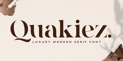
- Bluebeard by Canada Type,
$24.95 - Shoal by Graphicfresh,
$18.00
- Blocking by Gassstype,
$27.00
- Froga by Roman Melikhov,
$15.00
- HeartMatrixed by Ingrimayne Type,
$12.95
- URAL by Fenotype,
$19.00
- Scalactic J - Unknown license

- Rennie Mackintosh Moonlight by CRMFontCo,
$20.00 - Stainless by Gassstype,
$27.00
- Selectric by Indian Summer Studio,
$55.00
- Crypto Scam by Gassstype,
$29.00
- ShakeiTup - Personal use only

- Usuzi - Unknown license

- I Still Know - Unknown license

- P22 Glaser Houdini by P22 Type Foundry,
$24.95
- Amazon Lily by Forberas Club,
$16.00
- Titla Brus by ParaType,
$25.00
- YoungFreshFellows - Unknown license

- Bealiva Vintage by Mevstory Studio,
$15.00
- Rennie Mackintosh Stems by CRMFontCo,
$25.00 - Hollywood and Vine JNL by Jeff Levine,
$29.00
- Plak by Linotype,
$40.99
- News Ticker JNL by Jeff Levine,
$29.00
- Simple Stamp by Oleg Stepanov,
$20.00
- Dinosaur Jr - Unknown license

- Makalu by Juraj Chrastina,
$29.00
- B Surfers - Unknown license

- SavingsBond - Unknown license

- Kanji OC by Okaycat,
$29.95
- mzw teaparty - Unknown license

- Walbaum Fraktur by Linotype,
$67.99
- Klee by ITC,
$29.99 - PL Barnum Block by Monotype,
$29.99
- Viareggio by Hanoded,
$15.00
- Versacrum NF by Nick's Fonts,
$10.00


