1,165 search results
(0.018 seconds)
- Squealer - Unknown license

- LD Underwood 5 by Illustration Ink,
$3.00 - Rennie Mackintosh Hillhouse by CRMFontCo,
$20.00 - Aristide by Jonahfonts,
$29.95
- Aharoni MF by Masterfont,
$59.00
- Beat Poet JNL by Jeff Levine,
$29.00
- Bairak Script by Donchenko,
$10.00
- Fairport by Ryan Corey,
$10.00
- Working Dead by Asterisk,
$33.00
- VTG Watson Steel Pen by Voltage Ltd,
$35.00
- Hachraza MF by Masterfont,
$59.00
- Prat MF by Masterfont,
$59.00
- Ice Flowers by kapitza,
$69.00
- Plonker by Tour De Force,
$25.00
- LD Remington Portable by Illustration Ink,
$3.00 - Origami Bats by Lauren Ashpole,
$15.00
- Geoffrey - Personal use only

- Quake3ArenaBats - Unknown license

- LT Fillet Medium - 100% free

- Caesario by Scriptorium,
$18.00 - Rennie Mackintosh Scotland St by CRMFontCo,
$20.00 - Rapscallion - 100% free

- Schein by Almarkha Type,
$29.00
- Roskilde by Hanoded,
$15.00
- Hexore by Almarkha Type,
$29.00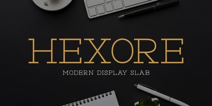
- Modesfa by Almarkha Type,
$33.00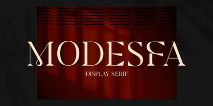
- Quinger by Almarkha Type,
$33.00
- Luxoorea by Almarkha Type,
$25.00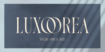
- Delaproza by Almarkha Type,
$29.00
- Sangira by Almarkha Type,
$29.00
- Glamorez by Almarkha Type,
$35.00
- Halewyn by Hanoded,
$15.00
- Balava PS Font Duo by pentagonistudio,
$19.00
- Nouveau Rock by Okaycat,
$29.95
- Trick Or Treating by Graphicxell,
$19.00
- Plans by Graphicxell,
$19.00
- Gorgeous Cultural by Graphicxell,
$19.00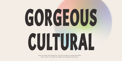
- Looky Cookie NF by Nick's Fonts,
$10.00 - Londrina by Tipos Pereira,
$-
- RMU Helion by RMU,
$35.00


