10,000 search results
(0.068 seconds)
- Magilio by Prioritype,
$19.00 Introducing Magilio - A Chic Serif Fonts Beautiful and soft fonts in a contemporary style that can make your design projects look modern, elegant and luxurious. Made with many alternative characters to make it easier for you to do various design projects and give you fun while typing. You can apply them to designs like social media posts, logos, merchandise, book covers, posters, video content thumbnails, quotes, landing pages, wedding invitations and much more which you can make with this great item for any design :) Features: -Uppercase -Lowercase -Numeral -Punctuation -Multilingual -Opentype Features & PUA Encoded Multilingual contained: Afrikaans, Albanian, Asu, Basque, Bemba, Bena, Breton, Catalan, Chiga, Cornish, Danish, Dutch, English, Estonian, Filipino, Finnish, French, Friulian, Galician, German, Gusii, Indonesian, Irish, Italian, Kabuverdianu, Kalenjin, Kinyarwanda, Luo, Luxembourgish, Luyia, Machame, Makhuwa-Meetto, Makonde, Malagasy, Manx, Morisyen, North Ndebele, Norwegian Bokmål, Norwegian Nynorsk, Nyankole, Oromo, Portuguese, Quechua, Romansh, Rombo, Rundi, Rwa, Samburu, Sango, Sangu, Scottish Gaelic, Sena, Shambala, Shona, Soga, Somali, Spanish, Swahili, Swedish, Swiss German, Taita, Teso, Uzbek (Latin), Volapük, Vunjo, Zulu. Note: Use a program that supports the Opentype features and the glyph panel is available, so you can see the various alternative characters available. Examples of programs such as Adobe Illustrator, Corel Draw or Affinity Designer.
 - FF Market by FontFont,
$76.99 German type designer H. A. Simon created this script FontFont in 1996. The family contains 3 weights: Regular, Condensed, and Bold and is ideally suited for advertising and packaging, festive occasions, editorial and publishing, poster and billboards as well as software and gaming. FF Market provides advanced typographical support with features such as ligatures, alternate characters, case-sensitive forms, fractions, super- and subscript characters, and stylistic alternates. It comes with tabular lining figures.
 - Promenade by Jen Wagner Co.,
$17.00 Introducing Promenade – a calligraphic serif that started on paper with a flat nib pen (see the 6th image), and blossomed into a full serif with italics. At its core, this font is just... beautiful. It's elegant, it's crisp, it's delicate, but can still hold its own. As I was creating the graphics, I just couldn't get over the flow of the letters – especially the italic. It's got class, but also isn't afraid to rock a pair of Doc Marten's. Funny enough, Jen from Tonic (they make beautiful websites) saw a preview of this font and said, "I'd take that font to prom." Which of course spurred a conversation about how this font would take a Mercedes G-Series instead of a limo, and wear Doc Marten's instead of heels, but still wear the most gorgeous dress, and that is 100% Promenade (and inspo for the name – thanks, Jen!). I've also been loving combining the regular and italic, especially for logos (see the "Friendfolk" logo) One thing to note about Promenade is the letter spacing. It was spaced for clean reading and intentional balance, so I recommend setting the spacing a little tighter if you want to create the display look found in many of the logo mockups(around -20 to -40 should do!).
 - Audace Std by Typofonderie,
$59.00 Between geometry & shapes inspired by nature, in 4 fonts Audace was born as a response to a simple brief: how to visually express human interaction and technology with abstract forms? The starting point is a humanistic sanserif, to which are added external references: design pieces, furniture, buildings. Architects shape our world with the intention to reconnect nature, human and address a perfect functionality. Not so far to typeface design which combines a personal vision and ensures good legibility in a certain context. Audace — like the works of those artists, designers, architects — is clearly influenced by the tension of the line, the play with negative space, the dynamics, the surprise, the nature that will influence the shapes of the letters. So if a v is asymmetrical, and the y based on similar asymmetry but in reverse, these two shapes help to distinguish from one to the other. This is a consequence of the influence of forms from design and art in the design of the Audace. And this small example illustrates the confrontations of the designer’s influences: the search for the most unique shapes, but without compromising on function: to be read, to be legible, even at very small size in the worst conditions. Audace, between geometry and shapes inspired by nature
 - Caldina by Artegra,
$29.00 Caldina is a delicious font family that adds a great taste to any given project. From light to bold, it comes with 10 fonts with matching true italics. Each font contains 659 glyphs which offers a great amount of language support including the Greek, Russian and other languages using the Cyrillic alphabet. Each glyph has been designed to perfection and kerned with countless amount of kerning pairs. When it comes to Opentype features it has oldstyle figures, tabular lining, tabular oldstyle, ligatures, subscript and superscript, fractions and language localizations (such as the Polish kreska). It’s great for display purposes but also its high legibility makes it a great text font as well. Although not limited to, it’s perfect for food, beverage and coffee brands as well as the cos- metic brands. Let it be branding, advertising, packaging or posters, Caldina is there to add that special flavor that you’re looking for.
 - Bilokos Pro by AukimVisuel,
$14.00 Bilokos Pro is a cool and modern display font. Designed by experts to make your design look out of this world, this font has the potential to take your creative ideas far. This is a condensed sans serif display font. On the one hand, it has rounded curves with very open terminals that make this font family elegant, user-friendly and contemporary and on the other hand very useful for writing titles in any medium. It also comes with stylistic variations of 0-9, A-Z and a-z to satisfy the most demanding professionals. It has OpenType features like full ligatures, tabular figures for tables, old style figures to elegantly insert numbers into your sentences. With its large character set, it meets the needs of professionals because it will support several languages of Western Europe, Eastern Europe, Central Europe, Greek and Cyrillic for international communication.
 - Richard & Caroline by Silverdav,
$10.00 **Richard & Caroline** is a classic font with a modern style, so it adds a luxurious feel to this font, there are many ligatures and alternates that you can use for your design, and this will make your design more stunning and stand out. This serif font contains a number of ‘lowercase’ (A, E, U, I, O) and Uppercase Alternates characters. this can be accessed by enabling ‘stylistic Alternates’ in any software that supports OpenType. all ligatures and special characters are also accessible via the Glyphs panel. it is available in most Adobe & Affinity Designer software. **NEW UPDATE - RICHARD & CAROLINE FAMILY** what’s included: - Richard & Caroline Thin - Richard & Caroline Extra Light - Richard & Caroline Light - Richard & Caroline Normal - Richard & Caroline Thin Italic - Richard & Caroline Extra Light Italic - Richard & Caroline Light Italic - Richard & Caroline Normal Italic - Added Many Ligatures - Added lots of Uppercase Alternates - Support 75 Languages If you have any questions, please contact us
 - Metro New One by JAB'M,
$15.00The main inspiration is from Art Nouveau which flourished in Europe at the end of the 19th and beginning of the 20th centuries. This design included furniture (Majorelle, Lalique) and architecture (Victor Horta, Henry Van de Velde, Gaudi, Alfons Mucha). But Hector Guimard remains the favorite for all aspects of its art and, of course, its typefaces used on the Parisian Metropolitan posters. In particular, the various kerning of the various letters he used to make the poster a whole design from singular designs, leading to numerous variations. As a designer, I first worked with the individual glyphs Hector Guimard designed and I discovered that they vary constantly from a poster to another, depending on the overall result he was looking for. Another difficulty in transferring his design to printing is that there was no lower case. I was excited to create the whole font from the original designs of Hector Guimard, incorporating its variations and "crazy kerning". After several attempts, it appeared to be impossible to include all variations and I slightly moved to my own new design as a complete font, upper and lower case, with kerning. I voluntarily limited the ascenders and descenders to the usual typography so that it can be used from 10 / 12 points. This version can be used to edit letters and books in the context of Art, specially Art Nouveau and Art Deco of course, posters of any kind. - Kigo by Prominent and Affluent,
$30.00 Artistic, bold and creatively designed - Kigo Font is the perfect choice for graphic designers who want to add an element of fun to their designs. Inspired by retro sans serif and the beloved shape of a cat, Kigo Font combines classic design with whimsy. With 4 styles including Regular, Round, Regular Italic and Round Italic, this font family offers versatility in every project you undertake. The multilingual support of Kigo allows you to seamlessly incorporate your message in any language without compromising on style or clarity. Perfectly suited for professional use, Kigo Font adds that touch of personality without sacrificing professionalism. Whether it's for branding projects or marketing collateral, let Kigo Font be your go-to choice when looking to create something truly unique. Upgrade your designs today with this playful yet sophisticated font!
 - Vilgorda by Letterhend,
$19.00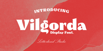 Vilgorda is a unique bold display font. This type of font perfectly made to be applied especially in logo, headline, signage and the other various formal forms such as invitations, labels, logos, magazines, books, greeting / wedding cards, packaging, fashion, make up, stationery, novels, labels or any type of advertising purpose. Features : uppercase & lowercase numbers and punctuation multilingual PUA encoded We highly recommend using a program that supports OpenType features and Glyphs panels like many of Adobe apps and Corel Draw, so you can see and access all Glyph variations. How to access opentype feature : letterhend.com/tutorials/using-opentype-feature-in-any-software/ Email us to letterhend@gmail.com if you need something! Happy Designing!
 - The Moon Milter by Letterhend,
$19.00 Introducing, The Moon Milter is a vintage sans serif font. Inspired by 50s 60s signages, this font made to bring back the good ol' days. This type of font perfectly made to be applied especially in logo, headline, signage and the other various formal forms such as invitations, labels, logos, magazines, books, greeting / wedding cards, packaging, fashion, make up, stationery, novels, labels or any type of advertising purpose. Features : numbers and punctuation multilingual -PUA encoded We highly recommend using a program that supports OpenType features and Glyphs panels like many of Adobe apps and Corel Draw, so you can see and access all Glyph variations. How to access opentype feature : letterhend.com/tutorials/using-opentype-feature-in-any-software/
 - Caligonia by Letterhend,
$19.00 Caligonia, a casual display font which has unique ligatures. This font perfectly made to be applied especially in logo, and the other various formal forms such as invitations, labels, logos, magazines, books, greeting / wedding cards, packaging, fashion, make up, stationery, novels, labels or any type of advertising purpose. Features : uppercase & lowercase numbers and punctuation multilingual ligatures alternates PUA encoded We highly recommend using a program that supports OpenType features and Glyphs panels like many of Adobe apps and Corel Draw, so you can see and access all Glyph variations. For how to accessing opentype feature, kindly check this link letterhend.com/tutorials/using-opentype-feature-in-any-software/ Email us to letterhend@gmail.com if you need something! Happy Designing!
 - Fruge by Grontype,
$12.00 Fruge is a fresh, calm, and charming monoline handwriting font family. This font is a round edge style and equipped with extra ligatures and alternatives. Fruge is Perfect for editorial design, branding, packaging, cards, posters, stickers, quotes, social media posts and more! Features: Regular & Italics Basic Latin Glyphs Uppercase and Lowercase Letters Alternates & Ligatures Numeral and Punctuation Multilingual Support Thankyou for picking up this font, hope you enjoy it. Regard. Grontype
 - Kathleen Sans by ActiveSphere,
$30.00 Kathleen Sans is a geometric sans-serif display font and works best in text and display applications, such as posters, headline, magazine, logos, titles, product branding, corporate branding and publishing. The Kathleen Sans font family has three weights: Light, Regular, and Bold, each available in italic, making a total of six styles. Each style has a full upper and lower-case, accents, punctuation and a selection of monetary symbols.
 - Rogenne by GuseType,
$12.00 Rogenne is a display serif font. Rogenne font also have elegant touch in every single character there make look more classy and luxury. This font has alternate and ligature features which are good for stylizing your text for completing various projects such as banners, brochure, logos, products, labels, websites, posters, brands and many more. Feature: - Kerning - Alternative Style and Ligature - Uppercase and Lowercase Letters - Numeral - Punctuation and Symbols - Multilingual Supports
 - Metroland by takoliko,
$15.00 Metroland inspired by urban and modern life on a metropolis city. Metroland have a Subway vibe and a transportation theme that relate to our routine. Metroland is simple and modern sans serif display family font. it has a monoline geometric, and simple atmosphere. Metroland came with 9 weight and 9 italic fonts. It can easily be matched to an incredibly large set of projects, and good for communicating your brands.
 - Mont Blanc by Fontfabric,
$35.00 A new type giant emerges taking after the legendary geometric sans serif Mont! Mont Blanc elevates all prized unique details of Mont and translates them into an independent flawless text font family. This type prodigy comes with heaping legibility improvements dedicated to the smaller sizes and challenging paragraphs. The new type family is set to climb to the top of your “favorite design tools” with adjusted x-height, refined weight, and glyphs redesign to name but a few. Venture into new projects equipped with 8 font weights and matching italics, multi-script support, and rich OpenType features set. Language Support: Extended Latin (all Western languages), Cyrillic, Greek OpenType Features: Localized Forms Subscript Scientific Inferiors Superscript Numerators and Denominators Fractions Ordinals Lining Figures Proportional Figures Tabular Figures Oldstyle Figures Case-Sensitive Forms Standard Ligatures Stylistic Alternates Contextual Alternates
 - Allister Rough by Ksenia Belobrova,
$29.00 Allister Rough is a handmade font family based on Oldstyle English and Transitional fonts, modern typography and lettering. It’s a kit of joyful fonts that can be used for cards, posters, books, t-shirts, etc. Allister Rough has three font Styles and Extras. “Decor 1” is an expressive font which has three sets for each letter. “Decor 2” has two sets and “Caps” has Capital letters and Small Capitals. So you can choose what you need or combine Styles to create different typography compositions. All contextual alternates are built into the ‘Liga’ feature and duplicated into the ‘Calt’ feature. So when you work with the fonts, please make sure that ‘Liga’ or ‘Calt’ is turned on. Font family also supports OpenType features like Titling, Oldstyle Figures, Fractions, Ordinals. Please take a look at the User Guide in the Gallery.
 - Nora Grotesque by vve.type,
$34.99 Nora Grotesque is a modern sans serif type family of five weights plus true matching obliques, all completely equipped with opentype features, fractions, lining numbers, old style figures, capsular numbers, superscript and inferiors. It has been designed parallel within the neogrotesque universe of typefaces and is inspired by humanist proportions and humanist-grotesk features in multiple languages, support Central and Eastern European as well as Western European languages. Working on Nora Grotesque type family, we've aimed to create a modern geometric grotesk with the widest implementation range, a reliable workhorse. Nora Grotesque is equipped for complex, professional typography with a high x-height for maximum legibility and a powerful personality then other alternates. We've been especially careful working on the uniq geometry of each glyph, both from the point of view of visual correctness and forms continuity.
 - Varisse by AVP,
$19.00 Varisse spans over two centuries of type design and draws its inspiration from well-loved classics that are as fresh today as they were when they were created. The range stretches from a quintessential 18th century transitional serif to an uncompromising 20th century sans. Think Baskerville, think Gill. The idea was to create a family that shared similar forms and the same vertical metrics, allowing them to be mixed to provide impact and readability as required. With a generous x-height and a host of options, the Varisse family is ideally suited to branding, packaging, magazines and editorial. It also provides a wealth of opportunity in website presentation. The fonts are divided into five subfamilies by degree of ‘serification’. Varisse Sans Varisse Soft Sans Varisse (normal) Varisse Soft Serif Varisse Serif Each subfamily contains six weights and accompanying italics.
 - Mamute by PintassilgoPrints,
$18.00 Mamute is a block rockin' family with a cool letterpress look. Its upper- and lower-case slots hold glyphs with slightly different textures for a natural look. Numbers and punctuation marks also have alternate versions. Just trigger the Contextual Alternates feature to easily cycle the alternate glyphs, preventing double letters from displaying the same texture. Mamute is a highly decorative typeface available in 2 widths, regular and condensed, each also offered as a layered font, a handy and playful way for adding shades to your composition. There’s also a generous ornaments font and a catchwords one to spice up your designs. Mamute is based on Aldine wood type spirit (as there were many incarnations of it!), from circa 1870. Please note that this family has a limited character set and doesn't bring diacritics nor accented characters. But yet it does rock, you bet!
 - Revolin by Propertype,
$9.00 Revolin is a contemporary geometric sans family in 18 styles. Strong geometric characters combine with a modern, sharp cut, resulting in a strong font with a distinctive personality. The bold concept of repeating basic shapes creates a clear rhythm and makes this a highly readable set suitable for everyday use. Revolin Comes in 9 weights, each designed to fill the space without screaming, appearing smooth and confident. The tall X height and strong capital letters maintain clear visibility across all weights and have been optically corrected for better readability. The matching slant at 12º helps provide complete expression. Fonts Included: Uppercase Characters Lowercase Characters Numbers and Ligatures Multilinguage Support This Revolin Family features this fresh reworking of a classic geometric style offering a wide range of potential applications: suitable for logos, branding, signage, interfaces and design.
 - Billowed by Ingrimayne Type,
$9.00 Billowed is a typeface family inspired by a simple shape that tessellates in three different ways: in a single orientation, in two orientations, and in four orientations. The shape resembles a billowing sail, with two concave edges that are adjacent and two convex edges, also adjacent. Forcing letters into this template shape results in some oddly shaped letters, but the result should not be judged by individual letters but by how the words and strings of words appear. Billowed was designed as an alternating-letter font in which two sets of characters alternate. The alternating is done automatically in applications that support the OpenType feature contextual alternatives (calt). To get the ripple pattern not just horizontally but also vertically, lines should alternate between the right and left styles and leading set to the same value as the font size. Billowed is monospaced with tight letter spacing to accentuate the ripple pattern. The family includes outline styles that can be used in a layer above the solid style to add color. Undulate was not designed for any particular use but as a challenge to fit letters into a particular geometric shape. The unusual patterns that result are eye-catching and may be useful for advertising or signage and in other places where one wants attention-grabbing lettering.
 - Carrol Wild by Sarid Ezra,
$13.00 Introducing Carrol Wild, the wild version of Carrol Sans Family! Carrol Wild is a wild and modern sans with a bunch of alternates in each alphabets! Every alphabet have alternates up to 6 kinds! This font fits in any project. You can use it for a tittle, logo, quotes, or become a pairing in any script font. There are three style of this font. Clean, Rough and Stamp. This font also support multi language! What will you get: CarrolWild Clean (OTF & TTF) CarrolWild Rough (OTF & TTF) CarrolWild Stamp (OTF & TTF)
 - Kapra Neue by Typoforge Studio,
$29.00 Kapra Neue was the #1 bestselling Grotesque Sans released in 2017 on MyFonts. Kapra Neue is a younger brother of Kapra. This new family has refreshed proportions, rounded corners, and a new shape of glyphs. It is characterised by a wide range of instances – 24 new weights, from Thin Condensed to Black Expanded, allowing use of the family in complex ways, depending on the user’s needs. Every instance comes with its italic version. The font has a glyph set for latin script and old-style figures. Kapra Neue is inspired by a “You And Me Monthly” magazine, published by National Magazines Publisher RSW "Prasa” in Poland, from May 1960 till December 1973.
 - Stettinum Nicodemus Pro Sansum by Wardziukiewicz,
$20.00 Stettinum Nicodemus Pro is a project to revitalize lettering from tenement houses in Szczecin. The project includes the digitization of letter remains from ul. Kaszubska in Szczecin to form functional fonts. The main idea of the project was to preserve the disappearing remnants of Szczecin's typographic past, which, despite the span of glyphs limited by time, can be an inspiration for many future extensions of the already established family. Stettinum Nicodemus Pro Sansum is a family of typefaces consisting of 7 variations. The block structure with a regular structure and a relatively high minuscule allows for many different applications. Versions 700, 800 and 900 are intended for titles, headings and emphasis, typefaces 300 to 600 are text typefaces.
 - Patron by Vesturbær,
$45.00 Patron is a modern, mono-linear, sans-serif font family with large x-height and softened edges containing 12 fonts. This typeface was born as a corporate font design for non-profit sector and today it is available for public. At the moment Patron is offered as a PostScript-flavored OTF, but its construction is tuned to display well on screen as well. Works on a TrueType version with individual glyph hinting are being carried out. In addition, Patron has alternative family (Patron Alt) with enhanced personality, suitable mainly for headlines. Patron is graduation work of Matěj Hlaváček at AAAD in Prague, Studio Of Typography. Supervised by František Štorm, Tomáš Brousil and Karel Haloun.
 - Caniste by Ilham Herry,
$20.00 The vintage typeface returns with the Caniste typeface family. My passion for something with a vintage aesthetic is one reason I created Caniste. Inspired by antique ephemera such as cigar box labels that were common in the 19th century, it harkens back to the beauty of typographic design at that time. The Caniste font family is an all-caps serif font with uppercase titling. It comes in 6 weights: Extra Light, Light, Regular, Semibold, Bold, and Ultra Bold. It also has very user-friendly Extras, such as scrolls, ornaments, and panels, and allows you to create beautiful ornamentation to suit your needs. I hope you enjoy using the Caniste fonts. Thank you!
 - Grandecort by Ingrimayne Type,
$9.95Grandecort is derived from the OakPark family. It has lost the serifs, and has moved to a more traditional look. The upper case letters are a bit heavier than the lower case letters, but overall the letter shapes are fairly conventional for a bold, display face. In later 2018 the family was expanded to 9 fonts. GrancMitStripes was reworked to make four new faces: GrancAllStripes, GrancTopStripes, GrancBottomStripes, and GrancCaps. The last can be used as a background layer for the others. Also, The interior of GrandecortShadow was separated out to form GrandecortShadowInside. It has the same shapes as Grandecort-Regular but the spacing of GrandecortShadow and can be layered with the shadowed style to easily create bi-colored letters. - Auster by Resistenza,
$39.00 Auster, A Sans with Flair! Auster packs sensational personality in its fine-tuned forms. Confident and quirky, yet comfortable to read, this distinctive san serif family stands out from the crowd. The curves cinch and strokes flair in unconventional places making Auster an unashamed rebel sure to turn heads. Originally designed during the TipoBrda Workshop in Slovenia. Resistenza spent 3 years developing this 2 style (roman & Italic), 20 weight family. The subtle reverse contrast characters were first painted with a flat brush, then polished in pencil on tracing paper before being carefully digitized, to include language support and all the opentype features you expect in a quality contemporary font. More About Opentype Features: https://bit.ly/opentype-rsz
 - Filosofia by Emigre,
$69.00 The Filosofia Regular family is designed for text applications. It is somewhat rugged with reduced contrast to withstand the reduction to text sizes. The Filosofia Grand family is intended for display applications and is therefore more delicate and refined. An additional variant, included in the Grand package, is a Unicase version which uses a single height for characters that are otherwise separated into upper and lower case. This is similar to Bradbury Thompson’s Alphabet 26, except that Thompson’s goal was to create a text alphabet free of such redundancies as the two different forms which represent the character “a” or “A”, whereas Filosofia Unicase does have stylistic variants to provide flexibility for headline use.
 - Fellbaum Grotesk by Vintage Type Company,
$15.00 Fellbaum Grotesk is a condensed typeface with both grotesque and cursive/humanist attributes. Fellbaum Grotesk Regular presents a clean, “grotesk” exterior, while the Italic version features faint slab-style flourishes. These characteristics, combined with a subtle stroke contrast and slightly extended x-height make for a distinct, and artisanal appearance. The family was inspired by the condensed & sterile, yet quirky, sans serifs found on a lot of vintage apothecary labels & municipal street signage. Both styles in the family are modest enough to work as secondary fonts, but also sport enough character to work as a primary sans face for wordmarks, logos, headers, etc. Fellbaum Grotesk Features: • 14 Fonts, 7 Weights, 2 Styles • OpenType Support • Adobe CE Language Support • Dingbats
 - Patron Alt by Vesturbær,
$45.00 Patron is a modern, mono-linear, sans-serif font family with large x-height and softened edges containing 12 fonts. This typeface was born as a corporate font design for non-profit sector and today it is available for public. At the moment Patron is offered as a PostScript-flavored OTF, but its construction is tuned to display well on screen as well. Works on a TrueType version with individual glyph hinting are being carried out. In addition, Patron has alternative family (Patron Alt) with enhanced personality, suitable mainly for headlines. Patron is graduation work of Matěj Hlaváček at AAAD in Prague, Studio Of Typography. Supervised by František Štorm, Tomáš Brousil and Karel Haloun.
 - Obla by LetterPalette,
$20.00 The Obla font family is a modern serif typeface accompanied by appropriate italic in seven weights. Sketches of letters were drawn manually, using thick marker for creating shape and pencil for finishing details. Calligraphic origin of shapes is revealed beneath strained curves drawn on computer. All of the weights were carefully adjusted to each other. Obla is equipped with some basic OpenType features and supports Cyrillic and Latin script. Using Obla in small sizes is very convenient, because of its large x-height, and Obla is a very readable typeface. It seduces the reader with its vivacious character. The typeface is also suitable for usage in large sizes. The best choice for headlines is using the heaviest (Black) and the lightest (Thin) weight. There are two smaller family packages in offer: Obla Basic Set contains Regular, Italic, Bold and Bold Italic, while Obla Light Set contains Light, Light Italic, SemiBold and SemiBold Italic. These two sets are the most appropriate for working with small text. Other weights can be bought separately, or within the whole family. Obla is an awarded typeface. It got Special Mention in Cyrillic Typefaces category in Granshan 2016 competition and it was chosen as a Merit Winner in Print’s Typography and Lettering Awards competition. At that time, before publishing, the typeface was named Petra.
 - Fushar by Mikołaj Grabowski,
$19.00 Fushar is a bold comic color font family which comes in 5 layer-styles easy to compose in a multicolor manner and 3 OpenType-SVG color styles to make the work faster and easier. Character set covers Latin alphabet of European languages, Vietnamese and Pinyin with standard ligatures, digits, punctuation, currencies and other symbols - the total of 555 glyphs. The idea came from a custom logotype I made several years ago for a local charity organisation that helps children. The logotype was based on bold letters with light that make the "balloon" effect visible in "Holes" style. Later I expanded the family with "Cuts" and all the derivative fonts that make the whole color family. The purpose was to create a funny, friendly and playful script that would embrace the beauty of the Arabic script which is available in Fushar Arabic. The Latin character set is a useful addition and is available in multilingual bundles. Solid, Cuts and Holes are classic one-color styles which can be used separately to compose a simple text. With Shadows and Lights they can produce a multicolour design, as shown on the images above. To save the time, there are three already prepared combinations in the new OpenType-SVG color format. The features include contextual alternates, standard ligatures, fractions, ordinals, case-sensitive forms, proper mark attachment, superscript (1, 2, 3) & localizations.
 - Core Sans G by S-Core,
$40.00 The Core Sans G Family is a part of the Core Sans Series, such as Core Sans N SC, Core Sans N, Core Sans NR, and Core Sans M. Core Sans G is constructed of straight, circular or square shapes. These geometric shapes are inspired by classic geometric sans (Futura, Avenir, Avant Garde etc.). Every stem is a rectangle or a straight line and every letter, lowercase or uppercase, seems to be in perfect geometric form and even weighted. The small x-height makes readability clean and clear. Core Sans G can be used equally well in headings or in body copy. The Core Sans G Family consists of 9 weights (Thin, Extra Light, Light, Regular, Medium, Bold, Extra Bold, Heavy, Black), 3 for rounded (Medium, Bold, Extra Bold) with matching Italics. It also includes 4 effects fonts (Outline, Neon, Shadow, Dimensional), Alternate Characters (a,g,t) and a bunch of ligatures. The Core Sans G provides a wide range of character sets to support (Cyrillic, Central and Eastern European characters) and advanced typographical support with features such as proportional Figures, tabular Figures, numerators, denominators, superscript, scientific Inferiors, subscript, fractions, standard ligatures, discretionary ligatures and stylistic alternates. Core Sans G is an ideal font family for use in magazines, web pages, screens, displays, and so on.
 - Bosca by Larin Type Co,
$16.00 Bosca this is an elegant serif font family which includes 4 weights. It is multi-purpose and can be used for a variety of tasks. It can look either conservative and restrained or modern and elegant thanks to ligatures and alternative substitutes, they will add variety to your project and make it more attractive and give many options for creating your design. Heavier weights are great for headlines, logos, and other important things. light will look elegant and more discharged. The regular weight is perfect for text tasks, it has a balanced dynamics and is easy to read. This font is easy to use has OpenType features, and all characters in this font have PUA encoding.
 - Ornatique by VP Creative Shop,
$19.00 Introducing Ornatique: Where Elegance Meets Grace Discover the beauty of Ornatique, a stunning and feminine calligraphy typeface designed to add a touch of sophistication to any project. With its clean lines and delicate curves, Ornatique captures the essence of graceful handwriting. This versatile typeface offers four scripts to choose from: the classic Regular script for a timeless look, the Italic script for added flair and elegance, and the Alternate versions that provide even more variety and creative possibilities. But that's not all! Ornatique is truly a global communicator, supporting a staggering 87 languages. Whether you're designing for English, Spanish, French, or countless others, this typeface has got you covered. Embrace the power of seamless multilingual design. What sets Ornatique apart is its collection of 58 swash endings, crafted as ligatures. These intricate and decorative elements bring an extra layer of beauty and charm to your designs. From elegant flourishes to delicate swirls, each swash ending adds a touch of enchantment, making your typography truly remarkable. Whether you're creating wedding invitations, branding materials, or simply adding a touch of elegance to your personal projects, Ornatique is the perfect choice. It combines clean lines with feminine grace, ensuring that your designs will captivate and inspire. Let your creativity soar with Ornatique and discover the magic of calligraphy that transcends language and culture. Elevate your designs and leave a lasting impression with this exquisite typeface. Embrace the beauty of Ornatique today and let your imagination flow! Language Support : Afrikaans, Albanian, Asu, Basque, Bemba, Bena, Breton, Chiga, Colognian, Cornish, Czech, Danish, Dutch, Embu, English, Estonian, Faroese, Filipino, Finnish, French, Friulian, Galician, Ganda, German, Gusi,i Hungarian, Indonesian, Irish, Italian, Jola-Fonyi, Kabuverdianu, Kalenjin, Kamba, Kikuyu, Kinyarwanda, Latvian, Lithuanian, Lower Sorbian, Luo, Luxembourgish, Luyia, Machame, Makhuwa-Meetto, Makonde, Malagasy, Maltese, Manx, Meru, Morisyen, North Ndebele, Norwegian, Bokmål, Norwegian, Nynorsk, Nyankole, Oromo, Polish, Portuguese, Quechua, Romanian, Romansh, Rombo, Rundi, Rwa, Samburu, Sango, Sangu, Scottish, Gaelic, Sena, Shambala, Shona, Slovak, Soga, Somali, Spanish, Swahili, Swedish, Swiss, German, Taita, Teso, Turkish, Upper, Sorbian, Uzbek (Latin), Volapük, Vunjo, Walser, Welsh, Western Frisian, Zulu How to access flourish ending? Just type from ""aa01"" to ""aa58"" at the end of your word :) How to access alternate glyphs? To access alternate glyphs in Adobe InDesign or Illustrator, choose Window Type & Tables Glyphs In Photoshop, choose Window Glyphs. In the panel that opens, click the Show menu and choose Alternates for Selection. Double-click an alternate's thumbnail to swap them out. Mock ups and backgrounds used are not included. Thank you! Enjoy!
 - FS Lucas by Fontsmith,
$80.00 Pure and not-so-simple Maybe it’s the air of purity, openness and transparency that they transmit, but geometric typefaces are more popular than ever among leading brands. Based on near-perfect circles, triangles and squares, geometric letterforms look uncomplicated, even though making them readable is anything but – something the designers of the first wave of geometric fonts discovered nearly a century ago. Many of the world’s most recognisable brands in technology, retail, travel, food, manufacturing and other industries continue to be drawn to the straightforward, honest character that geometric fonts convey. Fontsmith set out in 2015 to develop a typeface in the same tradition, but optimised for the demands of modern brands – online and offline usage, readability and accessibility. And, of course, with the all-important Fontsmith x-factor built in. FS Lucas is the bold and deceptively simple result. Handle with care The letterforms of FS Lucas are round and generous, along the lines of Trajan Column lettering stripped of its serifs. But beware their thorns. Their designer, Stuart de Rozario, who also crafted the award-winning FS Millbank, wanted a contrast between spiky and soft, giving sharp apexes to the more angular letterforms, such as A, M, N, v, w and z. Among his inspirations were the colourful, geometric compositions of Frank Stella, the 1920s art deco poster designs of AM Cassandre, and the triangular cosmic element symbol, which led him to tackle the capital A first, instead of the usual H. The proportions and angles of the triangular form would set the template for many of the other characters. It was this form, and the light-scattering effects of triangular prisms, that lit the path to a name for the typeface: Lucas is derived from lux, the Latin word for light. Recommended reading Early geometric typefaces were accused of putting mathematical integrity before readability. FS Lucas achieves the trick of appearing geometric, while taking the edge off elements that make reading difficult. Perfectly circlular shapes don’t read well. The way around that is to slightly thicken the vertical strokes, and pull out the curves at the corners to compensate; the O and o of FS Lucas are optical illusions. Pointed apexes aren’t as sharp as they look; the flattened tips are an essential design feature. And distinctive details such as the open terminals of the c, e, f, g, j, r and s, and the x-height bar on the i and j, aid legibility, especially on-screen. These and many other features, the product of sketching the letterforms in the first instance by hand rather than mapping them out mechanically by computer, give FS Lucas the built-in humanity and character that make it a better, easier read all-round. Marks of distinction Unlike some of its more buttoned-up geometric bedfellows, FS Lucas can’t contain its natural personality and quirks: the flick of the foot of the l, for example, and the flattish tail on the g and j. The unusual bar on the J improves character recognition, and the G is circular, without a straight stem. There’s a touch of Fontsmith about the t, too, with the curve across the left cross section in the lighter weights, and the ampersand is one of a kind. There’s a lot to like about Lucas. With its 9 weights, perfect proportions and soft but spiky take on the classic geometric font, it’s a typeface that could light up any brand.
 - FS Lucas Paneureopean by Fontsmith,
$90.00Pure and not-so-simple Maybe it’s the air of purity, openness and transparency that they transmit, but geometric typefaces are more popular than ever among leading brands. Based on near-perfect circles, triangles and squares, geometric letterforms look uncomplicated, even though making them readable is anything but – something the designers of the first wave of geometric fonts discovered nearly a century ago. Many of the world’s most recognisable brands in technology, retail, travel, food, manufacturing and other industries continue to be drawn to the straightforward, honest character that geometric fonts convey. Fontsmith set out in 2015 to develop a typeface in the same tradition, but optimised for the demands of modern brands – online and offline usage, readability and accessibility. And, of course, with the all-important Fontsmith x-factor built in. FS Lucas is the bold and deceptively simple result. Handle with care The letterforms of FS Lucas are round and generous, along the lines of Trajan Column lettering stripped of its serifs. But beware their thorns. Their designer, Stuart de Rozario, who also crafted the award-winning FS Millbank, wanted a contrast between spiky and soft, giving sharp apexes to the more angular letterforms, such as A, M, N, v, w and z. Among his inspirations were the colourful, geometric compositions of Frank Stella, the 1920s art deco poster designs of AM Cassandre, and the triangular cosmic element symbol, which led him to tackle the capital A first, instead of the usual H. The proportions and angles of the triangular form would set the template for many of the other characters. It was this form, and the light-scattering effects of triangular prisms, that lit the path to a name for the typeface: Lucas is derived from lux, the Latin word for light. Recommended reading Early geometric typefaces were accused of putting mathematical integrity before readability. FS Lucas achieves the trick of appearing geometric, while taking the edge off elements that make reading difficult. Perfectly circlular shapes don’t read well. The way around that is to slightly thicken the vertical strokes, and pull out the curves at the corners to compensate; the O and o of FS Lucas are optical illusions. Pointed apexes aren’t as sharp as they look; the flattened tips are an essential design feature. And distinctive details such as the open terminals of the c, e, f, g, j, r and s, and the x-height bar on the i and j, aid legibility, especially on-screen. These and many other features, the product of sketching the letterforms in the first instance by hand rather than mapping them out mechanically by computer, give FS Lucas the built-in humanity and character that make it a better, easier read all-round. Marks of distinction Unlike some of its more buttoned-up geometric bedfellows, FS Lucas can’t contain its natural personality and quirks: the flick of the foot of the l, for example, and the flattish tail on the g and j. The unusual bar on the J improves character recognition, and the G is circular, without a straight stem. There’s a touch of Fontsmith about the t, too, with the curve across the left cross section in the lighter weights, and the ampersand is one of a kind. There’s a lot to like about Lucas. With its 9 weights, perfect proportions and soft but spiky take on the classic geometric font, it’s a typeface that could light up any brand.