10,000 search results
(0.054 seconds)
- Ozana Pro Display by Mostardesign,
$25.00 Ozana Pro is a bracketed serif font family adapted to the professional requirements of graphic designers, web designers and mobile app developers. Comprised of 24 styles including 12 styles designed especially for headlines and 12 styles for text and long paragraph design. Ozana Pro is a very versatile family of fonts that can be used in many projects such as editorial design, branding or corporate identity creation, design of posters or logos, the creation of websites or the development of mobile applications. With this design of glyphs differentiated by the optical size according to the styles, the titles have a very graphic aspect while the long texts have a more classic design in order to keep an optimal readability in all cases. Ozana Pro is also equipped with powerful OpenType features such as case sensitivity, true small caps, ligatures, tabular figures, old styles figures, numbers circled. Ozana Pro is also available as a variable font family.
 - Hermush by Letterhend,
$19.00 Hermush Display is a condensed unique typeface with unusual anatomy. This type of font perfectly made to be applied especially in logo, headline, signage and the other various formal forms such as invitations, labels, logos, magazines, books, greeting / wedding cards, packaging, fashion, make up, stationery, novels, labels or any type of advertising purpose. Features : numbers and punctuation multilingual alternates / swashes and ligatures PUA encoded We highly recommend using a program that supports OpenType features and Glyphs panels like many of Adobe apps and Corel Draw, so you can see and access all Glyph variations. How to access opentype feature : letterhend.com/tutorials/using-opentype-feature-in-any-software/ Email us to letterhend@gmail.com if you need something! Happy Designing!
 - The Randi by Letterhend,
$19.00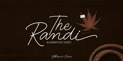 Introducing, The Randi - A monoline handwritten script with classy look. This type of font perfectly made to be applied especially in logo, and the other various formal forms such as invitations, labels, logos, magazines, books, greeting / wedding cards, packaging, fashion, make up, stationery, novels, labels or any type of advertising purpose. Features : uppercase & lowercase numbers and punctuation multilingual swash and ligature alternates PUA encoded We highly recommend using a program that supports OpenType features and Glyphs panels like many of Adobe apps and Corel Draw, so you can see and access all Glyph variations. How to access opentype feature : letterhend.com/tutorials/using-opentype-feature-in-any-software/ Email us to letterhend@gmail.com if you need something! Happy Designing!
 - Zophina by Letterhend,
$17.00 Say hello to The Zophina, a new handwritten script font that perfectly balances casual style with a hint of femininity. With its effortless charm and carefully crafted ligatures, this font is ideal for adding a touch of elegance and personality to any project, especially in various formal forms such as invitations, labels, logos, magazines, books, greeting / wedding cards, packaging, fashion, make up, stationery, novels, labels or any type of advertising purpose. Features : Uppercase & lowercase Numbers and punctuation Alternates & Ligatures Multilingual PUA encoded We highly recommend using a program that supports OpenType features and Glyphs panels like many of Adobe apps and Corel Draw, so you can see and access all Glyph variations.
 - Pierogies by HafisHidayat,
$23.00 Pierogies is a signature font, specifically made with a very interesting and unique style when typing letters that are followed by interesting ligatures and a few alternatives. This font is perfect for various design needs such as creating logos, business cards, posters, invitations, packaging products, and more. Pierogies is coded with PUA Unicode, which allows full access to all the extra characters without having special designing software. Mac users can use Font Book , and Windows users can use Character Map to view and copy any of the extra characters to paste into your favourite text editor/app. Thanks so much for looking and please let me know if you have any questions.
 - Binerka by Letterhend,
$19.00 Binerka is a stylish modern serif font. This typeface has can be used for modern theme or vintage looks with ligatures & alternates. Very suitable for logo, headline, tittle, and the other various formal forms such as invitations, labels, logos, magazines, books, greeting / wedding cards, packaging, fashion, make up, stationery, novels, labels or any type of advertising purpose. Features : uppercase and lowercase numbers and punctuation multilingual ligatures alternates PUA encoded We highly recommend using a program that supports OpenType features and Glyphs panels like many of Adobe apps and Corel Draw, so you can see and access all Glyph variations. How to access opentype feature : letterhend.com/tutorials/using-opentype-feature-in-any-software/
 - Instant Harmony by Hanoded,
$15.00 Wouldn’t it be nice to have a pack of Instant Harmony in your cupboard? Just add water and *poof* - all strive and struggle have gone, having been replaced by peace and quiet. The grass seems greener, the sky bluer and the air smells like a fresh mowed lawn. Ahhhh! Zap! Back to reality. There is no instant harmony, don’t go looking for it in your local supermarket! If you want a taste of something resembling instant harmony, then add this super-duper font family to your collection and use it for your designs. You may find that your creativity levels are up, your morning coffee tastes better and your designs look exactly like you had in mind. Pinky promise!
 - As of my last update in April 2023, the "OhMyGodStars" font by WhoAmI Design captures a playful yet enchanting essence that dazzles the eye and sparks the imagination. This font is a vibrant ode to c...
- Sacramento Pro by Stiggy & Sands,
$39.00 The Sacramento Pro family of typefaces was inspired by a monoline, semi-connected script from hand-lettering artist brochure work of the 1950's and 1960's. With its sophisticated upright stance, it stands on a thin line between formal and casual lettering styles, yet it has a commanding presence for headlines and titles. The Slim adds a fine pen-line style, while the Stout style expands the formal/casual dichotomy much further than the original weight. Opentype features include: - Contextual Alternates for initial and final forms. - Stylistic Alternates for an alternate lowercase t. - Discretionary Ligatures* for catch words like “and”, “at”, “by”, “for”, “of”, “or”, “the”, “to”, and “with”. - Full set of Inferiors and Superiors for limitless fractions. - Proportional and Oldstyle figure sets. * Discretionary Ligatures not included in the Stout style due to heavyweight nature.
 - Devilion by Letterhend,
$15.00 Say hallo to our newest item: Devilion, an amazing hand lettering bold script typeface with attractive swashes and alternates! This font is perfect to be applied especially in logos and various other formal forms such as invitations, labels, magazines, books, greeting/wedding cards, packaging, fashion, make up, stationery, novels, or any type of advertising purpose. This fonts comes in 2 style, Regular with clean script looks and Stamp to give an aged and vintage feel. Features : uppercase & lowercase numbers and punctuation multi-lingual ligatures alternates swashes PUA encoded What will you get : Devilion Regular Devilion Stamp We highly recommend using a program that supports OpenType features and Glyphs panels like many of Adobe apps and Corel Draw, so you can see and access all Glyph variations. Email us to letterhend@gmail.com if you need something! Happy Designing!
 - Electrone by Alit Design,
$21.00 💥Introducing "Electrone" – Unleash the Power of Typography with a Superhero Flair! Unleash the electrifying energy of "Electrone," a dynamic font that embodies the essence of superheroes with lightning speed, unmatched strength, and a dash of style. This font is not just a typeface; it's a superpower for your design projects! Key Features: Electrifying Glyphs: With 890 meticulously crafted glyphs, "Electrone" offers a vast array of characters that will add a powerful punch to your designs. Every glyph is a superhero in its own right. Sided Ligature: Seamlessly blend characters with our specially designed sided ligatures, creating a visual impact that resonates with strength and unity. Alternate Characters: Customize your text with alternate characters to give your designs a unique and personalized touch. The alternates are carefully curated to ensure versatility without compromising the superhero aesthetic. Lightning Swash: Add a bolt of energy to your typography with lightning swashes that strike through your text. Watch your words come to life with the electrifying force of "Electrone." Wings of Typography: Elevate your designs to new heights with the winged elements included in "Electrone." These wings symbolize the freedom and power associated with superheroes, making your text soar above the ordinary. Suit Up Your Designs: "Electrone" is not just a font; it's a complete superhero costume for your words. Whether you're working on comic book titles, posters, logos, or any design that demands a bold statement, "Electrone" is here to save the day. Perfect for: Comic Books and Graphic Novels Superhero Movie Posters Action-packed Logos Gaming Graphics Apparel Design and more! Embrace the electrifying power of "Electrone" and turn your designs into epic adventures. Download now and witness the transformation of ordinary into extraordinary!
 - Hachraza MF by Masterfont,
$59.00 These are the letter forms from the famous monument in memory of the founders of the state of Israel.
 - ITC Medea by ITC,
$40.99The designer of ITC Medea , Silvio Napoleone said: “I've always had an interest in early letter shapes, particularly how they influenced modern typographic designs. While I was on vacation in Greece, I had a chance to see, first-hand, examples of early letterforms and typography. They really made an impression on me.” The idea of combining the ancient and the modern to create something new was the primary inspiration behind ITC Medea. ITC Medea is essentially a careful blending of the modern sans serif with the elegant forms of the uncial. At first glance, Medea appears to be constructed of geometric shapes. However, closer inspection reveals many calligraphic subtleties. Stroke terminals are flared slightly in characters like the 'e' and 'c.' The top curve of the 'd' is more pronounced than the bottom, and characters like the 'o' are elliptical rather than round. “I gravitated towards the simplicity and legibility of the uncial and half-uncial,” Napoleone recalls. “I thought it would make a great titling font, and I was surprised at how attractive ITC Medea looked in a body text.” - Mirava by Din Studio,
$25.00 Hi, Everyone! Ready to make your branding spark? If you need to create a big, bold logo for your business, work on a poster for an event, or whatever your project may be-then this is the perfect font for you. Mirava Sans-A Sans Serif Font Family If we can give you many options then why not? Mirava San is a package that will delight you. With this family you will get many options to maximize your designs with stylish fonts. This font designed to bring your branding to life and add a touch of modernity, fun and style. Mirava paves the way for you to write the information you need to send out to your audience. Perfect to create amazing headings, logos, menus, social media graphics, and many more. Our font always includes Multilingual Support to make your branding reach a global audience. Features: Multilingual Support PUA Encoded Numerals and Punctuation Thank you for downloading premium fonts from Din Studio
 - Allumi Std by Typofonderie,
$59.00 Technology in mind in 12 fonts Allumi is a different font. Different from anything Jean François Porchez has designed in the past. Allumi is a sleek typeface designed with technology in mind. It’s a perfect font family for any communication concerning design, robotics, or functionality. Pushed to its extreme limits, the Allumi shapes are neither perfectly round or geometrically square. It’s a human design with a high tech touch. Allumi can be described as the Eurostyle (designed by Aldo Novarese in 1964) of the new century, mixed with Frutiger. Allumi is a serious typeface because of the unique design and sturdy form. The pure shapes can create a global presence today with an eye on the world of tomorrow. Two widths The Allumi family has been built around two series of widths, standard and extended. Italics have been carefully designed as slanted roman with all necessary optical and human corrections to create a perfect and neat italic. I Love Typography 2009
 - Balcony by Shaily Patel,
$10.00 Balcony is a decorative display typeface inspired by the patterns of metal safety grills. Its highly geometric features may be used to identify it as Art Deco. It is a monospaced type family with all characters confined in a square frame. The main idea of Balcony is to create a grill-like pattern when letterforms are placed together. This creates an illusionary experience for the reader. The best way to use this typeface is without leading, as shown in the visuals. Balcony also comes with two stylistic sets. The first stylistic set contains most characters with more decorative elements and the second one includes Dingbats. These Dingbats are motifs with simple geometric patterns that may be used for any kind of ornamentation. The diacritics letterforms are geometrically squeezed within the square frame to include the accents. This experimental typeface comes with about 650 characters and four weights (Thin, Light, Regular and Bold). The font family supports Western and Central European languages.
 - Arbus by Popskraft,
$18.00 When we think of a child's font, random scribbles often come to mind, but I thought, why not make a child's font fun, spontaneous, and at the same time simple and readable. This is how the Arbus font was born. This font is perfect for anyone looking for a light, free-style font that will last a long time. In addition, the font has a number of undeniable advantages: The Arbus font is perfectly balanced, which allows you to use it both in headings and for large amounts of text. Thus, you can completely design your products with one font family. The Arbus font family has nine font weights. The font supports all European languages and of course the Latin alphabet. Works on PC & Mac This beautiful Arbus font can be installed on any operating system, it can also be used in professional programs like Figma or Addobe Crative Cloud, as well as in other simpler software like Canva.
 - Brock Pro by Stawix,
$49.00 Brock Pro celebrate the essence of the famous 19th century wooden letterpress type, Block Berthold by bringing out its remarkable features and explicate them in relation to the modern day trend. Brock Pro is a conventional font with a twist, fun, easy to use and has a very particular tone of voice that suits numerous design purposes. Brock pro comes in 10 weights and 20 styles to support a wide range of usage, every needs and great building brands, Brock Pro also available in both ttf. and otf.
 - 1522 Vicentino by GLC,
$60.00 This font is mainly inspired from the engraved characters of the small book known as “Operina”, or “The method and rules for writing cursive letters or chancery script” from the famous calligrapher Ludovico Vicentino Arrighi, published in Roma in 1522 and signed with simplicity “Ludovico Vicentino”. The font contains a large set of standard ligatures and alternative characters: two lower cases, four sets of standard capitals, long s and variants, titlings, each feature easy to use with OTF managing software. It is a pro font, containing Baltic, Eastern, Central, Western European and Turkish diacritics.
 - Bananas by Canada Type,
$30.00 In the history of 20th century graphic arts, the evolution of the informal sans serif has been a uniquely American phenomenon. The ongoing saga of this (still as popular as ever) sub-genre dates back to the maturity of the Industrial Age and early Hollywood film titling, runs through the prosperous times of interwar print publications, sees mass flourishing during the various media propagations of the film type era, and solidifies itself as arguably the most common design element in the latter years of the century. Fun, bouncy, playful, and highly exciting, the casual sans serif is now all over game packaging, film and animation titles, book covers, food boxes, concert posters, and pretty much everywhere design aims to induce excitement about a product or an event. The casual sans is the natural high pill of typesetting. We figured it was high time for the casual sans to adapt to 21st century technology, gain more versatility, and become as much fun to use as the emotions it triggers. So we’re quite excited to issue Bananas, a fun sans serif family in 6 weights and 3 widths that can be used anywhere your designer’s imagination can take you. Rather than being based on a single design, Bananas was sourced from multiple American film era faces, all from 1950s and 1960s, when the casual sans genre was at its popular peak. Headliners’ Catalina and its very similar cousin, Letter Graphics’ Carmel, served as initial study points. Then a few Dave West designs informed the design development and weighting process, before narrow and wide takes were sketched out and included in the family. The entire development process happened in a highly precise interpolative environment. All Bananas fonts come with a full glyph complement supporting the majority of Latin languages, as well as five sets of figures, automatic fractions, quite a few ligatures, biform/unicase shapes and other stylistic alternates.
 - Above the Beyond by My Creative Land,
$27.00 Above the Beyond is a font family that contains a high contrast Contemporary Garamond Serif and a Casual Signature Brush script. The serif comes in two styles - Regular and Italic - the italic angle is similar to the one used in the Script font. The main difference between traditional Garamond and Above the Beyond Garamond is that the ascenders are significantly shorter which makes the serif fonts more suitable for branding design and helps to reduce the distance between lines without scarifying the legibility. The Italic style has many stardard ligatures as well as calligraphic ones. Above the Beyond Script is full of OpenType enhancements such as ligatures and alternates - everything that is needed to create an organic handwritten look. It is fully unicode mapped and can be used in any software - either using OpenType panel of the application in use or your OS default Font management software - Character Map or FontBook - by copy-pasting the glyphs you need. The font family is perfect for all kind of designs: quotes, t-shirt, branding, social media, magazines, cards, packaging etc.
 - PF DIN Mono by Parachute,
$45.00 PF DIN Mono is the latest addition to the ever-growing set of DIN super-families by Parachute. It was based on its proportional counterpart DIN Text Pro but was completely redesigned to reflect its new identity. DIN Mono is a monospace typeface which is comprised of characters with fixed width. Traditionally, monospaced fonts have been used to create forms, tables and documents that require exact text line lengths and precise character alignment. DIN Mono, on the other hand, can prove to be more than a useful typeface for technical applications. In the world of proportionality, DIN Mono stands out as a fresh new alternative to the popular standard, particularly for publishing and branding applications. Additional care was given to the aesthetic form and its pleasing characteristics. The spacing attributes of the glyphs were redefined and legibility was further improved by revising or changing the shape of the letterforms. Furthermore, kerning was not included in order to preserve the monospace nature of this typeface. The family consists of 12 weights including true-italics. Currently, it supports Latin, Eastern European, Turkish and Baltic.
 - Dsert by Latinotype,
$26.00 D Sert—based on the Pirata typeface—is inspired by 70s Chilean constructivist design and the political propaganda posters artwork of La Unidad Popular (Chilean political coalition). D Sert is the result of the combination of the Chilean graphic art revival with new trends, such as the handmade movement and super font families. The super family comprises 47 weights and comes with two versions: D Sert and D Sert Alt, plus extras. Diagonal strokes are significantly different between the two versions: diagonals of the Alt version are much more logical than the diagonals of the normal version. Another difference is the bowls of the capitals: in the D Sert version, they slightly project above the cap height, making it a more daring version and bringing it closer to calligraphy; contrarily, in the Alt version, bowls do not project above the cap height, which makes it a more tidy font. This way, the combination of the two versions and extras provides the user with the freedom to create any kind of artwork.
 - Contenu by Hackberry Font Foundry,
$24.95 Because Contenu is designed for text use, it is spaced for body copy in the 9-12 point range. That is far too much spacing for heads, subheads, and the like. So I made the display version of Contenu Book to use for headers. In the process of tightening the spacing at the very large sizes, I also made some minor modifications to the glyph shapes to make this version a little more elegant. Contenu Opentype has two Opentype families for print design. Contenu Book has five fonts: Regular, Italic, Bold, Bold Italic, and Display. Contenu has Medium, Medium Italic, Black, and Black Italic. The name is French for content and this is what the family is designed for: text, body copy, and book layout. If it has a style, it is a modern take on oldstyle serif font using Jenson as a mask. There are no plans for display versions of the bolder weights or the italics. If you want them, use Contenu Medium, Book Bold, Contenu Black, or any of the four italics and tighten the tracking.
 - Onimusha by Artisticandunique,
$30.00 Onimusha - Serif font family - 6 Styles - Multilingual supports. Onimusha is an elegant serif font family with different alternative character designs. It has a unique emblem.The inspiration for the characters is based on ancient Japan, samurai philosophy and Far Eastern mysticism. Hard and pointed ends represent a Katana, and elegant soft turns represent the aesthetic understanding. This font provides flexibility in all your projects with the alternatives it offers you with its multiple language options, 6 styles and rich glyph options. You will have the opportunity to enrich the content of your projects with alternative characters. According to the purpose of use in typographic compositions that you will create with the aesthetic structure of alternative characters; You can enrich your titles in books or magazines, and your logos in branding. Especially for editorials, magazines, books, branding, packaging, logo design, web design, headlines, movie and game titles etc. If you're looking for a font with stylistic alternatives, Onimusha serif font might meet your needs. With this font you can create your unique designs. If you have a question, please contact me. Have a good time.
 - P22 Saarinen by IHOF,
$39.95 P22 Saarinen is a typeface based on the architectural lettering of Finnish American architect Eero Saarinen.The Saarinen fonts were created to help commemorate the 75th anniversary of Kleinhans Music Hall in Buffalo, NY, which was designed by Saarinen in collaboration with his father Eliel Saarinen and is recognized as one of the greatest concert halls ever built in the United States. Saarinen’s own lettering styles were combined with various lettering manual suggestion for proper lettering to create a flexible casual lettering style in regular and bold weights. The Pro fonts include multiple variations of each letter for a more natural lettering style as well as stylist in variants to achieve various highs for crossbars and other customizable variants. The Pro fonts also include Central European character set, fractions, small caps and an array of hand drawn directional arrows. Individual non-pro versions feature: Saarinen Regular - characters with low cross bars Saarinen Alt 1 - characters with high cross bars Saarinen Alt 2 - characters with mid cross bars and old style figures Saarinen Arrows - bold and regular arrows combined in one font
 - Contenu Book by Hackberry Font Foundry,
$24.95Because Contenu is designed for text use, it is spaced for body copy in the 9-12 point range. That is far too much spacing for heads, subheads, and the like. So I made the display version of Contenu Book to use for headers. In the process of tightening the spacing at the very large sizes, I also made some minor modifications to the glyph shapes to make this version a little more elegant. Contenu Opentype has two Opentype families for print design. Contenu Book has five fonts: Regular, Italic, Bold, Bold Italic, and Display. Contenu has Medium, Medium Italic, Black, and Black Italic. The name is French for content and this is what the family is designed for: text, body copy, and book layout. If it has a style, it is a modern take on oldstyle serif font using Jenson as a mask. There are no plans for display versions of the bolder weights or the italics. If you want them, use Contenu Medium, Book Bold, Contenu Black, or any of the four italics and tighten the tracking. - Stack by James Todd,
$40.00 Stack brings the spirit of industrial chimney lettering from the early twentieth century to the digital age. The typeface is designed to work both horizontally and vertically. Additionally, the fonts can work together in myriad chromatic expressions—providing limitless design possibilities. The family is true to the spirit of masonry lettering without being a direct lift of any specific lettering style from the industrial age. Like some of its masonry predecessors Stack is built as a typeface of 15 courses (horizontal rows) of ‘bricks.’ Based on several years of research a collection of 150+ photographs and roughly two dozen archival engineering drawings were amassed. The value of the historical references is a type family that is a legitimate reflection of masonry lettering styles of the period. In updating Stack for the digital age, the proportions of the base-unit ‘bricks’ and the thickness of ‘mortar’ joints have been optically adjusted to work in both screen-based and print media. Stack would not have been possible without the research and design input from Craig Welsh and Jenna Flickinger of GoWelsh.
 - Lievin by Mofr24,
$11.00 Lievin is an exceptional slab serif font that stands out for its simplicity, clean lines, and captivating elegance. What sets it apart is its unique ability to effortlessly adapt to diverse design needs, making it a versatile choice for any project. With an impressive range of 50 variable styles, ranging from delicate thin to bold and massive black, Lievin caters to a wide array of typographic demands. Its versatility makes it perfect for various applications such as posters, marketing materials, logotypes, headlines, books, magazines, and more. One of the defining features of Lievin is its impeccable balance of classic charm and contemporary appeal. Its sleek and refined aesthetic adds a touch of sophistication to any design. The font's exceptional legibility ensures that the message is conveyed with clarity and impact. Lievin pairs harmoniously with a range of typefaces, making it an ideal choice for combination and layering. It complements sans-serif fonts, such as Helvetica or Futura, creating a visually dynamic and engaging typographic composition. Beyond its visual appeal, Lievin boasts an extensive character set, providing support for multiple languages and typographic features. This allows designers to express their creativity and accommodate different linguistic requirements. The design concept of Lievin is rooted in the desire to create a timeless and versatile slab serif font that would seamlessly integrate into modern design practices. Its clean lines and balanced proportions ensure legibility across various media and sizes, while its elegant charm adds a touch of sophistication. Lievin is the result of a meticulous creative process aimed at delivering a font that captures attention and makes a lasting impression. It combines the best of traditional and contemporary design elements, offering a fresh take on slab serif typography. As a modern typeface, Lievin is an original creation, not based on any historical design or revival. It embodies a contemporary interpretation of slab serif fonts while incorporating functional aspects that cater to the needs of today's designers.
 - Dog Days by Fenotype,
$45.00 Dog Days is an American hand lettering style brush script family. Dog Days is swift, strong and full of bursting energy. Due to its clean features it’s legible even in small sizes. Dog Days is great for any display use -from poster to packaging and logo to t-shirt. Dog Days is also great for lettering works. Dog Days Brush boasts with more than 700 glyphs and plenty of OpenType features: Keep Standard Ligatures on - it adds variety in hand lettering style and keeps the flow steady. If you need more action try turning on Swash, Stylistic or Titling Alternates in any OpenType savvy software. Dog Days Brush is also equipped with Old Style Numerals if you need your numbers to fit more into text. Dog Days Brush uppercase letters are designed to work as initials so if you need to write all caps you might want to use Dog Days Caps or Dog Days Small Caps. Dog Days Caps can also be used as uppercase letters for the script. Dog Days Extras is a set of badges, swashes and swirls designed to play with the font. Dog Days is inspired by a hand lettering sample in a vintage American swimsuit advertisement.
 - Heimat Display by Atlas Font Foundry,
$50.00 Heimat Display is the high contrast sans serif typeface family within the Heimat Collection, also containing Heimat Didone, Heimat Sans, Heimat Mono and Heimat Stencil. Heimat Display is a typeface family designed for contemporary typography, especially for use in headlines and on posters, but also for reading purposes. It combines an idiosyncratic appearance with the feeling of a grid-based letter construction of the late 20s. Since the design might be too extreme for some applications, Heimat Display’s character set provides different alphabets, the regular one plus alternate designs that comes across as less suspenseful. Heimat Display [873 glyphs] comes in 72 styles and contains extra sets of alternate glyphs, many ligatures, lining figures [proportionally spaced and monospaced], hanging figures [proportionally spaced and monospaced], positive and negative circled figures for upper and lower case, superior and inferior, fractions, extensive language support and many more OpenType features.
 - Heimat Didone by Atlas Font Foundry,
$50.00 Heimat Didone is the high contrast serif typeface family within the Heimat Collection, also containing Heimat Display, Heimat Sans, Heimat Mono and Heimat Stencil. Heimat Didone is a neo-classical typeface family designed for contemporary typography, especially for use in headlines and on posters, but also for reading purposes. It combines an idiosyncratic appearance with the feeling of a grid-based letter construction of the late 20s. Since the design might be too extreme for some applications, Heimat Didone’s character set provides two alphabets, the regular one plus an alternate design that comes across as less suspenseful. Heimat Didone [872 glyphs] comes in 72 styles and contains 6 optical weights, extra sets of alternate glyphs, many ligatures, lining figures [proportionally spaced and monospaced], hanging figures [proportionally spaced and monospaced], positive and negative circled figures for upper and lower case, superior and inferior, fractions, extensive language support and many more OpenType features.
 - Moguine Serif by Mans Greback,
$69.00 Moguine Serif is a neo-classic serif typeface. With disappearing hair thin lines and weighted vertical strokes, this modern font family is the perfect lettering for a headline. Why not use Moguine Serif for a short poem or quote that requires a neutral but beautifully clean look. Created with pride and care, this type has the optimal appearance of a classic vintage logo but for a modern setting. The font family consists of the styles Regular and Italic. The font is built with advanced OpenType functionality and has a guaranteed top-notch quality, containing stylistic and contextual alternates, ligatures and more features; all to give you full control and customizability. It has extensive lingual support, covering all Latin-based languages, from Northern Europe to South Africa, from America to South-East Asia. It contains all characters and symbols you'll ever need, including all punctuation and numbers.
 - Trenda by Latinotype,
$29.00 Designed by Daniel Hernández and Paula Nazal. Corrections and review by Alfonso García and Rodrigo Fuenzalida. Trenda is a geometric sans-serif typeface based on the uppercase of Trend —a Latinotype font, released in 2013, that was very well received. This new typeface comes with a wider character set that offers a complete family of uppercase and lowercase in different weights. Trenda is a versatile easy-to-use functional display font with a strong personality, especially its uppercase, which makes the designer’s work easier. Trenda’s lightest and heaviest variants are ideal for display use while its middle weights work well with short and mid-length texts. This typeface has been designed especially for corporate projects, logotypes and publishing. Trenda comes in 8 weights, ranging from Thin to Heavy, and includes matching italics as well as small caps and alternates. The family contains a 634-character set that supports 206 different languages.
 - Wano Quin by MIX.Jpg,
$12.00 Wano Quin | Beautiful and Elegant Serif Font Wano Quin font is a beautiful and stylish font family that offers many elegant serif, classic and elegant style for poster design, magazines, beauty branding with a flower-shaped asterisk glyph suitable for your beautiful and elegant design concept Wano Quin | Beautiful and Elegant Serif Font family with alternates that you can combine to get curves and beautiful shapes just in seconds. Play with the ornaments to create a more stunning display. Features Uppercase & Lowercase, Number & Symbol, Multi language, Ligatures, Alternates for each characters. We highly recommend using a program that supports OpenType features and Glyphs panels like many of Adobe apps and Corel Draw, so you can see and access all Glyph variations. HOW TO ACCESS ALTERNATE CHARACTERS Open glyphs panel: -In Adobe Photoshop go to Window - glyphs -In Adobe Illustrator go to Type - glyphs Thanks & Happy designing
 - Hildor by MIX.Jpg,
$25.00 Hildor Font | Beautiful and Elegant Display Font Hildor Font is a beautiful and stylish font family that offers many elegant serif, classic and elegant style for poster design, magazines, beauty branding with a flower-shaped asterisk glyph suitable for your beautiful and elegant design concept Hildor Font | Beautiful and Elegant Display Font family with alternates that you can combine to get curves and beautiful shapes just in seconds. Play with the ornaments to create a more stunning display. Features: Regular OutLine Script Uppercase & Lowercase, Number & Symbol, Multi language, Ligatures, Alternates for each characters. We highly recommend using a program that supports OpenType features and Glyphs panels like many of Adobe apps and Corel Draw, so you can see and access all Glyph variations. HOW TO ACCESS ALTERNATE CHARACTERS Open glyphs panel: -In Adobe Photoshop go to Window - glyphs -In Adobe Illustrator go to Type - glyphs Thanks & Happy designing
 - PF Square Sans Condensed Pro by Parachute,
$79.00 Square Sans Pro is one of Parachute’s most popular typefaces. It has been used by the likes of companies such as Samsung and organizations like the European Commission. Now a new version has been released. Square Sans Condensed Pro is a square-shouldered, modern and self-assured text typeface which lends style to a variety of projects. With its generous x-height, full-bodied counters and uniform stroke weight, it provides high legibility and uniform typographic color at all sizes. This is an exceptionally warm and comprehensive type family -with slightly rounded edges and softened curves- which possesses a robust and friendly appearance. The family consists of 12 fonts -from extrablack to thin- including true italics. It supports opentype features like small caps, fractions, ordinals, etc. and offers multilingual support for all European languages including Latin, Greek and Cyrillic. Download its complehensive PDF Specimen Manual for further details.
 - Sybilla by Karandash,
$19.95 Sybilla is a robust, but friendly, humanist slab serif well suitable for broad range of design projects. A true workhorse and superb text type family, Sybilla was especially designed with legibility in mind. Its soft almost cursive shapes and generous internal spaces define a slab serif that is easier on the reader’s eye and help establish a feeling of warmth and friendliness. The type family consists of eight weights with complimentary italics. While the Light, Book, Regular and Medium weights are great performers for body text, the Thin, Bold and Heavy weights make an excellent choice for headlines. Also there is the specially designed Ultra weight if extra punch is needed. Sybilla has extensive multilingual support and specially designed Cyrillic that works harmoniously with its Latin counterparts - a perfect choice for design projects that need both writing systems running side by side.
 - Rigatoni by Sudtipos,
$39.00 Rigatoni is a didone display family with exceptional readability. Based on a German mid-century lettering specimen by Nerdinger, designer Alejandro Paul expanded the face into an extensive family, with 5 weights, italics, and a 2 weights stencil version. Its tall letterforms and sturdy serifs give it a noble bearing when set in all caps; in the lower case its large x-height and spacious counters imbue it with a welcoming tone. A plethora of alternate and swash characters let you create distinctive settings for identities, labels, titles, and headlines. Use the shorter ascender and descender variants for aesthetic effects, or to prevent collisions in tightly stacked text. Since we've imagined Rigatoni being used for restaurants, menus, and food packaging, Sudtipos asked to designer Esteban Diácono to create some 3D visualizations. Ale’s type has never looked saucier!
 - Misha Gergoval by Rotterlab Studio,
$15.00 Misha Gergoval Script is a new and fresh font script that comes in a vintage and neat style. This font can be used easily, even in mixing and matching with other fonts so that it can provide alternatives and new sensations for designers or craftsmen, in working on various projects. Misha Gergoval comes with uppercase letters, lowercase letters, numbers, punctuation, and so many variations on each character including OpenType alternatives to allow you to customize the design. This font is perfect for all your projects such as wedding invitations, greeting cards, branding materials, business cards, quotes, posters, badges, greeting cards, or you can use these fonts for various (vintage) logo projects and more. The characters are ideal for creating interesting messages, mixing and matching Misha Gergoval with a group of alternative characters that are suitable for your project.