10,000 search results
(0.052 seconds)
- Grenale Slab by insigne,
$- Grenale Slab adds to the new standard of elegance within the Grenale family. Not your typical slab, Grenale has some unique forms that give it a look all its own. This glamourous slab still draws much inspiration from Grenale’s Didone sans and its haute couture influence. Independently attractive, it’s balanced and poised, with well formed strokes. Grenale Slab’s thin weights are simple but vibrant--elegant forms that naturally lend themselves to designer journals and high-end branding along with upscale applications. With added energy and power, the thicker weights give your work a firmer, statlier look. Grenale Slab’s upright versions are also matched by optically adjusted italics. The fashionable typeface includes a multitude of alternates that may be accessed in any OpenType-enabled application. The stylish features include a large group of alternates, swashes, and meticulously refined details with ball terminals and alternate titling caps to accessorize the font. Also included are capital swash alternates, old style figures, and small caps. Peruse the PDF brochure to see these features in action. OpenType enabled applications such as the Adobe suite or Quark can take full advantage of the automatic replacing ligatures and alternates. This family also offers the glyphs to support a wide range of languages. Any of Slab’s weights also provide a well-matched companion to its original counterparts, Grenale #2 and the original Grenale. It’s time to think high-class. Graceful and assured, the carefully crafted forms of Grenale Slab step pleasantly onto each page with elegant charm. Include its range of alternate glyphs, and this chic font is a superb choice for bringing a far more refined look to your copy.
 - Jeles by Tour De Force,
$25.00 Inheriting the beauty and style of old type classics from this genre, Jeles is blended with very elegant modern approach featuring soft corners, round slab serifs and tasty ball terminals. Jeles is designed mostly for display use and it is highly recommended to get the whole family if you want to get the best result. It is designed in two styles Condensed and Normal. The Condensed version is developed in two weights each coming with corresponding italics. While the Normal styles are three ranging from Regular, Bold and Black. The total of 7 separate fonts inside the family are quite enough if you look for diversity and flexibility at one place. You could use the uprights for more serious and strong headlines while the Italics work perfectly for more fresh and live subheads. Of course editorial design is only one of the many directions where Jeles family could be used successfully as we all know typefaces with so visible contrast between thin and thick and combined with classic elegance, could be easily used in every design of cosmetic industry, fashion, food, jewelry, etc. Try to design a stylish boutique shop signboard and you will surely discover its beauty and potential. Easy-to-read, it is good for print design, revealing its authentic letterpress-like character as well as perfect for screen use note that the thin strokes and serifs are not that thin to vanish on a low resolution monitor. Professionally designed, they are solid enough yet very elegant and even gentle making Jeles a desired family design of attractive web banners, web sites, apps and e-books.
 - Kaglia by Letterhend,
$17.00 Kaglia is a font duo package contain a hand drawn bold script and sans serif which looks great to be paired especially for vintage and adventure theme! This font duo is purposely made for headline, display or logotype, and signature which need a standout appearing. This font is also suitable to be applied especially in logo, and the other various formal forms such as invitations, labels, logos, magazines, books, greeting / wedding cards, packaging, fashion, make up, stationery, novels, labels or any type of advertising purpose. Features : Kaglia Script Regular and Rough Kaglia Sans Regular and Rough uppercase & lowercase numbers and punctuation multilingual alternates & ligatures PUA encoded We highly recommend using a program that supports OpenType features and Glyphs panels like many of Adobe apps and Corel Draw, so you can see and access all Glyph variations. How to access opentype feature : letterhend.com/tutorials/using-opentype-feature-in-any-software/
 - Rikna by Tour De Force,
$30.00 Rikna is compact, solid and gently condensed slab serif font family that comes in 14 styles. Imagined as family with ability to be used as main project font, Rikna’s visual flow of characters in composed paragraph reveals its high legibility in all sizes. With distinctive serifs, Rikna contains display characteristics with recommend the font for use in bigger sizes as well. Contains Fractions as Open Type Feature.
 - Ring Eyes by Ochakov,
$11.00 Now you can see... the new direction of the big family called Ring - Ring Eyes! That's a very unique Ring & truly devoted. There are only four styles, but they are all very important. Ring Eyes font like our eyes held a million stories. Ring Eyes font like other of the Ring Family is the perfect choice for headlines, logos, branding, packaging, publications, and much more.
 - KT Higer by Kotivoro Lab,
$18.00 KT Higer is a display font inspired by old design archives. This font Designed by Wahyu Ichsan Fauzi & Fikri Maulana Ikhfa. they focused develop Higer to a Display Headline font. This font have total 381 Glyphs and the families is still under development to be super family typeface. This font suitable with your projects such as poster, user interface, magazine, logo, apparel design, etc.
 - Galerie by ArtyType,
$29.00 Incorporating a certain Gallic ‘je ne sais quoi’ Galerie is a chic & stylish sans serif, though you'll notice some short tails with angled terminals acting rather like serifs, lending a sophisticated characteristic to its balanced proportions. Galerie’s large x-height makes it a very legible font family, available in 4 weights: Thin, Light, Medium and Bold. See also the condensed sister family Galerie 2.
 - Chromium Yellow NF by Nick's Fonts,
$10.00The Chromium Yellow family is based, very loosely, on Electro-type Serif, designed by John Wu of Hong Kong’s Archetype foundry. The rather quirky serifs have been removed and a few odd letter treatment have been amended to produce a smooth, techno-friendly family of faces. This font contains the complete Latin language character set (Unicode 1252) plus support for Central European (Unicode 1250) languages as well. - Raspberry Sherbet by Hanoded,
$15.00 I have actually never had a sherbet. When I made this font family, I wish I had one, as it was a whopping 38 degrees (Celsius, not Fahrenheit…) outside. Raspberry Sherbet is a cute little font family, consisting of a rounded fat kids font and an inline version. Comes with all the bells & whistles, plus a super duper cooling effect when you use it!
 - Kolo LP by LetterPerfect,
$39.00 The Kolo family was designed by Paul Shaw, inspired by the lettering of Koloman Moser, Gustav Klimt, Alfred Roller and other members of the Secession, Vienna’s turn-of-the-century Art Nouveau movement. Kolo’s family variants—narrow, regular, wide & alternates—serve as stand-alone display styles, or can be used in combination to pack text creatively in the manner characterized by Secession-period graphics.
 - Burger by Lián Types,
$25.00 Inspired in the world of the fast-food, my aim with Burger was to achieve a sexy slab serif font. Since it's not very common to see slabs with swashes I consider this project as an experiment with interesting results. In order to mantain an even weight on the written word, all the glyphs including the swashy ones had to look like compact blocks: This makes the font work much better used with almost no leading, as seen in posters above. Despite the formal look of its genre, this slab serif is also very playful and unique. (Maybe unhealthy food deserves better fonts already, right?) Taste Burger, come on, give it a try! On a more personal note: Why I made this font? Some months ago I started the gym and with it, an strict diet to see some results faster... Maybe my temptation is being, in Lacanian terms, "sublimated" by making delicious and unhealthy fonts.
 - Mc Lemore by Galapagos,
$39.00Back when OpenType hadn't yet opened and Apple was developing the Line Layout Manager called GX Typography I created a test font that I name after my stepdaughter, Kristen (now ITC Kristen). Not wanting to offend my wife I started on a font project and gave her name to this new set of glyphs, Roberta. Unfortunately, the name was already in use so I needed to find another name for the fonts. After September 11th I decided that there were people I'd met during my life who were truly cut from the cloth of the hero. Master Sargent McLemore of the 75th Ranger Battalion was one of these people. I met the Sarge when I was in basic training at Fort Gordon. I saw him 2 weeks before he died in 1970. All of the heroes we see on the silver screen pale in comparison to this man. John Wayne and Clint Eastwood both have played the type well, both could have taken lessons from the Sarge. - Jantur Type by Lemon Studio Type,
$12.00 Jantur Type is a simple geometric sans family with charming curves and natural flow. variable font technology, and its axis weight range spreads from thin to black forms. Flexible and adaptable, it is 100% Latin Plus, Supporting 219 Latin-based languages, which are spoken in different 212 countries. This font is suitable for any project. Great for graphic design and any display use. It can easily work for web, signage, corporate as well as editorial designs. Jantur Type has 9 weights with a total of 9 styles. and legibility makes it suitable for any kind of text application, from brand design to extensive text layouts.
 - Lacoste Celtic by Ronny Studio,
$19.00 Introducing, Lacoste Celtic, A sophisticated ligature serif from us. This typeface has been made carefully to make sure its premium quality and luxury feel. The ligatures makes this typeface unique and stands out rather than the regular serif font, very suitable for logo, headline, tittle, and the other various formal forms such as invitations, labels, logos, magazines, books, greeting / wedding cards, packaging, fashion, make up, stationery, novels, labels or any type of advertising purpose. Features : - Lowercase & Uppercase - numbers and punctuation - multilingual - ligatures - alternates - PUA encoded Please contact us if you have any questions. Enjoy Crafting and thanks for supporting us! :) Thank you
 - Jhon Halend by Typebae,
$19.00 Jhon Halend is the perfect signature font, featuring a natural and stylish flow that showcases elegant tails at the beginning and end of each letter. It provides a binding element, allowing specific letter combinations to flow seamlessly for a more natural and authentic appearance, making it suitable for various projects that require a natural handwriting touch. To use beginning and ending swashes (tail), you don't need to use software that supports opentype, because we have made it separately so it's very easy to use. Files included: Jhon Halend-Regular Jhon Halend-Tail Feature: Ligature, Stylistic Alternate, Multilingual and PUA encoded.
 - Small Business Club by PeachCreme,
$15.00 Our new font duo “Small Business Club“ - sweet hand-drawn script and display fonts made to complement each other harmoniously. Small Business Club Display • Cute handwritten all-caps sans serif font. With its legible and convenient letters, the font works great for small business projects, Instagram posts, and various display headlines as well. Small Business Club Script • Featuring 139 ligatures, the script font with its pleasantly sloppy letters looks like it was written in hand giving the product an authentic and realistic look. Perfect for quote designs, quaint logos, packaging, lighthearted signboards, greeting cards, merchandise designs and so much more!
 - Bullgine by Letterhend,
$19.00 Introducing, Bullgine - A modern gothic blackletter typeface. This type of font perfectly made to be applied especially in logo, and the other various formal forms such as Logo, Clothing, Fashion, Headline, or any type of advertising purpose. Features : uppercase & lowercase numbers and punctuation stylistic alternate multilingual PUA encoded We highly recommend using a program that supports OpenType features and Glyphs panels like many of Adobe apps and Corel Draw, so you can see and access all Glyph variations. How to access opentype feature : letterhend.com/tutorials/using-opentype-feature-in-any-software/ Email us to letterhend@gmail.com if you need something! Happy Designing!
 - Brandice by Letterhend,
$19.00 Introducing, Brandice- A blackletter typeface. This type of font perfectly made to be applied especially in logo, and the other various formal forms such as Logo, Clothing, Fashion, Headline, or any type of advertising purpose. Features : uppercase & lowercase numbers and punctuation stylistic alternate multilingual PUA encoded We highly recommend using a program that supports OpenType features and Glyphs panels like many of Adobe apps and Corel Draw, so you can see and access all Glyph variations. How to access opentype feature : letterhend.com/tutorials/using-opentype-feature-in-any-software/ Email us to letterhend@gmail.com if you need something! Happy Designing!
 - Flowers by BluHead Studio,
$22.00 The Flowers Family is a collection of 3 typefaces in two weights, meticulously drawn by British designer Roy Preston. The Flowers fonts share a common clean and narrow design, with oval-shaped rounds and distinctive individual letter shapes that give each font a unique character all their own. Flowers Petal is the base typeface, essentially a sanserif with rounded terminal ends. Flowers Bud adds a unique inverted triangle shaped serif, and Flowers Thorn replaces that with an elegant pointed serif. All 3 typefaces are very legible and usable for text runs, and there are bold weights of each font for headlines and display applications. Flowers' extended character set supports many Western European languages and each font has some OpenType features, including Ligatures, that make them more useful.
 - Beachclub by Royalclub,
$12.00 Get some beach holiday vibe so needed during a crazy year in the city! BEACHCLUB fonts are inspired by tropical islands hand-painted signs. Bring the summer beach parties feeling with sunshine, music and strong cocktails. We crafted digital versions of woodcrafted letters as if it was made for a beach bar in Hawaii. Then the time, sea and sand did the rest. Use our fonts to bring this fun and relaxed energy to your graphics! Key Features: BEACHCLUB fonts will be a great help and perfect fit for various posters, banners, typography and illustrations. Fonts can be used for both personal and commercial projects. Credits: BEACHCLUB clean and BEACHCLUB grunge are designed by Royalclub. For purchasing the full kit (brushes/frames) proceed to www.royalclub.sh/royalclub-supplies
 - Gessetto by Resistenza,
$39.00 Gessetto is an extensive chalk font family, containing script, sans, roman, figures and ornaments. One of the things most charming about chalkboard lettering is the variation; in both texture and style. Our goal was to achieve a real chalk effect using the varied typographic genres in a digital format. With flexibility and control for the designer in mind, we built a digital chalk toolkit. The script is a fusion of Italic Roman and cursive, it contains swashy alternates for each capital letters with some long and extended flair on some ascendent and descendent letters. An all caps high contrast sans is in 5 complimentary styles. The Roman is precisely proportioned and maintains elegance while being bold. There is a set of Figures and ornaments. Gessetto is perfect to grab attention on signage, print advertising and editorial applications like book covers, but suits branding applications too. The diverse styles and subtle handcrafted textures in this display type family will well serve any designer looking for the authentic chalkboard aesthetic. We recommend to combine Timberline with: Turquoise
 - Syncopate Pro by Stiggy & Sands,
$29.00 The Syncopate Pro Family is a unicase design where the traditional lowercase x-height has been abandoned and a single uppercase height rules the design of all of the alpha and numeric glyphs. Some uppercase glyphs are copied to their lowercase slots, where other lowercase glyphs such as the a, e, and r, are scaled up to uppercase heights. This motif allows for a vast array of typesetting possibilities. A modern and stylish sans inspired by the many trendy sans serif typefaces that are prevalent today, the Syncopate Pro Family, primarily intended for display and headline use, also works well for limited text runs. The thin and regular weights and wide body impart a certain level of elegance, while the unicase approach keeps the look lively and fresh. The bold weight imparts a powerful substantiality, lending a strong corporate presence to any design. Opentype features include: - Stylistic Alternates for a collection of alternate Small Caps - Full set of Inferiors and Superiors for limitless fractions - Lining and Proportional figure sets
 - Broadside by Device,
$39.00 Broadside is a versatile, authoritative and functional family inspired by the sans serifs seen on ’40s and ’50s patriotic posters and period advertising. It is available in seven weights across condensed, normal and extended widths, each with reweighed italics. The type from this period was very often hand-drawn, and so differs considerably from poster to poster. Many American examples of this period use a Photo-Lettering style called Murray Hill and its derivatives, although their UK counterparts, designed by such luminaries as Abram Games or Tom Eckersley, are more stylistically diverse. Even though no single model is available to base a digitisation on, there are certain recurring stylistic quirks that give the type its unique flavour, and so the most interesting examples from several sources were be combined for the final family. Alternate short descenders, allowing for tighter line spacing, can be toggled on or off in the Opentype panel of Indesign or Illustrator. Tabular and lining numerals and a single-story ‘a’ are also available in all weights and styles.
 - Cabrito Serif by insigne,
$33.00 The Cabrito family is making a statement again. Launched as a supplement to the children's book, The Clothes Letters Wear, the original Cabrito is carefree, fun and easy on the eyes. Now, by balancing this friendly connection with new elegance, Cabrito Serif arrives: attractive copy text with an extra sophisticated sensibility incorporated into the design. Still bright and playful, this new Cabrito is cleaner and leaner, ensuring that its polished appearance retains legibility. 54 fonts include upright alternates, ligatures, and old figures. The range includes extended and condensed variants. To see any of these interactive features, see the PDF manual. The family also includes language support for 72 Latin-based languages, and there are more than 600 glyphs. Cabrito Serif can be used for logos and packaging, as well as for brochures and web pages. It’s readability makes it an excellent choice for a wide range of jobs. Take a walk with Cabrito Serif and see how much fun it is. By the way, look at some other Cabrito members and see how much you love the original, Inverto, Contrast or Didone.
 - Esquina by Green Type,
$37.00 Esquina is a family of octagonal slab serif fonts. Designed for use in outdoor advertising, branding, packaging. Esquina is also ideal for sports related materials such as team logos, flyers, posters and more. Esquina contains Latin, Cyrillic and Greek glyphs.
 - Unholy by Natural Ink,
$12.00 Unholy Script is a modern calligraphy design, including Regular. This font is casual and beautiful with swash. Can be used for various purposes. such as logos, product packaging, wedding invitations, branding, headlines, signage, labels, signatures, book covers, posters, quotes, and more.
 - Cinio Text by TeGeType,
$29.00 The new Cinio Text type family is a version of Cinio that can be used on screen and for text composition. The rounded corners of the glyph design increase its legibility in small size and on supports with a low resolution.
 - Meche Pro by RodrigoTypo,
$29.00 Meche Pro it is a geometric typeface family with a semi-formal touch, it contains 12 variants, from the Thin to Black and Stencil Thin to Black versions, plus Cyrillic alphabet with alternatives and different ligatures was added, especially for titles
 - Reflex Pro by RMU,
$30.00 Reflex Pro with its two styles - Regular and Solid - is a great sans serif all-caps font family, ideal for headlines, posters and signboards. The solid style makes it easy for you to fill the letters with photographs or background patterns.
 - Twilight by Natural Ink,
$12.00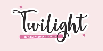 Twilight Script is a modern calligraphy design, including Regular. This font is casual and beautiful with swash. Can be used for various purposes. such as logos, product packaging, wedding invitations, branding, headlines, signage, labels, signatures, book covers, posters, quotes, and more.
 - Pavilion by Cocodesign,
$12.00 Pavilion Script is a modern calligraphy design, including Regular. This font is casual and beautiful with swash. Can be used for various purposes. such as logos, product packaging, wedding invitations, branding, headlines, signage, labels, signatures, book covers, posters, quotes, and more.
 - Angel cute by Cocodesign,
$12.00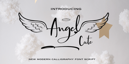 Angel cute is a modern calligraphy design, including Regular. This font is casual and beautiful with swash. Can be used for various purposes. such as logos, product packaging, wedding invitations, branding, headlines, signage, labels, signatures, book covers, posters, quotes, and more.
 - Mekari by Cocodesign,
$10.00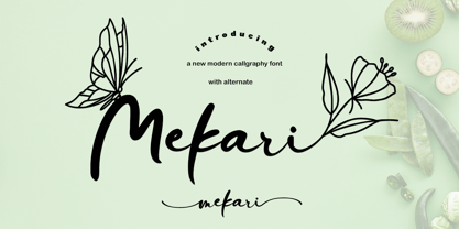 Mekari Script is a modern calligraphy design, including Regular. This font is casual and beautiful with swash. Can be used for various purposes. such as logos, product packaging, wedding invitations, branding, headlines, signage, labels, signatures, book covers, posters, quotes, and more.
 - Stupids by Natural Ink,
$12.00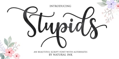 Stupids Script is a modern calligraphy design, including Regular. This font is casual and beautiful with swash. Can be used for various purposes. such as logos, product packaging, wedding invitations, branding, headlines, signage, labels, signatures, book covers, posters, quotes, and more.
 - Hey Insomnia by Dhan Studio,
$20.00 Hey Insomnia is a modern handwriting, organic style, dynamic and energetic and has a ligature, also has an a-z alternative. Can be used for various purposes such as titles, signatures, logos, correspondence, letterhead, signage, labels, bulletins, posters, badges, etc.
 - Heroic Condensed by TypeTrust,
$30.00Heroic Condensed is an idealized narrow grotesque: a fusion of clean geometry and optical balance. Its constructed framework exudes technical refinement tempered by humanist curves across a family of eight weights. Heroic Condensed includes small caps, tabular figures, and stacked fractions. - Black Isometric by Funk King,
$10.00 The Black Isometric Family is the progression of the Isometric series from funk_king. Currently two fonts that evoke science and engineering. These are full sets with 99 characters each. Designed for use as display type and for limited text use.
 - Mahadewa by Cocodesign,
$12.00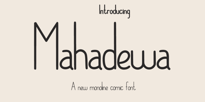 Mahadewa Display is a modern calligraphy design, including Regular. This font is casual and beautiful with swash. Can be used for various purposes. such as logos, product packaging, wedding invitations, branding, headlines, signage, labels, signatures, book covers, posters, quotes, and more.
 - Moyenage Sans by Storm Type Foundry,
$55.00Moyenage is a modern replica of blackletter. Whereas the calligraphic typeface family can be used in shorter texts and posters, the sans-serif variation is rather experimental project which may find its use on music cover design, occasional lettering and invitations. - HU Blackout KR by Heummdesign,
$25.00 HU BlackoutKR is a typeface for titles that feels like letters are trapped in a square and has a constant and very narrow inner space. It is composed of three types of family typeface to increase usability. HU BlackoutKR includes Korean.