10,000 search results
(0.214 seconds)
- Elettra by Flanker,
$23.00 Elettra is a completely new type, primarily designed for display or titling. As you can see, Elettra adopting a transitional style between the nineteenth century printing typefaces and the new fonts at the beginning of the twentieth century: in particular serif are elongated, but the oblique or round shapes continuing softly on the horizontal line instead of staying vertical. Furthermore, two more glyphs were designed for each capital letter: a swashed form, which tends to embrace the following letter, and a backswashed version, that instead embraces the previous. The swash version is accessible from swash or from stylistc set 01 OTF features, while the backswashed version is accessible from stylistc set 02 OTF feature. Be aware that the stylistic set OTF features are not available on Photoshop or Illustrator.
 - Shaky Kane by Comicraft,
$39.00 He sees you! He can see everything YOU do! He wears X-Ray Spex! He glows in the dark! Top Pop Cult Comic Artist Shaky Kane pushes at the limits of taste, dragging a scalpel down the veil of your illusions to make you see the world as it really is, as HE sees it. You've wondered at his work in the pages of ELEPHANTMEN! THE BULLETPROOF COFFIN! CAP'N DINOSAUR! THAT'S BECAUSE YOU'RE A ROBOT! MONSTER TRUCK and DEADLINE! You've worn the HATEFUL DEAD t-shirt and drawn blood with the SHAKY KANE FAN CLUB pins. Now Shaky Kane isn't just a disaffected punk rock way of looking at the world, it's a font too. A little Shaky, a little Stirred, best served with a purple eyeball spiked on a cocktail stick.
 - Pounder by CozyFonts,
$20.00 Pounder Fonts were designed by Tom Nikosey / CozyFonts Foundry. This font, as all my fonts started with pencil sketches based on the letter O. Once I arrived at the comfortable shape I worked out the C, G, & Q. The H, M, T matched the visual weight and so I moved on to E & S. As the E & S are 2 of the most repeated characters in fonts' I wanted a little bit extra here. The font is obviously heavy weighted yet very legible and almost architectural in presence. There are flashes of Art Deco yet futuristic style. After sketching the feel of this font I was excited by the possibility of the numerals styling. I can see these used for many applications. Why the title Pounder? Why not it seems to fit.
 - Claudium NB by No Bodoni,
$35.00Claudium started as an attempt to create a sans serif version of Garamond. As time went on it gradually became a meditation on the nature of French typography from Garamond to Excoffon. It was especially influenced by Cassandre's type for the Orly airport which seems to epitomize certain aspects of the French character�at least in typography. Attempts to create an italic met with disaster. Gradually, after lots of Cotes du Rhone, a cursive, based on Garamond�s Greek forms, emerged. It came at a time when I was looking at lot at Victor Hammer�s uncial and Andromaque cursive. So Claudium Cursive was developed as a lower case only and mated to the Claudium Regular caps ala Griffo�s original italic type. In keeping with the cursive lowercase there are cursive oldstyle numbers. - Trust Sans by Latinotype Mexico,
$29.00 Empathic • Contemporary • Versatile • Corporate A typeface specially designed for corporate identity. Trust Sans is a friendly typeface, with a flowing ductus and humanist features, specially created to help designers face everyday challenges. This font comes in a variety of weights—perfectly suited to establishing an effective typographic hierarchy—and contains an extensive character set, including small caps, different figure styles, case-sensitive forms, contextual and discretionary ligatures, etc. The family glyph set supports over 200 Latin-based languages. Trust Sans is composed of two complementary sub-families: a standard, formal font and an alternative, more casual, version. Each family comes in 6 weights, from Thin to Black, with matching true italics. All these characteristics make it an ideal typeface for a range of applications such as editorial design, immersive text, corporate identity, branding or packaging.
 - Slam Normal by Wiescher Design,
$12.00 »SLAM« is my new, very sturdy but elegant slab-serif font family. I designed this font family with body copy in mind and gave it all the glyphs necessary for use with all latin writing languages. I also gave the fonts all kinds of different numerals as well as a complete set of small caps and overall extensive kerning. It comes in eight normal weights with corresponding oblique cuts and it comes in a rounded version and corresponding obliques as well. Enjoy this original font, it is a real work horse!
 - State Wide by Arkitype,
$10.00 Say hello to State, this family is inspired by sport and a further development on Comply Slab. This family of fonts has some bold letters as well as stylistic alternates to give your layouts some interesting variation. State comes in 3 styles, Regular, Soft and Rough each with 7 weights and italics. It was specifically designed with a wider structure for better appearance in small sizes and the extra attention to the detail was needed for the big sizes. Use State to get the delivery you need, whether its for print, online or Television.
 - Daytona Variable by Monotype,
$209.99The Daytona™ typeface family grew out Jim Wasco’s desire to design a readable and legible typeface for video and on screen use. Because of its high levels of legibility, the Daytona family is additionally an ideal design for display usage in digital user interfaces and a wide range of print applications. Wasco drew each character with legibility as a primary goal, some of the letters having unique attributes to minimize the ambiguity. Daytona Variables are font files which are featuring two width axes and have a preset instance from Thin to Fat. - Slam Rounded by Wiescher Design,
$12.00 »SLAM« is my new, very sturdy but elegant slab-serif font family. I designed this font family with body copy in mind and gave it all the glyphs necessary for use with all latin writing languages. I also gave the fonts all kinds of different numerals as well as a complete set of small caps and overall extensive kerning. It comes in eight rounded weights with corresponding oblique cuts and it comes in a normal version and corresponding obliques as well. Enjoy this original font, it is a real work horse!
 - Charmini by Luxfont,
$18.00 Charmini is an exquisite font with a soft and at the same time confident serifs, modern and with a touch of retro. Font lines are strict with smooth, perfect transitions. Charmini family includes 2 types of uppercase letters and has 9 font thickness options - from the lightest weights, suitable for large amounts of text to the heaviest weights, intended for headlines. Tech Specs: 36 fonts in family UPPERCASE and 2 versions of lowercase letters ligature fi ff fl Numbers & basic Punctuation Serif Typeface 9 variants of width + italic OTF font format ld.luxfont@gmail.com
 - Manuscript Felice by Kaer,
$24.00 Manuscript Felice blackletter font family with 2 styles. This font family based on vintage Italian Processional manuscript. The book block has disintegrated, and I don’t know who is the author. Luckily I found the last owner, Felice Osio and the last date 1634. That's all) I manually redesign original and regular style fonts from this folio. Also, I’ve added some modern symbols. With this set, you can precisely imitate medieval style text. You’ll get: * Initials & Regular styles * Uppercase and lowercase * Multilingual support * Numbers * Symbols * Punctuation * Ligatures Best, Roman. Thank you!
 - Sunsive by Yukita Creative,
$14.00 Sunsive Sans Serif Font family is the perfect choice for clean, minimalist, and professional designs. With a variety of weights and styles, it's suitable for headlines, body, web, print, and modern branding. This font provides a bold and elegant look to your graphic projects. Sunsive Sans Serif Font family provides a variety of variations from Regular to Black, allowing you to customize the appearance of the text according to your needs. From simple Regular to powerful Black, each weight provides flexibility in designing text with a professional, modern touch.
 - Egon Sans by TipografiaRamis,
$29.00 Egon Sans is a geometric sans serif typeface family built in ten styles (extra-light, light, regular, bold and black weights all in roman and italic). Egon Sans is an extension to the Egon (Slab Serif) family, designed in 2008. The typeface is designed with industrial and architectural flavor, as homage to Egon Eiermann, one of Germany’s great architects of 20th century. Egon Sans is ideal as text and display font for publication use. Egon Sans is released as OpenType single master with a Western CP1252 character set.
 - Roanne by Tour De Force,
$25.00 Roanne is a sans serif family named after a town in France. This font family contains 2 width variations: Normal and Condensed, and all together counts 44 font styles. Equipped with OpenType features (Tabular Figures, Fractions, Stylistic Alternates, Localization for Serbia, Poland and the Netherlands, Case Sensitive brackets) for extended Latin and Cyrillic character set with a small charming set of Dingbats. For easier usage as webfont, Roanne font files contain numeric values for CSS weight attribute – 100, 150, 200, 300, 400, 500, 600, 700, 800, 850, 900.
 - ChicaGogo NF by Nick's Fonts,
$10.00The compendium Alphabete: ein Schriftaltas von A bis Z listed the pattern for this family of faces under the name Chicago which, owing to the number of other faces using the same name, makes its origins difficult to ascertain. Nonetheless, its soft lines and round forms have a timeless appeal makes this family an excellent choice for both headlines and text use. Both versions of this font include the complete Latin 1252, Central European 1250 and Turkish 1254 character sets, along with localization for Lithuanian, Moldovan, Romanian and Turkish. - Kurdis by That That Creative,
$32.00 Kurdis Varibel Font Family is a modern sans serif family with six widths and five Weights Making 30 Set Styles and of course 10,000 more combinations when considering the Variable options. This Typeface is a real work horse for titles. At its condensed Width it is sophisticated and professional with well considered ink traps that help it really stand out at Large Sizes. the Regular width works well for longer bodies of text on websites or posters and the Wide Styles give an elevated look to your average wide sans serif.
 - Filson Pro by Mostardesign,
$26.00 Designed by Olivier Gourvat in 2014, Filson Pro is a new geometric sans serif family with versatility in mind. With its 575 glyphs and its round aspect, this typeface covers all kind of graphic and web design projects. This font family contains 16 fonts from Thin to Black with a professional range of Opentype functions such as pro kerning,lining and oldstyle figures, stylistic alternates, case sensitive forms, localized forms and f-ligatures. For better typographic control, Filson Pro also includes Opentype class kerning with thousands of kerning pairs.
 - Envoy by Tim Rolands,
$20.00 Envoy is a serif type inspired primarily by Garalde oldstyle types like those of Claude Garamond. As such, it is particularly well suited for book and magazine text. Characteristic details more typical of Venetian oldstyle faces serve to give Envoy just a bit more personality. The base family includes regular, italic, bold, bold italic and small capitals. Expert sets add ligatures and alternate letterforms. Display sets include letterforms customized for titling. Originally designed in 1995 and 1996, for the 1996 Morisawa International Typeface Design Competition, Envoy was later revived, completed and publicly released in 1998. During the initial design, the family was known as Truman in honor of Northeast Missouri State University becoming Truman State University, but the name was changed to Envoy prior to entry in the competition.
 - Vilane by Din Studio,
$25.00 Hi, Everyone! Want to make your branding bold? Looking for a font that exudes fabulous, style, and adventure? Then, we got the solution for you. Introducing Vilane - A Sans Serif Font Family A package that will delight you. With this family, you will get many options to captivate, engage, and inspire your audience and clients. These fonts can be used for a host of different content needs and projects. Perfect for social media branding projects, fashion designs, printed quotes, packaging, or even as a stylish text overlay to any background image. Our font always includes Multilingual Support to make your branding reach a global audience. Inspire your audience, clients, or guests with this beautiful, statement font. Features: Multilingual Support PUA Encoded Numerals and Punctuation Thank you for downloading premium fonts from Din Studio
 - Outset by Alexander Phelps,
$5.98 Outset is a rough, display font family designed for a wide range of expression. It's all-caps design gives additional variants to make sure that you can create with your desired intention. Each letterform for the Outset font family was drawn by hand to insure natural deviations for it's roughness. These deviations help make this typeface feel authentic and relatable. The boldness of the letterforms makes this typeface an excellent choice for display type for posters, titles, merchandise, and specific marketing opportunities. Outset was originally drawn up for a range of t-shirt designs, and has now been extended into the full typeface you see now. It's rough edges interact perfectly with textures and overlays. Outset's multiple styles and variant letterforms allow for a very versatile range of outputs.
 - Arabic Script by Kaer,
$22.00 Hello! I'm happy to present you my new ethnic font family. I tried to create Latin letters font in Arabic style. Right now, you can type your text with Latin characters, and it can be read internationally. So, can you read this script? This font family consists of two font styles (regular and rough). Both of them will make an Arabic feel to every text you type using this font. I paid a lot of time for ligatures to provide flowing effect to every lettering. You can easily design Ramadan advertising, Islamic quotes posters, Arabic style greeting cards, Eastern brand logos, and others. You'll get: * Uppercase and lowercase * Mültîlíñgúãl Sùppört * Special Alternates and ligatures * Numbers * Symbols * Punctuation Please feel free to request to add characters you need: kaer.pro@gmail.com Best, Roman.
 - Adventures Unlimited by My Creative Land,
$29.99 Please welcome a new contemporary font family: an adventurous pair of ultra condensed sans serif and a monoline signature script. Both fonts are charged with ligatures and swashes and will make your design journey even more enjoyable! The ultra condensed sans serif comes in three weights while the script font - in two. You can mix-n-match all five to enhance your design and to invigorate your ideas. The font family is perfect for all kind of designs: quotes, t-shirt, branding, social media, magazines, cards, packaging etc. All fonts are fully unicode mapped and can be used in any software - either using OpenType panel of the application in use or your OS default Font management software - Character Map or FontBook - by copy-pasting the glyphs you need. Enjoy!
 - Benedictus Brush by Ben Hodosi,
$29.00 Benedictus Brush is a stylish, fresh new layered brush script font family. With lots of alternate characters (415+) and more than 340 realistically created standard ligatures. The letters are made with brush pen and scanned thereafter carefully drawn into vector format. Benedict Brush is a versatile multilungual font family and comes with several of OpenType features: - 340+ Standard Ligatures - Stylistic Set - Character Variant - Terminal Forms - Proportional Figures - Tabular Figures - More than 1140 Glyphs - Multilingual To make you more better eye-catching and colorful designs, Benedictus Brush is a layered font! There are 7 variants of Benedictus Brush, to add even more flexibility to your designs: Solid Base, Shine Solo, Shadow Solo, Combo One, Combo Two, Combo Three and Complex. These are features that offers virtually endless variation. Enjoy!
 - Paralucent Slab by Device,
$39.00 Paralucent Slab is an addition to the ever-popular Paralucent family. Paralucent is versatile all-purpose modern sans and slab serif design. Available in seven weights, from Thin to Heavy, with corresponding italics, it avoids some of the more eccentric calligraphic quirks of Akzidenz or Helvetica or the cool precision of Univers for an elegant, functional, yet warm design. Several core ideas inform Paralucent’s design. Prime attention has given to the negative space between characters, giving a more even “colour”, especially in text. For example, the J, L and T have shorter arms than comparable sans typefaces, while the M and W are wider. The A has a lower bar, opening up the interior counter. An unusually high lower-case x-height again helps to give a more even colour and improve legibility. Care has been taken to rationalise repeated elements like the tails on lower-case letters, or the Q and the “ear” of the g. Typographic design solutions that are consistent across all these features add more stylistic cohesion. ‘Ink traps’ are exaggerated incisions used to open up a letter's narrower internal angles, which can become clogged with ink, especially in small point sizes. Now largely redundant due to the high quality of modern print, they are still sometimes used as a stylistic quirk or design feature. Now that digital fonts are often reversed or outlined, or enlarged to enormous sizes, these can also lead to unexpected or obtrusive results. Paralucent takes these inevitable digital manipulations into account, and adds optical corrections without resort to ink traps. The family has been picked up by many UK and US publishers, featuring heavily in magazines like Loaded, Heat and TV Quick, as well as high-end coffee-table photography books and gallery websites. The addition of the Slab family adds even more options for running text and headline.
 - Cubevano by Lafontiva,
$19.00 Cubevano is a geometric, modular display typeface. It is the result of fascination with geometry, impossible objects and work of artists such as Oscar Reutersvärd. Family was created in 6 styles for any type of graphic design, such as logos, covers, posters, signs, shirts, etc. It looks best in large sizes. Cubevano typeface comes with uppercase and lowercase letters, numbers, currencies, punctations and multilingual support.
 - Nightlong by RagamKata,
$14.00 New retro display font, Nightlong! Nightlong is a strong and bold sans serif with a touch of vintage look and feel. This type of font perfectly made to be applied especially in logo, headline, signage and the other various formal forms such as invitations, labels, logos, magazines, books, greeting / wedding cards, packaging, fashion, make up, stationery, novels, labels or any type of advertising purpose.
 - Svolta by Stefano Giliberti,
$15.00 SVOLTA is a font family designed by Stefano Giliberti — each character handwritten on paper to form something truly unreplicable, a reinterpretation and celebration of blackletter Germanic typefaces. But its uniqueness goes beyond form: SVOLTA integrates in its styles PARTITA 1990, a pixel typeface aiming in the opposite direction of time, the present and future, resulting in a duo that adds personality and depth to your designs.
 - Lorjuk by Aisyah,
$12.00 Lorjuk is a handwritten font that features a natural and casual style. It has a personal and unique touch, with strokes that mimic the look of hand-written letters. This font is perfect for adding a personal touch to your designs, such as invitations, posters, or social media posts. The font is versatile and can be used for various projects, from informal to more formal ones.
 - Mersh by Sign Studio,
$12.00 Mersh is a type system that provides a wide range of options for any design project. The typeface comes with 9 weight in both regular and italic styles. Mersh is the result of exploring minimalist design trends and classic typography. Have the ability to be a display font and writing text well. Mers sans serif family is a very versatile font suitable for headlines, posters, logotypes, etc.
 - Time To Play by Vozzy,
$10.00 Introducing vintage label font named Time To Play. This font has a wide languages support with west european and cyrillic characters (check out all available characters on previews). The font family has four styles: Base, Grunge, Volume and Texture. All styles have the same metrics and kerning. This font will look good on any vintage styled designs like a poster, T-shirt, label, logo, etc.
 - Sunlight Dreams by Viswell,
$19.00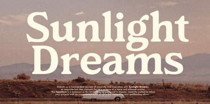 Introducing "Sunlight Dreams", a retro serif font that seamlessly combines vintage charm with contemporary flair. Meticulously crafted, its sophisticated serifs and gentle curvature exude warmth and timeless appeal. Ideal for various design applications, this font adds a touch of refined nostalgia, making it perfect for branding, packaging, and creative projects. Embrace the timeless allure of 'Sunlight Dreams' to elevate your designs with a hint of vintage elegance."
 - Djoker State by Letterara,
$8.00 Djoker State is a cool typeface which can be used for various purposes such as: quotes, advertising, headings, logos, badges, posters, book covers, newspapers and much more! Don't wait anymore, put it in your shopping basket :) and follow me, because there will be many promos! Thanks for checking out my store, and feel free to get in touch if you have any questions! thomasaradea@gmail.com Thank you :)
 - Verdana Pro by Microsoft,
$40.00 The Verdana typeface family was designed specifically to address the challenges of on-screen display. Verdana was originally designed by world-renowned type designer Matthew Carter, and tuned for screen display by the leading TrueType hinting expert, Tom Rickner. The Verdana fonts are unique examples of type designed specifically for the computer screen.The Verdana family received a major update in 2011 as a collaboration between The Font Bureau, Monotype Imaging and Matthew Carter. The original Verdana family included only four fonts: regular, italic, bold and bold italic. The new and expanded Verdana Pro family contains 20 fonts in total. The Verdana Pro and Verdana Pro Condensed families each contain 10 fonts: Light, Regular, Semibold, Bold and Black (each with matching italic styles).Verdana exhibits characteristics derived from the pixel rather than the pen, the brush or the chisel. The balance between straight, curve and diagonal were meticulously tuned to ensure that the pixel patterns at small sizes are pleasing, clear and legible. Commonly confused characters, such as the lowercase i j l, the uppercase I J L and the number 1, have been carefully drawn for maximum individuality - an important characteristic of fonts designed for on-screen use. Another reason for the legibility of the Verdana fonts on the screen is their generous width and spacing.Designed by David Berlow and David Johnathan Ross of the Font Bureau, with typographic consultation by Matthew Carter, the new Verdana Pro includes a variety of advanced typographic features including true small capitals, ligatures, fractions, old style figures, lining tabular figures and lining proportional figures. An OpenType-savvy application is required to access these typographic features. The expanded weights and completely new condensed range of fonts provide designers with an expanded palette of typographic options for use in print and on-screen, in both small text sizes and headlines.
 - Ainslie by insigne,
$- Get your Aussie on! The new typeface, Ainslie, with its mix of influences from Oz, makes its mark as the first semi-serif from insigne Design. Ainslie, named for Mt. Ainslie and Canberra’s inner suburb of the same name, was originally developed for the Canberra Australia Centennial Typeface Competition. Canberra is Australia’s capital, and it’s a planned city designed by American Walter Burley Griffin, a contemporary and one-time associate of Frank Lloyd Wright. Griffin’s plan involved a distinctly geometric design with several focal points--one of which was Mt. Ainslie. This same purely geometric scheme is now the basis for insigne’s new release. Similar to the Chatype project in its scope, its challenge, and the way its concept was developed, Ainslie incorporates influences from Canberra and surrounding areas to form a font that is uniquely Australian. In comparison, Chatype was developed for the city of Chattanooga, Tennessee by insigne in conjunction with designer Robbie de Villiers. Chatype took elements from Chattanooga’s industrial character and Cherokee past and merged them with the area’s technological influences. Likewise, Ainslie takes Canberra’s distinct, geometric design and blends it with the organic, flowing effect of aboriginal art. Add in touches from the smooth, aerodynamic design of the boomerang and Ainslie gives you a look uniquely Australian yet usable in a wide range of applications. The fashionable typeface includes a multitude of alternates that can be accessed in any OpenType-enabled application. These stylish alternates along with a number of swashes as well as meticulously refined details with ball terminals and alternate titling caps keep the font well accessorized. Also included are capital swash alternates, old style figures, and small caps. Peruse the PDF brochure to see these features in action. OpenType enabled applications such as the Adobe suite or Quark can take full advantage of the automatic replacing ligatures and alternates. This family also offers the glyphs to support a wide range of languages. While Ainslie wasn't selected as the final font in the Canberra competition, the outcome allowed for additional adjustments to the typeface. Several approaches were attempted for the final product including a technological hexagonal concept, which may still be developed to another form later. Some of the organic forms were removed and substituted with more abrupt endings, leaving the face looking pretty spiffy and a fair bit more legible. In the end, Ainslie was pulled back to the basic forms from which it was started. Give it a go for your next project. It’s guaranteed to be anything but a barbeque stopper.
 - Aftika Soft by Graphite,
$18.00 Aftika Soft is the soft edged version of Aftika type family. It is a clean geometric sans serif family of seven weights. Characterised by a prominent x-height, it is well suited for advertising, packaging, editorial and publishing, logos, branding, posters, billboards, signage as well as for small text for print or digital screens.
 - Arsis by Linotype,
$40.99Arsis is a condesed modern headline face that was originally produced and cast in hot metal by the Dutch type foundry Lettergieterij Amsterdam. The Arsis font family was designed by Gerry Powell in 1937. Arsis is a Serif (Antiqua) Modern Style font. Arsis font family attributes include roman serif, Didone, elegant, formal, modern style, feminine. - Majestic Wisteria by Letterhanna Studio,
$19.00 Majestic Wisteria is a a sweet handwritten font that is made with great care in order to produce the expected outcomes. This font can be used for writing various kinds of products according to their respective needs. It will add a luxury spark to any design project that you wish to create! This font is PUA encoded which means you can access all of the amazing glyphs and ligatures with ease!
 - Billion Reach by Letterhend,
$19.00 Introducing, Billion Reach - A beautiful signature script based on manual hand writing. The stylistic alternate and the ligatures make this font looks a real hand writing instead of typing a font. This type of font perfectly made to be applied especially in logo, and the other various formal forms such as invitations, labels, logos, magazines, books, greeting / wedding cards, packaging, fashion, make up, stationery, novels, labels or any type of advertising purpose. Features : uppercase & lowercase numbers and punctuation multilingual alternates and ligatures PUA encoded We highly recommend using a program that supports OpenType features and Glyphs panels like many of Adobe apps and Corel Draw, so you can see and access all Glyph variations. How to access opentype feature : letterhend.com/tutorials/using-opentype-feature-in-any-software/ Email us to letterhend@gmail.com if you need something! Happy Designing!
 - Halis Grotesque by Ahmet Altun,
$19.00 The Halis Grotesque font family comes in eight weights of Normal and Italic. In addition, all weights contain small caps in both italic and normal. The name of the font means “pure, clean.” The Halis Grotesque Font Family has the new Turkish Lira Sign as well as an alternative ampersand created by Prof. Halis Biçer, renowned in Turkey for his expertise in typography, calligraphy, and graphic design. That’s why this font’s name is inscribed with a dedication to the venerable Halis Biçer. The spaces between characters are wide enough to be legible even at very small sizes. With the HALIS GROTESQUE FONT FAMILY, you can create beautiful works for the web, including logos, banners, body copy, and presentations. Halis Grotesque also works nicely in print formats such as posters, T-shirts, magazines, and affiches. Because of its eye-pleasing style, this font is both effective and versatile.
 - Basil by Karandash,
$- A mix between tradition and innovation, Basil is a unique humanist slab serif well suitable for broad range of design projects - editorial, logotype, poster, etc. With its tall x-height and generous internal spaces, the type family was especially designed with legibility in mind and is well suitable for body text at small sizes. In the same time Basil is equally able as titling and headline font due to numerous distinctive visual features that shape its attractive appearance. A true workhorse, packed with lots of OpenType features and full multilingual support, the type family consisting of six weights, with Regular available for free! Basil type family received Special Mention in Cyrillic text Typeface category at 7th International Type Design Competition for non-Latin typefaces - Granshan 2014. It also was exhibited at New Bulgarian Typography exhibition part of Sofia Design week 2013 and then took part in several travelling exhibitions.