10,000 search results
(0.087 seconds)
- Emalia by JprintStudio,
$10.00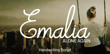 Emalia is a cute and casual handwritten font with an incredibly friendly feel. It features gorgeous swashes and ligatures that make this script incredibly versatile. Whether you’re looking for fonts for Instagram or calligraphy scripts for DIY projects, Emalia will turn any creative idea into a true piece of art!
 - Lavineta by Balpirick,
$15.00 Lavineta is a beautiful and elegant handwritten font with an incredibly friendly feel. It features gorgeous swashes and ligatures that make this script incredibly versatile. Whether you’re looking for fonts for Instagram or calligraphy scripts for DIY projects, Lavineta will turn any creative idea into a true piece of art!
 - Bashirah by Cititype,
$14.00 Bashirah is a cute and casual handwritten font with an incredibly friendly feel. It features gorgeous swashes and ligatures that make this script incredibly versatile. Whether you’re looking for fonts for Instagram or calligraphy scripts for DIY projects, Bashirah will turn any creative idea into a true piece of art!
 - Revenge by Juncreative,
$19.00 Revenge is a cute and casual handwritten font with an incredibly friendly feel. It features gorgeous swashes and ligatures that make this script incredibly versatile. Whether you’re looking for fonts for Instagram or calligraphy scripts for DIY projects, Revenge will turn any creative idea into a true piece of art!
 - Moyenage by Storm Type Foundry,
$55.00Blackletter typefaces follow certain fixed rules, both in respect to their forms and to the orthography. Possibly, they were a reaction to the half-developed Carolingian minuscule which was soon to end in the Latin script. Narrow, ordered script was to replace the round, hesitant and shattered shapes of letters in order to simplify writing, to unify the meaning of individual letters, and to save some parchment, too. Opposed to the practice common in monasterial scriptoriums where Uncial, Irish and Carolingian inspiration flew freely and as a result, the styles of writing differed in each monastery, the blackletter type was to define one, common standard. It was to express spiritual verticality, in perfect tune with the architecture of the Gothic era. Typography became an integral part of the overall style of the period. The pointed arch and the blackletter type were the vanguard of the spectacular transformation from the Middle Ages towards the modern era, they were a celebration of a time when works of art were not signed by their makers yet. Some unfortunate souls keep linking blackletter solely with Germany and the Third Reich, while the truth is that its direct predecessor, the Gothic minuscule, evolved mostly in France. Even Hitler himself indicated blackletter type obsolete in the age of steel, iron and concrete – thus making a significant contribution to the spreading of the Latin script in Germany. Once we leave our prejudice aside, we find that the shapes of blackletter type have exceptional potential, unheard of in sans-serif letterforms. The lower case letters fit into an imaginary rectangle which is easily extended both upwards and sideways. In its scope and in the name itself, the Moyenage type family project is to celebrate the diversity of the Middle Ages. I begun realizing the urge to design my own blackletter when visiting the beer gardens of Munich and while walking through the villages of rural Austria. The letters from the notice boards of inns are scented with spring air, with the flowers of cudweed, with white sausage and weissbier. The crooked calligraphic hooks and beaks seem to imitate the hearty yodeling of local drinkers and the rustle of the giant skirts of girls who distribute the giant wreaths of beer jugs. Moyenage is, however, a modern replica of blackletter, so it contains some otherwise unacceptable Latin script elements in upper case. I chose these keeping the modern reader in mind, striving for better legibility. The font is drawn as if written with a flat pen or brush, and with the ambition to, perhaps, serve as a calligraphic model. In medium width, the face is surprisingly well legible; it is perfect for menus as well as posters and CD covers for some of the heavier kinds of music. It has five types of numerals and also a set of Cyrillic script, symbolising the lovelorn union of Germans and Russians in the 20th century. Thus, it is well suited for the setting of bilingual texts of the German classic literature, which, according to the ancient rules, must not be set in Latin script. - M Gentle PRC by Monotype HK,
$523.99 The design concept of M Gentle is inspired by the aesthetics of ribbon gymnastics and the tenderness of orchids. The beauty of the two are combined in one typeface. Keeping the characters in right proportion and standard structure, its horizontal and vertical strokes (橫、豎) are generally straight. The linkage among dots (點), downstrokes and the ticks (剔) to the right represent a sense of movement and fill the typeface with liveliness and humanity. While M Gentle Light shows purity and softness, Medium and Bold fonts have their own personalities. They are all legible and suitable for a wide range of purposes, make the family a popular choice in the advertising industry.
 - M Gentle HK by Monotype HK,
$523.99 The design concept of M Gentle is inspired by the aesthetics of ribbon gymnastics and the tenderness of orchids. The beauty of the two are combined in one typeface. Keeping the characters in right proportion and standard structure, its horizontal and vertical strokes (橫、豎) are generally straight. The linkage among dots (點), downstrokes and the ticks (剔) to the right represent a sense of movement and fill the typeface with liveliness and humanity. While M Gentle Light shows purity and softness, Medium and Bold fonts have their own personalities. They are all legible and suitable for a wide range of purposes, make the family a popular choice in the advertising industry.
 - TT Severs by TypeType,
$29.00 TT Severs useful links: Specimen | Graphic presentation | Customization options TT Severs is a geometric grotesque with emphasized elements of internal brackets. A distinctive feature of TT Severs is the unusual form of internal ovals, which refers us to the style of traditional Arabic writing. TT Severs has a strong character and is great for use in high tech (IT), the web, in robotics, computer games, and sports. TT Severs is a 2-in-1 font family. In a large body size, it works great as a display font, creating a distinctive character for logos and headings. At the same time, when TT Severs is used in a small body size or in large text arrays, the font’s peculiarities of bracket construction fade, and it perfectly functions as a text font, thanks to both the low contrast between vertical and horizontal strokes and the detailed logic of interaction of black and white letter elements. The font family TT Severs includes 18 fonts, each of which consists of 558 glyphs. The family has standard and discrete ligatures, which include experimental ligatures for the Cyrillic alphabet. In addition, TT Severs can be made a little more humanist—it is enough to turn on stylistic alternates, and due to them the font takes the form of a humanist grotesque, which refers us to traditional broad nib writing. As part of the font family, you will also find old-style figures and a large number of OT features such as case, ordn, sups, sinf, dnom, numr, onum, tnum, pnum, liga, dlig, salt (ss01), frac.
 - Dix by Just My Type,
$20.00 An offbeat not-quite-slab, not-quite-bracketed serif. And its extreme weight and width. Richard Dix started as a surgeon and turned out an actor, one of the lucky few who made a successful transition from silent film to talkies. In 1929 he made the movie western, “Redskins,” and his name appeared on a brilliant poster promoting the film. “Richard DIX”; four upper case and six lower case letters. The font Dix is derived and extrapolated from impressions of those 10 letters. Inspired by the poster for the 1929 film, “Redskin,” and a desire to create a black Edwardian font with an offbeat serif. Usage recommendations Western movie or 19th century-style advertising posters.
 - Alas, as of my last update in April 2023, "LT Soul" by LyonsType is one of those elusive characters in the font world, not widely recognized or cataloged in the grand archives of typography I have ac...
- Hello Robiyton by IM Studio,
$12.00 Hello Robiyton Script is a modern calligraphy font with today's handwriting style, this font is perfect for branding, wedding invitations, magazines, mugs, business cards, quotes, posters, and more, you can try first if you want to buy this font. Hello Robiyton Script comes with 371 glyphs. and by having many of these glyphs, you will be able to choose letters according to your liking, lots of variations and options for each letter, so you can adjust to your design choices. To use various kinds of glyphs, a program that supports OpenType features is required such as Adobe Photoshop Cs/Adobe Photoshop CC, Adobe Illustrator CS/Adobe Illustrator CC, Adobe Indesign and Corel Draw and many more programs that support OpenType. If you don't have a program that supports OpenType, you can access all the alternative glyphs using Font Book (Mac) or Character Map (Windows). Thanks and happy designing :-) Thank you for buying!
 - Briliond by Ardyanatypes,
$15.00 Briliond has an aesthetic style, and the serif-type tagline is modern and elegant. This font is equipped with ten levels of thickness, from thin to black suits your needs. Briliond is also equipped with the latest professional characteristics that can present an elegant and attractive identity for your company or project for business purposes. It goes well with modern serifs, and scripts depicted or stand firm as a title and brand representative for an elegant look. Briliond also comes with multiple languages, making it easy for any country and language use. It also comes with alternative Ligatures and styles to make your designs more attractive. Briliond is suitable for branding projects and various design purposes such as business cards, name tags, and uniforms as a brand enhancement. Advertisements, posters, invitations, branding, logos, magazines, merchandise, presentations, etc.
 - Ottenburg Display by FoxType,
$14.00 Ottenburg Display is a Brand New Elegant Typeface with a powerful font family. It has a dependable and uncompromising style, with controlled letterforms and modern touches. It looks amazing in logos, magazines, and movies . Ottenburg Font would be perfect for branding, headlines, Captions, paragraph, and posters. The various weights allow you to experiment with a wide range of applications. It's created to make an impression without sacrificing its beauty and readability. It's shown a clean, minimalist, warmth, quirky, yet still purposed to be versatile The Typeface includes Nine Weights - Regular, Medium, SemiBold, Bold. All offer wide language support numerals and extended punctuation. Thank you for taking the time to look into the font.
 - Maleo by Tokotype,
$39.00 Maleo is a contemporary display sans with grotesque roots, taking cues from typefaces such as Benton’s Franklin Gothic & Alternate Gothic and contemporaries such as Obviously & Mars Condensed. Designed by Aditya Wiraatmaja as his debut retail typeface, Maleo is primarily designed with large-size usage in mind. Its tiny flare and angled cut terminal lends itself a friendly and approachable presence. With a family of 14 styles that range from thin to black with matching italics, it is a versatile display type that stands out in headlines, yet one that emits a charming personality. Maleo support various languages and is equipped with many Opentype features including; Old Style Figures, Ligature, Fractions, Numerators and Denominators, and Stylistic Alternates.
 - Gatter Sans by Arodora Type,
$35.00 Gatter Sans is a modern family with lots of alternate glyphs with geometric lines. Thanks to the crowd family, it will give you a great advantage in your poster works. You can also benefit from this creative and original family for your digital designs, ui/ux applications, and corporate identities.
 - Grenale Slab by insigne,
$- Grenale Slab adds to the new standard of elegance within the Grenale family. Not your typical slab, Grenale has some unique forms that give it a look all its own. This glamourous slab still draws much inspiration from Grenale’s Didone sans and its haute couture influence. Independently attractive, it’s balanced and poised, with well formed strokes. Grenale Slab’s thin weights are simple but vibrant--elegant forms that naturally lend themselves to designer journals and high-end branding along with upscale applications. With added energy and power, the thicker weights give your work a firmer, statlier look. Grenale Slab’s upright versions are also matched by optically adjusted italics. The fashionable typeface includes a multitude of alternates that may be accessed in any OpenType-enabled application. The stylish features include a large group of alternates, swashes, and meticulously refined details with ball terminals and alternate titling caps to accessorize the font. Also included are capital swash alternates, old style figures, and small caps. Peruse the PDF brochure to see these features in action. OpenType enabled applications such as the Adobe suite or Quark can take full advantage of the automatic replacing ligatures and alternates. This family also offers the glyphs to support a wide range of languages. Any of Slab’s weights also provide a well-matched companion to its original counterparts, Grenale #2 and the original Grenale. It’s time to think high-class. Graceful and assured, the carefully crafted forms of Grenale Slab step pleasantly onto each page with elegant charm. Include its range of alternate glyphs, and this chic font is a superb choice for bringing a far more refined look to your copy.
 - Jeles by Tour De Force,
$25.00 Inheriting the beauty and style of old type classics from this genre, Jeles is blended with very elegant modern approach featuring soft corners, round slab serifs and tasty ball terminals. Jeles is designed mostly for display use and it is highly recommended to get the whole family if you want to get the best result. It is designed in two styles Condensed and Normal. The Condensed version is developed in two weights each coming with corresponding italics. While the Normal styles are three ranging from Regular, Bold and Black. The total of 7 separate fonts inside the family are quite enough if you look for diversity and flexibility at one place. You could use the uprights for more serious and strong headlines while the Italics work perfectly for more fresh and live subheads. Of course editorial design is only one of the many directions where Jeles family could be used successfully as we all know typefaces with so visible contrast between thin and thick and combined with classic elegance, could be easily used in every design of cosmetic industry, fashion, food, jewelry, etc. Try to design a stylish boutique shop signboard and you will surely discover its beauty and potential. Easy-to-read, it is good for print design, revealing its authentic letterpress-like character as well as perfect for screen use note that the thin strokes and serifs are not that thin to vanish on a low resolution monitor. Professionally designed, they are solid enough yet very elegant and even gentle making Jeles a desired family design of attractive web banners, web sites, apps and e-books.
 - Henderson Slab by Sudtipos,
$39.00 A few bold caps drawn by Albert Du Bois for the 1906 Henderson Sign Painter book started me in the direction of looking at how sign painters approached slabs after the industrial revolution. The usual happened from there. My exercise in the early lettering roots of what eventually became the definition of geometric typography ended up having a life of its own. The majuscules led to minuscules, one idiosyncratic bold weight led to six more, and uprights led to italics. What was kind-of-interesting in the early twentieth century persuaded me to make it interesting enough a century later. This of course meant alternates, swashes, the standard baggage that keeps calling my name. Henderson Slab is a family of seven weights plus italics, all full of open features and extended Latin language support. Part of this family’s appeal is its coverage of nearly the entire of the slab serif through the last 100 years — the basis is the manual, humanist origins, the swashed forms come right out of the phototypesetting era, and the alternates and mostly modern constructs of contemporary ideas. The result is a set with the ability to function in modern spaces, from corporate to editorial, in text or display, while both winking and nodding at the roots of what is now considered a geometric endeavor. (Basic version do not include alternates, swashes, etc).
 - Plakato Pro by Underware,
$50.00 Plakato, a stencil love affair Plakato is a family of display fonts, consisting of various eye-catching styles, each of them very bold. Plakato is an identity toolkit, a heavyweight building block in case you need a strong personality, a small stencil font family to cut out your best ideas and grab all the attention. But just as with many other creations, its outcome is as divers as its multiple origins. Plakato comes in 16 eye-catching styles. The default stencil style comes in Regular & Italic. They both have 2 variations: one version, named Plakato Stencil, automatically creates borders around the text, putting any text into a graphic stencil in this way. Another version, the extruded three-dimensional version, guarantees even more attention for your message. Next to this there is also the Inline version, which is an optical play with a lot of lines. Plakato Inline has a supportive background layer, a separate font in case you want to add a background in a different colour. Then there is Plakato Paper, a manually teared version of Plakato offering a more physical look. This small family of eye-catching display fonts also contains a Neon font, an independent design in Plakato style, which can actually be used for making neon signs due to its construction. Plakato Neon comes with its own Dingbat font for that extra flush-flush. Plakato has also been redrawn on a C64, and with all its accompanying limitations been ported back and turned into a font: Plakato Game. Also this font comes with its own Dingbat font, full of emoji’s and icons for oldskool pleasure. Last but not least there is Plakato Build, constructed out of blocks. As if that wasn’t enough, there are various dynamic versions in the Plakato Play package, which offer a whole new range of possibilities for typographic expression, with new animation and interaction opportunities.
 - Verse Serif by Hubert Jocham Type,
$39.00 In 2006 the art director of Emotion, a women’s psychology magazine, asked me to design a copy typeface for them. Before I actually got the job I started to work on a serif. I wanted it to be feminine but still clear and modern. On one hand there are the floral round elements and on the other hand the angular serifs. In the composition I wanted the two extremes to work together. All the other elements had to be harmonized. The proportions needed to match the magazine’s requirements. The ascenders and descenders are short enough to work in narrow columns but long enough to work in small sizes. As you can imagine, the emotion-job never happened. Verse is now a serif and a san-serif with 7 weights with italics and smallcaps. In copy you should not get heavier than Heavy. Extrabold and Ultrabold work best in display.
 - Backbone by 38-lineart,
$17.00 Backbone is a unique blackletter font. It’s suitable for use in various projects such as gothic letters, tattoos, headlines, posters, magazines, newspapers, t-shirts, labels, and any other designs that you wish to create. Get inspired by Black metal and It will add an edgy feel to any crafting project! Bold and spooky, Ideal for any October project or Halloween party, this font will become your top choice in no time!
 - Ardena by Julien Fincker,
$34.99 About the design: Ardena is a modern sans-serif typeface family. While neutral and clear at first glance, it can be characterized as both pleasant and confident due to its open, rounded forms and vertical terminals. It can be used in both a restrained and expressive way. The thinner and thicker weights are particularly suitable for strong headlines, while the middle weights can be used for typographic challenges and body text. Completed with an extensive character collection, it becomes a real workhorse. A versatile allrounder that is up to all challenges – for Corporate Identity, Editorial, Branding, Orientation and Guidance systems and much more. Features: The Ardena family has a total of 20 styles, from thin to heavy with matching italics. With over 1064 characters, it covers over 200 Latin-based languages. It has an extended set of currency symbols and a whole range of Open Type Features. There are alternative characters as stylistic sets, small caps, automatic fractions – just to name a few. Arrows and numbers: In particular, the extensive range of arrows and numbers should be highlighted, which are perfectly suited for use in orientation and guidance systems. Thanks to Open Type Features and an easy system, the various designs of arrows and numbers can also be simply "written" without first having to select them in a glyph palette. The principle is easily explained: If a number is placed in round or square brackets, it will automatically be displayed in an outlined circle or square. If you add a period to the number, it is displayed in a full circle or square. The same principle also applies to the arrows. The arrows themselves are combinations of greater/less symbols with the various slashes or hyphens. Get the Variable Font here: https://www.myfonts.com/fonts/julien-fincker/ardena-variable/
 - Onedrips by Prioritype,
$25.00 Introducing Onedrips - Graffiti Script Fonts Script style fonts mixed with ink drop style are very special to work with you. You can use them in merchandise designs, album covers, t-shirt designs, youtube thumbnails, book covers, posters, stickers, social media posts, landing pages and much more you can make with this great item for any design! Features: -Uppercase -Lowercase -Numeral -Punctuation -Multilingual -Swash & Element -PUA Encoded -Opentype Features Multilingual contained: Afrikaans, Albanian, Asu, Basque, Bemba, Bena, Breton, Chiga, Cornish, Danish, Dutch, English, Filipino, French, Friulian, Galician, German, Gusii, Indonesian, Irish, Italian, Kabuverdianu, Kalenjin, Kinyarwanda, Luo, Luxembourgish, Luyia, Machame, Makhuwa-Meetto, Makonde, Malagasy, Manx, Morisyen, North Ndebele, Norwegian Bokmål, Norwegian Nynorsk, Nyankole, Oromo, Portuguese, Quechua, Romansh, Rombo, Rundi, Rwa, Samburu, Sango, Sangu, Scottish Gaelic, Sena, Shambala, Shona, Soga, Somali, Spanish, Swahili, Swedish, Swiss German, Taita, Teso, Uzbek (Latin), Volapük, Vunjo, Zulu. Note: Use a program that supports the Opentype features and the glyph panel is available, so you can see the various alternative characters available. Examples of programs such as Adobe Illustrator, Corel Draw or Affinity Designer. Thanks.
 - Waikiki Doodles by Outside the Line,
$19.00 Take a little trip to the land of sun and sand with Waikiki Doodles. 30 resort drawings that can be used for Waikiki and other warm weather destinations. From generic tourist icons like palm trees and a camera to the specific like Diamond Head and hula dancer. 29 drawings and the word Aloha lettered in script.
 - Anselm Sans by Storm Type Foundry,
$63.00One of the good practices of today’s type foundries is that they release their type families as systems including both serif and sans serif type. Usually, the sources of inspiration need to be well tried with time and practice, since production of a type family is such a laborious and complex process. From the beginning, it needs to be clear that the result will be suited for universal use. Such systems, complete with the broad, multi-lingual variations permitted by the OpenType format, have become the elementary, default instrument of visual communication. Non-Latin scripts are useful for a wide scope of academic publications, for packaging and corporate systems alike. And what about outdoor advertisement designated for markets in developing countries? Cyrillics and Greek have become an integral part of our OpenType font systems. Maybe you noticed that the sans serif cuts have richer variety of the light – black scale. This is due to the fact that sans serif families tend to be less susceptible to deformities in form, and thus they are able to retain their original character throughout the full range of weights. On the other hand, the nature of serifed, contrasted cuts does not permit such extremes without sacrificing their characteristic features. Both weights were drawn by hand, only the Medium cut has been interpolated. Anselm Ten is a unique family of four cuts, slightly strengthened and adjusted for the setting in sizes around 10 pt and smaller, as its name indicates. The ancestry of Anselm goes back to Jannon, a slightly modified Old Style Roman. I drew Serapion back in 1997, so its spirit is youthful, a bit frisky, and it is charmed by romantic, playful details. Anselm succeeds it after ten years of evolution, it is a sober, reliable laborer, immune to all eccentricities. The most significant difference between Sebastian/Serapion and Anselm is the raised x-height of lowercase, which makes it ideal for applications in extensive texts. Our goal was to create an all-round type family, equally suitable for poetry, magazines, books, posters, and information systems. - Anselm Serif by Storm Type Foundry,
$63.00 One of the good practices of today’s type foundries is that they release their type families as systems including both serif and sans serif type. Usually, the sources of inspiration need to be well tried with time and practice, since production of a type family is such a laborious and complex process. From the beginning, it needs to be clear that the result will be suited for universal use. Such systems, complete with the broad, multi-lingual variations permitted by the OpenType format, have become the elementary, default instrument of visual communication. Non-Latin scripts are useful for a wide scope of academic publications, for packaging and corporate systems alike. And what about outdoor advertisement designated for markets in developing countries? Cyrillics and Greek have become an integral part of our OpenType font systems. Maybe you noticed that the sans serif cuts have richer variety of the light – black scale. This is due to the fact that sans serif families tend to be less susceptible to deformities in form, and thus they are able to retain their original character throughout the full range of weights. On the other hand, the nature of serifed, contrasted cuts does not permit such extremes without sacrificing their characteristic features. Both weights were drawn by hand, only the Medium cut has been interpolated. Anselm Ten is a unique family of four cuts, slightly strengthened and adjusted for the setting in sizes around 10 pt and smaller, as its name indicates. The ancestry of Anselm goes back to Jannon , a slightly modified Old Style Roman. I drew Serapion back in 1997, so its spirit is youthful, a bit frisky, and it is charmed by romantic, playful details. Anselm succeeds it after ten years of evolution, it is a sober, reliable laborer, immune to all eccentricities. The most significant difference between Sebastian/Serapion and Anselm is the raised x-height of lowercase, which makes it ideal for applications in extensive texts. Our goal was to create an all-round type family, equally suitable for poetry, magazines, books, posters, and information systems.
 - Logtown by Jinan Studio,
$12.00 Logtown Duo is a hand-drawn font that blends vintage charm with a rugged edge. It's the perfect choice for your vintage-themed logos, branding, and adventurous designs. This font combo combines both elegant Script and Slab Serif styles, giving you options from solid to textured looks. Plus, it's got your back with support for multiple languages, making sure your message reaches everyone. Whether you're aiming for nostalgia or a modern twist on the classics, Logtown Duo has you covered for stylish and impactful designs. Features A set of uppercase and lowercase glyphs Number, symbol, and punctuation Multilingual Support Alternates, ligatures, and swashes (script version) Type j_1 until j_9 to features swash, ligatures will automatically replace the standard letter pairs whenever available, when using any OpenType capable software (script version).
 - dT Delicatta by dooType,
$40.00 Easy to use, but hard to miss. That’s dT Delicatta. An elegant script face that adds a special touch to any message. Script typefaces usually come packed with endless features and, more often then not, all those possibilities take their toll on the designer or art director. With usability in mind, we kept dT Delicatta simple and straightforward to use while delivering refined shapes that enhance your or your client’s communication. dT Delicatta is a revised, improved and virtually new font of our old classic Delicatta
 - BoxyBlocks by d[esign],
$17.38 The laboriously hand drawn letters of the BoxyBlocks font family are something reminiscent of the letters and decorative elements which adorned our childhood artworks, posters, pencil cases and workbooks. The BoxyBlocks font family consists of three fonts; BoxyBlocks, BoxyBlocks Nero and BoxyBlocks Original. BoxyBlocks and BoxyBlocks Nero can be used together to fill in the sides of BoxyBlocks' letters, by layering BoxyBlocks above a differently coloured BoxyBlocks Nero in your image editor of choice.
 - Dandy JY by JY&A,
$29.00 Danielle Smith describes her friendly, hand-drawn typeface family, available in roman and italic, as ‘non-élitist and accessible’. Originally created for a theatre project at Massey University, Dandy is reminiscent of Pablo Ferro’s hand-lettering.
 - Opake by Ndiscover,
$36.00 Opake™ is an experimental typeface design that steps away from regular design conventions. Instead of basing the design on a calligraphic tool or geometric shapes, Opake™ is the result of the exercise of creating letters with a single continuous loop line. This unseen technique makes the overall design very unique. Though unconventional, the design resonates with some familiarity because of its calligraphic stroke terminations and some shape decisions that might resemble Cooper Black. In the end Opake™ is a cutting edge non-connecting script font, with a warm and happy feeling. Ideal for large headlines and general display use, but also branding, posters and apparel. If you like unconventional solutions and edgy design, Opake is the font to go for.
 - Ivory Coast by Aminmario Studio,
$20.00 Introducing Ivory Coast font is modern and elegant handwritten with a quick stroke pen effect. Comes with regular and italic. With built in Opentype features, this script comes to life as if you were writing it yourself. This font is great for your creative projects such as watermark on photography, and perfect for logos & branding, photography, invitation, watermark, advertisements, product designs, stationery, wedding designs,label, product packaging, social media, movie titles, books titles, a short text even a long text letter and good for your secondary text font with sans or serif. And also for special events or anything that need handwritting taste. Don't hesitate if you have any questions. Thanks for checking out this font. I hope you enjoy it! AminMario
 - ITC Riptide by ITC,
$29.99ITC Riptide is a work of British designer Timothy Donaldson. Abrupt changes in stroke, pointed stroke ends and changing slant direction characterize this very experimental alphabet. The temperamental figures are irrepressible and aggressive, the forms seem to have been chosen randomly, and these traits lend the font its informality and spontaneity. ITC Riptide is legible in point sizes of 14 and its fresh character is perfect for comics and cartoons. - Stitka by ARToni,
$19.00 Stitka is a chic, refined script font that emanates sophistication and elegance. Its stylish and ligatures make this font the perfect match for any project.
 - Geronimo by Canada Type,
$24.95Geronimo is a rough poster script done in the spirit of brush calligraphy experiments conducted by American calligrapher and historian, Professor Alexander Nesbitt. This particular approach to brush script uses a pointed brush. Although Nesbitt considered the pointed brush corruptive and not at all suited to present day western letter forms, he put forth that with enough control of the brush (keeping it upright, maintaining stroke evenness, etc) even an unexperienced letterer can easily draw current day letters, though the result will always show characteristics of the letterer's own handwriting. Geronimo is a great choice for entertainment design, like book covers, film poster and packaging, and CD inserts. It also is a great overall display design for anything that seeks to depict adventure or an environment with a rough human element. Many alternates are sprinkled throughout the font. - Rosalinde by Scriptorium,
$18.00Rosalinde is an original font based on rough hand-lettering reminiscent of 1960s era protest poster lettering. It's the kind of lettering you'd expect to see used for a snippet of anti-war poetry set against a red-white-and-blue striped background, or perhaps accompanied by a fat dove with an olive-branch. - Ambatah by Differentialtype,
$10.00 Ambatah is a sans serif font family that comes with 18 styles. Specially designed to be your favorite font of choice. Add it to any of your creative projects, and it will make it stand out! Ambatah has a set of expanded alternate characters, and all is PUA coded, which means you can access all glyphs and swashes easily!
 - Yemeyi by AukimVisuel,
$9.00 Yemeyi family is a modern and daring display font. No matter the topic, this font will be an incredibly asset to your fonts’ library, as it has the potential to elevate any creation. Yemeyi is a simple and neat lettered sans serif font. Add this font to your creative ideas and notice how it will make them stand out!
 - MOO! - Personal use only

- Envelove by Sudtipos,
$39.00 «Envelove» is the brand new typographic challenge handwritten by Yani Arabena and designed along with Guille Vizzari and Ale Paul, for Sudtipos. It all started as a game for Yani. A carefree and spontaneous calligraphy, making use of the pointed nib with black ink, exploring its expressive possibilities pressing against paper. With time that nib turned into her dearest tool to flow through her writing, breeding this particular style of hers that let her trespass the barrier that kept personal and professional passions apart. All that inspiration is present in «Envelove», a play on words that reflects the love of letters. An expressive free-and-easy typeface that follows no formal calligraphic model and lets itself go with the meaning of words, rhythm and sensations. «Envelove» successfully joins three different fonts, «Envelove Script»—free, spontaneous and unique of its kind—going together with «Envelove Caps»—an uppercase style that builds controlled but dynamic words thanks to its alternates and ligatures, and to its own true Small Caps set as well—and «Envelove Icons», ideal to decorate and bring to life any written message. «Envelove» encourages you to write as if you have a nib, ink and an envelope. It invites you to take part in other worlds like a magic cocktail, a summer night, a long-awaited reunion, a first dance, a dish cooked with your own hands. The fashion world, gourmet, stationery, scrapbooking and everyone where a Handmade or Handcrafted feel is craved for, save a special place for «Envelove». (The illustration series that are shown with «Envelove» were made by the incredible Argentine illustrator Eugenia Mello.)
