10,000 search results
(0.07 seconds)
- Burin by Monotype,
$29.99The Burin family of typefaces consists of Roman and Sans variations. Burin Roman has very distinct lowercase characters b, c, d, g and y with a quirky use of tapered strokes and hairlines. Burin Sans is a light display face with an extended tail on the lowercase y. - Prose Sans by Ayca Atalay,
$29.00 Prose Sans is a wide sans serif font family that comes in 8 weights. With its slightly tilted axis and relatively high contrast strokes, it is both elegant and strong. The standard and discretionary ligatures help achieve a more tailored look, excellent for branding, logo design, poster design etc.
 - Burin Sans by Monotype,
$29.99The Burin family of typefaces consists of Roman and Sans variations. Burin Roman has very distinct lowercase characters b, c, d, g and y with a quirky use of tapered strokes and hairlines. Burin Sans is a light display face with an extended tail on the lowercase y. - Black Bruno by Subectype,
$18.00 Black Bruno is a supercharged, street-wise brush font bursting with energy. It includes extra attention to quick strokes and sharp details. This font is perfect for challenging jobs, titles, t-shirts, websites, hoodies, clothing, headline, logotype, branding, advertising, event and various print and digital media with energy.
 - Neoscript Pro by John Moore Type Foundry,
$59.95 NeoScript Pro is a family of typefaces that leads Neoscript Pro Zero, a commercial script writing similar to those used in ads advertising the 40s and 50s, with fine lettering combinations of that time. NeoScript Pro is ideal for composing headlines and subheads and this is supplied four variations.
 - Scriptonah by Jonahfonts,
$39.95 A script font family which include 4 variations, Light, Regular, DemiBold and Bold. An easily-legible font useful for notes, invitations and announcements, also for the package designer Read John Downers' article in Typographica®: ‘Our Favorite Typefaces of 2007’ https://typographica.org/typeface-reviews/scriptonah-and-casual-brush/
 - Fineday by Melvastype,
$29.00 Fineday is a clean and lining brush script. It is available with two different styles of uppercases: Style One and Style Two. Style One is swashy and decorative. Style Two is more plain and straightforward. Fineday is also available with connecting and non-connecting lowercases. All the Fineday versions have fancy alternate characters like ending swashes, tales and swashy ascenders. The family has an extended character set supporting most Central European and Eastern European languages.
 - Love Distance by Letterhend,
$17.00 The Love Distance is a beautiful handwritten script with organic style. This type of font perfectly made to be applied especially in logo, and the other various formal forms such as invitations, labels, logos, magazines, books, greeting / wedding cards, packaging, fashion, make up, stationery, novels, labels or any type of advertising purpose. Features : Uppercase & lowercase Numbers and punctuation Alternates & Ligatures Multilingual PUA encoded
 - Mangkaning by TSA Creative,
$16.00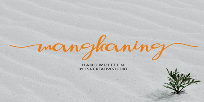 mangkaning is a beautiful script font with stylistic set ( ss01 & ss02), this font looks natural, elegant and perfect for any extraordinary project. mangkaning is suitable for various products such as invitations, product packaging, product design, crafter, labels, photography, watermarks, logos & branding. Everything can be accessed using software that supports Opentype, such as Adobe Indesign, Adobe CS Illustrator, Adobe Photoshop CC, and Corel Draw.
 - Brandy by Artisan Studio,
$20.00 Brandy is a font scrip, so, font script that is beautiful and unique, it is a model of modern calligraphy typefaces, in combination with a calligraphy writing style. The Features of this fonts is: Swash Alternates Standart ligatures Contextual Alternates Stylistic Alternates Stylistic sets Can be used for various purposes.such as headings, logos, wedding invitation, t-shirt, letterhead, signage, lable, news, posters, badges etc. To enable the OpenType Stylistic alternates, you need a program that supports OpenType features such as Adobe Illustrator CS, Adobe Indesign & CorelDraw X6-X7
 - Rosliyati by Sulthan Studio,
$14.00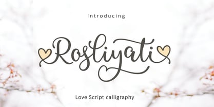 Rosliyati script -font that is fresh, funny, interesting, cute with lots of heart characters and also very beautiful with alternatives, this font looks natural, elegant, and perfect for extraordinary projects. Rosliyati script is suitable for various products such as invitations, product packaging, offers, product design, crafters, labels, photography, watermarks, logos & branding. Everything can be accessed using software that supports Opentype, such as Adobe Indesign, Adobe CS Illustrator, Adobe Photoshop CC, and Corel Draw.
 - Fresh Press by Fenotype,
$30.00 Fresh Press is a pack of handmade goodness - a visual delight in the form of a beautiful and strong script family. Fress Press consists of Regular, Bold, Caps and Ornaments that all play smoothly together. If Fresh Press feels too clean, there’s a Printed version of the whole family with a rough outline and texture. Fresh Press is equipped with Standard Ligatures and Contextual Alternates that maintain a smooth text flow. If that isn’t enough, try Swash, Stylistic or Titling Alternates in any OpenType-savvy program, or manually look for alternates from character map. Fresh Press is a clear and strong choice for any display use from branding to packaging and online to print.
 - Diplomatic by Sudtipos,
$59.00 Diplomatic is another script from the Koziupa and Paul duo. It relies on calligraphic simplicity to reach its artistic sophistication. Prominent ascenders and descenders work alongside calculated but casual strokes to produce an unmistakably elegant typesetting. Designed by Koziupa and digitized by Ale Paul.
 - P22 Slogan by IHOF,
$24.95 P22 Slogan is a non-connecting script font that captures the essence of the lettering used in 1950s European advertising. Bold strokes of this brush-drawn face make this design a great choice for both retro design and contemporary work. The font is based on the 1957 design Slogan by Aldo Novarese for the Italian Nebiolo Type Foundry. At the time of its original release, it was touted for "striking publicity work". This new digitization accurately reproduces the outlines of the original not found in previous digital versions of this design. P22 Slogan is a non-Pro Opentype font that includes Central European characters.
 - Hokagata Brush by Fargun Studio,
$12.00 Hokagata is a casually and quickly written brush script. Letters are made with brush pen on a paper. Then scanned and carefully drawn into vector format. There is just a right amount of texture left so it looks good in small and big sizes. These elements gives Hokagata its organic, authentic and laid-back characteristics. The Hokagata Family includes 2 font files: 1. Hokagata • A handwritten script font containing upper & lowercase characters, numerals and a large range of punctuation. 2. Hokagata Swashes • A set of 64 hand-drawn swashes, the perfect finishing touch to underline your Hokagata text. Simply install this as a separate font, select it from your font menu and type any A-U character to create a swash.
 - Blank Page by Ergibi Studio,
$21.00 Blank Page Font Duo, these fonts are of two types serif and script. Display Serif inspired by famous logo, This typeface has been made carefully to make sure its premium quality and luxury feel. The ligatures on serif makes this typeface unique and stands out rather than the regular serif font, perfectly for headlines, wedding, social media, logos, posters, packaging, T-shirts,coffee shops, restaurants, magazine’s headers, signs or gift/post cards,cafe’s and weddings or any type of advertising purpose. if you have any questions, don’t hesitate to contact us Ergibi Studio
 - Adva Open MF by Masterfont,
$59.00 Highly legible single stroked stencil font family in 3 weights. Use for titles, signage, captions etc.
 - Hawkes by Kimmy Design,
$15.00 Hawkes is an extensive handmade typeface family that comes with a bundle of weights, widths and styles, all designed to work cohesively. Here is a breakdown of the Hawkes family. Hawkes Sans: The primary subfamily is a sans-serif typeface that includes nine fonts: three weights (light, medium and bold) and three widths (narrow, regular and wide). Within this set are an array of stylistic features; including small capitals, character style alternatives, discretionary ligatures and contextual alternatives. See details below for more information on OpenType Features. Hawkes Variable Width Sans: The secondary subfamily is the same base sans-serif fonts but combined in variating widths. Essentially, it takes all three widths of each weight and randomly mixes them together. This creates a funky and creative alternative to the more traditional sans-serif set. The variations are for the uppercase, lowercase, small capitals, ligatures and numbers. Hawkes Script: The last subfamily is the script typeface. It’s a quirky script with variations of its own, including ligatures, swashes and contextual alternatives (again, see below for further details.) The script font works great as a complimentary style to the sans-serif, or on it’s own. FEATURES Alright, let’s get into all the extra goodies this typeface has to offer. Small Capitals: Small caps are short capital letters designed to blend with lowercase text. These aren’t just capital letters just scaled down but designed to fit with the weight of both the lowercase and capitals. With Hawkes, small caps can either sit on the baseline (in line with the base of the capital and lowercase) or to be lifted to match the height of the capital letters by applying the discretionary ligature setting in the OpenType panel. These small capitals have a dot underlining them that sit along the baseline. The feature offers a unique display affect that is great for logos, titles and other headline needs. Discretionary Ligatures: A discretionary ligature is more decorative and unique combination than a standard ligature and can be applied at the users discretion (as the name indicates.) The specific styling for these ligatures varies for different fonts. With Hawkes, they are used as an all capital styling feature, or to lift the small capitals to align with the height of the capitals. In the former setting, both lowercase and uppercase letters are first changed to all capitals, then a specialized set of letter combinations are transitioned so small characters are positioned within a main capital letter. These combinations only happen with main characters that include an applicable stem, such as C F K L R T Y. Some of these combinations include two or three characters. When Small Caps is turned ‘on’, this feature will lift the small caps to the height of the capital letter. For more information, please check out the user guide! Stylistic Alternatives: Stylistic alternates are a secondary form of a character, often used to enhance the look or style of a font. For Hawkes, these alternatives provide a slightly more handmade feel. A - the capital and small capital A will lose its pointed apex and become rounded. Think of it more as an upside-down U than an up-side-down V ;-) Oo, G, Ss, Cc- these characters’ topmost terminal becomes a loop. The O is applied automatically, the G S and C need to be turn on individually. Titling Alternatives: This feature does sort of the opposite of what it intends. Instead of being used for titling purposes, this feature makes the text look better in paragraph text settings. Kk Rr h n m - curved terminals on the are straightened e - the counter stroke also gets straightened from a more looping motion y - the shape of y is changed from a rounded character to a sharper apex (think more like a ‘v’ than ‘u’) Contextual Alternatives: Contextual alternates are glyphs designed to work within context of other adjacent glyphs. With Hawkes Sans, there are three slightly different variations per character. The feature rotates the application of each variation. This helps with organic authenticity, so if you have two e’s next to each other, they won’t look identical (reflecting the natural variations in handwriting and lettering.) With Hawkes Variable width fonts, I have created a contextual pattern that randomizes the widths of each character. So, when the feature is turned ‘on’ in the OpenType panel, the widths would alternate in a pattern such as: Narrow, Wide, Regular, Narrow, Regular Wide, Narrow, etc. It happens automatically so the user doesn’t have to think or worry about getting a random seed. With Hawkes Script, contextual alternates allow strokes to connect properly from one character to the next while maintaining a believable, natural flow. Connecting strokes are present for two letters next to each other but are replaced by a shorter stroke when located at the end of a word or sentence. Some characters have in-strokes when located at the start of a word. When a character is preceded by a capital letter that doesn’t connect, it too needs an in-stroke or altered spacing. This feature is complicated and messy, but luckily you don’t really have to think about it! I’ve done all the coding so all you have to do is turn ‘on’ the feature in the OpenType panel and you are off to the races! I’m just letting you know what’s happening behind the scenes. Swashes: These are just for Hawkes Script and provide tail swashes to the start and ends of letters. There are three different options. You can pick the basic option by turning ‘on’ the swash feature in the OpenType panel, or you can pick using the Glyph panel. Stylistic Sets: This feature work in new versions of Illustrator CC and InDesign CC. You can pick specific styling sets instead of turning on an entire feature. For example, let’s say you want to have a loopy S, but not a loopy C or O, you can just turn on the S in the Style Set. It also helps create the little drop box that pops up when you hover over a character, showing you the alternates associated with that character. This makes it easy to pick and choose specific styles you want in a word or headline. ---------- And there it is folks! That’s all the basic info on Hawkes, I know it’s been a lot and I appreciate you hanging on. If you are like me and need more of a visual reference to accessing all these goodies, I’ve made a user guide to help navigate Hawkes and everything it has to offer. Altogether this extensive family boasts 14 total fonts in a wide array of styles, weights and widths, making it a great addition to any handmade type collection. Enjoy!
 - 58 Rodeo by Baseline Fonts,
$24.00Introducing 58 Rodeo: A Classic Redefined 58 Rodeo is based on several different woodtypes used primarily as display faces in the late 1800s/early 1900s. The difference with this version of a classic woodtype is the balance and legibility. 58 Rodeo has been redrawn to emphasize line and character uniformity. The goal is to create a eurostyle, square look in a western font designed for modern applications with wild west sensibility. Additional characters provide whimsy and flair to round out any layout on the fly. Stars and other sorts are included in this reinterpreted design. Egyptienne-style fonts possess a universal appeal and are spectacular for adding interest and legibility in a variety of applications. The extended character set includes the Euro, placed on the currency key. - ZT Vollun by Khaiuns,
$29.00 ZT Vollun is a work of awakening from my valley of boredom in making fonts, it is not only a transformation of thickness, but also in terms of theme, aura, shape and beauty. Maybe this is a superstition of adulthood and also as we get older, our taste in cigarettes can change too. And the taste of the coffee is also getting bitter, in fact there is no sugar anymore, but the enjoyment is increasing. ZT Vollun consists of seven weights, starting from the thin one with curves combined with thin strokes, offering a playful aura, to the thickest one with a firm design that will present a thick modern atmosphere. Whether you're working on a branding project, an editorial project, or any other graphic project, ZT Vollun is the perfect choice for a modern, elegant look or any design vibe you can get your hands on. I hope you have fun using ZT Vollun. Thanks for using this font
 - Redberries by Letterhend,
$19.00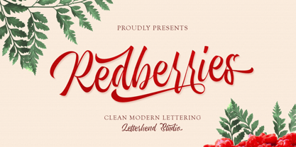 Introducing, Redberries Script. A beautiful and unique modern calligraphy script typeface. This type of font perfectly made to be applied especially in logo, and the other various formal forms such as invitations, labels, logos, magazines, books, greeting / wedding cards, packaging, fashion, make up, stationery, novels, labels or any type of advertising purpose. Features : uppercase & lowercase numbers and punctuation multilingual swashes and ligatures alternates PUA encoded We highly recommend using a program that supports OpenType features and Glyphs panels like many of Adobe apps and Corel Draw, so you can see and access all Glyph variations. How to access opentype feature : letterhend.com/tutorials/using-opentype-feature-in-any-software/ Email us to letterhend@gmail.com if you need something! Happy Designing!
 - Antafeda by Gloow Studio,
$15.00 Antafeda is our another retro script typeface. Use this typeface and you will make a retro design with ease! Combined your design with dozens of stylistic alternates and elegant swashes which is included in this typeface, this retro typeface is really perfect for logo design, t-shirt, vintage and retro badge, vintage quotes, branding, packaging, etc. Antafeda features: A full set of upper & lowercase characters Numbers & punctuation Multilingual language support PUA Encoded Characters +320 Glyph Up to 80 Stylistic Alternates with Swashes and Ligatures! OpenType Features To enable the OpenType Stylistic alternates, you need a program that supports OpenType features such as Adobe Illustrator CS, Adobe InDesign & CorelDraw X6-X7, Microsoft Word 2010 or later versions. There are additional ways to access alternates/swashes, using Character Map (Windows), Nexus Font (Windows), Font Book (Mac) or a software program such as Pop Char (for Windows and Mac). Thankyou for purchasing our product, hope you like and have fun with our product. If you have any queries, questions or issues, please don't hesitate to contact us directly. If you satisfied with our product, please give 5 stars rating. Happy Designing...
 - Arapix by Anatoletype,
$69.00 Arapix is a 12 pixel high multilingual Latin-Arabic pixel font with incredible capabilities. The Arapix is an almost traditional Naskh. It is elegant and easy to read even in very small sizes. It includes almost every feature you would expect from a high range Naskh font. Its humanistic look and feel fit perfectly to its Latin counterpart. Arapix was originally designed for a web project that didn't see the light a few years back. It started with the idea of fitting both Latin and Arabic into a 12 pixel vertical grid. The latin glyphs fit properly within the vertical limits, but when it came to the arabic glyphs, it proved to be more challenging. Arabic letters with lower diacritic dots like the (Yeh-fina) or letters with accents above like the (Alef-Hamza-above) need much more space than any Latin letter. Add to this the fact that accents needs to be positioned above and below the glyphs. It is technically impossible to fit a (Yeh-fina-kasratan) or a (Alef-Hamza-above-shadda-damma) into 12 pixels. Initially the accents were dropped and not included in the design. Although it seemed impossible at the start, Sylvain found a solution in the end, including as many contextual alternates and contextual kerning as needed to avoid every collision between letters and diacritics, letters and accents, and diacritics and accents. The contextual kerning was added to achieve an even letter and word spacing in longer text. Arapix is amazingly legible in small size on screen and in print. On the other hand, it also works perfectly as display titling font due to its unique and contemporary pixel approach. It can be used for screens with very low resolution as well as for high resolution screens and prints. The new Arapix comes with various new features and new glyphs including Persian and Urdu letters, stylistic set, old style figures, contextual kerning, contextual alternates and a few icons too. Enjoy the new Arapix and have fun with it.
 - Raqmi Monoshape by Arabetics,
$39.00 Raqmi Monoshape is a simplified version of the Raqmi font family with unified (non-varying) shapes. This font family supports all Arabetic scripts covered by Unicode 6.1, and the latest Arabic Supplement and Extended-A Unicode blocks, including support for Quranic texts. It includes two weights: regular and light, each of which has normal and left-slanted Italic versions. The script design of this font family follows the Arabetics Mutamathil style utilizing varying x-heights. The Mutamathil type style utilizes only one glyph per Arabic Unicode character or letter, as defined by the Unicode Standards. Raqmi Monoshape includes the required Lam-Alif ligatures in addition to all vowel diacritic ligatures. Soft-vowel diacritic marks (harakat) are selectively positioned with most of them appearing on similar high and low levels—top left corner—, to clearly distinguish them from the letters. Tatweel is a zero-width glyph.
 - Linotype Gotharda by Linotype,
$29.99Linotype Gotharda is part of the Take Type Library, chosen from contestants of Linotype’s International Digital Type Design Contests of 1994 and 1997. This display font started as an experiment of the Croatian-German designer Milo Dominik Ivir. He wanted to design a font with characteristics of both sans serif and Gothic faces. From the Gothic he took the heavy strokes, the narrow letters, the exaggerated overmatter and the high x-height. The modern standard forms of the letters s, a, x and z, the clear capitals and the lack of serifs are the characteristics taken from sans serif faces. The result is a font with a constructed, old German feel. Linotype Gotharda is intended exclusivley for headlines in large point sizes. - Ethery by LABFcreations,
$14.00 Ethery. Decorative modern serif font with a unique style. Elegant & Refined modern font. Geometric and stylish, this font is ideal for creating logon and branding. With original ligatures. It works perfect for creating stylish logos, striking editorials, invitations, graphic quotes, and more. Uppercase Characters Lowercase Characters Discretionary Ligatures Multilingual support for various languages Follow me by Instagram: @labfcreations Made in France with LOVE. © LABFcreations
 - Khonsong by Jipatype,
$27.00 ขอแนะนำฟอนต์ Khonsong ฟอนต์แบบ semi-condensed sans serif ซึ่งผสมผสานความทันสมัยและอนาคตเข้าด้วยกันอย่างกลมกลืน ด้วยรูปลักษณ์ที่โฉบเฉี่ยวและร่วมสมัย ความกว้างแบบ semi-condensed ทำให้มีความสมดุลที่สมบูรณ์แบบระหว่างการประหยัดพื้นที่และความสามารถในการอ่าน ทำให้เป็นตัวเลือกที่เหมาะสำหรับการใช้งานที่หลากหลาย ตั้งแต่สื่อออนไลน์ไปจนถึงสื่อสิ่งพิมพ์ Introducing "Khonsong," a semi-condensed sans serif font that embodies a harmonious blend of modernity and futurism. With its sleek and contemporary appearance, Its semi-condensed proportions strike a perfect balance between space-saving efficiency and legibility, making it an ideal choice for various applications, from online media to print media.
 - Munc by Stone Type Foundry,
$49.00 Munc is the uncial version of Magma. It has been designed with the same stroke weights and cap heights. Characters from the two families can be mixed. Uncial letterforms are ancient, but familiar. Their history remains somewhat mysterious.
 - Receding Hairline NF by Nick's Fonts,
$10.00 Based on L&C Hairline, this family of faces is weighted to achieve stroke consistency in a variety of sizes. Both versions of this font support the Latin 1262, Central European 1250, Turkish 1254 and Baltic 1257 codepages.
 - Ridinger Pro by RMU,
$30.00 Based upon Riedingerschrift, cut by Franz Riedinger for Benj. Krebs Succ. in Frankfurt am Main in 1906, here come Ridinger Std and its extended version, Ridinger Pro. An elegant cursive font which also includes various adorning swash strokes.
 - Ridinger by RMU,
$30.00Based upon Riedingerschrift, cut by Franz Riedinger for Benj. Krebs Succ. in Frankfurt am Main in 1906, here come Ridinger Std and its extended version, Ridinger Pro. An elegant cursive font which also includes various adorning swash strokes. - Shalleh by Akifatype,
$14.00 Shalleh is a bold script font, featuring Arabic Style. Designed expertly to make your project or work more modern, this font can be used for various projects such as: greeting cards, branding, logos, screen printing, and many others.
 - Alius by Lucas Tillian,
$18.00 Alius is something else. Experimental shapes combined with traditional ones result in an extremely legible typeface that—because of its economically spaced characters—works extraordinarily well for copy texts as well as big striking headings. Alius has been created with great attention to detail which is particularly noticeable in smaller sizes where proportions and shapes remain intact. The Typeface includes stylistic alternates that provide the designer with endless possibilities for combinations and variations. Alius contains PS-Hinting and is therefore as legible on screen as it is on paper. The typeface comes with powerful OpenType features that will satisfy even the most demanding of designers. With more than 680 Glyphs and a coverage of over 130 languages, Alius is as versatile as it is beautiful. The development of the typeface started in the summer and concluded in the fall of 2021.
 - Bonhomme Richard by Three Islands Press,
$39.00 Bonhomme Richard evokes the cursive penmanship of Chevalier John Paul Jones (1747–1792), celebrated Continental Navy commander during the American Revolution, in letters from the late 18th century. The font’s name comes from Jones’s famous frigate, lost during his victorious engagement with the British in the Battle of Flamborough Head in 1779. During this battle Jones is said to have exclaimed, when urged to surrender, “I have not yet begun to fight!” (In fact, his likely words were, “I may sink, but I’ll be damned if I strike!” – i.e., surrender.) A legible script, Bonhomme Richard has an elegance about it while also conjuring the colonial era of its source material. Use to simulate historical handwriting in film props, games, formal invitations, product labels, and the like.
 - Jukotha by Twinletter,
$10.00 Jukotha is a casual retro from the san serif font family that carries a vintage theme, this font is designed with care so that it can produce a blend of letters and become a sweet and elegant word but still natural. by using this font, your work will become stronger and more extraordinary. This font is suitable for various graphic promotion media, banners, posters, logos, typography, hand lettering, packaging, t-shirts, labels, and much more.
 - Vadelma by Melvastype,
$29.00 Vadelma is a script type family of four fonts. It is inspired by brush lettering and has soft and friendly looks. Vadelma can be used for branding, packaging and where ever you need a legible and smooth script font. Vadelma has lots of ligatures, swashes and alternative characters that will make your design unique and beautiful. You can also buy Vadelma as Variable Font and adjust the weight of Vadelma smoothly between Light and Bold weights. Notice that you need design software that supports Variable Fonts.
 - ITC Outpost by ITC,
$29.99Hal Taylor's ITC Outpost was not the result of a detailed design brief, nor was there a methodical development of key concepts or characters. Outpost just seemed to emerge all at once during a brief sketching session," says Taylor. "I guess what I was thinking of was an antiquated Western perception of some sort of Middle Eastern hand lettering - a 'mysterious East' sort of thing." ITC Outpost's sense of the exotic has an almost Art Nouveau quality, with its sensuous curves and sweeping strokes. The open bowls and opposing weight bias in many of the characters add to the design's striking personality. A suite of alternate and swash letters enables the setting of distinctive display copy. ITC Outpost's family of roman, italic, and swash characters is compact but versatile. The caps have the grace and authority of a titling face. Add in the lowercase and swash letters and copy is transformed into something lighthearted and full of verve. ITC Outpost creates dramatic headlines and adds a flourish to invitations, menus, logos and packaging An accomplished designer, Taylor has spent most of his career in the lettering and typographic arts. He began as a photo-lettering typographer, setting headlines and creating custom lettering, and now works in the publishing industry. " - Mostyn by Artisan Studio,
$20.00 Description Mostyn Variantions is the font family, Mostyn Variantions is a font family that has 8 variations plus extrude in every variety, it is a model of modern calligraphy typefaces, in combination with a calligraphy writing style. Can be used for various purposes.such as headings, logos, wedding invitation, t-shirt, letterhead, lable, news, posters, badges etc. Multilingual support for various languages including: French, German, Spanish, Portuguese, Italian, Dutch, Finnish, Swedish, and more. Mostyn Variantions works great in any branding, logos, magazines, films. The different weights give you a full range of whole hosts of applications, while the outlined fonts give a real modern feel to any project. OpenType features can be accessed by using OpenType smart programs such as Adobe Photo Shop, Adobe Illustrator, Adobe Indesign, Corel Draw and Microsoft Office. can also be accessed through the character map.
 - Mail Route JNL by Jeff Levine,
$29.00 It’s not often a vintage cartoon can inspire a type design, but such is the case when the name “Daffy Duck” is hand lettered on a mailbox in the 1946 Warner Brothers cartoon “The Great Piggy Bank Robbery” (famously being a send-up of the popular Dick Tracy comic strip by Chester Gould). Mail Route JNL is available in both regular and oblique versions.
 - Paverify by Esintype,
$14.00 Paverify is an all-caps geometric slab serif display face inspired by a particular pavement tile component which is evoking a blocky “I” letter. All other characters were interpreted based on its look and drawn accordingly. There are three uppercase Roman fonts in different weights and widths substantially. With the additional versions, type family consisting of 7 fonts in total. Over 220 Latin, Cyrillic and Greek script languages supported. Each font contains an extensive multilingual support with more than 1600 glyphs and OpenType features, including number forms, fractions, and stylistic alternate sets those provide different looks by the typographic preferences. For the lowercase letters there are small caps variants, i.e., shorter caps. These also have identical glyphs and matching marks to enable “Small Capitals From Capitals” feature. Narrower Medium and Bold styles was produced to accompany the Black first design. Paverify comes with an ornaments font named as “Extras”, which contains geometric graphical elements, i.e., paver stone patterns, banner/sticker background sets, star comps and a collection of catchwords to simplify creating feature rich layouts. As is known as interlocking paver in certain regions — a rectangular shape with the distinctive diagonal tabs — transcribing the simplest letter to draw into the whole alphabet was a challenging task. Not only it was the single thing that can be used as a source, considering its thick form in roughly 1.2:1 proportions compared to the sophistication of letterforms was the challenge. Starting point was keeping design consistent while both avoiding and preserving a particular appearance to achieve a similar texture, basically a repeating pattern on the streets. In contrary of a traditional approach, Paverify tend to have more contrast than the other slab serifs which helps to reduce massive stem weight of the source form. This look contributes to its hand painted sign effect achieved in a certain degree, which may otherwise impractical to transform because the source material is an inorganic, static form by definition. Tight and even spacing of the pavement tiles was inspirational for the kerning balance of the letters. Although the lighter weights have more space between the letter pairs, black weight adjusted as to be close to each other as the original grid. Tight spacing can be ignored by using Capital Spacing OpenType feature for the Outline versions as layer fonts. In one stroke, this gives an extra space between the letters to avoid diagonal armed letter terminals overlap. Black typographic colour and texture gives a sturdy appearance to the lines, it is useful for the projects where a robust display faces preferred for the titling, strong headlines, letter stacks, dropcaps, initials, short names on materials such as advertisements, book covers, posters, logotypes, wordmarks, package designs, and more in print or digital. Paverify can be paired as a complimentary face in a combination with broader type systems, where vintage look compositions and woodcut style fusions requiring an extra stunning texture.