10,000 search results
(0.062 seconds)
- Eskapade by TypeTogether,
$53.50 The Eskapade font family is the result of Alisa Nowak’s research into Roman and German blackletter forms, mainly Fraktur letters. The idea was to adapt these broken forms into a contemporary family instead of creating a faithful revival of a historical typeface. On one hand, the ten normal Eskapade styles are conceived for continuous text in books and magazines with good legibility in smaller sizes. On the other hand, the six angled Eskapade Fraktur styles capture the reader’s attention in headlines with its mixture of round and straight forms as seen in ‘e’, ‘g’, and ‘o’. Eskapade works exceptionally well for branding, logotypes, and visual identities, for editorials like magazines, fanzines, or posters, and for packaging. Eskapade roman adopts a humanist structure, but is more condensed than other oldstyle serifs. The reason behind this stems from the goal of closely resembling the Fraktur style to create harmony in mixed text settings. Legibility is enhanced by its low contrast between thick and thin strokes and its tall x-height. Eskapade offers an airy and light typographic colour with its smooth design. Eskapade italic is based on the Cancellaresca script and shows some particularities in its condensed and round forms. This structure also provided the base for Eskapade Fraktur italic. Eskapade Fraktur is more contrasted and slightly bolder than the usual darkness of a regular weight. The innovative Eskapade Fraktur italic, equally based on the Cancellaresca script previously mentioned, is secondarily influenced by the Sütterlin forms — an unique script practiced in Germany in the vanishingly short period between 1915 and 1941. The new ornaments are also hybrid Sütterlin forms to fit with the smooth roman styles. Although there are many Fraktur-style typefaces available today, they usually lack italics, and their italics are usually slanted uprights rather than proper italics. This motivated extensive experimentation with the italic Fraktur shapes and resulted in Eskapade Fraktur’s unusual and interesting solutions. In addition to standard capitals, it offers a second set of more decorative capitals with double-stroke lines to intensify creative application and encourage experimental use. The Thin and Black Fraktur styles are meant for display sizes (headlines, posters, branding, and signage). A typeface with this much tension needs to keep a good harmony between strokes and counters, so Eskapade Black has amplified inktraps and a more dynamic structure seen in the contrast between straight and round forms. These qualities make the family bolder and more enticing, especially with the included uppercase alternates. The Fraktur’s black weights are strident, refusing to let the white of the paper win the tug-of-war. It also won’t give away its secrets: Is it modern or historic, edgy or amicable, beguiling ornamentation or brutish presentation? That all depends on how the radically expanded Eskapade family is used, but its 16 fonts certainly aren’t tame.
 - Dance Partner JNL by Jeff Levine,
$29.00 The unusual mix of Art Deco lettering with a smattering of Art Nouveau characters found within Dance Partner JNL comes from a movie poster for the 1935 RKO picture "Roberta" starring Fred Astaire and Ginger Rogers. The musical was based on the hit 1933 stage play that introduced the song "Smoke Gets in Your Eyes". The play itself was based on the Alice Duer Miller novel "Gowns by Roberta".
 - Matryo by Typogama,
$29.00 Matryo is a narrow, sans serif typeface family of fourteen typefaces, ranging from Thin to Black with accompanying Italics. With a soft, rounded form stroke and open shapes, it aims to remain clear and legible at all point sizes and can be set either in longer passages or for headlines and logos. Conceived as a multilingual family, its large character set covers most latin, cyrillic and greek based languages with a particular attention given to covering the historical forms for added functionality. Through Opentype features, Matryo equally offers a choice of numeral styles and some ligatures or alternative letters to add further choices for end users.
 - Gabriel Bautista by Comicraft,
$29.00 Comix Gorilla GABRIEL BAUTISTA is the artist of John JG Roshell's CHARLEY LOVES ROBOTS series. His incredible watercolors graced the pages of ELEPHANTMEN #50. In some circles he is known as "Galvo" or "Gabo" and he has brought his brofu color skills to the pages THE SPIRIT, ALL STAR WESTERN and also illustrated JESUS CHRIST, IN THE NAME OF THE GUN. He is also the creator of comic battling site ENTERVOID.COM and indy press PULPOPRESS.COM. He loves his girl, his dog lulu and his font.
 - FiveOh by Ingrimayne Type,
$9.95 The FiveOh fonts are caps-only with extreme contrast.. They are decorative or display fonts with a carefree, wobbly look. FiveOh-One and FiveOh-Shadowed contain the same set of letters on upper and lower-case keys. FiveOh-Two, Three, and Stars contain different interior decorations on upper and lower cases. Thus there are eight different sets of letters in the five typefaces. FiveOh-One can serve as a base layer with the other four fonts layered on top of it to give letters with two colors.
 - 1883 Fraktur by GLC,
$38.00 This family was inspired by the set of fonts used in the end of 1800s by the famous J. H. Geiger, printer in Lahr (Germany), especially these used to print an almanac for the year 1883. It is a Fraktur pattern, with two styles, as a few others incomplete fonts also used for this work were Blackletters from other patterns. Both were used in two size, for titles, subtitles, main text and notes. This font contains standard ligatures and German historical ligatures (German double s, long s, tz, ch, ck...) and diacritics. 1543 German Deluxe Initials may be used in complement this family.
 - Edito by Wiescher Design,
$39.50 Edito is a completely new bodycopy font. The special thing about this font is, that all serifs have the same height. So no matter if you take the thinnest cut (A) or the fattest (F), you will always have aligning serifs. I started Edito as an experiment. I tried to enhance the classic and sturdy Times font. But I soon dicovered, that it would be more efficient to take only the basic idea behind Times (the robust design) and start from scratch. It turned out a real solid and useful typeface for everyday use. In due time I will add a couple of extra cuts. Yours in a journalistic mood Gert Wiescher
 - Rufina by TipoType,
$16.00 Rufina was as tall and thin as a reed. Elegant but with that distance that well-defined forms seem to impose. Her voice, however, was sweeter, closer, and when she spoke her name, like a slow whisper, one felt like what she had come to say could be read in her image. Rufina’s story can only be told through a detour because her origin does not coincide with her birth. Rufina was born on a Sunday afternoon while her father was drawing black letters on a white background, and her mother was trying to join those same letters to form words that could tell a story. But her origin goes much further back, and that is why she is pierced by a story that precedes her, even though it is not her own. Maybe her origin can be traced back to that autumn night in which that tall man with that distant demeanor ran into that woman with that sweet smile and elegant aspect. He looked at her in such a way that he was trapped by that gaze, even though they found no words to say to each other, and they stayed in silence. Somehow, some words leaked into that gaze because since that moment they were never apart again. Later, after they started talking, projects started coming up and then coexistence and arguments, routines and mismatches. But in that chaos of crossed words in their life together, something was stable through the silence of the gazes. In those gazes, the silent words sustained that indescribable love that they didn’t even try to understand. And in one of those silences, Rufina appeared, when that man told that woman that he needed a text to try out his new font, and she saw him look at her with that same fascination of the first time, and she started to write something with those forms that he was giving her as a gift. Rufina was as tall and thin as a reed, wrote her mother when Rufina was born. Photo (Fragilité): Karin Topolanski / Post: Raw (www.raw.com.uy) - María Pérez Gutiérrez
 - Makeup by Andinistas,
$28.00 Andinistas.net presents Makeup Script. Expressive hand-made typography to design sentences with high textured impact; has 4 creative tools. Our priorities are continually updated and we prefer to use the elevator since taking the stairs is a very long process. If you see a long text, you close it and look for something shorter. For quick calligraphy you need to consume hours and hours of learning, discomfort and effort. Think of calligraphic words or phrases to write about a photo no matter how expressive it may be. Try to write quickly with signature style for logos, labels or packaging for clothes, suitcases, shops, malls, department stores, etc. Do you want to be able to calligraphy well? STUDY. Do you want to be a calligrapher? PRACTICE. Want to produce good ideas? PUSH YOURSELF. If you practice for hours every day, those hours will turn into years, but for many, to think in years of study and practice is too long, since most want everything instantaneous and few want to cultivate skills related to calligraphic patience. Makeup was born in the midst of this type of reflections about countless themes about art, beauty and calligraphy. All the ideas that revolve around makeup parade through its insightful and solitary design, lover of instant and fast writing for graphic design related to food, household goods, fashion, etc. CFCG. teamwork by Carolina Suarez & Illustrations by Eder Salas. In that order of ideas Makeup offers the following tools: • Makeup Script (238 glyphs): It is a script with vibrant fleeting strokes that form capital letters, lowercase letters, numbers and character sets and extended punctuation for Central, Eastern and Western Europe. • Makeup Alternates (238 glyphs): Offers new script possibilities, different from uppercase, lowercase, numbers that work at the beginning or end of words, in a way that your design will look more real and calligraphic. • Makeup Swashes (238 glyphs): These are tiny script letters that reinforce the idea of fast binding between handwritten letters that will fill your design or concepts with power and expressiveness through multiple textured contours. • Makeup Extras (80 glyphs): Here you'll find over 70 exciting, hand-crafted decorations that are ideal for underlining your ideas written in Makeup.
 - Balter Serif by Art Grootfontein,
$19.00 Balter Serif is a hand-drawn layered typeface family inspired by sign painting, 1960’s movie posters and jazz album lettering. It can look fresh and modern or exquisitely vintage. Combine upper, lowercase and alternates to create a handmade custom lettered look, then layer the styles using colors to add value and depth to your designs ! Balter Serif works perfectly in short headlines. It is suitable to create a wide range of projects from posters to branding, logos, packaging, magazines and more. Features Uppercase & Small caps Numbers & Symbols International Glyphs 60 Alternates & swashes 70 Ligatures 30 Letter combinations Quick tip for layered fonts in Adobe Illustrator : Click and drag out a text frame to start (don’t just click with the cursor on the page). Then select the stacked text frames, go to Type in the menu bar > Area Type Options > Offset: First Baseline and select “Fixed”.
 - Weitalic by Wilhelm Eckert,
$48.00 The aim of the project was to create a new type family for corporate and editorial design. The resulting humanist sans serif Weitalic has strict and angular strokes, but at the same time possesses a calligraphic look – an interplay of contrasts. Thanks to the very eye-catching features the result is a distinctive typeface that looks good in both the headline and the area of body text. With its 8 weights with matching italics and numerous OpenType features Weitalic is prepared for professional and complex typographic work. The fonts have an extended character set to support Central and Eastern European as well as Western European languages.
 - Magallanes Essential by Los Andes,
$18.00 Magallanes Essential a contemporary neo-humanist sans serif font designed by Daniel Hernández. Its strokes and terminals are related to the calligraphic strokes from humanist typefaces. Every weight comes with alternative glyphs for a more dynamic use. Magallanes is the perfect titling font to complement text faces in magazines, logotypes, etc. It is a essential family of 8 fonts, 4 weights and italics. This typeface no contains alternate glyphs and add only Windows 1252 Character set (219 Glyphs).
 - Milk Child by HafisHidayat,
$20.00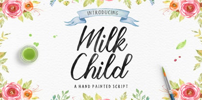 Milk Child is an organic, energetic, dynamic and modern handwriting script that can be used for various purposes, such as with titles, correspondence, wedding invitations, letterheads, signage, labels, signature newsletters, logos, posters, badges, and more.
 - Sonora by profonts,
$51.99 Sonora is a brandnew profonts script typeface family supplied in the new OpenType Pro font format. Sonora contains six styles as light, medium, bold and the corresponding italics. The character set covers about 1.500 glyphs for the complete Latin character set (West, East, Baltic, Turkish, Romanian), and a huge number of handmade ligatures and alternates to make it a perfect OpenType Pro connecting script. Sonora is a very distinguished, elegant and versatile, intentionally non-slanted script font.
 - Valentine by profonts,
$51.99 Valentine is another brand-new profonts script typeface family with versions in light, light italic, medium and medium italic, supplied in the new OpenType Pro font format. Valentine contains about 1.100 glyphs for every weight, covering the complete Latin character set (West, East, Baltic, Turkish, Romanian), and a huge number of handmade ligatures, character combinations and alternates to make it a perfect OpenType Pro connecting script. Valentine is a very distinguished, elegant and versatile script font.
 - Santa Fe by profonts,
$51.99 Santa Fe is a profonts script typeface family supplied in the new OpenType Pro font format. Santa Fe contains six styles as light, medium, bold and the corresponding italics. The character set covers about 500 glyphs for the complete Latin character set (West, East, Baltic, Turkish, Romanian), and a large number of handmade ligatures and alternates to make it a perfect OpenType Pro connecting script. Santa Fe is a very distinguished, elegant and versatile, intentionally non-slanted script font.
 - Mosaic by Paul O'Connell,
$9.95 This innovative styled Mosaic font was created to suit various design applications within the typeface market and is aimed at people looking for a modern styled brush script typeface that doesn't fit in with the regular trends of script fonts. Designed and produced by Paul O'Connell of POCT, it is a slick and light hearted script typeface that reflects many irregularities, but still manages to retain a very balanced and modern feel with just a touch of fun too.
 - Jullina by Danielle Eneh,
$18.00 Jullina is a charming script font that adds an organic, handwritten feel to your designs while staying polished and clean. It’s a versatile font that would work great in many different projects including branding, social media posts, product packaging, product designs, labels, and invitations. Jullina comes with 359 glyphs including uppercase, lowercase, numerals, punctuation and includes OpenType features such as an alternate Uppercase set and 47 ligatures to create an authentic, handmade feel. Opentype- Jullina is an opentype font and recommended for programs that support opentype features such as Adobe Illustrator, Adobe Photoshop, Adobe Indesign, Pages, Word. What’s Included 359 glyphs — Uppercase, lowercase, numbers, symbols, punctuation, 47 styled ligatures & an alternate Uppercase set for more customization. Multilingual Support — Multilingual Support is included for Western & Central European Languages.
 - Glade by Dear Alison,
$24.00 My latest typeface is a formal, copperplate script named Glade. Beginning as a project for a client who wanted several widths of a formal script style, the project never saw fruition. However, it did get me excited about the idea of a width family of steel nib scripts, ranging from extra narrow to extra wide, and the result is the Glade family. To give Glade a minor modern makeover from the original intent, the lowercase has been scaled up, and the Capitals scaled down for a more friendly personality. The character set has been expanded, and OpenType support has been added for unlimited fractions, ordinals, superiors and inferiors. So if you have the need for a formal connecting script, but are short on space, try Glade Narrow or Glade Extra Narrow. If space is not an issue, then the Regular, Wide or the generously gracious Extra Wide should do nicely. And if you get the whole family, well then you are set for anything that comes your way.
 - Crowfeather by Hanoded,
$15.00 I first wanted to call this family Crowbone, after Olaf Tryggvason, the legendary Viking king from Norway. Somehow I changed my mind and went for Crowfeather, because this is not a Viking font and the name ‘felt’ better. Crowfeather is a family of two distinct fonts: a classic Serif and an old school script font. They work really well together!
 - Picador Sans by Picador,
$29.00 Picador Sans is a modern sans serif typeface. Intriguingly condensed. Distinctively eye-catching. Interestingly well-developed. This family covers latin script – every weight has more than 1200 glyphs. The whole family consist of 10 weights and italics, small caps, superscript and subscript letters, oldstyle, tabular figures, ligatures and fractions. Picador Sans is a perfect match for the elegance of serif Praho Pro.
 - Shapiro Base by OGJ Type Design,
$29.00 The bold cut is a good starting point for a branding.
 - Nasty Life by Struggle Studio,
$12.00 Nasty Life is a beautiful hand-painted script, which is organic, fun and has a dancing baseline as well as different swashes that can be applied to the beginning and ends of all lowercase. International support for most Western Languages is included. For the separate swashes font, type lowercase a-z for the beginning swashes and end swashes. This fonts can be used for various purposes such as headings, signature, logos, wedding invitation, t-shirts, letterhead, signage, labels, news, posters, badges and more. Thanks so much for looking and please let me know if you have any questions.
 - Featherful by Ditatype,
$29.00 Introducing Featherful, a handwritten brush font that embraces the bold and vibrant strokes of a paintbrush. With Featherful, you have a handwritten brush font that speaks the language of artistry. The characters in Featherful boast generous proportions, ensuring a visually striking impact in any design. The thick weight enhances the font's presence, making it suitable for various creative applications. What sets Featherful apart is its rounded letter shapes, creating a friendly and approachable vibe. The details within each letter mimic the expressive strokes of a paintbrush, adding an authentic and artistic touch. Enjoy the features here. Features: Ligatures Stylistic Sets Multilingual Supports PUA Encoded Numerals and Punctuations Featherful fits in headlines, logos, posters, flyers, branding materials, greeting cards, print media, editorial layouts, and many more designs. Find out more ways to use this font by taking a look at the font preview. Thanks for purchasing our fonts. Hopefully, you have a great time using our font. Feel free to contact us anytime for further information or when you have trouble with the font. Thanks a lot and happy designing.
 - Impact by URW Type Foundry,
$35.99 Impact As its name suggests, Impact, a bold sans serif, is designed to make an impression on the reader. Obviously a display font, Impact makes use of its thick strokes and blocked style, to catch and hold the eye. Because Impact is so striking, it is best placed in plenty of white space so that it does not overwhelm any accompanying text.
 - Lady Dodo by Sudtipos,
$49.00 And the day in which I introduce my second typographic family has arrived. In order to do this, I borrowed several passages from this beautiful book by Maurice Maeterlinck, “Life and Flowers”. His poetic observation of Nature made me reflect about the small discoveries behind the flow of my pen on paper. About that quick, spontaneous, overwhelmed stroke, with some awkwardness as well as certainty in it. About the writing that looms line after line. About the mischievous stains of ink flooding my writing tool. Lady Dodó was born as a product of these drawings, pieces of writing and reflections. Following the steps of its ancestor and friend, Lady René, it takes advantage of the goodness of the Open Type technology to propose a systematized as well as a personalized writing font. Both friendly and challenging. Due to the large number of alternate characters (both for lower and upper case as well as for numbers) and to its precise programming, it proposes to design diverse and rich typographical sets with multiple strokes in a simple way. However, Lady Dodó is not just made of typographical signs; it also proposes a set of modules to make patterns and another one to design frames. From the combination of these modular signs, an infinite universe of possibilities for decoration arises. Here is Lady Dodó, ready to get started and write its destiny. July 2015.
 - Flinders by Eko Bimantara,
$24.00 Flinders is a modern humanist sans serif font family designed by Eko Bimantara in 2023. This typeface is intended to be used for various reading purposes and has letterforms optimized for legibility and ease of reading. The styles of Flinders are a sans serif interpretation of classical roman proportions, characterized by a low x-height, subtle calligraphic strokes, angled stroke ends, and open counters and apertures. Flinders is a versatile typeface that is readable in both large and small sizes. Its legibility makes it an excellent choice for body text in books, magazines, and newspapers, while its modern design and open counters make it well-suited for digital screens and web design. Flinders can also be used for branding and identity design, as well as packaging and signage. Overall, Flinders is a contemporary and readable typeface that is suitable for a wide range of design projects. Its humanist characteristics and modern design make it a unique and versatile option for designers looking for a typeface that combines classical proportions with contemporary style.
 - Modern Couture by Rochart,
$25.00 Modern Couture font is an elegant and artistic script font, designed with beautiful and soft handwriting style. Each letter has a unique stroke, with flowing and agile shapes, and an attention-grabbing signature. This font is ideal for graphic designs that require a personal and artistic touch, such as wedding invitations, greeting cards, posters, and more. Modern Couture font, you can add a touch of beauty and genuine hand impression to your design projects.
 - Moliere by Eurotypo,
$44.00 The life of Molière is a story of struggle, hard work, domestic unhappiness, death and burial in obscurity and almost in shame. Molière left behind a body of work that not only changed the face of French classical comedy, but has also come to influence the work of other dramatists from around the world. Despite his own preference for tragedy, which he had tried to further with the Illustre Théâtre, Molière became famous for his farces, which were generally in one act and performed after the tragedy. Both the comic and the serious drama were powerfully affected by the work of Molière, not only in his own age and country but everywhere and up to the present time. Didot is a name given to a group of typefaces named after the famous French printing and type producing family. The classification is known as modern, or Didone. The typeface we know today was based on a collection of related types developed in the period 1784–1811. Firmin Didot cut the letters, and cast them as type in Paris. Along with Giambattista Bodoni of Italy, Firmin Didot is credited with establishing the use of the "Modern" classification of typefaces. The types that Didot used are characterized by extreme contrast in thick strokes and thin strokes, by the use of hairline serifs and by the vertical stress of the letters. As in the extreme contrasts of the literature of Molière, in Didione's typefaces, thick and thin strokes, straight and curved, are the most relevant characteristic for an era marked by the changes.
 - Buffalo Western by Kustomtype,
$25.00 Frederick Cody, as known as Buffalo Bill, and his renowned travelling Western Circus are now celebrated through the creation of the Buffalo Circus and the Buffalo Western type fonts, both developed quite in the spirit of the stirring wood type fonts from the 19th century. All characters are fully hand traced and vectorized and provided with appealing glyphs and cool catchwords.
 - Buffalo Circus by Kustomtype,
$25.00 Frederick Cody, as known as Buffalo Bill, and his renowned travelling Western Circus are now celebrated through the creation of the Buffalo Circus and the Buffalo Western type fonts, both developed quite in the spirit of the stirring wood type fonts from the 19th century. All characters are fully hand traced and vectorized and provided with appealing glyphs and cool catchwords.
 - Parisine Office Std by Typofonderie,
$59.00 Humanistic sanserif in 4 fonts The Parisine Office typeface family can be considered as the text version of the Parisine. When Parisine xheight fit Helvetica large xheight, Parisine Office is more close to Gill Sans in term of proportion, as it was developed for Ratp, the public transport in Paris to allow compatibility with documents set in Gill Sans without changing the length of text. Parisine Office by default is a humanistic sanserif available in 4 fonts perfect for text setting. The design of the italic lowercases is more cursive than in Parisine. About Parisine Parisine helps Parisians catch the right bus Observateur du design star of 2007
 - Compacta by ITC,
$39.00 Compacta is the work of Fred Lambert and is reminiscent of the extremely narrow, sans serif stencilled fonts of the 1920s, then intended as titles or headlines for magazines and posters. The characters of all cuts are narrow and the space between letters is very small. The white spaces between strokes are perceived almost as only small white stripes and dots which stand out from the black bands of the lines of text. Compacta is not meant for longer texts but is impressive in titles and headlines.
 - Compacta MT by Monotype,
$29.00 Compacta is the work of Fred Lambert and is reminiscent of the extremely narrow, sans serif stencilled fonts of the 1920s, then intended as titles or headlines for magazines and posters. The characters of all cuts are narrow and the space between letters is very small. The white spaces between strokes are perceived almost as only small white stripes and dots which stand out from the black bands of the lines of text. Compacta is not meant for longer texts but is impressive in titles and headlines.
 - Fine New Bonbons by Tour De Force,
$25.00 High contrasted script family with a pack of dingbats.
 - Radugo by Twinletter,
$10.00 Radugo is a san serif font family designed with light strokes that make up a vintage style with a rustic touch and a stamp with 2 fonts, as the ribs in your design work, and able to beautify and strengthen your work in the form of logotypes, typography, hand lettering, packaging, t-shirts, labels, and many more.
 - SomaSkript Tall by ArtyType,
$19.00 Somaskript Tall shares the same concept as Somatype Skwosh, namely a desire to ignore traditional rules and re-scale along one axis only. This time the starting point was Somaskript and the end result is a condensed & uniquely elegant display face, vertically extended by the process but with legibility very much intact and its personality preserved.
 - Soapy Feelings by PizzaDude.dk,
$18.00 Soapy Feelings is my slightly rough-edged handmade fantasy (or perhaps even fairytale) font. I've added several swashes, which can be used for both starting and endings of words. I've also added 4 slightly different versions of each letter (and they automatically cycle as you type!) and lastly, of course Soapy Feelings has multilingual support! Caps Only Fonts
 - Gimbal Egyptian by AVP,
$19.00 Gimbal Egyptian is a richly-featured font family providing many style options across a broad range of languages. It is twinned with Gimbal Grotesque, a sans-serif family with an identical range of weights and features. Originally conceived as a small webfont family, the letterforms have been revitalised to put a spring in their step and the family has been extended to create a versatile multi-script text face equally at home on the printed page. Carefully crafted at all weights, Gimbal also lends itself to headlines and display applications such as posters, exhibitions and signage while resolving well on-screen for general document creation and web-based applications. The letters are spaced for best readability on-screen and in the usual printed body text ranges but are tolerant of tracking adjustment to suit other uses. The styles are divided by width into four families (Compressed, Condensed, Normal, Extended), each family possessing six weights plus corresponding italics. Within each family, the 'regular' and 'bold' weights are style-linked, and all upright forms have an italic counterpart. The full opentype character set includes latin, greek and cyrillic scripts with appropriate local variants (also as stylistic sets) for Turkish, Polish and Romanian (latin) and Russian, Bulgarian and Serbian (cyrillic). All fonts contain small capitals for all scripts, superscript for latin and commonly used greek together with the usual numeral style, size and positioning options. The default numerals are 'proportional lining'. Other opentype features include case-sensitive marks, fractions, and some discretionary ligatures. A set of circled numerals and circled latin capitals is included, along with an unusual feature that composes 2-character country codes.
 - Gimbal Grotesque by AVP,
$19.00 Gimbal Grotesque is a richly-featured font family providing many style options across a broad range of languages. It is twinned with Gimbal Egyptian, a slab-serif family with an identical range of weights and features. Originally conceived as a small webfont family, the letterforms have been revitalised to put a spring in their step and the family has been extended to create a versatile multi-script text face equally at home on the printed page. Carefully crafted at all weights, Gimbal also lends itself to headlines and display applications such as posters, exhibitions and signage while resolving well on-screen for general document creation and web-based applications. The letters are spaced for best readability on-screen and in the usual printed body text ranges but are tolerant of tracking adjustment to suit other uses. The styles are divided by width into four families (Compressed, Condensed, Normal, Extended), each family possessing six weights plus corresponding italics. Within each family, the 'regular' and 'bold' weights are style-linked, and all upright forms have an italic counterpart. The full opentype character set includes latin, greek and cyrillic scripts with appropriate local variants (also as stylistic sets) for Turkish, Polish and Romanian (latin) and Russian, Bulgarian and Serbian (cyrillic). All fonts contain small capitals for all scripts, superscript for latin and commonly used greek together with the usual numeral style, size and positioning options. The default numerals are 'proportional lining'. Other opentype features include case-sensitive marks, fractions, and some discretionary ligatures. A set of circled numerals and circled latin capitals is included, along with an unusual feature that composes 2-character country codes.