10,000 search results
(0.041 seconds)
- HWT Archimedes by Hamilton Wood Type Collection,
$24.95 Archimedes is a wood type design sometimes known as Mansard. This particular version was brought back to life as a wood type font by Virgin Wood Type. The variation with screw heads in the design was first seen in 1879 by the William H. Page Co. This new digital version is a simultaneous release with Virgin Wood Type and features a variety of styles including the standard screw head option—plus a Phillips head, Hex/Allen Wrench head, and even the vexing Apple® pentalobe tamper reistant star screw. The result is a sturdy and industrial font that has a certain “joie de vivre” and “bling” attitude. Not for every designer, but you know this is for YOU! As a bonus, the screwheads themselves are accessible via a glyph palette, so you can put the screws to Comic Sans, or any other font, if you so desire.
 - Kwalett by Ingrimayne Type,
$5.50 Kwalett is a sans serif typeface family with low contrast and a high x-height. Kwalett has two widths, each with five weights and each weight has an italics. The family is derived from the thinnest member of the Qualettee family. As members of that family get bolder, their contrast increases. As members of the Kwalett family get bolder, their contrast remains very low. Kwalett is designed to work better as text than the Qualettee family. The family has two ways to get fractions. A few fractions are preformed and are accessed with the OpenType discretionary ligatures feature. The OpenType fraction feature uses the superscript and subscript numbers to create any fraction.
 - Sisco by Tipo Pèpel,
$21.00 Sisco is a complete font family of 18 weights intended for editorial use and brand identity. Open counterforms give it a touch of modernity and technological. Sisco is designed to be legible in small sizes in both paper and display devices. It contains a set of authentic Small Caps and various sets of numerals, fractions, ligatures, and an extensive map of suitable characters for most languages based on Latin characters. Sisco is a typeface that will bring the future to your graphic projects.
 - Goolage by Beary,
$15.00 Introducing Goolage: A Modern Serif Font for Elegance! Goolage is our latest font creation, blending the aesthetics of modern serif with an unmatched touch of elegance. Goolage is the top choice to elevate the look of your designs with a touch of elegant modern serif. Start using Goolage in your projects and let this font bring a unique and beautiful aesthetic to your work. Get Goolage now and witness how your designs become extraordinary!
 - 19th Century American Initials by Celebrity Fontz,
$19.9919th Century American Initials is a collection of beautiful Art Deco letters surrounded by swelling, sinuous, stylized natural forms of flowers, scrolls, spirals, rosettes, waves, and rain drops. This curvy artistic font Includes one set of A-Z ornamental initials conveniently assigned to both the upper and lower case alphabet characters. Perfect for starting off the beginning of paragraphs in artistic publications, storybooks, fairy tales, and texts conveying the feel of the Art Deco period. - Wesna by Type Salon,
$41.90 Typeface Wesna was created as a reflection of the current state of design whose starting point is rooted in the letterings from the Slovenian posters from the interwar period. Bold strokes, condensed letterforms, sharp stroke joints and unique features are combined in the typeface. Wesna preserves the Slovenian typography heritage and establishes the connection between the past and the present through new digital formation. Available in 3 weights, italics in Latin & Cyrillic.
 - Prism by Stereotypes,
$- Prism was mainly inspired by two things, the sketches of Rudolf Koch for Prisma and the proportions of Avant Garde by Herb Lubalin. Even when the proportions and widths stay the same from ExtraLight to Black, you get the opportunity to change the weight and get a complete new look for that typeface by changing the grayscale or color. It is a modern combination for headlines, that want to have a different look.
 - Lombardia Illuminata by Celebrity Fontz,
$24.99Lombardia Illuminata is a collection of Lombardic-style letters surrounded by natural forms of vines, leaves, trellises, scrolls, sun rays, and flowers. This beautifully ornate font includes one set of A-Z ornamental initials conveniently assigned to both the upper and lower case alphabet characters which are perfect for starting off the beginning of paragraphs in artistic publications, storybooks, fairy tales, and texts conveying the feel of medieval manuscripts of the 12th-16th centuries. - ITC Mona Lisa by ITC,
$29.99ITC Mona Lisa was designed by Pat Hickson, a stark and elegant typeface originally drawn in the 1930s by Albert Auspurg. The original drawings were long gone and the surviving metal type was already severely worn when Hickson studied Auspurg's design for his recreation. The result is a typeface which melds the flavor of the 1930s with current design standards. ITC Mona Lisa displays all the suave sophistication of Fred Astaire and Greta Garbo. - Bruce 532 Blackletter by Intellecta Design,
$23.90 A classic font design remastered by the type foundry Intellecta Design, from the extra-rare Bruce's New York typefoundry from 1882. Distressed and antique, use this font in display purposes for a stylized type design. Great display face for headers and antique-like projects. Contains a limited amount of letter designs. Using the "0" and "2" keys you get two different fleurons to start words. Use "1" or "3" keys to close words with fleurons.
 - Friday Freak PB by Pink Broccoli,
$16.00 Friday Freak PB is a playful font inspired by the titling of the 1976 Disney film, "Freaky Friday". This font has a slightly clumsy stumble to it, adding to its personality and appeal. From slightly weird weighting to a ligatures feature that will auto-shuffle all-caps and all-lowercase settings to have a mix of both, keeps typesetting lively. Stir things up and get a little crazy with Friday Freak today!
 - Frink Rio by Brenners Template,
$19.00 Frink Rio Modren Grotesk Font Family It has evolved to converge wider and more trendy design needs. By designing the thin style vertical stem value as 10pt, the contrast between individual styles is ensured. Great care has been taken to ensure that the characteristics of individual Glyphs are well reflected in the each style. Extended Cyrillic language support will help make this font family more universal. And the support of various OpenType Features will respond to the designer's coverage in a variety of ways. OpenType Features Ligatures - fi, fl Small Caps (from lowercases) Ordinals (1st. 2nd. 3rd, 4~9th) Oldstyle Figures Tabular Figures Fractions Scientific Inferiors Superscrpt (lowercases. numbers) Check in advance how the apps you are using support these OpenType Features.
 - Cosmopolitan by Fenotype,
$35.00 Cosmopolitan is a monoline font family with script and sans versions that both work great together or alone. It comes with five weights and “printed” versions. For extra swashes, swirls and pictograms there is Cosmopolitan Extras. Cosmopolitan Script is packed with OpenType alternates: turn on Swash, Stylistic or Titling Alternates in any OpenType savvy program or find even more alternates from the Glyph Palette. Cosmopolitan Sans has different Swash Alternates for both upper and lowercase characters. Cosmopolitan Family gives an elegant look for any project from print to digital. For the very best price purchase the whole family! Cosmopolitan Family is inspired by two other great monoline font families: Selfie and Beloved.
 - Kyber Ricon by TypeClassHeroes,
$17.00 Kyber Ricon and Kyber Ricon Neu is a Monospaced sans serif family. Design with various width and weight that you can explore and combine creating rhythm and texture for comfortable reading. This font supports more than 400 Latin-based languages and has extensive Cyrillic and Greek support for languages like Russian, Bulgarian, Ukrainian, and many more. In variable version, it allows multiple options when designing, adapting to different composition solutions. Feature Uppercase & Lowercase Number & Symbol International Glyphs (Cyrillic & Greek) Multilingual support Hope you enjoy it.
 - Midnight Hour - Personal use only

- Blitzen by Anastasia Kuznetsova,
$16.00 Introducing the Blitzen font! Blitzen is a fabulous and playful but striking font. These are massive, hand-drawn letters that are guaranteed to stand out, whether on lighthearted product designs or more spectacular quote designs. Ideal for quotes, lattering projects, packaging of goods... so many things! Font Features A-Z; a-z character set; 1 language (English); numbers and punctuation marks, symbols A font containing uppercase and lowercase letters, numbers, and a wide range of punctuation marks. Fonts can be opened and used in any software that can read standard fonts, even in MS Word. No special software is required, and to get started. It is recommended to use it in Adobe Illustrator or Adobe Photoshop Made with love ♡
 - Orchid Key by Missy Meyer,
$12.00 I built the Orchid Key font family from the ground up with the idea that there would be several different styles; the Inline Spurs style was the first to be built, which let me then subtract the spurs, inline slices, or both to make the other styles. I've never made a font quite like this before, which shows in the time it took - it's been over 5 months since I started construction! Each style contains the same character set, with 700 total glyphs. Each has the usual basics: letters, numbers, and punctuation; plus over 300 extended Latin characters for language support, and almost 200 alternates for tons of variety! There's a swash alternate for every uppercase letter, at least 6 alternates for every single lowercase letter, and a set of 10 extra swashes and flourishes so you can customize! Whether you're looking for a western or country look, a retro look, or a modern hipster look for your project, check out Orchid Key!
 - Doretypo by Rosario Nocera,
$10.00 Doretypo was born accidentally, during the design of a poster for a jazz festival in Rome. I was going to realize a typesetting, but I could not find the right character and decided to draw the letters I needed, starting from the first letter of the headline, capital M. I was looking for a lettering able to evoke musical notes, where each letter could be linked to the following one, to the previous one, to the largest at the top and the smallest at the bottom. From this idea doretypo came to life gradually. In the beginning there were a few medium capital letters with very few glyphs, but given the good results I decided to decline in light and bold, integrating minuscule letters, for a whole of 374 glyphs. Today doretypo OpenType is a family of fonts with three weights, 374 glyphs, supporting about 57 languages, ligatures standard, plus a new “NY”. Moreover, each glyph can be used individually to create textures and graphic symbols.
 - Garlic by Java Pep,
$15.00 The proudly present an elegant font that always outstanding in every your project design. Garlic font is a versatile typeface that perfect for designing a headline, title, wedding invitations, logotype, quotes, advertisements, and more. Garlic font offered 4 styles set such as regular, italic, outline regular, and outline italic so you can be combining to make a more elegant and beautiful design. What's included Garlic regular and italic (otf, ttf, and web font) Garlic Outline regular and italic (otf, ttf, and web font) Multilingual, support 17 languages If you have any questions don't hesitate to drop me a message. Stay safe, healthy, and have a nice day
 - Forgotten Playbill by Lauren Ashpole,
$15.00 Years ago, I came across a vintage playbill and was struck by its lettering. The detailed floral pattern surrounded by thick outlines stayed in my mind even though the play's name and cast have faded. I finally tried to recreate the style from memory and Forgotten Playbill is the result. While all letters are actually capitals, the uppercase rotate slightly counterclockwise and the lowercase slightly clockwise. I suggest alternating between the two to reproduce my mystery inspiration.
 - Alonso Flair by BA Graphics,
$45.00This font, as indicated by its namesake, was designed and started by the late Bob Alonso. It represents the first of his unfinished work to be completed by friend and colleague John Bomparte, following Bob's passing in December of 2007. It is a font that speaks with a distinctively robust voice; and would be a great choice for a wide variety of uses. Central European languages are supported through OpenType, and Windows/Mac OSX TrueType versions. - Milk & Clay by loryn ipsum,
$15.00 Milk & Clay | handwritten sans serif font Meet Milk & Clay, the font that started it all. This font was inspired by a friend who is a ceramists. The smooth and soft bumpy edges of this font is influenced by the texture and shape of clay as you’re working with it - almost perfect letter or shapes but not quite there. The letters are unique and feel soft and handmade. Perfect for; handmade products, ceramics, branding, logos, instagram quote text.
 - Studio Brush by Hanoded,
$15.00 I really enjoy making brush fonts. I usually just get my Chinese ink and a bunch of brushes and start drawing glyphs. It took some time to get Studio Brush right, but I think spending that extra time paid off. Studio Brush is quite a neat brush font: the glyphs of this all caps font are of equal height (more or less) and complement each other perfectly. Studio Brush comes with double letter ligatures and some alternate glyphs.
 - Zombie Punks by Wing's Art Studio,
$15.00 Zombie Punks - The Retro Horror Video Font Introducing the first in a range of new font designs inspired by 80s VHS covers and the nostalgic video rental store experience. Starting off with a classic horror flavour, Zombie Punks is a grungy, hand-drawn brush font supplied in two styles with additional underlines and paint spills. The perfect choice for use on movie posters and trailers, album covers, books and much more. This all-caps design features punctuation, numerals and language support along with an alternative set of characters ensuring that you’ll never have to repeat your e’s or t’s for a more convincing and natural hand-made look. Check out the visuals for more details and cool usage examples.
 - Phone Pro Hebrew by Tamar Fonts,
$30.00 Note: the 'Phone Pro Hebrew' typeface, includes just the Hebrew characters of the comprehensive "Phone Pro" family font, sold separately [on this MyFonts site], so they are economical for those interested just in the Hebrew Characters. And regarding the “Phone Pro” project in general, this is what I wrote: 'PRISTINE'; this font is—neither beautiful nor ugly, neither vigorous nor weak, neither traditional nor modern, neither serif nor sans serif, neither script nor printable, neither a text font nor a display font—it is rather all of the above, which makes it a more versatile typographic tool—[handwritten] characters that are well-suited for a wide variety of applications—from editorial design, [friendly] greeting cards... to branding, advertising, publicity and digital. Each glyph design combines its unique shapes and stylish ink-traps with parabolic curves. Each glyph design has been treated as an 'individual character'—the way I would treat a breathing, living, vulnerable and courteous human being; looking after each and every character as if it was my only child — bringing to light the authenticity and uniqueness of each individual, as well as my objective to bring about peace and harmony between them all as a whole. Designed with the intention of harmonizing between four scripts — Latin, Cyrillic, Greek and Hebrew; the whole family has a comprehensive set of characters—in addition to the Latin letters, the Phone typeface also has a full set of characters for Vietnamese, partially extended Cyrillic, Greek and Hebrew (sold separately). The t_t ligature is something unique to Phone, as well as the t_z ligature, among others and extras. A distinctive trait of the Phone typeface, is a high x-height combined with relatively short ascenders. The Phone typeface is in a way evoking the feeling of some Gaelic font and of the [Egyptian] Papyrus font (by Chris Costello, though, not being based on neither of those), having an exotic and an exquisite look, under the category of "Soft Fonts & Friendly Faces".
 - Odile by Kontour Type,
$50.00 Odile is a text typeface with bracketed head and bracket-free bottom lower case serifs, a quality that counters rigidness most traditional slab serif typefaces possess. This contemporary design draws inspiration from an experimental typeface named Charter originally designed by the American book and type designer William Addision Dwiggins. It consisted of an informal lowercase alphabet, a narrow seemingly non-inclined vertical letter with script attributes, featuring non-joining letterforms. Dwiggins’ contemplated Charter as the italic companion to Arcadia, Experimental No. 221. The Charter project progressed sporadic stalled during the Second World War and came to a halt in 1955. Charter remained incomplete and was never commercially released. Assessing Charter’s whimsical design, its fragments were rethought and developed into a comprehensive text family. Odile Upright Italic reveals recognizable similarities shared by Dwiggin’s Charter and defines the design approach for the family. The steep calligraphic outstroke and low junctions off the stem as in the upright italic “n” or “r”, for example, are gradually lessened in the italic and moved up for the roman weights. The six optically balanced weights range from the delicate Light to stark Black, accompanied by display variants with feminine flair and ardent Ornaments. Two sorts of Initials, one amplified with interweaving swashes, the other more restrained, both are clearly derived from the Upright Italic. This mid-contrast serif offers a wide range of tools for text and display typographies with a palette of strict to playful. This family shines in magazine, book and display use. The graceful serifed type harmonizes perfectly with Elido, Odile’s sans companion. Sans and serif share the family array and OpenType features in perfect tune. Odile offers an extensive character set, numerous OT features including roman and italic Small Caps, five sets of numerals, alluring ligatures, and many more. OT stylistic variants (with accents) offer a one-story “a” for the roman weights, alternate “g” and “s” designs for the italics, and a variant “s” for the Upright Italic.
 - LFT Arnoldo by TypeTogether,
$39.00 LFT Arnoldo began as an all-caps book cover typeface created during the rebranding of Oscar Mondadori, the most important Italian publisher, with over 4,500 titles from ancient classics to contemporary works, and spanning academic essays to children’s and self-help books. For such a diverse catalogue, it was necessary to find a coherent and flexible paradigm which took into account genre and readership differences and ensured harmony among its works. The main idea was to create a typeface suitable for the branding element and which could be used for each title of the immense catalogue. So what makes LFT Arnoldo a companion to the centuries? Starting with the design of the capital letters, it is first a rational typeface with contemporary proportions. But rationality without style wasn’t enough, so its glyphic nature carries an engraved feeling to resemble letters when chisel is put to stone. Once these two traits were settled, the entire character set was developed as a flared humanist sans in order to complete the family and extend its usage, from titles and display settings to texts. LFT Arnoldo sets titles with dignified authority to appear digitally carved and more arresting than the usual sans or flared sans designs of the past. It is calm and dependable in paragraph use and a captivating vehicle of aesthetic expression in title and display use. At once rugged and syncopated, the slight hourglass stems and incised details make each letter come alive and engrave each paragraph upon our emotions. LFT Arnoldo intends to be a resilient type family for centuries to come. Its seven roman weights have italic counterparts and the entire family is loaded with OpenType features: alternates, ligatures, small caps, oldstyle and lining numerals, and science and math capabilities. In the battle of charisma, where the right voice must project intelligence, influence, and refinement, LFT Arnoldo is the victor.
 - Magola by Andinistas,
$39.95 Magola is a creamy flavor font family whose purpose is to season with emotions the reading of words and phrases formed by puffy glyphs coated with a caramel of empty spaces external and internal. Independently or in groups, members of the family serve to decorate and organize packaging or advertising material in letters apparently crafted for food or entertainment contexts. Its starting point was to draw letters like a ballon fish evolved into a black version with empty areas and microscopic contrasted with colorful inflated and filled areas. Then the challenge was based on the sum transferred between full and empty into a lighter caliber. In that vein, its overall design adapted skeletons of italics and Roman calligraphy. Therefore, its regular, bold and black files have great height "x" with upwards and downwards extremely short and large internal counterblocks to facilitate reading. In this regard, to strengthen its objective and capture the reader's attention, its kind of contrast and simulated auctions flat tip brush strokes, and amount of contrast between thick and thin in the black version is slightly inverted. Its sizes, smooth strokes and irregular lines reinforce its traditional spirit, so it is favorable to shine the information on posters or large-format media. In short, its optical conformation based on a non-literal way, in metrics similar in all family members to be easily exchanged without changing the ìxî height. It is therefore a striking and versatile tool, that besides being useful in large sizes, can be used in small sizes as well. And more importantly, its general concept is more profitable when its members are mixed to nest headings, subheadings and short paragraphs, designed according to size, position, color and location in logos, covers, posters, ads and flyers.
 - Malevich by BBDO Studio,
$19.00 Hi! I am Black Square! Probably the most famous square in the world. Thanks to my godfather Kazimir Malevich, who created me in 1915, this year I am celebrating 100th anniversary. Let me tell you what a great gift I just got! It`s a family of almost 300 letters and symbols suprematic as suprematic can be - shapes, form attacks, booms and even hashtags! All under the name of Malevich Font. Isn`t it a great present for my anniversary? Thank You BBDO Ukraine
 - Easy Headline by Dumadi,
$25.00 Hello Designers! Are you ready to make your Designs rock the world? If so, we know the right solution. Now comes the Easy Headline font ready to use for your best projects. Easy Headline is equipped with Uppercase Letters, Lowercase Letters made with unique and cool shapes, Numbers, and Multilingual Support. This font is made for any professional branding project, Great for creating titles, Movie titles, Event titles, Social media titles, Book cover titles, Poster titles, branding, posters, Each letter has a unique and beautiful touch. You can see the sample preview above for comparison, stay the center of attention and classy!
 - Sour Crunch by DM Studio,
$15.00 Introducing Sour Crunch! It's a 'crunchy' comical Display Font, inspired by pop art style comic fonts. It's a good choice for both personal and commercial project purpose, for creating logos, packaging, posters, headers, wall arts, cafe banners, t-shirt designs, advertisements, kids stuff, social media posts and much more! Sour Crunch feature : - All in CAPS with standard character set, including numeric and symbols. - Multilingual Supports ( Afrikaans, Albanian, Catalan, Danish, Dutch, English, Estonian, Finnish, French, German, Italian, Norwegian, Portugese, Spanish, Swedish, Zulu ) If you have any question please kindly send us a message. Hope you enjoy this font. Thanks and Stay Creative!
 - EmBauhaus by Emboss,
$25.00 EmBauhaus is a display typeface, geometric in style, inspired by the face named after the world changing Bauhaus School. To aid readability I rethought the original typeface and closed all of the voids cut out of the strokes. We also modified the upper case to make it a more traditional design. An example of this is the upper case L, where a 90 degree angle was added. This typeface was designed to be used judiciously in a layout, to draw focus to words and headlines, using stark angles, radii and geometry to create visual rhythm and gestalt.
 - Ancukaseyo by Allouse Studio,
$16.00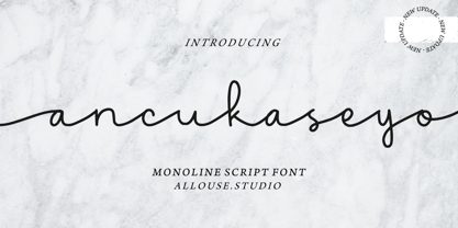 Proudly Presenting, Ancukaseyo a Monoline Script Font. Ancukaseyo come with Start Alternate Lowercase, Ligatures and Multi-Lingual Support which will fulfill your need with some exploration. We highly recommend using a program that supports OpenType features and Glyphs panels like many of Adobe apps and Corel Draw, so you can see and access all Glyph variations. Ancukaseyo is perfect for any tittle, logo, product packaging, branding project, megazine, social media, wedding, or just used to express words above the background. Enjoy the font, feel free to comment or feedback, send me PM or email. Thank You!
 - Rotis Semi Sans by Monotype,
$40.99 Rotis¿ is a comprehensive family group with Sans Serif, Semi Sans, Serif, and Semi Serif styles, for a total of 17 weights including italics. The four families have similar weights, heights and proportions; though the Sans is primarily monotone, the Semi Sans has swelling strokes, the Semi Serif has just a few serifs, and the Serif has serifs and strokes with mostly vertical axes. Designed by Otl Aicher for Agfa in 1989, Rotis has become something of a European zeitgeist. This highly rationalized yet intriguing type is seen everywhere, from book text to billboards. The blending of sans with serif was almost revolutionary when Aicher first started working on the idea. Traditionalists felt that discarding serifs from some forms and giving unusual curves and edges to others might be something new, but not something better. But Rotis was based on those principles, and has proven itself not only highly legible, but also remarkably successful on a wide scale. Rotis is easily identifiable in all its styles by the cap C and lowercase c and e: note the hooked tops, serifless bottoms, and underslung body curves. Aicher is a long-time teacher of design and has many years of practical experience as a graphic designer. He named Rotis after the small village in southern German where he lives. Rotis¿ is suitable for just about any use: book text, documentation, business reports, business correspondence, magazines, newspapers, posters, advertisements, multimedia, and corporate design.Today Rotis ia also available with pan european caracter set.
 - Rotis Semi Sans Paneuropean by Monotype,
$92.99Rotis¿ is a comprehensive family group with Sans Serif, Semi Sans, Serif, and Semi Serif styles, for a total of 17 weights including italics. The four families have similar weights, heights and proportions; though the Sans is primarily monotone, the Semi Sans has swelling strokes, the Semi Serif has just a few serifs, and the Serif has serifs and strokes with mostly vertical axes. Designed by Otl Aicher for Agfa in 1989, Rotis has become something of a European zeitgeist. This highly rationalized yet intriguing type is seen everywhere, from book text to billboards. The blending of sans with serif was almost revolutionary when Aicher first started working on the idea. Traditionalists felt that discarding serifs from some forms and giving unusual curves and edges to others might be something new, but not something better. But Rotis was based on those principles, and has proven itself not only highly legible, but also remarkably successful on a wide scale. Rotis is easily identifiable in all its styles by the cap C and lowercase c and e: note the hooked tops, serifless bottoms, and underslung body curves. Aicher is a long-time teacher of design and has many years of practical experience as a graphic designer. He named Rotis after the small village in southern German where he lives. Rotis¿ is suitable for just about any use: book text, documentation, business reports, business correspondence, magazines, newspapers, posters, advertisements, multimedia, and corporate design.Today Rotis ia also available with pan european caracter set. - Rotis Semi Serif Paneuropean by Monotype,
$92.99Rotis¿ is a comprehensive family group with Sans Serif, Semi Sans, Serif, and Semi Serif styles, for a total of 17 weights including italics. The four families have similar weights, heights and proportions; though the Sans is primarily monotone, the Semi Sans has swelling strokes, the Semi Serif has just a few serifs, and the Serif has serifs and strokes with mostly vertical axes. Designed by Otl Aicher for Agfa in 1989, Rotis has become something of a European zeitgeist. This highly rationalized yet intriguing type is seen everywhere, from book text to billboards. The blending of sans with serif was almost revolutionary when Aicher first started working on the idea. Traditionalists felt that discarding serifs from some forms and giving unusual curves and edges to others might be something new, but not something better. But Rotis was based on those principles, and has proven itself not only highly legible, but also remarkably successful on a wide scale. Rotis is easily identifiable in all its styles by the cap C and lowercase c and e: note the hooked tops, serifless bottoms, and underslung body curves. Aicher is a long-time teacher of design and has many years of practical experience as a graphic designer. He named Rotis after the small village in southern German where he lives. Rotis¿ is suitable for just about any use: book text, documentation, business reports, business correspondence, magazines, newspapers, posters, advertisements, multimedia, and corporate design. Today Rotis ia also available with paneuropean caracter set. - Rotis Semi Serif by Monotype,
$40.99 Rotis¿ is a comprehensive family group with Sans Serif, Semi Sans, Serif, and Semi Serif styles, for a total of 17 weights including italics. The four families have similar weights, heights and proportions; though the Sans is primarily monotone, the Semi Sans has swelling strokes, the Semi Serif has just a few serifs, and the Serif has serifs and strokes with mostly vertical axes. Designed by Otl Aicher for Agfa in 1989, Rotis has become something of a European zeitgeist. This highly rationalized yet intriguing type is seen everywhere, from book text to billboards. The blending of sans with serif was almost revolutionary when Aicher first started working on the idea. Traditionalists felt that discarding serifs from some forms and giving unusual curves and edges to others might be something new, but not something better. But Rotis was based on those principles, and has proven itself not only highly legible, but also remarkably successful on a wide scale. Rotis is easily identifiable in all its styles by the cap C and lowercase c and e: note the hooked tops, serifless bottoms, and underslung body curves. Aicher is a long-time teacher of design and has many years of practical experience as a graphic designer. He named Rotis after the small village in southern German where he lives. Rotis¿ is suitable for just about any use: book text, documentation, business reports, business correspondence, magazines, newspapers, posters, advertisements, multimedia, and corporate design. Today Rotis ia also available with paneuropean caracter set.
 - Pradock Sans by Genesislab,
$100.00 Pradock The newest geometric Sans-Serif font for a family is easy to use almost anywhere on your website, be it in the header or as smaller text with the Variable concept. A font with a bold aesthetic that is energetic and youthful, this is an excellent choice for the millennial demographic - which is why it is so well suited to use by digital and creative agencies. - 18 Font +1 Variable Fonts Family, Opentype Feature - Free updates and added features - Multilingual support for various languages including: French, Spanish, Swedish, German, Italian, Portuguese, Dutch, and more ... Software support (Adobe, MS Word, Pages, etc.). if you want to take advantage of additional OpenType features and style alternatives, use OpenType-savvy software (such as Adobe applications etc.).
 - Xenois Soft by Linotype,
$29.99Xenois is a sweeping suite of designs that will provide solutions for a multitude of projects. Annual reports, restaurant menus, business correspondence, corporate identity programs, movie credits and advertising campaigns can all be set with various faces from the family. Interrelating perfectly, the sub-families within the series include Xenois Sans, Serif, Semi, Soft, Slab and Super. The designs have a common and obvious design bond, yet each is able to stand on its own as a distinct typestyle. The Xenois typefaces are based on a common underlying model; they have the same cap height, the same lowercase x-height, the same stem weights, and the same basic character shapes. This unity of shape and proportion results in a remarkably complementary set of typeface designs. - Xenois Slab by Linotype,
$40.99Xenois is a sweeping suite of designs that will provide solutions for a multitude of projects. Annual reports, restaurant menus, business correspondence, corporate identity programs, movie credits and advertising campaigns can all be set with various faces from the family. Interrelating perfectly, the sub-families within the series include Xenois Sans, Serif, Semi, Soft, Slab and Super. The designs have a common and obvious design bond, yet each is able to stand on its own as a distinct typestyle. The Xenois typefaces are based on a common underlying model; they have the same cap height, the same lowercase x-height, the same stem weights, and the same basic character shapes. This unity of shape and proportion results in a remarkably complementary set of typeface designs.
