10,000 search results
(0.053 seconds)
- Saylove by Sinfa,
$18.00 Something beautiful does require extra energy to realize it !!! This Saylove font is very tiring in its work but now you only need a few minutes in an instant to make various crafts that you are working on, which allows you to work on various types of typography you need to get beautiful hands made in a short time. With some interesting initial and final forms, the Saylove font suits your needs in creating logos, invitations, cards, product packaging, headers, and whatever you want. You will be very satisfied with the presence of attractive replacement letters, where you can make according to the shape you expect, Saylove is equipped with a number of small letters including swash that you can use to realize a hand job that suits your imagination. I really hope you will get special satisfaction in using this font.
 - Tropical Jungle by Colllab Studio,
$19.00 "Hi there, thank you for passing by. Colllab Studio is here. We crafted best collection of typefaces in a variety of styles to keep you covered for any project that comes your way! Tropical Jungle is a fun wild font, inspired by the wild life of the jungle. Inspired by the tropical rainforests of South America, Africa, and Asia, this font will inspire you to get out there and explore! Tropical Jungle is a bold, quirky typeface that captures the joyous spirit of life on earth or at least, of the parts we’re most familiar with: monkeys swinging through trees, tigers stalking their prey through the jungle, butterflies flitting from flower to flower. You can tell just from looking at it that this is going to be a fun-loving font that will bring a smile to your face and a bounce to your step. With over 500 glyphs, this stack of jungle animals will be a joy to use! We made sure our font was easy to read in any application so you don’t have to worry about your documents cluttering up. We know you can’t wait to get started using it in your next project. So go ahead! Grab Tropical Jungle now! A Million Thanks Colllab Studio www.colllabstudio.com
 - FF Masterpiece by FontFont,
$41.99 Slovakian type designer Peter Bil'ak created this script FontFont in 1996. The family contains 2 weights and is ideally suited for festive occasions. FF Masterpiece provides advanced typographical support with features such as ligatures, alternate characters, case-sensitive forms, and stylistic alternates. It comes with proportional lining and proportional oldstyle figures.
 - Lupa Sans Pro by Melli Diete,
$49.00 The Sans Serif is crafted for complex display typography with friendly extravagance and high readability. Each font has an extended character set and provides latin based languages. The typefaces include ligatures, alternate- & swash letters, various ampersands, smallcaps, fractions, lining-, tabular numbers, superior/inferior figures and other extras. Go with the flow!
 - SF Mettle by Sultan Fonts,
$19.99 Mettle Bilingual Arabic font, Latin-Arabic for print and web. The Mettle font family contains four weights: thin, normal, medium, and broad. This font supports Arabic, Latin, Persian, Urdu, and Kurdish languages. The digital designer can use the variable Mettle font to access wider options in working with the text.
 - Folty by Degarism Studio,
$15.00 Folty Typeface is a display based an a geometric sans serif with unique characters and has a sharp vertex. Folty was inspired by Modern graphic design and contemporary typeface. The family contains 6 weights from Thin to Bold good for advertising, packaging, editorial and publishing, logo, branding, music software, etc.
 - Disgrunged ABCD by Aah Yes,
$12.00Disgrunged is a distressed grunge font, as you might guess, and industrial sans-serif in feel. The Disgrunged ABCD family resembles bad printing with rubber stamps, with corners showing, along with misprinted letters, and the typeface has four versions (A, B, C, D) giving increasing amounts of chaos, jumbledness and irregularities. - Quickline Slab by Jonahfonts,
$35.00 Quickline-SLAB OpenType font family in four weights supporting Central-European languages, containing ligatures, fractions and an abundance of alternates for upper and lower case glyphs. Quickline-SLAB also comes in a matching Quickline ”SANS” version containing four weights as well. Quickline-Slab works well as a text and display font.
 - Joe College NF by Nick's Fonts,
$10.00Go, team, go! Fight, team, fight! Win, team, win! Here’s a family of typefaces based on typical athletic jersey lettering, in sans and serif styles, with inlines and an extrabold Letter Sweater treatment. Both versions of this font include the complete Unicode Latin 1252 and Central European 1250 character sets. - Hayken Script by Lemonthe,
$10.00 Hayken Script is a brush script font with a dynamic and energetic style. There are two types of styles (clean and textured). It can used for various purposes such as titles, logotypes, t-shirt designs, letterheads, signage’s, labels, newsletters, posters, badges, and every other design which needs an unique, striking font.
 - Alacant by Eurotypo,
$28.00 Alacant is a family of slab serif fonts composed of seven weights and their versions in italics. One of the most characteristic advantages of this font is its particularly square shape, very short descenders, open counter-forms and precise kerning that provides a very good visual impact and clear legibility.
 - Brembo by Yoga Letter,
$16.00 "Brembo" is a font with a curly style. This font is very unique and elegant. It is suitable for various needs, such as writing on children's themes, animals, learning, Christmas, summer, holidays, book titles, film titles, Halloween, and others. This font is equipped with uppercase, lowercase, numerals, punctuation, and multilingual support.
 - Bartino by OKSHUtypeCO,
$9.00 Bartino Family - a new fresh handmade sans serif font. Very suitable for greeting cards, branding materials, business cards, quotes, posters, and more!This font are perfect for wedding postcard. Or you can create perfect and unique design of your logo, blog, stationery, marketing, magazines and more :) Multilingual outline version streak version
 - Konexy by Variatype,
$20.00 Konexy is inspired by the trends in technology, automotive vehicles and sports nowadays. We crafted this font family for your design project. It contains more than 300 glyphs, many stylistic alternates and multi-language support. You can easily create a cool logo, branding, and promotion with this font. Get it now!
 - Stepira by Gatype,
$12.00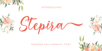 Stepira Script is a modern calligraphy font, with characters dancing along the baseline and an elegant touch. OpenType features such stylistic alternates, ligatures and multilingual support. Stepira Script can be used for various purposes such as logos, wedding invitations, headings, t-shirts, letterhead, signage, labels, news, posters, badges and more.
 - Baligo by Sarid Ezra,
$13.00 Hello, this is Baligo, playful font family! Baligo is a quotable font that have 3 weight style. Comes with light, regular and bold this font will make your project more bright and cheerful. This playful font is very suitable for quotes, branding, children books, and more. Baligo also support multi language!
 - Innovate P Rounded by NicolassFonts,
$29.00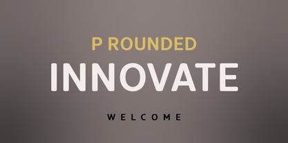 Innovate is a modern versatile sans-serif typeface based on Innovate font family. What differentiates Innovate from the other fonts is an exceptionally distinctive design. It is brilliantly suited for graphic design and display use and perfect for logotypes, t-shirts, packaging, brand identity, books, magazines, newspapers, posters, billboards, and advertising.
 - Asticus by Teweka,
$10.00 New Fresh! Asticus was born by adapting the Blackletter style. This font is very distinctive, with lines that still maintain the blackletter style. This font has 372 glyphs and is multilingual. and some ligatures in it. This font is very suitable for various product designs, t-shirts, branding and others.
 - Placard by Monotype,
$29.99The Placard Condensed font family is based on drawings received from Germany. These narrow, heavy, sans serif typefaces were made for use in headlines and advertising display work. Placard Condensed has a large x-height, short ascenders and descenders and is capable of packing very tightly to produce forceful publicity work. - Edigna by Johannes Hoffmann,
$25.00 Edigna is a clean, rounded sans-serif with a tall x-height. It contains five different weights and a matching inline style. The font family supports a variety of languages, including Western, Southern, Northern and Central European as well as Eastern European. It's good for headlines, posters, brands, and magazines.
 - Fun Play by FunFont,
$17.00 Fun Play is A Fun and Playful display typeface family with 5 wights variant; from Light to Bold. Comes with many features; Multilingual Support, Ligatures, Stylistic Alternate and more. Each character represents a child's joy. ‘Fun Play’ can be used for branding, packaging, headline and all styles of children-related design.
 - Bridgeta by Nk Studio,
$14.00 The Bridgeta is a very legible Elegant Calligraphy, which is simply beautiful, classy, and elegant. Can be used for various purposes. Such as logos, wedding invitations, t-shirts, letterheads, signboards, news, posters, badges etc. The Bridgeta features 389 glyphs, including initials and terminal letters, alternates, ligatures, and multiple language support.
 - Citta Novela by Jvne77 Studio,
$12.00 Jvne77 Studio presents: Cittá Novela is an upright typeface family inspired by vintage architecture from the mid 20's to the 60's. A classy and didonesque streamlined sans which will perfectly set in a poor line space for Titling and text. Multilingual, diacritics, ligatures and alternates for near 570 glyphes.
 - Ahimsa by Satori TF,
$12.00 Ahimsa is a dynamic humanist sans serif family. It comes in 6 weights with matching italics. It contains a lot of contrast in the connection to the stems in order to give it a more dynamic feel, and also has low descenders and a large x-height and great legibility.
 - Opkrop by Jipatype,
$25.00 Opkrom is Thai language mean Crispy or Crunchy. With informal sans serif style look like semi handwriting give feel friendly and warm . It support major Latin scripts and Thai scripts. It have stylistic set for Thai script. Opkrop is suited for headline on packaging, print ad and various graphic work.
 - Orange Flower by Anastasia Kuznetsova,
$18.00 Say hello to 'Orange Flower'!! A bold and beautiful font with a brush and a lot of additions! I am very pleased to present 'Orange Flower' - a versatile and artistic set of handmade fonts with a brush! The font comes with alternative uppercase and lowercase characters. Thanks to the very clear contrast in weight and authentic style made with a brush, 'Orange Flower' is guaranteed to give your text an individual, individual feeling - ideal for logos, printed quotes, invitations, postcards, product packaging, headlines and everything your imagination is capable of, use in ink-based drawings or watercolors or independently in the form of bold handmade inscriptions!! :) The font comes with a lot of great features to keep you busy :) Each character has its own alternative version, which allows you to create unique words and layouts. There is also a second font brush 'Orange Flower Brush', which contains brush strokes, underscores and brush splashes. This gives you the opportunity to create an artistic image of your text, which will give your design a sloppy realistic look :) Both fonts have a large selection of characters, including ligatures. 'Orange Flower' includes ligatures and stylistic alternatives for those who have software with opentype support (for example, Photoshop/Illustrator). I really hope you enjoy it, and please feel free to write me a message if you have any questions or concerns! :) Font Features: - A-Z; a-z character set; - 1 language (English); - numbers and punctuation marks, symbols. Fonts can be opened and used in any software that can read standard fonts, even in MS Word. No special software is required to get started. It is recommended to use it in Adobe Illustrator or Adobe Photoshop. Made with love and magic ♡ Thank you for reading it, and do not hesitate to send me a message if you have any questions! ~ Anastasia
 - DIN Next Arabic by Monotype,
$155.99 DIN Next is a typeface family inspired by the classic industrial German engineering designs, DIN 1451 Engschrift and Mittelschrift. Akira Kobayashi began by revising these two faces-who names just mean ""condensed"" and ""regular"" before expanding them into a new family with seven weights (Light to Black). Each weight ships in three varieties: Regular, Italic, and Condensed, bringing the total number of fonts in the DIN Next family to 21. DIN Next is part of Linotype's Platinum Collection. Linotype has been supplying its customers with the two DIN 1451 fonts since 1980. Recently, they have become more popular than ever, with designers regularly asking for additional weights. The abbreviation ""DIN"" stands for ""Deutsches Institut für Normung e.V."", which is the German Institute for Industrial Standardization. In 1936 the German Standard Committee settled upon DIN 1451 as the standard font for the areas of technology, traffic, administration and business. The design was to be used on German street signs and house numbers. The committee wanted a sans serif, thinking it would be more legible, straightforward, and easy to reproduce. They did not intend for the design to be used for advertisements and other artistically oriented purposes. Nevertheless, because DIN 1451 was seen all over Germany on signs for town names and traffic directions, it became familiar enough to make its way onto the palettes of graphic designers and advertising art directors. The digital version of DIN 1451 would go on to be adopted and used by designers in other countries as well, solidifying its worldwide design reputation. There are many subtle differences in DIN Next's letters when compared with DIN 1451 original. These were added by Kobayashi to make the new family even more versatile in 21st-century media. For instance, although DIN 1451's corners are all pointed angles, DIN Next has rounded them all slightly. Even this softening is a nod to part of DIN 1451's past, however. Many of the signs that use DIN 1451 are cut with routers, which cannot make perfect corners; their rounded heads cut rounded corners best. Linotype's DIN 1451 Engschrift and Mittelschrift are certified by the German DIN Institute for use on official signage projects. Since DIN Next is a new design, these applications within Germany are not possible with it. However, DIN Next may be used for any other project, and it may be used for industrial signage in any other country! DIN Next has been tailored especially for graphic designers, but its industrial heritage makes it surprisingly functional in just about any application. The DIN Next family has been extended with seven Arabic weights and five Devanagari weights. The display of the Devanagari fonts on the website does not show all features of the font and therefore not all language features may be displayed correctly.
 - DIN Next Devanagari by Monotype,
$103.99DIN Next is a typeface family inspired by the classic industrial German engineering designs, DIN 1451 Engschrift and Mittelschrift. Akira Kobayashi began by revising these two faces-who names just mean ""condensed"" and ""regular"" before expanding them into a new family with seven weights (Light to Black). Each weight ships in three varieties: Regular, Italic, and Condensed, bringing the total number of fonts in the DIN Next family to 21. DIN Next is part of Linotype's Platinum Collection. Linotype has been supplying its customers with the two DIN 1451 fonts since 1980. Recently, they have become more popular than ever, with designers regularly asking for additional weights. The abbreviation ""DIN"" stands for ""Deutsches Institut für Normung e.V."", which is the German Institute for Industrial Standardization. In 1936 the German Standard Committee settled upon DIN 1451 as the standard font for the areas of technology, traffic, administration and business. The design was to be used on German street signs and house numbers. The committee wanted a sans serif, thinking it would be more legible, straightforward, and easy to reproduce. They did not intend for the design to be used for advertisements and other artistically oriented purposes. Nevertheless, because DIN 1451 was seen all over Germany on signs for town names and traffic directions, it became familiar enough to make its way onto the palettes of graphic designers and advertising art directors. The digital version of DIN 1451 would go on to be adopted and used by designers in other countries as well, solidifying its worldwide design reputation. There are many subtle differences in DIN Next's letters when compared with DIN 1451 original. These were added by Kobayashi to make the new family even more versatile in 21st-century media. For instance, although DIN 1451's corners are all pointed angles, DIN Next has rounded them all slightly. Even this softening is a nod to part of DIN 1451's past, however. Many of the signs that use DIN 1451 are cut with routers, which cannot make perfect corners; their rounded heads cut rounded corners best. Linotype's DIN 1451 Engschrift and Mittelschrift are certified by the German DIN Institute for use on official signage projects. Since DIN Next is a new design, these applications within Germany are not possible with it. However, DIN Next may be used for any other project, and it may be used for industrial signage in any other country! DIN Next has been tailored especially for graphic designers, but its industrial heritage makes it surprisingly functional in just about any application. The DIN Next family has been extended with seven Arabic weights and five Devanagari weights. The display of the Devanagari fonts on the website does not show all features of the font and therefore not all language features may be displayed correctly. - DIN Next Cyrillic by Monotype,
$65.00DIN Next is a typeface family inspired by the classic industrial German engineering designs, DIN 1451 Engschrift and Mittelschrift. Akira Kobayashi began by revising these two faces-who names just mean ""condensed"" and ""regular"" before expanding them into a new family with seven weights (Light to Black). Each weight ships in three varieties: Regular, Italic, and Condensed, bringing the total number of fonts in the DIN Next family to 21. DIN Next is part of Linotype's Platinum Collection. Linotype has been supplying its customers with the two DIN 1451 fonts since 1980. Recently, they have become more popular than ever, with designers regularly asking for additional weights. The abbreviation ""DIN"" stands for ""Deutsches Institut für Normung e.V."", which is the German Institute for Industrial Standardization. In 1936 the German Standard Committee settled upon DIN 1451 as the standard font for the areas of technology, traffic, administration and business. The design was to be used on German street signs and house numbers. The committee wanted a sans serif, thinking it would be more legible, straightforward, and easy to reproduce. They did not intend for the design to be used for advertisements and other artistically oriented purposes. Nevertheless, because DIN 1451 was seen all over Germany on signs for town names and traffic directions, it became familiar enough to make its way onto the palettes of graphic designers and advertising art directors. The digital version of DIN 1451 would go on to be adopted and used by designers in other countries as well, solidifying its worldwide design reputation. There are many subtle differences in DIN Next's letters when compared with DIN 1451 original. These were added by Kobayashi to make the new family even more versatile in 21st-century media. For instance, although DIN 1451's corners are all pointed angles, DIN Next has rounded them all slightly. Even this softening is a nod to part of DIN 1451's past, however. Many of the signs that use DIN 1451 are cut with routers, which cannot make perfect corners; their rounded heads cut rounded corners best. Linotype's DIN 1451 Engschrift and Mittelschrift are certified by the German DIN Institute for use on official signage projects. Since DIN Next is a new design, these applications within Germany are not possible with it. However, DIN Next may be used for any other project, and it may be used for industrial signage in any other country! DIN Next has been tailored especially for graphic designers, but its industrial heritage makes it surprisingly functional in just about any application. The DIN Next family has been extended with seven Arabic weights and five Devanagari weights. The display of the Devanagari fonts on the website does not show all features of the font and therefore not all language features may be displayed correctly. - DIN Next Paneuropean by Monotype,
$92.99DIN Next is a typeface family inspired by the classic industrial German engineering designs, DIN 1451 Engschrift and Mittelschrift. Akira Kobayashi began by revising these two faces-who names just mean ""condensed"" and ""regular"" before expanding them into a new family with seven weights (Light to Black). Each weight ships in three varieties: Regular, Italic, and Condensed, bringing the total number of fonts in the DIN Next family to 21. DIN Next is part of Linotype's Platinum Collection. Linotype has been supplying its customers with the two DIN 1451 fonts since 1980. Recently, they have become more popular than ever, with designers regularly asking for additional weights. The abbreviation ""DIN"" stands for ""Deutsches Institut für Normung e.V."", which is the German Institute for Industrial Standardization. In 1936 the German Standard Committee settled upon DIN 1451 as the standard font for the areas of technology, traffic, administration and business. The design was to be used on German street signs and house numbers. The committee wanted a sans serif, thinking it would be more legible, straightforward, and easy to reproduce. They did not intend for the design to be used for advertisements and other artistically oriented purposes. Nevertheless, because DIN 1451 was seen all over Germany on signs for town names and traffic directions, it became familiar enough to make its way onto the palettes of graphic designers and advertising art directors. The digital version of DIN 1451 would go on to be adopted and used by designers in other countries as well, solidifying its worldwide design reputation. There are many subtle differences in DIN Next's letters when compared with DIN 1451 original. These were added by Kobayashi to make the new family even more versatile in 21st-century media. For instance, although DIN 1451's corners are all pointed angles, DIN Next has rounded them all slightly. Even this softening is a nod to part of DIN 1451's past, however. Many of the signs that use DIN 1451 are cut with routers, which cannot make perfect corners; their rounded heads cut rounded corners best. Linotype's DIN 1451 Engschrift and Mittelschrift are certified by the German DIN Institute for use on official signage projects. Since DIN Next is a new design, these applications within Germany are not possible with it. However, DIN Next may be used for any other project, and it may be used for industrial signage in any other country! DIN Next has been tailored especially for graphic designers, but its industrial heritage makes it surprisingly functional in just about any application. The DIN Next family has been extended with seven Arabic weights and five Devanagari weights. The display of the Devanagari fonts on the website does not show all features of the font and therefore not all language features may be displayed correctly. - Midnight Edition by Up Up Creative,
$15.00 Midnight Edition is a stylish, modern serif font family that gives traditional serif design elements a modern feel, making it ideal for body text, headlines, and calls to action. Its clean lines, generous curves, and crisp details make it suitable for a wide range of design projects. The Midnight Edition complete font family includes 14 fonts (7 weights, each with an upright and an italic version). Each weight and style includes over 400 glyphs — including 10 standard ligatures and a smattering of character variants — and supports over 200 languages. The OpenType features can be very easily accessed by using OpenType-savvy programs such as Adobe Illustrator and Adobe InDesign. (To access these features in Microsoft Word, you'll need to get comfortable with the advanced tab of Word's font menu.)
 - Kautiva Pro by Sudtipos,
$99.00 Kautiva is a comprehensive modern sans serif family that includes true italics, small caps, and unicase variations. Kautiva was developed to be efficient in both text and display environments. Kautiva serves as a refreshing middle ground between serious geometric and overly humanistic design. This gives it a balance, allowing significantly more flexibility than is normally expected from a sans serif typeface. Versatile in its functionality, Kautiva is also extensive in its features. The OpenType format Kautiva Pro family is available for layout architects who want to take advantage of the numerous features of the format: from true small caps to a variety of ligatures and stylistic alternates, through proportional and tabular figures and complete support for a multitude of Latin-based languages, as well as Cyrillic and Greek scripts.
 - Kautiva by Sudtipos,
$35.00 Kautiva is a comprehensive modern sans serif family that includes true italics, small caps, and unicase variations. Kautiva was developed to be efficient in both text and display environments. Kautiva serves as a refreshing middle ground between serious geometric and overly humanistic design. This gives it a balance, allowing significantly more flexibility than is normally expected from a sans serif typeface. Versatile in its functionality, Kautiva is also extensive in its features. The OpenType format Kautiva Pro family is available for layout architects who want to take advantage of the numerous features of the format: from true small caps to a variety of ligatures and stylistic alternates, through proportional and tabular figures and complete support for a multitude of Latin-based languages, as well as Cyrillic and Greek scripts.
 - Epilepsja by Mikołaj Grabowski,
$29.00 Epilepsja is an all-caps type family perfect for display works. It has been derived from stencil-sprayed and painted letters in the city space. The glyphs are simple but unordinary. Every letter has something from 3D illusion, but is flat simultaneously. The main feature and asset of this family is the ability to create multicolor text. Epilepsja consists of three styles: Outline, Solid and Fill. Outline is the base from which the other two styles are created. When you mix Solid with Fill, you can create two-color Outline style. Solid is neat and legible in small sizes. There are alternative uppercase/lowercase characters, digits, diacritics of western, central and southeastern Europe and Africa, punctuation and symbols including currency. Use it for posters, headlines, magazines, websites or anything you like.
 - Mastro by Ndiscover,
$49.00 Mastro is a contemporary design comprising 72 styles. With 9 weights and 4 optical sizes: Caption, Text, Sub-head and Display. A super versatile font family ideal for editorial, graphic design, branding and web. Filled with iconic unusual shapes, yet with a super rigorous professional look this design will stand out and work efficiently. Caption styles are meant for very small text like footnotes; Text styles are meant for long strings of text; Subhead styles are meant for sub-headlines; Display styles are meant for large size type setting. Mastro has many OpenType features such as Small Caps, Standard and Discretionary Ligatures, Superscript Letters, Case Sensitive Forms, Lining Figures, Old Style Figures, Tabular and Proportional Numbers, and more. If you want to enlarge this font family make sure you get its sans counterpart: Mastro Sans.
 - Killegar by Tony Fahy Font Foundry,
$20.00 The Killegar family is inspired by one of the great houses of Ireland...Killegar—which is on the grand Estate of Killegar. I lived there for many years. It is a quiet and peaceful place surrounded by lakes and trees and is inspirational in so many ways. All of my creative talents were boosted by this amazing two hundred year old building with all of it's secrets and heritage. Time stood still in Killegar....except for me and my modern day computers, cell phones and fax machines. This twist of fate, with me living both a rural and hi-tech life, living in an environment of the early 18th century, with the friendliest local people on the Earth, played it's part in the origin of the Killegar family of fonts. Tony Fahy
 - Marlon Pro by Mostardesign,
$25.00 Marlon Pro is a soft sans serif font family characterized by its contemporary aspect and its warm touch. It provides advanced typographical support with features such as case sensitive forms, small caps, ligatures, alternate characters, fractions, slashed zero, circled gures, pro kerning...It comes with a complete range of gure set options – oldstyle and lining gures, each in tabular and proportional widths. It comes in 9 weights with corresponding italics and it's suited for multiple purposes including editorial use, web font, apps, digital ads, ebook, and also for advertising, long text, packaging and branding. As a modern sans serif font family, Marlon Pro Sans has true italics to give more style in long texts. It has also an extended character set to support Central and Eastern European as well as Western European languages.
 - Song ASC Traditional by Ascender,
$523.99Song ASC is a Traditional Chinese family with Big 5 support. Song ASC features a serif stroke style. The Song ASC font character set supports Latin-1 and Traditional Chinese (code page 950). - Aperta by Stefano Giliberti,
$15.00 Adita is a font family that elevates the content of its characters. It supports 113 languages, features a total of 467 glyphs and includes an italicized version for each of the 5 weights.
 - Aupress by S6 Foundry,
$29.00 Aupress is a contemporary luxurious serif typeface featuring large open counters, curved, round forms, creating a modern & elegant glyph set. The family has been designed to give style and form to every project.