10,000 search results
(0.11 seconds)
- Timberland by Letterhend,
$16.00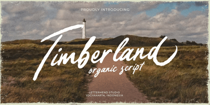 Timberland is a casual script with organic style. This type of font perfectly made to be applied especially in logo, and the other various formal forms such as invitations, labels, logos, magazines, books, greeting / wedding cards, packaging, fashion, make up, stationery, novels, labels or any type of advertising purpose. Features : Uppercase & lowercase Numbers and punctuation Alternates & Ligatures Multilingual PUA encoded We highly recommend using a program that supports OpenType features and Glyphs panels like many of Adobe apps and Corel Draw, so you can see and access all Glyph variations.
 - Lord Story by Letterhend,
$19.00 Lord Story is a great display font with medieval middle age theme. This font is also suitable to be applied especially in logo, and the other various formal forms such as invitations, labels, logos, magazines, books, greeting / wedding cards, packaging, fashion, make up, stationery, novels, labels or any type of advertising purpose. Features : uppercase & lowercase numbers and punctuation multilingual alternates & ligatures PUA encoded We highly recommend using a program that supports OpenType features and Glyphs panels like many of Adobe apps and Corel Draw, so you can see and access all Glyph variations.
 - Fulline by Letterhend,
$19.00 Fulline is a display typeface. This type of font perfectly made to be applied especially in headlines which is need a standout font, and the other various formal forms such as invitations, labels, logos, magazines, books, greeting / wedding cards, packaging, fashion, make up, stationery, novels, labels or any type of advertising purpose. Features : Solid version numbers and punctuation multilingual PUA encoded We highly recommend using a program that supports OpenType features and Glyphs panels like many of Adobe apps and Corel Draw, so you can see and access all Glyph variations.
 - Raksana by Letterhend,
$19.00 Introducing, Raksana. A retro bold script which will bring you back to 60s feel. This font perfectly made to be applied especially in logo, and the other various formal forms such as invitations, labels, logos, magazines, books, greeting / wedding cards, packaging, fashion, make up, stationery, novels, labels or any type of advertising purpose. Features : uppercase & lowercase numbers and punctuation multilingual ligatures alternates swashes PUA encoded We highly recommend using a program that supports OpenType features and Glyphs panels like many of Adobe apps and Corel Draw, so you can see and access all Glyph variations.
 - Festivo Clean by Ahmet Altun,
$19.00 Festivo Clean is the clean version of the popular fonts Festivo Letters and Festivo lowercase Font Families. Festivo fonts are easy to use. After copying the text layer you created with Ctrl + C, the layers overlap with Ctrl + F or Ctrl + B paste command. You can achieve infinite color options by applying the desired color to the layers. The Festivo Clean family also includes three-dimensional fonts. In this version, the language support is increased. Festivo Clean would be a great choice for packaging designs, banners, posters and all other graphic designs.
 - Guenter by ParaType,
$25.00 Guenter type got its name after Guenter Gnauck — the calligrapher from Eastern Germany whose works brought an inspiration and initial incitement for the design. But in contradiction to the calligraphic nature of the inspiration source Guenter has a specific construction that is built solely with straight stems. Like KvadratZ family Guenter belongs to so called 'in-one-touch' series. The first version in one basic style was developed by Zakhar Yaschin in 2001. In 2009 the font was redesigned with addition of 3 new styles and released by ParaType as a family.
 - JollyGood Proper by Letradora,
$18.00 JollyGood Proper is a fun, friendly typeface that is clean enough to use for longer texts. It is a complete family with 7 weights in regular and italic for a total of 16 fonts. It has an amazing character set, with support for most European languages, as well as alternates and ligatures. JollyGood Proper works well for packaging, children’s books, or wherever you need an informal text without being too cartoony.It is also an excellent replacement for The Comic Font that Must Not Be Named. Check out the other members of the JollyGood family
 - 1751 GLC Copperplate by GLC,
$38.00 This family was inspired by an engraved plate from Diderot & Dalembert's Encyclopedia (publication beginning in 1751), illustrating the chapter devoted to letter engraving techniques. The plate bears two engravers names : "Aubin" (may be one of the four St Aubin brothers ?)and "Benard" ( which name is present below all plates of the Encyclopedia printed in Geneva ). It seems to be a transitional type, but different from Fournier or Grandjean. Small caps are included in fonts for TTF and OTF version, separate files are included in the family sets of the Mac TT version.
 - Franklin Gothic by URW Type Foundry,
$39.99 By 1915, all the major foundries offered families of sans serifs, sometimes called Gothic in the USA. Franklin was a response suitable for countries in the vanguard of the machine age. Designed by Morris Benton in 1903-1912, Franklin has preserved its own personality ever since. The ITC Franklin Gothic font family is a redrawing by ITC that keeps the original strength intact, meeting the demand for a strong typeface. ITC Franklin Gothic is better read in display sizes and considered a standard in the newspaper and advertising fields.
 - Quant Text by Hoftype,
$49.00 Quant Text is the optimized text version of the Quant family. It comes with a slightly greater width, stronger hairlines and stronger serifs which make it very stable for small text, but also gives it a forceful appearance when used for headlines. Quant is well-equipped for ambitious typography. The Quant family consists of 8 styles, comes in OpenType format with extended language support for more than 40 languages. All weights contain small caps, proportional lining figures, tabular lining figures, proportional old style figures, lining old style figures, matching currency symbols, fraction- and scientific numerals.
 - Gelato Sans by Stolat Studio,
$29.00 Gelato is the Italian word for ice cream, commonly used in English for ice cream made in an Italian style. Gelato Sans designed by Ania Wieluńska is a humanistic typeface with geometric construction. It is characterised by a lot of details, which gives it a friendly and warm character. Scalable and large x height, sharp cuts makes Gelato good choice for many purposes from textes to display usage. All family consist 18 styles with italics from hairline to black. Ania was awarded a TDC Beatrice Warde Scholarship for this type family.
 - Malista by Genesislab,
$5.00 Malista is a large yet elegant Family display font. The unique and creative character according to today's style will be very interesting for you to create any design work with a classy model while still maintaining a calm and classy style to look at. You're sure to have inspiration to match your creativity! Multilingual Support. Ligature Pounding . Malista . Malista Italic . Malista Italic Outline . Malista Outline . Malista Rounde . Malista Rounde Italic Don't delay any longer to download quality goods only here. Thank You
 - RNS Camelia by RNS Fonts,
$3.00 Camelia is an demi–slab display type family with reversed strokes to achieve an unexpected look and rythm. Was designed and optimized for use in large sizes. It is inspired by the geometric typefaces of the 1920s and the egyptiennes of the 1930s. An emphasis on circular and rectangular shape give it the identity.
 - Mottingham Elegant Calligraphy by Axara Creative,
$49.00 Mottingham Script is handwritten stylish calligraphy font, with a dancing baseline, and classic and elegant touch. Can be used for various purposes.such as headings, signature, logos, wedding invitations, t-shirts, letterhead, signage, labels, news, posters, badges etc. Mottingham Script features 338 glyphs alternate characters. Including initial and terminal letters, alternates, ligatures and multiple language support.
 - FF Layout by FontFont,
$41.99 German type designer Gerd Wippich created this script FontFont in 1996. The family has 7 weights, ranging from Regular to Bold (including italics) and is ideally suited for festive occasions and editorial and publishing. FF Layout provides advanced typographical support with features such as ligatures and case-sensitive forms. It comes with tabular lining figures.
 - Montaigne by Fenotype,
$20.00 Delve into the world of timelessness with Montaigne. With its blend of classic elements and contemporary design, this serif family offers a comprehensive selection of eight styles and their corresponding italics. Explore Montaigne's OpenType features, including Small Caps, OldStyle numerals, and a delightful array of Swash initials and Discretionary ligatures in the Italic styles.
 - FF Manga Steel by FontFont,
$41.99Dutch type designer Donald Beekman created this display FontFont in 2001. The family has 8 weights, (including italics) and is ideally suited for logo, branding and creative industries, music and nightlife as well as poster and billboards. FF Manga provides advanced typographical support with features such as ligatures. It comes with proportional lining figures. - FF Matto by FontFont,
$41.99 Italian type designer Alessio Leonardi created this display FontFont in 1996. The family has 12 weights, ranging from Regular to Bold (including italics) and is ideally suited for festive occasions and poster and billboards. FF Matto provides advanced typographical support with features such as ligatures and case-sensitive forms. It comes with proportional oldstyle figures.
 - FF Stoned by FontFont,
$41.99 German type designer Theo Nonnen created this display FontFont in 1996. The family has 15 weights, and is ideally suited for advertising and packaging, festive occasions as well as film and tv. FF Stoned provides advanced typographical support with features such as ligatures. It comes with tabular lining, proportional oldstyle, and proportional lining figures.
 - The Marmars by Eotype,
$14.00 The Marmars is display typeface that has bold characteristics. This font can give your designs a playful and friendly impression. You can use this font for retro, vintage and urban designs. This font comes with alternative style and ligature features which are suitable for various projects such as logos, product labels, posters and many more.
 - Nocturne Serif by Borutta Group,
$29.00 Nocturne Serif – font is inspired by the lettering on stone tablets commemorating the victims of World War II and Warsaw architecture. Nocturne is a text font that features clean geometrical shapes and high contrast, and is modernist in character. The family consists of over 750 glyphs, including: Latin, Cyrillic, small caps and many others…
 - Brinnan by Typogama,
$19.00 Brinnan is a wide, contemporary sans serif typeface that was conceived as a branding and editorial solution. With it’s ten weights, ranging from an elegant Thin weight to a solid and dense Black weight, this family was designed as a versatile and flexible that can be used on a range of projects and mediums.
 - Stout by Greater Albion Typefounders,
$10.00 Stout is a deliberately aggressively solid family of four faces, offered in two weights and in serif (deliberately large serifs) and sans forms. It’s ideal for signage that needs to be read over long distances or for anything where an emphatic statement is needed. Stout is big and clear and always makes a statement.
 - Juby Rounded by Fontsphere,
$12.00 Juby Rounded - Heavy, visible and distinctive display font, rounded brother of the Juby Font. Designed especially for display purposes. Can be used successfully in posters, headlines, visual identities, and everything needs to stand out. Font containing uppercase and lowercase characters, numerals and a large range of punctuation. The family has 3 weights with matching italics.
 - Monsal Gothic by The Northern Block,
$32.00 A contemporary gothic sans font family with simple and condensed proportions. The design pays close attention towards balance and expression of form, creating a functional yet elegant typeface suitable for extensive text-based publications in print and screen. Details include 680 characters, seven weights with true italics, small caps, manually edited kerning and Opentype features.
 - Mongoose by Kostic,
$40.00 Mongoose is a condensed sans serif, made for posters, headlines and logotypes. Caps and x-height were made to match the ultra wide Briller, so it could be fun to combine these two highly contrasting type families. Thanks to the OpenType features, figures come in both tabular and proportional widths, fractions and superior/inferior positions.
 - Neues Haus by S6 Foundry,
$80.00 Neues Haus is a typeface with legible characters for maximum readability and legibility — perfect for a modern and stylish contemporary design, characterized by more generous oval proportions and slightly more open terminals. This font family can be used as a headline or as a body copy typeface, and also includes a useful icon set.
 - Long giraffe by Ask Foundry,
$19.00 Meet "Long giraffe," a condensed font inspired by a giraffe's elongated neck. It offers two font families, one displaying significant thickness contrast between horizontal and vertical strokes. Perfect for mobile screens and narrow spaces. Supports Western and Eastern European languages, making it versatile for diverse design needs. Embrace the elegance and functionality of Long giraffe.
 - Unytour by NicolassFonts,
$25.00 Unytour is a modern sans serif font family of 54 fonts. It includes nine weights with italics from Extra Light to Heavy. Each weight includes alternatives (A,G,I,R,a,l) and OpenType features. Unytour is easy to read and perfect for logotypes, advertising, packaging, book covers and magazines, headings, corporate identities, and more.
 - Joa Script by IbraCreative,
$17.00 Joa Script – A Modern Signature Typeface Joa Script, a contemporary and elegant modern signature typeface, effortlessly captures the essence of sophistication and personal flair. With its fluid and dynamic strokes, Joa Script exudes a sense of grace and individuality, making it the perfect choice for those seeking a signature-style font that resonates with a modern aesthetic. The letters seamlessly flow into one another, creating a harmonious and visually appealing script that adds a touch of refinement to any design. Joa Script’s versatility shines through in various applications, from branding and logos to invitations and social media graphics, providing a timeless and distinctive character that embodies both style and professionalism. Joa Script is perfect for branding projects, logo, wedding designs, social media posts, advertisements, product packaging, product designs, label, photography, watermark, invitation, stationery, game, fashion and any projects. Fonts include multilingual support for; Afrikaans, Albanian, Czech, Danish, Dutch, English, Estonian, Finnish, French, German, Hungarian, Italian, Latvian, Lithuanian, Norwegian, Polish, Portuguese, Slovak, Slovenian, Spanish, Swedish.
 - Sagittarius by Hoefler & Co.,
$51.99 A typeface with lightly-worn futurism, Sagittarius is equally at home among the beauty and wellness aisles, or the coils of the warp core. The Sagittarius typeface was designed by Jonathan Hoefler in 2021. A decorative adaptation of Hoefler’s Peristyle typeface (2017), Sagittarius’s rounded corners and streamlined shapes recall the digital aesthetic of the first alphabets designed for machine reading, a style that survives as a cheeky Space Age invocation of futurism. Sagittarius was created for The Historical Dictionary of Science Fiction, where it first appeared in 2021. From the desk of the designer: Typeface designers spend a lot of time chasing down strange valences. We try to figure out what’s producing that whiff of Art Deco, or that vaguely militaristic air, or what’s making a once solemn typeface suddenly feel tongue-in-cheek. If we can identify the source of these qualities, we can cultivate them, and change the direction of the design; more often, we just extinguish them without mercy. Sometimes, we get the chance to follow a third path, which is how we arrived at Sagittarius. During the development of Peristyle, our family of compact, high-contrast sans serifs, I often found myself unwittingly humming space-age pop songs. Nothing about Peristyle’s chic and elegant letterforms suggested the deadpan romp of “The Planet Plan” by United Future Organization, let alone “Music To Watch Space Girls By” from the ill-advised (but delicious) Leonard Nimoy Presents Mr. Spock’s Music from Outer Space, but there they were. Something in the fonts was provoking an afterimage of the otherworldly, as if the typeface was sliding in and out of a parallel universe of high-tech spycraft and low-tech brawls with rubber-masked aliens. It might have had something to do with a new eyeglass prescription. But I liked the effect, and started thinking about creating an alternate, space-age version of the typeface, one with a little more funk, and a lot more fun. I wondered if softer edges, a measured dose of seventies retrofuturism, and some proper draftsmanship might produce a typeface not only suitable for sci-fi potboilers, but for more serious projects, too: why not a line of skin care products, a fitness system, a high-end digital camera, or a music festival? I put a pin in the idea, wondering if there’d ever be a project that called for equal parts sobriety and fantasy. And almost immediately, exactly such a project appeared. The Historical Dictionary of Science Fiction Jesse Sheidlower is a lexicographer, a former Editor at Large for the Oxford English Dictionary, and a longtime friend. He’s someone who takes equal pleasure in the words ‘usufructuary’ and ‘megaboss,’ and therefore a welcome collaborator for the typeface designer whose love of the Flemish baroque is matched by a fondness for alphabets made of logs. Jesse was preparing to launch The Historical Dictionary of Science Fiction, a comprehensive online resource dedicated to the terminology of the genre, whose combination of scholarship and joy was a perfect fit for the typeface I imagined. For linguists, there’d be well-researched citations to explain how the hitherto uninvented ‘force field’ and ‘warp speed’ came to enter the lexicon. For science fiction fans, there’d be definitive (and sometimes surprising) histories of the argot of Stars both Trek and Wars. And for everyone, there’d be the pleasure of discovering science fiction’s less enduring contributions, from ‘saucerman’ to ‘braintape,’ each ripe for a comeback. A moderated, crowdsourced project, the dictionary is now online and growing every day. You’ll find it dressed in three font families from H&Co: Whitney ScreenSmart for its text, Decimal for its navigational icons, and Sagittarius for its headlines — with some of the font’s more fantastical alternate characters turned on. The New Typeface Sagittarius is a typeface whose rounded corners and streamlined forms give it a romantically scientific voice. In the interest of versatility, its letterforms make only oblique references to specific technologies, helping the typeface remain open to interpretation. But for projects that need the full-throated voice of science fiction, a few sets of digital accessories are included, which designers can introduce at their own discretion. There are alternate letters with futuristic pedigrees, from the barless A popularized by Danne & Blackburn’s 1975 ‘worm’ logo for NASA, to a disconnected K recalling the 1968 RCA logo by Lippincott & Margulies. A collection of digitally-inspired symbols are included for decorative use, from the evocative MICR symbols of electronic banking, to the obligatory barcodes that forever haunt human–machine interactions. More widely applicable are the font’s arrows and manicules, and the automatic substitutions that resolve thirty-four awkward combinations of letters with streamlined ligatures. About the Name Sagittarius is one of thirteen constellations of the zodiac, and home to some of astronomy’s most inspiring discoveries. In 1977, a powerful radio signal originating in the Sagittarius constellation was considered by many to be the most compelling recorded evidence of extraterrestrial life. Thanks to an astronomer’s enthusiastically penned comment, the 72-second transmission became known as the Wow! signal, and it galvanized support for one of science’s most affecting projects, the Search for Extraterrestrial Intelligence (SETI). More recently, Sagittarius has been identified as the location of a staggering celestial discovery: a supermassive black hole, some 44 million kilometers in diameter, in the Galactic Center of the Milky Way. <
 - Chubs by Type.p,
$24.00 "Chubs," a typeface specifically designed for large display sizes, perfect for making a bold statement. Each letter in Chubs has been meticulously crafted to possess a thick and prominent appearance, ensuring that your designs leave a lasting impact on viewers. Chubs's distinctive weight and blackness make it an ideal choice for a wide range of applications, including posters, packaging, and logos. Whether you want to create eye-catching promotional materials or design a powerful brand identity, Chubs has got you covered. Within the Chubs typeface family, you'll find two distinct styles, each with its own personality and visual appeal. The first style, "Chubs Black," features letters with a captivating slit, reminiscent of a belly that overlaps. This distinctive groove adds an extra layer of visual interest and uniqueness to your designs. On the other hand, "Chubs Filled" offers a solid and plump appearance, without the characteristic slit. This style amplifies the chubby nature of the letters, resulting in a bold and impactful display. To further enhance your creative options, both styles within the Chubs family include an alternate character set featuring a wink shadow in every letter. These additional characters provide a touch of fanciness and playfulness, allowing you to experiment and add unique elements to your designs. Choose "Chubs" for your next big project, and witness the boldness and charm that sets your designs apart from the rest. Let Chubs bring your ideas to life and make a powerful visual statement that captures attention and leaves a lasting impression.
 - Cocogoose Pro by Zetafonts,
$39.00 Discover Cocogoose Pro Narrow Weights! Designed by Cosimo Lorenzo Pancini in 2013, Cocogoose was first expanded in 2015 with the help of Francesco Canovaro who co-designed the decorative display weights and Andrea Tartarelli who developed the condensed widths. In 2020 a full redesign of the typeface has been published: Cocogoose Pro now includes new widths, weights, open type features and characters, thanks to the help of Mario De Libero. Influenced by vernacular sign-painting and modernist ideals, Cocogoose is drawn on a classic geometric sans skeleton, softened by rounded corners and slight visual corrections. Its very low contrast, dark color and tall x-height make it a solid choice for all designers looking for a powerful display typeface for logos, headings and vintage-inspired branding. The tall x-height makes texts set in Cocogoose very readable even at small sizes, while the bold regular weight allows for maximum impact when used as a branding, signage or decorative typeface. Cocogoose Pro was designed as a highly reliable tool for design problem solving, and given all the features a graphic designer needs, starting from its wide range of widths and weights. Its 2000+ latin, cyrillic and greek characters make sure it covers over 200 languages worldwide, while its comprehensive set of open type features allows faultless typesetting thanks to small capitals, positional numbers & case sensitive forms. A wide range of alternate letterforms, developed along nine different stylistic sets, gives you an extra level of design fine-tuning. The layerable and color-ready display variants include inline, outline, shadow and a letterpress version that can simulate the effect of old print, also thanks to programmed randomization of its letters. Cocogoose Pro has been completely re-engineered in 2020 to include extra features and technologies. A variable font version allows you to fine tune precisely the appearance of the text while minimizing download size on the web. A darkmode weight range has been added to the whole family, to keep consistency of effect when the typeface is used in reverse on the web and in dark mode interfaces. Also, a new text subfamily has been developed for body text usage, to keep the look and feel of Cocogoose while maximizing readability on screen and on the printed page.
 - Brolachess by Almarkha Type,
$35.00 Hello Introducing, Brolachess - Luxury Ligatures Serif is an elegant, unique font that uses 30 ligatures to smoothly link letters. inspired by the famous minimalist logo, perfect for the purposes of designing templates, brochures, videos, advertising branding, logos and more. Perfect for adding a unique twist to word-mark logos, monograms or pull quotes.
 - Bushing by Hackberry Font Foundry,
$13.95 Bushing is a quick serif experiment going for open light display type. For years I have always stopped and really liked what I saw with fonts like the original Cushing from the turn of the 20th century. This time the desire for a font was stirred by Felici's article in CreativePro on fonts from the beginning of the 20th century, especially his captures of Cushing No. 2 and the version commissioned for Norwood press from ATF. I'm not interested in historically accurate reconstructions. My desire is for the general feel I get when I see a font. As a result, Bushing has little to do with Cushing (other than the last six letters). But it is a Serif font with small serifs and a huge x-height with a very open feel. I like it. I hope you do also. I made it into a limited display version of OpenType Pro. I added small caps and oldstyle figures, as I can hardly work without them. But ligatures seemed silly for this one.
 - Nicla by madeDeduk,
$15.00 Introducing Nicla is a brand new beautiful script family with beautiful ligatures, much special alternative glyphs to get more stunning and multilingual support. Use this beautiful font for all your designs project, event and more. Feature 9 Weight UPPERCASE & Lowercase Number & Symbol International Glyphs Alternative & Ligatures Feel free to drop us a message any time and follow my shop for upcoming updates Shoot me on email at: dedukvic@gmail.com and find more previews on my Instagram here : https://www.instagram.com/acekelgondolayu/?hl=en Hope you enjoy it.
 - Pueblito by Corradine Fonts,
$15.00 Pueblito is a hand drawn font with a rustic and antique appearance. Was inspired from old books and newspapers but express a very own personality and not necessary represent a specific classic style. The family consists of twelve fonts in six weights plus a set of ornaments in order to compose all kind of texts. Using Pueblito in your projects, you can obtain an original aged flavor and just by adding a subtle texture effect will help you to obtain the desired vintage look.
 - Alexio Ace Display by FoxType,
$12.00 Alexio Ace Display is a Unique Modern Elegant Typeface From Alexio Family with Web-fonts. It's a very versatile font that works great in large and small sizes. Alexio Font would perfect for branding, logos, headlines, Captions. or simply as a stylish text overlay to any background image. Strong capitals and a smooth, open lowercase are effective in a variety of applications. It's shown a clean, minimalist, warmth, quirky, yet still purposed to be versatile and easy to read. 04 Weights Included. Free updates and feature additions.
 - Densa by Graviton,
$24.00 Densa font family has been designed for Graviton Font Foundry by Pablo Balcells in 2020. It is a condensed sans serif typeface with some unconventional display endings. Its condensed design makes it very effective for space economizing and its display features make it a very interesting option for display usages such as logos, packaging and posters. It has been conceived to be most suitable for headlines and short length text blocks. Densa consists of 8 styles. Each containing small caps and glyph coverage for several languages.
 - Babylone Script by Almeera Studio,
$15.00 Babylone is a modern calligraphy with many alternative styles, this font looks natural, elegant and perfect for any extraordinary project. Babylone is suitable for various products such as invitations, product packaging, quotes, product design, crafter, labels, photography, watermarks, logos & branding and very suitable for design Valentine day, mother day, wedding, spring, christmas, etc.Everything Stylistic Altternate can be accessed using software that supports Opentype, such as Adobe Indesign, Adobe CS Illustrator, Adobe Photoshop CC, and Corel Draw or It has swash and stylistic alternates. Thank you & Happy design.