10,000 search results
(0.048 seconds)
- Decimosexto NF by Nick's Fonts,
$10.00This typeface family includes Spanish Roman letters and “Griffo” style italics, both hand-drawn by Francisco Lucas in Madrid, 1577. The letters, sometimes slightly mismatched in size or off the baseline, capture the look and feel of sixteenth-century printing. Both versions of the font include 1252 Latin, 1250 CE (with localization for Romanian and Moldovan). - Poster Linear by Jehansyah,
$9.00 Poster Linear Natural sans serif font is simple but looks very futuristic and very stylish, it adds to your confidence to make your designs look bolder and modern. Perfect for stickers, media posts, social media statuses, magazines, books, covers, game covers, banners, wall magazines, sports shades, and more, plus a few families you can incorporate into your designs.
 - WOODTYPE Collection by Borutta Group,
$19.00 WOOD TYPE COLLECTION from Mateusz Machalski is a set of wonderful, warm, and weathered hand made typefaces designed by Mateusz Machalski. The Inspiration for this collection comes from a wooden letter blocks and other old technologies used for printing. WTC supports 40 different languages and contains over 300 glyphs per style. The Family consists of 20 typefaces. ENJOY!
 - Cruz Script Ballpoint Pro by Cruz Fonts,
$32.00 The three Script fonts: Brush Pro, Ballpoint Pro and Calligraphic Pro were derived from the original Ballpoint design. A custom Brush and Calligraphic texture was added to complete the family and twenty-two clip-art illustrations were created for each style. The 3-font package with illustrations is available in the Buying Choices of any of the three fonts.
 - Mushin by Satori TF,
$16.99 Mushin is a typeface, that comes with 14 fonts, roman and the matching italics, which draws inspiration from the grotesques of the beginning of the 20th century. However, its humanistic details and endings, remove the coldness so characteristic of this style, making Mushin a typeface of lively and dynamic curves, which can be used for various purposes.
 - Blunder by 3Wprotype,
$10.00 Introducing, Blunder Display Font. Concise typeface is fun, and relaxed with natural handwriting. This type of font is very suitable to be applied especially for the needs of letters and logos, and various other formal forms such as invitations, labels, magazines, books, greeting/wedding cards, packaging, fashion, make up, stationery, novels, labels or any type of advertising purpose.
 - FS Brabo Paneuropean by Fontsmith,
$90.00Worldly Even though it’s a new arrival, FS Brabo has seen the world. Designed by a Brazilian working in London and studying in Belgium under a Dutchman, it’s certainly well-travelled. And it was inspired by the extraordinary archive of early book typefaces at the world-renowned Plantin-Moretus Museum in Antwerp, while Fernando Mello was attending Frank Blokland’s Expert class Type Design course at the Plantin Institute of Typography. It was there that Fernando became engrossed in the collection of early metal type, matrices, punches and type samples by figures such as Garamond and Granjon. So much so that he took on the mighty task of developing ‘a beautiful, functional, serifed text font’ of his own. Heroic FS Brabo’s journey from sketch to font family took an epic three years, starting in Antwerp, continuing at Fontsmith in London, and reaching its conclusion back in Fernando’s home city of São Paulo. No wonder Fernando was reminded of another titanic face-off: that of Antwerp’s Roman hero of legend, Silvius Brabo, and the evil ogre, Antigoon. Brabo came to the town’s rescue after the tyrannical giant had been charging ships’ captains extortionate taxes and chopping off the hands of those who refused to pay up. Having finally downed Antigoon after a long and terrible duel, Brabo cut off the giant’s own hand and threw it into the river Scheldt, unwittingly giving the town its name: the Dutch for ‘hand-throw’ is hand werpen. What better way for Fernando to name his literary typeface than after the hero of Antwerp’s oldest tale? The garalde factor FS Brabo is not a revival, but a very much a contemporary, personal interpretation of a garalde – a class of typeface originating in the 16th century that includes Bembo, Garamond and Plantin, with characteristically rounded serifs and moderate contrast between strokes. Brabo’s ‘ct’ and ‘st’ ligatures, upper-case italic swashes and contextual ending ligatures – ‘as’, ‘is’, ‘us’ – all preserve the beauty and character of traditional typefaces, but its serifs are chunkier than a garalde. Their sharp cuts and squared edges give them a crispness at text sizes, helping to bring a beautifully bookish personality to hardworking modern applications. A workhorse with pedigree It may give the appearance of a simple, four-weight typeface, but FS Brabo has hidden depths beneath its simplicity and beauty. OpenType features such as cap italic swashes, contextual ending swashes – programmed only to appear at the end of words – and stylistic alternatives make this a complete and well-equipped typeface. Comprehensive testing was carried out at text and display sizes, too, to prevent counters from filling in. All of which makes FS Brabo a very modern take on a traditional workhorse serif typeface: colourful and versatile enough to adorn not just editorial projects but also signage, advertising and logotypes. - FS Brabo by Fontsmith,
$80.00 Worldly Even though it’s a new arrival, FS Brabo has seen the world. Designed by a Brazilian working in London and studying in Belgium under a Dutchman, it’s certainly well-travelled. And it was inspired by the extraordinary archive of early book typefaces at the world-renowned Plantin-Moretus Museum in Antwerp, while Fernando Mello was attending Frank Blokland’s Expert class Type Design course at the Plantin Institute of Typography. It was there that Fernando became engrossed in the collection of early metal type, matrices, punches and type samples by figures such as Garamond and Granjon. So much so that he took on the mighty task of developing ‘a beautiful, functional, serifed text font’ of his own. Heroic FS Brabo’s journey from sketch to font family took an epic three years, starting in Antwerp, continuing at Fontsmith in London, and reaching its conclusion back in Fernando’s home city of São Paulo. No wonder Fernando was reminded of another titanic face-off: that of Antwerp’s Roman hero of legend, Silvius Brabo, and the evil ogre, Antigoon. Brabo came to the town’s rescue after the tyrannical giant had been charging ships’ captains extortionate taxes and chopping off the hands of those who refused to pay up. Having finally downed Antigoon after a long and terrible duel, Brabo cut off the giant’s own hand and threw it into the river Scheldt, unwittingly giving the town its name: the Dutch for ‘hand-throw’ is hand werpen. What better way for Fernando to name his literary typeface than after the hero of Antwerp’s oldest tale? The garalde factor FS Brabo is not a revival, but a very much a contemporary, personal interpretation of a garalde – a class of typeface originating in the 16th century that includes Bembo, Garamond and Plantin, with characteristically rounded serifs and moderate contrast between strokes. Brabo’s ‘ct’ and ‘st’ ligatures, upper-case italic swashes and contextual ending ligatures – ‘as’, ‘is’, ‘us’ – all preserve the beauty and character of traditional typefaces, but its serifs are chunkier than a garalde. Their sharp cuts and squared edges give them a crispness at text sizes, helping to bring a beautifully bookish personality to hardworking modern applications. A workhorse with pedigree It may give the appearance of a simple, four-weight typeface, but FS Brabo has hidden depths beneath its simplicity and beauty. OpenType features such as cap italic swashes, contextual ending swashes – programmed only to appear at the end of words – and stylistic alternatives make this a complete and well-equipped typeface. Comprehensive testing was carried out at text and display sizes, too, to prevent counters from filling in. All of which makes FS Brabo a very modern take on a traditional workhorse serif typeface: colourful and versatile enough to adorn not just editorial projects but also signage, advertising and logotypes.
 - 1781 La Fayette by GLC,
$42.00 This font was inspired from the numerous font-types looking like Hand-carved in the 1700's. The capitals are mainly inspired from the font carved by Fournier in year 1781, the year of the famous American and French decisive victory at Yorktown, and drawn by Benjamin Franklin himself, and the lower cases are inspired from the well known "bâtarde coulée" style, ornamented with final loops and enriched with alternates and ligatures. The font is available for English, Western Europe (including Celtic) Icelandic, Baltic, Eastern Europe and Turquish languages.
 - Normatica by CarnokyType,
$42.00 Normatica is a neutral typeface inspired by advertising letters used as letterings on shop windows during period of Normalization (the 60s–90s) in former Czechoslovakia. The complete font family consist of 24 styles in 6 weights (Thin–Black) with matching Italics where every style is followed by his Display counterpart. The difference between default and display styles is tighter spacing in Display fonts and different design of punctuation and diacritics accents. Beside the complete set of Latin, Normatica includes Cyrillic characters as well. Each font contains of alternative variation of some characters (j, t, y, Q) and includes a wide range of the Opentype features (for more details see pdf Specimen in Gallery section). Mixture of Normatica and Normatica Display can be effectively used for both text and display usage. It can be used in advertising, signage, corporate identities and various situations of editorial design. You can try two Demo styles in Medium weight fully for free.
 - MN Grissee by Mantra Naga Studio,
$20.00 MN Grissee - a Sans Serif Super Family Font. This typeface has many alternatives with swashes that can make your lettering/logotype more attractive. This font is suitable for logos and various other formal forms, such as invitations, labels, logos, magazines, books, greeting/wedding cards, packaging, fashion, makeup, stationery, novels, labels, or advertising. This font is PUA encoded, which means you can access all of the glyphs and swashes with ease! 436 Glyphs 9 Opentype features 10 Ligatures, Stylistic Set and Swash 3 Widths (Condensed, Normal, Expanded) 8 Weights (Thin, Extra Light, Light, Regular, Medium, Semibold, Bold, Extrabold) 2 Styles (Regular & Italic) Support Multilingual for 89 languages We highly recommend using a program that supports the OpenType feature and the Glyphs pane like many Adobe and Corel Draw applications, so that you can view and access all variations of Glyphs. Thanks for your support of our product and using it in your project.
 - Deco Sans by Alan Ronn,
$30.00This font was created while looking at the various shapes my handwriting consistently took, especially in the ways that letters would have breaks in them. Over the course of a few months I continually tweaked the letter forms and shapes, and lo and behold, I developed Deco Sans. This family currently only includes a thin weight, as I'm only one person, and very busy with college. I'm continuing work on a regular, bold, and possibly a future italic weight, but these may not be released for many months to come. As this is a very thin font, it should be used at sizes no smaller than around 16 or 18pt as it tends to get lost in whitespace, and looks best at large sizes. As such, this weight should be considered more of a display font than a text font, however, I predict a regular weight to be very readable and much more useable for the everyday. - TNG Monitors is a highly specialized typeface designed primarily with a nod to the aesthetics of the computer displays and interfaces seen in the Star Trek universe, specifically within "The Next Gen...
- Soliden by Eko Bimantara,
$29.00 Soliden is a neo grotesk san serif font family with solid letterforms. Designed and published by Eko Bimantara in 2022, Soliden became a suitable choice for large display and functional purposes. The letterforms are built in large x-height with spacious counters. It consists of 8 weight from Thin to Black and 3 width; Condensed, Normal and Expanded, which make it a large font family with 48 styles. Soliden has 394 glyphs which cover broad latin languages.
 - Parangon by ParaType,
$25.00 PT Parangon™ was designed in 1986-2002 by Anatoly Kudryavtsev and licensed by ParaType. This type family belonges to Neogrotesque subclass of closed Sans Serif. Letterforms of lower case is based on the tradition of 1710 Civil type and some modern Italic types. The family has a lot of weights and styles including Extra Condensed, Condensed, Regular, Extra Light, Light, Bold, Extra Bold. For advertising and display matter. Also it can be used for texts in advertising magazines.
 - Geometrico Slab by FSdesign-Salmina,
$39.00 GeometricoSlab. Round with strong serifs. Should it express power? Geometric and Slabserifs: a relatively rare combination. GeometricoSlab takes its cue from Herb Lubalin’s typeface family of the same name, and by using optical corrections with restraint, it looks a touch more uncompromising. The flexible, partly asymmetrical arrangement of the serifs avoids an overly heavy effect. The typeface family is suitable for both headlines and small point sizes and is related Geometrico Sans Curious? Try GeometricSlab free of charge.
 - Code Saver by Dharma Type,
$9.99 Code Saver — Next-generation monospaced font — 1. Code Saver is a monospaced font family for coding and tabular layout. 2. Code Saver is a clean, natural and simple monospaced font family. 3. Code Saver consists of 6 style, Regular, Medium, Bold and their 11° Italic. 4. Code Saver has 93.33% condensed width for more usable space. 5. Code Saver has good distinguishability and legibility especially numerals. 6. Code Saver brings a fresh sensitivity to boring old existing monospaced fonts.
 - Karlsen Round by TypeUnion,
$30.00 Designed and built in London by TypeUnion, Karlsen Round is a structured, functional typeface which embraces harmony, flow and versatility, but with a cheeky twist. The Karlsen Round Family is made up of 14 styles, which range from a delicate thin, all the way through to a substantial extra-bold and each carry a versatility for multiple applications and uses. Karlsen Round provides extensive language support to provide a flexible, substantial user experience. Please also see our Karlsen family.
 - Clydesdale by Red Rooster Collection,
$60.00 Clydesdale is a five-weight compressed sans serif font family. It was designed by Steve Jackaman over a several-year period, and was released in 2017. Clydesdale, much like its sister typefaces Coliseum and Torpedo, was inspired by authoritative Roman display typefaces. The font family excels in displays, but is a great performer in all text sizes. It is perfect for users who enjoy the impressiveness of Coliseum Pro and Torpedo, and need a complementary sans serif typeface.
 - Salve by Ahmet Altun,
$9.00 Salve is a monoline font family with scripts, sans and serif versions that work great together or alone. Salve Fonts would be a perfect choice to create wonderful designs in your works such as textile, signboards, posters, invitation cards, logos and more. Extras include very stylish and useful ornaments which are eye-pleasing when used together with the fonts, and you can easily reach them with the basic keys on your keyboard. Enjoy Salve Font Family!
 - Cern by Wordshape,
$20.00 Cern is a family of20 weights of neutral, yet formally nuanced grotesk typefaces that takes inspiration from the original metal types from Switzerland, yet had a slightly larger x-height for more pronounced legibility. Cern is designed to be highly readable in print and on-screen. The italic variations are true italics and have been designed for smooth, fluid reading and text-setting. The Cern family works equally well for text typesetting and for display design work.
 - Bronzier by Arterfak Project,
$13.00 Bronzier is a strong serif display family with 8 different styles. Bronzier was designed with a strong and sharp serif which gives it a more manly look. Sporty, vintage and modern taste at the same time which mean you can use this font family for many design styles. Inspired by old-school typography and modern style. Create a perfect design with Bronzier! Because Bronzier is suitable for logos, logotypes, apparel, jersey, tags, labels, posters, stickers, branding and more.
 - Cagke by Ardyanatypes,
$15.00 Cagke is a font that offers a captivating classic and retro style. With nine weights ranging from thin to Black, Cagke provides flexibility for various design needs. The main advantage of Cagke is its ability to support multiple languages, making it easily usable worldwide. With the provided OpenType features, Cagke offers additional variations and sensitivity when designing with this font. Cagke is highly suitable for designs with classic, retro, vintage, modern, or elegant aesthetics. In various projects, including posters, books, magazines, advertisements, and even films, Cagke will provide the perfect touch. Another advantage of Cagke is its ease of development to meet various design requirements. Classic and retro styles, this font will enrich every design creation you make.
 - Alamia by Ani Dimitrova,
$29.00 The Alamia type family is a sans serif in 20 weights, ranging from Hair Line to Black with matching italics. Each style contains more than 900 glyphs. Alamia comes with an extended coverage of the Latin and Cyrillic Script. All weights of this family are equipped for complex, professional typography with OpenType Features including: Small Caps, Ligatures, Discretionary Ligatures, Superscript, Subscript, Tabular Figures, Old-Style Figures, Circled Figures, Arrows, Matching currency symbols and fraction.The construction of the characters combines clean grotesque style with modern, that gives the font an organic, warm and friendly touch. The Alamia font family is a perfect choice for body text, branding design, web design, editorial design and more.
 - Discordia by Naipe Foundry,
$60.00 Discórdia is a type-family of contrasting contrasts. Each of the four members of the family has a different contrast type. Regular has broad-nib contrast, Bold has horizontal contrast, the Italic is monoline, which means it has no apparent contrast, and Bold Italic is... Well, it’s probably best if see for yourself. These different design structures were fine-tuned to work well together in the same line, creating emphasis and hierarchy through a mini-super-family that groups a wedge-serif Regular, a slab-serif Bold, a sans-serif-ish Italic and a twisted Bold Italic. Naipe teamed up with Ben Nathan of Hafontia to extend Discórdia and give full Hebrew Support. Coming soon!
 - AC Honey Bee by Will Albin-Clark,
$35.00 Honey Bee is a type family developed over the course of 2020. Consisting of two sub-families that share the same DNA of two opposing styles. Honey Bee Serif is a transitional modern serif with some reference to fundamental letterforms. Honey Bee Sans is a low contrast semi-geometric sans serif with bold rounded letterforms. These typefaces were made in unison, designed for perfect font pairing for a variety of projects and intensions. It’s design is ideal for small and large scale, with the distinct characters of the Sans family and funky headlines or titles with the stylistic Serif Italic. Super legible and a variety of characters allow for multi-lingual use.
 - Divan Pro by Naghi Naghachian,
$58.00 Divan Pro font family is designed by Naghi Naghashian. It is a Headline font family, a modern interpretation of sans serif characters in 2 weighs: Heavy and ExtraBlack.The character set of this Font family supports most western languages including: Afrikaans, Basque, Breton, Catalan, Danish, Dutch, English, Finnish, French, Gaelic, German, Icelandic, Indonesian, Irish, Italian, Norwegian, Portuguese, Sami, Spanish, Swahili and Swedish. There are 17 additional symbol characters: euro, litre, estimated, omega, pi, partialdiff, delta, product, summation, radical, infinity, integral, approxequal, notequal, lessequal, greaterequal, and lozenge. It also includes the characters necessary to support the following central European languages: Croatian, Czech, Estonian, Hungarian, Latvian, Lithuanian, Polish, Romanian, Serbian (Latin), Slovak, Slovenian and Turkish.
 - Courier Coco by Okaycat,
$19.50 Courier Coco is simple, legible, and unmistakably unique. This full flavored font family brings an elegant yet subtle spirit to any design. Check it out! Courier Coco is extended, containing West European diacritics & ligatures, making it suitable for multilingual environments & publications.
 - Bindas by WingBuk Studio,
$16.00 Bindas is a high quality blackletter typeface for your designs, with metal and gothic accents to make your designs even more exclusive. Can be use for various designs such as band logos, cloting, even film covers or posters. No Punctuation !
 - Cinestory by Goodigital13,
$20.00 This type of font perfectly made to be applied especially in logo, and the other various formal forms such as invitations, labels, logos, magazines, books, greeting / wedding cards, packaging, fashion, make up, stationery, novels, labels or any type of advertising purpose.
 - Whipsnapper by Pink Broccoli,
$14.00 A wild at heart offbeat sansserif family inspired not by any single pulp or vintage source but a varied collection of influences. Just an all-around fun typeface with the widths and weights to offer a wide variety of uses.
 - Hantaran by Goodigital13,
$20.00 This type of font perfectly made to be applied especially in logo, and the other various formal forms such as invitations, labels, logos, magazines, books, greeting / wedding cards, packaging, fashion, make up, stationery, novels, labels or any type of advertising purpose.
 - P22 Elizabethan by IHOF,
$24.95 Elizabethan is part of the fonts designed by Ted Staunton for his historic novel centered around a family bible and the handwritten annotation through seven generations. The Elizabethan font is based on a style known as “secretary hand” circa 1610.
 - Sweet Holidays Brush by Stripes Studio,
$20.00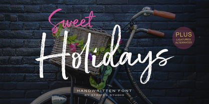 Sweet Holidays Brush is a super casual hand brushed script with detailed brush stroke texture, and a quirky, Can be used for various purposes. such as the title, signature, letterhead, signage, labels, newsletters, posters, logos, correspondence, wedding invitations, badges, etc.
 - Horyzen - Personal use only

- FF Prater Serif by FontFont,
$62.99 German type designers Henning Wagenbreth and Steffen Sauerteig created this display and serif FontFont in 2000. The family contains 2 weights: Regular and Bold and is ideally suited for advertising and packaging, festive occasions, film and tv, editorial and publishing as well as poster and billboards. FF Prater Serif provides advanced typographical support with features such as ligatures, alternate characters, and case-sensitive forms. It comes with tabular lining and proportional lining figures. This FontFont is a member of the FF Prater super family, which also includes FF Prater Block, FF Prater Sans, and FF Prater Script.
 - FF Prater Sans by FontFont,
$62.99 German type designers Henning Wagenbreth and Steffen Sauerteig created this display and sans FontFont in 2000. The family contains 2 weights: Regular and Bold and is ideally suited for advertising and packaging, festive occasions, film and tv, editorial and publishing as well as poster and billboards. FF Prater Sans provides advanced typographical support with features such as ligatures, alternate characters, and case-sensitive forms. It comes with tabular lining and proportional lining figures. This FontFont is a member of the FF Prater super family, which also includes FF Prater Block, FF Prater Script, and FF Prater Serif.
 - Makalu by Juraj Chrastina,
$29.00 Makalu is a funny flower font inspired by the lovely drawings of the famous illustrator Zdeněk Miler (best known for his small mole). His flowers are at the same time cartoony and realistic. Enjoy this choice of 27 original and distinctive illustrations while creating your designs.
 - Giambattista by Wiescher Design,
$39.50 Giambattista is a long-time project of mine finally come to an end. After redesigning all of Giambattista Bodoni's work and then some additional cuts I started a long time ago with this Non-Bodoni Bodoni. The idea came to me while redesigning the original Chancellerosa (chancery). I thought Bodoni just didn't have the right approach to a chancery, this was just not his cup of tea! Maybe that is why he never used the Chancellerosa very much for his own printshop in Parma. So I thought someone has to design a script, that looks like Bodoni could have designed it but is more lively than his. Over the years I have been working on and off on the face and it turned out to become three typefaces which can be freely mixed. Here is my modern version of a script in the style of Giambattista, meant as an hommage, I called it Giambattista. Your modern scribe Gert Wiescher
 - Marcinelle by Fando Fonts,
$4.00 The origin of this family is the classic French-Belgian comics. The screams and onomatopoeia of these comics have so much personality that I needed to create a typeface family that would allow the designer to really replicate them. But this family has many more applications: packaging, logos, posters, signage, packaging, branding, etc. With its wide variety of glyphs you can make your sound effects, logos, etc. in most Latin languages.
