10,000 search results
(0.05 seconds)
- Gwyner by Typomancer,
$24.00 Gwyner, a strengthened didone with sharp and clean characteristics, comes with thin to bold weights and is suitable in italic for various uses. A condensed family for space-saving design.
 - Hayken Script by Lemonthe,
$10.00 Hayken Script is a brush script font with a dynamic and energetic style. There are two types of styles (clean and textured). It can used for various purposes such as titles, logotypes, t-shirt designs, letterheads, signage’s, labels, newsletters, posters, badges, and every other design which needs an unique, striking font.
 - Quirky by Fine Fonts,
$29.00 The origin of Quirky lay in the Duke Ellington number It don't mean a thing if it ain't got that swing. For some time I had wanted to create a font from expanded stroked lines. I wanted to produce a light-hearted font, but with some classic touches. One day, whilst doodling in Adobe Illustrator, Quirky’s letterforms just appeared on screen as if from nowhere. First I drew the test word ‘hamburgefonts’ and then just kept going, unable to stop. Character after character appeared as if by magic. From the start, Quirky had a life of its own. The letterforms are rather more sophisticated than merely outlined stroked lines. Subtle adjustments to compensate for optical effects have been been incorporated. For example, horizontal stems have thicknesses slightly less than vertical stems and where stems join together, the thickening effect has been reduced by cutting into the joint. Being almost monoline, Quirky works well reversed out of a solid background and for TV credits. The Quirky fonts are fun fonts, so set, laugh and enjoy! I hope Quirky will give you as much pleasure in using it as I got in creating it! Shortly after the roman version was born, an italic version and then a thin version were created to form a family of three fonts.
 - Kica by iframe,
$32.00 3 weights (Light, Regular, Bold) 613 glyphs Character set A-Z Uppercase & Lowercase Numerals & Punctuation Multilingual Language support: Latin, Greek, Cyrillic Works on PC & Mac Kica is a modern display typeface that is characterized by its clean lines, bold strokes, and geometric shapes. This typeface was designed with the intention of creating a strong visual impact and capturing attention.
 - Baksheesh by HamburgerFonts,
$25.00 The Baksheesh family comes in three weights with accompanying italics and small caps. The catalyst for the development of the typeface came from the desire to create a contemporary family of constructed letterforms built upon a flexible system. The aesthetic of the font is influenced by the characters drawn by Wim Crouwel in 1976 for Olivetti’s typewriter font that could support varying character widths, hence Baksheesh’s faux-monospace appearance. Each of the characters has been designed according to an intricate grid, helping to rationalise the letterforms into a system that can be translated across the various styles. The flexibility of the grid also allows for optical adjustments to be made, for example stroke thinning at junctions and baseline/x-height overshoot for enhanced definition throughout. Baksheesh is suitable for setting small amounts of text as a distinguishable and legible headline font.
 - Darcy by Atlantic Fonts,
$26.00 Darcy is bold and exuberant. As an all-cap family (exception “i”), every letter has an artsy, handmade alternate. For the most joyful bounce, choose all lower or mix up the cases. For a more even baseline, go with all uppercase. Darcy Prints has gestural, organic motifs and patterns, including leaves, grasses, flowers and abstract shapes. Each playful letter has two options with different looks easily available in upper/lower places. Darcy Designs is a cheerful picture font adapted from 26 of the hand-drawings in Darcy Prints. Darcy family is based on hand-lettered cards the designer makes for friends. Darcy family lends itself to products that celebrate warmth, creativity, and a zest for humor and fun!
 - Geis by Galapagos,
$39.00In 1978 I went to work at Mergenthaler as a letter drawer. Being an inquisitive sort I decided that I should take a stab at this type design 'stuff'. I drew 25 or 30 glyphs before the work found its way to a high shelf in a dark corner of my apartment. Just 23 years later I found the drawings on a different shelf, in a different home, in a different city and decided to finish what I had started. I'm still trying to deal with my predisposition toward procrastination but I've finished the font. The name of the font is the last name of somebody I played softball with before I moved to Beantown. Ronnie Geis was one of the courageous firefighters we lost on September 11th when the WTC collapsed. - VTC Bloke by Vintage Type Company,
$19.00 VTC Bloke is a revival of Miller & Richard’s classic metal typeface, ‘Egyptian Expanded’, including the three-dimensional, ‘Open’ style that was later introduced to the family. The roots of this typeface stem from the UK, where William Miller and his son-in-law Richard had their initial foundry in Edinburgh, Scotland. In addition to the beautiful and timeless type designs, the foundry gained a reputation for offering super small type sizes, designed for Bibles, dictionaries, documents, etc. Slab Serifs (or Egyptian Serifs) started to gain popularity in the early 19th century. It’s around this time, due to emerging industrial technologies, and an ever-expanding advertising industry, that type designers started to really experiment with letterforms that could help their clients distinguish themselves from the competitor, and catch people's eyes. The size of posters and advertising space was getting bigger, and bigger, and so was the type. All original letterforms have been re-drawn and cleaned up, with some more modern glyphs and characters added in. VTC Bloke supports Adobe Latin 1 Language Support.
 - Arcato by Stefano Giliberti,
$15.00 Arcato is a font family shaped from spherical curves inspired by celestial bodies. It supports 114 languages, features a total of 508 glyphs and includes an italicized version for each of the 5 weights.
 - Achtung Baby by Comicraft,
$19.00 Pull up your Jackboots and check out this Teutonic title font designed by Richard Starkings for Rob Liefeld's controversial relaunch of Marvel's CAPTAIN AMERICA.
 - Cagliari by Latinotype,
$29.00 An elegant, stylish and easy-to-use typeface. Just as a nice hat makes you look good, Cagliari brings beauty to your designs—through the traditional flavor of Didone faces, and the simplicity of Modern and neo-Grotesk fonts. The font is based on the "Queulat" design yet features a higher contrast, between thick and thin strokes, which makes it look simple and suitable for a wider range of uses. Due to an abrupt contrast in stroke weight, Cagliari is more noticeable on terminals and teardrop terminals compared to Queulat. The Neogrotesk-style shapes add a minimalist touch to the font with thoughtful attention to detail. Cagliari is the ideal choice for fashion magazines, Italian-author books and logotypes for prestigious brands.
 - Blackduck by Eurotypo,
$60.00 “Blackduck” font is a typical Gothic, usually named “Blackletter” . This typeface was born with the name of “Textur” and developed from Carolingian cursive. It was used in the middle age as sacred script, became increasingly narrower, his vertical lines were emphasized and his strokes very compacted to save space. Along the time the early German print typefaces derived in others styles that were more readable such as Schwabacher and Fraktur, very popular in Germany and sometimes associated to the identity of the country. The font "Blackduck" was inspired mixing carefully the last two “Blackletters”. We try to joine some characteristics of both to reach good legibility without loosing the strong impact and powerfulness of the shapes. Some minuscules like the “o” “c” “e” “d” are rounded on both sides, while both strokes join in an angle at the top and at the bottom. Some other lower cases are formed by an angular and rounded stroke. This font contains a full set of OpenType features; swashes, stylistics alternates, old style figures (Arabic numeral were carefully shape integrated), ligatures and some extras ornaments were added to help in your design. "Blackduck" includes diacritic signs for Central European languages.
 - Monsieur des problemes by Woodcutter,
$55.00 The commercial typeface with its irregular appearance is an artistic expression,With uneven strokes and slightly chaotic shapes, it exudes authenticity and impression.Perfect for titles that capture attention and stand out from the crowd,Complete with accents and punctuation marks, it's ready to make your designs proud.This typography brings originality and freshness, an unmistakable style,A tribute to creativity that will make your projects worthwhile.
 - Mezalia Sans by Arrière-garde,
$9.00 Mezalia Sans is a logical continuation of the Mezalia family. Its shapes are based on medieval calligraphic style: the Bastarda. This time the evolution is taken a step further, as these classic shapes are merged with the straightforwardness of a modern sans-serif. This results in an original, strong yet very much usable typeface, that can hold its own in a wide range of applications. Mezalia Sans has two distinct styles: straight and cursive (true italic if you will, although the word is not really correct here), which come in ten weights, from thin to black. This wide range ensures that whether you are looking for delicate or bold strokes (or a combination of both) you will be satisfied. Every style also contains a set of small caps (with matching punctuation). Old-style, proportional and tabular numerals are included too, along with ligatures, symbols and language support in Adobe Latin 3 range.
 - Liston by Gatype,
$14.00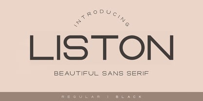 Liston is a modern multilingual elegant display font enhanced with ligatures, alternations, and strokes. Liston is a very versatile font character - with its seamless shapes and modern features it will cover a wide range of design projects from greeting cards to magazines, wedding invitations, websites, etc. The number of alternatives is incredible, from simple style alternatives to sweeps, ligatures, and alternatives. Enjoy!
 - Starsight by Gatype,
$12.00 Starsight is a modern multilingual elegant display font enhanced with ligatures, alternations, and strokes. Starsight is a very versatile font character - with its seamless shapes and modern features it will cover a wide range of design projects from greeting cards to magazines, wedding invitations, websites, etc. The number of alternatives is incredible, from simple style alternatives to sweeps, ligatures and alternatives. Enjoy!
 - Bourton Text by Kimmy Design,
$25.00 Bourton Text is a modern sans-serif typeface family perfect for both text type settings and display purposes. While it’s not a layering type family like its brother, Bourton, it come packed with features, extras and over 2,000 characters that make it stand on its own. HISTORY Bourton Text is a new take of the Bourton family that was one of the best-selling and favorite fonts of 2016. After countless requests for lowercase alphabet, or suggestions for a font pairing with Bourton, this new text setting family is based on the original shapes of Bourton. DESIGN & CREATION In taking Bourton Base was the starting point as they narrowest width and boldest weight. From there, lowercase shapes were designed that matched the aesthetic and details of the popular capitals. As Bourton was a heavy display font, some small tweaks were done to make it more fitting for smaller text settings, including reducing the letter-spacing and reworking some counters. Some areas needed complete reconstruction, such as the figures. The design of those began anew with a style that worked with the capitals and lowercase but also as a standalone set. Currency shapes were updated to match the numerals. Punctuation was also reimagined to work better in smaller type settings. Diacritics and extended language support was also updated and expanded to include full Latin plus language support for 219 latin based language spoken in 212 countries. Once the basic alphabet for Bourton Text Bold Narrow was formed, the font was expanded in both weight and width. Taking the weight from Bold down to Hairline, it allowed for more range in use. The typeface needed to be expanded in order to reach better as a book weight and width, in addition to a regular width, a wider version was create as well. FEATURES Once the extremes were set in place, small capital forms were designed for text and display purposes. These also allow for nested capital letters, lifted small caps and other display features offered in the typeface. One of the most popular fonts in the Bourton layering font family is Bourton Line. This led to an experimentation with rounded Bourton Text completely and thus a complete set of duplicated characters with rounded terminals. By using the Opentype Panel, a rounded font is a single click away. Every feature has been carefully thought out and updated across the entire font. In total, Bourton boasts over 2,300 glyphs, 42 font files with 3 widths and 7 weights in upright and italic.
 - Metal Cry by Fabulous Rice,
$25.00 Metal Cry is a font family that was inspired by countless hours spent playing video games, watching old movies or reading comic books. And even more hours closely analysing the design of all these things. The art of creating beautiful letters has slowly declined with the rise of the digital age and its solid-colour, 2D fonts. And most of the time, the care given to typography in cultural products just isn't what it used to be anymore. This was the inspiration for Metal Cry, a family of 4 layerable fonts that can bring a feeling of depth to its letters, and offers endless possible combinations. Metal Cry Outlands is the basic shape of all the characters, it can be used as the bright side of the bevel. Metal Cry Front is the inline border font that can be used as the front side of the bevel. Metal Cry Shadow can be used as the dark side of the bevel. Metal Cry Depth can be used to flash out the inside shape of the letter. But of course, any font can be combined with any other font(s) to obtain various results. The planets in the above visuals are courtesy of 3D artist Thomas Veyrat / veyratom.com
 - Ribera by URW Type Foundry,
$39.99 Ribera is a contemporary sans serif typeface including three styles. The Ribera characters have smooth curved spins and little contrast combined with a big x-height and big counters. These characteristics make Ribera ideal for almost any type of graphic design. Its unique look is well suited for corporate identity, its precise drawing for branding and poster design, the fresh look for advertising and the clear appearance for sign posting. But also editorial design benefits from Ribera. It expresses a modern look in headlines and stays highly legible in small sizes. As part of the URW++ SelecType collection, Ribera meets very high quality standards. The character set includes various OpenType features and a broad language support.
 - Belda by insigne,
$29.99 Step into the beauty of Belda’s elegant form and discover the richness flowing from both its historic influence and its strong elements. At its heart, Belda's graceful style embodies the classical calligraphy of the Roman capital, best known from such Roman monuments as Trajan's Column. To lessen the possibility for error, the builders of these defining structures brushed their templates onto the marble before taking their first cuts from the expensive stone. These simple strokes now mark a simple but wonderful path full of life and mystery. Beyond a copy of the past, Belda has grown from its roots to offer a brave, new world of potential through its still-simple structure. The new design strongly contrasts thickness and stroke. Its delicate shape, curves and sharp serifs provide a unique style of harmony and beauty. The resulting balance? The lighter weight design remains subtle and elegant, while the combination in its bolder counterparts provides an intense luster and sparkle, pulling the reader’s eye to the font’s captivating features. A quick look beyond its surface of standard forms also reveals Belda has more layers to discover with OpenType small capitals, titling capitals and more. With a wealth of weights and many widths beside, the font is capable of serving as both text and titling. While especially strong as a movie title or poster font, it’s also great for book jackets, advertising, and packaging. So start your journey with Belda. The possibilities to explore on this path are practically endless. Production assistance from Lucas Azevedo and ikern.
 - EB Corp by Eko Bimantara,
$21.00 EB Corp designed to be fit for corporate nuances. its letterforms shaped in tune with technological feels. Its shown simplicity, minimal stroke contrast, moderate spacing. Its consist of 18 styles from Thin to Black, contain 470+ glyphs that support broad latin language, contain variation of linning figures, and some alternates glyphs.
 - Provincial Railway by Fabio Ares,
$19.99 Provincial Railway is the first product of argentine typographic archeology project called "Tipografía Histórica Ferroviaria" (Fabio Ares & Octavio Osores, since 2012). Is about the signboards of the stations of the P1 line of the Provincial Railway of Buenos Aires (1907-1977). The letter of this signboards can be described as display type, with a tall box and a constructivist style, with elementary geometric shapes and without line modulation. Although without a doubt, its differential feature is provided by the rectangular shapes that it has towards the ascending and descending lines, which in some cases coincide with the stems, showing a curious rhythm in the composition of the text line. The family is completed with complementary fonts of different styles. The proceeds from the sale of the fonts will be used to finance the project.
 - Celeb MF by Masterfont,
$59.00 This happy font family derives its geometric shapes from old Hebrew typefaces with added a modern twist. Suitable for any point size with a variety of 4 weights.
 - Milk Cursive by Okaycat,
$29.50 Milk Cursive is the healthy choice. Fortify your designs & fulfill your daily textual needs with these flowing, bubbly letters. Enjoy the refreshingly natural look of an every-man's calligraphy with a fat & wide style. Milk Cursive is extended, containing West European diacritics & ligatures, making it suitable for multilingual environments & publications. It also contains some icons as extra characters, such as a star, a heart, an arrow, flowers, a butterfly, and manicules (pointing hands). Go ahead and have fun with it!
 - Pepper Sans by VIDI Visual Design Studio,
$17.99 The core design of Pepper family, designed by VIDI Visual Design Studio, is the fingertip handwriting style inspired by children’s writings on windows. This distinctive low-contrast typeface combines characteristics from neo-grotesque and organic models. Warmer than most Helvetica inspired typefaces, Pepper has organic shapes, playful strokes, rounded endings, and a generous x-height which makes Pepper easy to read. This family could be used well for food packagings, content aimed for children, book covers, branding, high-impact titles and small body texts, advertising, editorial design and more. What makes Pepper Sans Vol.1 competent and more spicy then some other fonts is that it contains a set of more than 900 characters for each of 5 weights that support many Latin-based languages, Greek and Cyrillic. As the weight decreases, the typeface gains impact with becoming elegant, giving titles in (Hair, Thin or Light) a breath of fresh air. We derived a typeface family consisting of Hair, Thin, Light, Regular, Semi Bold in this Vol.1 edition. Typeface features: • 5 weights: Hair, Thin, Light, Regular, Semi Bold • Latin, Greek & Cyrillic multilingual support • More than 900 characters for each of 5 weights Font Specs: • Created: August 2020 • Files type: .ttf
 - Dee Dee by TipografiaRamis,
$39.00 This is a second edition of Deedee type family, originally designed in 2011. Deedee is a geometric sans serif typeface family of ten styles with extended support for most Latin languages plus Cyrillic. Revisions in this edition included minor adjustments to glyph shapes and improved kerning tables. The typeface is ideal for use in display sizes and is quite legible in the text.
 - Viory by Sign Studio,
$15.00 Viory is a versatile font family. There are 7 thicknesses that match the italic version. They will complement each other to support your design. Equipped with Stylistic Set, Discretionary Ligature and Alternative Character features. Viory has a smooth shape because the pressure on each curve has been adjusted to the ideal. The impression of an elegant and classic is in this family.
 - Spektra by Type Salon,
$35.00 Spektra is a multi-script type family that combines 5 scripts: Latin, Cyrillic, Arabic, Greek and Hebrew. It is a variable font - ranging from backslant to italic axis. Its condensed and black shapes are combining the same style concept throughout every script. Progressive shapes contribute to expressing statements on bigger mediums. Spektra combines different locations, cultures and ideas as statements around the world and celebrates the differences among them. Awards • Modern Cyrillic 2021
 - Susan Sans by ParaType,
$30.00 An original text and display type family was designed for ParaType in 2008 by Manvel Shmavonyan to be used together with Susan and Susan Classic, earlier released type families by the same author. This is a low-contrast sans serif font with open letterforms. Its shape is distinguished by rounded upper parts of lower case. Susan, Susan Classic and Susan Sans forms a super family coordinated on weight, style and proportions. Susan Sans is well suited for short and middle range text composing as well as for use in advertising and display typography.
 - The Jakarta by XdCreative,
$29.00 Say hi to "The Jakarta" a stylish display sans typeface is the latest collection from @faldykudo "The Jakarta" basic technical and anatomy comes from the genetics of the "Magnify" family (Geometric classification of typefaces) with several stroke modifications and a combination smooth curves for a minimalist, elegant and modern sans serif. The Jakarta is perfect for the logo, product, headline or any of display design. The Jakarta has a complete characters A-Z, a-z (including stylistic Alternates), Numeral, Punctuations, and standard ligature. thanks, hope you would like and accept "The Jakarta" as part of your family. thank you in advance
 - Likely by Adam Ladd,
$25.00 Likely is a joyful, brush script type family with complementary sans and extras styles. Hand drawn freely but carefully, each font is designed to work together to present a vibrant and natural package. Layer and colorize the free Counter styles to easily enhance the color palette or use the over 170 matching catchwords and shapes to make your designs even more fun!
 - Rufina STD by TipoType,
$13.00 Rufina was as tall and thin as a reed. Elegant but with that distance that well-defined forms seem to impose. Her voice, however, was sweeter, closer, and when she spoke her name, like a slow whisper, one felt like what she had come to say could be read in her image. Rufina's story can only be told through a detour because her origin does not coincide with her birth. Rufina was born on a Sunday afternoon while her father was drawing black letters on a white background, and her mother was trying to join those same letters to form words that could tell a story. But her origin goes much further back, and that is why she is pierced by a story that precedes her, even though it is not her own. Maybe her origin can be traced back to that autumn night in which that tall man with that distant demeanor ran into that woman with that sweet smile and elegant aspect. He looked at her in such a way that he was trapped by that gaze, even though they found no words to say to each other, and they stayed in silence. Somehow, some words leaked into that gaze because since that moment they were never apart again. Later, after they started talking, projects started coming up and then coexistence and arguments, routines and mismatches. But in that chaos of crossed words in their life together, something was stable through the silence of the gazes. In those gazes, the silent words sustained that indescribable love that they didn't even try to understand. And in one of those silences, Rufina appeared, when that man told that woman that he needed a text to try out his new font, and she saw him look at her with that same fascination of the first time, and she started to write something with those forms that he was giving her as a gift. Rufina was as tall and thin as a reed, wrote her mother when Rufina was born.
 - Java Heritages by Heybing Supply Co,
$25.00 Java Heritages Typeface is a multi-layered type family with opentype features, inspired by vintage signage that have unique decorative shapes. Comes with 4 font system that can be layered to create different effect (Regular, Drop Shadow, Inner Shadow & Inline). Java Heritages Typeface includes a full set of character A-Z, as well as multi-lingual support, currency figures, numerals, and punctuation. Java Heritages Typeface family is perfect for logotype, gig poster, letterhead, dropcap, titles, and any artworks.
 - Nexus Typewriter Pro by Martin Majoor,
$49.00 Nexus (2004) consists of three matching variants – a serif, a sans and a slab – which makes it a highly versatile typeface. Nexus started as an alternative to Seria, a typeface Majoor had designed some 5 years earlier. But soon the design developed into a new typeface, with numerous changes in proportions and in details and with a redrawn italic. Besides the three connected versions (Nexus Serif, Nexus Sans, Nexus Mix) Majoor designed a monospaced version called Nexus Typewriter. The Nexus family is a workhorse typeface system like Scala, with features such as small caps in all weights, four different sorts of numbers and an extensive set of ligatures. All fonts in the Nexus family come in regular, italic, bold and bold italic. Free bonus: there are more than 100 elegant Swash italics and dozens of arrows and other icons. The Nexus family was awarded the First Prize at the Creative Review Type Design Awards 2006.
 - Nexus Mix Pro by Martin Majoor,
$49.00 Nexus (2004) consists of three matching variants – a serif, a sans and a slab – which makes it a highly versatile typeface. Nexus started as an alternative to Seria, a typeface Majoor had designed some 5 years earlier. But soon the design developed into a new typeface, with numerous changes in proportions and in details and with a redrawn italic. Besides the three connected versions (Nexus Serif, Nexus Sans, Nexus Mix) Majoor designed a monospaced version called Nexus Typewriter. The Nexus family is a workhorse typeface system like Scala, with features such as small caps in all weights, four different sorts of numbers and an extensive set of ligatures. All fonts in the Nexus family come in regular, italic, bold and bold italic. Free bonus: there are more than 100 elegant Swash italics and dozens of arrows and other icons. The Nexus family was awarded the First Prize at the Creative Review Type Design Awards 2006.
 - Nexus Sans Pro by Martin Majoor,
$49.00 Nexus (2004) consists of three matching variants – a serif, a sans and a slab – which makes it a highly versatile typeface. Nexus started as an alternative to Seria, a typeface Majoor had designed some 5 years earlier. But soon the design developed into a new typeface, with numerous changes in proportions and in details and with a redrawn italic. Besides the three connected versions (Nexus Serif, Nexus Sans, Nexus Mix) Majoor designed a monospaced version called Nexus Typewriter. The Nexus family is a workhorse typeface system like Scala, with features such as small caps in all weights, four different sorts of numbers and an extensive set of ligatures. All fonts in the Nexus family come in regular, italic, bold and bold italic. Free bonus: there are more than 100 elegant Swash italics and dozens of arrows and other icons. The Nexus family was awarded the First Prize at the Creative Review Type Design Awards 2006.
 - Monday Routines by Walkeren,
$21.00 Say hello to Monday! The day when your spirit is reborn. Monday Routines Font comes to complement your warm spirit to start all your fun activities. Monday Routines Font is a simple and bold signature font style designed with decisive and strong lines, provides an authoritative impression. You can use Monday Routines Font for any purposes such as branding, signatures, product packaging, titles of books or novels, or just on social media posts. Monday Routines Font includes some alternates, ligatures, and a complete set of uppercase and lowercase letters, as well as multi-language support, numbers, punctuation and comes with various swashes. Thanks so much for looking and please let me know if you have any questions. Just contact us
 - Niemeyer by Latinotype,
$36.00 Oscar Niemeyer is one of the greatest architects of our time—his unique way of mixing straight lines and abstract curves gives rise to an unmistakable and characteristic style. This typeface is my own tribute to Brazilian architect Oscar Niemeyer. The design process started when my wife and I visited Brazil while she was running a series of workshops on calligraphy. In my spare time, I would walk through the streets of beautiful cities like Rio de Janeiro or São Paulo, enjoying the local architecture and urban life. I had also the opportunity to attend to some of the workshops during which I was able to observe the organic of calligraphy and people. Then, I started to draw some shapes that reflected everything about this beautiful place: Niemeyer’s architecture and work and, in his own words ‘the curves on the body of the beloved woman’. This versatile typeface comes in 8 weights with matching italics, alternative characters, oldstyle figures and much more! Niemeyer is well-suited for logotypes, advertising, publishing, branding and corporate use. Special thanks to everyone in the Latinotype Team (especially to César Araya) for their support, help with corrections and digital editing.
 - Patron by Milieu Grotesque,
$99.00 Patron is a sans serif influenced by two dissimilar type designers, Günther Gerhard Lange and Roger Excoffon. Patron is a sans serif influenced by two dissimilar type designers, Günther Gerhard Lange and Roger Excoffon. Patron unites their contradictory approaches to create an expressive, yet versatile grotesk. As a result, Patron is characterised by a generous x-height, flared stroke endings and an unconventional shift in balance, inspired by Excoffon and a rigorously precise, modern interpretation for which Lange was most famous.
 - Washida by Crowntype Studio,
$14.00 Washida is a script type family of four fonts. It is inspired by Lovely Fonts and has a soft and welcoming look. Washida can be used for branding, packaging and wherever you need a script font that is easy to read and smooth. Washida has many ties, strokes, and alternative characters that will make your designs unique and beautiful.