10,000 search results
(0.062 seconds)
- Rotis Semi Sans by Monotype,
$40.99 Rotis¿ is a comprehensive family group with Sans Serif, Semi Sans, Serif, and Semi Serif styles, for a total of 17 weights including italics. The four families have similar weights, heights and proportions; though the Sans is primarily monotone, the Semi Sans has swelling strokes, the Semi Serif has just a few serifs, and the Serif has serifs and strokes with mostly vertical axes. Designed by Otl Aicher for Agfa in 1989, Rotis has become something of a European zeitgeist. This highly rationalized yet intriguing type is seen everywhere, from book text to billboards. The blending of sans with serif was almost revolutionary when Aicher first started working on the idea. Traditionalists felt that discarding serifs from some forms and giving unusual curves and edges to others might be something new, but not something better. But Rotis was based on those principles, and has proven itself not only highly legible, but also remarkably successful on a wide scale. Rotis is easily identifiable in all its styles by the cap C and lowercase c and e: note the hooked tops, serifless bottoms, and underslung body curves. Aicher is a long-time teacher of design and has many years of practical experience as a graphic designer. He named Rotis after the small village in southern German where he lives. Rotis¿ is suitable for just about any use: book text, documentation, business reports, business correspondence, magazines, newspapers, posters, advertisements, multimedia, and corporate design.Today Rotis ia also available with pan european caracter set.
 - Rotis Semi Sans Paneuropean by Monotype,
$92.99Rotis¿ is a comprehensive family group with Sans Serif, Semi Sans, Serif, and Semi Serif styles, for a total of 17 weights including italics. The four families have similar weights, heights and proportions; though the Sans is primarily monotone, the Semi Sans has swelling strokes, the Semi Serif has just a few serifs, and the Serif has serifs and strokes with mostly vertical axes. Designed by Otl Aicher for Agfa in 1989, Rotis has become something of a European zeitgeist. This highly rationalized yet intriguing type is seen everywhere, from book text to billboards. The blending of sans with serif was almost revolutionary when Aicher first started working on the idea. Traditionalists felt that discarding serifs from some forms and giving unusual curves and edges to others might be something new, but not something better. But Rotis was based on those principles, and has proven itself not only highly legible, but also remarkably successful on a wide scale. Rotis is easily identifiable in all its styles by the cap C and lowercase c and e: note the hooked tops, serifless bottoms, and underslung body curves. Aicher is a long-time teacher of design and has many years of practical experience as a graphic designer. He named Rotis after the small village in southern German where he lives. Rotis¿ is suitable for just about any use: book text, documentation, business reports, business correspondence, magazines, newspapers, posters, advertisements, multimedia, and corporate design.Today Rotis ia also available with pan european caracter set. - Rotis Semi Serif Paneuropean by Monotype,
$92.99Rotis¿ is a comprehensive family group with Sans Serif, Semi Sans, Serif, and Semi Serif styles, for a total of 17 weights including italics. The four families have similar weights, heights and proportions; though the Sans is primarily monotone, the Semi Sans has swelling strokes, the Semi Serif has just a few serifs, and the Serif has serifs and strokes with mostly vertical axes. Designed by Otl Aicher for Agfa in 1989, Rotis has become something of a European zeitgeist. This highly rationalized yet intriguing type is seen everywhere, from book text to billboards. The blending of sans with serif was almost revolutionary when Aicher first started working on the idea. Traditionalists felt that discarding serifs from some forms and giving unusual curves and edges to others might be something new, but not something better. But Rotis was based on those principles, and has proven itself not only highly legible, but also remarkably successful on a wide scale. Rotis is easily identifiable in all its styles by the cap C and lowercase c and e: note the hooked tops, serifless bottoms, and underslung body curves. Aicher is a long-time teacher of design and has many years of practical experience as a graphic designer. He named Rotis after the small village in southern German where he lives. Rotis¿ is suitable for just about any use: book text, documentation, business reports, business correspondence, magazines, newspapers, posters, advertisements, multimedia, and corporate design. Today Rotis ia also available with paneuropean caracter set. - Rotis Semi Serif by Monotype,
$40.99 Rotis¿ is a comprehensive family group with Sans Serif, Semi Sans, Serif, and Semi Serif styles, for a total of 17 weights including italics. The four families have similar weights, heights and proportions; though the Sans is primarily monotone, the Semi Sans has swelling strokes, the Semi Serif has just a few serifs, and the Serif has serifs and strokes with mostly vertical axes. Designed by Otl Aicher for Agfa in 1989, Rotis has become something of a European zeitgeist. This highly rationalized yet intriguing type is seen everywhere, from book text to billboards. The blending of sans with serif was almost revolutionary when Aicher first started working on the idea. Traditionalists felt that discarding serifs from some forms and giving unusual curves and edges to others might be something new, but not something better. But Rotis was based on those principles, and has proven itself not only highly legible, but also remarkably successful on a wide scale. Rotis is easily identifiable in all its styles by the cap C and lowercase c and e: note the hooked tops, serifless bottoms, and underslung body curves. Aicher is a long-time teacher of design and has many years of practical experience as a graphic designer. He named Rotis after the small village in southern German where he lives. Rotis¿ is suitable for just about any use: book text, documentation, business reports, business correspondence, magazines, newspapers, posters, advertisements, multimedia, and corporate design. Today Rotis ia also available with paneuropean caracter set.
 - Macho Moustache by CAST,
$45.00 Macho Moustache is closely related to Macho Modular , the parent type with which it shares modular widths and most letterforms. The difference is that Macho Moustache follows the ‘Grotesque' tradition of tight apertures for a, c, e and s as well as some of the numerals. Original design work started together with Macho Modular in 2008. Now the range and communication potential of the Macho family has been developed with five weights. Since the Macho family was designed bearing in mind the idea of Themerson's semantic typography, Macho Moustache features all sets of modular brackets and underlinings.
 - King Xmas Trial - Unknown license

- African Elephant Trunk by Dharma Type,
$14.99 Based on retro vinyl records in the early and middle of 20th century. This font includes small caps for advanced typography. There are three other fonts designed by in the same concept. -Moon Star Soul -Rebel Train Goes -Word From Radio -African Elephant Trunk
 - Daisy Lau by Dharma Type,
$19.99 Based on some script in the 19th century. Inky texture gives realistic handwriting appearance. Smooth writing feeling creates antiqued and nostalgic atmosphere. Rising Star on March 2007. There are two other script designed by in the same concept. -Daisy Lau -Lily Wang -Pansy Bo
 - TCF Diple by TypeCult Foundry,
$22.00 TCF Diple is a sans serif typeface, characterised by the presence of the hand. The letter shapes introduce soft and delicate curvilinear strokes and refined contrast, that contribute to a comfortable and pleasant reading. Available with seven weights and matching italics, TCF Diple comes with extended Latin language support, and multiple options for the numerals available through the OpenType features.
 - Spirit of 69 by Mysterylab,
$21.00 Here's a lively new take on the swirly psychedelic type we all know and love, Spirit of '69 brings in some subtle dimensions of waviness to the vertical strokes, upslanted horizontal strokes, and alluring paisley shapes formed out of the negative spaces. This is a unicase font, in the grand tradition of the Art Nouveau lettering of the early 20th century, and the melty groovy fonts of the 1960s. Lots of fun and beautiful too!
 - Sackers Square Gothic by Monotype,
$34.99Sackers Roman is an engraver, all-capitals family for invitations and stationery. The letters have strong contrast between thin and thick strokes. See also Sackers Gothic, Sackers Square Gothic, Sackers Script, and Sackers Classic Roman. - Sackers Roman by Monotype,
$29.99Sackers Roman is an engraver, all-capitals family for invitations and stationery. The letters have strong contrast between thin and thick strokes. See also Sackers Gothic, Sackers Square Gothic, Sackers Script, and Sackers Classic Roman. - Sackers Solid Antique Roman by Monotype,
$29.99Sackers Roman is an engraver, all-capitals family for invitations and stationery. The letters have strong contrast between thin and thick strokes. See also Sackers Gothic, Sackers Square Gothic, Sackers Script, and Sackers Classic Roman. - Sackers Script by Monotype,
$40.99Sackers Roman is an engraver, all-capitals family for invitations and stationery. The letters have strong contrast between thin and thick strokes. See also Sackers Gothic, Sackers Square Gothic, Sackers Script, and Sackers Classic Roman. - Sackers Classic Roman by Monotype,
$29.99Sackers Roman is an engraver, all-capitals family for invitations and stationery. The letters have strong contrast between thin and thick strokes. See also Sackers Gothic, Sackers Square Gothic, Sackers Script, and Sackers Classic Roman. - Carelia by My Creative Land,
$29.00 Carelia is a modern multilingual (including cyrillic) serif family with classic forms, enhanced by extended OpenType features. It is well suited for all sorts of design - starting from web, to editorial and branding. Its stylistic alternates, swashes and ligatures (more 1200 glyphs in each font) will make your design even more stylized and unique. Carelia comes in two styles Upright and Italic - each has it's own character but both share the same curves and style. Both fonts are fully unicode mapped - can be used in any application of your choice.
 - Tigbrush by Sipanji21,
$19.00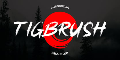 "Tigbrush" is a simple and realistic brush font that adds an authentic touch to your designs. Perfect for headlines and various design projects, its natural brush strokes create a versatile and captivating typographic element. With its effortless charm, "Tigbrush" brings a handcrafted feel without the need for actual brushwork.
 - Impact by URW Type Foundry,
$35.99 Impact As its name suggests, Impact, a bold sans serif, is designed to make an impression on the reader. Obviously a display font, Impact makes use of its thick strokes and blocked style, to catch and hold the eye. Because Impact is so striking, it is best placed in plenty of white space so that it does not overwhelm any accompanying text.
 - Metropolis by Monotype,
$29.99Metropolis was designed by W. Schwerdtner and released in 1928. The tapered strokes give the impression of height. The Metropolis font family shares an attractive, informal headline design. - American Christmas by Mans Greback,
$79.00 American Christmas is a funky and decorative season's typeface. As a cozy winter script, it brings a festive touch to every word, with letters that seem to dance joyously across the page. Its bold flow is reminiscent of retro holiday signage, evoking a sense of nostalgia and warmth. This typeface is adorned with stars that twinkle like lights on a tree, adding a sparkle to your seasonal greetings. This typeface family is provided in three starry versions and one clean, and also comes with an extra symbol font for beautiful Xmas icons. Use parenthesis symbols () [] {} to make stars around any word. Example: {Xmas}[Songs] Use underscore _ after any word to make a swash. Example: Santa_ Multiple underscores make longer tails. Example: Yuletide____ The font is built with advanced OpenType functionality and guaranteed top-notch quality, containing stylistic and contextual alternates, ligatures and more automatic and manual features; all to give you full control and customizability. It has extensive lingual support, covering all Latin-based languages, from North Europa to South Africa, from America to South-East Asia. It contains all characters and symbols you'll ever need, including all punctuation and numbers. With American Christmas, Mans Greback has crafted a typeface that captures the essence of the holiday spirit. Each character is designed to convey the excitement and heartfelt connection of the season, making it an ideal choice for those moments when you want your message to be wrapped in the warmth of the holidays.
 - Bohemian Initials by Kaer,
$24.00 I’m happy to present you the Bohemian initials font family. Regular and Colored styles (Uppercase & Numbers) based on Codex Gigas originated in medieval Bohemia. The manuscript has been dated 1230. The elaborate initials are at the beginning of the main texts and their principal divisions. The painter was aiming to achieve a plastic depiction of the trailing vines of the initials, and he painted with solid colours. He used only four of the primary colours cinnabar red, blue, green and yellow, brightly toned, as well as white accents and contours. The trailing vines of the initial letters are painted in a decorative, advanced Romanesque style, already bordering on naturalism. The plant taken as the starting point is the acanthus, a thistle-like plant which grows wild in the Mediterranean countries. The decoration of the Devil’s Bible is not the work of an amateur. Scholars have concurred: it is book illuminations created in Northeast France and Southern England in the so-called Channel style which provided the starting point for the coiled trailing-vine shapes in the initials of the Devil’s Bible. --- You can use color fonts in PS CC 2017+, AI CC 2018+, ID CC 2019+, macOS 10.14 Mojave+ Please note that the Canva & Corel & Affinity doesn't support color fonts! --- Please feel free to request any help you need: kaer.pro@gmail.com Thank you!
 - Best Hero by Yoga Letter,
$16.00 "Best Hero" is an elegant and unique font with star decoration on each letter. This font is equipped with uppercase, lowercase, numerals, punctuations, multilingual support. Very suitable for the nuances of struggle, 4th of july, teacher, father's day, graduation, film titles, magazines, book titles, promotions, banners, branding, stickers and others.
 - Faux Hebrew by Page Studio Graphics,
$24.00 The simulated font is based on the characteristic Hebrew calligraphy. Some of the original Hebrew characters have been given new roles, others modified to resemble modern Latin characters. The font includes an upper case alphabet, numerals, and basic faux punctuation, plus Harp of David, Menorah, and Star of David symbols.
 - Take Charge JNL by Jeff Levine,
$29.00 Take Charge JNL is based on the opening title card for the 1936 film "The Charge of the Light Brigade" starring Errol Flynn and Olivia de Havilland, Donald Crisp and David Niven. The typeface is a simple, bold titling font with the slight feel of Art Deco influence in its design.
 - Binner Poster by Monotype,
$29.99Binner was designed by John F. Cumming in 1898 and is an alphabet with a strongly historic character. It takes the reader back to the early part of the 20th century, when typefaces of this kind could be found in advertisements on houses and posters. The robust figures display a marked stroke contrast. Particularly striking are the high middle strokes of the E and F as well as the wavy connecting stroke of the H. The curves of the R and P extend well into the lower third of the characters. With its robust figures, Binner is best used for headlines in middle and larger point sizes. - Violety Dreams by Nathatype,
$29.00 Violety Dreams is a serene and elegant serif font that will transport your designs to a realm of beauty and sophistication. With its timeless letterforms and delicate swinging strokes on select letters, this typeface evokes a sense of tranquility and grace. This serif uniqueness in its graceful swinging strokes, which adorn certain letters, adding a touch of whimsy and charm. These elegant extensions create a sense of movement and fluidity, capturing the essence of grace and elegance. Inspired by the ethereal nature of dreams and the delicate beauty of violet flowers, Violety Dreams embodies a sense of tranquility and enchantment. The serif letterforms are meticulously crafted to exude elegance and sophistication, while the swinging strokes add a unique touch of whimsicality. This font strikes a perfect balance between classic charm and imaginative flair. The letterforms are designed with precision and clarity, ensuring legibility and readability. Each letter retains its distinctive shape, while the swinging strokes create a visual interest and draw the eye. You can use it in big text sizes to be greatly legible and enjoy the available features here. Features: Stylistic Sets Multilingual Supports PUA Encoded Numerals and Punctuations Violety Dreams is well-suited for headings, titles, invitations, wedding stationery, luxury branding, editorial layouts, branding materials, and any design project that calls for an elegant and dreamy typography. Find out more ways to use this font by taking a look at the font preview. Thanks for purchasing our fonts. Hopefully, you have a great time using our font. Feel free to contact us anytime for further information or when you have trouble with the font. Thanks a lot and happy designing
 - Sweet Holidays Brush by Stripes Studio,
$20.00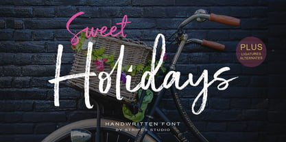 Sweet Holidays Brush is a super casual hand brushed script with detailed brush stroke texture, and a quirky, Can be used for various purposes. such as the title, signature, letterhead, signage, labels, newsletters, posters, logos, correspondence, wedding invitations, badges, etc.
 - Bridle Path by Cititype,
$19.00 ‘Bridle Path’ is a captivating font that embodies the graceful beauty of natural ink strokes. With its unique blend of thick and light strokes, it exudes a tranquil and soulful writing style that is both relaxed and inviting. The font's distinctive character makes it an excellent choice for various applications, including brands, logos, photography logo watermarks, headers, titles, weddings, cards, and website banners. The fluidity of Bridle Path’s design creates an enchanting visual experience, as if each letter was crafted by an artist's brush. The thick strokes provide a sense of boldness and strength, while the light strokes add delicacy and elegance to the overall appearance. This combination results in a font that captures attention and leaves a lasting impression. Bridle Path’s versatility extends beyond its aesthetic appeal. It has been meticulously crafted to support multilanguage usage, ensuring that it can seamlessly adapt to various linguistic needs. Whether your content is in English, Spanish, French, German, or any other language, Bridle Path will faithfully represent your words with clarity and beauty. Whether you're seeking a font that embodies a serene atmosphere or one that adds a touch of sophistication, Bridle Path is the perfect choice. Its soothing and expressive nature elevates any design, making it a valuable asset for both professional and personal projects. Embrace the allure of ‘Bridle Path’ and bring a sense of natural elegance to your creations.
 - Haakke by Dawnland,
$13.00 Haakke (or Håkke) - a casual, hand drawn (Stabilo OH pen, Fine) font with 4 alternates to all upper and lower case letters (a-z + å ä ö) as well as numbers for a realistic hand written look and feel! “Ligatures” have been created for double letters (TT, tt, ff, ll & LL (open type version of the font and open type compatible layout application required). Of course it holds all(?) the special characters that you will ever need. 451 glyphs... Haakke also includes symbols. Zodiak signs (letter a-l, upper case A-L write the corresponding name of the sign), planet signs (m-z, upper case M-Z write the corresponding name of the planet) triangles, squares and stars (from pentagrams (5 pointed) to Dodecagrams (12 pointed). (Write a 4, or shift-4 ("euro-sign", european keyboard, or "dollar sign", american keyboard) before your star or triangle and you will get a circle around it).
 - Water Street - Unknown license

- PF Bague Inline Pro by Parachute,
$79.00 Bague Inline Pro is the inline version of Bague Universal a contemporary geometric typeface family which blends distinct minimalist characteristics with mainstream details. Despite its inspiration from Herbert Bayer’s drawings of the 1920s, it diverts from the constructivist rigidity and display structure of early geometric typefaces by incorporating humanist characteristics as well as classic letterform shapes which balance out the extremity of the minimal shapes. Bague Inline is a typeface that stays true to its urban nature and heritage. A very interesting feature of Bague Inline is its vast array of uppercase alternates and ligatures which truly shine when set at display sizes. Make your selection from 4 groups of alternates as well as a rich set of discretionary ligatures and watch it transform into a flexible, charming and stylish typeface with strong modern aesthetics. This typeface offers enormous possibilities and variations for editorial design and branding. Bague Inline is the only commercially available inline typeface that comes in 4 weights for uppercase and lowercase letters. Each style consists of 775 glyphs with more that 128 alternates and ligatures and an extended set of characters which supports simultaneously Latin, Cyrillic and Greek. PDF Specimen Bague Inline on Behance
 - Dark Razoor Graffiti by Sipanji21,
$13.00 This Fonts designed so that users can use it more easily and make graffiti designs easier. Dark Razoor is very suitable for use in various media such as; packaging, logos, labels, posters, shirt designs, bulletins, typography, and many other media, especially with graffiti look. Features: All Caps PUA Encoded open Support for MAC or PC Simple installation for Adobe Illustrator, Corel Draw, Photoshop, or Procreate (New Updated) That's it! If you have any questions don't hesitate to ask! Stay Classy!
 - Thwaites by Eyad Al-Samman,
$20.00 ‘Thwaites’ typeface is fully dedicated to one of my best Canadian friends who I do cherish and value highly. This great and industrious Canadian friend is ‘James Douglas Thwaites’ who lives along with his good-natured family in British Columbia, Canada. For me, James is like a source of inspiration and I do consider him as an ideal in my life. Our strong friendship has started since 1999 and I hope that it will endure just to the last moment of my life. Sometimes I see him as the writer and poet that I learn a lot from, sometimes I see him as a devoted religious minister that I try to understand more about his teachings, and other times I see him as the educator that I strive to imitate verbatim in my life. When I want to talk more about this Canadian friend, I will not be able to give him his due in full. Thus, I will instead mention some excerpts of his biography that he wrote himself saying that: “James D. Thwaites is a self-accomplished man. Having worked in various fields including restaurant management and cleaning, he has achieved his goals of being a full-time teacher, past-time writer, and volunteer religious minister for the Christian Congregation of Jehovah's Witnesses. His personal and academic pursuits have led him to be published in various magazines, newspapers, self-published books, and websites, including his now defunct ‘poetryofthemonth.com’ website. He continues to learn and augment the craft of writing while working primarily in early literacy and delayed literacy learners, teaching reading and literature to a wide age range of students. He views his religious endeavors as an extension of his academic ones. He teaches others both as a public speaker and in one-on-one situations, teaching about the benefits of submission to God and to His teachings. His future goals include expanding his ministry and continuing his writing.” The name ‘Thwaites’ itself comes from Great Britain and originated from the last Viking raids upon England, being an Anglicized version of a Scandinavian term meaning—depending on the source material—either "a place that is difficult to approach" or "a small thicket of trees." Another recitation mentions that ‘Thwaites’ can be described also as an English surname but one of pre 7th century Norse-Viking origins. It may be either topographical or locational, and is derived from the word "thveit", meaning a clearing or farm. As a locational surname it originates from any one of the various places called "Thwaite", found in several parts of Northern England and East Anglia to the south. The various modern spelling forms include Thwaite, Thwaites, Thwaytes, Thoytes, Twaite, Twatt, Twaites, Tweats and Twite. The name, although often appearing unique to outsiders, can often be found within other famous names like Braithwaite, Goldthwaites, or Misslethwaites. With various spellings, some families not including the ‘e’ or the ‘s’ at the end, Thwaites and its derivations—although not exceedingly common—is a name found worldwide. ‘Thwaites’ typeface is simply a sans-serif streamlined, stylish, and versatile font. It is designed using a combination of thick and thin strokes for its +585 characters. Its character set supports nearly most of the Central, Eastern, and Western European languages using Latin scripts including the Irish language. The typeface is appropriate for any type of typographic and graphic designs in web, print, and other media. It is also absolutely preferable to be used in the wide fields related to publication, press, services, and production industries. It can create a very impressive impact when used in headlines, posters, titles, products’ surfaces, logos, medical packages, product and corporate branding, and also signage. It has also both of lining and old-style numerals which makes it more suitable for any printing or designing purposes. ‘Thwaites’ typeface is really the cannot-miss choice for anyone who wants to possess unique artistic and modern designs produced using this streamlined typeface.
 - Qidango by Sealoung,
$21.00 Introducing, Qidango is a serif typeface created with elegance and luxury, exuding femininity and glamour, but also a side of beauty with many alternatives to help you create endless variations for your creative needs. Featuring an italic style with striking contrasts and subtle details, as well as luxurious strokes and voluptuous curves, it creates a beautiful and powerful statement for any typographic composition, combining glamor with a contemporary aesthetic.
 - Matondo Pro by AukimVisuel,
$9.00 The Matondo Pro Family is a marvelous, elegantly designed font family. This sans serif doubles as a display font, because of it’s unique shapes. The Matondo Pro font family is guaranteed to make your design stand out from the crowd, and leave a lasting impression.
 - ATF Poster Gothic by ATF Collection,
$59.00 ATF Poster Gothic is an expansion of a typeface designed in 1934 by Morris Fuller Benton for American Type Founders. The one-weight design was a slightly condensed display companion to Benton’s ubiquitous Bank Gothic family. This new family of aggressively rectilinear headline types expands the design’s possibilities, offering 30 fonts. The all-cap design sports square corners in the counters, creating tension between angular and curved details; this feature, and the generally rectangular shape of the whole alphabet, makes ATF Poster Gothic distinctive on the page or screen, while its relationship to Bank Gothic makes it seem somehow familiar. Vertical strokes on the C, G, J, and S, as well as on several of the numerals, are cut off at an angle, which suggest the curves those strokes might typically display if the characters were less boxy in design and more along the lines of late-19th-century headline faces. Certain weights also recall the style of lettering used on athletic team jerseys, television crime dramas, action & adventure movie titles, and engraved stationery. With three widths and five weights, ATF Poster Gothic is distinctive and versatile at the same time. The full family is also available in a “Round” version, with corners subtly rounded for a softer, more “printed” feel.
 - Blitzen by Anastasia Kuznetsova,
$16.00 Introducing the Blitzen font! Blitzen is a fabulous and playful but striking font. These are massive, hand-drawn letters that are guaranteed to stand out, whether on lighthearted product designs or more spectacular quote designs. Ideal for quotes, lattering projects, packaging of goods... so many things! Font Features A-Z; a-z character set; 1 language (English); numbers and punctuation marks, symbols A font containing uppercase and lowercase letters, numbers, and a wide range of punctuation marks. Fonts can be opened and used in any software that can read standard fonts, even in MS Word. No special software is required, and to get started. It is recommended to use it in Adobe Illustrator or Adobe Photoshop Made with love ♡
 - WBP Emperio by Studio Jasper Nijssen,
$20.00 A classic serif font with a twist. WBP Emperio has an interesting shape. She has rounded corners and a slightly 'curvy' look. The little indent makes her stand out above the rest. A sensation in the making. Emperio has two styles. The Regular: Great for designing friendly corporate identities. And there's the Hand Drawn style: Great for design posters of prints with a handmade feel. Combine the two and you can go infinite. WBP Emperio was a sketch I designed when I started my company. So you can say it's been five years in the making XD. When I was invited to add two pages to the Typodarium 2022, I speeded up the process and added the hand-drawn style. The end result is awesome. A classic serif font, with a crazy extra style.
 - Golden Signer by Letrasupply Typefoundry,
$20.00 Golden Signer was inspired by vintage and tattoo letters. The font family comes with Regular and Serif type, completed with alternates characters, deboss style, shapes and also free ornaments. Golden Signer is a perfect package for any project that needs display lettering.
 - Boisterous Fun by Missy Meyer,
$12.00 Have you ever been drawing out the letters for a font, then you start making some multi-letter ligatures? Then you think up some more to make, and you make those too? And you keep making them, until you have over a hundred of them? No? Just me? Boisterous Fun is a font that started out simple -- a nice handwriting style with a single stroke width. But add in the ligatures, plus a dozen single-letter alternates and my usual crowd of accented characters for language support, and this baby has grown to over 600 characters total. It's a great casual font for branding or packaging, but it's also smoothed so it's easy for cutting. Boisterous Fun includes: - The usual A-Z, a-z, 0-9, and lots of punctuation; - Over 300 extended Latin characters for language support; - 140 alternates and ligatures for variety, all PUA-encoded for easy use! I had a ton of fun making it, and I hope you have a ton of fun using it!

