10,000 search results
(0.079 seconds)
- Hera Big by Lucas Sharp,
$40.00 Hera Big is a type family in eight weights & 16 fonts. The family explores the motion and fluidity of the ball serif, in an evolution from its previous identity as a counterpart to the slab serif. Informed by great fat-faces from Figgins to Lubalin, but never deferring to precedent by default, Hera is a fresh mix of originality and organic form, never sacrificing function for beauty.
 - Veneribe by Greater Albion Typefounders,
$10.95 Veneribe -the Venerable face- is an experiment in what many today might call 'grunge', though we at Greater Albion would probably prefer to talk of rustic (or if we're feeling really old-fashioned rustick) charm. It's a derivative of our Clementhorpe family, and aims to combine a battered antique look with the charm of that decorative Roman family. Regular and oblique forms are offered.
 - Stannum by Eko Bimantara,
$21.00 Stannum is a modulated display sans font family. It enriched by letterforms that shown a simple, classic and elegant impression. Its a compact font family that consist of 9 style of weight, from thin to black. It consists of 380s of glyphs which support broad latin languages. This font is fit for display, large usage, brand, titles, short text, web headlines and ample of other possibilities.
 - Antario by Locomotype,
$15.00 Antario is a high-contrast sans-serif font with a classic rounded style so it looks elegant and attractive. Available in two styles, Regular and Bold including various OpenType features such as disrectional ligatures, swashes, stylistic sets, fraction etc. Antario font also supports multilingual including Cyrillic. With more than 600 glyphs, you can be more creative in creating various types of typography in graphic design.
 - Mr Eaves Sans by Emigre,
$59.00 Mr Eaves is the sans-serif companion to Mrs Eaves, one of Emigre’s classic typeface designs. Created by Zuzana Licko, this 2009 addition to the Emigre Type Library expands the versatility of the original Mrs Eaves with two complementary families: Mr Eaves Sans and Mr Eaves Modern. Mr Eaves was based on the proportions of Mrs Eaves, but Licko took some liberty with its design. One of the main concerns was to avoid creating a typeface that looked like it simply had its serifs cut off. And while it matches Mrs Eaves in weight, color, and armature, Mr Eaves stands as its own typeface with many unique characteristics. The Sans version relates most directly to the original serif version, noticeably in the roman lower case letters a, e, and g, as well as in subtle details such as the angled lead in strokes, the counter forms of the b, d, p, and q, and the flared leg of the capital R, the tail of the Q. The distinctly loose-fitting letter spacing of Mrs Eaves was applied also to the Sans version. This, together with generous built-in line spacing due to a small x-height and extended ascenders and descenders, renders the same kind of lightness and airiness when setting text that is so characteristic of Mrs Eaves. Deviations from the original Mrs Eaves are evident in the overall decrease of contrast, as well as in details such as the flag and tail of the f and j, and the finial of the t, which were shortened to maintain a cleaner, sans serif look. And the lower case c had to be balanced out differently after it lost its top ball terminal. And with the loss of serifs, Mr Eaves set width is slightly narrower. Mr Eaves Italic also carries over many forms from its Mrs Eaves model, most notably the v, w, and z, which are unusually flamboyant for a sans italic design. It also utilizes lead in and terminal tails that are reminiscent of the serif italic. The biggest departure here is the width of the characters. The extra narrow gauge and delicate features seemed more appropriate for the Serif than the Sans. To allow for a comfortable fit, Mr Eaves Italic has a more robust design and wider character width. Meanwhile, the Modern family provides an overall less humanistic look, with simpler and more geometric-looking shapes, most noticeably in the squared-off terminals and symmetric lower case counters. This family has moved furthest from its roots, yet still contains some of Mrs Eaves' DNA. The Modern Italic is free of tails, and overall the Modern exhibits more repetition of forms, projecting a cleaner look. This provides stronger differentiation from the serif version whenever a more contrasting look is desired. Each version (Sans and Modern) contains its own set of alternates providing unique options for applications such as headlines, word logos, letterheads, pull quotes, and other short text settings. Both the Sans and Modern come in three weights. The simpler forms of a sans-serif provide the opportunity of more weights than do serif letter forms, which are more complex in structure, making it difficult to accommodate additional weight without distortions. Regular and Bold match the original Mrs Eaves weights, while the Heavy provides an additional weight for extra emphasis.
 - Baldufa by Letterjuice,
$66.00Baldufa is a charming typeface with strong personality, which looks very comfortable in text. There is a search to obtain complicated curves and detailed features, which give the typeface a touch of beauty and elegance. However, this is also a self-conscious design that claims appreciation for quirkiness and human imperfection through the rounded serifs and irregular vertical stems. The typeface family is also a multi script project, containing Latin and Arabic scripts. The Latin consists of Regular, Bold and Italic styles, including Small Caps and many other typographic features. Whereas Arabic Naskh includes Regular and Bold weights. The whole family has been designed to work harmoniously together to help to produce catalogues and small publications of cultural content. We believe that Baldufa is a tiny but nice contribution to build bridges between cultures and this make us very happy. The letterforms in the Latin are inspired by the slight distortions and idiosyncrasies that came with old printing methods. It has distinct, features such as rounded serifs, irregular vertical streams, ink traps and extremely thin junctions. In the Italic, serifs have been removed to enhance movement and expressivity. These experiments in form have not come at the cost of legibility: The typeface remains suitable for both small and display text. To certain extent, the design of the Arabic gathers the same interest for experimentation than its Latin companion. Baldufa Arabic respects the basic features of Arabic script such as thick stokes in the baseline, multiple vertical axis, genuine stem modulation and good linking between words. However, it steps away from traditional Calligraphic Style. It has rounded top terminals and the traditional contrast between curves and straight stokes has been softened. Letter shapes sometimes slightly differs from tradition in order to obtain more expressivity. Overall, Arabic has been designed to acquire the same elegant and quirky aspect of the Latin. - Strong Beast by Ironbird Creative,
$15.00 Strong Beast is a BOLD AND STRONG ALL CAPS organic hand-drawn typeface. This item consists of 7 FONTS in various styles which you can play around with it. NOTE : Please Check the Help File first and for all the characters are also available, accessible in the Adobe Illustrator Glyphs Panel, or in Adobe Photoshop Character Open Type Panel. We hope you enjoy the font, please feel free to comment if you have any thoughts or feedback. Thanks for purchasing and have fun! Regards, Ironbird Creative
 - Open Sans Soft by Matteson Typographics,
$9.95 Open Sans Soft is the warm and friendly cousin of the web’s 2nd-most viewed font family – Open Sans designed by Steve Matteson. Open Sans Soft tones down your communications by adding organic-looking curvature to the corners of letters. A similar effect is found in such popular fonts as Microsoft’s Calibri and Linotype’s DIN Next. Open Sans Soft approximates the same, proven letterforms and letter spacing as Open Sans making it a wonderful companion for any application – correspondence, headlines, branding, packaging or interface design.
 - Stonecrop by Andrew Harper Fonts,
$5.00 Stonecrop is a font unified by bold, imposing lines as well as its use of rounded rectangles as the central stylistic shape. Stonecrop loosely conforms to the monospaced font style, with near-equal widths for all letters and numbers (but not all symbols/punctuation), however it does incorporate kerning for all types of glyphs where appropriate to aid in legibility. A perfect font for usages that demand consistency and precision, while still maintaining a quirky and stylized handwritten effect.
 - Heritage Signature by Lunas Type,
$19.00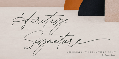 Introducing, Heritage Signature! Heritage Signature is a modern and stylish signature font. This Font have natural flow and unique shape for each letter. Heritage Signature is perfect for many design needs such as merch, T-shirts, signature logo, wedding, book covers, social media posts, websites, events, and many more. What’s you get : – Ending Swashes, beginning swashes, Love connector swashes. – Underline Swashes (just type _1, _2, etc) – Numeral & Punctuation. – ligature. – Multilingual Support. Enjoy Designing! Thanks! Lunas Type
 - Mahezty by DRM Works,
$19.99 Mahezty is a modern, bold and fashionable serif display font. This font is imposing and features uniquely shaped letters, and as a result, it will easily match a wide range of creations that require a distinct touch. Mahezty is perfect choice for people looking for modern, minimalist, elegant, clean, beauty design styles. Suitable for almost any graphic designs such as identity, business cards, branding materials, gift cards, t-shirt, cover, thumbnail, print, poster, photography, quotes .etc
 - Sellia by Scoothtype,
$9.00 "Sellia," a delightful handwritten font meticulously crafted with love and attention to detail. This font encapsulates the essence of joy and brings a touch of whimsy to your design projects. "Sellia" embodies the playful nature of handwritten script, with its charming curves and natural stroke variations. Every letter reflects the genuine warmth and sincerity of my handwriting, infusing your designs with a sense of individuality and happiness. With its elegant yet cheerful style, "Sellia" is versatile and perfect for a wide range of creative applications. Whether you're designing logos, branding materials, invitations, greeting cards, or any project that calls for a lighthearted touch, this font will add a touch of enchantment. The meticulously designed letterforms of "Sellia" ensure both legibility and artistic appeal. Its balanced proportions and thoughtfully crafted characters make it a pleasure to work with, whether on digital or printed mediums.
 - Urban Tour by Roland Hüse Design,
$10.00 -This font has been basically designed for poster display in black weight and big size (mostly for capital letters). The rest of the family is a derivative work of it. I can’t guarantee if it works well on small size print. -Future updates may follow in the near future or on request. Please feel free to contact me via rolandhuse@aol.com about the following: -This family does not contain all the language extensions, but I am willing to create any extensions (including Cyrillic) on request; - Discovering kerning problems while using; Or any other question.
 - Kroine by Craft Supply Co,
$20.00 Meet Kroine – Versatile Serif Typeface Kroine redefines versatility. It’s a serif that suits any display size. Subtle Elegance in Low Contrast Its low contrast strokes offer modern simplicity. Also, Kroine delivers a clean reading experience. The delicate serifs enhance legibility, perfect for extended text. Designed for Flexibility Kroine thrives in both small and large displays. Furthermore, its uniform thickness ensures consistency. Thus, it becomes an ideal choice for diverse design needs.
 - Quirky Notes by Insan Perkasya,
$12.00 Introducing the "Quirky Notes" font, which is a handwriting font made specifically for notes, but even though it is specifically for notes, this font is also very suitable for other things, such as quotes, lesson schedules, branding, logos and others. Quirky Notes font is made by handwriting so it produces natural strokes but is still beautiful to use. If you have any questions, don't hesitate to contact us. Thank You
 - Kaleko 105 Remix by Talbot Type,
$19.50 A remixed variation, available in three weights, of the popular Talbot Type geometric sans Kaleko 105 . The addition of occasional flourishes at the intersections of strokes, in both upper and lower case, adds character charm, making the font a perfect titling font to accompany Kaleko 105, or a display font in its own right. Kaleko 105 Remix features a comprehensive glyph set including accented characters for central European languages.
 - Convexion by Typogama,
$19.00 Designed as a versatile and functional family, Convexion is the result of a personal exploration into the use of convex forms in serif designs. Its humanist form is inspired by a fusion of classical serif forms with the more expressive forms found in script lettering, to create a legible yet original typeface family. Consisting of 3 weights, with accompanying cursive inspired italics, this family is suited for a wide range of applications such as branding that will expose its defined personality or editorial design were it can be used for both display titles or text. This family supports a range of Opentype features, offering multiple numeral styles, ligatures and other alternate glyphs. With an extended Latin glyph set, it will support most Latin based languages.
 - Rotosh BKL Regular by Bakeel Studio,
$35.00 Rotosh BKL Regular Font is a modern Arabic and English font designed to meet the needs of a wide variety of users. It contains many characters, signs and languages, including the splintered languages derived from Arabic and English . The font is distinguished by its unique drawing and shape, making it a truly versatile font. The font is also easy to read and legible, making it the perfect choice for any project. With Rotosh BKL Regular, you can be sure that your designs will be truly unique and stand out from the rest.
 - Aront by BaronWNM,
$14.00 Aront is a font with a modern and simple style. Having round and triangular geometric shapes adds a simple and stable impression to this font, plus a slight curve at each corner so that this font doesn't look stiff. The Aront font is perfect for logos, branding, film titles, games, and other techno-themed projects. Not only limited to techno themes, this font is also suitable for use in other themes that seem clean and simple. Aront font has multilingual support, alternate, and several ligatures as a plus.
 - Huevo by Burghal Design,
$29.00Versatile egg-shaped Huevo, like all Burghal Design fonts, includes upper and lower case letters, as well as numbers, symbols, punctuation, and accented foreign characters. Huevo is the head of the household known as Los Huevos. Tequila-guzzling, cerveza-swilling Huevo Loco is the boldest of Los Huevos and includes cocktail glass, olive, and eight ball dingbats. Huevo Loco can drink any other font under the table. Like most red-blooded American fonts, the favorite pastimes of Huevo Gordo are eating and couch warming, and boy, does it show! - Careny by Salamahtype,
$17.00 Introducing “Careny” – an elegant and modern typeface. This typeface has a refined look due to its sleek shape and perfect curves. Its modern aesthetic lends a touch of sophistication to any project, from magazine layout to logo branding. Careny is the ideal choice for anyone looking for a versatile and fashionable typeface that effortlessly blends traditional elegance with modern design. Careny is perfect for branding projects, logos, social media posts, advertisements, product packaging, wedding invitations, product design, labels, photography, watermarks, stationery, and more. Features : Uppercase and lowercase Punctuation and symbols Multilingual support Ligatures Alternates
 - Mercurial by Grype,
$16.00 Geometric/Technical style logotypes have been developed for car chrome labels since the early 1980’s, but automobile companies don't monopolize the style by any means. During the 80’s and 90’s, a lot of these logos leaned towards the geometric sans styles and the swiss styling of fonts like Handel Gothic, while playing with varying degrees of squared rounds and varying expanded widths per logotype. Mercurial has this flavor, but it wasn’t derived from logotypes. Instead, it began as a digitization of a film typeface from LetterGraphics in the early 70's known as "Sam". It visual ties to this genre of automotive logotypes and fonts like Handel Gothic lend a familiarity to it, yet it has an identity all its own. As with so many automotive logotypes, this singular style film typeface, lacked an expansive family which shows off all potential the logotypes have and what they "could" be and do. And that's where we come in. What originally began as this family’s Regular Width - Bold Style has been expanded into a collection of 3 Width Families, each containing 5 Weights. Here’s what’s included with the Mercurial Complete bundle: 396 glyphs per style - including Capitals, Lowercase, Numerals, Punctuation and an extensive character set that covers multilingual support of latin based languages. (see the final poster graphics for a preview of the characters included) 3 widths in the collection: Narrow, Regular, & Wide 5 weights in each width family: Light, Book, Regular, Medium & Bold. Here’s why the Mercurial Family is for you: - You’re in need of stylish sans font family with a range of widths and weights. - You’re love those 80’s automotive logos, but want more range of use. - You’re looking for an alternative to Handel Gothic. - You’re looking for a clean techno typeface for your rave poster designs. - You just like to collect quality fonts to add to your design arsenal.
 - Young Fighter by Alit Design,
$18.00 Embrace the timeless charm of the "Young Fighter" Font Family, a carefully crafted vintage display typeface that brings a touch of nostalgia to your designs. This versatile font family features 6 unique styles, each designed to capture the essence of classic typography while adding a modern twist. With a seamless blend of serif, display, sans serif, and dingbat ornament options, the "Young Fighter" Font Family offers unparalleled versatility for your creative projects.
 - With Love by Pen Culture,
$17.00 Introducing "With Love Calligraphy Font" With Love is a beautiful calligraphy font that features elegant and flowing letterforms. This font come with ligature and beginning and ending swashes, which are ornamental flourishes that extend from the first or last letter of a word, adding an extra touch of elegance and sophistication to your designs. These swashes are perfect for adding a romantic and intimate feel to your designs. With love also has a unique set of swashes that are shaped like the love sign. These swashes add a romantic and playful touch to the font, and are perfect for projects that require a bit of whimsy and charm. What will you get: With Love OTF With Love TTF With Love WOFF I really hope you enjoy it – please do let me know what you think, comments & likes are always hugely welcomed and appreciated. More importantly, please don’t hesitate to drop me a message if you have any issues or queries. Thank you
 - Kingthings Serifique Pro by CheapProFonts,
$10.00 This is what you get when you mix monoline rounded letters with some bracketed serifs and finish it off with a sprinkle of ornamental appendages. The result is very readable, rather original and quite charming. I have fixed some inconsistencies in serif designs across the weights, cleaned up the serif connections - and added a fourth weight. But I have kept all the wonky curves and slightly differing stroke thicknesses, as they are so integral to the charm. Kevin King says: "I guess all type designers at some point think 'Well, I'll just have a go at a standard text face...' There is a long story here somewhere, suffice it to say that I started with the thinnest version - typical. I wanted to make a standard serif text face - until I saw it in print and thought "Yuk! it looks like everything else!" - still does really but with twiddles and pooneys..." If you find the "twiddles & pooneys" too much you can tone them down with the OpenType Stylistic Alternate feature (which will make sure they don't appear on three consecutive letters) or remove them completely with the OpenType Swash feature. ALL fonts from CheapProFonts have very extensive language support: They contain some unusual diacritic letters (some of which are contained in the Latin Extended-B Unicode block) supporting: Cornish, Filipino (Tagalog), Guarani, Luxembourgian, Malagasy, Romanian, Ulithian and Welsh. They also contain all glyphs in the Latin Extended-A Unicode block (which among others cover the Central European and Baltic areas) supporting: Afrikaans, Belarusian (Lacinka), Bosnian, Catalan, Chichewa, Croatian, Czech, Dutch, Esperanto, Greenlandic, Hungarian, Kashubian, Kurdish (Kurmanji), Latvian, Lithuanian, Maltese, Maori, Polish, Saami (Inari), Saami (North), Serbian (latin), Slovak(ian), Slovene, Sorbian (Lower), Sorbian (Upper), Turkish and Turkmen. And they of course contain all the usual "western" glyphs supporting: Albanian, Basque, Breton, Chamorro, Danish, Estonian, Faroese, Finnish, French, Frisian, Galican, German, Icelandic, Indonesian, Irish (Gaelic), Italian, Northern Sotho, Norwegian, Occitan, Portuguese, Rhaeto-Romance, Sami (Lule), Sami (South), Scots (Gaelic), Spanish, Swedish, Tswana, Walloon and Yapese.
 - Prisma Grotesk by TOMO Fonts,
$20.00 Discover TOMO Prisma Grotesk, a contemporary typeface that beautifully blends elegance and functionality, making it perfect for a wide range of applications. This typeface is a polyglot of design, speaking the language of both modernity and classic taste, ideal for corporate branding and advertising. Its geometric construction and modest design lend a sense of understated sophistication. With its sans serif styling, Prisma Grotesk is incredibly legible, suitable for everything from body text to headlines. Whether you're crafting an editorial piece or designing a magazine layout, its neutral yet striking appearance adapts seamlessly. Designed for the digital age, Prisma Grotesk is a neo-grotesque typeface, providing flexibility and adaptability across various media. It's perfect for identity and package design, where a distinctive and memorable appearance is key. In the realm of branding, Prisma Grotesk stands out with its neo-grotesque style, offering a contemporary twist on the grotesk tradition. A casual, approachable feel, suitable for both corporate and creative environments. Prisma Grotesk is not just a font but a comprehensive tool for designers seeking a reliable, elegant, and functional typeface. Elevate your design work with Prisma Grotesk – where contemporary style meets classic elegance, and versatility meets functionality. This typeface is not just a choice; it's a statement in design excellence. www.tomofonts.com
 - Diamond by Volcano Type,
$19.00 Angular diamond shapes.
 - Lota Grotesque by Los Andes,
$29.00 Lota Grotesque was designed by Daniel Hernández with the collaboration of Rodrigo Fuenzalida and Latinotype Team in digital editing. The family comes in 7 weights with matching italics and includes alternative versions that provide high versatility and functionality. The whole font family is composed of 4 subfamilies that share exactly the same number of characters and styles but with differences in programming and default characters. Lota Grotesque contains a 760-character set that supports 219 languages and includes alternative characters, discretionary ligatures, small caps, and a variety of figures and fractions—a wide range of typographic tools to meet different design needs.
 - FF Dax Compact by FontFont,
$59.99 German type designer Hans Reichel created this sans FontFont in 2004. The family has 6 weights, ranging from Light to Black and is ideally suited for editorial and publishing and small text. FF Dax Compact provides advanced typographical support with features such as ligatures, alternate characters, case-sensitive forms, fractions, super- and subscript characters, and stylistic alternates. It comes with a complete range of figure set options – oldstyle and lining figures, each in tabular and proportional widths. This FontFont is a member of the FF Dax super family, which also includes FF Dax and FF Daxline.
 - FF Nuvo Mono by FontFont,
$68.99 German type designer Siegfried Rückel created this sans FontFont in 2011. The family has 10 weights, ranging from Regular to Black (including italics) and is ideally suited for film and tv, logo, branding and creative industries, software and gaming as well as web and screen design. FF Nuvo Mono provides advanced typographical support with features such as ligatures, small capitals, alternate characters, case-sensitive forms, super- and subscript characters, and stylistic alternates. It comes with tabular oldstyle, proportional oldstyle, and tabular lining figures. This FontFont is a member of the FF Nuvo super family, which also includes FF Nuvo.
 - UT Laurelle by Uniontype,
$20.00 Laurelle is a polished and smooth script family. The family consists of light, regular, bold and press styles. Laurelle provides advanced typographical support with contextual alternates, final forms, ligatures and swashes. This font also includes Cyrillic, with all OpenType features. It is most suitable for the headlines of all sizes, as well as for the text blocks. Laurelle is versatile and can be used on cards, posters, merchandise, book covers, websites, packaging, and basically anywhere you like. The overall feel of the font is warm, elegant and informal and it is perfect if you want to convey a sense of friendliness and style.
 - FF Letter Gothic Mono by FontFont,
$62.99 Italian type designer Albert Pinggera created this sans FontFont in 1998. The family has 6 weights, ranging from Light to Bold (including italics) and is ideally suited for editorial and publishing, logo, branding and creative industries as well as software and gaming. FF Letter Gothic Mono provides advanced typographical support with features such as ligatures, alternate characters, case-sensitive forms, super- and subscript characters, and stylistic alternates. It comes with tabular oldstyle and tabular lining figures. This FontFont is a member of the FF Letter Gothic super family, which also includes FF Letter Gothic Slang and FF Letter Gothic Text.
 - FF OCR-F by FontFont,
$68.99 German type designer Albert-Jan Pool created this sans FontFont in 1995. The family contains 3 weights: Light, Regular, and Bold and is ideally suited for film and tv, small text as well as software and gaming. FF OCR-F provides advanced typographical support with features such as ligatures, alternate characters, case-sensitive forms, fractions, super- and subscript characters, and stylistic alternates. It comes with a complete range of figure set options – oldstyle and lining figures, each in tabular and proportional widths. As well as Latin-based languages, the typeface family also supports the Cyrillic writing system.
 - FF Letter Gothic Slang by FontFont,
$41.99 American type designer Susanna Dulkinys created this display and sans FontFont in 1999. The family has 6 weights, ranging from Light to Bold and is ideally suited for festive occasions and music and nightlife. FF Letter Gothic Slang provides advanced typographical support with features such as ligatures, alternate characters, case-sensitive forms, and stylistic alternates. It comes with a complete range of figure set options – oldstyle and lining figures, each in tabular and proportional widths. This FontFont is a member of the FF Letter Gothic super family, which also includes FF Letter Gothic Mono and FF Letter Gothic Text.
 - Styx by Canada Type,
$24.95 Philip Bouwsma makes use of his extensive calligraphy and type design experience by reaching into his vault and completing one of his unfinished projects from the mid-1990s. The result is Styx, a four-font connected-script family, with rough and smooth variations, each containing two sets of majuscules and plenty of alternates sprinkled throughout the character map. The Styx family comes in all popular font formats, and includes an extended range of language support covering Western and Central/Eastern European languages, Turkish, Baltic, Esperanto and Celtic/Welsh. The OpenType fonts contain both flat and class-based kerning.
 - Sancoale Narrow by insigne,
$22.00 Sancoale Narrow is a carefully honed and meticulously crafted new family member for the Sancoale series. Sancoale Narrow has been specially designed to allow for even more versatility for the Sancoale Family. Sancoale Narrow continues with Sancoale's successful simple, geometric and legible structure. It is a contemporary design that is distinctive and unique. This new narrow addition can be used in conjunction with the original Sancoale, but it can also stand on its own. Narrow type comes in a handy in a myriad of situations, from poster design to book covers, web pages to editorial layouts. Sancoale Narrow's six weights make for a typeface family that is very useful for many applications, and also includes a set of true italics. The design is simplified without stems or spurs in the default character set. OpenType alternates do include alternates with stems, Small Caps, Fractions, Tabular Figures, and plenty of alts, including "normal" capitals and lowercase letters. Please see the informative .pdf brochure to see these features in action. Sancoale Narrow also includes a full array of Latin diacritics for multilingual support. OpenType capable applications such as Quark or the Adobe suite can take full advantage of the automatically replacing ligatures and alternates. This family also includes the glyphs to support a wide range of languages. The Sancoale superfamily is suitable for a wide range of uses and is a very economical and versatile addition to any designer's font collection.
 - Technotyp by URW Type Foundry,
$39.99 The digital font Technotyp is based on the hot metal typeface created by the German typographer and type designer Herbert Thannhaeuser (1898-1963) for the former East German type foundry Typoart in Dresden. In the typography book ‘Der Schriftsetzer’ (Fachbuchverlag, Leipzig, 1952), by Paul Fritzsche, this absolutely beautiful slab serif design is presented in all its variations. Fritzsche remarked that – because of its rather condensed form and its relatively long ascenders – the 'Werkschrift' of the Technotyp (comparable with our 'Regular') seemed to be very well suited to serve as a text face, and recommended for this purpose that the face be cut for the composing machine. However, this never happened and the entire Technotyp family was made available for hand composition only. This is finally changing and being remedied for good now: URW++ proudly presents the new digital version of this really charming font family with its distinct flavor of the 1950s, adding it to the other digital renditions of Herbert Thannhaeuser fonts at URW++, namely Garamond No. 4 and Magna. The original Typoart family had an italic style for the light version only. The new digital version of Technotyp includes italic styles for the regular, medium and bold weights as well, enhancing the family to meet today’s standards and requirements for professional type setting. To further increase its usefulness, Cyrillic faces were created, too. True to the standard for all digital fonts at URW++, the character set for Technotyp covers all West- and East European languages.
 - Carter Sans by ITC,
$40.99 Carter Sans: a wonderfully accomplished humanist sans serif with a beautiful twist Matthew Carter has been involved in designing typefaces since before many of us were in diapers. With dozens of great typefaces to his name, he has finally put his name to one. His newest typeface, Carter Sans™, brings together those decades of wisdom, experience, and technical expertise. The result is a humanist sans with flared strokes and terminals, a feature that has more in common with the chisel rather than the broad nib pen. Subtle detail, elegant curves, and graceful proportions make for an exceptional and distinctive sans serif typeface, that Carter himself describes as a 'humanist stressed sans.' This imbues the letterforms with a dynamism sometimes lacking in humanist sans serifs. Use it to striking effect in all-caps settings, or for extended texts. Carter Sans was recently used to great effect by Michael Bierut and Joe Marianek of Pentagram, in their work for the Art Directors Club.Carter Sans italics are unfussy, with the only remnants of cursiveness in letters like e and f. It sets beautifully with the roman. Award winning type designer Dan Reynolds (Malabar™ et al.) collaborated with Carter to produce a type that looks just magnificent in print; it would also make a fine choice for that letterpress project! Certainly a welcome addition to anyone's type library.
 - Fantasi Women by Gatype,
$8.00 WOMEN FANTASY - A modern serif font family with a unique and classy style. It looks amazing on any screen size and is easy to read in text size. Fantasi Women is a display font created primarily for headlines, titles and other short text and is perfect for advertising, vintage moodboards, branding, logo types, packaging, titles, editorial designs, and modern and vintage designs. This font will add a fun and friendly touch to any of your projects! This font is PUA encoded which means you can access all the glyphs and sweeps easily and more. Have fun using Fantasy Women. I really hope you enjoy it! Feel free to follow, like and share. Thank you so much for checking out my shop!
 - Ebisu by Thinkdust,
$10.00 Ebisu is a sans serif family consisting of 10 different weights. Designed by Alex Haigh in 2010, and influenced by one of his original designs from 2008 Hiruko - Ebisu loses the soft sans serif curves, for a more robust geometric styling. But it’s much more than a geo-replica. The lowercase characters also have a more exaggerated sharpness that gives the whole family a unique look and feel. The kerning has been individually crafted for each letter, with vigorous attention - to ensure that each letter from is produced in a way that works with every member of the set, for a tightly knit sans serif family. It speaks many languages too. The open type features have an extended character set to support Eastern and Western European languages. With each weight conveying a different personality, Ebisu is set to become the modern new sans serif family to sit alongside you classics for versatility, cleanliness and a crafted edge.