10,000 search results
(0.06 seconds)
- Coliseum Pro by Red Rooster Collection,
$60.00 Coliseum Pro is a five-weight compressed spur serif font family. ITF’s original Coliseum family, released in 1992, was designed by Julie Hopwood and Pat Hickson. Steve Jackaman completely redesigned, redrew, and improved the Coliseum family over a two-year period, and two additional lighter weights have emerged: Light and Book. Coliseum Pro is inspired by Roman display typefaces, and is powerful and eye-catching at any size. Two sister typefaces, Clydesdale and Torpedo, were born from Coliseum’s redesign.
 - Yasbigan Script by Attract Studio,
$12.00 Yasbigan Script is this beautiful font for those who need a modern beauty and is perfect for wedding invitations, saving date cards and feminine branding. Yasbigan Script includes a handy OpenType feature that makes the font look more natural that includes a full set of letters with initial strokes and strokes end as well as an alternative set of lowercase letters with beautiful bindings. How to Access Alternate Characters: https://www.youtube.com/watch?v=Go9vacoYmBw https://www.youtube.com/watch?v=XzwjMkbB-wQ https://www.youtube.com/watch?v=x1A_ilsBsGs
 - Duero by Eurotypo,
$34.00 The Duero is one of the major rivers of the Iberian Peninsula, flowing from its source across northern-central Spain and Portugal to its outlet at Porto. The "Duero viñatero", is an area of the Duero Valley where its famous wines are produced. "Duero", a new script font designed by Olcar Alcaide. Its slight bounce and intentional irregularity gives your words a wonderful flow. The thick and thin strokes in this typeface combine balance and harmony. "Duero" has OpenType features such as Stylistics and Contextual alternates, Swashes, Ligatures, that allow you to mix and match pairs of letters and a Central European language support to fit your design. This will help your creativity and make it easier to make the impressive and elegant typographic work. "Duero" looks good on food packaging, logo design, business-cards, fashion, magazines, menus, book covers and much more!
 - Santorio by Skinny Type,
$15.00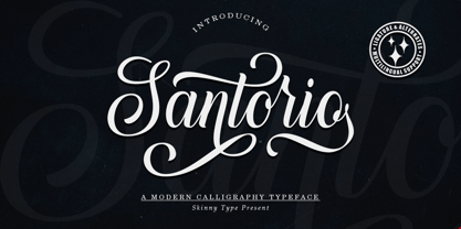 Please welcome our newest script typeface, Santorio Script, a beautiful script typeface with unique alternatives and strokes. This font is very suitable to be applied especially to logos, and various other formal forms such as invitations, labels, logos, magazines, books, greeting / wedding cards, packaging, fashion, make up, stationery, novels, labels or other types of fonts. advertising purposes. Feature : uppercase & lowercase numbers and punctuation multilingual ligature alternative PUA encoded We highly recommend using a program that supports the OpenType feature and the Glyphs panel like many Adobe and Corel Draw applications, so that you can view and access all variations of Glyphs. Email us to skinnyart871@gmail.com if you need anything! Happy Designing! Thank you
 - Garota Serif - Personal use only

- Paradise Garden by Nathatype,
$29.00 Would you like a professional, yet friendly looking design? If so, Paradise Garden is the best option. Paradise Garden is a serif font in thick weights and round shapes. Due to the weight and shape, this font expresses cute, friendly impressions on your designs. Its main characters are first, the noticeable differences between the thick and the thin lines and second, vertical and horizontal hooks or little wipes on the edges of each letter. It is better applied for big texts for a legibility purpose. You can also enjoy fascinating features on this font. Features: Ligatures Stylistic Sets Multilingual Supports PUA Encoded Numerals and Punctuations Paradise Garden fits for various design projects, such as posters, banners, logos, book covers, album covers, quotes, invitations, greeting cards, printed products, social media, etc. Find out more ways to use this font by taking a look at the font preview. Feel free to contact us if you require more information when you are dealing with a problem. Thank you. Happy designing.
 - Naskle by Creativemedialab,
$18.00 Naskle featuring unique shape letters, this fun groovy and retro psychedelic font is ideal for any fun theme design concept, Illustration posters, kids clothing, stickers, title, logo and more
 - Stropha by Tour De Force,
$25.00 Stropha is compact slab serif font family that comes with matching Italics. With distinctive differences between letter stems and with five weights only, Stropha is imagined as small, but "all you really need" family. It's original, with characteristic serifs, with deep ink traps, curvy top diagonal endings and gentle curvy touches in details. Contains Extended Latin character set. Fully applicable in any situation, from branding and editorial design to webfont usage.
 - Kids Place by Sabrcreative,
$10.00 Introducing Kids Place, a delightful and vibrant display sans serif font designed to bring joy and playfulness to your designs. This font is perfect for adding a touch of whimsy to children's books, nursery decor, party invitations, and more. Let your creativity soar with Kids Place and create designs that capture the imaginations of both young and young-at-heart. With its charming combination of uppercase and lowercase letters, Kids Place offers versatility and adds a sense of fun to your typography. The extensive set of numbers and punctuations ensures consistency and usability in various design projects. Kids Place goes beyond language barriers with its multilingual support, allowing you to express your messages in different languages and connect with a global audience. From English to Spanish, French to German, Kids Place provides a seamless experience. Unlock the full potential of Kids Place with its PUA encoding, which grants easy access to additional glyphs and characters. This feature enables you to add playful elements and unique touches to your designs, making them truly stand out. Let your imagination run wild with Kids Place, the perfect font for all your whimsical and playful projects. Whether you're designing for children or simply embracing your inner child, Kids Place is the font that will bring a smile to your face.
 - Evoque by Monotype,
$40.00 Evoque is a humanist serif type family designed for both text and display purposes. Its appearance is crisp and modern while echoing a classical Garamond heritage. The inspiration for Evoque came after reminiscing over Apple’s advertising of the eighties and nineties that utilised incredibly tightly-spaced headlines set in Apple Garamond. I wanted to create a typeface that evoked nostalgia of those times and that distinctive typographic style. A number of swash alternates and discretionary ligatures enhance Evoque, giving you the opportunity to add more flair and personality to your title and branding designs. Simply activate Stylistic Sets to start adding these flourishes to your typography. Other useful features include Small Caps at the click of a button, and Old Style Figures are an option to the default proportional figure style. There are 36 fonts altogether, with 6 weights in roman and italic from Thin to Heavy weights across Condensed, Narrow, and Regular widths. Evoque has an extensive character set (900+ glyphs) that covers every Latin European language. Please also take a look at Evoque Text which is specifically designed for the publishing sector. Key features: 6 weights in both roman and italic 3 widths – Regular, Narrow, Condensed 80 Alternates 26 Ligatures Small Caps Full European character set (Latin only) 900+ glyphs per font.
 - Swingdancer by Chank,
$99.00 With a swooshy hand-painted flow, the strokes of this vintage brush script will make your designs sing and dance. While each character is charming on its own merit, put 'em together and this font dances with the swing rhythm and bursting energy of Benny Goodman’s big band. And don't miss the dandy special characters for letter combinations tt, th, or, os, and an extra fancy alternate capital M. Without a doubt, Swingdancer will satisfy the script jones of any retro font fan. Now available in new OpenType format, too!
 - Carin by Nine Font,
$20.00 Carin is a hand-lettered uppercase type family with both sans-serif and serif styles, including ornaments and symbols. Its characters have been drawn by hand to give them a natural and friendly look. Each style has one basic font with two weights and three decorative fonts (A, B, C). Carin is an emotional type family.
 - Lovelace by Zetafonts,
$39.00 Designed by Cosimo Lorenzo Pancini and Andrea Tartarelli with Maria Chiara Fantini, Lovelace is Zetafonts homage to the tradition of nineteenth century “Old Style” typography - a revival of Renaissance hand-lettered shapes driven by the desire to create a less formal and more friendly alternative to Bodonian serifs. While taking inspiration from the letter shapes created by Pheimester or Alexander Kay - with their calligraphic curves and heavy angled serifs that influenced Benguiat and Goudy’s typefaces in the 70s - we also tried to add elegance and contrast by following another 19th century revival style: the Elzevir. This digital homage to victorian typography, aptly named after the algorist daughter of lord Byron, is developed in two optical sizes, both in a six weights range from extralight to extrabold. The text variant offers maximum readability thanks to the generous x-height and screen-friendly design, while the display variant excels in the sharp contrast and thin details needed for editorial and large-size titling use. The italics, strongly influenced by calligraphy, have been complemented with a display script family, including luscious swashes and connected lowercase letters, lovingly designed by Zetafont in-house calligrapher. All the thirty weights of Lovelace cover over 200 languages that use latin, cyrillic and greek alphabets, and include advanced Open Type features as Stylistic Alternates, Standard and Discretionary Ligatures, Positional Numerals, Small Caps and Case Sensitive Forms.
 - P22 Slogan by IHOF,
$24.95 P22 Slogan is a non-connecting script font that captures the essence of the lettering used in 1950s European advertising. Bold strokes of this brush-drawn face make this design a great choice for both retro design and contemporary work. The font is based on the 1957 design Slogan by Aldo Novarese for the Italian Nebiolo Type Foundry. At the time of its original release, it was touted for "striking publicity work". This new digitization accurately reproduces the outlines of the original not found in previous digital versions of this design. P22 Slogan is a non-Pro Opentype font that includes Central European characters.
 - Rosalinde by Scriptorium,
$18.00Rosalinde is an original font based on rough hand-lettering reminiscent of 1960s era protest poster lettering. It's the kind of lettering you'd expect to see used for a snippet of anti-war poetry set against a red-white-and-blue striped background, or perhaps accompanied by a fat dove with an olive-branch. - New Millennium Linear by Three Islands Press,
$24.00New Millennium Linear is one of three font families that share a common name, a common design philosophy, a common x-height, and basic character shapes. (The others are New Millennium and New Millennium Sans; all three work well together.) New Millennium Linear is a "monotone" newer version of the Sans face whose smooth, geometric, "Gothic" look gives it a completely different personality. The typeface comes with regular, bold, italic, and bold italic styles, each with a complete character set. New Millennium Linear might best be used in captions, callouts, labels, titles, and similar display situations. - Stolzl Display by Inhouse Type,
$33.78 Stolzl Display is an original font family designed for headlines, titles and subtitles. Based on the combination of contrasting shapes, the harmony of form and rhythm is fundamental to the design. Inspired by Bauhaus, Stolzl represents, not just the significant influence of this “crucible of modernism”, but aims at capturing its original idealism, commitment to creativity and experiment driven philosophy. Details include six weights, Cyrillic, 480 characters, alternative glyphs, manually edited kerning and Opentype features. Named after Gunta Stölzl, the Bauhaus’s only female master, Stolzl Display is the first subfamily of the Stolzl font collection to be released this year.
 - Pixerius Random by Shapovalov Fonts,
$9.00 Pixerius is a family of pixel fonts containing 3 characters in width and 12 styles, from square shapes to very rounded ones. There is also a tracing mixing letters of different widths in a random order. The font is suitable for logos, large headlines, posters and signs. It combines the classic retro character of 8-bit games and the playful character of a random set. Pixerius contains extended Latin, Cyrillic, ligatures and space invaders. It contains OpenType features: liga, numr, dnom, calt, ss01, ss02. The font is also case sensitive, has fractions, currency signs including the ruble sign.
 - Mato Sans by Picador,
$29.00 Legible and dynamic shape, tons of OpenType options, different scripts – that’s Mato Sans. Difficult small size, long text in Vietnamese, huge heading in Russian or table full of figures to create? It’s not a problem with this family. There are over 2000 glyphs in every weight with such features: superscript and subscript characters, tabular lining and old style figures, small caps, fractions, arrows or even case sensitive parenthesis. Mato Sans was designed for use in Latin as well as in Cyrillic script. Every font contains an extended set of Cyrillic characters including special, local glyphs for Bulgarian, Macedonian and Serbian.
 - Bandera by AndrijType,
$21.00 This square serif typeface is a real workhorse. It is a modern tool for text design: extremely legible and well shaped. Bandera has six weights with original italics. It catches attention in headlines of posters and magazines or makes reading comfortable in plain texts. Bandera shares main proportions with sans serif Osnova Pro typefamily so ideally can pair it. It has Bandera Text and Bandera Display sister families as well. Please check also Pro version for pan-european support (full Latin-Greek-Cyrillic). Bandera is Spanish for ‘flag’. And Bandera is a symbol of Ukrainian fighting for freedom for many years.
 - somalove - Personal use only

- Slumberin by Aisyah,
$12.00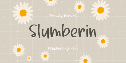 Slumberin Handwriting Font is a beautiful and playful script font that features natural handwriting strokes with a modern twist. It is a versatile font that can be used for a variety of design projects such as greeting cards, logos, invitations, social media posts, and more. The font includes uppercase and lowercase letters, numbers, punctuation, and special characters. Its unique style adds a touch of whimsy and charm to any design.
 - Harmona by Locomotype,
$19.00 Harmona Font Family comes from a romantic feeling and a strong desire to unite in harmony. Harmona Script presents a simple yet beautiful and elegant typeface while still prioritizing readability on various sizes and media. For those of you who love signature fonts, this font is suitable for you to capture beautiful poems and quotes, invitation design, posters, logotype etc. To complement Harmona Script, we also provide Harmona Sans with a classic and luxurious touch to make it easier for you to combine the design into a more fun and attractive.
 - Mirador by René Bieder,
$30.00 Mirador is a powerful neoclassical font family designed for various usages — ranging from editorial and corporate design to web, interaction and product design. It is a contemporary take on high contrast typefaces that have never gone out of style — defined by elegance, tradition and timelessness. Although Mirador seems to be a display font at first glance, its proportions and design reveal a powerful and characteristic workhorse when set in smaller sizes. Mirador comes in 10 weights with matching italics. It is equipped with ligatures, a large set of alternative glyphs and many more opentype features.
 - Romantic SS by Sensatype Studio,
$15.00 Romantic is a Modern Beauty Sans Serif A Sans Serif font that we created special for branding needs with classy shape to add value of your brand. It's so nice to leverage designer or product owner that need solutions to make their design look more classy and fashionable. And specially for Romantic font, We prepared any characters with Elegant shape to help you create classy style of your design. Romantic Modern Beauty sans serif font ready with: Lowercase and Uppercase characters Numbers and Punctuations Preview as a inspirations that you can do with Romantic font Wish you enjoy our font.
 - Linex Sans by Monotype,
$29.99Linex Sweet was designed by Albert Boton in the late 1990s. It's a smallish family of three weights; the middle weight has an italic companion face. With its soft corners and slightly quirky head-serifs, Linex Sweet is a friendly design that sees much use. Several years later, Boton began sketching a new design, based on the original Linex Sweet but with a little more authority and grace. Linex Sans is the result. A mix of crisp angles and soft shapes, this new addition to the extended Linex family is both inviting and elegant. The subtle calligraphic overtones distinguish the design from more traditional sans serif designs. A three-weight family with a complementary italic for the Regular weight, Linex Sans is a versatile communications tool in both text and display sizes. It offers that mix of sophistication and joie de vivre that characterizes the designs of Albert Boton. Boton began his professional career as a carpenter. Fortunately for designers and typographers, he quickly turned from pounding nails to hammering out graphic design and constructing great letterforms as a profession. In his long career, he has created hundreds of distinctive, highly useful and award-winning designs. And even though he is now retired from active business, Boton continues to create fresh, new typeface designs. Add Linex Sans to the list. - SomaSlab by ArtyType,
$29.00 The 'Somatype' range has expanded further with this latest addition to the collection, titled SomaSlab. Although the basic letterforms are the same as in the generic Somatype family, the introduction of slab-serifs to appropriate characters has transformed the typeface into something new, creating a completely different styling in the process and striking a pleasing balance between classic & contemporary styles. The fishtail and curved serifs on certain characters also introduces a unique quirkiness, making SomaSlab stand out alongside most classic slab serif fonts. Some alternative characters are available too, together with an extended Latin glyph set, allowing users a variable choice and great versatility for text settings. SomaSlab comes in both Regular & Slanted styles, each in 4 practical weights, providing plenty of flexibility on any creative project.
 - Bill Hiffith Handwritten by Colllab Studio,
$19.00 "Hi there, thank you for passing by. Colllab Studio is here. We crafted best collection of typefaces in a variety of styles to keep you covered for any project that comes your way! Bill Hiffith is an Organic Script, a gorgeous font that can be used for making multiple things. it includes smooth brush stroke, simple and soft. Its elegant taste is one of the most gorgeous fonts. This typography is reflected in this exquisite font family. The type is clean and simple yet fun and stylish. It is beautiful, better for headlines style design or logo design. Or you can have it on your website’s body style. Grab it now, Bill Hiffith could elevate your elegance brand design. A Million Thanks Colllab Studio www.colllabstudio.com
 - Frutiger Serif by Linotype,
$42.99 Frutiger® Serif is a re-envisioning of Meridien,a typeface first released by Deberny & Peignot during the 1950s. Working closely with Adrian Frutiger, Linotype's Type Director Akira Kobayashi expanded the original metal type version of Meridien into a new digital family of 20 variants. Renamed Frutiger Serif, this up-to-date Meridien has new weights, widths, and styles that correspond better with several other of Frutiger's designs. Just as Meridien has always been a fine choice for text settings, Frutiger Serif works brilliantly for large amounts of text & also at small point sizes. With its many weights and styles, this family is strong enough for most typographic projects. However, its added versatility is revealed when used in combination with other fonts. Frutiger Serif works well with the original Frutiger, Frutiger Next, and Univers - just to name a few. Paring these serif and sans serif families together is perfect for creating complex hierarchies and clear information design. Working with complicated typographic systems - involving elements such as headlines, captions, pull quotes, multilingual text, etc - is made easy by selecting Frutiger Serif and another of Frutiger's sans serif families. The designer needs simply to mix and match different weights and styles for the various textual elements to create smart and innovative layouts.
 - Toppler by K-Type,
$20.00 TOPPLER is a top-heavy comic font, K-Type’s salute to nineties freebies such as Ben Balvanz’s Baby Kruffy, Comix Heavy from WSI, and Dave Bastian’s Startling. Unlike those glorious fonts-of-old, Toppler contains a complete repertoire of symbols, dingbats and Latin Extended-A accented characters, as well as a proper lowercase, careful spacing and tasty kerning. Toppler also boasts cleaner outlines and more refined shapes. The Toppler family comprises four fonts that share spacing and kerning, so can be overlapped to produce bicolor and multicolor effects. In addition to the regular, solid style of Toppler, there is a shaded ‘Popdots’ style, plus thick and thin outline fonts.
 - Jotia by Hashtag Type,
$32.00 Creating a combination between serif and sans serif typefaces, Jotia utilises the best of both worlds, resulting in a unique and modern neo-humanist font family. Taking its inspiration from lapidary inscriptions rather than pen drawn text, Jotia uses triangular serif shape details to create a strong uniformed personality with clear legibility. This original quality enables characters to be expressive in headlines, as well as in printed and onscreen text situations. Jotia also works beautifully alongside both serif and sans serif typefaces giving complex editorial work a more powerful and visually stimulating dynamic. Details include six weights, manual kerning and spacing, ligatures and alternatives.
 - Bari Sans by JCFonts,
$30.00 Bari Sans is a solid grotesque typeface with tense curves and compact proportions, but also more subtle details like the angled terminals, the double storey g and the distinctive shape of the lowercase a. Designed to look robust and masculine, this family is also quite versatile with its 9 weights, ranging from thin to black, plus matching italics. Each font include over 500 glyphs with several OpenType features and 8 stylistic sets: alternate lowercase a, g, l, and y, alternate uppercase I and J, alternate quotation marks... Tabular figures, localized forms, ligatures and automatic fractions are also present, among others. Check the pdf specimen for more details.
 - Square Line Icons Coffee by Howcolour,
$17.00 Coffee and tea related, pixel perfect, editable stroke, up scalable square line vector icon set.
 - Elcatraz by Almarkha Type,
$25.00 Elcatraz Family is a Fancy and Retro Sans full of charm. It will take any DIY-project to the next level! Elcatraz Family is perfect for Craft , product packaging, product designs, label, branding projects, logo, vintage social media posts, advertisements, watermark, invitation, stationery and any projects .
 - Francker Paneuropean by Linotype,
$103.99Francker is a sans-serif typeface family based on clean and simple principles of design. The letterforms' curves are inspired by the "super ellipse," a mathematical shape that is about halfway between an ellipse and a rectangle. Francker's lowercase letters appear somewhat reduced, as the a, b, n and u have no spurs. The family is available in nine weights, from Extra Light to Extra Black. Excellent areas of use for Francker signage, posters, magazines, advertisements, or logos; wherever a timeless, modern look is needed. Francker's fonts have a large character set that includes all glyphs in Linotype's W1G specification (World Glyph Set 1). Proportional figures are available as alternatives to the tabular defaults, via an OpenType feature. The Francker type was developed designed by Anders Francker (b. 1972), an engineer and designer living in Denmark. - K haus 105 by Talbot Type,
$19.50 K-haus 105 is inspired by the work of graphic designer and typographer, Herbert Bayer, during his time at the Bauhaus around 100 years ago — work that kick-started graphic design as we know it, to this day. It owes something to the simple geometry of Bayer’s hand-drawn, ‘universal typeface’, updated and expanded to deliver a clean, balanced, geometric sans for today. Also available as K-haus 205 , featuring a few, more 'daring' characters here and there, chiefly in the lower case set. Both variations include an extended character set, featuring accented characters for Central European languages.
 - Handwritten Note JNL by Jeff Levine,
$29.00 The movie poster promoting the 1962 James Cagney comedy "One, Two Three" had it's text done in free-style hand lettering. Starting with an auto-trace in order to have an isolated version of the black letters separated from the red poster background, the tracing kept the basic forms intact, but with limited accuracy. Cleaning up and digitally reshaping the letters manually to form a more correct version [closer to the original movie poster], additional figures, foreign characters, accents and punctuation were drawn from scratch. This is now available as Handwritten Note JNL in both regular and oblique versions.
 - Dropsomaniacal by Proportional Lime,
$9.99 Drop Caps happen. They started off life as decorated initials way back when in the days of illuminated manuscripts. Then printing came and they became the work of the rubricators and then somewhere soon after printing began, at least by the 1490’s, they were printed directly into the text. This then is a collection of over a hundred glyphs from that closing decade of the Incunabula period. All of them are based on examples found in the works printed by Michael Wenssler in Basel. This font also contains a few useful pointing hands and a set of spacing characters.
 - K haus 205 by Talbot Type,
$19.50 K-haus 205 is inspired by the work of graphic designer and typographer, Herbert Bayer, during his time at the Bauhaus around 100 years ago — work that kick-started graphic design as we know it, to this day. It owes something to the simple geometry of Bayer’s hand-drawn, ‘universal typeface’, updated and expanded to deliver a clean, balanced, geometric sans for today. Also available as K-haus 105 , featuring a few different characters here and there, chiefly in the lower case set. Both variations include an extended character set, featuring accented characters for Central European languages.
 - FF Berlage Burcht by FontFont,
$58.99 FF Berlage started as a research project about the typography of the prominent Dutch architect Hendrik Pieter Berlage (1856 1935). Donald Beekman based the design on a great number of sources, but mainly lettering found in two of Berlage s most quintessential buildings, the Amsterdam Commodities Exchange building (called Beurs van Berlage), and the ANDB building for the Amsterdam diamond cutters union (called De Burcht). Berlage is considered the father of modern architecture in The Netherlands due to his revolutionary theories on architecture and design, that would greatly influence many Dutch architect groups, like the Amsterdam School and De Stijl.

