10,000 search results
(0.054 seconds)
- Instant Harmony by Hanoded,
$15.00 Wouldn’t it be nice to have a pack of Instant Harmony in your cupboard? Just add water and *poof* - all strive and struggle have gone, having been replaced by peace and quiet. The grass seems greener, the sky bluer and the air smells like a fresh mowed lawn. Ahhhh! Zap! Back to reality. There is no instant harmony, don’t go looking for it in your local supermarket! If you want a taste of something resembling instant harmony, then add this super-duper font family to your collection and use it for your designs. You may find that your creativity levels are up, your morning coffee tastes better and your designs look exactly like you had in mind. Pinky promise!
 - Gumley by Robert Corseanschi,
$29.00 Gumley - a font which has a fresh natural look and feel inspired by nature, at the same time it has a gummy feel which would fit very well on packaging design. With a little inspiration every product can look awesome with this font, starting from kids magazines to logos and package design.
 - Backstreet by Letterara,
$12.00 Backstreet is a purely handwritten typeface with its own unique characteristics. It has an elegant, feminine style with good readability. Perfect for Valentine day, neon design, signatures, invitations, titles, and much more! To stay up to date for my latest job, follow me and let’s be friends because there will be many promos.
 - Fermata by Fermata Fonts,
$15.00 Fermata is an original calligraphic textface inspired by humanist serif typefaces from the 16th century, characterized by the translation contrast of a handwritten pen stroke, monumental Roman capitals, and true italics. Fermata has been modernized for 21st century textual requirements, with clean lines, moderated contrast, and a seamless blending of italics and lining characters into the text form, while still retaining the warmth and subtle idiosyncracies of the handwritten origins of old style serifs. The font was developed with invaluable advice and mentorship from Hannes Famira.
 - Ghost Halloween by Ake,
$18.00 Halloween Font is a delightful brush-style display font. With its cute and charming appeal, this typeface is perfect for adding a touch of whimsy to your designs. The authentic brush strokes give it a personal and realistic feel, making it an ideal choice for various creative projects. From Halloween-themed designs to children's books, party invitations, posters, and more, Ghost Halloween Font will bring a playful and engaging vibe to your creations. Get ready to make your designs stand out with this adorable and versatile font!
 - Clobberin Time by Comicraft,
$19.00 Created by Richard Starkings for the Powerhouse Punches thrown by Marvel's more muscular heroes, CLOBBERINTIME is sure to bring the house down!
 - Asterluck by Letterhend,
$19.00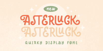 Introducing, Asterluck - A quiirky display font. This font has unique shape, very suitable for casual and playful theme design. This font also perfectly made to be applied especially in logo, and the other various formal forms such as invitations, labels, logos, magazines, books, greeting / wedding cards, packaging, fashion, make up, stationery, novels, labels or any type of advertising purpose. Features : uppercase and lowercase numbers and punctuation multilingual PUA encoded We highly recommend using a program that supports OpenType features and Glyphs panels like many of Adobe apps and Corel Draw, so you can see and access all Glyph variations.
 - PF Mellon by Parachute,
$35.00 PF Mellon is a modernist variable grotesque with mixed roots. Its unconventional aesthetic is the product of an exploration into the art of emphasizing titles, headlines and text in captivating and unpredictable ways. Contrary to conventional practices of highlighting text with heavier weights, PF Mellon proposes an intriguing new scheme based on striking and attention-grabbing compositions of narrow and extended letterforms- even when set in lowercase. Part geometric and part grotesque, PF Mellon’s expressionist alphabet and extravagant style challenge conventions of visual culture in an Art Deco-like manner. PF Mellon’s rebellious idiosyncrasy takes its cues from the eccentric personality of our popular PF Venue, an earlier geometric sans serif characterized by its daring combinations of non-uniform structures. PF Mellon’s basic design skeleton was influenced by nineteenth and early twentieth century condensed sans serif typefaces such as Stephenson Blake's Grotesque No.77 and ATF’s Alternate Gothic, adding an extra contrast to the thickness of strokes. PF Mellon is also available as a variable font format which you may request it free of charge from Parachute® once you purchase the whole type family.
 - Morl by Typesketchbook,
$55.00 Developed from condensed san serif families of the 90’s to 00’s, Morl brings together the distinctive features of the time but presented in a simpler design. Its potential is increased with Original, Sans, and Rounded options which offer varied moods. Suitable for publications, web and product designs, Morl can fit either headlines or body. It’s also effectively supported in various devices. The family comes in 10 weights, making it available to use for your required tasks in 60 styles.
 - Buinton by Melvastype,
$35.00 Buinton is a script typeface with noble and vintage looks. It has serifs at the beginnings of the strokes, swash capitals and formal design. Buinton has lots of alternate characters, swashes and ligatures. It has also a bunch of tails with different shapes and widths to give the vintage logotype or sports look to your design. These alternates makes Buinton very versatile. You can design beautiful, elegant and diverse typographic elements with it. It’s well suited for logos, lettering artwork, t-shirt designs, editorial illustrations to name a few. Buinton is also available in roughed up versions: Buinton Rough
 - Babetta by Viktor Nübel Type Design,
$- Babetta is a display typeface that comes with some decorative typographical features. Alongside a set of arrows and flower icons, it also includes an alternative ›E‹, some special diacritic marks, a wavy ›S‹ and a series of ligatures. It features 5 weights, a special ›Neon‹ version and supports a wide range of Latin languages. This typographical tool box provides a large and playful variety of options for headlines and logotypes. Babetta supports Latin and Cyrillic languages. The initial inspiration for Babetta was an illuminated vintage shop sign—that of a famous bookstore in Berlin called Karl-Marx-Buchhandlung that dates back to the days of East Germany. During the course of the design process, this slightly shabby historical original was kissed by an Italian Art Deco beauty and has blossomed into a new typeface with its own special charm. The aim was not to preserve the original lettering, but to use it as a starting point for typographical exploration.
 - Kage Pro by Balibilly Design,
$25.00 Greetings: We are introducing an advanced version of the Kage font released and received great exposure from users and worldwide font enthusiasts. The massive development puts forward experimentation on the alternate letters. We redesign each shape to make it more functional and comfortable when text size escalation occurs. In addition to rejuvenating the letterform, we also apply an oblique style to provide diverse style choices. Learn more about Kage Pro here: Graphics presentation | Type Specimen | The Inspiration: The radical exploration world of fashion inspires us. It leads our minds to the Neo-classical type style created during the age of enlightenment in the 18th century. It has a reasonably extreme contrast from the previous serif style, making the impression that it is emitted more expensive and classy. Organically, this Neo-Classical typeface is closely related to the fashion world, especially in Europe, and even spread across the globe. Fashion and this typeface reflect each other. After, we boldly observed Japanese fashion designer Rei Kawakubo. Famous for radical & deconstructive fashion, which makes the world of fashion more flexible and dynamic. The Design: As well as the typeface that we made, we started it with a cultural foundation of the Didone typeface. We tried to deconstruct the appearance. The decoration that better reflected the dynamic of fashion implemented in the fashionable alternate and calligraphical stylistic set ended with ball terminals. The versatile impression created is like taking off a scarf on the model's hair during a fashion show. The deconstructive image is combined with a legibility structure like the appearance of the Neo-Classical style. Kage Pro is designed to visualize a costly and exclusive image of a thing, product, world clothing brand, famous fashion magazine, etc. The modern transitions of each letterform are softer, so when repositioning and escalating the size of this font, it will remain beautiful without injuring other elements. So, Kage Pro is a bold choice on headlines and more prominent media with a portion of 50% even more. The Feature: Kage Pro has 11 upright and 11 oblique styles from thin to black; all family-style consist of one variable font with 2 axes. The total number of glyphs is 1,665 in each style. She comes with tons of swirly ligatures and stylistic alternates in Advance OpenType features, including: Case-sensitive forms, small caps, standard and discretionary ligatures, stylistic alternates, ordinals, fractions, numerator, denominator, superscript, subscript, circled number, slashed zero, old-style figure, tabular and lining figure. Support multi-language including Western European, Central European, Southeastern European, South American, Oceanian, Vietnamese.
 - René Menue by URW Type Foundry,
$39.99 Some time ago, I started to think about the idea of combining my passionate hobby cooking with my profession as a graphic designer. While browsing through cooking books, cooking magazines and graphic publications I noticed that there were no symbols and drawings easily recognizable for interested cooks (hobby or professional). So I decided to create symbols for all the classical cooking paraphernalia still found in grand mother’s kitchen cabinet. René Menue Symbol contains 99 kitchen symbols of classical design and quality. To complement the symbols typographically, there is René Menue, a fitting linear Sans Serif typeface with plenty of extra characters such as ligatures, figures etc. René Menue is a modern, slightly condensed and economic design with round shapes, very modern but classical at the same time. These features make it perfectly usable in many different publications, not necessarily restricted to cooking… A successful cooking and enjoy your meal!
 - Midsole SC by Grype,
$16.00 Geometric/Technical style logotypes have been developed for car chrome labels since the early 1980’s, but automobile companies don't monopolize the style by any means. Shoe companies have a foothold in the geometric sans serif styles as well, and range from straightforward to full of techno styled play. Nonetheless, these logotypes all lack an expansive family which shows off all the logotypes are and what they "could" be and do. And that's where we come in. The Midsole SC Family finds its origin of inspiration in the CONVERSE shoe company logo, or an older version of their logo, and from there we expanded it into a 40 font family of weights, widths, and obliques. Midsole pays homage to the styling of the earlier logotype, including unicase variations to match the original look, while further evolving beyond the brand inspiration to yield a family that pulls on modern and historical styles. It adopts a sturdy yet approachable and recognizable style with its uniform stroke forms and curves, and goes on to include smallcaps, numerals, and a comprehensive range of weights, creating a straightforward, uncompromising collection of typefaces that lend a solid foundation and a broad range of expression for designers. Here’s what’s included with the Midsole SC Family bundle: 489 glyphs per style - including Capitals, SmallCaps, Numerals, Punctuation and an extensive character set that covers multilingual support of latin based languages. (see the 10th graphic for a preview of the characters included) Stylistic Alternates - alternate characters and unicase variants for a less standardized text look. 4 weights in the family: Light, Regular, Medium & Bold. 4 obliques in the family, one for each weight: Light, Regular, Medium & Bold. Here’s why the Midsole SC Family is for you: - You’re in need of stylish sans font family with a range of weights and obliques. - You’re love that older CONVERSE letter styling, and want to design anything within that genre. - You’re looking for an alternative to Eurostile & Handel Gothic. - You’re looking for a clean techno typeface for your rave poster designs. - You just like to collect quality fonts to add to your design arsenal.
 - Midsole by Grype,
$16.00 Geometric/Technical style logotypes have been developed for car chrome labels since the early 1980’s, but automobile companies don't monopolize the style by any means. Shoe companies have a foothold in the geometric sans serif styles as well, and range from straightforward to full of techno styled play. Nonetheless, these logotypes all lack an expansive family which shows off all the logotypes are and what they "could" be and do. And that's where we come in. The Midsole Family finds its origin of inspiration in the CONVERSE shoe company logo, or an older version fo their logo, and from there expanded it into a 40 font family of weights, widths, and obliques. Midsole pays homage to the styling of the earlier logotype, including unicase variations to match the original look, while further evolving beyond the brand inspiration to yield a family that pulls on modern and historical styles. It adopts a sturdy yet approachable and recognizable style with its uniform stroke forms and curves, and goes on to include a lowercase, numerals, and a comprehensive range of weights, creating a straightforward, uncompromising collection of typefaces that lend a solid foundation and a broad range of expression for designers. Here’s what’s included with the Midsole Family bundle: 489 glyphs per style - including Capitals, Lowercase, Numerals, Punctuation and an extensive character set that covers multilingual support of latin based languages. (see the 10th graphic for a preview of the characters included) Stylistic Alternates - alternate characters and unicase variants for a less standardized text look. 4 weights in the family: Light, Regular, Medium & Bold. 4 obliques in the family, one for each weight: Light, Regular, Medium & Bold. Here’s why the Midsole Family is for you: - You’re in need of stylish sans font family with a range of weights and obliques. - You’re love that older CONVERSE letter styling, and want to design anything within that genre. - You’re looking for an alternative to Eurostile & Handel Gothic. - You’re looking for a clean techno typeface for your rave poster designs. - You just like to collect quality fonts to add to your design arsenal.
 - Cattyfox by Popskraft,
$19.00 Everyone loves black, strict stylish and elegant shapes. We strive to be perfect. Right? But ... don't you think we have lost something? Maybe childish spontaneity? The Cattyfox font will take you back to those wonderful times when there was no need to be serious, when the whole world was not so serious. If you want to have some uncompromising fun, hover above the crowd to show everyone how free you are, just create something in Cattyfox font and you will understand what true freedom is.
 - Sweet Pancake by Locomotype,
$15.00 We often see calligraphy fonts with a standard style developed from the brush pen strokes. Sweet Pancake fonts come in different calligraphy styles. The usual shape has been customized to make it look more personal and special. Sweet Pancake is available in two versions, regular and X. The second version is the development of the regular version by adding sharp corners to the stem. To be more specific, this font also includes several swash so that you can easily mix and match unique and different typographic designs. To attach a special swash to the letter end automatically, you only need to add two / three / four hyphens (the standard ligature feature must be activated). Sweet Pancake is suitable for logotype, invitation, poster and more. Available in OTF and TTF formats, also supports multi-language and PUA encoded.
 - Elettra by Flanker,
$23.00 Elettra is a completely new type, primarily designed for display or titling. As you can see, Elettra adopting a transitional style between the nineteenth century printing typefaces and the new fonts at the beginning of the twentieth century: in particular serif are elongated, but the oblique or round shapes continuing softly on the horizontal line instead of staying vertical. Furthermore, two more glyphs were designed for each capital letter: a swashed form, which tends to embrace the following letter, and a backswashed version, that instead embraces the previous. The swash version is accessible from swash or from stylistc set 01 OTF features, while the backswashed version is accessible from stylistc set 02 OTF feature. Be aware that the stylistic set OTF features are not available on Photoshop or Illustrator.
 - Pounder by CozyFonts,
$20.00 Pounder Fonts were designed by Tom Nikosey / CozyFonts Foundry. This font, as all my fonts started with pencil sketches based on the letter O. Once I arrived at the comfortable shape I worked out the C, G, & Q. The H, M, T matched the visual weight and so I moved on to E & S. As the E & S are 2 of the most repeated characters in fonts' I wanted a little bit extra here. The font is obviously heavy weighted yet very legible and almost architectural in presence. There are flashes of Art Deco yet futuristic style. After sketching the feel of this font I was excited by the possibility of the numerals styling. I can see these used for many applications. Why the title Pounder? Why not it seems to fit.
 - ITC Abaton by ITC,
$29.00 ITC Abaton, by Argentinian designer Luis Siquot, is an exercise in geometry and simplification. “It is done,” says Siquot, “with few elements, with modules of only straight lines (horizontals, verticals and diagonals of almost 45 degrees). Drawing the I and the O, I got the basic elements, and so started the fight between strict geometry and optical impression, until I obtained the rest of the characters.” The basic rectangular form is characterized by wedge-shaped serifs, almost like caps on the heads and feet of the letters. “Abaton has the 'spirit' of 19th-century faces used on money bills or postage stamps, but the realization is totally different,” Siquot explains. Abaton is a “shaded” typeface of caps and slightly smaller caps, upright and slightly condensed in form. Although the letterforms are legible at small sizes, the shading tends to clog up if it gets too small, so Abaton is happiest as a distinctive display face.
 - Barwastu by IbraCreative,
$17.00 Barwastu, a refined serif typeface, epitomizes timeless elegance with its meticulous design and sophisticated aesthetic. The graceful curves and distinctive serifs of Barwastu convey a sense of tradition and authority, making it an ideal choice for projects that demand a touch of class and professionalism. The well-balanced letterforms and subtle variations in stroke width contribute to its readability and versatility across various applications, from editorial layouts to branding. Barwastu seamlessly blends a classic sensibility with a contemporary edge, ensuring that it stands out as a distinguished and tasteful typeface in the realm of typography.
 - Agger serif by S6 Foundry,
$29.00 Agger is a contemporary serif typeface featuring large open counters, curved, round forms, creating a modern and elegant glyph set. The extreme contrast between thick and thin strokes gives Agger a harmonic and stylish look. Designed with an elegance to the letterforms, the font is adapt for the beauty and the cosmetic industry, giving each project a unique style and feel. Agger is perfectly suited for editorial design, branding, magazines, logos, headings, and more. The family Latin supports Western, Central, South Eastern, South American, Oceanian, Pan African, Vietnamese, and Sámi.
 - Vanilla by Device,
$29.00 Two-flavour stripes feature in this geometric font that is reminiscent of the Deco styles that adorn seaside ice-cream parlours and arcades.
 - Aleesya Rose by Brenners Template,
$19.00 Aleesya Rose is a Stylish Font Family to bring a touch of elegance to any design. The clear contrast blends into all styles - even thin styles - and the strong individuality by weight delights the designer's imagination. 14 styles including 7 weights and italics are essential for designers to complete more detailed and sophisticated typography. This style has 426 glyphs each, check the glyph window in your app. The upright standing of the vertical stems stably supports the center of gravity of the entire font. And the thin strokes used as finishing touches will convey an elegant personality to the layout. The ligatures are designed to appeal to the reader with their beautiful tenderness, and they are: Ba, Be, Ha, He, LO, Le, Lo, Re, Ro, ck, de, do, ee, ff, fi, oo, rr, th. In particular, we recommend that you choose this font family to achieve the following purposes: Editorial design, Personal branding, Branding business, logo design, portfolio, and any special design.
 - PF Benchmark Pro by Parachute,
$79.00 Benchmark Pro is a carefully structured geometric typeface which works amazingly well in body text due to its simplistic nature and large x-height. The design of Benchmark Pro started out as an attempt to convert the minimalistic structure of a technical and purely geometric design into a readable modern and friendly sans serif. This was achieved by selectively changing and turning the straight lines of the initial drawings into curves and applying legibility techniques to the transformed letterforms. These letterforms have a distinct personality which is bolstered by its angular curves and open counter terminals. The result is a contemporary text typeface that looks quite fashionable. Benchmark Pro gets away from the ultra modern and mechanical structure but keeps its display nature, it gets away from the classical but still remains legible. This robust san serif type family offers an extended character set which supports simultaneously Latin, Cyrillic and Greek. All Benchmark Pro font variants have a companion italic, rounding the total family members at 14 fonts. Each font includes more than 750 glyphs and is powered with 17 opentype features. PDF Specimen Benchmark on Behance
 - Elise by Context,
$12.00 Elise is a sweet natured, layered display typeface, with a few layers but a wealth of options. From the feminine to the fun to the nostalgic, Elise is a capable and personable set. Best used BIG and with color, you’ll always find an occasion for Elise’s charm. To use this typeface, once you have your copy in place in the design program of your choice, copy your text block and paste it directly on top of your existing text block. Set this new text block to a different Elise layer and voila! You’ll already start to see some interesting effects take place. In some cases, different effects are achieved by bringing The Elise Ribbed layer to the front or to the back. Also available is a free ornament set to get you started.
 - Bufallo by ryan creative,
$11.00 Bufallo is a style of handwritten script with a simple hand stroke that makes this font look simple. It can be used for various purposes such as greeting cards, business designs, product designs, quotes etc. FEATURES; -Uppercase, Lowercase, Foreign Support, Numbers and Punctuation. -Works on PC. -Simple installation. -Accessible in Adobe Illustrator, Adobe Photoshop. Adobe InDesign, it even works in Microsoft Word. -Fully accessible without additional design software. Buffalo encoded with Unicode PUA, which allows full access to all additional characters without having to design special software. Mac users can use the Fontbook, and Windows users can use the Character map to view and copy any extra characters to paste into your favorite text editor/app. See you again ;)
 - Darkmire by ryan creative,
$12.00 Darkmire Blackletter is a writing style created with the pentool. Attractive hand strokes give this font a strong look. It can be used for various purposes. such as, business design, product design, quotation etc. FEATURES; -Uppercase, Lowercase, Foreign Support, Numbers and Punctuation. -Regular & italic -Works on PC. -Simple installation. -Accessible in Adobe Illustrator, Adobe Photoshop. Adobe InDesign, it even works in Microsoft Word. -Fully accessible without additional design software. Darkmire is coded with Unicode PUA, which allows full access to all additional characters without having to design any special software. Mac users can use the Font book, and Windows users can use the Character map to view and copy any extra characters to paste into your favorite text editor/app.
 - Aristotelica Pro by Zetafonts,
$39.00 Aristotelica Pro is the 2020 redesign of the rounded geometric sans designed by Cosimo Lorenzo Pancini and Andrea Tartarelli developing the original philosophy of one of the classic and best-selling Zetafonts typefaces, Arista by Francesco Canovaro. Originally conceived as an exercise in restraint and simplicity, Aristotelica is typographic eulogy to the simple beauty of circular shapes, aptly named after the greek philosopher who pioneered formal logic. It shows its strengths mostly in display uses and logo design, with a palette of moods ranging from the stark elegance of the uppercase hairline weights to the playful softness of the lowercase bold weights. True to its universalist calling, it has however been developed in a variant text version that applies slight corrections to design and metrics to allow for better legibility in long body copy. In Aristotelica Pro both the display and the text subfamilies have been complemented with a condensed version, though especially for mobile screens and other situations where space-saving is a concern. Also the original language coverage (extended latin, greek and cyrillic) has been expanded with the inclusion of arabic language glyphs, bringing the typeface to a total of over 1100 glyphs and 200 languages covered. The family is further enriched by the inclusion of Aristotelica Icons, a set of matching variable-width monoline icons that can be used to faultlessly match the typeface line width. OpenType features includes stylistic alternates, old style and lining figures and small caps.
 - Oracul Decorative by Struvictory.art,
$16.00 Oracul is a modern display font with Bohemian motives. The font is created in a psychedelic retro style and decorated with the stars. Oracul includes stylistic alternates and ligatures. The font is suitable for the design on the theme of astrology, mysticism, spirituality, witchcraft, magic, esotericism, fortune-telling, tarot. Oracul has extensive language support, it includes English, French, German, Italian, Spanish, Portuguese, Danish, Norwegian, Swedish, Finnish, Estonian, Turkish. Oracul font includes stylistic alternates for symbols: E, H, I, J, L, O, Q, T, U, Y. There are also ligatures: MA, RA, KA, XA, AA, AM, RM, OO.
 - Egyptian Hieroglyphics – Dendera by Deniart Systems,
$25.00 Cast your stars like the ancient Pharaohs. Commonly known as the Zodiac of Dendera, this series is based on the symbols found on the roof of the temple at Dendera. It is believed that the Egyptians likely borrowed the signs of the zodiac from the Greeks, possibly in the Ptolemaic period. Containing 52 unique characters, the series includes the 12 zodiac signs, the 30 phases of the moon in its equatorial position, the Gods of the four winds, and the Gods of the five planets of Venus, Mercury, Mars, Saturn and Jupiter. NOTE: this font comes with an interpretation guide in pdf format.
 - Manhattan Midnight by Scholtz Fonts,
$19.95 Manhattan Midnight owes its style to Art Deco fonts of the early 20th century. It has the opulence of New York City in the 20s and 30s, the glitter of city lights, the glamour of movie stars, the razzmatazz of Manhattan in the bad old days. You can use Manhattan Midnight for all advertising with an art deco flavor, for music media needing a bluesy, retro look, for movie posters reminiscent of the era, and so many more applications. The font has all the features usually included in a fully professional font. Language support includes all European character sets.
 - Bank Sans EF by Elsner+Flake,
$35.00 With its extended complement, this comprehensive redesign of Bank Gothic by Elsner+Flake offers a wide spectrum for usage. After 80 years, the typeface Bank Gothic, designed by Morris Fuller Benton in 1930, is still as desirable for all areas of graphic design as it has ever been. Its usage spans the design of headlines to exterior design. Game manufacturers adopt this spry typeface, so reminiscent of the Bauhaus and its geometric forms, as often as do architects and web designers. The creative path of the Bank Gothic from hot metal type via phototypesetting to digital variations created by desktop designers has by now taken on great breadth. The number of cuts has increased. The original Roman weight has been augmented by Oblique and Italic variants. The original versions came with just a complement of Small Caps. Now, they are, however, enlarged by often quite individualized lower case letters. In order to do justice to the form changes and in order to differentiate between the various versions, the Bank Gothic, since 2007 a US trademark of the Grosse Pointe Group (Trademark FontHaus, USA), is nowadays available under a variety of different names. Some of these variations remain close to the original concept, others strive for greater individualism in their designs. The typeface family which was cut by the American typefoundry ATF (American Type Founders) in the early 1930’s consisted of a normal and a narrow type family, each one in the weights Light, Medium and Bold. In addition to its basic ornamental structure which has its origin in square or rectangular geometric forms, there is another unique feature of the Bank Gothic: the normally round upper case letters such as B, C, G, O, P, Q, R and U are also rectangular. The one exception is the upper case letter D, which remains round, most likely for legibility reasons (there is the danger of mistaking it for the letter O.) Because of the huge success of this type design, which follows the design principles of the more square and the more contemporary adaption of the already existing Copperplate, it was soon adopted by all of the major type and typesetting manufacturers. Thus, the Bank Gothic appeared at Linotype; as Commerce Gothic it was brought out by Ludlow; and as Deluxe Gothic on Intertype typesetters. Among others, it was also available from Monotype and sold under the name Stationer’s Gothic. In 1936, Linotype introduced 6pt and 12pt weights of the condensed version as Card Gothic. Lateron, Linotype came out with Bank Gothic Medium Condensed in larger sizes and a more narrow set width and named it Poster Gothic. With the advent of photoypesetters and CRT technologies, the Bank Gothic experienced an even wider acceptance. The first digital versions, designed according to present computing technologies, was created by Bitstream whose PostScript fonts in Regular and Medium weights have been available through FontShop since 1991. These were followed by digital redesigns by FontHaus, USA, and, in 1996, by Elsner+Flake who were also the first company to add cursive cuts. In 2009, they extended the family to 16 weights in both Roman and Oblique designs. In addition, they created the long-awaited Cyrillic complement. In 2010, Elsner+Flake completed the set with lowercase letters and small caps. Since its redesign the type family has been available from Elsner+Flake under the name Bank Sans®. The character set of the Bank Sans® Caps and the Bank Sans® covers almost all latin-based languages (Europe Plus) as well as the Cyrillic character set MAC OS Cyrillic and MS Windows 1251. Both families are available in Normal, Condensed and Compressed weights in 4 stroke widths each (Light, Regular, Medium and Bold). The basic stroke widths of the different weights have been kept even which allows the mixing of, for instance, normal upper case letters and the more narrow small caps. This gives the family an even wider and more interactive range of use. There are, furthermore, extensive sets of numerals which can be accessed via OpenType-Features. The Bank Sans® type family, as opposed to the Bank Sans® Caps family, contains, instead of the optically reduced upper case letters, newly designed lower case letters and the matching small caps. Bank Sans® fonts are available in the formats OpenType and TrueType.
 - Mantika Book by Linotype,
$50.99 Mantika Book was originally conceived and drawn parallel to the first Agilita drawings. *[images: pencil drawings] It took several years before having a chance looking at these designs again. But then, my first impulse was to turn this alphabet into a new sanserif, which was to become Mantika Sans. This was the starting point to conceive a super family consisting of different design styles and corresponding weights. The initial drawings of Mantika Book were refined and an Italic was developed to go with it. The aim was to create a modern serif typeface which is reminiscent of humanistic Renaissance typefaces, yet without following a particular historic model. Its large x-height for one is far away from original Renaissance models. Mantika Book was designed as a companion serif typeface to Mantika Sans that can be set for lengthy texts as in books, hence its name. It shares the same x-height with Mantika Sans but has longer ascenders and descenders, making for better word shapes in long, continuous reading. The approach of an ›old-style‹ looking typeface with large minuscules makes Mantika Book also a choice for magazine text settings where one often needs smaller point sizes to fit in a multiple columns layout. The unique details of Mantika Book are the asymetric bracketed serifs in the upright font and its higher stroke contrast than usual in a Renaissance style. The stems are slightly curved inwards. Also, the Italics have a low degree of inclination, which makes longer passages of text set in Italic rather pleasing to read. Another feature Mantika Book shares with Mantika Sans is that all four weights take up the same line length. It covers all European languages plus Cyrillic and Greek, is equipped with lots of useful scientific symbols [double square brackets, angle brackets, empty set, arrows] and the regular weight has small caps. There is a kind of an old-style feeling to Mantika Book, yet these citations were turned into a contemporary serif typeface with a soft but sturdy character.
 - SK Barbicane by Salih Kizilkaya,
$9.99 SK Barbicane is a family of typefaces named after Jules Verne's famous book, From the Earth to the Moon. Inspired by Jules Verne's foresight, it was designed with a synthesis of the future and the past. While it carries sharper and futuristic lines than the future, it also incorporates the organic structure of the past. All characters have equal dimensions in this font with mono weight and mono space. In this way, you can create regular typographic layouts in your designs. Consisting of two different families, Normal and Unicase, this font has a total of 12 different fonts and 5088 glyphs. In this way, it contains many typographic elements that you will need in your designs.
 - UNicod Sans by Mostardesign,
$26.00 This font has been especially designed for Mostardesign Studio by Olivier Gourvat. Created in 2010, this font family has been designed to serve sectors like financial services, modern industries, business and many more activities who needs a modern aspect in their communication. Its square proportions make the design very readable at a wide range of sizes. Shapes give the face a unique futuristic look and is a very practical choice for modern headlines, branding, text and web fonts work. The family contains also an alternative set with simplified letters designed especially for text and a unique stylistic set for titles and branding. UNicod Sans is available in 5 weights with corresponding italics and 2 styles.
 - Calafati Soft by Wannatype,
$24.00 Basilio Calafati (1800–1878) worked as a magician under the name of Salamucci in the Wiener Prater. Later he obtained the license for a roundabout and other amusement facilities in the Wiener Prater. Calafati typeface family is characterised by little contrast and strong emphasis on the horizontals. It is a robust font that has many applications. Its character shapes are simple and relatively unembellished. With regard to metrics and proportions it combines perfectly with the Wien Pro and the Liebelei Pro. Calafati is available in weights light, regular, medium, bold and black. In 2022, Calafati received a major update. The recent family, Calafati Soft, is an 100% offspring of sharp-edged Original Calafati.
 - Camila by Latinotype,
$39.00 Camila is a delicate and smooth Didone typeface designed by Paula Nazal. The family is inspired by concepts such as elegance, simplicity, femininity, and primarily based on Coco Chanel. A remarkable feature of this font is that it lacks teardrop terminals, characteristic of Didone typefaces. This font of thin serifs and soft finishes also includes italics, strengthening the concept of its design. A great variety of shapes makes Camila an ideal font for both display and small sizes. Camila is the perfect choice for branding and publishing projects.. This font family comes in 7 weights, ranging from Thin to Black, each with matching italics and includes a set of 426 characters that support 206 different languages.
 - Egon by TipografiaRamis,
$29.00 Egon is a contemporary Slab-Serif typeface family built in ten styles—extra-light, light, regular, bold and black weights in roman and italic respectably. This is a refreshed (second) edition of Egon Serif, originally designed in 2008. The typeface has been updated—four new styles in ExtraLight and Black weights were added to the family and minor adjustments to glyph shapes (mostly italics) have been made.The typeface is designed with industrial and architectural flavor, as homage to Egon Eiermann, one of Germany’s great architects of 20th century. Egon is ideal as text and display font for publication use. Egon is released as OpenType single master with a Western CP1252 character set.
 - Fallen Angels by Set Sail Studios,
$19.00 Fallen Angels Is a modern take on a classic serif style. The stylised capitals add romantic curves and a rebellious elegance to the strong standard character set. It's a bold choice of typography for logo designs, product packaging, album artwork, quotes, posters, apparel & more. Accessing Extra Characters • Alternate characters are available for E, F, r & k. These can be accessed by switching on 'Stylistic Alternates' or via a Glyphs panel. 6 icons are also included within the font (3 halo's and 3 stars) which can be accessed via a Glyphs panel. Language Support • English, French, Italian, Spanish, Portuguese, German, Swedish, Norwegian, Danish, Dutch, Finnish, Indonesian, Malay, Hungarian, Polish, Croatian, Turkish, Romanian, Czech, Latvian, Lithuanian, Slovak, Slovenian