10,000 search results
(0.037 seconds)
- Alright, picture this: a font that decided it wanted to be the cool uncle of the comic book world, showing up at family gatherings with a leather jacket and a slight lean to one side. That, my friend...
- LTC Bixler Ornaments by Lanston Type Co.,
$24.95 LTC Bixler Ornaments One includes all designs found in the metal Bixler Type Handypacks #1–6 from P22 that were created using actual Lanston mats to cast these metal type sets. The 14 designs found in the metal type are presented in this digital version—each rotated and optimized to align easily and tightly for digital layouts.? LTC Bixler Ornaments Two incudes all designs found in the metal Bixler Type Handypacks #7–14 from P22 that were created using actual Lanston mats to cast these metal type sets. The 17 designs found in the metal type are presented in this digital version—each rotated and optimized to align easily and tightly for digital layouts.
 - Quotes by Sudtipos,
$49.00 «Quotes» is the second typeface calligraphed by Yani Arabena, designed along with Guille Vizzari and Ale Paul, for Sudtipos. Being thrilled by the use of the pointed brush, spontaneous messages, gesture and freshness to represent inspirational phrases and quotes written by hand, «Quotes» comes in two handwriting styles: Script and Caps. «Quotes Script» and «Quotes Caps» are thought together and complement each other filling with rhythm and infinite sensations to the spoken words. A more free and spontaneous version –Script–, joined by an uppercase system –Caps–, that offers a huge amount of alternate glyphs, ligatures and connectors, to enrich different messages brought to life with this type family. «Quotes Script» counts on a great variety of alternate signs in its lowercase as well as its uppercase letters. It hands a combination of ligatures and capital alternates that allows to shape the beginnings and endings of words and phrases intended to be inspiring and to inspire others that read them. «Quotes» also stands for the fashion universe, Gourmet, Natural, the D.I.Y. passionates, and for all those who seek for the Handcrafted spirit and agrees that it adds an added value to its products and in their communication possibilities. Nowadays, new trends in the calligraphic and drawn letters fields, have lead to the use of the brush pen as a daily practice, bringing to life phrases that motivates people to share their thoughts. «Quotes» is a typeface that invites to write, share and influence others to make their own. Sometimes a feeling can’t be explained, but «Quotes» is a font that can.
 - Sleepy Bear by Missy Meyer,
$12.00 I've been learning to read Cyrillic and Greek letters lately, mainly because I've been playing the game GeoGuessr. (If you haven't played it, I highly recommend! It plops you down somewhere in the world in Google Street View, and you have to figure out where you are.) Cyrillic shows up in so many more places than Russia! You can see it in Bulgaria, Mongolia, Serbia, Montenegro, Kyrgyzstan, and more. Because of that, I made sure to include a fun double-uppercase version of those alphabet sets in Sleepy Bear. They're styled the same way as the Latin characters: all uppercase height, with some lowercase-styled letters thrown in at that same height for a fun look for all ages. I've also made two weights of Sleepy Bear: a plump and smooth regular weight, and a lighter weight that's built to stack on top of the regular (though you can use it on its own). Just type out a word in Sleepy Bear, copy it, and then change the copy to Sleepy Bear Light. You'll get a great outline look in seconds! All characters are extensively cleaned up, with smooth curves and rounded ends. Sleepy Bear is great for all print projects, and also cuts out of all materials like a dream. It's a cute and quirky monoline font family that's great for all of your family's designs. Each font contains over 850 glyphs, and includes: - Latin and extended Latin characters to support over 100 languages; - Cyrillic and Greek double-uppercase alphabet sets; - 18 fractions; - Punctuation galore; - 38 double-letter ligatures for variety (including international pairs like KK and II); - And a half-dozen alternates for even more variety!
 - Gyoza by Ahmad Jamaludin,
$15.00 Introducing Gyoza - Font Family (4 Fonts) Gyoza - was designed in late 2022 and published on January 2023. The Typeface was inspired by the 90’s playful cartoons and comic books. This font comes with 4 weights; Regular, Semibold, Bold, and Black. Gyoza - available with the variable fonts in weights and the Ink Trap. With the regular style, you'll have the correct anatomy of the fonts. with the Ink Trap style, it added more extreme space on the Ink Trap. Gyoza - contains everything you need to create stunning typography – from headline fonts to body text fonts - all in one place. Whether you're starting out or you've been designing for years, Gyoza has everything you need. Can be used for modern and vintage designs, and also can be easily paired with some graphic elements (Illustration, Photography) this font is perfect for, Logotype, Branding, Title, and Packaging. So take your design skills up a notch and get started on some fresh new projects with Gyoza today! Similar Item: Gunydrops : LINK HERE Kelpo : LINK HERE Swipe : LINK HERE Replay : LINK HERE What you get : Gyoza Regular Gyoza Semibold Gyoza Bold Gyoza Black Features : Ligatures Instructions ( Access special characters, even in circuit design ) Letters, numbers, symbols, and punctuation No special software is required to use this typeface even work in Canva Multilingual Support Language Support: Danish, English, Estonian, Filipino, Finnish, French, Friulian, Galician, German, Gusii, Indonesian, Irish, Italian, Luxembourgish, Norwegian Bokmål, Norwegian Nynorsk, Nyankole, Oromo, Portuguese, Romansh, Rombo, Spanish, Swedish, Swiss-German, Uzbek (Latin) Please contact us if you have any questions. Enjoy crafting and thanks for supporting us! Come and say hello over on Instagram! https://www.instagram.com/dharmas.studio/ Regards, Dharmas Studio
 - Martian Grotesk by Martian Fonts,
$35.00 Martian Grotesk is a large typeface family originally designed for the screen which consists of a variable font with 2 axes of variation and 63 styles: Condensed to Ultra Wide, Thin to Ultra Black. Aesthetics The font style is characterized by some brutality and assertiveness. Overhanging terminals, a closed aperture, and an almost complete lack of contrast lead to this effect. Additionally, some elements of the letters are especially enlarged. This font gives any text the impression of being a “signature” style. Nevertheless, we still maintain the golden mean between its rebellious nature and readability. Perfect for web development We created Martian Grotesk for the web and digital project world. When laying out web pages, frontend developers are constantly faced with the fact that uneven metrics do not allow text to be evenly placed on some design element, for example, on a button. Instead, they have to compensate in some way, like making the top padding smaller and the bottom padding larger in CSS. This little deal really hurts. Also, if your project adheres to design system principles, you might be unable to stand a lack of systematic approach when working with fonts. We researched and calculated vertical metrics and set them up in a way that guarantees equal space above the cap height and under the baseline. This enables the text labels to be evenly placed on buttons, inputs, lists, and forms. In addition, we found a proper ratio of the letter heights, so, with commonly used font sizes—10, 15, and 20 pixels—the glyph heights stick to the pixel grid. As a result, the letter shapes become sharper, which reduces the load on the reader's eyes and simply looks much better. The typeface also comes equipped with OpenType and TrueType hinting, and Martian Grotesk appears legible on most platforms, even when being rendered in small sizes. When coupled together, all the above features make Martian Grotesk a reasonable choice for any user interface design. Roadmap Martian Grotesk right now is a work-in-progress product. The font is completely ready for professional use, however, many great features are still ahead! For example, support for Extended Cyrillic characters, and italics. Pricing Purchasing an early version of the font presents the opportunity to get it at a very attractive price! That’s because with every new version, costs will go up to reflect the additional value that comes with every release. But after purchasing Martian Grotesk, all its future updates are included for free!
 - Kage Pro by Balibilly Design,
$25.00 Greetings: We are introducing an advanced version of the Kage font released and received great exposure from users and worldwide font enthusiasts. The massive development puts forward experimentation on the alternate letters. We redesign each shape to make it more functional and comfortable when text size escalation occurs. In addition to rejuvenating the letterform, we also apply an oblique style to provide diverse style choices. Learn more about Kage Pro here: Graphics presentation | Type Specimen | The Inspiration: The radical exploration world of fashion inspires us. It leads our minds to the Neo-classical type style created during the age of enlightenment in the 18th century. It has a reasonably extreme contrast from the previous serif style, making the impression that it is emitted more expensive and classy. Organically, this Neo-Classical typeface is closely related to the fashion world, especially in Europe, and even spread across the globe. Fashion and this typeface reflect each other. After, we boldly observed Japanese fashion designer Rei Kawakubo. Famous for radical & deconstructive fashion, which makes the world of fashion more flexible and dynamic. The Design: As well as the typeface that we made, we started it with a cultural foundation of the Didone typeface. We tried to deconstruct the appearance. The decoration that better reflected the dynamic of fashion implemented in the fashionable alternate and calligraphical stylistic set ended with ball terminals. The versatile impression created is like taking off a scarf on the model's hair during a fashion show. The deconstructive image is combined with a legibility structure like the appearance of the Neo-Classical style. Kage Pro is designed to visualize a costly and exclusive image of a thing, product, world clothing brand, famous fashion magazine, etc. The modern transitions of each letterform are softer, so when repositioning and escalating the size of this font, it will remain beautiful without injuring other elements. So, Kage Pro is a bold choice on headlines and more prominent media with a portion of 50% even more. The Feature: Kage Pro has 11 upright and 11 oblique styles from thin to black; all family-style consist of one variable font with 2 axes. The total number of glyphs is 1,665 in each style. She comes with tons of swirly ligatures and stylistic alternates in Advance OpenType features, including: Case-sensitive forms, small caps, standard and discretionary ligatures, stylistic alternates, ordinals, fractions, numerator, denominator, superscript, subscript, circled number, slashed zero, old-style figure, tabular and lining figure. Support multi-language including Western European, Central European, Southeastern European, South American, Oceanian, Vietnamese.
 - Lovely Flowers by Fargun Studio,
$14.00 Lovely Flowers is modern script that perfect for photography, branding, signature. It is so beautiful and classy for your projects. This font has given PUA code (specially coded fonts). So that all the alternate characters can easily be accessed in full by a craftsman or designer.
 - Rhythmics by Fauzistudio,
$12.00 Rhythmics is a smooth and simple monoline script font, but intricately worked on. suitable for retro or modern style designs with a minimalist and elegant impression. with PUA encoded so all characters are easily accessible. The supporting font is the Satisfactory font. Hope you enjoy. Intuisi Creative
 - Hydrella by Ayca Atalay,
$28.00 Hydrella is a modern sans serif with sharp, unique features and moderately high contrast. Its easily distinguishable attributes provide just enough of a fresh new look without overpowering the overall design. Available in 9 weights, Hydrella works well as both a display typeface and in smaller sizes.
 - The Mix Office by LucasFonts,
$59.00"TheMix" is a semi-serif typeface with low-contrast – i.e., the differences between thin and thick strokes are not very pronounced. Yet the reference to writing with the broad-nibbed pen is still present, giving the letters a diagonal stress and a forward flow that facilitates reading. - Bolderist by Sign Studio,
$12.00 Bolderist is a bold serif font designed for writing that needs to be read easily and clearly. However, the Bolderist still has an artistic and elegant form. Each curve is integral and has a point at extrema. You will get a smooth shape on each side.
 - Great Lakes Shadow NF by Nick's Fonts,
$10.00Handlettering on a 1930s travel poster for the Canadian Pacific Railway provided the pattern for this distinctive Deco typeface. A strong dropshadow treatment has been added so you can create can't-miss headlines easily. Both versions of the font contain characters to support all major European languages. - HT Qays Sans by HadiTypeStudio,
$85.00 HT Qays Sans New Arabic Font performs equally well in print and on-screen and the designs can be used at very small sizes in packaging and catalogs, while massive print headlines – even complicated way-finding projects pose no stumbling blocks to the family’s typographic dexterity.
 - Fontazia Mazzo by Deniart Systems,
$15.00 Fontazia Mazzo features a unique assortment of floral bouquets in abstract vases. A modern addition to any interior design layout or for any project where flowers say just the right thing! Like other type, these dingbats can easily be integrated into any text document or graphic program.
 - Hamdany by Fargun Studio,
$16.00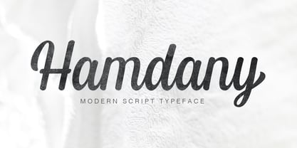 Hamdany is modern script typeface that perfect for photography, branding, signature. It is so beautiful and classy for your projects. This Font has given PUA code (specially coded fonts). So that all the alternate characters can easily be accessed in full by a craftsman or designer.
 - Colesberg Script by Letrasupply Typefoundry,
$20.00 Inspired by vintage script letters, Colesberg Script comes with layered font styles, alternates characters, swash, and ornaments. Have fun with these fonts, you can make a beautiful decorative type and perfect script for any project such as custom name, logos, quotes, invitation, and more creative project easily.
 - TheMix by LucasFonts,
$59.00 "TheMix" is a semi-serif typeface with low-contrast – i.e., the differences between thin and thick strokes are not very pronounced. Yet the reference to writing with the broad-nibbed pen is still present, giving the letters a diagonal stress and a forward flow that facilitates reading.
 - Adagietto by Hanoded,
$15.00 Adagietto is a musical term and means: ‘fairly slow’. I wasn’t in a rush to create this font, so the name kind of suits! Adagietto is a classic font, ideally suited for posters, book covers and product packaging - and just about everything that needs a classy look.
 - Kora Vibes by Jehansyah,
$15.00 Kora Vibes is an elegant and modern serif font with a luxurious feel. Perfect for any title or large font, emails, magazines, book titles, movies, notes, brands, logos and more. This font is PUA coded, which means you can easily access all the glyphs and swashes!
 - Have Heart by Set Sail Studios,
$13.00 Have Heart is a set of 2 hand-made marker pen fonts, designed to combine perfectly and allow you to create stunning hand-lettering quickly and easily. Also included is a set of 12 bonus swashes, ideal for giving your text that final touch of finesse!
 - Cordillera by Latinotype,
$39.00 Clear, simple and multipurpose. We present Cordillera, a new sans serif designed for corporate use, which mixes classic proportions, geometric and neo-grotesque characters. Its alternative characters will allow you to go from expressive titles to neutral texts easily while maintaining the harmony of the system.
 - MBF Neurotic by Moonbandit,
$18.00 Neurotic is a geometric modern minimalist square sans serif display font. An experimental combination between angled and straight lines makes this a unique typeface design. Easily access the styles with uppercase and lowercase. Perfect usage includes logo, poster, display, headline, t-shirt design and many more.
 - Fruitella by Zamjump,
$17.00 Fruitella is a geometric sans serif look. Designed with powerful opentype features in mind. equipped with ligature standards that are different from ligatures in general. Perfect for graphic design and any display use. It can easily work for web, signage, corporate, and also for editorial design.
 - Hanthem Script by Fargun Studio,
$14.00 Hanthem Script is modern script that perfect for photography, branding, signature. It is so beautiful and classy for your projects. This Font has given PUA code (specially coded fonts). So that all the alternate characters can easily be accessed in full by a craftsman or designer.
 - Linger On by Gustav & Brun,
$16.00 Linger On is a handwritten fairly rough brush script. It’s equipped with some Open Type features and an extra set of the most common used letters. It also includes lines and endings for you to have more fun with and make Linger On even more unique.
 - As of my last update in early 2023, the "Bharatic-Font" does not reference a specific, widely recognized typographical design or font family within the extensive array of available fonts worldwide. H...
- An expanded proportion sans serif typeface family, imbued with futuristic urban style and technological inspiration, reflecting my passion for design and geometric precision to achieve unique aesthet...
- FF Kaytek Slab by FontFont,
$50.99 Kaytek™ Slab is a fresh take on the correspondence typefaces of the 90s - which were originally designed for the demands of office environments. Just like its predecessors, this text typeface is robust and hard-working - meaning it works well in challenging design or printing environments - but it’s not without personality. Look closer at the lowercase g and a, especially in the italic, and you can see some unexpected elements of subversiveness within the design. This blend of sturdiness and quirkiness means it’s just as relevant for information-heavy projects, such as annual reports, as it is in more expressive environments. Although first and foremost designed for text, Kaytek Slab’s details shine through in its heavier weights and larger sizes, meaning it also has display potential. Every style of the typeface takes up exactly the same amount of space, thanks to the way Radek Łukasiewicz created the design. He based the entire typeface on a single, master set of proportions. This means designers can switch between styles without the text being reflowed, making it particularly useful in magazines, where space might be limited, and also on the internet, where hover links appear in a different style. As well as its roots in the office, Kaytek Slab draws on a little bit more 90s nostalgia. It’s named for the first and only Polish walkman, and embodies the same solid, no-nonsense shapes that made the analogue technology of the era so charming. Kaytek Slab is robust and solid. Kaytek Slab comes in 12 weights, from Thin to Black Italic, and offers multi-language support. Kaytek Sans, Kaytek Headline and Kaytek Rounded, are also available.
 - Beynkales by Scriptorium,
$18.00Now here's a font with an unusual backstory. You may recall that a while ago we discovered that Tim Burton was using an outdated version of one of our fonts for the interior titles in his The Corpse Bride. Well, our quest to get hold of him didn't bear any immediate fruit, but in a totally unrelated event we were contacted by the graphic arts company working with the overseas distributors for The Corpse Bride and it turned out that they needed a font based on the main title of the movie so they could keep the same style when they retitled it into other languages. The original title was either hand lettered or a heavily modified font, bearing some resemblance to our Ligeia and Tuscarora fonts, so we had to create a whole font more or less from scratch and extrapolate most of the letters from the very limited sample in the original title by identifying certain consistent characteristics and building new characters around them. It was a lot of work, but the good news is that they didn't want exclusivity, so we've got the font to add to our collection. We ended up calling it Beynkales which means 'Bone Bride' in Yiddish, which makes sense given the context of the movie. So here it is, in all its tattered glory, and bound to end up in our Halloween font selection later this year as well. Beynkales Alternate is a companion font that includes a full set of alternative upper and lower case characters which can be used on their own or in combination with the characters from Beynkales to create a more varied and handwritten look. - Baskerville Neo by Storm Type Foundry,
$69.00 One of the most widely used typefaces in the world is actually a legacy of 18th century aesthetics, representing the spirit of late Baroque design, architecture, fashion and society. It has been created and printed for millions of readers around the world for more than two and a half centuries. It influenced many modern typographers. It shaped culture, education, entertainment and science, but also the development of typography itself. As a calligrapher and technical innovator, Baskerville invented new design, papermaking and printing methods, and his typography is very natural and legible to this day. Graphic design today calls for clean and minimalistic solutions, where the use of historical typefaces can achieve a vivid contrast with contemporary elements on the page or screen. Baskerville is undoubtedly the best choice for any kind of publishing house. In keeping with the original inventor’s spirit of excellence, we hereby offer its most advanced digital version. This is not a precise remake of rare Baskerville prints or a restoration of the original punches cut by John Handy, but rather our ideal essence of transitional typography. The old masters were limited by the technology of the time, but today we can dare to have very fine lines, unlimited ligatures, size variations and sophisticated OpenType functions. Drawing, programming, proofing and testing took us many years of development and brought thousands of new letters and dozens of language options. We are convinced that your readers will enjoy this font mainly for reading extensive works, but also for creating corporate identity, orientation systems and cultural posters. Baskerville is perfectly modern in its antiquity, striking in its modesty and timeless in its transiency.
 - Scarab - Unknown license

- Gevher by Hurufatfont,
$23.00 Gevher is a grotesque based font family that the product of a meticulous work that spread over 2 years. It differs from other grotesque fonts with its very soft angular turns to the rounded forms and its daring ink traps. The rigid and stable structure is balanced by deep ink traps and unusual opposite angle at the joints. Thus it has a more humanistic expression. It has 3 widths: Condensed, Narrow and Normal. It consists of 8 main weights and their compatible italics, totally has 48 styles. Therefore, it provides a wide range of usage practices. It offers creative "contextual alternates" for the best reading experience. Ideal for every editorial design, packaging, corporate identity, brand, application, web and desktop usages.
 - Postulat Pro by ParaType,
$40.00 Postulat Pro is a contemporary slab serif typeface. The family contains 16 fonts: 8 romans with matching italics, from Hairline to Bold. The character set include contains more than 2100 glyphs which support most Latin and Cyrillic languages including Vietnamese, Greek, as well as small caps, stylistic and local alternates, and many other useful characters. The font uses a combination of smooth and extremely simple straight shapes. The author abandoned the use of teardrop-shaped classical elements, replacing them with straight ones, which makes Postulat Pro more dynamic and modern. These unique features give the font a unique personality. Postulat Pro is the perfect choice for headlines, logos, branding, packaging, publications and websites. The typeface was designed 2021 by Alexey Chekulaev.
 - Mauritz Caps by Mans Greback,
$59.00 Mauritz Caps is a brush script typeface. A lively uppercase graffiti-style lettering fonts, Mauritz Caps was drawn and created by Mans Greback in 2021 to be the ultimate set of wild-style handwritings for logotypes and branding. This calligraphy family consists of five high-quality fonts in a variety of weights: Mauritz Caps Thin, Light, Regular and Bold. The font is built with advanced OpenType functionality and has a guaranteed top-notch quality, containing stylistic and contextual alternates, ligatures and more features; all to give you full control and customizability. It has extensive lingual support, covering all Latin-based languages, from North Europe to South Africa, from America to South-East Asia. It contains all characters and symbols you'll ever need, including all punctuation and numbers.
 - Ledare by Mans Greback,
$39.00 Ledare is a dynamic sans-serif typeface. Created by Mans Greback between years 2019-2021, this expressive font leads the way of your message with confidence and determination. It has a soft, easy-going outlook, yet is formal and rigid. The Ledare family consists of 14 fonts: Thin, ExtraLight, Light, Medium, Bold, ExtraBold and Black, with each weight as italic. The font is built with advanced OpenType functionality and has a guaranteed top-notch quality, containing alternates, ligatures and more features; all to give you full control and customizability. It has extensive lingual support, covering all Latin-based languages, from North Europa to South Africa, from America to South-East Asia. It contains all characters and symbols you'll ever need, including all punctuation and numbers.
 - Oddee by Informal Type,
$25.00 Construction period of Anafor deeply inspired by the pioneer of geometric abstract art and the creator of the avant-garde suprematist movement Kazimir Severinovic, Malevich’s suprematist compositions. Anafor typeface is separated from the basic Latin letters in terms of character and letter structure. Furthermore, The forms and main structure are designed together with alternatives by taking into account the relationships between the defined angles.Anafor contains certain aspects of a display typeface, due to the structure of the letter forms that are open to abstract connotations. Typeface family includes 2 styles; Anafor Basic and Anafor Crash. Each individual style has 235 glyphs and it has OpenType encoding. Due to the diversity of three styles, Anafor is providing a wide range of possibilities for the user.
 - Joaquin Typeface by FoxType,
$10.00 Joaquin Display is a Brand New Elegant Bubbly Typeface with a powerful font family. It has a dependable and uncompromising style, with controlled letterforms and modern touches. It looks amazing in funny logos, cartoon posters, and movies. Joaquin Font would be perfect for kid's craft, comic posters, Captions, bubbly texts, and cute funny boards. The various weights allow you to experiment with a wide range of applications. It's created to make an impression without sacrificing its beauty and readability. It's shown a clean, bubbly, warmth, funny, yet still purposed to be versatile The Typeface includes four Weights - Regular, Medium, SemiBold, and Bold All offer wide language support Uppercases and Lowercases. Numerals and extended punctuation. Thank you for taking the time to look into the font
 - Elen Sans by Hurufatfont,
$19.00 The first design of Elensans consisted of 4 styles that are including two weights and their italics which I designed in my student years in 2002. It was designed with a little Art Nouveau style touch with inspired by classical geometric based fonts such as Friz Quadrata and Eras. It was updated with according to the orientations of the day in 2012 and eventually it took its final form with actual touches in 2020. The family has 18 weights, ranging from Thin to Black in normal styles and including their italics. It is ideally suited for advertising and packaging, editorial and publishing, logo, branding and creative industries, poster and billboards, small text, wayfinding and signage as well as web and screen design.
 - Faktum by René Bieder,
$39.00 Faktum is an exploration into the geometric sans genre, inspired by Mid-century modern architecture and interior design. Especially the combination of clear lines, organic curves and geometric shapes, highly popular among designers and architects of the second third of the 20th century, gave the impetus for a design with clear modernist roots and a strong contemporary finish. The family comes in 8 weights plus matching italics, featuring a wide range of alternate characters and opentype features like discretionary ligatures, case sensitive shapes, different number sets and many more. Due to its clean lines and slightly organic structure, Faktum functions great in many sizes and surroundings, working either as a restrained supporting font in long paragraphs, or as a main actor in powerful headlines.
