10,000 search results
(0.156 seconds)
- Pinx Niera by Sitintahitam,
$20.00 Pinx Niera is a bold psychedelic typeface. Inspired by psychedelic music and visual. The typeface looks bold, clean, and unique form. Suitable for any graphic designs such as branding materials, t-shirt, print, logo, poster, packaging .etc
 - Light Line Deco JNL by Jeff Levine,
$29.00 The unusual, thin line hand lettering on the cover of the sheet music for 1936's "If You Love Me" was the basis for Light Line Deco JNL, which is available in both regular and oblique versions.
 - Neurotic Roman JNL by Jeff Levine,
$29.00 The free-form, Art Nouveau hand lettering on the cover of the sheet music for 1915's "She Was All That a Pal Ought to Be" inspired Neurotic Roman JNL; available in both regular and oblique versions.
 - Bubble Boom by Blankids,
$18.00 Bubble Boom is inspired by graffiti, and fits well for themes such as graffiti posters, Hip Hop music, kids posters, flyers, children books, cartoons, comics, and more. Features included: Uppercase Lowercase Number Punctuation Multilingual PUA Encode OpenType
 - American Grunge by Hanoded,
$15.00 American Grunge is a spooky font. It was created using a steel pen and China ink - and a lot of splatter. American Grunge is my tribute to that nineties wave of fantastic music coming out of Seattle.
 - Kaaos Pro by The Type Fetish,
$25.00 Kaaos Pro is based on the logo of the Finnish hardcore band of the same name. It was expanded to include extended Latin, extended Cyrillic and Greek alphabets so it will work with most languages in Europe and the Americas.
 - Date Night JNL by Jeff Levine,
$29.00 The opening title card for 1931's pre-code movie drama "Other Men's Women" (with Mary Astor, Regis Toomey, James Cagney and Joan Blondell amongst the cast members) is the basis for the Art Deco type face Date Night JNL.
 - Jadran by Mina Arko,
$7.00 Jadran drew inspiration from holidays in the 80's, spent on the Adriatic coast. This all caps display face supports all European languages and comes with several illustrations. Jadran font is an homage to a cult children's magazine named 'Ciciban'.
 - Regency by Studio K,
$45.00 Regency is named after the style associated with the period, which is at once elegant and luxurious. A modern classic, it is influenced by Americana and Optima and combines the style of a serif face with the simplicity of sans serif.
 - P22 Basala by IHOF,
$24.95 P22 Basala was created using straight horizontal and vertical lines, but with large rounded corners to create an unconventional softness for a bold face. The naming of the font reflects this juxtaposition: Basara= Basala= (in Japanese) free and unrestrained, unconventional.
 - Revolver by Device,
$39.00 Designed for the seminal comics magazine of the same name, Revolver was one of Rian Hughes’ first typeface designs. Originally published as part of the FontFont range, it has now been remastered and includes full European glyph support and Opentype features.
 - Sepian by Laura Worthington,
$19.00 Sepian is a wickedly fresh update on the centuries-old textura blackletter form. Use its razor-sharp “gothic” face and darkly cool character to create tattoos, horror-movie posters, or scary video game text. See what’s included! http://bit.ly/2c5MnNN
 - Figgins Antique by HiH,
$12.00 “Hey, look at me!” cried the new advertising typefaces. With the nineteenth century and the industrial revolution came an esthetic revolution in type design. Brash, loud, fat display faces elbowed their way into the crowd of book faces, demanding attention. Those who admired traditional book types harumphed and complained. Robert Thorne had fired the opening round with his Fatface. With the cutting of Figgins Antique, the battle was well and truly joined. Job printing came into its own and it seemed like everything changed. The world of printing had been turned upside down and the gentile book-type aficionados recoiled in horror much as the rural landed gentry recoiled at the upstart middle class shopkeepers and manufacturers. William Savage, approvingly quoted by Daniel Berkeley Updike over a hundred years later, described the new display faces as “a barbarous extreme.” These were exciting times. According to Geoffrey Dowding in his An Introduction To The History Of Printing Types, “The types which we know by the name of Egyptian were first shown by Vincent Figgins in his specimen book of 1815, under the name Antique.” Of course, dating the design is not quite as simple as that. Nicolete Gray points out that Figgins used the same “1815” title page on his specimen books from 1815 to 1821, adding pages as needed without regard to archival issues. As a result, there are different versions of the 1815 specimen book. In those copies that include the new Antique, that specific specimen is printed on paper with an 1817 watermark. The design is dated by the 1817 watermark rather than the 1815 title page. Figgins Antique ML is an all-cap font. This typeface is for bold statements. Don't waste it on wimpy whispers of hesitant whimsies. And please don't use it for extended text -- it will only give someone a headache. Think boldly. Use it boldly. Set it tight. Go ahead and run the serifs together. Solid and stolid, this face is very, very English. FIGGINS ANTIQIE ML represents a major extension of the original release, with the following changes: 1. Added glyphs for the 1250 Central Europe, the 1252 Turkish and the 1257 Baltic Code Pages. Added glyphs to complete standard 1252 Western Europe Code Page. Special glyphs relocated and assigned Unicode codepoints, some in Private Use area. Total of 331 glyphs. 2. Added OpenType GSUB layout features: liga and pnum. 3. Added 86 kerning pairs. 4. Revised vertical metrics for improved cross-platform line spacing. 5. Redesigned mathamatical operators. 6. Included of both tabular (standard) & proportional numbers (optional). 7. Refined various glyph outlines.
 - Deco Days JNL by Jeff Levine,
$29.00 The hand lettered pre-Deco style title and songwriters' credits on the cover of the sheet music for 1929s "The Love Parade" were the models for Deco Days JNL, which is available in both regular and oblique versions.
 - Nouveau To Go JNL by Jeff Levine,
$29.00 Nouveau To Go JNL is the digital version of the hand lettered title found on the 1915 sheet music for the song "Don't Bite the Hand That's Feeding You", and is available in both regular and oblique versions.
 - Poster Pen JNL by Jeff Levine,
$29.00 The bold round point pen lettering on the cover of the 1934 sheet music for “New England in the Rain” was the model and inspiration for Poster Pen JNL, which is available in both regular and oblique versions.
 - Courtship JNL by Jeff Levine,
$29.00 The Art Nouveau hand lettered title on the sheet music for the 1909 composition "If the Wind Had Only Blown the Other Way" was the basis for Courtship JNL, which is available in both regular and oblique versions.
 - Westfield Nouveau JNL by Jeff Levine,
$29.00 The hand lettered song title on the sheet music for 1918’s ‘N’ Everything (from the Al Jolson show “Sinbad”) was the inspiration and model for Westfield Nouveau JNL, which is available in both regular and oblique versions.
 - Song Crafter JNL by Jeff Levine,
$29.00 Song Crafter JNL was modeled from the writer credits on the cover of the 1943 sheet music for "This Love of Mine", a tune popularized by Frank Sinatra. The typeface is available in both regular and oblique versions.
 - Ceuphoria by Atasi Studio,
$18.00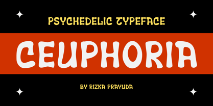 Ceuphoria is a display groovy font with a psychedelic look and trippy effect. Ceuphoria is ready and Perfectly fit for your logo designs, music projects & social media posts, event poster, brand imagery, product packaging, handwritten quotes, merchandise, etc.
 - ITC Blair by ITC,
$50.99 The ITC Blair™ typeface is a revival and reimaging of an early 20th century metal typeface of the same name. Even though only available as single weights of extended and condensed proportions, metal fonts of the face were sold well into the 1950s. In 1997, Jim Spiece resurrected the original extended design for digital imaging and, in the process, added two new weights. Almost 20 years later, he collaborated with Monotype type designers to extend the basic family again. The result was a new suite of three condensed designs and italic complements for all the roman weights. The family also benefits from a large set of alternative glyphs and many OpenType® features.
 - Buntisland by Greater Albion Typefounders,
$20.00 Buntisland (we wonder where we came up with that name from... another subconscious whim), is Greater Albion Typefounders blackletter release for Christmas 2016. The family consists of four typefaces- regular, weathered, shaded and shadowed, and has it's origin in a design challenge which came up in conversation, as all the best ones do. In this case it was 'design a legible all capitals black letter...' Challenge accepted and completed!
 - Discopia by Konstantine Studio,
$17.00 The invasion of futurism is begun. Came out prepared with our latest fonts collection, Discopia. Inspired by the visual of futuristic and techno-based design from the latest and upcoming trends. Perfectly fit for your gaming logo, branding, techno branding, digital assets, game design, UI, UX, synthwave, vaporwave, futuristic poster, contemporary typographic design, techwear apparel, vehicles design, prototype concept, anything you need a boost to the future, Discopia is here.
 - Bornholm Sandvig by Trine Rask,
$25.00 Bornholm Sandvig is named after the village, "Sandvig", on the only rocky island in Denmark, Bornholm. It is the second face in a series of rough stone cut typefaces, that shares proportions, but differs in any other aspect like different pieces of rock. It is a powerful face, but still very friendly. Good for very big sizes, but can be used for small texts, movie titles, cartoons, etc.
 - Bornholm Tejn by Trine Rask,
$25.00 Bornholm Tejn is named after the Tejn village on the only rocky island in Denmark, Bornholm. It is the first face in a series of rough stone cut typefaces, that shares proportions, but differs in any other aspect like different pieces of rock. It is powerful face, but still very friendly. Good for very big sizes, but can be used for small texts, movie titles, cartoons and more.
 - Kis by ParaType,
$30.00 The Bitstream version of Linotype Janson. Nicholas Kis (Miklos Kis) was a Hungarian punchcutter who worked in Amsterdam. His types are some of the greatest in the Dutch old face style and have been used as models for a number of developments in this century. The Linotype version of this style, Janson, was created by Chauncey H.Griffith in 1937 and based on an original face cut by Kis in 1670–90. The face is named after Anton Janson, a Dutchman who worked in Leipzig, with whom the face has no connection. The typeface is used for text setting. Cyrillic version was developed at ParaType in 2001 by Vladimir Yefimov.
 - Showmanship JNL by Jeff Levine,
$29.00 Despite the racially demeaning 1906 sheet music for "The Ghost of the Banjo Coon", the title's lettering provided an interesting hand-lettered sans serif that has been re-drawn digitally as Showmanship JNL in both regular and oblique versions.
 - Mystyline Decorative by Struvictory.art,
$14.00 Mystyline is a modern thin line condensed font inspired by hipster aesthetics. The letters are decorated with lines and dots. Mystyline is suitable for contemporary typographic posters (event design, movie posters, advertising, music production, photo overlays), hipster design etc.
 - Neon Bar by Zefrar,
$19.00 Neon Bar is very useful for any project related to Bar, Music, Panels, Signs and more. It has a unique style and inspired from Las Vegas Panels but the design is too modern and very fit with neon print.
 - Winning Team JNL by Jeff Levine,
$29.00 The second volume of the Robbins Music Corporation's "Hollywood Song Folio" features the word "Hollywood" lettered in a condensed block style with inline, strongly reminiscent of sports or college-themed typography. This was the inspiration for Winning Team JNL.
 - AlbertBetenbuch by Ingrimayne Type,
$14.95 The inspiration for AlbertBetenbuch came from a typeface drawn by Albert Dürer and an interpretation of that face in Arthur Baker’s Historic Calligraphic Alphabets (Dover, 1980). It is not a recreation of either. The characteristic common to AlbertBetenbuch and the faces inspiring it is the decorative zig-zag with the upper-case letters. In late 2018 the inside of the shadowed style was separated out. It looks very much like the plain face but its spacing matches the shadowed version. It can be layered with the shadowed version to easily create two-colored letters.
 - Marco Polo by Linotype,
$29.99Franko Luin, Marco Polo's designer, on this typeface: Marco Polo is a 'massacrated' oldstyle typeface that can be used in the same way as, e.g., Caslon Antique. I designed it - if the word design is appropriate in this case - to give the users an alternative so that they are not always directed to the same choice. For the same reason I made Marco Polo rounder. The name comes from the famous Venetian globetrotter, who has nothing at all to do with the typeface, since printing and punchcutting were still an invention of the future. - Erehwon Roman NF by Nick's Fonts,
$10.00This charming font, with its hints of the exotic, originally carried the rather prosaic name of Show Card Roman. It appeared in the book "Art Alphabets and Lettering: an encyclopedia of lettering including the most important standard alphabets and such classics as are in most demand for the use of engravers, designers, and all lovers of art" by the evidently rather verbose J. M. Bergling (1866-1933). As a nod to its exotic overtones, the font is named after the 1872 utopian novel of the same name by Samuel Butler. - MGT Vallery Hills by Magetype,
$15.00 When I was surfing the internet, with rock n 'roll music. I accidentally found a picture of a hotel sign with a very unique style, namely: Mid-century Modern (MCM). It looks very pretty and charming to me. And inspired me to create Font Family. And I am proud to present the Vallery Hills Font Family. This font is in the Retro style of the 50s to 60s. Okay, here are the specifications. 1. Vallery Hills Schrift There is one unique thing about this font. Usually, script fonts with Retro style always have an angled anatomical shape, but I made this font upright. The goal is to make a difference with other script fonts I've seen. By the way, this font comes in two styles, namely: Regular and Bouncy. Why do I make it like that? Because I want to make this font into two different functions, namely: If you want to make it a Display Font, which is usually used for Headings, then use the Bouncy style. And if you want to use it as Bodytext, then use Regular. 2. Vallery Hills Sherift This second font is a font that is very synonymous with the Mid-century Modern (MCM) era. A very distinctive form of the serif font of that era. Similar to the first font, this font also has 2 styles, namely: Regular and Bouncy. You can combine this font with the other two fonts in Vallery Hills. It could be Title, or Bodytext. And you can also combine two styles, namely: Regular and Bouncy. Try! 3. Vallery Hills Suns Sherift This last font is Sans Serif. Also has 2 styles like his two brothers, namely: Regular and Bouncy. The goal is actually the same. I am sure you are cooler to create a design that uses this font family. Well, there is one advantage of this font from its two siblings, which is that it has a feature, namely: SMALLCAPS. Which will be an option when you are bored with the mediocre shape or style of Lowercase. Try combining the Smallcaps with Uppercase or Lowercase. Must be cool! : D Oops, almost forgot. This font consists of several font formats, namely: OTF, TTF, and Webfonts. And of course everything is MULTILANGUAGE. OK, friends. That's all I can describe about the Vallery Hills Family. Hopefully it will please all of you. Cheers!
 - Eureka Antique by Solotype,
$19.95You may be familiar with a caps and small caps type called Cruickshank. In Germany the same face was called Eureka. We took the small caps, which are not so overblown as the caps, and designed a lowercase to harmonize with it. - Behrens Schrift by Solotype,
$19.95A simplified blackletter designed by Peter Behrens, architect and graphic artist who came into prominence around 1900. Issued by Rudhard's Typefoundry, Offenbach A. M., this face was typical of many in the Jugendstil period. Its squarish look works well in Craftsman period layouts. - Hello Sintha by Sakha Design,
$12.00 Hello Sintha is a fun and friendly handwritten font. Whether you are using it for cartoon-related designs, children’s games, quotes, titles, brand names, book covers, posters, or just any creation that requires a touch of joy, this font is a great choice.
 - Martial Arts JNL by Jeff Levine,
$29.00 The 1946 foreign publication entitled "100 Alphabets Publicitaires" ("100 Advertising Alphabets") collects a number of interesting and attractive lettering samples for design inspiration. One such example is Asian-inspired and was re-drawn as the digital type face now named Martial Arts JNL.
 - Surely You Jest NF by Nick's Fonts,
$10.00A late nineteenth-century type specimen catalog from Farmer, Little & Co. yielded this droll little typeface, originally called "Arbor". The distinctive decorations of the face suggested a fool's cap, and thus the font got its current name. And don't call me Surely. - HK Requisite by Hanken Design Co.,
$- HK Requisite™ is a sans serif typeface inspired by the compactness of Neue Haas Grotesk and the strong character of Akzidenz Grotesk. The name came from the fact that fonts are elements that are necessary for the achievement of a specified end.