10,000 search results
(0.044 seconds)
- Aviano Serif by insigne,
$24.99 Insigne's popular Aviano series returns with Aviano Serif. Aviano Serif features the same classically inspired and extended proportions of Aviano, but instead of the brush drawn forms of the original, Aviano Serif features a more geometric take with small, sharp serifs. Aviano Serif is perfect for mastheads, headlines and powerful logotypes. The Aviano Serif family includes four weights for a wide array of design possibilities. All weights feature 40 OpenType ligatures, old styles figures, 28 alternate characters and 10 eagle ornaments for unique, custom designs.
 - Beachfront Hotel JNL by Jeff Levine,
$29.00 The Raleigh Hotel at 18th Street and Collins Avenue on Miami Beach is an Art Deco landmark and part of the city's popular tourist district. A vintage matchbook from the hotel had its name hand lettered in what is now Beachfront Hotel JNL; available in both regular and oblique versions. The lower case letters have been made more traditional, eliminating the Deco-influenced "overhangs" present on the capital letters, and an alternate "E" from the original matchbook design is available on the bar and broken bar keys.
 - Berlinette NB by No Bodoni,
$39.00 These four typefaces, Berlinette NB, Lyonette NB, Marseillette NB and Parisette NB, were designed from the same basic shape, a fanciful geometric form that avoids strict horizontals and uses more offbeat triangular shapes. Berlinette is the medieval Gutenbergian version of the four. It’s like a weird black letter font from the 1930s. It would work well advertising an obscure brand of German beer on the side of a Zeppelin as it circles the soccer stadium during the last match. In a William Burroughs novel.
 - Bullish by Gerald Gallo,
$20.00 Bullish is a clean, contemporary, geometric font family. There are 12 fonts in the Bullish family, Light, Medium and Bold. Each with a lower case, small caps, lower case oblique and small caps oblique. The small caps versions have small caps in place of the lower case alphabets. The lower case and small caps versions have the same uppercase alphabet, numbers, punctuation, symbols and miscellaneous characters. The Bullish fonts are ideal for headlines, titles, branding, small blocks of text or wherever a fresh font is desirable.
 - Modified Gothic by Linotype,
$29.99Modified Gothic is an art deco titling face developed by the Linotype Design Studio. This typeface includes the following features: letterforms drawn with a monoweight line, a relatively narrow character base, proportionally altered small caps" in lieu of a lower case, and a distinctly round feeling. Use Modified Gothic anytime you need to evoke the spirit of the roaring 20s! Modified Gothic looks great in headlines, as well as in short lengths of large body text. Modified Gothic is part of the TakeType 4 Library." - Loppemarked by PizzaDude.dk,
$17.00 Loppemarked is Flea market in danish, and that’s where I got the inspiration to do these fonts from! Headline - chunky serifs here and there, and some are missing! No attempt to get it right…anywhere! Text - The letters are scribbled quickly, leaving not much attention to accuracy. Sans - With this font, there has been some effort to hit the same width of strokes, but it is still off here and there. All in all, the sweet innocence in these letters…I love it! <3</p>
 - Swissra Condensed by Abjad,
$- Following the great success of Swissra, the condensed cut was designed on the same principles of Swiss graphic design. Originally Swissra was designed to create a neutral and carefully crafted Arabic font family that can be used on many different applications. Now it creates even more possibilities to help designers in applications such as signage and editorial design where the condensed cut is needed. The typeface is one of very few Arabic condensed typefaces. Swissra Condensed comes in eight weights which range from Ultralight to Black.
 - Toews by Blank Is The New Black,
$10.00 Toews is a continuation of the work started with Versteeg, Huet, and Niemi. It combines the elements of the letterforms found in Huet and Niemi and uses the letterform outlines to create shapes that intersect with themselves. While Huet and Niemi can easily be outlined in most design programs, Toews outlining would not work smoothly in most programs, which is why an outlined version is available. The two styles are carefully designed to be able to transition from one to another smoothly within the same type field.
 - Campan by Hoftype,
$49.00 Campan, is a new semi-linear face which unites mono-line and classic elements. It is very strong in headlines and its tall x-height lends itself to comfortable reading in text applications. The Campan family comprises 12 styles and is well suited for ambitious typography. It comes in OpenType format with extended language support. All weights contain ligatures, small caps, proportional lining figures, tabular lining figures, proportional old style figures, lining old style figures, matching currency symbols, fraction- and scientific numerals and matching arrows.
 - Bell Gothic by ParaType,
$30.00 The Bitstream version of Bell Gothic designed by Chauncey H. Griffith in 1938 for telephone directories of the Bell Telephone Company. It is a good sans serif choice for listings, catalogues and directories as its design is very space saving. The weight of the line is moderate and uniform. Being a clear and easy-to-read font, Bell Gothic is popular now for display and magazine advertising. Cyrillic version by Isabella Chaeva was released by ParaType in 1999. Italic styles added in 2009 by the same designer.
 - Twombly by SAMUEL DESIGN,
$19.00 The name of this font is TWOMBLY, which is inspired by the abstract art master Cy Twombly. This original typeface has an Art Deco style with a firm, straightforward, confident character. Its self-respect is HEAVY, but it is very elegant and has a literary temperament. This font reveals a calm and calm temperament from Northern Europe. The details of the triangle used as a transition in the serif are full of playfulness, which makes the whole font have a youthful and cutting-edge feeling.
 - Burgery by Arterfak Project,
$18.00 Say hello, to Burgery! A playful display font. Inspired by kids' games and snacks typography. Burgery designed in monoline concept and adjusted well to keep the legibility. Burgery is a flexible typeface that you can use for many kinds of stuff and themes. Burgery is an all-caps font, equipped with stylistic alternates, ligatures, Burgery is perfect for kids' merchandise, quotes, t-shirts, posters, social media, pillow, packaging, storybook, food menu, cafe decoration, logos, and much more! Mix and play your words with Burgery!
 - Bad Girl by Scholtz Fonts,
$21.00Bad Girl was designed to appeal to the young consumer and the young-at-heart. While clearly feminine, it manages to combine a charming naïveté with in-your-face rebelliousness. The awkward, rather self-involved character shapes have a definite gauche appeal. Bad Girl has a gamine-like insouciance with a touch of wickedness. In contrast to its naive appearance, Bad Girl has been carefully crafted, letterspaced and kerned and contains a full character set of 237 characters. The font comes in two styles, regular and light. - Myster by Serebryakov,
$49.00 Myster is a truly random font — each lowercase letter has three alternatives, that interchange in the set. This makes Myster look alive, hand-crafted, painted for a special occasion, rather than a font selected from a regular type case… Of course, the mystical character of the font defines the scope of its usage — film, gaming and publishing industries. However Myster’s field of application goes beyond them. This font is able to create a desired atmosphere in packaging, children books, magazines, as well as in advertising.
 - Inversi by Hanken Design Co.,
$30.00 Inversi is a reverse-stress typeface that may be used as a display or text-face font for a wide range of subjects. Compared to other reverse-stress/reverse-contrast typefaces, Inversi's linear contrast is much lower which, at lower sizes, makes it a good options for text or captions. It has good language support, unique design, fractions, and three different widths. Inversi pairs well with HK Requisite. Use the narrow or condensed style when mixing with HK Requisite to give more contrast to the composition.
 - Tangent by Hoftype,
$49.00 Tangent provides a fresh new look on serif dominant typefaces. Its strict graphic outline makes it appear crisp, lively and unsentimental; and at the same time humanistic virtues have also been well taken into account. Tangentd consists of 18 styles. It comes in OpenType format and provides an extended language support. All weights contain standard and discretionary ligatures, proportional lining figures, tabular lining figures, proportional old style figures, lining old style figures, matching currency symbols, fraction- and scientific numerals, matching arrows and alternative characters.
 - Fortis by GroupType,
$19.00 Formerly named Atlas, Fortis is a 21st century contemporary Latin. Also categorized as a Glyphic, the design was first introduced in the last half of the nineteenth century and is characterized by large, sharp, triangular serifs. Latins were very popular for posters and as a newspaper headline font. Fortis is a Latin with attitude. It is bouncy and much more animated than its predecessors. As a display font, it brings motion and playful personality to a design. Great for party invitations, packaging, headlines, and children's books!
 - Spooky Hill by Attype Studio,
$10.00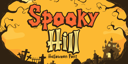 Hello! Spooky Hill is an incredibly unique and playful display font. Fall in love with its authentic feel and use it to create spectacular Halloween designs! Spooky Hill is perfect for branding, logo, invitation, stationery, social media post, product packaging, merchandise, blog design, game titles, cute style design, Book/Cover Title and more. What's Included : - Spooky Hill.otf - Spooky Hill Inline.otf - Multilingual Support (Afrikaans, Albanian, Catalan, Danish, Dutch, English, Estonian, Finnish, French, German, Icelandic, Italian, Norwegian, Portugese, Spanisch, Swedish, Zulu) --- Hope you enjoy with our font! Attype Studio
 - Saffron Walden by Hanoded,
$15.00 Saffron Walden is a small market town in Essex, England. When I created my first ever connected script font, I decided that a 'flowery' name would be best (since that seems to be the most popular choice for connected fonts….). Saffron Walden is a fattish, inky brush font, with a slight tilt to the right. It would be perfect for book covers, magazines, headlines and posters, but could also be used for packaging. Comes with a bunch of ligatures and a heap of diacritics.
 - Rambla Alt by TipoType,
$- Rambla Alt is a variation of Rambla, which has certain modifications without altering its main structure (Rambla is also available in Myfonts). For this reason Rambla Alt is great when used together with Rambla. Rambla Alt is a humanist sans for medium-long texts. It’s slightly condensed, with a generous x-height and short ascender/descenders. Its proportions have the objective of gaining space in height and width. It’s elegant in large sizes and legible at the same time, with a lot of rhythm in small sizes.
 - Taurunum by Kostic,
$40.00 The initial idea for this font came when a friend of mine asked me to create a logo for a sports team that he was forming. Since it was a martial arts competitive sport, bold and striking lettering was needed to reflect that. When the logo was finished, I was really pleased whith the letters so I decided to create the entire font. Taurunum is made with intention to be used for display design (logos, posters, etc.), and combining the weights should give best results.
 - Sofia City by Evolutionfonts,
$- Sofia City is a decorative hand-drawn family that can be used on both formal and informal occasions. It has a dual personality: One time it looks like unfinished contours of a sans serif, and the other - like a very thin serif. The family is named after the city of Sofia - the capital of Bulgaria, and my hometown. Sofia City comes in two versions - "Pencil" and "Ink" each with full character set and true italics. Also there is a free demo version (capital letters only).
 - Manche by NamelaType,
$19.00 Introducing our newest font called Manche. is a sans serif font with a geometric feel, The younger brother of Counte, made with the same �blueprint� but this font is developed more from the previous experience of designing Madani fonts. Equipped with 3 types of Width and 9 Weight as well Oblique resulting in 54 font family. This font is designed for the needs of digital printing, text, display and others so that it provides many options for various functions. Available in many languages and opentype features.
 - Jerome by Peterdraw,
$14.00 Jerome inspired by compact, strong, and solid font. It comes with 3 weights: Thin, Light, and Regular. Jerome features strong and solid lines, gorgeous glyphs, and stunning styles. It would perfect for logos, magazines, quotes, posters, branding, name card, stationary, design title, blog header, art quote, typography. Features: 3 weights: Thin, Light, and Regular Standard ligatures Small Caps Fractions Ordinals Superscript Subscript We wish you enjoy our font and please don't hesitate to drop us a message if you have any issues or queries.
 - Roca by My Creative Land,
$29.00 Initially started as an extension to Praline MCL, Roca transformed into a new font family - influenced by the same fonts as Praline - Windsor and Cooper Black - the hits of 60s and 70s – with a hint of Bookman. Created in 2 styles and 6 weights that can be mixed and match, it contains 24 fonts including alternates and true italics . It is full of OpenType features – stylistic alternates and ligatures. This multilingual font family supports most of the European languages as well as Cyrillic ones (Russian and Ukrainian).
 - Balsoon by Attype Studio,
$12.00 Introducing Balsoon - Inspired by urban typeface with texture style, Balsoon has strong character perfect for urban street design. Balsoon is perfect for branding, logo, invitation, stationery, product packaging, merchandise, monogram, blog design, game titles, cute style design, Book/Cover Title and more. Features : - Ending swash - Ligatures - Multilingual Support - Made it into separated file to make it easier to use by beginner & separated file user can use the font with software which doesn't accept open type features. Hope you enjoy with our font! Attype Studio
 - Elysia by Factory738,
$15.00 We present Elysia, a fresh two-faced serif with both MODERN and CLASSIC curves. Elysia is a split personality font that can be used for a variety of projects, including bold magazine imagery, wedding invitations, branding, poster design, and much more. 2 Weights (Light & Bold) 2 Styles (Modern & Classic) Basic Latin A-Z and a-z Numerals & Punctuation Stylistic Ligatures glyps Multilingual Support for ä ö ü Ä Ö Ü ... Free updates and feature additions Thanks for looking, and I hope you enjoy it.
 - Glaser Stencil by Linotype,
$40.99 The renowned American illustrator and graphic designer Milton Glaser designed Glaser Stencil in 1970. Glaser Stencil is a perfect summation of both Modernist proportion and New York-style solidity and self-assurance. An all capitals font, the shapes of the letters are reminiscent of popular sans serif faces of the time, such as Futura and ITC Avant Garde Gothic. Like everything New York-related, Glaser Stencil should be used big, in headlines and display applications, where it can play a bold, proud, and confident role.
 - Bastardre Hand by DC Design,
$32.00Bastardre Hand is a beautiful calligraphic face based on medieval miniscule script. With characters closer together yet still recognizable and easy to read, this font works well for illuminated text designs and wherever the look of a scribe's hand is desired. Bastardre Hand has punctuation and diacritics for: Afrikaans, Albanian, Bassa, Cebuano, Danish, Dutch, English, Estonian, Faeroese, Finnish, Flemish, French, Frisian, Gaelic, German, Haitian Creole, Hiligaynon, Hmong, Indonesian, Italian, Iloko, Kurmanji Kurdish (Roman script), Marshallese, Norwegian, Papiamento, Portuguese, Spanish, Swahili, Swedish, Tagalog, Trukese, Wolof, Xhosa, Zulu. - The Seasons by My Creative Land,
$25.00 The Seasons is an elegant classic serif font family consisting of a high contrast serif fonts with a vintage chic look, with corresponding calligraphic cursive italics that are based on a number of humanist italic scripts and written with a Pilot Parallel Pen. Both upright and italic fonts (6 in total) share same style soft terminals with a sharp cut and are enhanced by OpenType features such as ligatures and stylistic alternates. The Seasons can be used in high-end branding, logo designs, magazines, product packaging & invitations.
 - Brass Rail JNL by Jeff Levine,
$29.00 Brass Rail JNL is a novelty font, with its name derived from two key components of the source material. It was modeled from examples of vintage small letters stamped out of brass with "rails" above and below each character to fit within a slot. The most likely use of these letters would have been for either decorative initials or small merchandising signs (similar examples of both have been seen in the past). From these few examples comes a typeface with numerals, punctuation and an extended character set.
 - Rilke by Pelavin Fonts,
$20.00 Rilke, is the lettering used by Gustav Klimt on the 1st Vienna Secession poster in 1898 and is named for Klimt’s contemporary the poet Rainer Maria Rilke. The Vienna Secession was a group of artists whose motto was "to every age its art and to art its freedom." Their goal was to create a new style not based upon any historical influence. Its subtle curving strokes and the idiosyncratic set of the various characters create an elegant lightness which lends itself well to poetry, inscription
 - Rotunda by TipoType,
$24.00 Rotunda blends the best of three worlds: it’s geometric, humanist and grotesque. But, far from being a tasteless hybrid, it has a strong personality and British undertones that turn it into a stylish and sober classic font face. Thanks to its ample character set and many variables, it stands as a versatile, all-terrain font. Strong and elegant, modern and classic, firm and humanistic. It truly is a 21st Century classic. It includes a very thorough coverage for a wide variety of Latin alphabet-based language families.
 - Brenta by Ludwig Type,
$45.00 Brenta is a crisp typeface with open counters and compact proportions, its name referring to a range of mountains in northern Italy. Like its namesake, Brenta is characterized by sharp-edged and sturdy forms, but also by its clarity and elegance. Strong serifs, flat and bold shoulders and open terminals pronounce the horizontal and help to guide the eye along the line. Very fine junctures keep the characters sharply defined and create dynamic light traps. Visit this minisite to see the Brenta webfonts in action: http://brenta.ludwigtype.de
 - Original Garamond by ParaType,
$30.00 The Stempel foundry in Germany produced this version of Garamond in 1925 as a replica of a typeface of a French punchcutter Claude Garamond (middle of the 16th century). This design has an angular incised appearance which is unlike other Garamond types. It is also slightly heavier in weight, and is highly readable as a text face. Well suited for a wide range of applications and treatments. Original Garamond is the Bitstream version of Stempel Garamond. Cyrillic version was developed for ParaType in 2002 by Gayaneh Bagdasaryan..
 - Counter Attack by Arendxstudio,
$15.00 Counter Attack - Horror Font is a display font that is inspired by horror style because its shape is very unique and is perfect for any project that you will use with this theme. Counter Attack came with opentype features such stylistic alternates, stylistic sets & ligatures good for logotype, poster, badge, book cover, tshirt design, packaging and any more. Features : 1.Uppercase & Lowercase 2.Multilingual support 3.Number 4.Symbol 5.Punctuation. 6.Support in Mac and Windows OS -Support in design application (photoshop, illustrator, and more)
 - Ryno Slab by Philatype,
$32.00 Ryno Slab is a superslab that was born out of a need for an aggressive, heavy, geometric display face that did not appear clunky. Its serifs are so thick, you could create reasonably legible word shapes by using all caps and masking the words out. Ryno Slab’s tough geometric exterior and squarish forms make it suitable for tight setting in posters, t-shirts, and artwork. Also, an extended character set with support for European languages make Ryno Slab a good fit for magazine headlines.
 - Heavy Duty by Gerald Gallo,
$20.00 Heavy Duty is a bold condensed sans serif font set. Heavy Duty Solid is crisp and clean while Heavy Duty Sketch suggests characters that could have been sketched with a pen or pencil. Both fonts have the same uppercase and small caps lowercase alphabet, numbers, punctuation, symbols, and miscellaneous characters. The Heavy Duty fonts are ideal for making a bold statement in headlines, titles, or text. Heavy Duty Solid and Heavy Duty Sketch are to be sold only as a set priced at $20.
 - Vitrines by PintassilgoPrints,
$24.90 Vitrines is a digital and extended version of a charming alphabet featured in a 1913 book devoted to window signs and show cards. This version was carefully developed to preserve the original hand lettered look and feel. It includes a bold weight and a set of pattern tiles to adorn your compositions. A note about the pattern font: in order to create even patterns, be sure to set the line spacing the same size as the font and set no spaces before or after paragraphs.
 - Butterfly Effect by PintassilgoPrints,
$24.90 A swarm of butterflies that automagically turns into stunning patterns. This font counts 65 unique glyphs easily accessed through the keyboard (numerals, upper & lowercase plus some punctuation marks), making it possible to design patterns even in simple text editors. Just make sure to set the leading the same as the font size, as some software may override font settings. Well, in fact some glyphs don't require such accuracy and let you play with leading and letterspacing, resulting in sort of chaotic patterns. Sort of... butterfly effect.