10,000 search results
(0.029 seconds)
- Matrona by Hubert Jocham Type,
$39.00 When letterpress started with the Gutenberg Bible, the typeface was like a texture. Before humanism, type did not really need to be legible. The letters were rather drawn in an ornamental way. It filled a space. My idea for Matrona was to create a similar structure. I wanted it to be very bold and still as legible as possible. The result was a headline typeface that can fill spaces. You can even fill it with a picture. Or you create an ornament with contents. There are 3 weights to extend the usage to different sizes.
 - The KR Hunnybee font, created by Kat Rakos, exudes a playful and charming aura that captures the essence of spontaneity and creativity. This font falls into the category of decorative or novelty type...
- A Quick Note by Mvmet,
$9.00 A Quick Note is a fun quick handwriting font. You can use it for anything ranging from regular typing notes, school projects, to t-shirts, kids’ book designs, greeting cards, stickers, posters, or anything that needs a casual touch. Fall in love with its incredible style and use it to create lovely designs!
 - Candy Grunge by Mvmet,
$12.00 Candy Grunge is a fun and comical sans serif font. You can use it for anything ranging from t-shirts, kids’ book designs, and greeting cards to stickers and posters, or anything that needs a casual touch. Fall in love with its incredibly versatile style and use it to create lovely designs!
 - Shining Stars by Mvmet,
$14.00 Shining Stars is a starry night sky themed sans serif font. You can use it for anything ranging from t-shirts, kids’ book designs, and greeting cards to stickers and posters, or anything that needs a casual touch. Fall in love with its incredibly versatile style, and use it to create lovely designs!
 - Hey Beauty by Subectype,
$15.00 Hey Beauty is a Chic and Lovely Calligraphy font, described by a Love touch with natural handwritten style, perfect for your favorite projects. Fall in love with its incredibly distinct and timeless style and use it to create spectacular designs! What's Include : Hey Beauty OTF, TTF, WOFF Multilingual Support Thank You, Subectype
 - Moody by Sealoung,
$12.00 Hello Moody is a fun and pretty handwritten font. This font has two forms. Fall in love with his very versatile style which has an up and down style with each letter. Use it to create gorgeous wedding invitations, beautiful stationery art, great social media posts, logos, posters, comics, funny stories and more!
 - Grinchan by Mvmet,
$12.00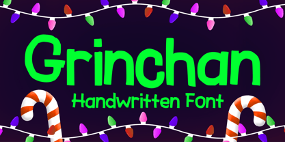 Grinchan is a fun to use Halloween and Christmas font. You can use it for anything ranging from t-shirts, kids’ book designs, and greeting cards to stickers and posters, or anything that needs a casual touch. Fall in love with its incredibly versatile style, and use it to create lovely designs!
 - Blooming Sakura by Mvmet,
$12.00 Blooming Sakura is a fun font with flower decorative twist. You can use it for anything ranging from regular typing notes, to t-shirts, kids’ book designs, greeting cards, stickers, posters, or anything that needs a casual touch. Fall in love with its incredible style and use it to create lovely designs!
 - Matthew Woolsen by Letterara,
$12.00 Matthew Woolsen is a sweet, soft hand-lettered font and monogram. Fall in love with its authentic feel and use it to create gorgeous wedding invitations, beautiful stationary art, eye-catching social media posts, Logo, Brand, and cute greeting cards. This display font is the perfect choice for making original and outstanding designs.
 - Black Vosten by Pandanwangi,
$19.00 Black Vosten is a textured brush font with a contemporary design style. Made with a brush on paper, then scanned and carefully drawn into vector format. It has a charming, authentic and relaxed feeling and is perfect for adding a natural touch to your design. Fall in love with unique and authentic letters!
 - Shourtcut by Arendxstudio,
$20.00 Shourtcut is a font designed for the needs of all your retro-themed projects and can be implemented to all the designs you want to make.
 - Bruno Ace Pro Rounded by Stiggy & Sands,
$29.00 Auto-Techno-Motive Stance in a softer package. Bruno Ace Rounded Pro is a fresh derivative of our Bruno Ace Pro typeface. It draws its inspiration from modern automotive logotypes. This geometric sans-serif has a wide stance with a tall x-height for a strong look and appeal, as well as ease of legibility. The SmallCaps and extensive figure sets offer a more extensive range of use as well as a more intense vibe. Bruno Ace Rounded Pro has an obviously softer feel to it compared to the original. See the 5th graphic for a comprehensive character map preview. Opentype features include: - SmallCaps. - Full set of Inferiors and Superiors for limitless fractions. - Tabular, Proportional, and Oldstyle figure sets (along with SmallCaps versions of the figures). - Stylistic Alternates for Caps to SmallCaps conversion.
 - Mr Happy by Hipopotam Studio,
$22.00 Hand drawn narrow typeface designed for one of our books. You can layer different styles over the background style to achieve lots of colorful effects. Use just one style to get a single color letter or set the shadow and fill over the background style to get a full, three color mode. Mr Happy has upper and lowercase characters with up to three alternate glyphs. Build in OpenType Contextual Alternates feature will automatically set alternate glyphs depending on frequency of appearance of the same character (even in web font but only in HTML5 browsers). The script doesn’t throw random glyphs. For example in the word “HIPPOPOTAMUS” you will automatically get three different “P” glyphs and two “O” glyphs. It really works great but of course you can always fine tune it by hand.
 - Carrington by Groen Studio,
$20.00 Carrington is a contemporary Serif font, it comes in 6 family variants, the font has a strong and bold character, Carrington gives a clear and elegant look to logos, quotes, advertisements, and more. Carrington is a versatile typography filled with the character you want. with Marston you work. Carrington has standard styles, Stylistic Alternates and ligatures. and includes upper and lower case letters, numbers and punctuation marks. Carrington works great in any branding, logos, magazines, films. The different weights give you full range to explore a whole host of applications, while the outlined fonts give a real modern feel to any project. OpenType Features can be accessed by using OpenType smart programs such as Adobe Photo Shop, Adobe Illustrator, Adobe Indesign, Corel Draw and Microsoft Office. can also be accessed through the character map.
 - Provincial Railway by Fabio Ares,
$19.99 Provincial Railway is the first product of argentine typographic archeology project called "Tipografía Histórica Ferroviaria" (Fabio Ares & Octavio Osores, since 2012). Is about the signboards of the stations of the P1 line of the Provincial Railway of Buenos Aires (1907-1977). The letter of this signboards can be described as display type, with a tall box and a constructivist style, with elementary geometric shapes and without line modulation. Although without a doubt, its differential feature is provided by the rectangular shapes that it has towards the ascending and descending lines, which in some cases coincide with the stems, showing a curious rhythm in the composition of the text line. The family is completed with complementary fonts of different styles. The proceeds from the sale of the fonts will be used to finance the project.
 - Quiroh by Hashtag Type,
$32.00 Quiroh is a functional typeface that expresses both artistic life and emotion. Taking its inspiration from the industrial revolution of the 19th Century where romance and science coincided. With a cushioned finish and designed according to traditional conventions, the sentiment is equally as important as the reason, resulting in a very pleasurable read. Quiroh includes both heavy display weights and lighter weights for small copy, it's a perfect tool for communicating to the masses. Tall ascenders and descenders give the typeface a distinctive look with an elegant feel, and while these expressive forms invite the reader to observe its visible shape and appearance, its rhythm and function invites the reader to peruse at their leisure. Full details include 7 weights from thin to heavy with over 470 characters, manually edited kerning and OpenType features.
 - Northern Monk by Kaer,
$19.00 Hi, guys! I like creating fonts with a story. Once me and my family were traveling and exploring the northern area of our region and came across an inscription carved on the wall of a monastery tower. It inspired me to create a full set of a multulingual font, but there is no lowercase letters. What's included? Only uppercase Multilingual support Numbers Symbols Punctuation Ligatures If Northern Monk is not ok, please check out my Celtic Spiral font https://www.myfonts.com/fonts/kaer/celtic-spiral/ I hope you enjoy this font. Follow my shop to receive updates of products and the very hottest news! If you have any question or issue, please contact me: kaer.pro@gmail.com Please request to add additional characters and glyphs if you need! Thank you!
 - Piedmont by 38-lineart,
$17.00 Hello good people. introducing our new font 'Piedmond' This time we wanted to create a gallant signature font. Inspired by men's hand strokes, with a decisive pattern, each glyph is formed through the pressing of the pen, the orientation of the shape is almost constant with the direction of the pattern that continues to point forward and ends with a strong pressing of the pen. We call it the masculine signature type, reflecting a confident attitude, a definite decision and full confidence. We design this font for modern product branding, not only for men, but women also love this masculine side. This font is equipped with swashes, alternates and additional ligatures for the lowercase. By using this font, it will give your brand more confidence to appear wider. Thanks
 - Pata Slab by In-House International,
$10.00 Pata Slab: the ultra-heavy optimism we all need in 2020 Pata Slab is the type equivalent of a catwalk stomp down a city sidewalk, a font that’s assertive, funky and more than a little sexy. Named after a colloquialism for ‘feet’, Pata features ultra-heavy slabs and contrasting hairline centers that rise from its chunky footprint. The resulting, retro-inspired vertiginous curves add instant attitude to any design. Developed in 2020, Pata is a type of its time.Pata is all upside, as it is a typeface with no descenders — one that elevates all characters to grow upward from the baseline (because, c’mon, we could all use something uplifting right now!) All uppercase characters were built to fit precisely inside a square, so they’re all the same width and height. The lowercase alphabet, eñes, cedillas, punctuation, numbers and symbols all follow the same height restrictions. Despite all that confinement, Pata sports standard-height terminals that connect seamlessly so there’s nearly endless options for modular ligatures. The upshot of all this meticulous awesomeness is that laying out, customizing and stacking text super simple. Pata Slab was created by In-House International, designed Alexander Wright in collaboration with Rodrigo Fuenzalida. It's available for Opentype format (.otf) compatible with Mac and PC.
 - Shmoopie by Typesthetic Studio,
$13.00 Shmoopie is a modern calligraphy font with handwritten, sophisticated flows. It is full of hearts and glyphs. Shmoopie perfect for logos, wedding stationery, cards, gift designs, photography, watermark, product packaging and handwritten quotes. This font also includes stylistic set, ligature, full set of uppercase and lowercase letters, multilingual symbols, numerals and punctuation.
 - National Oldstyle NF by Nick's Fonts,
$10.00 This font is based on a little-known work by master type craftsman Frederic Goudy called—wait for it—National Oldstyle. Use it when a blend of classic and slighly quirky is called for. Both versions of this font support the Latin 1252, Central European 1250, Turkish 1254 and Baltic 1257 codepages.
 - Braaains BB by Blambot,
$20.0053 all-original, all-terrifying zombie illustrations by Nate Piekos and Lee Morin! Also included is a character map so you can pick that perfect undead dingbat! - Olho de Boi - Personal use only

- Scandinavia Brush by Mans Greback,
$69.00 Scandinavia Brush is a wild calligraphy font by Mans Greback, inspired by the untamed beauty of Nordic nature. It captures a rugged essence, with each stroke reflecting the raw energy and grace of natural environments. This brush-painted typeface is perfect for logos, handwritten designs, and tattoo art with its active and streetwise feel. Designed with a professional touch and high-quality craftsmanship, Scandinavia Brush comes in six versatile styles: Regular, Upright, Bold, Italic, and the combinations Bold Italic and Bold Upright. The range of styles allows you to create unique, expressive designs that capture the spirit of adventure, speed, and beauty. Use underscores _ anywhere in a word to make an underline swash. Example: Nord___ic Bru_sh Ideal for designer and art projects, or high-end handcrafted products, Scandinavia Brush brings a bold, authentic, and captivating touch to your creative endeavors. The font is built with advanced OpenType functionality and has a guaranteed top-notch quality, containing stylistic and contextual alternates, ligatures, and more features; all to give you full control and customizability. It has extensive lingual support, covering all Latin-based languages, from Northern Europe to South Africa, from America to South-East Asia. It contains all characters and symbols you'll ever need, including all punctuation and numbers. Mans Greback is a Swedish typeface designer with a passion for creating unique and versatile fonts. With an extensive background in design and typography, Mans has built a reputation for his meticulous attention to detail and prolific craftsmanship. His many fonts are widely used by designers around the world, making his work synonymous with creativity and innovation.
 - Astrid Grotesk by Eclectotype,
$40.00 Astrid Grotesk is a normalized version of Schizotype Grotesk. Normalized; not neutralized. Where many neo-grotesks appear cold with their harsh neutrality, Astrid has a warmth, eminating from its (for want of a better word) clunkiness. With the latest update, it becomes a true workhorse, with a range of widths and italics for the normal widths. Astrid Grotesk, while being clearly a neo-grotesk in appearance, has a personality all of its own. Standout characters include the f and t, and the default binocular g, unusual in neo-grotesks. And the right angled terminals on c, e and s. Stylistic sets offer up alternate forms of a, g, y, I, @, dutch IJ, german eszett and l. A full complement of numerals is included: proportional and tabular, lining and oldstyle, plus fractions, subscript and superscript. Note also that the tabular figures are duplexed across weights - very useful when highlighting specific entries in tables. The tabular figures feature also substitutes in fixed width (across all weights) comma and period, so your decimals line up perfectly always. Lastly, case sensitive forms of certain glyphs are included for all-cap settings. This typeface will be useful for corporate identities and branding work. It’s spaced more for text settings in the normal width, and gets more display-optimized as the width decreases, but with careful tracking, all styles can sing at display sizes. Bored of those other Swiss style typefaces? Astrid Grotesk could be the face you need to breathe new life into your designs. Coupled with Schizotype Grotesk, its more eccentric cousin, you've got an unorthodox branding system ready to use straight out of the box.
 - Gimbal Egyptian by AVP,
$19.00 Gimbal Egyptian is a richly-featured font family providing many style options across a broad range of languages. It is twinned with Gimbal Grotesque, a sans-serif family with an identical range of weights and features. Originally conceived as a small webfont family, the letterforms have been revitalised to put a spring in their step and the family has been extended to create a versatile multi-script text face equally at home on the printed page. Carefully crafted at all weights, Gimbal also lends itself to headlines and display applications such as posters, exhibitions and signage while resolving well on-screen for general document creation and web-based applications. The letters are spaced for best readability on-screen and in the usual printed body text ranges but are tolerant of tracking adjustment to suit other uses. The styles are divided by width into four families (Compressed, Condensed, Normal, Extended), each family possessing six weights plus corresponding italics. Within each family, the 'regular' and 'bold' weights are style-linked, and all upright forms have an italic counterpart. The full opentype character set includes latin, greek and cyrillic scripts with appropriate local variants (also as stylistic sets) for Turkish, Polish and Romanian (latin) and Russian, Bulgarian and Serbian (cyrillic). All fonts contain small capitals for all scripts, superscript for latin and commonly used greek together with the usual numeral style, size and positioning options. The default numerals are 'proportional lining'. Other opentype features include case-sensitive marks, fractions, and some discretionary ligatures. A set of circled numerals and circled latin capitals is included, along with an unusual feature that composes 2-character country codes.
 - Karoline by Gilar Studio,
$16.00 Karoline is a lovely script font with beginning and ending swashes, 31 ligatures that add more beautiful and aesthetic fonts to perfect your extraordinary project. Karoline is a lovely script with handwritten, sophisticated flows. It is perfect for branding, wedding invites, and other romantic projects. "Karoline" includes a full set of uppercase and lowercase letters, multilingual symbols, Alternate,numerals, punctuation and ligatures. Also it includes: -short lowercase beginning and ending swashes which serve to connect two words or letters (This is so perfect for invitations, monograms) All of features and special characters of this font are included in one file. So it is easy to accessed by using program or software that support the opentype like Adobe Illustrator, Adobe Photosop, and Adobe Indesign). This font also very easy to use because compatible for all software even for non-opentype supported.so it would be perfect for all types of printing techniques+you can do embroidery, laser-cut, gold foil, etc. You can mix and match with Opentype feature: Ekstras 31 ligature More than 540 of glyphs Alternates Stylistic sets from ss01 to ss04 If you don't have a program that supports OpenType features such as Adobe Illustrator and CorelDraw X Versions, you can access all the alternate glyphs using Font Book (Mac) or Character Map (Windows). To Access Alternate Characters Click The Link Below: Adobe illustrator CS https://www.youtube.com/watch?v=geL0Ye02Ryk Adobe illustrator CC https://www.youtube.com/watch?v=V25yiUh8BcE Ms Word https://www.youtube.com/watch?v=HxkhZiCuwEw Coreldraw X7 https://www.youtube.com/watch?v=UBVsufJjons Adobe Photoshop CC https://www.youtube.com/watch?v=BYKXl58AdNY Indesign CS https://www.youtube.com/watch?v=HgZTCxKG14Q Check my other Font here : https://gilarstudio.com/ Thanks and happy designing :-)
 - Genotype BRK Pro by CheapProFonts,
$10.00 A stylistic and square outline font suitable for headlines and logos. The original font contained no diacritics at all, so I have designed these to match. I also made the descenders on "g/j/p/q/y" a bit longer - so they would balance better with the letters with diacritics below the letter... I redesigned the "t", but have included the original "t" as an alternate, available via your programs' glyph palette or using the OpenType functions "Stylistic Alternates"/"ss01". Genotype S BRK Pro is the perfect companion for Genotype H BRK Pro (The H stands for Hollow and the S stands for Solid). Can be used as a fill for its companion (using layers), but is also quite a usable font on its own. ALL fonts from CheapProFonts have very extensive language support: They contain some unusual diacritic letters (some of which are contained in the Latin Extended-B Unicode block) supporting: Cornish, Filipino (Tagalog), Guarani, Luxembourgian, Malagasy, Romanian, Ulithian and Welsh. They also contain all glyphs in the Latin Extended-A Unicode block (which among others cover the Central European and Baltic areas) supporting: Afrikaans, Belarusian (Lacinka), Bosnian, Catalan, Chichewa, Croatian, Czech, Dutch, Esperanto, Greenlandic, Hungarian, Kashubian, Kurdish (Kurmanji), Latvian, Lithuanian, Maltese, Maori, Polish, Saami (Inari), Saami (North), Serbian (latin), Slovak(ian), Slovene, Sorbian (Lower), Sorbian (Upper), Turkish and Turkmen. And they of course contain all the usual "western" glyphs supporting: Albanian, Basque, Breton, Chamorro, Danish, Estonian, Faroese, Finnish, French, Frisian, Galican, German, Icelandic, Indonesian, Irish (Gaelic), Italian, Northern Sotho, Norwegian, Occitan, Portuguese, Rhaeto-Romance, Sami (Lule), Sami (South), Scots (Gaelic), Spanish, Swedish, Tswana, Walloon and Yapese.
 - Gimbal Grotesque by AVP,
$19.00 Gimbal Grotesque is a richly-featured font family providing many style options across a broad range of languages. It is twinned with Gimbal Egyptian, a slab-serif family with an identical range of weights and features. Originally conceived as a small webfont family, the letterforms have been revitalised to put a spring in their step and the family has been extended to create a versatile multi-script text face equally at home on the printed page. Carefully crafted at all weights, Gimbal also lends itself to headlines and display applications such as posters, exhibitions and signage while resolving well on-screen for general document creation and web-based applications. The letters are spaced for best readability on-screen and in the usual printed body text ranges but are tolerant of tracking adjustment to suit other uses. The styles are divided by width into four families (Compressed, Condensed, Normal, Extended), each family possessing six weights plus corresponding italics. Within each family, the 'regular' and 'bold' weights are style-linked, and all upright forms have an italic counterpart. The full opentype character set includes latin, greek and cyrillic scripts with appropriate local variants (also as stylistic sets) for Turkish, Polish and Romanian (latin) and Russian, Bulgarian and Serbian (cyrillic). All fonts contain small capitals for all scripts, superscript for latin and commonly used greek together with the usual numeral style, size and positioning options. The default numerals are 'proportional lining'. Other opentype features include case-sensitive marks, fractions, and some discretionary ligatures. A set of circled numerals and circled latin capitals is included, along with an unusual feature that composes 2-character country codes.
 - JOPPATOWNE - Unknown license

- WhereCracksAppear - Unknown license

- KG How Many Times by Kimberly Geswein,
$5.00 A cute, markered skinny font that is tall and neat with plenty personality to spare.
 - Sentico Sans DT by DTP Types,
$49.00Originally created as a custom project and now released as a full family in OpenType. - Abysmal Gaze by Hanoded,
$15.00 A trashy script with some surprising glyphs. It comes with a full range of accents.
 - Quercus 10 by Storm Type Foundry,
$69.00 Quercus is characterised by open, yet a little bit condensed drawing with sufficient spacing so that the neighbouring letters never touch. It has eight interpolated weights with respective italics. Their fine gradation allows to find an exact valeur for any kind of design, especially on the web. Quercus serif styles took inspiration from classicistic typefaces with vertical shadows, ball terminals and thin serifs. The italics have the same width proportion as upright styles. This “modern” attitude is applied to both families and calls for use on the same page, e g in dictionaries and cultural programmes. Serif styles marked by “10” are dedicated to textual point sizes and long reading. The sans-serif principle is rather minimalistic, with subtle shadows and thinned joints between curved shapes and stems. Quercus family comprises of the usual functionality such as Small Caps, Cyrillics, diacritics, ligatures, scientific and aesthetic variants, swashes, and other bells & whistles. It excels in informational and magazine design, corporate identity and branding, but it’s very well suited for book covers, catalogues and posters as well. When choosing a name for this typeface I've been staring out from my studio window, thinking helplessly without any idea in sight. Suddenly I realised that all I can see is a spectacular alley of oaks (Quercus in Latin) surrounding my house. These oaks were planted by the builders of local ponds under the leadership of Jakub Krčín in the fifteenth century.
 - Quercus Whiteline by Storm Type Foundry,
$69.00 Quercus is characterised by open, yet a little bit condensed drawing with sufficient spacing so that the neighbouring letters never touch. It has eight interpolated weights with respective italics. Their fine gradation allows to find an exact valeur for any kind of design, especially on the web. Quercus serif styles took inspiration from classicistic typefaces with vertical shadows, ball terminals and thin serifs. The italics have the same width proportion as upright styles. This “modern” attitude is applied to both families and calls for use on the same page, e g in dictionaries and cultural programmes. Serif styles marked by “10” are dedicated to textual point sizes and long reading. The sans-serif principle is rather minimalistic, with subtle shadows and thinned joints between curved shapes and stems. Quercus family comprises of the usual functionality such as Small Caps, Cyrillics, diacritics, ligatures, scientific and aesthetic variants, swashes, and other bells & whistles. It excels in informational and magazine design, corporate identity and branding, but it’s very well suited for book covers, catalogues and posters as well. When choosing a name for this typeface I've been staring out from my studio window, thinking helplessly without any idea in sight. Suddenly I realised that all I can see is a spectacular alley of oaks (Quercus in Latin) surrounding my house. These oaks were planted by the builders of local ponds under the leadership of Jakub Krčín in the fifteenth century.
 - Quercus Serif by Storm Type Foundry,
$69.00 Quercus is characterised by open, yet a little bit condensed drawing with sufficient spacing so that the neighbouring letters never touch. It has eight interpolated weights with respective italics. Their fine gradation allows to find an exact valeur for any kind of design, especially on the web. Quercus serif styles took inspiration from classicistic typefaces with vertical shadows, ball terminals and thin serifs. The italics have the same width proportion as upright styles. This “modern” attitude is applied to both families and calls for use on the same page, e g in dictionaries and cultural programmes. Serif styles marked by “10” are dedicated to textual point sizes and long reading. The sans-serif principle is rather minimalistic, with subtle shadows and thinned joints between curved shapes and stems. Quercus family comprises of the usual functionality such as Small Caps, Cyrillics, diacritics, ligatures, scientific and aesthetic variants, swashes, and other bells & whistles. It excels in informational and magazine design, corporate identity and branding, but it’s very well suited for book covers, catalogues and posters as well. When choosing a name for this typeface I've been staring out from my studio window, thinking helplessly without any idea in sight. Suddenly I realised that all I can see is a spectacular alley of oaks (Quercus in Latin) surrounding my house. These oaks were planted by the builders of local ponds under the leadership of Jakub Krčín in the fifteenth century.
 - Quercus Sans by Storm Type Foundry,
$69.00 “Quercus” is characterised by open, yet a little bit condensed drawing with sufficient spacing so that the neighbouring letters never touch. It has eight interpolated weights with respective italics. Their fine gradation allows to find an exact valeur for any kind of design, especially on the web. Quercus serif styles took inspiration from classicistic typefaces with vertical shadows, ball terminals and thin serifs. The italics have the same width proportion as upright styles. This “modern” attitude is applied to both families and calls for use on the same page, e g in dictionaries and cultural programmes. Serif styles marked by “10” are dedicated to textual point sizes and long reading. The sans-serif principle is rather minimalistic, with subtle shadows and thinned joints between curved shapes and stems. Quercus family comprises of the usual functionality such as Small Caps, Cyrillics, diacritics, ligatures, scientific and aesthetic variants, swashes, and other bells & whistles. It excels in informational and magazine design, corporate identity and branding, but it’s very well suited for book covers, catalogues and posters as well. When choosing a name for this typeface I've been staring out from my studio window, thinking helplessly without any idea in sight. Suddenly I realised that all I can see is a spectacular alley of oaks (Quercus in Latin) surrounding my house. These oaks were planted by the builders of local ponds under the leadership of Jakub Krčín in the fifteenth century.
 - Salad by Zetafonts,
$39.00 The island of Fuerteventura is more known for its white sand beaches and windsurf-friendly constant winds than for its typographic marvels. Still, it's on the walls of a ballroom next to its white-sand beaches that Debora Manetti found the hand-painted letterforms that she took as inspiration for her typeface Sala de Fiestas. The resulting font was a condensed sans serif full of curious details and a jumpy latino vibe that many years after still keeps its freshness and vernacular charme. Francesco Canovaro took the original typeface as a starting point for a grand tour into sign-painter aesthetics, developing a reboot of the original into a new type family: Salad. While being faithful to the original proportions and feeling, Salad provides extreme versatility through its five-weights range, its extended charset and its set of Open Type features including stylistic sets, alternates, positional numerals, small capitals and case sensitive forms. While the roman family with its italic counterpart provide a good workhorse tool for informal branding, packaging and editorial projects, the interlocking and the inline weights add additional possibilities for display purposes. This is enriched by the inclusion in the typeface of a set hand-drawn decorative dingbats that further complement the sign painting vibe of the family. All Zetafonts expertise in handmade lettering, typographic design and water sports has been put to test to assure Salad is the best typographical alternative to a a trip to Canary Islands!


