10,000 search results
(0.026 seconds)
- Konstantin Forte by Wiescher Design,
$39.50My son Konstantin needs a bold face for his bold recipes. So I made Konstantin Forte for him — and the rest of the world. Your bold family designer, Gert Wiescher. - Berona by Alex Camacho Studio,
$15.00 Berona font family is a variable geometric sans serif with a modern display purpose. The dynamic sharp edges makes it ideal to be used in a medium and big scale.
 - Cadenza by Studio K,
$45.00 Cadenza is a bold condensed display font that combines flair with functionality, elegance with utility. Its weight and readability make it ideal for newspaper and magazine headlines, titling and signage.
 - Blue Dino by Sakha Design,
$10.00 Dino Blue is a sweet and friendly handwritten font. Its natural and unique style makes it incredibly fitting to a large pool of designs. The only limit is your imagination!
 - Xandercode by Sipanji21,
$10.00 Xandercode is a bold and chunky lettered display font. Add this font to your creative ideas and notice how it will make them stand out! with spalsh vector bonus inside.
 - Island Sans by BA Graphics,
$45.00A beautiful face that really works well for any application a distinguished clean look. Headlines, subheads and text anything goes. Will also work as a bolder version of California Sans. - Delighted Panda by Seemly Fonts,
$12.00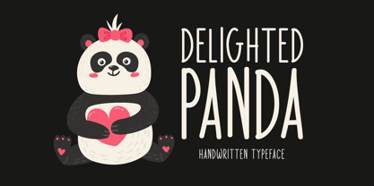 Delighted Panda is a sweet and simple handwritten font. Its natural and unique style makes it incredibly fitting to a large pool of designs. The only limit is your imagination!
 - Clattery by Ali Hamidi,
$10.00 Clattery is a simple monoline script font. It features an incredibly classy style, while still keeping a friendly feel. Clattery is the perfect font for making original and outstanding designs.
 - Snubnose by Bogstav,
$17.00 ALL CAPS font with lovely traces after the brushstrokes. With contextual alternates, which makes sure that your text varies between 5 different versions of each letter - and they cycle automatically!
 - Muskamot MF by Masterfont,
$59.00 Solid and elegant font family will stand out in headlines, signage, packaging and much more. The choice of 7 weights makes it super versatile to use in your next design.
 - Karl by Gustav & Brun,
$10.00 Karl is a hand drawn font that comes in four different variations + four oblique versions. You can combine the different styles of the family to make variations to your design.
 - Sketchura by Open Window,
$19.95 Sketchura offers a gritty twist on a classic font style -Futura- It was completely hand sketched which makes the font an organic centerpiece to any of your grungy design applications.
 - Chillight by Zamjump,
$19.00 Chillight is a serif typeface that is unique and has character, having a narrow, sharp width and ends. making it effective when used at large sizes for logotypes or headlines.
 - Arco by Nicolas Massi,
$30.00 Arco is a brand new fat-face with some geometrical tweaks grabbing fresh and ideal for fashion editorial headlines. Arco also combines elegant symbols to sweet contrast. Normal & Outline version.
 - Firme by DSType,
$40.00 Firme is a very personal take on the geometric typefaces, and it’s specially suited for corporate and editorial projects, with several stylistic alternates and discretionary ligatures, for improved typographic flexibility.
 - Nippon by Morganismi,
$9.00 Nippon is a handdrawn cartoon font with an oriental touch. I based it on my earlier typeface, Morganhand, making it more angular, and added some calligraphic impression in the glyphs.
 - Audrey Mirages by Sarid Ezra,
$15.00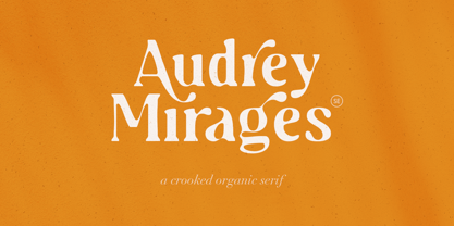 Audrey Mirages is a crooked styled serif that will make your design feels more organic and handmade. This font contains alternates and ligatures. It is also PUA Encoded. Happy Creating!
 - EF Franklin Gothic by Elsner+Flake,
$35.00 Franklin Gothic EF is a font family from the Elsner+Flake Library. It had its debut in 2000. In 2016 it was renovated and an additional weight "Italic“ was added.
 - Habanero by Mans Greback,
$59.00 Habanero is a hot, bold and happy typeface. The font was created by Måns Grebäck in 2016, and it contains contextual alternates and ligatures to make your type stand out.
 - Song And Dance JNL by Jeff Levine,
$29.00 The hand lettering of a piece of 1930s sheet music's title has once more yielded an interesting take on the popular "thick and thin" lettering of the Art Deco period.
 - Weiss by Bitstream,
$29.99In this face designed for Bauer in the twenties, Emil Rudolf Weiss used tiny serifs with many inversions and alternative forms to create the mannered texture peculiar to this form. - Spearhead by Solotype,
$19.95Once again we have added a lowercase to a caps-only type from late Victorian times. We made quite a few changes from the original to make words flow better. - York Game by Nirmana Visual,
$22.00 York Game - Retro Playful Display, very suitable for the title, logo, typography, clothes, magazines, brochures, packaging and much more for your design needs, making your designs more modern and professional.
 - Undercoat by Open Window,
$19.95 Undercoat offers a gritty twist on a classic font style (Helvetica). It was completely hand painted which makes the font an organic centerpiece to any of your grungy design applications.
 - Moftein Sough by Martype co,
$15.00 Moftein Sough Is a condensed serif font pairing with playful dingbat to make it satisfying, also suitable for minimalist, chic, branding, packaging and merch design to boost your design exploration.
 - Ayuga by Azzam Ridhamalik,
$18.00 Introducing Ayuga, a display typeface inspired by the retro and psychedelic typefaces out there. Ayuga is definitely bold and thic enough to make your design stand out from the crowd.
 - Mr Palker by Letterhead Studio-YG,
$35.00 A slab serif Mr Palker and grotesque Mr Palkerson build one superfamily together. These are blank types. In a way even the display ones. Typefaces for newspapers, announcements, cheap advertising and police posters. Mr Palker and Mr Palkerson will turn every language into a fence. And due to six types of faces one can choose what material should the fence be made from — from Thin steel rods to the Black stone blocks. In their simplest appearance Mrs P&P are intended for the solid blank composition in victorian or industrial style. They are quite decent, a bit old-fashioned slab serif and grotesque with closed aperture. All my types have layers. Walker and Palkerson also do. Besides the standard set of symbols, they have 4 add-ons. 1. Alternate glyphs, including unicase ones. 2. Ligatures with A letter. 3. Extra tall small caps. 4. Two-storey ligatures. All this options are intended for the complex composition. The additional letters are rather eccentric as their main function here is to imitate the victorian oddities. Imitate, parody, just not repeat. There are lower-case As and Es in the set in height of small caps and uppercases. They can turn every writing into the unicase. The lower-case A (as well as uppercase and small caps version of it) has deliberately by my taste grown a ludicrous tail. To compensate it I’ve built all the possible ligatures - ад, ал, ая. There are 35 of this ligatures all together. Take a closer look at the Russian letters D, L, K, Ya from the main set as well as their alternates. The additional glyphs are one more comic than the other — on purpose to imitate (not to repeat!) the victorian set. This sets have lowercase numbers. And small caps numbers as well. What a modern typeface without them. They also have an У-letter with a generously curvy tail. As if before the WWI. The Latin of course has alternates as well. It has letters to make the perfect French sound more like the russian provincial version of it. The tails of Js and Ts can be made a little bit more open — or a little bit closed. My favorite feature here, an invention of a kind - extra tall small caps. It allows to compose logos with the small caped uppercases directly from the keyboard. The small caps of this typefaces are usually much taller than the customary ones. This is the kind of small caps that Palker and Palkerson have. More to that, the strokes’ weight and the letters width are corresponded to the uppercases. Just a ready set for making a logo a la 1913 style. With a unicase, one has to mind! One more trick with the tall small caps is a possibility to make them work like lower uppercases. Their height is just in between of lower- and uppercases. Isn’t it great to have an additional set of uppercase working ponies in stock for the case of emergency. And finally — the trademark of Palkers family, two-storey ligatures. They are made in the height of uppercases and turn every writing into an ornament or a puzzle of a kind, while at the same time making them much shorter. Each face has 90 of them. Mainly those are twins: CC, BB, DD and so on. ll this things are for the unhasty compositing, even for lettering. Which means that for the things which are not there you always should have Command+Option+O and some patience. Also — among the two storey ligatures one also can find some belvedere villas. All my types are glasses from the one kaleidoscope. The P&Ps family was preliminary part of the victorian set, which already has 1 Cents and Clarendorf - optionally one can add Costro, Gordoni, Handy, Guardy, Surplus, Red Ring, Red Square, Babaev to the list. And also Sklad, Odessa, Dreamland, Romb, Platinum - here, at Letterhead’s, every second one is victorian. All together our typefaces can allow one to set advertisement of any kind, even the trickiest one, and compose everything, from the coffee place’s menu to the antiquarian magazine.
 - Mr Palkerson by Letterhead Studio-YG,
$35.00 A grotesque Mr Palkerson and slab serif Mr Palker build one superfamily together. These are blank types. In a way even the display ones. Typefaces for newspapers, announcements, cheap advertising and police posters. Mr Palker and Mr Palkerson will turn every language into a fence. And due to six types of faces one can choose what material should the fence be made from — from Thin steel rods to the Black stone blocks. In their simplest appearance Mrs P&P are intended for the solid blank composition in victorian or industrial style. They are quite decent, a bit old-fashioned slab serif and grotesque with closed aperture. All my types have layers. Walker and Palkerson also do. Besides the standard set of symbols, they have 4 add-ons. 1. Alternate glyphs, including unicase ones. 2. Ligatures with A letter. 3. Extra tall small caps. 4. Two-storey ligatures. All this options are intended for the complex composition. The additional letters are rather eccentric as their main function here is to imitate the victorian oddities. Imitate, parody, just not repeat. There are lower-case As and Es in the set in height of small caps and uppercases. They can turn every writing into the unicase. The lower-case A (as well as uppercase and small caps version of it) has deliberately by my taste grown a ludicrous tail. To compensate it I’ve built all the possible ligatures - ад, ал, ая. There are 35 of this ligatures all together. Take a closer look at the Russian letters D, L, K, Ya from the main set as well as their alternates. The additional glyphs are one more comic than the other — on purpose to imitate (not to repeat!) the victorian set. This sets have lowercase numbers. And small caps numbers as well. What a modern typeface without them. They also have an У-letter with a generously curvy tail. As if before the WWI. The Latin of course has alternates as well. It has letters to make the perfect French sound more like the russian provincial version of it. The tails of Js and Ts can be made a little bit more open — or a little bit closed. My favorite feature here, an invention of a kind - extra tall small caps. It allows to compose logos with the small caped uppercases directly from the keyboard. The small caps of this typefaces are usually much taller than the customary ones. This is the kind of small caps that Palker and Palkerson have. More to that, the strokes’ weight and the letters width are corresponded to the uppercases. Just a ready set for making a logo a la 1913 style. With a unicase, one has to mind! One more trick with the tall small caps is a possibility to make them work like lower uppercases. Their height is just in between of lower- and uppercases. Isn’t it great to have an additional set of uppercase working ponies in stock for the case of emergency. And finally — the trademark of Palkerson family, two-storey ligatures. They are made in the height of uppercases and turn every writing into an ornament or a puzzle of a kind, while at the same time making them much shorter. Each face has 90 of them. Mainly those are twins: CC, BB, DD and so on. ll this things are for the unhasty compositing, even for lettering. Which means that for the things which are not there you always should have Command+Option+O and some patience. Also — among the two storey ligatures one also can find some belvedere villas. All my types are glasses from the one kaleidoscope. The P&Ps family was preliminary part of the victorian set, which already has 21 Cents and Clarendorf - optionally one can add Costro, Gordoni, Handy, Guardy, Surplus, Red Ring, Red Square, Babaev to the list. And also Sklad, Odessa, Dreamland, Romb, Platinum - here, at Letterhead’s, every second one is victorian. All together our typefaces can allow one to set advertisement of any kind, even the trickiest one, and compose everything, from the coffee place’s menu to the antiquarian magazine.
 - Beat Fool by PizzaDude.dk,
$15.00 Beat Fool is my latest layered font. I love making layered fonts, because the possibilities are almost endless! Play around with transparency and your favourite colorschemes and patterns to create awesome effects! Beat Fool comes in two layers that plays well together. One layer is solid and can be used for shadow, fill, texture or other creative parts of your design. The second layer is the "Regular" one - the outline that made the basis for the font. I wanted the handmade and handwritten brushstrokes visible, to keep the flaws which makes the look more authentic. Every letter has 4 different versions, again to make things more natural and kind of random! Both layers can be used alone or as described, together - and since it has multilingual support, you can be creative in all kinds of languages! :)
 - Chanse Fresh by ArtGarbage,
$10.00 Graffiti is all repetition. Style, like brand logos, makes the repetition more recognizable, but style should never keep you from reading the word. Chanse Fresh was a project to make a handstyle font that wasn't self-concious and overworked - the font is clearly readable and fresh AF. Round is the base font with a thin version to create hierarchy or for longer pieces of text. Both round and thin have a "wet" drippy mop tag version best for key text. The font is all caps with alternates, so you can sub in capitals as needed with repetitive letters to change things up. There's a full latin alphabet so you can type all the words with accent marks natively and a ton of discretionary ligatures and accessory glyphs like arrows, stars, and crowns to make your lettering extra fresh.
 - Astra Goldie by Putracetol,
$28.00 Astra Goldie font makes for more elegant, trendy and more lively. This font is inspired by the bold font style and well balanced lines.This font has a surprise from alternate that will make your work even more beautiful. This font is perfect for a professional touch which makes it even more unique and classic. But this font is also suitable for logos, branding, greeting cards, invitation cards, advertisements, titles, healines, book titles, stickers, packaging, quotes, posters, t-shirts/apparel, billboards and others. The alternative characters were divided into several Open Type features such as Swash, Stylistic Sets, Stylistic Alternates, Contextual Alternates, and Ligature. The Open Type features can be accessed by using Open Type savvy programs such as Adobe Illustrator, Adobe InDesign, Adobe Photoshop Corel Draw X version, And Microsoft Word. This font is also support multi language.
 - Gerig by Twinletter,
$18.00 Gerig is a unique, stylish, and fun font that is unlike most other fonts. Having an anatomical shape between thin and thick lines makes it beautiful and visually unique from most other fonts make your project more stunning by adding this font. It is a font that every designer, writer, and programmer should have in their library. because this font is unique, stylish, and fun. Cool ligature and alternative fonts help add a unique flair to your project. Make the most of your designs by using this font today. What’s Included : Standard glyphs Iso Latin 1 Simple installations We highly recommend using a program that supports OpenType features and Glyphs panels like many Adobe apps and Corel Draw, so you can see and access all Glyph variations. PUA Encoded Characters – Fully accessible without additional design software. Fonts include Multilingual support
 - Messenger by Canada Type,
$29.95 Messenger is a redux of two mid-1970s Markus Low designs: Markus Roman, an upright calligraphic face, and Ingrid, a popular typositor-era script. Through the original film faces were a couple of years apart and carried different names, they essentially had the same kind of Roman/Italic relationship two members of the same typeface family would have. The forms of both faces were reworked and updated to fit in the Ingrid mold, which is the truer-to-calligraphy one. The Messenger package is comprised of two interchangeable fonts that support Western, Eastern and Central European languages, as well as Baltic, Celtic/Welsh and Esperanto. Messenger Pro is a single OpenType font that contains the characters of both Messenger and Messenger Alt, linked by programmed features for stylistic alternates, automatic f-ligatures and class-based kerning.
 - Sending by Din Studio,
$29.00 Does your project need something that makes people going WOW? Have you thought about how you can add that touch of something to your branding and projects? What if we told you that we have a solution to maximize your designs? Introducing Sending-A Handwritten Brush Font This font can bring your projector branding to another level. It encapsulates the essence of simplicity but elegance. With elegance and passion edged into every curve and twist of this brush font - you’ll be sure to boost your sales and make the best impressions. Use it for headings, logos, business cards, printed quotes, invitations of all sorts, cards, packaging, and your website or social media branding. Sending includes Multilingual Options to make your branding globally acceptable. Features: Beautiful Ligatures Multilingual Support PUA Encoded Numerals and Punctuation Thank you for downloading premium fonts from Din Studio
 - Vintage Scripter by Nathatype,
$29.00 Looking for a font that will make your branding stand out? Do you sometimes have an appetite for a bit more wholesome typography? Looking for a fabulous, stylish, and adventure font? We've got what you want. Vintage Scripter- AScript Font Vintage Scripter is a flowing and fun font. This font features thick and angular letters that easy on the eyes and nice to look while it’s also easy to read. Vintage Scripter becomes more special with extruding version option. It has a beautiful and balanced character, making it suitable for a variety of purposes. such as posters, logos, product packaging, branding, titles, signs, labels, mugs, book covers, quotes, and others. Our font always includes Multilingual Support to make your branding reach a global audience. Features: Ligatures Stylistic Set Swashes PUA Encoded Numerals and Punctuation Thank you for downloading premium fonts from Natha Studio
 - Jemrok by Product Type,
$17.00 Jemrok is a stunning display font that embodies a classic modernist style. With its beefy and elegant design, this font is perfect for creating stylish and sophisticated designs. The letters are happily made with cute and adorable shapes giving it a different, unique, and professional look. Jemrok has a unique combination of classic and modern elements that makes it stand out from other display fonts. The characters are designed to be bold and impactful, making them perfect for headlines, titles, and branding. This font also comes with different characters and alternatives, allowing for even more creative possibilities. Whether you design logos create posters or design websites, Jemrok is the perfect choice for any project that requires a classic modernist style. With its timeless design and versatility, this font is sure to make your designs stand out and leave a lasting impression.
 - Vectis by Greater Albion Typefounders,
$14.95 Vectis, named in honor of the Roman settlement of Britain's south coast on the Isle of Wight, brings a fresh approach to the classic simple elegance of ancient Roman faces. Vectis is offered as a small caps face designed to add a fresh hint of character to this style of classical design. Vectis can lend a note of formal dignity to any design project or poster and is ideal for clear headings and titles with a traditional feel. Two basic weights are offered, regular and bold, as well as a range of alternate letterforms and ligatures. This popular family has now been expanded with the incised 'Monumental' display face, and well as 'miniscule' lower case forms and condensed widths. Vectis and our Anavio families compliment each other perfectly, and can also be purchased together in a value pack.
 - Billiona by Wasabib Type Foundry,
$13.00 Introducing Billiona "Elegance Serif" - a modern, simple serif font that is perfectly suited for book flyers and corporate materials. This typeface strikes a harmonious balance between elegance and simplicity, making it an ideal choice for conveying professionalism and sophistication. Elegance Serif features clean, refined letterforms with subtle serifs that add a touch of classic charm. Its simplicity is its strength, as it effortlessly captures attention without overwhelming the reader. The minimalistic design of each character ensures excellent legibility, making it easy for readers to absorb the information presented. The timeless appeal of Elegance Serif makes it an excellent choice for a wide range of applications, particularly in the realm of book flyers and corporate materials. Whether you're designing a book cover, promotional flyer, or corporate brochure, this font will lend a sense of polished professionalism to your project.
 - AnoStencil by Alias,
$60.00 Stencil typefaces are popular because they are striking and decorative, and their associations - whether Utility, Travel, Vernacular, etc - are evocative. Anostencil is developed from, but not exactly like, our Ano typeface. Ano’s geometric skeleton, tweaked a bit, allows for a level of abstraction while retaining legibility. Some of Ano’s characters, such as the a, e, f and r, have been amended to make clearer, more graphic shapes when the stencil design has been applied. Different application of the stencil gaps in the letters make functional but decorative and expressive linear forms. This is particularly evident in Anostencil’s extended character set which features codified, semi abstract shapes. So the stencil design in Anostencil has been applied in not necessarily the most logical or immediate way, but in a way that makes each letter a striking and graphic shape.
 - Theossaint by Keristyper Studio,
$14.00 Introducing Theossaint font, the epitome of modern beauty in typography! This font is the perfect mix of contemporary and classic elements, making it the ideal choice for your next design project. With its clean lines, sharp edges, and bold presence, Theossaint font will elevate any design and make it stand out. Whether you're designing for a modern brand, a fashion label, or an editorial publication, this font is sure to make a statement. Get ready to add a touch of modern beauty to your design with Theossaint font! Featured: Standard, Uppercase & Lowercase Numeral & Punctuation Multilingual : ä ö ü Ä Ö Ü ß ¿ ¡ Alternate & Ligature PUA encoded We recommend programs that support the OpenType feature and the Glyphs panel such as Adobe applications or Corel Draw, so you can use all the variations of the glyphs. Hope you enjoy our fonts!