10,000 search results
(0.029 seconds)
- She is Mine by Olivetype,
$18.00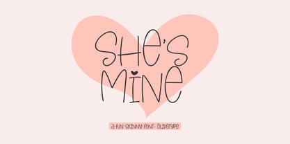 She's Mine is a fun and girly handwritten font. Its skinny and smooth style makes this font incredibly versatile, fitting a wide variety of creative ideas such as: kids, school projects, crafting and DIY projects. So what’s included: She's Mine (OTF) Basic Latin A-Z, a-z, numbers, symbols, and punctuations International Characters. Thank you
 - SK Aristo by Salih Kizilkaya,
$14.99 SK Aristo is a modern geometric and grotesque font. It was designed by Salih Kızılkaya in 2020, taking into account the current design needs. It meets all the typographic needs of your design and offers full support for the Latin alphabet. SK Aristo consists of 10 different fonts and includes a total of 5220 glyphs.
 - Snoogle by Linotype,
$29.00Snoogle is a friendly, round display typeface. Its character set contains 99 ligatures, which may be automatically implemented in OpenType-savvy applications. These give Snoogle the feeling of a script face, as opposed to normal rounded types. Snoogle's text variant is complimented by a Dingbats font, including further design elements as well as pictogram figures. - SailorsTattoo Waves by Otto Maurer,
$19.00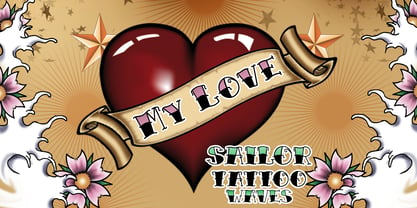 Sailors Tattoo Waves is a modifikation of my Font Sailors Tattoo. This Fonts are made for best oldschool or traditional Tattoodesigns. You can color the half-version with the full-version. Take a graphic app like Affinity Photo or Affinity Designer and use the layers. Drop the colored full-version under the black half-version.
 - Audrena by Putracetol,
$19.00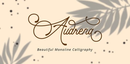 Audrena is a new elegant modern script font. A lovely, elegant and sweet script font. Audrena is perfect for styling logos, stationery, wedding event, invitation, quote, social media, websites and so much more! Come with Opentype feature with a lot of alternates, its help you to make great lettering.This font is also support multi language.
 - Love Light by TypeSETit,
$24.95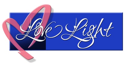 Love Light was the first commercial font released to the public by Rob Leuschke. As a result of many requests to make this piece of hand lettering into a font, Love Light introduced the world to the TypeSETit foundry. A playful calligraphic style, Love Light is great for scrapbooking, cards, invitations and other fun things.
 - Asterixa by Iwm Design,
$10.00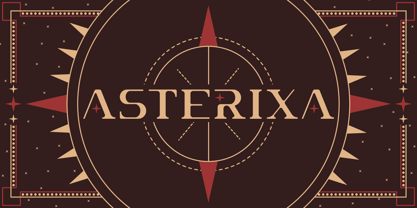 Asterixa is a modern serif font designed for display use. This uppercase font exudes an elegant and powerful aesthetic with a classic touch refined for the contemporary era. With Asterixa, you'll discover a distinctive and graceful presence, making it the perfect choice for design projects that demand a blend of classic beauty and modern appeal.
 - Yogeo by Rochart,
$14.00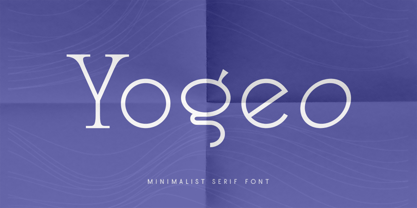 Give your designs a classy feel. "Yogeo" is perfectly suited to stationery, logo, typography quotes, magazine or book cover, website header, clothing, branding, packaging design and more. A minimalist serif font containing uppercase and lowercase characters, numerals, a large range of punctuation, international language and ligatures. I hope you make something cool with it!
 - Fello by Australian Type Foundry,
$23.99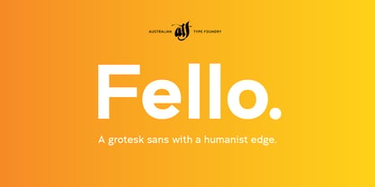 Fello is a geometric sans-serif with a university pedigree. Featuring some of the quirkiest alternates you will ever see, Fello is designed with a modernist tone of voice. Fello is great for display use but also has a large character set and includes many Opentype features, which makes it suitable for text use too.
 - Secretsoul by Balpirick,
$15.00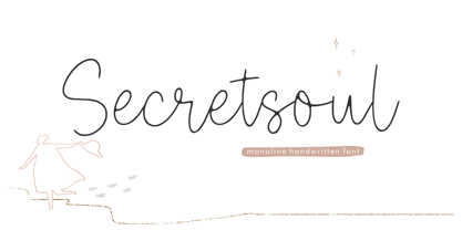 Secretsoul is a Monoline Handwritten Font. Secretsoul Monoline is a thin lettered, refined script font that emanates sophistication and elegance. Its stylish alternates and ligatures make this font the perfect match for any project. Secretsoul also multilingual support. Enjoy the font, feel free to comment or feedback, send me PM or email. Thank you!
 - Basreng by Bluestudio,
$20.00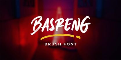 Basreng is our newest font brush. Basreng fonts are suitable for today’s projects such as clothing, covers, watermarks, web design, posters, branding. Basreng also comes with an underscore sweep bonus which can be perfectly matched. Just do it with your own creativity, Basreng is an easy to use font, will make your project easier.
 - Display Patrol by Hanoded,
$15.00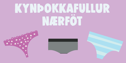 I have always liked handmade display fonts - maybe that’s why I have so many of them! Display Patrol is a rather fat, in your face font. It is completely handmade and comes in two distinct styles: regular and dots. Use it for your posters, books and product packaging. I am sure it will stand out!
 - Holland Matcha by Attype Studio,
$16.00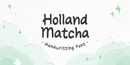 "Holland Matcha" – the handwritten font that adds a touch of organic elegance and warmth to your food and beverage brand. Elevate your identity with this unique, memorable typeface and make your culinary creations truly stand out. Explore "Holland Matcha" today for an unforgettable brand transformation. Features : - Holland Matcha Font - Multilingual, US Roman, Latin 1 Support
 - Rooster Scratch by Fat Hamster,
$20.00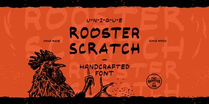 Rooster Scratch is an uppercase handwritten typeface, it'ill give your work natural and hand crafted feel. Now you can see what happens, when rooster takes a marker pen in its foot. Perfect for quotes, logos, magazine & poster design, bold headers, apparel, packaging & label design. In other words this typeface is perfect for your next project!
 - Long giraffe by Ask Foundry,
$19.00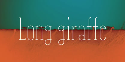 Meet "Long giraffe," a condensed font inspired by a giraffe's elongated neck. It offers two font families, one displaying significant thickness contrast between horizontal and vertical strokes. Perfect for mobile screens and narrow spaces. Supports Western and Eastern European languages, making it versatile for diverse design needs. Embrace the elegance and functionality of Long giraffe.
 - Umbra by Linotype,
$29.99Umbra was designed by R. Hunter Middleton for the Ludlow Corporation in 1935. This is a three-dimensional typeface, unique in that the main character shape is defined only by its shadow. It was originally designed to be a second-color drop-shadow for the typeface Tempo, but stands alone as an unusual display face. - Party Trick by PizzaDude.dk,
$15.00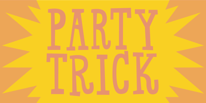 Party Trick is loosely based on the capital letters of a classic typewriter, but I have added a bit sugar and spice to the letters - making them more funky and loose. Another great thing is the contextual alternates, which gives you 6 different versions of each letter - and they automatically changes as you type!
 - Angelus by Sudtipos,
$59.00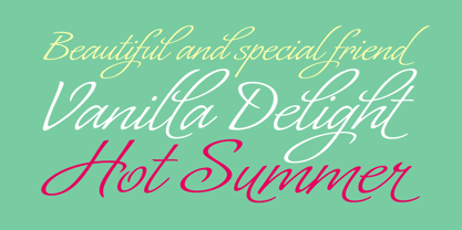 Angelus is a flowing script that can be seen as a more casual modern version of the copperplate script, with a fresh take on the way the ascenders and descenders interact with the totality of the setting. Angelus is ideal for use in package design, as well as on personalized collateral and book covers.
 - After Brush Graffiti by Sipanji21,
$16.00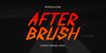 Hello, this is After Brush - Realistic Awesome Monoline Display Font! This font designed so that users can use it more easily and make Monoline designs easier. After Brush is very suitable for use in various media such as; packaging, logos, labels, posters, shirt designs, bulletins, typography, and many other media, especially with Monoline look.
 - Smooth Fantasy by Din Studio,
$29.00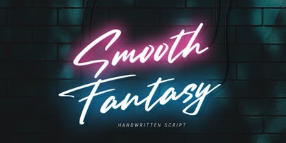 Smooth Fantasy is designed with a chic and natural handwritten style, and makes for a beautiful typefaces. Smooth Fantasy is best used for logotype, branding, quotes, and more. Features: - Ligatures - PUA Encoded - Multilingual Support - Numerals and Punctuation I hope your project design would be more beautiful with this Smooth Fantasy. Happy Design :) Thank You!
 - Hilde Sharp by Chank,
$59.00OMG it's got a smiley face underscoring the exclamation point! What a sweet, charming handwriting font from the wrist of an 18-year-old Norwegian girl. A sassy skip and a flowery flair lift this particular marker font up a notch above the rest. Now available in OpenType format for your Personal or Commercial Use. - Flower Child by Angele Kamp,
$24.00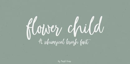 Flower Child is a whimsical, carefree, brush font with a bouncing baseline. This playful font will give your designs that fresh, handwritten feel to it and will look lovely on cards, headers, quotes and all your other lovely projects. Flower Child has nice smooth lines which makes it perfect for crafters and cutting machines.
 - Magical Signature by Zeenesia Studio,
$19.00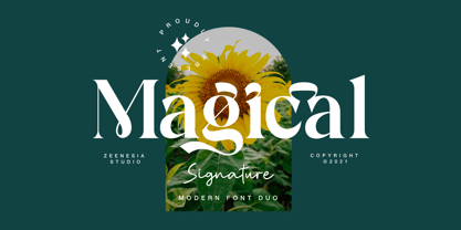 Magical Signature are Font duo that includes a serif typeface and signature script. Display Serif inspired by famous logo, This typeface has been made carefully to make sure its premium quality and luxury feel. suitable for your design project business, like logo branding, wedding invitation, typhography wedding, quotes text, magazine, or anything do you want.
 - Lost In South by Gassstype,
$27.00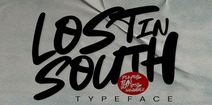 Introducing Lost in South – Natural Brush Font is a Signature Style and classy style, this font is great for your creative projects such as watermark on photography, and perfect for logos & branding. Lost in South a natural handwritten feel. This handmade font will make your design has a beautiful natural touch for each details.
 - Stencil Maker JNL by Jeff Levine,
$29.00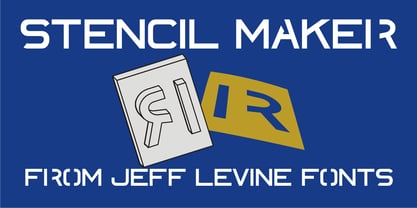 The type design which inspired Stencil Maker JNL comes from a 1920s-era machine used in movie theaters of the day. It rendered tiny punched out letters (some characters solid and some in stencil form), enabling the user to make projection slides of important messages or general notices for the theater audience to read.
 - Dark Sider by Sipanji21,
$18.00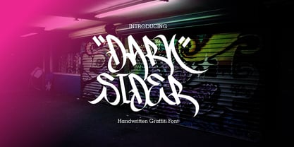 Hello, this is Dark Sider- Natural Handwritten Graffiti Tag Font! This font designed so that users can use it more easily and make graffiti designs easier. Dark Sider is very suitable for use in various media such as; packaging, logos, labels, posters, shirt designs, bulletins, typography, and many other media, especially with graffiti look.
 - Gartisans by Sign Studio,
$10.00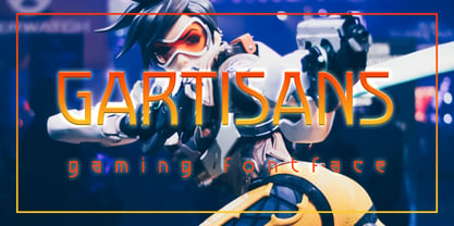 Gartisans are inspired by the appearance of games produced by Japan. Has a distinctive curves on the character (writing with Katakana). By using this font you will be able to feel the feel of the Katakana writing style (simple, clear, characterized). It is suitable for book cover design, poster, game UI, and logo making.
 - Orion by Linotype,
$29.99 Hermann Zapf made his first scetches for Orion in 1963. Zapf's aim was to create a neutral textface which can be ideally used as a newspaper face. Its strokethickness and open letterforms also fits well for book and magazine production. The final two weights of Orion were released in 1974 for the Linofilm photocomposing machine.
 - Ramban by WingBuk Studio,
$17.00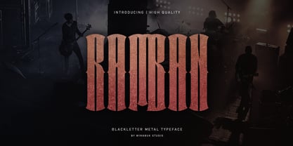 Ramban is a high quality blackletter typeface for your designs, with metal and gothic accents to make your designs even more exclusive. Can be use for various designs such as band logos, cloting, even film covers or tour posters. Includes Uppercase Letters and unique Roman Numbers with some extra bonus Ligature Characters. No Punctuation !
 - Futuriata by Tadiar,
$14.00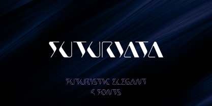 Futuriata is Elegant Futuristic Conceptual Font Family of four fonts different weights. It has unusual look which will make your title phrase unique, stylish, fashionable and hi-tech. Use it in your projects in such areas as robots & androids, hi-tech, future, virtual reality, space, fashion and others. Multilingual Extended Latin characters and symbols included.
 - Better Summer by Din Studio,
$29.00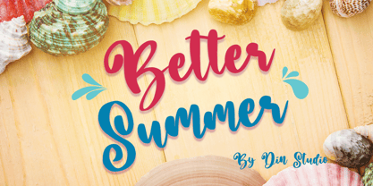 "Summer is Never Ending :D" Introducing a Better Summer Script. Made from a chic brush, it will make your design more beautiful. Includes: Better Summer (OTF) Features: Character Set A-z Numerals and Punctuation (OpenType Standard) Accents (Multilingual characters) PUA Encoded Beautiful ligatures I hope you can enjoy the font as you enjoy the summer :)
 - Drakoheart Revofit Sans by G3 Typefaces,
$-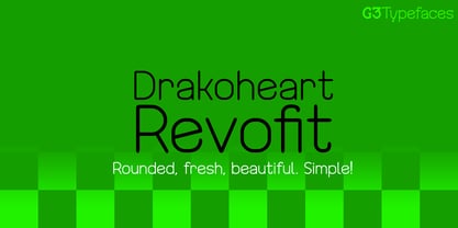 Drakoheart Revofit is an initiative to make sans fonts. It’s one of my personal favorites, in fact. In its first release, this font had a cool appearance but was improved with better kerning and a cool look in this new release. Perfect to write some digital texts as in web articles, blogs and branding.
 - Pierce Jackson by Balpirick,
$15.00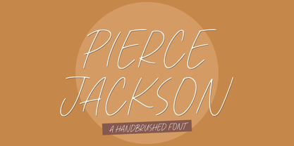 Pierce Jackson is a Handbrushed Font. Whether you’re using it for crafts, digital design, presentations, or making greeting cards, this font has the potential to become your favorite go-to font, no matter the occasion! This font only has allcaps letters. - also multilingual support Enjoy the font! Feel free to comment or feedback! Thank you!
 - Claudia Fiesta by Brenners Template,
$19.00Claudia Fiesta's sensitive and natural contrast appeals their styles more cultivated. The bold contrast between styles is minimized, but individual styles are displayed to stand out. And Uppercase's valiant Alternates will make your designs impressive. These stylistic alternates apply to all uppercase glyphs. You can choose according to your concepts to improve your design. - Beach Lombok by Letterena Studios,
$10.00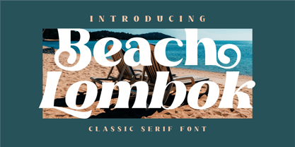 Beach Lombok is a modern and clean display (Serif) font create from our talented font designer. The design of Bogota will make your design more beautiful and inspiring. This font will suitable for any project, like branding, print template, logo and etc. Features: Accents (Multilingual characters) Alternates Ligatures PUA encoded Numerals and Punctuation (OpenType Standard)
 - The Kogles Script by Letterhend,
$19.00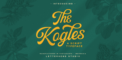 Please welcome our newest script typeface, The Kogles, a nice script typeface with retro feel. This font is perfect to be applied especially in logos and the other various formal forms such as invitations, labels, logos, magazines, books, greeting/wedding cards, packaging, fashion, make up, stationery, novels, labels or any type of advertising purpose.
 - Kis Antiqua Now TB Pro by Elsner+Flake,
$99.00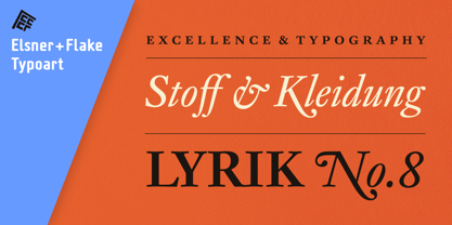 In the course of the re-vitalization of its Typoart typeface inventory, Elsner+Flake decided in 2006 to offer the “Kis Antiqua” by Hildegard Korger, in a re-worked form and with an extended sortiment, as an OpenType Pro-version. After consultation with Hildegard Korger, Elsner+Flake tasked the Leipzig type designer Erhard Kaiser with the execution of the re-design and expansion of the sortiment. Detlef Schäfer writes in “Fotosatzschriften Type-Design+Schrifthersteller”, VEB Fachbuchverlag Leipzig, 1989: No other printing type has ever generated as far-reaching a controversy as this typeface which Jan Tschichold called the most beautiful of all the old Antiqua types. For a long time, it was thought to have been designed by Anton Janson. In 1720 a large number of the original types were displayed in the catalog of the „Ehrhardische Gycery“ (Ehrhardt Typefoundry) in Leipzig. Recently, thanks to the research performed by Beatrice Warde and especially György Haimann, it has been proven unambiguously that the originator of this typeface was Miklós (Nicholas) Tótfalusi Kis (pronounced „Kisch“) who was born in 1650 in the Hungarian town of Tótfal. His calvinistic church had sent him to the Netherlands to oversee the printing of a Hungarian language bible. He studied printing and punch cutting and earned special recognition for his Armenian and Hebrew types. Upon his return to Hungary, an emergency situation forced him to sell several of his matrice sets to the Ehrhardt Typefoundry in Leipzig. In Hungary he printed from his own typefaces, but religious tensions arose between him and one of his church elders. He died at an early age in 1702. The significant characteristics of the “Dutch Antiqua” by Kis are the larger body size, relatively small lower case letters and strong upper case letters, which show clearly defined contrasts in the stroke widths. The “Kis Antiqua” is less elegant than the Garamond, rather somewhat austere in a calvinistic way, but its expression is unique and full of tension. The upper and lower case serifs are only slightly concave, and the upper case O as well as the lower case o have, for the first time, a vertical axis. In the replica, sensitively and respectfully (responsibly) drawn by Hildegard Korger, these characteristics of this pleasantly readable and beautiful face have been well met. For Typoart it was clear that this typeface has to appear under its only true name “Kis Antiqua.” It will be used primarily in book design. Elsner+Flake added two headline weights, which are available as a separate font family Kis Antiqua Now TH Pro Designer: Miklós (Nicholas) Tótfalusi Kis, 1686 Hildegard Korger, 1986-1988 Erhard Kaiser, 2008
 - Kage Pro by Balibilly Design,
$25.00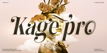 Greetings: We are introducing an advanced version of the Kage font released and received great exposure from users and worldwide font enthusiasts. The massive development puts forward experimentation on the alternate letters. We redesign each shape to make it more functional and comfortable when text size escalation occurs. In addition to rejuvenating the letterform, we also apply an oblique style to provide diverse style choices. Learn more about Kage Pro here: Graphics presentation | Type Specimen | The Inspiration: The radical exploration world of fashion inspires us. It leads our minds to the Neo-classical type style created during the age of enlightenment in the 18th century. It has a reasonably extreme contrast from the previous serif style, making the impression that it is emitted more expensive and classy. Organically, this Neo-Classical typeface is closely related to the fashion world, especially in Europe, and even spread across the globe. Fashion and this typeface reflect each other. After, we boldly observed Japanese fashion designer Rei Kawakubo. Famous for radical & deconstructive fashion, which makes the world of fashion more flexible and dynamic. The Design: As well as the typeface that we made, we started it with a cultural foundation of the Didone typeface. We tried to deconstruct the appearance. The decoration that better reflected the dynamic of fashion implemented in the fashionable alternate and calligraphical stylistic set ended with ball terminals. The versatile impression created is like taking off a scarf on the model's hair during a fashion show. The deconstructive image is combined with a legibility structure like the appearance of the Neo-Classical style. Kage Pro is designed to visualize a costly and exclusive image of a thing, product, world clothing brand, famous fashion magazine, etc. The modern transitions of each letterform are softer, so when repositioning and escalating the size of this font, it will remain beautiful without injuring other elements. So, Kage Pro is a bold choice on headlines and more prominent media with a portion of 50% even more. The Feature: Kage Pro has 11 upright and 11 oblique styles from thin to black; all family-style consist of one variable font with 2 axes. The total number of glyphs is 1,665 in each style. She comes with tons of swirly ligatures and stylistic alternates in Advance OpenType features, including: Case-sensitive forms, small caps, standard and discretionary ligatures, stylistic alternates, ordinals, fractions, numerator, denominator, superscript, subscript, circled number, slashed zero, old-style figure, tabular and lining figure. Support multi-language including Western European, Central European, Southeastern European, South American, Oceanian, Vietnamese.
 - ITC Stone Sans II by ITC,
$45.99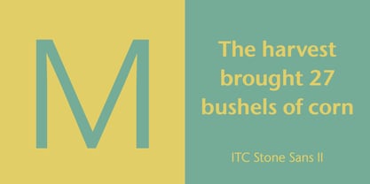 The ITC Stone Sans II typeface family is new from the drawing board up. Sumner Stone, who designed the original faces in 1988, recently collaborated with Delve Withrington and Jim Wasco of Monotype Imaging to update the family of faces that bears his name. Sumner was the lead designer and project director for the full-blown reworking – and his own greatest critic. The collaborative design effort began as a relatively simple upgrade to the ITC Stone Sans family. As so often happens, however, the upgrade proved to be not so simple, and grew into a major design undertaking. “My initial intent,” recalls Sumner, “was to provide ITC Stone Sans with even greater versatility. I planned to add an additional weight, maybe two, and to give the family some condensed designs.” As Sumner began to look more closely at his twenty-year-old typeface, he decided that it would benefit from more extensive design improvements. “I found myself making numerous refinements to character shapes and proportions,” says Sumner. “The project scope expanded dramatically, and I’m pleased with the final result. The redesign has improved both the legibility and the overall appearance of the face.” The original ITC Stone Sans is part of the ITC Stone super family, along with ITC Stone Serif and ITC Stone Informal. In 2005 ITC Stone Humanist joined the family. All of these designs have always offered the same three weights: Medium, Semibold, and Bold – each with an italic counterpart. Over time, Stone Sans has emerged as the godfather of the family, a powerful design used for everything from fine books, annual reports and corporate identity programs, to restaurant menus, movie credits and advertising campaigns. ITC Stone Sans, however, lacked one attribute of many sans serif families: a large range of widths and weights. “These fonts had enjoyed great popularity for many years – during which graphic designers repeatedly asked for more weights and condensed designs in the family,” says Sumner. “Their comments were the impetus.” ITC Stone Sans II includes six weights ranging from an elegant Light to a commanding Extra Bold. An italic counterpart and suite of condensed designs complements every weight. In all, the new family encompasses 24 typefaces. The ITC Stone Sans II family is also available as a suite of OpenType Pro fonts, allowing graphic communicators to pair its versatile design with the capabilities of OpenType. These fonts offer automatic insertion of ligatures, small caps and use-sensitive figure designs; their extended character set also supports most Central European and many Eastern European languages. ITC Stone® Sans II font field guide including best practices, font pairings and alternatives.
 - Dream Script by Lián Types,
$49.00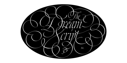 One of my dreams as a type-designer was making a good looking chancery cursive. Full of life, like some of the best calligraphers around the world do on their artworks. With Julian Waters, John Stevens and Denis Brown (just to name a few of them) (1) chancery, or italic script, was transformed into a new, exciting and very fresh style of calligraphy mainly at the end of 20th Century. Dream Script may be that dream named above made true. I have been practicing chancery in the way I learnt from those calligraphers for many years now. Making a font out of my ink-sketches was a tough work, since they were closer of -being art- than of -being type-. However, this font rescues many aspects of handmade calligraphy: You have to look at it really close to notice it is actually a font, and that was one of my goals. The secret of a good looking chancery is on its subtle details: pen angle is constantly changing, even on the strokes which seem straight. Capitals and swashes have to be done a little faster than lowercase letters. The rhythm has to be even, in spite of its playful look. The fact that makes Dream look alive is that it has many alternates per glyph. This makes each word look unique like it happens in calligraphy: you will find alternates for the beginning/ending of a word/phrase, some for the middle of it, some interchangeable. Also, to accompany the script, you will find Dream Caps, which was inspired in the eternally beautiful trajan capitals. Place them like I did on the posters and you will have great results for sure. The font works great in small, middle and big sizes and can be a great selection for magazines, wedding invitations, perfumes, and posters. Close your eyes, and Dream with me... TECHNICAL Dream Script Pro is the most complete style, it contains all the alternates and ligatures (OT programmed, better if you use Adobe applications) If you plan to use the font for text, be sure to activate the less decorative capitals, which are placed in the “salt” group of alternates. Dream Script Standard has less glyphs than the Pro one, it contains just some ligatures for a better legibility. (OT programmed, better if you use Adobe applications) NOTES (1) Not only are they great artists, but also good people, who are always willing to share with their students all what they know. I would also like to thank Ricardo Rousselot, whose work inspired me this time to make “The Dream Script” exlibris; and to Alisara Tareekes, a very talented friend which international calligraphy conferences gave me: She kindly helped me with some tips to make this font better.