10,000 search results
(0.08 seconds)
- Linotype Auferstehung by Linotype,
$29.99Linotype Auferstehung is part of the Take Type Library, selected from contestants of Linotype’s International Digital Type Design Contests of 1994 and 1997. German designer Johannes Plass was influenced by historic broken letter faces, particularly Caslon Gotisch, although the rounded corners give the font a handwritten look. Linotype Auferstehung is particularly good for headlines in larger point sizes. - Uncertainty by Okaycat,
$25.50 Uncertainty 2010 Edition is an intensely textured typeface carefully rendered by hand. This font is faded with a chalk-like texture. Please be aware that working with this highly detailed font may slow some graphics software as it requires more memory. Uncertainty is extended, containing West European diacritics and ligatures, making it suitable for multilingual environments and publications.
 - Bomber Urban by Nirmana Visual,
$22.00 Bomber Urban Inspired by Graffiti Street Art, Bomber Urban is a fun, urban-style display font. This font is suitable for designs like logos, advertising, apparel, jerseys, sportswear, skateboard designs, and more. Take your concepts to the next level with this stunning font! Make your designs stand out with the urban and edgy look of our Graffiti font.
 - Celari Titling by insigne,
$- Need for speed? Satisfy it with insigne’s Celari. Take it for a drive and watch how its simple curves, easy lines, and sturdy shapes handle the edges and corners of your projects with smooth and rapid execution. The negative space cuts through the rounded sans serif letterforms of Celari, giving this all-caps typeface a strong impression of dimension and speed. Celari’s organic stroke direction allows you to ease through its gentle turns, too, causing the font to hum around the lines of your project like a V8 engine on an open Nevada highway. The speed and agility of Celari is built for nothing less than a headline. Use the larger-than-life power of this face for any number of oversized applications--mastheads, posters, web headlines, flyers. It provides excellent performance for service-oriented ads where efficiency and quick buyer service are priorities. Customize your ride, too. The OpenType version of Celari includes some serious add-ons to make it your design. The font incorporates discretionary ligatures for some funky combinations and adds in stylistic and contextual alternates for virtually endless possibilities with the characters, ligatures, and composites. Make sure your setup allows for OpenType fonts (Adobe CS suite or Quark) before unleashing the fun of Celari, though. Be confident with your design. Be quick with your message. Again, take Celari for a drive and unleash the strength and velocity of its character in your design. You've been holding back long enough.
 - Madurai by insigne,
$24.75 The rounded forms found in Chennai have proven to be one of insigne's more popular designs for web-based company logotypes. Now, insigne's new superfamily Madurai takes its popular predecessor to a new level, offering a wide range of complementary fonts. Madurai removes Chennai's rounded stems and then adjusts the character width to account for its reduction in geometry, resulting in a balanced sans-serif face with humanist touches that works well for extended text. The Madurai family has a full range of six weights from thin to black and includes Condensed and extended options for a total of 36 fonts. All members of the Madurai series include a wide variety of OpenType alternates. Madurai is equipped for complex professional typography, including alternates, small caps and plenty of alts, including "normalized" capitals and lowercase letters that include stems. The face also has a number of numeral sets, including fractions, old-style and lining figures with superiors and inferiors. OpenType-capable applications such as Quark or the Adobe suite can take full advantage of automatically replacing ligatures and alternates. You can find these features demonstrated in the .pdf brochure. Madurai also includes the glyphs to support a wide range of languages, including Central, Eastern and Western European languages. In all, Madurai supports over 40 languages that use the extended Latin script, making the new addition a great choice for multi-lingual publications and packaging. For your next project, explore the fantastic potential of Madurai.
 - Holy Mary by Redy Studio,
$19.00 Take a closer look and see how beautifully soft this calligraphy script is, both elegant and simple. Holy Mary is a lovely calligraphy font that writes beautifully and is easy to read. Holy Mary Font will instantly make your designs stand out from the crowd, adding a unique look and touch to whatever you put it on! Providing the combination of elegance, freedom, and sophistication from its own unique curves and elegant ink flow, along with modern touch makes it perfect for various design needs, for your project needs a feminine or masculine touch, Holy Mary can do it all! Perfectly suited for logo design, wedding invitations, labels, quotes, headings, signage, and more! Feel free to give me a message if you have a problem or question. Thank you so much for taking the time to look at one of our products. ~Redy
 - FS Albert by Fontsmith,
$80.00 The x factor How do you make a font like FS Albert unique, distinctive? “When designing a font I try to question every letter,” says Jason Smith, “but all you need is a few that have an x factor. With FS Albert, they’re the lowercase ‘a’ and ‘g’ and the uppercase ‘I’ and ‘J’. “I remember a friend saying, ‘Why on earth have you designed the ‘a’ like that? Isn’t it too friendly for this kind of font?’ And, in a way, that’s what I wanted – honesty and warmth, because a lot of big brands at the time really needed to show a more human side.” Range of weights and styles FS Albert is a charismatic type: a warm, friendly sans serif face with a big personality. Open, strong and amenable, and available in a wide range of weights and styles, FS Albert suits almost every task you put it to. Fontsmith has crafted five finely-tuned upright Roman weights and four italic weights, as well as a special Narrow version to provide the best coverage and give headlines and text an easy-going character. The chunky kid “FS Albert was inspired by – and named after – my son, who was a bit of a chunky kid,” says Jason Smith. “I designed an extra bold weight because I always felt that the really big font heavy weights had the most personality. “I recently told Albert this story. He laughed, and forgave me for thinking he was a fat baby. He liked the big personality bit, though.” 1000s of glyphs Not content with a character set that covered Europe and the whole of the Western world, the studio decided to go further afield. There are now FS Albert character sets that cover western and eastern European languages, including those of Russia, as well as Cyrillic, Arabic and Greek scripts. In fact, the font now covers more than 100 languages, making it ideal for bringing a consistent typographic style to the communications of global brands.
 - FS Albert Paneuropean by Fontsmith,
$90.00The x factor How do you make a font like FS Albert unique, distinctive? “When designing a font I try to question every letter,” says Jason Smith, “but all you need is a few that have an x factor. With FS Albert, they’re the lowercase ‘a’ and ‘g’ and the uppercase ‘I’ and ‘J’. “I remember a friend saying, ‘Why on earth have you designed the ‘a’ like that? Isn’t it too friendly for this kind of font?’ And, in a way, that’s what I wanted – honesty and warmth, because a lot of big brands at the time really needed to show a more human side.” Range of weights and styles FS Albert is a charismatic type: a warm, friendly sans serif face with a big personality. Open, strong and amenable, and available in a wide range of weights and styles, FS Albert suits almost every task you put it to. Fontsmith has crafted five finely-tuned upright Roman weights and four italic weights, as well as a special Narrow version to provide the best coverage and give headlines and text an easy-going character. The chunky kid “FS Albert was inspired by – and named after – my son, who was a bit of a chunky kid,” says Jason Smith. “I designed an extra bold weight because I always felt that the really big font heavy weights had the most personality. “I recently told Albert this story. He laughed, and forgave me for thinking he was a fat baby. He liked the big personality bit, though.” 1000s of glyphs Not content with a character set that covered Europe and the whole of the Western world, the studio decided to go further afield. There are now FS Albert character sets that cover western and eastern European languages, including those of Russia, as well as Cyrillic, Arabic and Greek scripts. In fact, the font now covers more than 100 languages, making it ideal for bringing a consistent typographic style to the communications of global brands. - Haboro by insigne,
$- Haboro is a powerful workhorse. It’s a neoclassical font developed for numerous uses, ranging from editorial and corporate to web pages and apps. This new face from insigne Design takes a modern twist on the high-contrast typeface genre known as the Didone. Recognized for their ability to convey clarity, the geometric simplification of the Didone genre adds a level-headed rationality to whichever work it’s applied. Didones are used to lend style and sophistication to a wide number of applications—everything from style or cosmetic labels to annual reports. With its unique take on this classic genre, Haboro—with its slight wedge-shaped serifs and unique terminals—is still defined by elegance, tradition and timelessness. Even more to its versatility, this multi-purpose text face features whimsical terminals, which liven up even the most serious texts. If you desire, you can also opt for the more usual ball terminals by activating OpenType alternates. The Haboro family consists of seven weights from a Thin to a Black along with matching italics. The contrast from the letters’ thick strokes and thin strokes draws the eye to your design, making Haboro a powerful visual tool for communicating your message. The typeface also contains numerous ligatures and alternates. Choose between serif variants such as ball terminals or standard serifs by utilizing OpenType alternates. We recommend using the default contextual alternates and discretionary ligatures in order to benefit from all members of this fantastic font family. In addition, Haboro has a sizable set of option glyphs and numerous other OpenType variables to give your text the unique touches it needs. Haboro has all of the attributes you need to undertake your next project. Use its modified elegance to shape and mold your next design, whether a web site, app, branding package, or magazine. You’ll find there’s no job Haboro can’t take on.
 - Linotype Dala by Linotype,
$40.99Created by Swedish designer Bo Berndal in 1999, Linotype Dala Text can best be described as a softer, friendlier blackletter. Blackletter refers to typefaces that evolve out of Northern Europe's medieval manuscript tradition. Often called gothic, or Old English, these letters are identified by the traces of the wide-nibbed pen stroke within their forms. Linotype Dala Text most resembles the fraktur type of blackletter. Fraktur types were popular text faces in Northern Europe until the 20th century. Inspired by Swedish folklore, this fraktur is much softer and rounder than most examples. Its connection to the Scandinavian folkloric tradition makes Linotype Dala perfectly suited for such texts as fairy tales, medieval stories, and other things that might appeal to a child's sense of adventure. To strengthen the medieval fairy tale look, use Linotype Dala Text together with other elements of the Linotype Dala family: Library's Linotype Dala Pict and Linotype Dala Border. The characters in these two supplementary fonts were inspired by medieval and renaissance folk art, and were also drawn by Bo Berndal, making them a perfect match. All three styles of the Linotype Dala Family are part of the Take Type 4 collection from Linotype GmbH." - Future Tense by Borges Lettering,
$30.00 Future Tense is a modern type style that is perfect for logos, film, video games, packaging, signs, and more. Charles Borges de Oliveira & Vassil Kateliev's attention to letter forms insures extreme legibility without sacrificing this modern style. The 160 alternate letters will keep your designs looking fresh and different. A unique feature included in Future Tense is the small caps have their own set of small caps. This allows 3 different looks for each letter. What’s included in Future Tense: 160 alternate letters makes designing eye catching logos rewarding! The alternates are included in the small caps and second small caps as well. Future Tense is a titling face that contains small caps as well as a second set of small caps. Multilingual: support for over 200 languages. Over 2,500 glyphs make up Future Tense. PUA encoded. Take your designs to the next level with Future Tense. Please note: artwork is not included with font purchase. The images above show how Future Tense can be used in a design setting. Future Tense was designed and created by Charles Borges de Oliveira and Vassil Kateliev. This font is dedicated to Warrel Dane.
 - Fontella by Canada Type,
$24.95 Italian type design master Aldo Novarese was not famous for making calligraphic designs, nor had he any interest in them. He is much better known for his text faces, and quite innovative sans serif and decorative designs which became the definition of what we now know as techno and modern. But in 1968, Novarese surprised everyone with a fantastic flowing deco script entitled Elite. Novarese's formula of simple soft curves and toned-down swashes makes for one of the most unique alphabets ever seen, not to mention one of the best flowing and most legible scripts. This is now its digital incarnation, named Fontella. Fontella's applications are virtually limitless. This is the sort of script that can feel at home pretty much anywhere; a sign, a fridge magnet, a bumper sticker, a greeting card, a movie poster, a book cover, music artwork, magazine ads, newsletter headlines, etc. Digitized from original specimen and expanded with a few built-in alternates and ligatures by Rebecca Alaccari, the font was named after the famed jazz singer Fontella Bass. These letters are just so sweet they had to be called Fontella.
 - Cynapse OT by Positype,
$29.00 Several years ago I was faced with a project that required very small type to be used in a directory. In general, there was a need for a lot of 'fine print'. Faced with this, all of the tests I was making with existing faces were producing too much bleed of the individual glyphs...Cynapse was born. It evolved into this pseduo-techy looking type that standardized and glorified the ink trap (the small, tiny allowances of white space that reduces the amount of ink hitting the page, and in effect, reducing the appearance of bleed). The results was promising. The new OT version contains additional OpenType features that include expanded ligature sets, fractions, 5 sets of numerals as well as small caps and Central European diacritics.
 - Avenir Next Georgian by Linotype,
$49.00 The original Avenir typeface was designed by Adrian Frutiger in 1988, after years of having an interest in sans serif typefaces. The word Avenir means “future” in French and hints that the typeface owes some of its interpretation to Futura. But unlike Futura , Avenir is not purely geometric; it has vertical strokes that are thicker than the horizontals, an “o” that is not a perfect circle, and shortened ascenders. These nuances aid in legibility and give Avenir a harmonious and sensible appearance for both texts and headlines. In 2012, Akira Kobayashi worked alongside Avenir’s esteemed creator Adrian Frutiger to bring Avenir Next to life, as a new take on the classic Avenir. The goal of the project was to take a beautifully designed sans and update it so that its technical standards surpass the status quo, leaving us with a truly superior sans family. Since then, Monotype expanded the typeface to accommodate more languages. Akira’s deep familiarity with existing iterations of the Frutiger designs, along with his understanding of the design philosophy of the man himself, made him uniquely suited to lead the creation of different language fonts. Avenir Next World family, the most recent release from Monotype, is an expansive family of fonts that offers support for more than 150 languages and scripts that include Latin, Cyrillic, Greek, Hebrew, Arabic, Georgian, Armenian and Thai. Avenir Next World contains 10 weights, from UltraLight to ExtraBlack.
 - Linotype Bengali by Monotype,
$103.99 Linotype Bengali, a revival This project by Neelakash Kshetriymayum and Fiona Ross commissioned by Monotype is at heart a revival of the now ubiquitous original Linotype Bengali typeface designed by Tim Holloway and Fiona Ross (1978-1982) based on Ross’s research for her doctoral studies in Indian Palaeography. The new Linotype Bengali is informed by more recent research by Ross and Kshetrimayum resulting in additional glyphs that serve contemporary needs in a variety of genres – the original had been specifically designed for newspaper composition and in now outdated digital formats. The new design makes use of OpenType features with the employment of contextual vowel signs for Bengali – a feature that Ross and Holloway had first introduced in Indian scripts for the Adobe Devanagari typeface – and has sophisticated contextual mark positioning. Furthermore, whereas the original design had existed in only two typestyles, extensive work has been undertaken to produce this new design in 5 weights: Light, Regular, Medium, Bold and Black. It has been an important aspect of this project to remain true to the original design concepts, and so to achieve optimal readability for sustained reading at small type-sizes, but the additional weights enable differentiation in document design, and afford users scope to produce textural variety in their outputs. This revival design is intended to widen the hitherto very limited palette of typographic choices in the field of textual communication in Bengali, Assamese and other languages that make use of the Bengali script.
 - Aroxima by Prestige Artsy Studio,
$12.00 Introducing the stunning modern serif font family, Aroxima Serif. This font family takes the traditional serif design and puts a fresh, contemporary spin on it. Avenir Serif features clean, crisp lines and sharp edges that give it a sleek and sophisticated look. Its high contrast between thick and thin strokes create a beautiful visual rhythm that draws the eye in and makes for easy reading. Aroxima Serif comes in a variety of weights, from Regular to Black, making it a versatile option for any design project. Its elegant and refined appearance makes it the perfect choice for branding materials, editorial layouts, and websites. Avenir Serif also includes a range of special characters and ligatures for added flair and customization. Overall, Aroxima Serif is a modern serif font family that combines classic design elements with a contemporary twist, making it a timeless choice for any design project.
 - SF Yazan by Sultan Fonts,
$19.99Yazan is a New Arabic display typeface for desktop applications, inspired by oriental kufi and Qairawani kufi . Designed and developed by Sultan M. Saeed, Yazan has updated proportions and details, and is distinguished by its traditional serenity, modern aesthetics, This makes it suitable for large display sizes, especially in the area of advertising, while still functioning well as a text face. - Sonopa by Kenneth Woodruff,
$20.00Sonopa is a classically unclassifiable face, with an array of standard and extended ligatures and alternates, tabular and lining oldstyle figures. In essence, it is a playful, hand-penned script, with elements of rigidity taken from more structured styles. Sonopa contains enough detail to fare well at poster sizes, with an evenness of color that is also suitable for text runs. - Kirschwasser NF by Nick's Fonts,
$10.00An unannotated photocopy tucked inside the leaves of an old lettering book yielded this unusual and exuberant Art Deco face. The caps feature a simple “bubbly” pattern that makes this offering pack a punch, not unlike the German cherry brandy for which it is named. Both versions of the font include 1252 Latin, 1250 CE (with localization for Romanian and Moldovan). - Habanera by Artegra,
$29.00 Habanera's design is based on the idea of taking perfectionist geometric shapes and making them funky! With gentle tweaks here and there, the glyphs are deliberately designed to look more humane and fun. Same fonts are also presented with round corners, giving it an even more gentle look. Latin poster design and graphic art was an inspiration to design Habanera.
 - Bric-a-Braque NF by Nick's Fonts,
$10.00This assertively Art Deco face is based on Cubist Bold, designed by John W. Zimmerman for Barnhart Brothers & Spindler in 1929, and takes its name from one of the co-founders—with Pablo Picasso—of the Cubist Movement. Both versions of this font contain the complete Unicode 1252 (Latin) and Unicode 1250 (Central European) character sets, with localization for Romanian and Moldovan. - Kaprice NF by Nick's Fonts,
$10.00This unusual sans typeface was inspired by a serif face called Faust, designed by Albert Kapr for the Institut für Buchgestaltung in 1959. Its mix of medieval, Jugenstil and Bauhaus influences makes it an intriguing choice for your next project. Both versions of this font include the Unicode Latin 1252 and 1250 Central European character sets, with localization for Moldovan and Romanian. - Linotype Gaius by Linotype,
$29.99Gaius is a beautiful script face with a nice relationship between the broad-edged pen and the proportions of the letterforms. It is very flexible and gives a personal touch due to its various alternate fonts with swash beginners, ending and ligature letterforms. Like Zapfino from Hermann Zapf, Gaius offers a great variety and makes the text more personal and readable. - Smoru by Lemonthe,
$12.00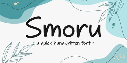 Smoru is a quick handwritten font. It is perfect for those who need to write quickly and efficiently. Its flowing strokes and consistent letterforms capture the natural rhythm and movement of handwriting, making it ideal for anything from taking notes to creating design projects. Suitable for any projects such as logos & branding, quotes, social media posts, product designs, label, and much more!
 - Frusta by District,
$20.00 Frusta is an earnest family of slab-serifs softened by tapered serifs and slightly squared curves that give it a warmth often absent in other slabs. Monoline and with a geometric foundation, this three-weight family includes true italics that can be their own headline face. The airy, yet sturdy construction makes this perfect for small text, infographics, and headlines of all sizes.
 - Inferno Dingbats by Just in Type,
$20.00Nobody knows what God looks like but we know that the Devil has a thousand different faces. Samuel Casal sees the demon everywhere. In the streets, the movies, rock music, books, gambling, other things and even in Hell. Devilishly, he captures it all with his magical design. Purchase the font Inferno Dingbats now and take control of the forces of Evil. - ALS Heino by Art. Lebedev Studio,
$63.00 Heino is a decorative face with two font styles that was inspired by an old magazine lettering. Its original features include heavy serifs and tight spacing, particularly if you take the Black version. The bouncing letters create a cheerful impression, and would look nice in children’s books and magazines, on candy and food packages, holiday and circus posters and flyers.
 - Major Birch by Salamahtype,
$19.00 Major Birch is a classic and modern font whose style never fades, a touch of stamp style can make this font look more naturally vintage. This font is perfect for logos, product labels, posters, or any design that wants a classic touch. Features: – 12 Font styles – Uppercase only ( All caps ) – Alternate characters – Regular, stamp, condensed, and expanded Version – Symbol and punctuation – Multilingual support
 - Beach Fool by PizzaDude.dk,
$19.00 People might consider me a fool - they might even consider me a fool on the beach...because I take a swim in the ocean, even in the wintertime! Beach Fool is a simple but yet very strong headline font. It has its roots in both grafitti and comics, which makes it really powerful for graphical expressions that needs an extra punch!
 - Linotype Aperto by Linotype,
$40.99Linotype Aperto is a typical text font in the style of transitional faces, like its often-used cousin Times. It is available in roman, semibold and bold weights, each with its matching italic. The roman weight is complete with old style figures and small caps. Its balanced, reserved appearance makes Aperto extremely flexible, good for long texts as well as headlines. - Cartella NF by Nick's Fonts,
$10.00This no-nonsense titling face is based on a Morris Fuller Benton 1934 offering for American Type Founders called, simply, Poster Gothic. Its crisp, clean lines and subtle Art Deco modeling make for attractive and attention-getting headlines. Available in plain and prismatic styles. Both versions of this font include the complete Unicode Latin 1252 and Central European 1250 character sets. - Koralle NF by Nick's Fonts,
$10.00This typeface made its first appearance in Schelter & Giesecke's 1915 specimen book. It exhibits the cleanness and crispness one might expect in a sans-serif face, along with a few unexpected grace notes that make it warm and friendly, as well. Both versions of this font include the complete Unicode Latin 1252, Central European 1250 and Turkish 1254 character sets. - Jampact NF by Nick's Fonts,
$10.00A little Compacta, a little Impact, a little photolettering from the 70s, all rolled into one make for a unique headline face that commands attention. Although this font is primarily unicase, the lowercase positions feature stylistic alternates, so can can mix things up and pack them in. Both versions of the font include 1252 Latin, 1250 CE (with localization for Romanian and Moldovan). - Los Niches by Latinotype,
$39.00 Los Niches is a stylized sans serif typeface that combines modern, monoline characters with strokes and loops reminiscent of manuscript lettering. With a consistant, harmonious style Los Niches takes on a youthful flair when presented in bright colors, but is elegant and contemporary when dressed all in black. The flexible personality of Los Niches makes it ideal for catalogs, magazines or product packaging.
 - Merry Old Soul NF by Nick's Fonts,
$10.00This jaunty display face was discovered in one of the many books on sign writing produced by Eric Matthews. The work was signed “King Cole", hence the font’s name. This typeface’s large x-height and tight spacing make it highly suitable for attention-grabbing headlines. Both versions of this font include the complete Unicode Latin 1252 and Central European 1250 character sets. - Trump Mediaeval LT by Linotype,
$67.99 Trump Mediaeval is an Old Face font developed by Georg Trump between 1954 and 1962. All cuts have both normal and old style numbers and their robust characters make them suitable even for inferior paper. Light and legible, the open forms of the lower case letters allow this font to be legible in text with as small a point size as 5.
 - Chewbrio by Samuelstype,
$24.00 Imagine shaping letterforms and messages from dough or chewed gum. This is Chewbrio in essence; No straight lines, no closed shapes and no sharp corners. Chewbrio is a fresh take on stencil. Four sets of all basic characters make for a very large number of combinations, and a hoard of ligatures will further your ability to surprise. Designed by Hans Samuelson in 2023.
 - Rhomantics by BaronWNM,
$12.00 Rhomantics is a sans serif font that carries a classic style. Rhomantics font takes a simple form but still has a classic feel in its shape so it is easy to identify each character of the letter to make it easier for us to read. This font can be used in invoice designs, history book covers, branding, advertisements, business cards, etc.
 - Olde Megrat NF by Nick's Fonts,
$10.00This rough-hewn offering is patterned after Antikva Margaret, designed by Zoltán Nagy for VGC in the mid-60s. Its energetic and, at times, eccentric letterforms make this face a perfect choice for headlines and subheads that will be noticed. Both versions include the complete Latin 1252, Central European 1250 and Turkish 1254 character sets, as well as localization for Moldovan and Romanian. - Bergell by ITC,
$29.00Inspired by the work of famed Swiss artist Alberto Giacometti, the German designer Thomas Finke created Bergell, a lively and natural script face. Bergell's calligraphic style is both dynamic and elegant, like the kind of special, festive handwriting many desire, but few ever manage to achieve. Why spend so much time at your drawing table when there are great fonts like this one?