10,000 search results
(0.017 seconds)
- Keira by Youthlabs,
$18.00 Introducing Keira Serif Font - A Brand New Serif Font with Simple and Elegant Look, More Opentype Feature, more neat curves Keira Serif Font Inspired by Simple and Elegant Typography. Keira Font is a very versatile font. you can use this font to various design. Basics can improve more than 200 alternative character. What's the Feature ? Uppercase & Lowercase Alternate 91 Language Support Ligatures Stylistic Alternate
 - Wavy Lines by Patria Ari,
$15.00 Introducing Wavy Lines – wave line font in uppercase and lowercase. This font can use to support your project to make design more beautiful. Wavy Lines suitable for book cover, merchandise, poster, title, quotes, and many more!
 - Backnotes by Silverdav,
$14.00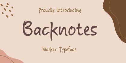 Backnotes font is a handwritten font with unique strokes, designed to enhance your designs so that your designs become more beautiful. Perfect for logo, wedding invitations, t-shirt, quotes, magazines, signature, branding silhouette, and many more.
 - State by Device,
$29.00 A futurist inspired geometric stencil in clean and rough versions. This design approach was distilled into a more regular typeface in Futura Black; State takes its inspiration from the more eccentric designs that predated that font.
 - Segatha by Ef Studio,
$15.00 Segatha is a beautiful casual handwritten font with beginning and ending lowercase swashes, 94 ligatures that add more beautiful and aesthetic fonts to perfect your extraordinary project. very suitable for branding, invitations, watermarks, photography, and more.
 - Overwave by Almarkha Type,
$23.00 Introducing Overwave - Display Sans the wave model with a unique arch. very suitable for the title, logo, typography, clothes, magazines, brochures, packaging and much more for your design needs, making your designs more modern and professional.
 - Cyber Track by Nirmana Visual,
$24.00 Cyber track - Techno Futuristic Display Typeface Inspired by Sci fi Movie, very suitable for the title, logo, typography, clothes, magazines, brochures, packaging and much more for your design needs,making your designs more modern and professional.
 - Semilla by Sudtipos,
$79.00 I spend a lot of time following two obsessions: packaging and hand lettering. Alongside a few other minor obsessions, those two have been my major ones for so many years now, I've finally reached the point where I can actually claim them as “obsessions” without getting a dramatic reaction from the little voice in the back of my head. When you spend so much time researching and studying a subject, you become very focused, directionally and objectively. But of course some of the research material you run into turns out to be tangential to whatever your focus happens to be at the time, so you absorb what you can from it, then shelf it — like the celebrity bobblehead that amused you for a while, but is now an almost invisible ornament eating dust and feathers somewhere in your environment. And just like the bobblehead may fall off the shelf one day to remind you of its existence, some of my lettering research material unveiled itself in my head one day for no particular reason. Hand lettering is now mostly perceived as an American art. Someone with my historical knowledge about lettering may be snooty enough to go as far as pointing out the British origins of almost everything American, including lettering — but for the most part, the contemporary perspective associates great lettering with America. The same perspective also associates blackletter, gothics and sans serifs with Germany. So you can imagine my simultaneous surprise and impatience when, in my research for one of my American lettering-based fonts, I ran into a German lettering book from 1953, by an artist called Bentele. It was no use for me because it didn't propel my focus at that particular time, but a few months ago I was marveling at what we take for granted — the sky is blue, blackletter is German, lettering is American — and found myself flipping through the pages of that book again. The lettering in that book is upbeat and casual sign making stuff, but it has a slightly strange and youthful experimentation at its heart. I suppose I find it strange because it deviates a lot from the American stuff I'm used to working with for so long now. To make a long story short, what’s inside that German book served as the semilla, which is Spanish for seed, for the typeface you see all over these pages. With Semilla, my normal routine went out the window. My life for a while was all Bezier all the time. No special analog or digital brushes or pens were used in drawing these forms. They're the product of a true Bezier process, all starting with a point creating a curve to another point, which draws a curve to another point, and so on. It’s a very time-consuming process, but at the end I am satisfied that it can get to pretty much the same results easier and more traditional methods accomplish. And as usual with my fonts, the OpenType is plenty and a lot of fun. Experimenting with substitution and automation is still a great pleasure for me. It is the OpenType that always saves me from the seemingly endless work hours every type designer must inevitably have to face at one point in his career. The artful photos used in this booklet are by French photographer and designer Stéphane Giner. He is very deserving of your patronage, so please keep an eye out for his marvelous work. I hope you like Semilla and enjoy using it. I have a feeling that it marks a transition to a more curious and flexible period in my career, but only time will tell.
 - Catalpa by TypeTogether,
$35.00 The Catalpa font family is José Scaglione and Veronika Burian’s wood type inspired design for an overwhelming headline presence. It has no regular weights, only four slender and four hulking weights. Catalpa wasn’t made to be normal; it was made to overwhelm, to stand out, to bellow. Catalpa is the first font family within a trilogy that will be released through 2020. Each of the three have a distinct purpose and their own look, but they serve a common goal: to act as a complete family covering an editorial’s wide array of needs. As the first of the three, Catalpa is the bookend font family with a headlining purpose. What requirements are there for a great headline typeface? Distinction, weight, and cohesiveness are a good start. Its distinctiveness must catch attention, it must have a range of weights applicable to its purpose, and its internal consistency and external look must create a cohesive family. Catalpa is a distinct and unified family whose weights are attuned to its single-minded purpose — headlines and large text. Catalpa has only eight styles that are divided into two ranges of weights — four very light weights (Hairline, Thin, Extralight, and Light ) and four very bold ones (Extrabold, Heavy, Black, and Extrablack). The thin and heavy ends of the spectrum also have their own variable fonts, each with one axis of weight so designers can fine-tune their work. The geometric influence of the design is more obvious in the light range, with their line thickness increasing in the classical manner. The bold weights increase more in width and substance to serve well in websites, mobile apps, posters, advertisements, and magazines that aim for impact more than spreading information. As a family, Catalpa gels in big headlines, short sentences, and isolated words. The family has many recognizable features, in the bolder weights especially, like the reversed contrast ‘S, s’ or the angular design of ‘Q, M, W, w, a, f, 2, 3’. Catalpa’s headlining mixture of geometry and quirkiness leaves an impression that is so characteristic of wood type, but designed for substrates and screens.
 - Bree by TypeTogether,
$37.50 The Bree font family is a spry sans serif by Veronika Burian and José Scaglione that delivers a spirited look and feel for branding and headline usage. As an upright italic, Bree shows a pleasant mix of rather unobtrusive capitals with more vivid lowercase letters, giving text a lively appearance. Bree is clearly influenced by handwriting. As such, some of its most characteristic features are the single-story ‘a’, the cursive ‘e’, the outstroke curves of ‘v’ and ‘w’, the flourished ‘Q’, and the fluid shapes of ‘g’, ‘y’, and ‘z’. Alternates of these letters are available when a more neutral look is desired. Bree has a touch of cheekiness, a wide stance for each character, and an extra-large x-height. All this adds up to a big personality, so even when set in small text there is no skimming past the words Bree voices. In 2019, the Bree font family got a huge update. A few shapes were updated or added (the ‘k’ and German capital ‘ß’), two entirely new weights were added (Book and Book Italic), and spacing was perfected. More than that, Vietnamese support was added to Bree Latin, and the Bree Greek and Bree Cyrillic scripts were designed from scratch to parallel the Latin’s tone. Additionally, Bree was designed in variable font format for those who want complete control over the font’s appearance while simultaneously saving digital weight in the form of kilobytes and megabytes. Bree is in the perfect position for the next digital revolution. The complete Bree font family, along with our entire catalogue, has been optimised for today’s varied screen uses. Bree has been chosen for such wide-ranging uses as Breast Cancer Awareness Month in the US, the branding for the country of Peru, and numerous layouts including mobile apps, magazines, newspapers, and books. Awards – Tipos Latinos exhibition 2008 – Several best-of-the-year typeface lists of 2008 MyFonts Top 10 Fonts of 2008 Smashing Magazine: 60 Brilliant Typefaces For Corporate Design https://www.smashingmagazine.com/2008/03/60-brilliant-typefaces-for-corporate-design/ Die besten Schriften 2008 http://www.fontwerk.com/619/die-besten-schriften-2008/ – Selected for Typographica’s Best Typefaces of 2008 – Won Bronze for Original Typeface in the 2009 European Design Awards
 - Secret Granola by Pen Culture,
$19.00 Introducing Granola. A modern calligrphy font with modern and lovely style of script font. This font comes with more than 50 ligatures and more than 20 alternates, so you will find it very easy to mix and match this font in your projects. This font will be very suitable for branding, logo design, magazines, posters, invitations and much more. I really hope you enjoy it – please do let me know what you think, comments & likes are always hugely welcomed and appreciated. More importantly, please don’t hesitate to drop me a message if you have any issues or queries. Thanks
 - Archimoto V01 by Owl king project,
$37.00 Archimoto V.01 Responded to the design of working drawing techniques in the world of architecture and letters on old stuff photography lens bodies, archimoto is designed with a more modern form, a little touch of detail in the corner area is so smooth that it aims to provide comfort to the eyes, by bringing 20 sizes including italic archimoto can be used more freely and can be adjusted more extensive exploration of its use. archimoto can be used as headlines and body text, the level of readability that looks comfortable makes the arrangement of letters more beautiful.
 - Chimphand by One Fonty Day,
$6.00 Chimphand is an organic, natural and contemporary handwritten typeface with their tall x-height. Weights of light, regular and bold for both normal width and condensed allow you to play with the typeface more. In addition, you will have an access to their style sets ( Gap ) to add stencil-ish character to every weights. This gap style is much more subtle than normal stencils, but unique and nicely fit to the typeface. Gaps are more visible on larger fonts and bolder weights. Chimphand is good for any purpose, but works more on shorter text. Thanks and enjoy!
 - Hurricane by TypeSETit,
$44.99 A storm has been brewing. It’s Hurricane. A complete redesign of a popular style. New flair and excitement abounds with this fast moving spirited brush script. This updated version of Hurricane was created with high end advertising in mind but can also be used for designs outside of commercial uses— greeting cards and social expression, or even scrap-booking projects. There are three regular styles and a PRO version of the script styles, plus a graphics font to add an extra breeze to your work. Hurricane Regular is straight forward with the more Roman capital forms. The Script version swaps the caps out for the more flourished uppercase. And finally, the Swash version contains many of the alternate letter forms found in the PRO version. Hurricane Pro offers the features of all three of the regular Hurricane versions with added OpenType programming and additional alternate glyphs. The Contextual feature of Hurricane swaps out the regular forms for more flashy characters along with necessary ligatures and alternates that give perfect flow to the words. Access the stylistic sets for even more creative options. In addition, see GLORY— a sans serif spin-off (pun intended) to complement the script styles. The Glory styles contrast to Hurricane’s slanted, brushy speed. In addition, an inline font has added to complete the pro package. I sincerely hope you enjoy this exciting update to a font I have always found to have huge potential.
 - MTC Agrinaya by Martype co,
$22.00 Agrinaya is a condensed display font with high contrast and feels like a serif style to make it more stylish and modern, this font is made for logotypes, branding, editorial designs, and more. Thank You & Happy Designing!
 - Conflict by Typomancer,
$20.00 ‘Conflict’ is one of Typomancer’s early typefaces; it was released when the foundry started. After a few years, we decide to give it some major changes, including more weights, more glyphs, brand new outline, and revamped kerning.
 - Charm by Typomancer,
$20.00 ‘Charm’ is one of Typomancer’s early typefaces; it was released when the foundry started. After a few years, we decide to give it some major changes, including more weights, more glyphs, brand new outline, and revamped kerning.
 - Neurock by Almarkha Type,
$25.00 Hello Everyone, Introduce our new collection, Neurock - Futuristic Font Sans With 2 Style, Inspired from famous logos of Futuristic Style and brands that have very strong characteristics, very suitable for posters, packaging, branding, logotype and more. Neurock font with strong and challenging nuances. very suitable for the title, typography, Poster, magazines, brochures, packaging,Websites and much more for your design needs, making your designs more modern and professional.
 - Keawneta by Almarkha Type,
$25.00 Hello Everyone, Introduce our new collection, Keawneta - Authentic Display - Bold Display With 15 Ligatures, Inspired from Modern logos of brands that have very strong characteristics, very suitable for posters, t-shirt, packaging, branding, logotype and more. Keawneta font with strong and challenging nuances. very suitable for the title, typography, Poster, magazines, brochures, packaging,Websites and much more for your design needs, making your designs more modern and professional.
 - Fragmented by Gassstype,
$22.00 Introducing Fragmented is a Special Rough Striped Typeface that is written casually and quickly. Letters are made with brushes on Procreate. Then crafted carefully drawn into vector format. That is why Fragmented has charming, authentic and relaxed characteristic more natural look to your text with a more natural look to your text. design more interesting. Fragmented is perfect for homeware designs,branding projects, Logo design, Quotes product packaging.
 - Pleasans by Gassstype,
$22.00 Hello Everyone, Introduce our new collection, Pleasans - Sans Serif Typeface ,Extended Display Sans Serif inspired by famous logos of Technology and brands that have very strong characteristics, very suitable for posters, packaging, branding, logotype and more. Pleasans font with strong and challenging nuances. very suitable for the title, typography, Poster, magazines, brochures, packaging,Websites and much more for your design needs, making your designs more modern and professional.
 - Carnollia Signature by Hanaksara Studio,
$17.00 Carnollia Signature is a stylish signature font with a modern and natural handwriting impression. And it's perfectly suited to logos, posters, wedding details, postcards, branding, apparel, taglines, quotes, and much more. Carnollia Signature includes more than 100 alternates within the following OpenType features: 3 Sets of lowercase Stylistic Alternates, Underline Swashes, and more than 40 ligatures. Thank you for checking this product and we hope you enjoy it!
 - Quote Notes by Trim Studio,
$12.00 Quote Notes is cute whimsical font with fun style to let you explore more about craft and cuteness, especially in precious moment like holiday, baby shower, birthday, christmas, easter and many more,, Its perfectly suited for crafter and graphic artist to complete their design such as invitation, advertisement, poster, logo, birthday, product sign, and many more! Quote Notes also Lightweight, even so contains All Standard glyphs and punctuations
 - Siestha by Attype Studio,
$15.00 Siestha is a stylish signature font with more than 90 ligatures and ending stylistic set that make amazing combination. It is perfect for any product like branding, invitations, stationery, wedding designs, social media posts, advertisements, product packaging, product designs, label, photography, watermark, special events and more. What's included: - Multilingual Support - More than 90 ligatures - Ending stylistic set - Support OpenType features --- Hope you enjoy with our font! Attype Studio
 - Heezpiero by Almarkha Type,
$25.00 Hello Everyone, Introduce our new collection, Heezpiero - Bold Display Sans With 33 Ligatures, Inspired from famous logos of Technology and brands that have very strong characteristics, very suitable for posters, t-shirt, packaging, branding, logotype and more. Heezpiero font with strong and challenging nuances. very suitable for the title, typography, clothes, Poster, magazines, brochures, packaging,Websites and much more for your design needs, making your designs more modern and professional.
 - Jatmika Typeface by Gassstype,
$23.00 Introducing our latest display typeface called Jatmika Typeface- Modern Blackletter Typeface – Display Vintage Serif can make your logotype become more interesting. Best Vintage font multilingual support. inspired by the decorative arts and architecture movement Jatmika Typeface fonts is perfect for your project and allows you to create designs, headlines, posters, logos, badges, and many more that are beautiful. It is also best used for posts, logos, posters, certificates, labels and more.
 - Halau Serif by Vintage Voyage Design Supply,
$10.00 Introducing mid-century modern font family – Halau Serif. Classic mid-century serif with characteristic cartoon look. Straight for your summer projects. More fun, more sun and more retro-modern! Play with it and get really cool retro-lettering style. Also, you can use some alternates (A, E, K, R, Y, a, g, l, k). Also, you get Mid-Century Modern style graphic objects set as letters and numerals alternates (36 Total).
 - Murisa Monolinia by Murisa Studio,
$10.00 Monolinia is a font that is unique and different from the others. Monolinia will make your designs and products more attractive. Try Monolinia and have an amazing experience. Your designs and products will look more elegant and authoritative.
 - Brokenz by Almarkha Type,
$29.00 Introducing BROKENZ – Bold Sans Condensed fonts with 4 styles with strong and challenging nuances. very suitable for the title, typography, clothes, magazines, brochures, packaging and much more for your design needs, making your designs more modern and professional
 - Abimanyu by Goodigital13,
$20.00 perfect for branding, photography, invitations, quotes, watermarks, advertisements, product designs, labels, and much more!. it will make your design project more beautiful. The font is suitable for any design like branding, fashion, print template, quotes, wedding and etc.
 - Groom by Scholtz Fonts,
$19.00Groom is a a casual brush script refined and developed from handwritten letters. It combines dramatic though readable caps with more readable, smoothly connecting and more formal lowercase to give a script that is both confident and legible. - Evil Eye by Goodigital13,
$20.00 Suitable for various media, posters, banners, brochures, and various merchandising such as t-shirts, totte bags, stickers and much more perfect for display such as label, apparel, fashion, sticker, books, poster, and many more! Complete with OpenType features.
 - Xenku by limitype,
$12.00 Xenku Is A Display Font With A Modern Sans Serif Style, Made With A More Dynamic And Flexible Impression, Making This Font Look More Futurustic. Xenku Comes With: - All Caps Fonts - Number - Symbol - Multi Language - And Italic Version
 - Techno Race by Nirmana Visual,
$19.00 Techno Race - Sport Display with strong and Sporty. with 2 styles : Regular & Italic. Very suitable for the title, logo, typography, clothes, magazines, brochures, packaging and much more for your design needs, making your designs more modern and professional.
 - Windgard by Runsell Type,
$17.00 Introducing Windgard - A Clean Brush Script Windgard inspired by hand lettering brush style that moves in clean, make with perfectly horizontal vertical bezier handles. Each glyph has its own uniqueness and when meeting with others will provide a dynamic and playfully. Alternate characters has 6 set (Contextual Alternates, Stylistic Alternates, and ss01-ss04). In addition to the purposes of logotype Windgard Font can also be applied in the esport logo, sticker, apparel, bag, magazine, website headlines, packaging, branding, quotes, business cards, and more. We hope this can make inspire for your work.
 - Thickset by Josh Grzybowski,
$19.99 She may not be the heaviest font on the street but Thickset can throw her weight around with the best of them. Designed as a display font, Thickset is a solid slab-serif with thin counters that makes it ideal for publications like fashion and editorial magazines. But don’t get me wrong, she’s more than willing to give anything a try. Just as long as you respect her in the morning. In addition to ligatures and fractions, Thickset’s other OpenType features include old style numbers and small caps.
 - Silent Movies JNL by Jeff Levine,
$29.00 An ad in the Oct. 27, 1919 issue of the trade magazine “The Moving Picture World” promoted “Princess Virtue” from Bluebird Pictures starring Mae Murray – The Adorable [as noted by the movie studio in the ad]. The Art Nouveau hand lettering emulated the style usually drawn with a round nib pen, but was given a specialized treatment for the ad. It was re-drawn in a more traditional ‘pen nib’ look for digital revival. The end result is Silent Movies JNL, which is available in both regular and oblique versions.
 - Menalde by Edignwn Type,
$12.00 The font is called "Menalde", it is slab serif display with vintage themes. The font comes with 4 style typefaces (regular, rounded, rough and textured). Uppercase and lowercase have different unique stamp textures, so you can combine the same 2 letters and not be boring . The Menalde matches applies in some designs such as the logotype, poster, label, badge, packaging, branding, and more custom design. Menalde includes : 4 style typefaces (regular, rounded, rough and textured) All-caps, numeral, symbol and punctuation Multilingual PUA Encoded Thank you for your support and choosing us.
 - Shoganai by Hanoded,
$15.00 I really like the Japanese language, as it has words that describe a whole world of meaning. Like Shoganai. It literally means: ‘It cannot be helped’. That’s life, get used to it. Shoganai sums up a lot of the Japanese culture and way of thinking: if things cannot be helped, then accept it and move on. Shoganai is a set of Brush fonts: a thinner, script font and a heavy display font. Use if for book covers, product packaging and more. If you can’t use it, then, well, Shoganai.
 - Garnison by OzType.,
$15.00 Garnison, is a contemporary take on the humanist sans serif from Eric Gill with readability and craftsmanship at its core. Specially designed for editorial and publishing purposes. Garnison blends Eric Gill’s humanist sensibilities with a younger, more versatile attitude with 74 variations ranging from lightest hairline to heaviest black, the family features an extensive set of weights and optical sizes, matching true italics and lots of cool OpenType features. The variation in stroke width and letterforms help it achieve great scalability while still retaining its character. For inquiries please contact ozfoundry@gmail.com.