10,000 search results
(0.037 seconds)
- Varp by Kobuzan,
$25.00 Varp is a rather narrow 2-axis variable geometric typeface with slight reverse contrast inspired by utilitarian and technical design. In Slim and Tight styles, the reverse contrast is enhanced. Typeface is adjustable in width, as if by mechanical deformation of proportions, which is often found in technical and transport markings. The letterforms are based in part on the shapes of DIN fonts, with the deliberate addition of contrasting connections, sharp spurs and massive ink traps for sharpness. With the help of special spacing, selective kerning and adjusted letter width, the effect of a monospaced font is created with no obvious "holes" in the text set, while maintaining a special rhythm. In addition to the width, Varp is adjustable in tilt angle to an extreme 30 degrees and an intermediate 15 degrees in both directions. Features: – Total glyph set: 795 glyphs; – 15 styles (3 widths x 5 italics) + variable; – Support 210+ languages; – Latin Extended; – Cyrillic Basic + Bulgarian letters; – Greek. OpenType features: – Uppercase, lowercase; – Proportional, circled, tabular numerals, superiors, inferiors, fractions; – Punctuations and symbols; – Arrows; – Stylistic sets (ss01-ss04); – Ligatures; – Case-sensitive forms.
 - Hillstone by 38-lineart,
$14.00 Hillstone is a handwritten font with a rough texture, the process of making letters with scratched with strong and fast stroke on paper to make the rough texture that characterizes of Hillstone, so this is a font with a rough and dry brush style. We repaired the letters computerically and if they didn't unite well and we made several alternate glyph. There is no problem for long or short text, so this font can be used in various designs widely. you can use this font for instagram, quotes and other long text, this font is also unique for one word text or short typing, that you can use for product brands, company logos, books and magazine covers, everytype will look very typical. use ligatures and alternatives to your taste.38. Anything made with this font will definitely be wrapped in a very contemporary style and elegance. We make several priview images as a guide for designing directions, please check them all Best regard and thank you very much.. 38.lineart studio
 - Magedo by Craft Supply Co,
$20.00 Introducing Magedo Vintage – Fluid Font Looking for a font that’s both fluid and exudes vintage charm? Look no further than Magedo Vintage – Fluid Font. This versatile typeface offers a blend of modern fluidity and classic vintage aesthetics display that will elevate your designs to the next level. Fluid Elegance Magedo Vintage boasts a fluidity that adds a touch of sophistication to your projects. Its smooth curves and flowing lines make it perfect for logos, headings, and invitations, creating a sense of dynamic movement that captures attention. Rustic Hand-Drawn Appeal Embrace the hand-drawn trend with Magedo Vintage. Its rustic, imperfect strokes give your text a unique character and a cozy, artisanal feel. Whether you’re designing a rustic wedding invitation or a quaint cafe menu, this font adds that charming touch. Timeless Stamp Effect Magedo Vintage also offers a stamp-like effect, reminiscent of classic imprints. This effect adds a sense of authenticity and nostalgia to your designs, making it ideal for vintage-themed posters, packaging, and labels.
 - Generous Hospitality by Dear Alison,
$19.00 While there can be similar handwriting styles out there, no two handwritings are exactly the same. I like to think that I have the same handwriting style as my father, but I had never seen him write with lowercase letters, only in all capitals, except when signing his name on something in cursive. I recently came across a letter my father had written long ago to a friend. It was returned to sender, yet he kept it intact. The letter primarily thanked his friend for his hospitality when my father unexpectedly dropped in for a visit while traveling. I was so taken by the handwriting, that I decided to make it into a font, not only to remember my father, but also to forever preserve his handwriting. Generous Hospitality not only taps into the character of the person the letter was written to, it also reflects the personality of my father. If you are looking for a masculine handwriting type style for your designs, I think this font could be a nice fit.
 - Rantic Kafis by Product Type,
$17.00 Introducing Rantic Kafis, a classic modern font with a bold and elegant touch. This font features thick strokes and rounded edges, giving it a distinctive and sophisticated look. With its stylistic set options for upper and lowercase letters, Rantic Kafis adds a touch of individuality and creativity to any design. Rantic Kafis is the perfect font to add a classic modern feel to your work. Its thick strokes and rounded edges make it highly legible, ensuring that your designs are easy to read and understand. So if you’re looking for a font that combines the best of classic and modern design, look no further than Rantic Kafis. Download it now and start creating stunning designs that stand out from the crowd! What’s Included : - File font - All glyphs Iso Latin 1 - We highly recommend using a program that supports OpenType features and Glyphs panels like many Adobe apps and Corel Draw, so you can see and access all Glyph variations. - PUA Encoded Characters – Fully accessible without additional design software. - Fonts include Multilingual support
 - Kit Cloudkicker by Anastasia Kuznetsova,
$19.00 I present to you the universal everyday font 'Kit Cloudkicker'!! This font is very versatile and can be used in various styles of projects where a fast relaxed handwritten font is required. Filled with fun and energetic brush strokes, this font will undoubtedly add a touch of playfulness to your text - perfect for greeting cards, branding, merchandise, invitations and handmade quotes! The 'Kit Cloudkicker' font is so easy to use and create completely unique, hand-made words every time. It looks so great!! Font Features A-Z; a-z character set; 1 language (English); numbers and punctuation marks, symbols. A font containing uppercase and lowercase letters, numbers, and a wide range of punctuation marks. Fonts can be opened and used in any software that can read standard fonts, even in MS Word. No special software is required, and to get started. It is recommended to use it in Adobe Illustrator or Adobe Photoshop Made with love and magic ♡ Thanks for checking it out, and feel free to drop me a message if you had any queries! ~ Anastasia
 - User Stencil by DSType,
$30.00 User is a monospaced type family with 30 styles, from Hairline to Bold, divided in Regular, Upright and Stencil, with five weights (Hairline, ExtraLight, Light, Medium and Bold) all with Cameo versions. Complexity and versatility are the keywords for this type family. Despite being a monospaced font, which means there's no kerning, all the glyphs were designed in order to sit comfortably in the 600 points width, a hard task because some glyphs are too narrow ('i' and 'l'), while others are too wide ('m' and 'w'), but they must fit the same width. The desire for keeping a comfortable readability in User was one of the key elements, therefore we designed several ligatures that fit both single and double space width, allowing to maintain a certain idea of proportional design. In this digital booklet you will find a detailed vision of the anatomy of the typefaces, the amount of characters available, the styles and weights, along with a series of features, specially designed to make User a very versatile and usable type system.
 - Bushing by Hackberry Font Foundry,
$13.95 Bushing is a quick serif experiment going for open light display type. For years I have always stopped and really liked what I saw with fonts like the original Cushing from the turn of the 20th century. This time the desire for a font was stirred by Felici's article in CreativePro on fonts from the beginning of the 20th century, especially his captures of Cushing No. 2 and the version commissioned for Norwood press from ATF. I'm not interested in historically accurate reconstructions. My desire is for the general feel I get when I see a font. As a result, Bushing has little to do with Cushing (other than the last six letters). But it is a Serif font with small serifs and a huge x-height with a very open feel. I like it. I hope you do also. I made it into a limited display version of OpenType Pro. I added small caps and oldstyle figures, as I can hardly work without them. But ligatures seemed silly for this one.
 - User Upright by DSType,
$30.00 User is a monospaced type family with 30 styles, from Hairline to Bold, divided in Regular, Upright and Stencil, with five weights (Hairline, ExtraLight, Light, Medium and Bold) all with Cameo versions. Complexity and versatility are the keywords for this type family. Despite being a monospaced font, which means there's no kerning, all the glyphs were designed in order to sit comfortably in the 600 points width, a hard task because some glyphs are too narrow ('i' and 'l'), while others are too wide ('m' and 'w'), but they must fit the same width. The desire for keeping a comfortable readability in User was one of the key elements, therefore we designed several ligatures that fit both single and double space width, allowing to maintain a certain idea of proportional design. In this digital booklet you will find a detailed vision of the anatomy of the typefaces, the amount of characters available, the styles and weights, along with a series of features, specially designed to make User a very versatile and usable type system.
 - Neutraface Text by House Industries,
$33.00 Although better known for his residential buildings, Richard Neutra’s commercial projects nevertheless resonate the same holistic ecology—unity with the surrounding landscape and uncompromising functionalism. His attention to detail even extended to the selection of signage for his buildings. It is no wonder that Neutra specified lettering that was open and unobtrusive, the same characteristics which typified his progressive architecture. House Industries brings the same linear geometry to Neutraface without sacrificing an unmistakably warm and human feel. FEATURES AUTOMATIC SMALL CAPS: If you specify “Small Caps”, InDesign and Photoshop will automatically substitute the true small caps charac- ters as well as the corresponding figures and punctuation for any lowercase characters. NEUTRAFACE TEXT ALTERNATES: Neutraface Text contains several stylistic alternate characters. LIGATURES: This feature is on by default. It will substitute a long list of “f” and “t” ligatures. For example, open InDesign or Photoshop and type “ff” or “tt”. Like all good subversives, House Industries hides in plain sight while amplifying the look, feel and style of the world’s most interesting brands, products and people. Based in Delaware, visually influencing the world.
 - Tin Lizzie JNL by Jeff Levine,
$29.00 One of the most unusual sets of antique stencils spotted for sale online comprises a set of twenty-four classic logos of early 20th Century automobile companies. For whatever purpose that is now lost to time, these stencils represented the logos of many of America's finest auto manufacturers; most now just historical memories. The logos were painstakingly redrawn, maintaining the distinctive look of the hand made cutting, although it was an exacting process - some of the images were taken at an angle, and a bit of artistic license had to be used as a compensatory factor. It is to be noted that any and all of the logos presented in this font are the intellectual property of the companies, successors or assignees that may still hold the rights to these symbols. No endorsements by such corporate entities are either expressed or implied. Additionally, it is advised that any use of these logos be restricted to historical or hobby purposes, and they should not be used in a way that would construe any authorized reproduction of the logos in a commercial fashion.
 - Codelia by Tabular Type Foundry,
$- No matter if you're professional or beginner, your work should be fun. And if you are a coder/programmer, your coding font should be something you enjoy looking for very long time. Square and crisp coding fonts might be easy on the pixels, but are they easy on your eyes? Do they keep you entertained at work? Codelia is a monospaced humanistic typeface designed for coding with focus on comfort and fun without sacrificing legibility or coding functionality. It's fun but not a joke. Its round shapes are easier on the eyes and make the code look less intimidating. It is not designed to make maximum use of every pixel on screen, but to make you forget about pixels. The italic is full of personality but sober enough to not draw unnecessary attention. Codelia works great for coding, but also in presentation, education as well as packaging and branding. Codelia is available in two families, one with coding ligatures and one without; ligatures in the latter are still present in Diescretionary Ligatures feature (dlig).
 - DT Augustina Slab by Deveze Type,
$29.00 DT Augustina Slab is an original Clarendon's style slab serif font family of 98 styles including 7 weights, 7 widths plus Italics. There is no such a big choice of Clarendons with a wide range of styles on a market. Super wide range family will satisfy almost any request. Ultra Lights and Light styles will add elegance and lightness to your headlines, especially with using Italic swashes. Regulars, Mediums and Semi Bold will make your text blocks readable and stylish. Combine with Italics and Small Caps for sub-headers and highlights to get an incredible result. And finally Bold and Extra Bold for massive and heavy text headers. Strong, stable and reliable. The whole family has been working well in almost any type of a project: Websites, Apps, E-Books, Books, Magazines, TV broadcasting, Packaging. The family has an Open Type Features like a Ligatures, Italic Swashes, Small Capitals, Case Sensitive Forms, Tabular Figures, Old Style Figures, Tabular Old Style Figures, Circled Figures, Black Circled Figures, Fractions, Superscripts, Subscripts, Stylistic Sets, Localisation forms for Moldavian / Romanian, Catalonian and Turkish.
 - User by DSType,
$30.00 User is a monospaced type family with 30 styles, from Hairline to Bold, divided in Regular, Upright and Stencil, with five weights (Hairline, ExtraLight, Light, Medium and Bold) all with Cameo versions. Complexity and versatility are the keywords for this type family. Despite being a monospaced font, which means there's no kerning, all the glyphs were designed in order to sit comfortably in the 600 points width, a hard task because some glyphs are too narrow ('i' and 'l'), while others are too wide ('m' and 'w'), but they must fit the same width. The desire for keeping a comfortable readability in User was one of the key elements, therefore we designed several ligatures that fit both single and double space width, allowing to maintain a certain idea of proportional design. In this digital booklet you will find a detailed vision of the anatomy of the typefaces, the amount of characters available, the styles and weights, along with a series of features, specially designed to make User a very versatile and usable type system.
 - Sippin Midweek by Clevus,
$16.00 Proudly present Sippin' Midweek a retro vibes yet glamour serif. In "Sippin' Midweek," we blend retro charm with unmatched elegance. Its serif style provides a classic touch that speaks of the luxury of yesteryears. This font is suitable for poster designs, labels, and branding materials that require a classic and radiant ambiance. Add an elegant retro touch to your project with Sippin' Midweek. Font Features : Lettres, numbers, symbols, and punctuation 55+ alternates and ligatures No special software required they may be used even in canva, any basic program /website apps that allows standard fonts That's it folks! Multilingual Support Language Support: Danish, English, Estonian, Filipino, Finnish, French, Friulian, Galician, German, Gusii, Indonesian, Irish, Italian, Luxembourgish, Norwegian Bokmål, Norwegian Nynorsk, Nyankole, Oromo, Portuguese, Romansh, Rombo, Spanish, Swedish, Swiss-German, Uzbek (Latin) Follow My Shop For Upcoming Updates Including Additional Glyphs And Language Support. And Please Message Me If You Want Your Language Included or If There Are Any Features or Glyph Requests, Feel Free to Send me A Message. Have a Good Day !
 - Franklin Gothic by Linotype,
$45.99Franklin Gothic was designed by Morris Fuller Benton for the American Type Founders Company in 1903-1912. Early types without serifs were known by the misnomer "gothic" in America ("grotesque" in Britain and "grotesk" in Germany). There were already many gothics in America in the early 1900s, but Benton was probably influenced by the popular German grotesks: Basic Commercial and Reform from D. Stempel AG. Franklin Gothic may have been named for Benjamin Franklin, though the design has no historical relationship to that famous early American printer and statesman. Benton was a prolific designer, and he designed several other sans serif fonts, including Alternate Gothic, Lightline Gothic and News Gothic. Recognizable aspects of Franklin Gothic include the two-story a and g, subtle stroke contrast, and the thinning of round strokes as they merge into stems. The type appears dark and monotone overall, giving it a robustly modern look. Franklin Gothic is still one of the most widely used sans serifs; it's a suitable choice for newspapers, advertising and posters. - Lagarto by Sudtipos,
$39.00 Some years ago, a good friend and typophile, Gonzalo García Barcha, approached me with the idea of designing a typeface for his editorial project Blacamán Ediciones. He had just came across an hitherto unknown manuscript by Luis Lagarto, a colonial illuminator and scribe, working in Mexico City and Puebla in the late 1500s. The manuscript calligraphy was incredible and stunningly original. It featured three different hands by the scribe, intermingled in the text: a kind of baroque «Roman» roundhand; a very ornate, lively «Italic»; and some sort of irregular, playful, even funny «small caps». All imbued with an eccentric, convoluted zest and vivacious rhythm. Lagarto is the final result of translating these extraordinary hands into a digital type family. Since the manuscript had no numerals, math signs and many other characters now in use, part of the fun of the job was to infer them from the stylistic peculiarities of Luis Lagarto's calligraphy. Lagarto received an Award of Excellence at the Type Directors Club of New York annual competition.
 - Othuf by Twinletter,
$13.00 Introducing “Othuf Font” – Where Handwriting Meets Elegance. Othuf Font is the epitome of handwritten elegance. With its captivating handwriting theme, this font is your key to adding a touch of sophistication and authenticity to your creative projects. Whether you’re designing invitations, posters, or branding materials, Othuf Font effortlessly grabs attention and infuses your designs with the charm of true handwriting. Crafted with meticulous detail, Othuf Font exudes the timeless beauty and grace of handwritten script, forging an immediate connection with your audience. Its versatility knows no bounds, making it a perfect fit for various applications, from wedding stationery to logo design. Othuf Font enhances readability and style with its graceful strokes and flowing lines, providing a natural and appealing look to your text. It also offers support for multiple languages, ensuring that it resonates with a global audience. Elevate your creative projects with the classic elegance of Othuf Font. Explore this exceptional typeface today and let your designs exude the beauty of authentic handwriting. – PUA Encoded Characters – Fully accessible without additional design software.
 - Habana Deco ML by HiH,
$12.00 Habana Deco ML was inspired by a hand-lettered sign on the stucco exterior of a small pharmacy in modern-day city of Havana, Cuba. It, in turn, was based on the fat-faced Art Deco lettering of the late 20s and early 30s, especially the Futurismo posters out of Italy, as well as alphabets designed in The Netherlands, France, USA and even the Soviet Union. There are 24 stylistic alternate glyphs (SALT), many inspired by a variety of these sources, including a couple from the sign in the front of the Congress Hotel in South Beach, Miami. The others features of the Habana Deco include 363 glyphs, 184 kerning pairs (KERN), 14 ornaments and shapes (ORNM) and 15 discretionary ligatures (DLIG). This is a font with which you can have fun. The zip package includes two versions of the font at no extra charge. There is an OTF version which is in Open PS (Post Script Type 1) format and a TTF version which is in Open TT (True Type)format. Use whichever works best for your applications.
 - Nasalization by Typodermic,
$11.95 Attention, design enthusiasts and space enthusiasts alike! Are you looking for a typeface that embodies the futuristic spirit of NASA and the excitement of space exploration? Look no further than Nasalization, an ultramodern sans serif font that takes inspiration from the iconic NASA logo of 1975. Nasalization is the perfect choice for any project that requires a touch of high-tech sophistication, from scientific research papers to sci-fi novels to sleek website designs. With its six weights and attention-grabbing italics, Nasalization offers versatility and visual impact in equal measure. But what really sets Nasalization apart is its dynamic design features. With the slanted “M” and “W” characters, this font is truly out of this world—the letters will automatically flip or straighten up depending on their surrounding characters, thanks to its OpenType-savvy programming. And if you prefer a more traditional look, you can easily turn off the flipped-letter effect by disabling the “standard ligatures” function in your design software. For even more customization options, Nasalization offers an OpenType “stylistic alternates” function that allows you to add a crossbar to the “A” character, giving your designs an extra touch of style and sophistication. So whether you’re designing a logo for a space-themed startup or crafting the perfect cover for your sci-fi novel, Nasalization is the typeface that will take your designs to new heights. Choose Nasalization and experience the power of NASA-inspired design today! Most Latin-based European, Vietnamese, Greek, and most Cyrillic-based writing systems are supported, including the following languages. Afaan Oromo, Afar, Afrikaans, Albanian, Alsatian, Aromanian, Aymara, Azerbaijani, Bashkir, Bashkir (Latin), Basque, Belarusian, Belarusian (Latin), Bemba, Bikol, Bosnian, Breton, Bulgarian, Buryat, Cape Verdean, Creole, Catalan, Cebuano, Chamorro, Chavacano, Chichewa, Crimean Tatar (Latin), Croatian, Czech, Danish, Dawan, Dholuo, Dungan, Dutch, English, Estonian, Faroese, Fijian, Filipino, Finnish, French, Frisian, Friulian, Gagauz (Latin), Galician, Ganda, Genoese, German, Gikuyu, Greenlandic, Guadeloupean Creole, Haitian Creole, Hawaiian, Hiligaynon, Hungarian, Icelandic, Igbo, Ilocano, Indonesian, Irish, Italian, Jamaican, Kaingang, Khalkha, Kalmyk, Kanuri, Kaqchikel, Karakalpak (Latin), Kashubian, Kazakh, Kikongo, Kinyarwanda, Kirundi, Komi-Permyak, Kurdish, Kurdish (Latin), Kyrgyz, Latvian, Lithuanian, Lombard, Low Saxon, Luxembourgish, Maasai, Macedonian, Makhuwa, Malay, Maltese, Māori, Moldovan, Montenegrin, Nahuatl, Ndebele, Neapolitan, Norwegian, Novial, Occitan, Ossetian, Ossetian (Latin), Papiamento, Piedmontese, Polish, Portuguese, Quechua, Rarotongan, Romanian, Romansh, Russian, Rusyn, Sami, Sango, Saramaccan, Sardinian, Scottish Gaelic, Serbian, Serbian (Latin), Shona, Sicilian, Silesian, Slovak, Slovenian, Somali, Sorbian, Sotho, Spanish, Swahili, Swazi, Swedish, Tagalog, Tahitian, Tajik, Tatar, Tetum, Tongan, Tshiluba, Tsonga, Tswana, Tumbuka, Turkish, Turkmen (Latin), Tuvaluan, Ukrainian, Uzbek, Uzbek (Latin), Venda, Venetian, Vepsian, Vietnamese, Võro, Walloon, Waray-Waray, Wayuu, Welsh, Wolof, Xavante, Xhosa, Yapese, Zapotec, Zarma, Zazaki, Zulu and Zuni.
 - Apresia Script by Asritype,
$42.00 Inspired by various shapes such as leaves, flowers, hearts etc., Apresia Script is harmonically crafted. My first intention is only for standard design, but, later added simpler characters for normal(standard) typings. Apresia Script is rich with capital letter variants and ornaments. There are also lowercase variants in lesser numbers. I assume that many or perhaps most people want to have their name or the other of their important designs to be written with some letters that are in various shapes harmoniously. Apresia Script with more then 4000 glyphs support this aim, also support many latin based languages. However, because of many variations, except the standard characters, the full marked capitals are only set in two variants; in ss01 and ss02, which is also some marked lowercases included here. Swash variants (swsh) consist only one variant of every uppercase and lowercase characters, but no marked characters. All the others capital and lowercase variants are put in stlystic alternatives (salt). There are tens of unmarked caps and fewer for unmarked lowercase in salt (see Apresia Script opentype features(1) poster for some). The ornaments can be accessed via opentype ornaments(ornm), using less() characters for easier access. There are also beginning small letter(lowercase) ornaments, end word(lowercase) ornaments and insertion ornaments to make your typing/design more flourish, using ornm via “[“ (bracketleft), “]” (bracketright) and “\” (backslash), respectively. For marks; marks via combining marks and mkmk was set for many characters variants, however, it seem most applications not yet support this features. Alternatively, you can add non standard unicode combining marks via ornaments for the language supported: asterisk “*” list for uppercase marks above letters; ASCIIcircum “^” list for lowercase marks above letters; underscore “_” for uppercase and lowercase marks below the letters; numbersign “#” for slashing characters, horn, caron alternate and reversed comma for g, (see Apresia Script opentype features(2) poster and save it if you download the font). Thus, it is recommended to have the application which are support these opentype features such as: Adobe in Design, Adobe Illustrator, CorelDRAW or others for easier accessing the glyphs. Still, for non supported applications, you can insert these glyphs via Character maps, insert symbols or other similar tools. Apresia Script will go for most typing/design such as invitation, wedding card, greeting card, banners, logos and many others. Use it for whatever you intended to, Apresia script will give an amazing end design, though you are not a designer. As intended to be able to be used by many, this font is set in an affordable price. Thank you very much for downloading this font.
 - BD Gitalona Moxa by Balibilly Design,
$19.00 This is an Experimental typeface, a direct descendant of the BD Gitalona font family, which has a supermassive family with Variable technology. However, this version is more on the aesthetic aspect, which is experimental and exploratory. It complements the beauty of the primary typeface that we released separately. If you are a fan of Effectiveness and flexibility, please learn more about BD Gitalona and BD Gitalona Variable! Inspiration The world of entertainment moves non-stop. One by one, figures appeared and left. We expect to create something to entertain previous trends with packaging more relevant to the present. More specifically, we admire and are inspired by some of the world's leading and top singers with a segmented nature. We imagine so many figures that can affect every viewer. However, each artist or singer has a segment because almost all of them have characteristics. The Design The basic design of this typeface begins with a transitional serif shape with sharp, shapeless corners. Then in the middle of the invention, there was an opportunity to explore it further from the readability side by adding an optical variable that can adjust the serif thickness when used together between large, medium to paragraph text sizes for editorials. The shift from serif to sans-serif with the contrast initiated by the shift of the serif family form as a different variable also makes this font richer in terms of the features it contains. Parts are expected to add to the user satisfaction with the complexity of this font. The Features BD Gitalona consists of one sub-family intended for body text with nine weights from Thin(100) to Black(900) and four other display sub-families such as Display serif, Flick, Harmony Sans and Contrast Sans. Each consists of four weights Thin(100), Regular Weight(400), Bold(700), and Black(900). And again, there are also retailed separately; the BD Gitalona Variable font, which is designed to accommodate all Subfamily in 1 font file, and BD Gitalona Moxa, an experimental typeface. A total of 700+ glyphs in each style. Advanced OpenType features functionally and aesthetically, such as Case-sensitive forms, small caps, standard and discretionary ligatures, stylistic alternates, ordinals, fractions, numerator, denominator, superscript, subscript, circled number, slashed zero, old-style figure, tabular and lining figure. Supports multi-languages including Western Europe, Central Europe, Southeast Europe, South America, and Oceania.
 - Friendly by Positype,
$29.00 Friendly is an homage to Morris Fuller Benton's adorable Announcement typeface. It is not a strict interpretation, digital revival or reverent reproduction of the original letterforms… but I would be remiss and shady to not acknowledge the letterforms that inspired this typeface. If you are looking for a more accurate 'scanned revival' I would recommend searching "Announcement" on MyFonts. As stated earlier, it is an homage to the original letterforms of the typeface but takes a great bit of freedom tightening the construction up in order to loosen up the movement of the variant letterforms to allow a great deal of usable personality. I enjoy stating this dichotomy… "loosen up to tighten up the forms" and vice versa. It seems counterintuitive or silly but by allowing the letterforms to normalize, I felt more comfortable going back and adding rather indulgent personality. Infused with stylistic alternates, swashes, titling, many many contextual alternates, 9 stylistic sets and 2 stylistic sets with wordmarks, the typeface became far more 'friendly' for me… how could it not? With so many loops, swashes and typographic indulgences, it was bound to be fun. The more elaborate and 'overdone' Friendly got, the more I wanted to slant it. Here's where my thinking differs from MFB's original. I like slanted romans… especially ones with long ascenders, but I do not like much of a slant. It has to be the lettering person in me. It's hard for me to do a completely upright serif and not pair it with an angle, but I did not feel Announcement's 'Italic' offered much and the actual slant needed to be far less. If it's not an italic, I prefer the letters to slant with an angle equivalent to the thickness of the vertical stroke. The Slanted version of Friendly is set at 3.6 degrees, is quite subtle, and very fitting for me. You will find that most characters have a contextual, stylistic, swash and titling alternate assigned to them and some have an echoed alternate to the swash and titling options if the stylistic alt has been selected in tandem. Additionally, all of these are accessible in the glyph palette directly from the base glyph typed or through selecting options through the Stylistic Sets 1–9. Stylistic Sets 10 & 11 are a little different. They are actually configured as complex majuscule ligatures… a result of me getting carried away. Other features like a default old style numeral set and coordinating glyphs have been produced along with case support, ordinals, and more have been added to make it more relevant for contemporary use.
 - FoxScript - Unknown license

- Langó - Unknown license

- Langó - Unknown license

- Langó - Unknown license

- Antaviana - Unknown license

- Antaviana - Unknown license

- Antaviana - Unknown license

- Langó - Unknown license

- Antaviana - Unknown license

- Anticode by Ronin Design,
$15.00 Anticode is a modern display font. Featuring a solid style and outline style. Anticode font will bring of your creative ideas to the highest level. This font is perfect for game/app designs, logo designs, poster and many more.
 - See You Again by Seemly Fonts,
$14.00 See You Again is a brand new and thin lettered display font. See You Again is perfectly suited for stationery, logos, t-shirt, paper, print design, website header, photo frame, flyer, music cover, poster, image slider, and much more.
 - Oliver Quin by Gittype,
$20.00 Oliver Quin, a beautiful and stylish low italic script handwriting font. Oliver Quin offers a harmonious pen movement for a diversity of design projects, including logos and branding, wedding designs, social media posts, advertisements, poster, watermark photography, and more.
 - Rocketto by Heinzel Std,
$10.00 Rocketto is a magical handwritten font carefully created with a touch of elegance. It will elevate a wide range of design projects to the highest level, be it branding, headings, wedding designs, invitations, signatures, logos, labels, and much more!
 - Morpho by ErlosDesign,
$19.00 Morpho - A Display Typeface by erlosDESIGN Morpho is a beautiful modern display typeface. It includes uppercase and lowercase letters, numeral, a large of punctuation and also multilingual support. Perfects for poster, web design, magazine cover, branding and many more.
 - Khadijah by Nandatype Studio,
$13.00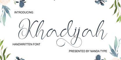 Khadijah is a classy and elegant modern calligraphy font. It can be used for various purposes, such as logos, wedding invitations, t-shirts, letterhead, signage, posters and more. It includes OpenType features including alternates, ligatures and multi-language support.
 - Kibly by Khoir,
$15.00 Kibly - Clean, classy serifs have beautiful curves and alternative additions that make this font look elegant, great for logo designs, titles, posters, business cards, branding needs, and more. What's included? Uppercase Characters Lowercase Characters Support 75+ Language Alternative Variation
 - Gaela by Letterena Studios,
$17.00 Gaela is a modern and classic serif typeface with a unique style and modern look. This typeface is perfect for an elegant & luxury logo, book or movie title design, fashion brand, magazine, clothes, lettering, quotes, and so much more.


