10,000 search results
(0.147 seconds)
- Handwriting by Cocodesign,
$10.00 Handwriting Script is a handwriting design, including Regular. This font is casual and beautiful . Can be used for various purposes. such as logos, product packaging, wedding invitations, branding, headlines, signage, labels, signatures, book covers, posters, quotes, and more.
 - Brumder by Trustha,
$17.00 Brumder is a condensed sans serif typeface. Inspired by Industrial style. Comes in several styles namely regular, round, rounded, rough, and stamp, with matching oblique, making it 10 styles. Brumder is perfect for branding, headlines, and many more.
 - Ando Round by JCFonts,
$30.00 This is the rounded version of Ando, an elegant geometric typeface with smooth curves, designed for headlines. Six styles are available, with the same OpenType features as the original: stylistic alternates, case sensitive forms, tabular figures, and more!
 - Hindia by Lafontype,
$14.00 Hindia is a casual handwritten font with a pleasant shape and taste on every glyph. Hindia also supports multiple languages so this font is suitable for any design such as branding, fashion, print templates, quotes, wedding and more.
 - Honey Milky by Fox7,
$12.00 Honey Milky font is a handwritten font designed to look cute, bright, and fun. You can use it for various projects, such as blog posts, logos, branding, ads, invitations, greeting cards, planners, photo albums, decorations, and much more.
 - Rasoav by Fo Da,
$12.00 Rasoav is a Display “ALL CAPs” font, derivative from Glyphic Serif consisting of a single weight. It supports English, Spanish, German, French, Extended Latin and more … Main Features: • Perfect for headlines • 265 glyphs • 78 ligatures • Support many languages
 - Hoomanist by Maulana Creative,
$14.00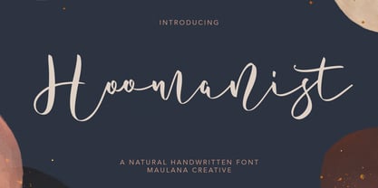 Give your designs an authentic handcrafted feel. "Hoomanist Natural Handwritten Font" is perfectly suited to signature, stationery, logo, typography quotes, magazine or book cover, website header, clothing, branding, packaging design and more. Thanks for use this font ~ Maulana
 - Bareta by Maulana Creative,
$14.00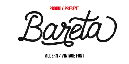 Give your designs an authentic handcrafted feel. "Bareta Vintage Modern Font" is perfectly suited to signature, stationery, logo, typography quotes, magazine or book cover, website header, clothing, branding, packaging design and more. Thanks for use this font ~ Maulana
 - Holly Wings by Maulana Creative,
$16.00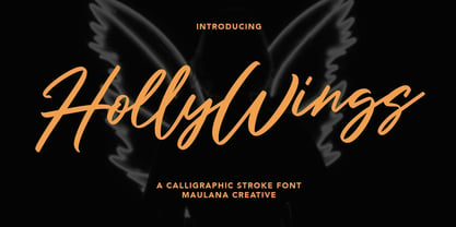 Give your designs an authentic handcrafted feel. "Holly Wings Calligraphic Font" is perfectly suited to signature, stationery, logo, typography quotes, magazine or book cover, website header, clothing, branding, packaging design and more. Thanks for use this font ~ Maulana
 - BAGISKO by Letterena Studios,
$9.00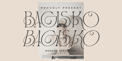 Bagisko is a serif modern and classic typeface with a unique style & modern look. This typeface is perfect for an elegant & luxury logo, book or movie title design, fashion brand, magazine, clothes, lettering, quotes, and so much more.
 - Potlar by Maulana Creative,
$9.00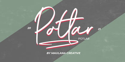 Give your designs an authentic handcrafted feel. "Potlar Signature Script Font" is perfectly suited to poster, stationery, logo, typography quotes, magazine or book cover, website header, clothing, branding, packaging design and more. Thanks for use this font ~ Maulana
 - Afiany by Maulana Creative,
$12.00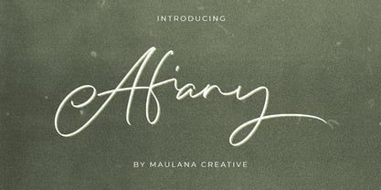 Afiany Brush Handwritten Script Font Give your designs an authentic handcrafted feel. "Afiany Brush Handwritten Script Font" is perfectly suited to signature, stationery, logo, typography quotes, magazine or book cover, website header, clothing, branding, packaging design and more.
 - Qojack by Maulana Creative,
$14.00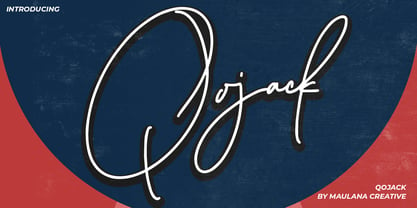 Give your designs an authentic handcrafted feel. �Qojack Signature Brush Font� is perfectly suited to signature, stationery, logo, typography quotes, magazine or book cover, website header, clothing, branding, packaging design and more. Thanks for use this font ~ Maulana
 - Silverstone by Arendxstudio,
$12.00 Introducing Silverstone, Luxury script font, using hand made style with brush. Beautiful for wedding card design, logotype, website header, fashion design and any more. Features : • Character Set A-Z • Numerals & Punctuations (OpenType Standard) • Accents (Multilingual characters) • Swash • Ligature
 - Starstoles by Maulana Creative,
$11.00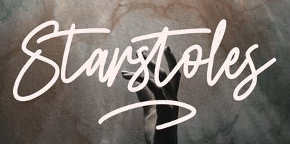 Give your designs an authentic handcrafted feel. "Starstoles Signature Script Typeface" is perfectly suited to signature, stationery, logo, typography quotes, magazine or book cover, website header, clothing, branding, packaging design and more. Thanks for use this font ~ Maulana
 - King Rabbit by ahweproject,
$9.00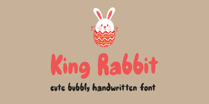 King Rabbit is a cute and bubbly display font, ready to make your designs look great and fun! Use it with confidence on your project designs such as quotes, greeting cards, invitations, posters, business cards, presentations, and more!
 - CLASSIC Line by WAP Type,
$25.00 frontline classic font Font a stylish Font. It’s useful for any Design project. Decal, card, e-card, Good for Logos & Headlines, Poster,Tag design, Newspaper & Magazine Ad Design and many more. True type and Open type font files
 - HV Clio by Harmonais Visual,
$12.00 Clio - a display sans serif with simple, clean, and visual elegance. Specially designed for elegant-themed projects, perfectly suitable for creating simple, clean, lifestyle design such as logos, title, and magazine and more. The font features standard ligatures.
 - Volustion by Maulana Creative,
$12.00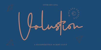 Give your designs an authentic handcrafted feel. "Volustion Handwritten Script Font" is perfectly suited to signature, stationery, logo, typography quotes, magazine or book cover, website header, clothing, branding, packaging design and more. Thanks for use this font ~ Maulana
 - MC Fower by Maulana Creative,
$16.00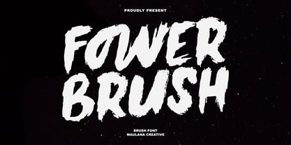 Give your designs an authentic handcrafted feel. “Fower Brush Font” is perfectly suited to signature, stationery, logo, typography quotes, magazine or book cover, website header, clothing, branding, packaging design and more. Thanks for use this font, Maulana Creative
 - Mist Sunshine Brush by Maulana Creative,
$22.00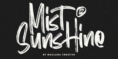 Give your designs an authentic brush handcrafted feel. "Mist Sunshine" is perfectly suited to signature, stationery, logo, typography quotes, magazine or book cover, website header, flyer, clothing, branding, packaging design and more. Thanks for use this font. MaulanaCreative
 - Corestairs by Maulana Creative,
$11.00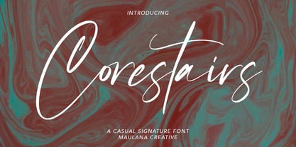 Give your designs an authentic handcrafted feel. "Corestairs Casual Signature Font" is perfectly suited to signature, stationery, logo, typography quotes, magazine or book cover, website header, clothing, branding, packaging design and more. Thanks for use this font ~ Maulana
 - Buljirya by Hishand Studio,
$15.00 Buljirya font is inspired by dream and pastel colour combined with elegant. Perfect for Logo, product packaging, advertisement, social media post, fashion brand, magazine headers and many more complete with ligatures alternates regular italic icon kerning multilingual support
 - Nouthend by Lemonthe,
$15.00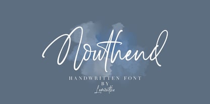 Nouthend is a beautiful and flowing handwritten font with a modern style. This gentle font will look gorgeous on a variety of design ideas such as, logos & branding, invitation, stationery, wedding designs, product designs, labels, photography, and more!
 - Beauty Flome by Maulana Creative,
$11.00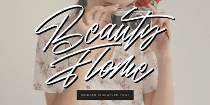 Give your designs an authentic brush handcrafted feel. "Beauty Flome" is perfectly suited to signature, stationery, logo, typography quotes, magazine or book cover, website header, flyer, clothing, branding, packaging design and more. Thanks for use this font. MaulanaCreative
 - Sweet Melody by Artcity,
$8.00 Fun and playful childish font, perfect for comic books, book for kids, t-shirt designs, phone cases, greeting cards, invitations, mugs and so much more. If your project requires a fun look, then this font is for you.
 - Funky Shed by PizzaDude.dk,
$20.00OMG it's the funky shed! The height and width of each character vary to make it look jumpy. At the same time, Funky Shed, has got a crunchy line which makes it even more funky to look at! - The Wobliy by Letterena Studios,
$9.00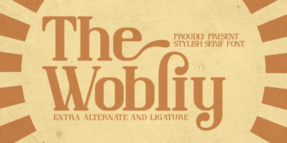 Wobliy is a classy serif font that has its own unique style & modern look. This typeface is perfect for an elegant & luxury logo, book or movie title design, fashion brand, magazine, clothes, lettering, quotes, and so much more.
 - Lattiefa by AEN Creative Studio,
$10.00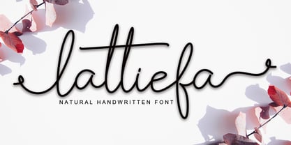 Lattiefa is a great font for your design projects. It's simple, casual and elegant, has a natural touch and comes with ligatures & beautiful swashes. Lattiefa is perfect for logos, wedding invitations, social media posts, signatures and much more!
 - Black Mortal by Yoga Letter,
$30.00 "Black Mortal" is an elegant and unique block font. This font is perfect for logos, movie titles, business branding, stickers, book titles, banners, posters, Halloween, Black Friday, and more. Equipped with uppercase, lowercase, numerals, punctuation, and multilingual support
 - Buttercut by PizzaDude.dk,
$15.00 Buttercut was inspired by classic slab serif fonts, such as Roboto Slab and Rockwell. However, Buttercut is way more bouncy and “off grid” - maybe the reason for that is that it was influenced by both grafitti and comics?!
 - December by OrakArik,
$10.00 December is an easy to use script, suitable for greeting cards, logos, watermarks, and more. It is made with a light and elegant drawing style, as a reminder of a quieter season at the end of the year.
 - Le Atallier by Hishand Studio,
$15.00 Introducing Le Atallier an elegant sans serif font that look classy. Perfect for Logo brand, product packaging, advertisement, social media post, clothing brand, magazine headers and many more complete with ligatures alternates regular italic icon kerning multilingual support
 - Nort Mono by ATK Studio,
$15.00 Nort Mono™ is a tech-monospaced typeface with inktrap experiment and diagonal edges by Atk Studio. Created for tech display poster, informational video display, ads, and more. Come with single weight. This font covers over 67 languages.
 - Spring Display by Yoga Letter,
$14.00 "Spring Display" is a cute and unique display font. This font is equipped with uppercase, lowercase, numerals, punctuations, and multilingual support. This font is perfect for Easter, summer, winter, holidays, spring, back to school, mother's day, and more.
 - Kollate by Invasi Studio,
$19.00 Kollate - a display serif with a line, simple, clean, and visually elegant. Specially designed for elegant-themed projects, perfectly suitable for creating simple, clean, lifestyle designs such as logos, titles, magazines, and more. The font features standard ligatures.
 - Jarvitts by Maulana Creative,
$11.00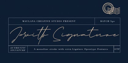 Jarvitts Signature Give your designs an authentic handcrafted feel. "Jarvitts Signature" is perfectly suited to signature, stationery, logo, typography quotes, magazine or book cover, website header, clothing, branding, packaging design and more. Thanks for use this font ~ Maulana
 - Galaxy Power by Yoga Letter,
$30.00 "Galaxy Power" is an elegant display block font that is perfect for action movie titles, graffiti, 3D works, advertisements, banners, posters, branding, stickers, mockups, and more. This font is equipped with uppercase, lowercase, numerals, punctuation, and multilingual support.
 - Casualties Pro by The Type Fetish,
$45.00 Casualties Pro is an OpenType font that contains four variations of every character in its extended character set. OpenType-savvy applications will be able to rotate through the variations to give a more random look to the text.
 - Boneous by Trustha,
$17.00 Boneous is a display font. Inspired by the shape of the bones. Comes in two font styles, regular and oblique. Boneous comes with 400+ glyphs, which also includes multilingual languages. It's perfect for headlines, branding, and many more.