10,000 search results
(0.025 seconds)
- Brushberry by My Creative Land,
$20.00 Please welcome a new brush written font family of four. Charged with positivity, this playful family is loaded with alternates, ligatures and swirls-n-swashes. It is an ideal companion in creating all sort of greeting cards, t-shirt designs, packaging design, branding etc. Design Elements includes a variety of Christmas and winter holidays related elements (check preview images!). All fonts are fully unicode mapped and you can select the glyphs you need using either your application's glyphs panel or a standard software that comes with Windows/Mac - CharactersMap/FontBook. Hope you enjoy using this hand-lettered font family as much as I enjoyed creating it!
 - Milligan by Greater Albion Typefounders,
$14.50 Milligan is named in honor of the late Spike Milligan, a wonderful comedian who (amongst many other things) wrote and start in the Goon Show. It's a jolly, boisterous display Roman which can bring a sense of liveliness and fun to any project where it's used.
 - Reality Check by Hanoded,
$15.00 Reality Check is a family of two display fonts (plus their Italics). These fonts can be used together in a design, but work just as fine on their own. Reality Check comes with an alternative s - just in case you get bored with the ‘normal’ one.
 - Albertiny by Nurf Designs,
$19.00 Albertiny comes with an awesome look and has a variety of alternative characters. Albertiny is the perfect fit for all of your logos, branding, social media, and crafty DIY projects. It has OpenType features (alternates, swash, ligature) that can help you find different sensations with each use.
 - Kidzhood Arabic by NamelaType,
$34.00 Kidzhood Arabic is sibling of Kidzhood with the addition of Arabic glyphs, for Arabic, Urdu, and Farsi. The font represent the characters as funny and flexible, just like childish characters can be. Kidzhood equipped with cute letter form and some attractive ligatures, giving it a playful feeling.
 - Craptoy by PizzaDude.dk,
$20.00Craptoy is a grunge Open Type font - full of different auto ligatures! That means you can write words like beer, letter, bubble, success (just to name a few) without having the double letter repeating itself! (You will need to use OpenType supporting applications to use the autoligatures). - Diltoon by Prioritype,
$15.00 Introducing a new unique and cute font. You can apply this font in projects such as packaging products, crafts, video previews, food products, logos, and much more to explore. For a view see some of the preview examples above. Features: -Uppercase -Lowercase -Numeral -Punctuation -Multilingual Thanks.
 - Classic House by Letterara,
$12.00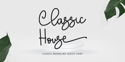 Classic House is a beautiful monoline font. It is the best choice for creating eye-catching logos, branding, and quotes. Every letter has a unique and beautiful touch, making your design come alive! This font is PUA encoded, meaning you can access all of the glyphs.
 - The Outlander by Daily Studio,
$14.00 The Outlander - Design by Daily Studio This ttypeface can make your design look strong. Simple accessible on any of yor projects. Is great for headers, logos, and quotes. Comes with a full uppercase, lowercase, punctuation, and standard multilingual support. With 255 glyphs and in OTF format.
 - Plutonian by Patria Ari,
$19.00Inspiring from space aircraft theme, Plutonian was made with simple geometric shapes and come with 3 different weights. With this typeface, you can use it for logo, title, magazine cover, headline, powerpoint templates design, signs, and many more. What's included? - Uppercase Characters - Lowercase Characters - Multilingual support. - P22 Sherwood by IHOF,
$24.95 Sherwood is a reproduction of an unusually small wood type font from England, dating from the last years of the 18th century. Somewhat reminiscent of Caslon Old Face. The original wood type is used at Sherwood Letterpress and can be seen on the Sherwood home page.
 - Cutie Shop by Goodigital13,
$20.00 This font can be used Such as logo branding, editorial design, stationery design, blog design, modern advertising design, card invitation, art quote, home decor, book/cover title, special events and any more. font suitable for logo, branding, greeting card, poster and any design that you create.
 - Opera by Stereo Type Haus,
$10.00 Characterized by its quirky counter spaces, Opera is named after the font’s letter “O”, resembling the open mouth of an opera singer. The 3 weights plus italics can be used individually or together for a variety of applications including magazine body texts or a striking headline.
 - Beckson by Valentino Vergan,
$12.00 Beckson is a futuristic unique sans serif typeface, which comes with creative alternative letters. Beckson is designed with minimalist distinctive shapes that make it very eye catching. Beckson is a fantastic typeface for modern and futuristic designs, you can use it for a wide range of projects.
 - Halloween Island by Letterara,
$12.00 Halloween Island is a unique and bold lettered decorative font. This font comes with cool extras. Add it to your creative Halloween-themed ideas and notice how it makes them stand out! This font is PUA encoded which means you can access all of the glyphs.
 - Kora Vibes by Jehansyah,
$15.00 Kora Vibes is an elegant and modern serif font with a luxurious feel. Perfect for any title or large font, emails, magazines, book titles, movies, notes, brands, logos and more. This font is PUA coded, which means you can easily access all the glyphs and swashes!
 - Road Rage by Vozzy,
$10.00 Introducing a vintage look label font family named "Road Rage". All available characters you can see at the screenshot. This font have 4 styles - Regular, Shadow, Rough and Rough Shadow. This font will good viewed on any retro design like poster, t-shirt, label, logo etc.
 - Megaxoid by PizzaDude.dk,
$20.00Megaxoid is a grunge Open Type font - full of different auto ligatures! That means you can write words like beer, letter, bubble, success (just to name a few) without having the double letter repeating itself! (You will need to use OpenType supporting applications to use the autoligatures). - Polina by GRIN3 (Nowak),
$16.00Polina (previously named Dobra) is a handmade, layered type family which includes several textures and shadows. Different font types can be created using various combinations of Polina fonts and colors. Language support includes Western, Central and Eastern European character sets, as well as Baltic and Turkish languages. - Relix by Intellecta Design,
$11.25 Relix, emulating the old videogame's screen fonts, that's a good font to non-formam small texts, names, logotypes, titles, headers, topics etc., developed from the original Reliant's Intellecta typeface. Big sizes of this font can be used for texts on posters, t-shirts and other surfaces.
 - Nimbo TTW by Talavera,
$10.00 This is a playful collection of 135 diagrams based on letterforms from different styles. You can use this symbols as bullets, ornaments, but also to make your own mandala-like exercises and release some stress out! Nimbo, by the way, is the word for "halo" in spanish.
 - Autoprom Pro by Stefan Stoychev,
$29.88 AutopromPro is a modern sans serif display font with a geometric touch contains 24 styles. It comes in 6 weights and its matching rounded and italics. The Thin weight and Black Rounded Italic is a free of charge, so you can use them to your projects.
 - Brew House by Vozzy,
$15.00 Introducing a vintage look label font named "Brew House". All available characters you can see at the screenshot. This font have 5 basic styles - Regular, Full, Shadow, Light and Aged. This font will good viewed on any retro design like poster, t-shirt, label, logo etc.
 - Rangedit by Muksal Creatives,
$15.00 Rangedit is a Display font created especially for projects that need vintage and Retro typography! Use it for projects like magazines, banners, stationery, branding, name tags, invitations, and more. This font is PUA encoded, which means you can access all of the glyphs and swashes with ease!
 - Schotis Text by Huy!Fonts,
$35.00 Schotis Text is a workhorse typeface designed for perfect reading on running texts. Its design is based in Scotch Roman 19th-century style but designed from scratch, with a more contemporary and not nostalgic look. It has seven weights plus matching italics, with 1100 glyphs per font, with a very extended character set for Latin based languages as well as Vietnamese, and shows all its potential with OpenType-savvy applications. Every font includes small caps, ligatures, old-style, lining, proportional and tabular figures, superscript, subscript, numerators, denominators, and fractions. The Scotch Romans were one of the most used letters during the 19th and early 20th century, but they don’t have their own place in the main typographical classifications. They appeared at the beginning of the 19th century with Pica No. 2 in the catalog of William Miller (1813) and assumed the British route towards high contrast and vertical axis modern Romans. In fact, they were called just Modern. In opposition to the continental route of Fournier, Didot, and Bodoni, the English way opted for a wider, more legible letter also resistant to bad printing conditions. The name Schotis comes from the misspelling of Scottish that gave the name to a popular dance in Madrid in the 19th-century. It first was called Schotis and today is knows as Chotis.
 - Cosma by Wiescher Design,
$35.00 »COSMA« is an old greek word that stands for »beauty« and »order«, I thought it a very befitting name for my new font-family. My »Cosma« has that special high-contrast Renaissance beauty but is very orderly in appearance. »Cosma« is a classical beauty with modern touches that make it unique. You will love this font. It is a great everyday workhorse with seven weights from UltraLight to Bold and all the necessary weights in between. Great for body copy and headlines! With 964 Glyphs it is a truly European font designed for all Central European and Latin using countries. »Cosma« has a set of Cyrillic that is also good for Serbia, Macedonia and Ukraine. Sorry, no Greek! But it has oldstyle- and lining-, tabular- and tabular-oldstyle-figures, many alternative letters and ligatures. On top I designed two sets of alternative, decorated caps each in normal and oblique. »Cosma« comes in Normal, Italic and Oblique, sometimes you just don’t want to use Oblique instead of Italic that would be too playful for the occasion. »Cosma« doesn’t come cheap, but I start off with an 80 % reduction, so that is a good chance to get all 49 cuts for a phantastic price. Oh, I almost forgot, If you buy the whole family, you get the variable fonts to go with it for free, that’s a good investment into the future. Enjoy!
 - Joyful Juliana Pro by CheapProFonts,
$10.00 This is Kimberly Gesweins own handwriting, named for a sweet California friend of hers. Kimberly has spotted the original free version of this font in use in the far outskirts of China, and now - with the expanded language support - this Pro version can also be used in more remote parts of the western world. ALL fonts from CheapProFonts have very extensive language support: They contain some unusual diacritic letters (some of which are contained in the Latin Extended-B Unicode block) supporting: Cornish, Filipino (Tagalog), Guarani, Luxembourgian, Malagasy, Romanian, Ulithian and Welsh. They also contain all glyphs in the Latin Extended-A Unicode block (which among others cover the Central European and Baltic areas) supporting: Afrikaans, Belarusian (Lacinka), Bosnian, Catalan, Chichewa, Croatian, Czech, Dutch, Esperanto, Greenlandic, Hungarian, Kashubian, Kurdish (Kurmanji), Latvian, Lithuanian, Maltese, Maori, Polish, Saami (Inari), Saami (North), Serbian (latin), Slovak(ian), Slovene, Sorbian (Lower), Sorbian (Upper), Turkish and Turkmen. And they of course contain all the usual "western" glyphs supporting: Albanian, Basque, Breton, Chamorro, Danish, Estonian, Faroese, Finnish, French, Frisian, Galican, German, Icelandic, Indonesian, Irish (Gaelic), Italian, Northern Sotho, Norwegian, Occitan, Portuguese, Rhaeto-Romance, Sami (Lule), Sami (South), Scots (Gaelic), Spanish, Swedish, Tswana, Walloon and Yapese.
 - Bastia by Jen Wagner Co.,
$17.00 Bastia is a classy, bold upper and lowercase typeface that looks incredible in both large and small settings. Best used as a display for headings and logos, Bastia's clean lines and smooth curves give any project an extra touch of class. See how it looks when used for body text in the 11th sample image above. I also love combining Bastia and clean sans serifs for minimal logos (see the "Lucky Finch" sample logo). This download also includes a special outline version of the serif, so you can layer text or add some flair to your logos and display type. There are also alternates available for "k" and "s" that give each letter some extra curves (available via the special characters panel One thing to note about Bastia is the letter spacing. It was intentionally spaced for clean reading if you wanted to use it for body type, so I recommend setting the spacing a little tighter for display use (around -10 to -20 should do!). Includes: Bastia Bold (uppercase & lowercase) Bastia Bold Outline (uppercase & lowercase) Numbers & punctuation Foreign language support Alternates for "k" and "s" – available via the special characters panel
 - MFC Botanical Borders by Monogram Fonts Co.,
$19.95 The inspiration source for MFC Botanical Borders is a collection of border treatments from the 1886 “Spécimens de caractères d'imprimerie” by E. Houpied a Paris. This collection of elegant floral and foliage borders has been put together with their original decorated rules, as well as alternate matching precision rules for added versatility. You can start with a new document or work on a new layer within an existing document. Select MFC Botanical Borders from the font menu. (Some users may have font previewing enabled in the font menu which will cause the font name to appear as border elements, disable this option in order to choose the name) Make certain that the point size of the font is the same as the leading being applied to the font so the borders will meet up properly. While we’ve adjusted this within the font, your program may override these settings. For instance a 12 point font should have 12 points of leading. A PDF guidebook for MFC Botanical Borders is included in the font package. Download and view the MFC Botanical Borders Guidebook if you would like to learn a little more.
 - Fontella by Canada Type,
$24.95 Italian type design master Aldo Novarese was not famous for making calligraphic designs, nor had he any interest in them. He is much better known for his text faces, and quite innovative sans serif and decorative designs which became the definition of what we now know as techno and modern. But in 1968, Novarese surprised everyone with a fantastic flowing deco script entitled Elite. Novarese's formula of simple soft curves and toned-down swashes makes for one of the most unique alphabets ever seen, not to mention one of the best flowing and most legible scripts. This is now its digital incarnation, named Fontella. Fontella's applications are virtually limitless. This is the sort of script that can feel at home pretty much anywhere; a sign, a fridge magnet, a bumper sticker, a greeting card, a movie poster, a book cover, music artwork, magazine ads, newsletter headlines, etc. Digitized from original specimen and expanded with a few built-in alternates and ligatures by Rebecca Alaccari, the font was named after the famed jazz singer Fontella Bass. These letters are just so sweet they had to be called Fontella.
 - Fibra by Los Andes,
$26.00 The font is actually not a revival of ‘Avant Garde’—by Herb Lubalin—but it takes its spirit. Fibra is a geometric sans serif, yet without the typical structural strictness of these kind of fonts, that represents experimental type design. This can be seen in the contrast between curves and straight lines in some characters such as ’n’ and ‘h’ unlike rounded ones such as ‘a’ and ‘d’; details of some display characters (e.g. three upper terminals in ‘W’ and projection off the stem in ‘A’); and exaggerated terminal in ‘R’. All these features give Fibra a strong personality—a sans serif typeface that ‘gives you the chills’. Fibra was specially designed for display use. The font has a very generous x-height that allows for use in corporate text, thanks to its good readability. Fibra comes with 2 subfamilies—a more ’normal’ Basic family, with a smaller amount of stylistic features, for use in subheadings or any other type of text that requires formality, and an Alt family that shows off the true potential of the font, making it the perfect choice for magazine headlines, posters and logotypes.
 - Axeo by Asritype,
$13.00 Axeo is a freeform serif typeface. With more than 500 glyphs for each cut, Axeo supporting wide Latin Base Languages. The font structures is sans-serif typeface. Then, the fonts is made into serif (serifed) using rhombus and adapted/modified rhombus (before remove overlaps) placed on its appropriate positions. This fonts is released first, while the sans-serif is being in process. There are 10 fonts; 5 weight in normal width: Light, Regular, Medium, Bold, and Black; and 4 in semi-condensed: Light, Regular, Medium, Bold and Black, too. The fonts has some minor character variations, all are sets in SS01.There are also standard and discretionary ligatures, arrow, some geometric shapes and ornaments. With its sansserif structure, the Medium, Bold and Black fonts is playful with text effect in various applications such MS Word, CorelDraw or others to enhance the appearance. Its serif form will make unique enhancements. Thus, the fonts is suitable for Branding, logos, cards, advertisements, banners, display and more; for the main texts or its companions. While the light, regular and medium fonts can also be used as description text, card text, note, caption and longer non-formal texts or other usages.
 - MFC Spindler Borders by Monogram Fonts Co.,
$19.95 The inspiration source for MFC Spindler Borders is a collection of border treatments revived from the “Catalog 25 TYPE FACES” by Barnhart Brothers & Spindler. The border designs were recreated from two different border sets, “Classic Art Borders” and “Classic Black & White Borders”. This collection of borders represents a structured repetition of elements in various ways to create elegant patterns and backgrounds. You can start with a new document or work on a new layer within an existing document. Select MFC Spindler Borders from the font menu. (Some users may have font previewing enabled in the font menu which will cause the font name to appear as border elements, disable this option in order to choose the name) Make certain that the point size of the font is the same as the leading being applied to the font so the borders will meet up properly. While we’ve adjusted this within the font, your program may override these settings. For instance a 12 point font should have 12 points of leading. Download and view the MFC Spindler Borders Guidebook if you would like to learn a little more.
 - Old Thunder by FontMesa,
$25.00Old Thunder is a revival of an 1800’s Tuscan style font called Lavinia, we've expanded the original font to include a lowercase, an Open faced version, a very attractive Black face and last this set just wouldn't be complete without a Fill font. When you see the word Fill in a fonts name this describes its purpose which means the font is intended to be used for filling in the open space of its parent font or the Open faced shadowed version from that font family or group. Some Fill fonts look as if they may be used as stand alone fonts but others simply do not look good used as a plain font. The Fill font for Old Thunder was designed to work as both a fill and a regular font, although when used as a regular font the letter spacing will appear a little wide. If needed the spacing can be adjusted in some applications font settings, check the help file in your application for further information on spacing. You will need an application that allows layering of your fonts in order to take advantage of FontMesa Fill fonts. - 1589 Humane Bordeaux by GLC,
$38.00 This family was created inspired from the Garamond patern set of fonts used by S. Millanges "imprimeur ordinaire du Roy", in Bordeaux, circa 1580-1590. Especially for reprint L'instruction des curés (Instructions to parish priests), from Jean Gerson. The set contains two styles, Normal and Italic, the second one with a lot of caps and ligatures variants. The initials, except a few decorated letters (six in total) where only large caps, covering no more than three lines. Added are a few fleurons. It can be used as variously as web-site titles, posters and flyers design, publishing texts looking like ancient ones, or greeting cards, all various sorts of presentations, as a very elegant and legible font... This font supports strong enlargements as easily as small size (legible from 6 points when printed) remaining very smart and fine. Its original cap height is about five millimeters. Decorated letters like 1512 Initials, 1550 Arabesques, 1565 Venetian, can be used with this family without anachronism.
 - Chivels by Adam Fathony,
$20.00 Chivels : Vintage Chiseled 3D Type System This vintage type family combines chisel effects and pinstripe styling to give it more life. Chivels comes with six fonts that you can combine with each other to get different effects. Starting with a base, you can add more fonts in front to get inner, chisel light, and chisel dark effects. You can also add fonts behind to add outline and shadow effects. Alternate characters are available for every single alphabetical character. In the OTF version, you can select the alternate characters in the Glyphs or Open Type panels. If you're using software that doesn't include Open Type features, you can use the TTF version.
 - Bank Sans EF by Elsner+Flake,
$35.00 With its extended complement, this comprehensive redesign of Bank Gothic by Elsner+Flake offers a wide spectrum for usage. After 80 years, the typeface Bank Gothic, designed by Morris Fuller Benton in 1930, is still as desirable for all areas of graphic design as it has ever been. Its usage spans the design of headlines to exterior design. Game manufacturers adopt this spry typeface, so reminiscent of the Bauhaus and its geometric forms, as often as do architects and web designers. The creative path of the Bank Gothic from hot metal type via phototypesetting to digital variations created by desktop designers has by now taken on great breadth. The number of cuts has increased. The original Roman weight has been augmented by Oblique and Italic variants. The original versions came with just a complement of Small Caps. Now, they are, however, enlarged by often quite individualized lower case letters. In order to do justice to the form changes and in order to differentiate between the various versions, the Bank Gothic, since 2007 a US trademark of the Grosse Pointe Group (Trademark FontHaus, USA), is nowadays available under a variety of different names. Some of these variations remain close to the original concept, others strive for greater individualism in their designs. The typeface family which was cut by the American typefoundry ATF (American Type Founders) in the early 1930’s consisted of a normal and a narrow type family, each one in the weights Light, Medium and Bold. In addition to its basic ornamental structure which has its origin in square or rectangular geometric forms, there is another unique feature of the Bank Gothic: the normally round upper case letters such as B, C, G, O, P, Q, R and U are also rectangular. The one exception is the upper case letter D, which remains round, most likely for legibility reasons (there is the danger of mistaking it for the letter O.) Because of the huge success of this type design, which follows the design principles of the more square and the more contemporary adaption of the already existing Copperplate, it was soon adopted by all of the major type and typesetting manufacturers. Thus, the Bank Gothic appeared at Linotype; as Commerce Gothic it was brought out by Ludlow; and as Deluxe Gothic on Intertype typesetters. Among others, it was also available from Monotype and sold under the name Stationer’s Gothic. In 1936, Linotype introduced 6pt and 12pt weights of the condensed version as Card Gothic. Lateron, Linotype came out with Bank Gothic Medium Condensed in larger sizes and a more narrow set width and named it Poster Gothic. With the advent of photoypesetters and CRT technologies, the Bank Gothic experienced an even wider acceptance. The first digital versions, designed according to present computing technologies, was created by Bitstream whose PostScript fonts in Regular and Medium weights have been available through FontShop since 1991. These were followed by digital redesigns by FontHaus, USA, and, in 1996, by Elsner+Flake who were also the first company to add cursive cuts. In 2009, they extended the family to 16 weights in both Roman and Oblique designs. In addition, they created the long-awaited Cyrillic complement. In 2010, Elsner+Flake completed the set with lowercase letters and small caps. Since its redesign the type family has been available from Elsner+Flake under the name Bank Sans®. The character set of the Bank Sans® Caps and the Bank Sans® covers almost all latin-based languages (Europe Plus) as well as the Cyrillic character set MAC OS Cyrillic and MS Windows 1251. Both families are available in Normal, Condensed and Compressed weights in 4 stroke widths each (Light, Regular, Medium and Bold). The basic stroke widths of the different weights have been kept even which allows the mixing of, for instance, normal upper case letters and the more narrow small caps. This gives the family an even wider and more interactive range of use. There are, furthermore, extensive sets of numerals which can be accessed via OpenType-Features. The Bank Sans® type family, as opposed to the Bank Sans® Caps family, contains, instead of the optically reduced upper case letters, newly designed lower case letters and the matching small caps. Bank Sans® fonts are available in the formats OpenType and TrueType.
 - ATF Headline Gothic by ATF Collection,
$59.00 ATF Headline Gothic cries out to be used in headlines, and that is exactly how it was used after it was first created by American Type Founders in 1936 with newspapers in mind. It would be hard to imagine a better typeface for a shocking, front-page headline in a scene from an old black-and-white movie. With its all-caps character set, and its big, bold, condensed design, ATF Headline Gothic is the epitome of its name. “Extra! Extra!” The style of ATF Headline Gothic recalls the bold, condensed gothic display faces of the 19th century, but with more refinement in its details than many large types of the time (typically wood type). Its most recognizable trait is the restrained, high-waisted M, with short diagonal strokes that end with their point well above the baseline; this avoids the sometimes cramped look of a bold condensed M with a deep “V” in the middle, common in many similar headline faces. The digital ATF Headline Gothic comes in a single weight, all caps, like its predecessor, but offers two styles: one crisply drawn, and a “Round” version with softer corners, to suggest a more “printed” feel, reminiscent of wood type. Of course, in either style it includes a full modern character set, including symbols such as the Euro, Ruble, and Rupee, that didn’t exist in 1936.
 - Torus Pro by Monotype,
$40.00 Torus Pro is a rounded monoline typeface. As its name suggests, this is a more professional version of my original Torus family released in 2017. Each glyph has been scrutinised and redrawn where necessary. In addition, there are now italics, small caps, old style figures, and numerous other improvements. Torus Pro includes many new decorative alternates and ligatures that will add distinctive flourishes to your typographic compositions. With up to nine alternates for some glyphs, these additional styles include stencilled, simple dots, looped and smooth swashes, plus a more aggressive angled option for those looking for something a little different. When used subtly, these alternates and glyph combinations will add flair and personality to your own creations. Perfect for titling and branding, Torus Pro also packs a punch without these features activated, as well as being a comfortable read in long runs of text. There are 12 fonts altogether, ranging from Thin to Heavy weights in both roman and italic. The variable font versions of the family allow you to define the weight exactly to your liking. Torus Pro has an extensive character set that covers all Latin European languages. Key features: 6 weights in both roman and italic Variable fonts included with full family 212 Alternates 20 Ligatures Small Caps Full European character set (Latin only) 1450+ glyphs per font.
 - Yusyad by Eyad Al-Samman,
$20.00 The typeface Yusyad is designed mainly for a very sentimental and emotional reason. Metaphorically, it is a modest artistic gift offered virtually from the designer to one of his beloved and cherished persons in this life, namely, his loyal and devoting wife. She represents one of the most essential motives for many artistic and non-artistic works that the designer achieved during his life. This was done through her tranquil personality, infinite patience, sincere support, and endless encouragement. The designer's partner (i.e., the significant other) lives with him along with their three children looking both always for a life full of peace, achievements, philanthropy, and of course love. The typeface's name Yusyad is a portmanteau word consists of two morphemes. It is a simple name-meshing for two different names. Those names represent the name of the designer's wife (Yusra) and the name of the designer (Eyad). Yusyad is like an epithet that ties the two partners' honest and eternal relationship until the last day of their lives. Technically, Yusyad is a sans-serif condensed and display typeface. It comprises seven fonts with dual styles and multiple weights. Specifically, it has two main styles, namely, the normal and the inline design. The normal style comes in five weights (i.e., thin, light, regular, bold, and black) whereas the inline style has two weights (i.e., regular and bold). The typeface is designed with more than 700 glyphs or characters. Its character set supports nearly most of the Central, Eastern, and Western European languages using Latin scripts including the Irish and the Vietnamese languages. The typeface is appropriate for any type of typographic and graphic designs in the web, print, and other media. It is also absolutely preferable to be used in the wide fields related to publication, press, services, and production industries. It can create a very impressive impact when used in movies' or TV-series titles, posters, products’ surfaces, logos, signage, novels, books, and magazines covers, medical packages, as well as the product and corporate branding. It has also both of lining and old-style numerals which makes it more suitable for any printing or designing purposes. To end, Yusyad's condensed appearance—especially the inline style—makes it very memorable, eye-catching, and striking for advertising, marketing, and promotional purposes.