10,000 search results
(0.028 seconds)
- DINfun Pro Grunge by CheapProFonts,
$10.00 A collection of DIN Mittelschrift variants with some typical grunge style treatments. The Plain font is included if you buy the family pack, and can be mixed in. The DINfun Pro fonts are special versions of the classic DIN 1451 Mittelschrift, far removed from the original typeface's serious and no-nonsense roots. I have made them as companions to the classic, with some some very different expressions, complete with a large multilingual character set. Time to spice up that DIN profile! :) ALL fonts from CheapProFonts have very extensive language support: They contain some unusual diacritic letters (some of which are contained in the Latin Extended-B Unicode block) supporting: Cornish, Filipino (Tagalog), Guarani, Luxembourgian, Malagasy, Romanian, Ulithian and Welsh. They also contain all glyphs in the Latin Extended-A Unicode block (which among others cover the Central European and Baltic areas) supporting: Afrikaans, Belarusian (Lacinka), Bosnian, Catalan, Chichewa, Croatian, Czech, Dutch, Esperanto, Greenlandic, Hungarian, Kashubian, Kurdish (Kurmanji), Latvian, Lithuanian, Maltese, Maori, Polish, Saami (Inari), Saami (North), Serbian (latin), Slovak(ian), Slovene, Sorbian (Lower), Sorbian (Upper), Turkish and Turkmen. And they of course contain all the usual "western" glyphs supporting: Albanian, Basque, Breton, Chamorro, Danish, Estonian, Faroese, Finnish, French, Frisian, Galican, German, Icelandic, Indonesian, Irish (Gaelic), Italian, Northern Sotho, Norwegian, Occitan, Portuguese, Rhaeto-Romance, Sami (Lule), Sami (South), Scots (Gaelic), Spanish, Swedish, Tswana, Walloon and Yapese.
 - Pauline Didone by insigne,
$22.00 An Art Deco, script inspired typeface for 'modern' times, Pauline Didone is a full type family with a unique and flavorful design. It has a sense of femininity and naïveté that comes from its predecessor, Pauline. It's a typeface useful for short bits of copy, logotypes and interesting titling. This typeface family of 10 different fonts includes 5 weights and their italics and a wide range of OpenType alternates. The original Pauline was inspired by and has a strong influence from retro scripts. The typeface is geometric, formed with deliberate contrasting brush strokes and a ostentatious flair. Pauline Didone's high contrast strokes give it a very interesting look that is up to date with latest design trends and very useful for today's design environment. Pauline Didone pairs nicely with the original sans-serif Pauline. The typeface family also includes a full array of alternate forms, including over 150 alternate characters. These alternates can be accessed by activating OpenType features and style sets. Note: In order to use these OpenType features, you will need a program with advanced typography capabilities such as the Adobe Suite or Quark. These alternates also include a group of ball terminals that can be accessed under the swash alternates. Pauline Didone is the latest in a trusted line of typefaces from insigne. Why settle for the ordinary when you can choose Pauline Didone to lend its unique look to your art work?
 - HS Alwajd by Hiba Studio,
$50.00 Hs Alwajd is an Arabic display typeface, under “titles” category. It is useful for book titles, creative designs and modern logos. Also, it is used when a contemporary and simple look is desired that can fit with the characteristics of Kufi fatmic where horizontal parts are equal than vertical ones. It is a new style based on HS Almajd but without swirling round forms terminating in ball. The font is based on Kufi Fatmic calligraphy along with some derived ideas of decorative fonts, maintaining the beauty of the Arabic font and its fixed rates. Undoubtedly, the insertion of curved ornament in some parts adds more beauty and fascinating diversity in the flow line between sharp, soft and curved parts. This font supports Arabic, Persian, Pashtu, Kurdish Sorani, Kurdish Kirmanji and Urdu, consisting only one weight which can add to the library of Arabic Kufic fonts contemporary models that meet with the purposes of various designs for all purposes and all tastes.
 - Scandiebox by My Creative Land,
$25.00 It’s time to have some fun! The Scandiebox Hadlettering Collection was inspired by simplicity of the modern Scandinavian style and also have some influence of Japanese kawaii. All handwritten fonts in this collection perfectly compliment each other as well as the set of more than 100 illustrations created in the same happy style. You can find Scandiebox Extras Manual here. The collection’s childish look-and-feel makes it perfect for all sorts of designs for children - books, cards, invitations, packaging, apparel, children shop ads, etc. If you are an Adobe Suite user, you’ll find that working with illustrations is extremely easy - just select a stylistic alternate you want in either drop down list or using the glyphs panel. If you are using an application that doesn’t support opentype features, you can use all the fonts additional features with a help of either your default font management software or using the pdf reference guide mentioned above. Enjoy!"
 - AccruedInterest by Ingrimayne Type,
$9.00 AccruedInterest is an all caps font with hollow letters, the outlines of which were roughly drawn with a calligraphic pen. The serifs are large and round. In a revision in 2019, the insides of the letters were separated out to allow easy bi-colored lettering when using layers. This inside style can also be used alone if one needs very sloppy and loosely-spaced text.
 - Impulsa by Just Font You,
$16.00 Impulsa is a very impulsive handwritten font. It is finished with digital touch but still keep holding on to the honest of the handwriting feeling. I believe messages with personalized handwriting vibes always deliver deeper feelings to anybody. Impulsa is an all-caps font. You can play with the uppercase and lowercase mix to get the different vibes of every letters so it looks seamlessly handwritten.
 - Maraschino by Device,
$29.00 DF Maraschino Black - A sleek, sophisticated swash capital font with elegant thick and thin weight distribution. Bold yet poised, direct yet refined. The swash capitals are intended for use at the beginnings of words only - best not to set this in ALL CAPS. Use at larger sizes. Also includes stylistic decorative alternates for certain characters that can be toggled on and off in the Opentype panel.
 - VVDS London Oatmeal by Vintage Voyage Design Supply,
$15.00 London Oatmeal - a new stylish font duo, an elegant modern art-deco inspired sans with a lot of ligatures with retro look stylish brush script. It's nice font pair for use it in blogs, posters, magazines, logo’s or greeting/wedding cards. The sans has caps lowercase, so you can combine them in many ways. More than 100 OpenType features as Alternates, Swashes and Ligatures.
 - Baby Stingrays by Gassstype,
$27.00 Introducing our latest display typeface called Baby Stingrays - Strong Bold All Caps Font Display Vintage Serif with can make your logotype become more interesting. Font is 2 Style Best Vintage font and multilingual support. inspired by the decorative arts and architecture movement Baby Stingrays fonts is perfect for your project and allows you to create designs, headlines, posters, logos, badges and many more that are beautiful.
 - Rodetta by Grezline Studio,
$8.00 Rodetta is hand drawn vintage sans font that I drawn very carefully, it is an all-caps font. Perfectly match to use for any branding design that needs a handcrafted touch feel. Rodetta is a font that you can use to make a vintage logo for branding, typography design, magazine or book cover, website header, product packaging, t-shirt design, label poster and many more.
 - Downey by Sarid Ezra,
$17.00 Introducing, a casual and powerful wide sans, Downey Font Family! Downey is a casual and essential all caps sans. With slightly wide form and strong look, this font will suitable for your any project and designs. You can use it for a tittle, logo, quotes, or become a pairing with any font. This font also contain the outline version each weight. This font also support multi language!
 - Thinset by Josh Grzybowski,
$19.99 The original intent for Thinset was to be used strictly as a display font only, but this single weight typeface can at times work great as a body of text as well. It's a clean, legible, and light font which is ideal for publications like fashion and editorial magazines. In addition to ligatures and fractions, Thinset’s other OpenType features include old style numbers and small caps.
 - Megatype Script by Mega Type,
$16.00 Megatype Script is a handmade script that comes with a extrude effect. This font Inspired by Retro style and combination with Hand Lettering style. I hope this can make inspire you from your work. You don't need extra effort to create an extrude effect for this font. That's because we include the extrude with this font. This means you can saves your time by only adding the extrude font on the back layer. Megatype Script is great for Logotype, Branding Design, Logo Design, Digital Lettering Arts, Poster, T-Shirt/Apparel, Magazine, Quotes, Signs, Instagram Design, Advertising Design, and any Type Design needs. Megatype Script also has a standard Multilingual Support. Megatype Script features OpenType stylistic alternates, ligatures and International support for most Western Languages is included. To enable the OpenType Stylistic alternates, you need a program that supports OpenType features such as Adobe Illustrator CS, Adobe Indesign & CorelDraw X6-X7, Microsoft Word 2010 or later versions. Megatype Script is coded with PUA Unicode, which allows full access to all the extra characters without having special designing software. Mac users can use Font Book , and Windows users can use Character Map to view and copy any of the extra characters to paste into your favourite text editor/app. If you have any question, don't hesitate to contact me by email : megatype04@gmail.com Thanks so much for looking and Enjoy it!
 - Hello Heart by Romie Creative,
$13.00 Hello Heart Script is an elegant calligraphy font, designed to convey elegance and style. It's sleek, feminine and friendly, this font is casual and pretty with crap. Can be used for various purposes. such as logos, product packaging, wedding invitations, branding, headlines, signage, labels, signatures, book covers, posters, quotes, and others. Hello Heart Script features an OpenType style of alternative styles, ties and international support for most Western languages including. To activate the OpenType Stylistic alternative, you need a program that supports OpenType features such as Adobe Illustrator CS, Adobe Indesign & CorelDraw X6-X7, Microsoft Word 2010 or newer versions. How to access all alternative characters using Adobe Illustrator: https://www.youtube.com/watch?v=XzwjMkbB-wQ Hello Heart Script is encoded with Unicode PUA, which allows full access to all additional characters without having special design software. Mac users can use Letter Books, and Windows users can use Character Maps to view and copy any of the additional characters to paste into your favorite text editor / application. How to access all alternative characters, using Windows Character Map with Photoshop: https://www.youtube.com/watch?v=Go9vacoYmBw If you need help or have questions, let me know. I am happy to help :) Thank you & Happy Designing!
 - Tecna Dark Up Triangle BNF by Descarflex,
$30.00 The Tecn@ Dark&Light Triangle Background Nomenclature Font family is differentiated by the direction of the triangle tip in the 4 cardinal points. The family were designed to head, enumerate, indicate or highlight writings or design plans, for this reason, the characters are available only in capital letters and some signs or symbols that can serve such purposes. A triangle or empty character is included so that the user can use it overlaying any character of his choice or to be used alone. What is Lorem Ipsum? Lorem Ipsum is simply dummy text of the printing and typesetting industry. Lorem Ipsum has been the industry's standard dummy text ever since the 1500s, when an unknown printer took a galley of type and scrambled it to make a type specimen book. It has survived not only five centuries, but also the leap into electronic typesetting, remaining essentially unchanged. It was popularised in the 1960s with the release of Letraset sheets containing Lorem Ipsum passages, and more recently with desktop publishing software like Aldus PageMaker including versions of Lorem Ipsum. Why do we use it? It is a long established fact that a reader will be distracted by the readable content of a page when looking at its layout. The point of using Lorem Ipsum is that it has a more-or-less normal distribution of letters, as opposed to using 'Content here, content here', making it look like readable English. Many desktop publishing packages and web page editors now use Lorem Ipsum as their default model text, and a search for 'lorem ipsum' will uncover many web sites still in their infancy. Various versions have evolved over the years, sometimes by accident, sometimes on purpose (injected humour and the like). Where does it come from? Contrary to popular belief, Lorem Ipsum is not simply random text. It has roots in a piece of classical Latin literature from 45 BC, making it over 2000 years old. Richard McClintock, a Latin professor at Hampden-Sydney College in Virginia, looked up one of the more obscure Latin words, consectetur, from a Lorem Ipsum passage, and going through the cites of the word in classical literature, discovered the undoubtable source. Lorem Ipsum comes from sections 1.10.32 and 1.10.33 of "de Finibus Bonorum et Malorum" (The Extremes of Good and Evil) by Cicero, written in 45 BC. This book is a treatise on the theory of ethics, very popular during the Renaissance. The first line of Lorem Ipsum, "Lorem ipsum dolor sit amet..", comes from a line in section 1.10.32. The standard chunk of Lorem Ipsum used since the 1500s is reproduced below for those interested. Sections 1.10.32 and 1.10.33 from "de Finibus Bonorum et Malorum" by Cicero are also reproduced in their exact original form, accompanied by English versions from the 1914 translation by H. Rackham. Where can I get some? There are many variations of passages of Lorem Ipsum available, but the majority have suffered alteration in some form, by injected humour, or randomised words which don't look even slightly believable. If you are going to use a passage of Lorem Ipsum, you need to be sure there isn't anything embarrassing hidden in the middle of text. All the Lorem Ipsum generators on the Internet tend to repeat predefined chunks as necessary, making this the first true generator on the Internet. It uses a dictionary of over 200 Latin words, combined with a handful of model sentence structures, to generate Lorem Ipsum which looks reasonable. The generated Lorem Ipsum is therefore always free from repetition, injected humour, or non-characteristic words etc.
 - Zanna by Valentino Vergan,
$16.00 Zanna is a modern typeface with lots of style and elegance. The Zanna typeface was inspired by the high contrast Didot look, which has been synonymous with fashion for decades. The Zanna typeface also has a very thin hairline and short non-bracketed serifs, which gives it a nostalgic and modern look. The Zanna typeface comes in two styles Regular and Stencil, each style has an oblique version. The Zanna typeface has over 140 ligatures and alternate characters, this makes it perfect for creating modern and elegant feminine logos. With so many ligatures and alternates characters to choose from, you can definitely create stunning designs for your brand or clients. The Zanna typeface can be paired with a beautiful minimal sans serif or light script font, this combination will make your next project look elegant and classy. The Zanna typeface is very versatile and can cover a wide range of project such as: fashion branding, mastheads, magazines, feminine logos, facebook banners, wedding invitations, Instagram posts, websites, blog posts, pull quotes, editorials, product packaging, trendy social media posts, advertisements and much more. If you are looking for something modern, nostalgic and chic for you next project, Zanna is the font for you. What you get: Zanna Regular.otf Zanna Oblique.otf Zanna Stencil.otf Zanna Stencil oblique.otf Zanna includes a full set of: Uppercase and lowercase letters. Numbers. Punctuation. Ligatures. Alternate characters. Small Caps. Multilingual symbols. We hope you enjoy using the Zanna typeface.
 - Sancoale Narrow by insigne,
$22.00 Sancoale Narrow is a carefully honed and meticulously crafted new family member for the Sancoale series. Sancoale Narrow has been specially designed to allow for even more versatility for the Sancoale Family. Sancoale Narrow continues with Sancoale's successful simple, geometric and legible structure. It is a contemporary design that is distinctive and unique. This new narrow addition can be used in conjunction with the original Sancoale, but it can also stand on its own. Narrow type comes in a handy in a myriad of situations, from poster design to book covers, web pages to editorial layouts. Sancoale Narrow's six weights make for a typeface family that is very useful for many applications, and also includes a set of true italics. The design is simplified without stems or spurs in the default character set. OpenType alternates do include alternates with stems, Small Caps, Fractions, Tabular Figures, and plenty of alts, including "normal" capitals and lowercase letters. Please see the informative .pdf brochure to see these features in action. Sancoale Narrow also includes a full array of Latin diacritics for multilingual support. OpenType capable applications such as Quark or the Adobe suite can take full advantage of the automatically replacing ligatures and alternates. This family also includes the glyphs to support a wide range of languages. The Sancoale superfamily is suitable for a wide range of uses and is a very economical and versatile addition to any designer's font collection.
 - My Aunt Celia by Quadrat,
$25.00 My Aunt Celia was designed as a quaint, quasi-elegant display face using caps and small caps. The family consists of two fonts: regular and alternate which, between them, provide many special swash characters, tall caps and ligatures for lively, quirky, mixed settings.
 - Quietism Variable by Michael Rafailyk,
$150.00 A smooth contemplative Antiqua with aspiring to the sky ascenders, inspired by the Quietism philosophy. Clarity of the mind is achieved by bringing the body into a state of calm and contemplation, and this is reflected in the design – the quiet horizontal serifs (body) are opposed to the peaky soaring ascenders (mind). The design also features four optical size subfamilies with different x-height and contrast, oldstyle diagonal stress, oldstyle figures by default, smooth details and slightly dark texture. Variable axes: Weight, Contrast, X-Height. Scripts: Latin, Greek, Cyrillic. Languages: 480+. The complete list of supported languages: michaelrafailyk.com/quietism Kerning: 4553 class-to-class pairs. Hinting: Not applied. Format: TTF – OpenType with TrueType outlines. Variable Font: Quietism Variable provides more options than static versions, and has three axes: Weight (Thin–Black), Contrast (Low-High), and X-Height (Low-High). Variable fonts includes thousands of styles that you can access using a sliders on graphic editor or via CSS on web browser. Mixing different axes gives you extra styles not represented by static fonts. Optical Size: The typeface is represented by four subfamilies: Text (low contrast, high x-height – for paragraph 10-20 pt), Deck (medium contrast, medium x-height – for subheading 20+ pt), Display (high contrast, medium x-height – for heading 72+ pt), Poster (high contrast, low x-height – for big size 120+ pt). Small Caps: Lowercase letters and Oldstyle Figures are replaced with Small Capitals forms. Capitals to Small Caps: Uppercase letters, all figures, and some punctuation are replaced with Small Capitals forms. Case Sensitive Forms: ()[]{}‹›«»-–—•·#%‰@ and Arrows are centered on capitals. Oldstyle figures are replaced with Lining figures. Oldstyle Figures: 0123456789 #%‰. Designed to work with lowercase letters. Used by default. Lining Figures: 0123456789 #%‰. Figures are the same height as uppercase letters (cap height). Proportional Figures: Lining, Oldstyle, Small Caps, Capitals to Small Caps. Tabular Figures: Lining, Oldstyle, Small Caps, Capitals to Small Caps. Ordinals: adehnorst. Superscript, Subscript, Numerator, Denominator: 0123456789. Fractions: ¼½¾⅐⅑⅒⅓⅔⅕⅖⅗⅘⅙⅚⅛⅜⅝⅞⅟ (precomposed). Any other fractions (even those typed through a slash) will also be displayed correctly, with the automatic replacement to Numerator + fraction + Denominator. Slashed Zero: All 0 figures. Contextual Alternates: Number sign character (#) before uppercase letters is replaced by its version centered on capitals. Hyphen character (-) between two uppercase letters is replaced by its version centered on capitals. First of two TT letters is replaced by its alternate form. Letters vwy before the letters fijmnprtuvwxy are replaced with an alternate shorter versions that fits better in the context. Contextual Alternates (Greek): ΆΈΉΊΌΎΏ. Greek uppercase accented characters lose their tonos accent and retain only dieresis in All Caps and Small Caps modes. Turned on by default. If you need tonos accents in All Caps then turn off Contextual Alternates (calt) feature. Stylistic Alternates: FTГТИЦЩцщ and their versions with diacritical marks. Stylistic Set 01 “Arrows”: Left <- Right -> Up Left Right <-> Up Down North West South East \> South West Stylistic Set 02 “Round-Square Cyrillic”: ДИЙЍЛФвгджзийѝклнптцчшщьъю characters are replaced with its Bulgarian or Russian forms. Stylistic Set 03 “Cyrillic Tse Shcha short tails”: ЦЩцщ characters are replaced with its alternate form with short tail. Stylistic Set 04 “Cyrillic I full serifs”: ИЙЍӢ characters are replaced with its alternate form with inner serifs. Stylistic Set 05 “FT bent inward serif”: FTГ characters and their versions with diacritical marks are replaced with its alternate form with right head serif that bent inside. Stylistic Set 06 “Small Caps centered on Capitals”: Small Caps are vertically centered on uppercase letters. Standard Ligatures: fi fl fb ff fh fj fk ffb ffh ffi ffj ffk ffl. Discretionary Ligatures: Th ct st. Localized Forms: 52 character substitutions for Azeri, Bulgarian, Catalan, Dutch, German, Kazakh, Macedonian, Moldavian, Polish, Romanian, Serbian, Tatar, Turkish. Glyph Composition/Decomposition (Diacritics): Full Latin and based Vietnamese set of diacritics (571 characters). Precomposed.
 - Secret Memories by Flawlessandco,
$9.00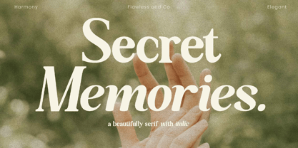 Secret Memories is a Serif Italic Font with a classy and elegant style in each character, so it's fitted for some wedding invitation display. There's some connected letters and some alternates that suitable for any graphic designs such as branding materials, t-shirt, print, business cards, logo, poster, t-shirt, photography, quotes .etc This font support for some multilingual. Also contains uppercase A-Z and lowercase a-z, alternate character, numbers 0-9, and some punctuation. If you need help, just write me! Thanks so much for checking out my shop!
 - Golden Cosmic by Flawlessandco,
$9.00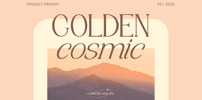 Golden Cosmic is a Serif Italic Font with a classy and elegant style in each character, so it's fitted for some wedding invitation display. There's some connected letters and some alternates that suitable for any graphic designs such as branding materials, t-shirt, print, business cards, logo, poster, t-shirt, photography, quotes .etc This font support for some multilingual. Also contains uppercase A-Z and lowercase a-z, alternate character, numbers 0-9, and some punctuation. If you need help, just write me! Thanks so much for checking out my shop!
 - Mondrake by Flawlessandco,
$9.00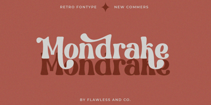 Mondrake is a modern retro with a fun and bold style that perfect for your retro-themed projects. Try out some alternate characters for another visual result! There's some connected letters and some alternates that suitable for any graphic designs such as branding materials, t-shirt, print, business cards, logo, poster, t-shirt, photography, quotes .etc This font support for some multilingual. Also contains uppercase A-Z and lowercase a-z, alternate character, numbers 0-9, and some punctuation. If you need help, just write me! Thanks so much for checking out my shop!
 - Mondice by Flawlessandco,
$9.00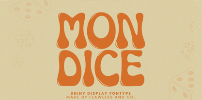 Mondice is a Groovy Retro Font that made with an additional shiny mode in each character, so it's fitted for some retro project. There's some connected letters and some alternates that suitable for any graphic designs such as branding materials, t-shirt, print, business cards, logo, poster, t-shirt, photography, quotes .etc This font support for some multilingual. Also contains uppercase A-Z and lowercase a-z, alternate character, numbers 0-9, and some punctuation. If you need help, just write me! Thanks so much for checking out my shop!
 - Dominic by Flawlessandco,
$9.00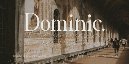 Dominic is a Serif Italic Font with a classy and elegant style in each character, so it's fitted for some wedding invitation display. There's some connected letters and some alternates that suitable for any graphic designs such as branding materials, t-shirt, print, business cards, logo, poster, t-shirt, photography, quotes .etc This font support for some multilingual. Also contains uppercase A-Z and lowercase a-z, alternate character, numbers 0-9, and some punctuation. If you need help, just write me! Thanks so much for checking out my shop!
 - Mothern by Flawlessandco,
$9.00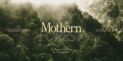 Mothern is a Serif Italic Font with a classy and elegant style in each character, so it's fitted for some wedding invitation display. There's some connected letters and some alternates that suitable for any graphic designs such as branding materials, t-shirt, print, business cards, logo, poster, t-shirt, photography, quotes .etc This font support for some multilingual. Also contains uppercase A-Z and lowercase a-z, alternate character, numbers 0-9, and some punctuation. If you need help, just write me! Thanks so much for checking out my shop!
 - Benogi by Flawlessandco,
$9.00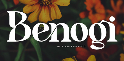 Benogi is a Modern Retro Font with a classy and unique style in each character, so it's fitted for some wedding invitation display. There's some connected letters and some alternates that suitable for any graphic designs such as branding materials, t-shirt, print, business cards, logo, poster, t-shirt, photography, quotes .etc This font support for some multilingual. Also contains uppercase A-Z and lowercase a-z, alternate character, numbers 0-9, and some punctuation. If you need help, just write me! Thanks so much for checking out my shop!
 - Croist by Flawlessandco,
$9.00 Croist is a modern retro with a fun and bold style that perfect for your retro-themed projects. Try out some alternate characters for another visual result! There's some connected letters and some alternates that suitable for any graphic designs such as branding materials, t-shirt, print, business cards, logo, poster, t-shirt, photography, quotes .etc This font support for some multilingual. Also contains uppercase A-Z and lowercase a-z, alternate character, numbers 0-9, and some punctuation. If you need help, just write me! Thanks so much for checking out my shop!
 - Helios Retro by Flawlessandco,
$9.00 Helios Retro is a modern retro with a fun and bold style that perfect for your boho-themed projects. Try out some alternate characters for another visual result! There's some connected letters and some alternates that suitable for any graphic designs such as branding materials, t-shirt, print, business cards, logo, poster, t-shirt, photography, quotes .etc This font support for some multilingual. Also contains uppercase A-Z and lowercase a-z, alternate character, numbers 0-9, and some punctuation. If you need help, just write me! Thanks so much for checking out my shop!
 - Brahmasta by Flawlessandco,
$9.00 Brahmasta is a modern serif with a classic retro style that perfect for your retro-themed projects. Try out some alternate characters for another visual result! There's some connected letters and some alternates that suitable for any graphic designs such as branding materials, t-shirt, print, business cards, logo, poster, t-shirt, photography, quotes .etc This font support for some multilingual. Also contains uppercase A-Z and lowercase a-z, alternate character, numbers 0-9, and some punctuation. If you need help, just write me! Thanks so much for checking out my shop!
 - Nadier by Flawlessandco,
$9.00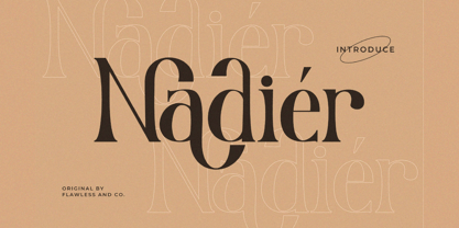 Nadier is a Modern Serif Font that made with a classic style in each character, so it's fitted for some wedding invitation display. There's some connected letters and some alternates that suitable for any graphic designs such as branding materials, t-shirt, print, business cards, logo, poster, t-shirt, photography, quotes .etc This font support for some multilingual. Also contains uppercase A-Z and lowercase a-z, alternate character, numbers 0-9, and some punctuation. If you need help, just write me! Thanks so much for checking out my shop!
 - Renaf by Flawlessandco,
$9.00 Renaf is a Groovy Retro Font that made with an additional shiny mode in each character, so it's fitted for some retro project. There's some connected letters and some alternates that suitable for any graphic designs such as branding materials, t-shirt, print, business cards, logo, poster, t-shirt, photography, quotes .etc This font support for some multilingual. Also contains uppercase A-Z and lowercase a-z, alternate character, numbers 0-9, and some punctuation. If you need help, just write me! Thanks so much for checking out my shop!
 - Eurocine by Monotype,
$31.99 Eurocine is an expansive display typeface – a square sans serif that’s perfect for titling, headlines, logotype and branding. This 36-font family is packed with features to make it supremely versatile. This typeface attempts to capture the mood of movie credits from European Cinema in the 1970s, with a focus on Giallo films in particular. In terms of style, Eurocine sits somewhere between Walter Baum and Konrad Friedrich Bauer’s Folio, and Aldo Novarese’s Eurostile. With Eurocine you get a more versatile typeface by way of its small caps and additional stylistic sets giving you extended caps, extended small caps, and petite caps, as well as upper and lowercase unicase. Creating typographic masterpieces of your own will be so much easier! Key features: • 6 Weights in Roman and Oblique • 3 Widths – Narrow, Regular, Wide • Extended Caps • Small Caps • Extended Small Caps • Petite Caps • Unicase • Old Style Figures • European Language Support (Latin) • 1,200 glyphs per font.
 - VVDS Big Tickle by Vintage Voyage Design Supply,
$15.00 To the sound of smooth jazz 50's and incendiary Rock'n'Roll dance of 60's Im glad to Introduce you the new product in my Vintage Voyage — The Big Tickle Font Family! Absolute useful collection! Firstly is playful serif. The range of weights can be used to maintain an even colour across different sizes. Use it normally or all caps and play with baseline, give more bounce to composition. Or try to use Caps alternates and get really bouncing letters. Alternates has every uppercase letter. Also, for more variety I add a few versions for decoration: Inner hatched and Offset with Shadow. Okay, folks! The second one is Script. I really love them, they look like was signed with true brush. It can be perfectly used both independently and in tandem with the serifs. And the last one is Retro Graphic! Authentic collection of typical design elements of 50's and 60's style of Poster, Books or Ads. You can create awesome retro patterns or use them individually. 124 graphic elements total. A-Z; a-z; 0-9. Multilingual. Grab this stuff and have a good time with Mid Century Modern Adventure!
 - Preta by Lián Types,
$39.00 Preta, portuguese for a very pure kind of black, has its name very related to its concept: I wanted to make the fattest/darkest script ever. People who follow my work may notice its forms are very related to works of my past (1) but this time the challenge was to be very cautious with the white spaces between letters. Not only I followed some rules and ductus of the copperplate style of calligraphy but also I took a lot of inspiration in posters of the early Art Nouveau (specially in Alfred Roller of the Vienna Secession) where letters forms looked like black squares if not looked from a close distance. With Preta, I wanted to achieve that same idea of “darkness” and thanks to the always welcomed question -what if?- the font grew a lot. The result is a very fat font, that looks delicious. Due to possible customer needs, I designed Preta Small, so it can be used in smaller sizes. Preta Ao Sol (which literally means under the sun!) is a style with those lovely tiny details to give the sensation of bright. Preta Ao Sol Solo was made to be used as a layered font with Preta. Finally, Preta Capitals serves as a company for Preta. Hope you enjoy the font as much as I did when designing it: The fact that it’s full of alternates, swashes, ligatures and swirls makes it really pleasurable at the moment of using it. Give it a try and dance with Preta! TIPS For better results, use Preta with the ‘standard ligatures’ feature activated. NOTES (1) Beatle in 2014. Seventies in 2015.
 - Flink by Identity Letters,
$25.00 The joy of pure geometry, revisited. Geometric typefaces are a staple in every typographer’s toolbox since the 1920s. It was a time when iconic faces such as Futura, Erbar, and Kabel appeared on the scene and turned the world of type upside-down. Inspired by those early giants as well as later epigones with a legacy of their own (such as 1970’s Avant Garde Gothic), Flink is the Identity Letters take on this genre, characterized by a clean and focused appearance. With neat shapes and the look of pure geometry, Flink adapts to a vast range of applications and topics, from the fine print in contract to website body copy to logo design to billboard-size slogans. Its x-height is considerably larger than in classic geometric sans-serif fonts; its proportions are harmonized as opposed to strictly constructed. This makes for a more contemporary look, setting it apart from the classics. To further reduce the rigidity of a purely geometric composition, you can replace some letters with more humanist alternates, such as a, g, j, etc. This font family comes along in 8 weights from Thin to Black. Each weight consists of an Upright and Italic version. There are more than 750 characters per style, including two stylistic sets that offer variations to the look and feel of Flink, making it even more versatile. Plenty of additional Open Type Features like ligatures, case sensitive forms, old-style figures, and symbols make Flink a valuable tool for the discerning typographer. Flink is the reimagination of a classic genre, designed to suit the needs of our time. ––––– Please note: There is an upgraded Version available: Flink Neue
 - Ysobel by Monotype,
$29.99 The Ysobel™ typeface family is not only elegant; it is also exceptionally legible and space economical. A collaborative design effort between Robin Nicholas, as lead designer and project director, Delve Withrington and Alice Savoie of Monotype Imaging, the project had the primary design goal of creating a typeface family for setting text in newspapers and periodicals. The result, however, is also ideal for any application that requires quick and easy assimilation of text. According to Nicholas, “The idea for the design started when I was asked to develop a custom version of Century Schoolbook. I wanted to give the design a more contemporary feel, although the client ultimately decided to keep their typeface closer to the original. The project nevertheless gave me ideas for a new design. Since designing Nimrod, some 30 years ago, I had wanted to make a more modern typeface family for newspapers and magazines – this seemed the ideal candidate.” Ysobel (pronounced “Isabel”) has the soft, inviting letter shapes of Century Schoolbook but contrasts these with more incised serifs and terminals. Its capitals are also narrower than those of Century Schoolbook, and care was taken to ensure that they harmonize perfectly with the lowercase. Ysobel’s x-height is full-bodied without disrupting lowercase proportions. In addition, curved terminals, such as those in the “C,” “c” and “e,” were drawn more open as an aid to legibility and readability in text copy. Weight stress is near vertical, and hairlines are robust to ensure character fidelity in small point sizes. Development began with the text version of the family, which has four weights, each with an italic companion. All weights feature lining and old style numerals, fractions, superiors and extended Latin language coverage. Small caps are also available in the Roman Regular design. Ysobel Display is a completely redrawn version of the typeface; it is narrower, and has a slightly smaller x-height, thinner hairlines and subtle design changes to improve its appearance when set at large sizes. The Display Italic received particular attention to make it ideal for setting headlines, subheads and short blocks of copy. Changes include a slightly greater italic angle and more cursive treatment of some letter shapes. Alternative styles of capital “J” and “Q,” to provide variation, are available in all weights.
 - VLNL Neue Sardines by VetteLetters,
$35.00 Sardines is a project by Jacques Le Bailly aka Baron von Fonthausen. It first saw the light as a student project for a monospaced font and eventually grew into Vette Letters’ largest font family. We saw its potential and expect it to be a million seller, just like our other typefaces. VLNL Sardines comes in 42 different variations, like rough and clean cuts, regular and condensed widths (condensed is the exactly half of the regular width). Sardines is an eclectic mash of classic curves and mathematical measurements, leaving a very distinct typographic flavor. While most of our type is market-fresh, this one comes out of the can, but it’s delicious nonetheless. And it’s great for adventurous BBQ-ing!
 - Distory Script by Letterfreshstudio,
$15.00 Distory Script Is a calligraphy Vintage script font that comes with beautiful alternate characters. copper plate mix calligraphy with handlettering style. Designed to convey stylish elegance. Pagoda attracts like a typeface that is smooth, clean, feminine, sensual, glamorous, simple and very easy to read. Distory Script comes with a Clean and Aged version, beautiful upper and lower case, binding and loved by many finishes. It has Multilingual support (Western European characters) and works with the following languages: English, Danish, Dutch, Estonian, Finnish, French, German, Hungarian, Icelandic, Italian, Norwegian, Polish, Portuguese, Spanish, Swedish. In my example I show how this script can be used. It's perfect for logos, wedding invitations, alcohol labels, romantic cards, and more. Thanks You.
 - Combinado by My Creative Land,
$20.00 Please welcome a new Combinado Font Family that has it all: elegant display sans serif and serif fonts in three weights each; a modern calligraphy script that looks beautiful next to them; a sans serif font designed specifically for the best on-screen reading experience, which comes in two weights (for now! more to come); and the last but not least - Design Elements font that has more than 70 elements to compliment your designs. This font family is very universal and you can use it everywhere: websites, instagram ads, magazines, books, cards and invitation designs, as well as in all possible personal design project that do not fit in any of the listed categories! Enjoy!
 - Royal Banks by Putracetol,
$20.00 Royal Banks - Retro Bold Font. In Royal Banks, I try to combine retro style with luxury and aesthetics touch. So the Royal Banks can be used in various projects with retro/vintage and luxury themes or another project with bold font. Such as logos, branding, posters, packaging, book covers, clothes/apparel, quotes, titles and others. Royal Banks come with clean and rough font version. Come with Opentype feature with a lot of alternates, its help you to make great lettering. Royal Banks is also support multi language. To access the alternate glyphs, you need a program that supports OpenType features such as Adobe Illustrator CS, Adobe Photoshop CC, Adobe Indesign, Corel Draw, Microsoft Office.