7,648 search results
(0.012 seconds)
- Spiderfingers - 100% free

- Systeme Robraille - Unknown license

- i-hearts - Unknown license

- Faraco Hand - Unknown license

- Vital Formations - Unknown license

- Bodybag - Unknown license

- Gilke 3000 - Unknown license

- Arcade by Solotype,
$19.95 - Friendly Yellow by PizzaDude.dk,
$16.00
- Puffball by Open Window,
$-
- Editorial Comment JNL by Jeff Levine,
$29.00 - Akakios by Nantia.co,
$12.00
- The Glory by FunType,
$14.00
- Mallorga by Top Type,
$11.00
- Sandwell by AEN Creative Studio,
$12.00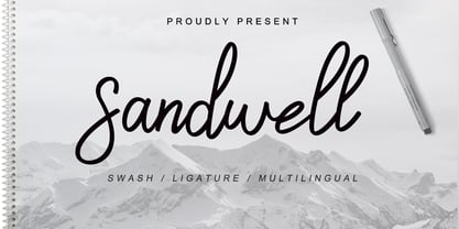
- Faust Text by Solotype,
$19.95 - Vacant by Reserves,
$39.99
- Europa Text by Solotype,
$19.95 - Ginko by Monotype,
$29.99 - Dias Irregulares by Jrmuitos,
$20.00
- Invoice by MADType,
$21.00
- Walentiny by Stringlabs Creative Studio,
$25.00
- Amore by ParaType,
$30.00
- Manic by Siren Fonts,
$10.00
- Thievery by Hanoded,
$15.00
- Skelett Antiken NF by Nick's Fonts,
$10.00
- Torino by URW Type Foundry,
$35.99
- Fayte by That That Creative,
$15.00
- Arionna by Stringlabs Creative Studio,
$25.00
- Inflex by Monotype,
$29.99
- Origami Bats by Lauren Ashpole,
$15.00
- Sage & Pink by Pixel Colours,
$15.00
- Marshall by Solotype,
$19.95 - Mercenary by Miller Type Foundry,
$35.99
- Bandstand by Solotype,
$19.95 - LTC Squareface by Lanston Type Co.,
$24.95
- Date Night JNL by Jeff Levine,
$29.00
- Cherily Blussom by PizzaDude.dk,
$15.00
- MPI No. 510 by mpressInteractive,
$5.00
- Happy arila script by Sulthan Studio,
$10.00


