5,240 search results
(0.02 seconds)
- Anonima by Gassstype,
$29.00 Hello Everyone, introduce our new product Font ANONIMA This Is Classic Bold Font.This is a Textured Natural Style and classy style with a clear style and dramatic movement. That is has charming, authentic and relaxed characteristic more natural look to your text.
 - Brigantia by Gassstype,
$23.00 Hello Everyone, introduce our new product Font Brigantia This Is Fast Marker Font.This is a Textured Natural Style and classy style with a clear style and dramatic movement. That is has charming, authentic and relaxed characteristic more natural look to your text.
 - Sugar Junk by Bogstav,
$17.00 Sugar Junk is my all-caps brush font with soft edges and rough lines. Use it when you need something stated with clear legible and organic looking letters! I've added 5 different versions of each letter, and they automatically cycles as you type!
 - Painter Dude by Gassstype,
$25.00 Hello Everyone, introduce our new product Font Painter Dude This Is Display Brush Font.This is a Textured Natural Style and classy style with a clear style and dramatic movement. That is has charming, authentic and relaxed characteristic more natural look to your text.
 - Hands Up by Huy!Fonts,
$15.00 Hands Up is a useful collection of hand designs, with or without shirt. It has from pointing hand to annoying hands or happy hands and some give-the-finger hands. They are drawing in a clear cartoon style, suitable for modern designs.
 - Pisang by Hanoded,
$15.00 Pisang means banana in Malay and Bahasa Indonesia. It is a tall, narrow and very clear font, ideal for books, recipes, food labeling and posters. It comes with a full range of diacritics and some interesting alternates for the closed glyphs as well.
 - Road Trip by Melissa Lapadula,
$19.95This font has wide letterforms and bends which echo the continuous roads traveled on when reaching distant holiday destinations. The typography aims to be clear and legible, as do helpful road signs. This font can function as headings, subheadings and body text. - Don Perry by Gassstype,
$25.00 Hello Everyone, introduce our new product Font Don Perry This Is Brush Display Font.This is a Textured Natural Style and classy style with a clear style and dramatic movement. That is has charming, authentic and relaxed characteristic more natural look to your text.
 - Heathtop by Warnetype,
$6.00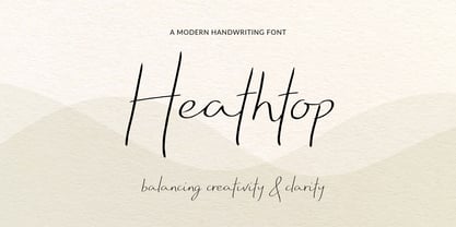 A modern handwritten script font that balances creativity with clear legibility that contains upper & lowercase characters, all punctuation and numerals. Designed so the text reflects stylish natural handwriting, with ligatures and carefully kerned characters mixed with unjoined letters for a contemporary feel.
 - Nitrous Oxide by Gassstype,
$29.00 Hello Everyone, introduce our new product Font Nitrous Oxides This Is Modern Sport Fonts.This is a Textured Natural Style and classy style with a clear style and dramatic movement. That is has charming, authentic and relaxed characteristic more natural look to your text.
 - Ribelano by Frantic Disorder,
$12.00 Ribelano is a serif display font that represents clear, contrast, and sharpness. The font comes in 6 different weight styles from Light to Black and it comes with 300+ glyphs. Perfectly suited for display needs such as heading, branding, logos, poster, etc.
 - Rasangar by Gassstype,
$27.00 Hello Everyone, introduce our new product Font Rasangar This Is Blackletter Display Font.This is a Textured Natural Style and classy style with a clear style and dramatic movement. That is has charming, authentic and relaxed characteristic more natural look to your text.
 - Liaisons by The Ampersand Forest,
$35.00 A Belle Époque humanist serif in two styles: crisp, high-contrast Haut-Monde and soft, low-contrast Demimonde… When you design a lot of display pieces, you’re often in need of tall, slim type. Liaisons provides that, in a distinct fin-de-siècle style inspired by the great posters of the Gilded Age from Sweden, Denmark, France, and Scotland. (The ampersand alone is a bit of a love letter to Charles Rennie Mackintosh!) Both styles use the same slim skeleton, and are named after the stratum of society where one might find… a “dancing partner.” HAUT-MONDE is a high contrast face of the sort that says “High Society.” Elegant and sleek, it speaks to the refinement of the moneyed classes of a bygone era. Great for high-end products, too! DEMIMONDE is soft and low-contrast — more reminiscent of hand-lettering on Art Nouveau/Jugendstil/Wiener Werkstätte advertisements and posters. A comfortably chic display face all around! Both typefaces feature full Western and Eastern Latin character sets, as well as full Cyrillic/Slavic ones. And, perhaps best of all, both typefaces feature capitals with high, middle, and low waists, so you can change up the look as you see fit! Part of The Ampersand Forest's Sondheim Series
 - Katlynne by Ryan Williamson,
$5.00 Katlynne is unpredictable. Katlynne is erratic. Katlynne is beautiful. Katlynne is an alternating contrast, sans serif type family. Arbitrarily separating the characters into ‘rounder’ and ‘straighter’ letterforms to determine what contrast each glyph will take. Katlynne is inspired by the observations made while watching the inexperienced use of broad tip pens. I found how and when individuals rotated their pen gave a visually intrusive, if not also pleasantly conspicuous effect. Often, the pen would naturally rotate horizontally (vertical contrast) on the rounder letterforms, and vertically (reverse contrast) on the straighter ones. This is more or less the formula Katlynne adopts as the contrast changes throughout the styles. Katlynne’s severity of contrast varies from ‘Negative Three’ to ‘Positive Three’ in four weights. With a central style ‘Book’ being the sensible, low contrast font in the family. Within the family there are four weights with 7 contrast styles, with complimenting true italics. Giving a total of 56 fonts! Katlynne's array of options works for creating stylistic similitude within layouts, where conspicuous title faces are needed with a cohesive text face to compliment. Alone, the ends of the contrast spectrum (Negative and Positive Three) create striking word forms for advertising, packaging and anywhere else a loud voice is needed.
 - Mandrel Didone by insigne,
$24.00 A new family has sprung from the world of insigne. Mandrel Didone is his name. The face is well-liked by those with whom it seeks an audience because of its courtly demeanor and exquisite look. Mandrel Didone conducts itself beautifully in front of each set of eyes with a confident attitude, never wavering or tripping in its polished step. But, despite it’s gentility, this exquisite family is not weak in the face of adversity. Mandrel Didone is a powerful and conspicuous typeface that has towering x-heights, great contrast, confident bends, and sharp serifs. It is well-crafted for high-impact resistance. It uses its sharp serif ends deftly, cutting through opponents' clumsy clutter in the battle for the reader's attention. This noble family consists of nine weights and their matching italics, ranging from Thin to Black. Mandrel Didone also comes with a plethora of OpenType options to let you embellish your text. The family's 500 glyphs and support for more than 70 languages are accompanied with ligatures, old-style figures, and stylistic sets. Raise your glass in honor of the new Mandrel Didone! This champion, with its powerful serifs and great contrast, is ready to take on your challenge in many tests to come.
 - Aviano Future by insigne,
$24.99 The Aviano series returns with a vigorous and futuristic sans serif. Aviano Future’s powerful squared forms lend intensity and authority to your designs. Aviano Future’s extended forms give the face strength and muscle. Aviano Future is a versatile new addition to the Aviano titling series. Aviano Future comes in six different weights with “fast” Fasts and is packed with OpenType features. Want to use more traditional rounded forms? Need swash forms? Art Deco alternates? Aviano Future includes 390 alternate characters. Eleven style sets are available, two sets of art deco inspired alternates, small forms, tough swash, constructivist titling and traditional stylistic alternates. Aviano Future also includes 40 discretionary ligatures for artistic typographic compositions. Please see the informative .pdf brochure to see these features in action. OpenType capable applications such as Quark or the Adobe suite can take full advantage of the automatically replacing ligatures and alternates. This family also includes the glyphs to support a wide range of languages. Aviano Future is a great choice for a professional designer that wants to achieve a technological, futuristic or epic look. Be sure to check out the rest of the Aviano series which can be used as complementary faces, including Aviano, Aviano Serif, Aviano Sans, Aviano Didone, Aviano Flare and Aviano Slab.
 - Sommet Slab Rounded by insigne,
$22.00 Sommet Slab Round is the latest in the Sommet series, designed as a slab serif companion to Sommet Rounded. The typeface features slightly wider counters to accommodate the serifs and this more generous whitespace allows the typeface to display well on-screen and as a webfont. Rounded serifs give the face more warmth than the original Sommet Slab, which is strong, rigid and technical. Sommet Slab Rounded’s serifs are not just blunted, but slightly obliqued, giving the face dynamic forward momentum. This geometric typeface is based on bold and clean rounded rectangles. It’s soft and friendly look lends itself to a number of applications. It would be a fine choice for tech company logotypes, magazine headlines and can be used for body copy. The typeface family also includes some alternate titling forms. These alternates can be accessed by activating OpenType features and style sets. In order to use these OpenType features, you will need a program with advanced typography capabilities such as the Adobe Suite or Quark. These alternates include a group of simplified forms that can be accessed under the swash alternates. Sommet Slab is just the latest in the versatile Sommet superfamily from insigne. Be sure to check out the rest of the design family that includes serif and sans members.
 - Aljaraz by Cuchi, qué tipo,
$9.95 Aljaraz (meaning “small bell” in english) is a curvy typeface inspired on the “Fat face" letters with an extremely bold design from the early 19th century, but with an insolent touch of brave and psychedelic distortions. Aljaraz has a regular and italic variable, and in both styles the capital letters have a swash alternative where the naughty touch reaches its maximum expression. It is ideal to recall the lysergic era of the 60s, write funny words, or simply to express small texts in a display way that powerfully attracts attention. Let Aljaraz inspire you groovy kind of love! Designed by Carlos Campos cuchi@cuchiquetipo.com Secondary typeface: 'Escuela', also by Carlos Campos _ Aljaraz (“campanita”) es una tipografía curvy inspirada en las letras con un diseño extremadamente grueso y atrevido de principios del siglo XIX (las “Fat face”), pero con un toque insolente de valientes distorsiones psicodélicas. Aljaraz tiene una variable regular y cursiva, y en ambos estilos las mayúsculas tienen una alternativa súper decorada donde el toque travieso alcanza su máxima expresión. Es ideal para rememorar la época lisérgica de los años 60, escribir palabras graciosas, o simplemente expresar textos graciosos de una forma visual que llame poderosamente la atención. ¡Deja que Aljaraz te inspire su maravilloso amor!
 - Aviano Wedge by insigne,
$24.99 Firm and resolute, the sharp, triangular wedge serifs of the new Aviano Wedge stamps your copy with the confidence of late 19th century luxury, wealth, and power. Indicative of banknotes and financial strength, the large, elegant Aviano Wedge is composed in the Latin style. Aviano Wedge takes its original footing from period signage found on a building in Asheville, NC. While shaped largely by engraved faces, the elegant Aviano Wedge maintains the extra-wide comfort and ease found with the rest of the Aviano series. Aviano Wedge comes in six different weights and is packed with OpenType features. As a complement to these characters, Aviano Wedge includes 40 discretionary ligatures for artistic typographic compositions. To see these features in action, please see the informative .pdf brochure. OpenType capable applications such as Quark or the Adobe Creative suite can take full advantage of the automatically replacing ligatures and alternates. Aviano Wedge also includes support for all Western European languages. This new face has also been designed to pair well with the rest of the Aviano series, including our best-selling Aviano, Aviano Serif, Aviano Sans, Aviano Didone, Aviano Flare, Aviano Contrast, and Aviano Slab. Use it alone, or combine Aviano Wedge with any of these other fonts to build the strong presence you’re looking for.
 - MVB Sirenne by MVB,
$39.00A rare natural history book from the early 18th century served as inspiration for the MVB Sirenne typefaces. The artisan who engraved the book—likely a map engraver—had a distinctive style of lettering that was used on the descriptive captions for the many tropical fishes depicted in the book. The plates used to print the illustrations would have been copper, the letterforms hand-engraved. The designers at MVB Fonts found the distinctive quirks of the roman letterforms and the eccentric stress of the italic interesting enough to embark on developing digital fonts based on the engraved samples. As the captions were hand-lettered, there was a great degree of variation, making a direct “revival” impossible, so Alan Dague-Greene interpreted the characteristics of the letterforms into a workable typeface design. The challenge was to retain a rustic quirkiness to the forms, yet have a typeface that was useful for more than display. The solution was to make optical sizes. The “Six” faces are full of character, but strong and open for clarity at small sizes. The design of the “Text” faces is more subtle, so that they can be used for passages of text, but retain the feel of their model. MVB Sirenne “Eighteen” and “Seventy Two” are intended for display use. - Sancoale Slab by insigne,
$32.00 The contemporary feel of the Sancoale superfamily takes a bolder turn with this futuristic slab. Built from Sancoale's successfully simple geometry, Slab's serif elements and tall x-height give the face an energetic, yet clean figure that easily complements its cousins: Sancoale Softened--a sans with blunted terminals; Sancoale Narrow; and, of course, the original Sancoale itself. The weights of each member have been balanced carefully to ensure compatibility with the others, and when used together, the combination creates a powerful design that is easy to identify. With weights ranging from the classier Thin to the authoritative Black, Slab opens the door to a range of applications. Used in different text sizes, its tech image is legible and neutral enough for longer bodies of copy--both in print and on the web. Have a more prominent need? The web font also stands out well in a headline or even as a display face. Slabís great personality puts a strong foot forward without giving its reader a kick in the teeth. Whatever the task, this font's one to capture the Zeitgeist into your work. All Insigne fonts are fully loaded with OpenType features. Sancoale Slab is also equipped for complex professional typography, including alternates with stems, small caps and plenty of alts, including "normalized" capitals and lowercase letters. The face includes a number of numeral sets, including fractions, old-style and lining figures with superiors and inferiors. OpenType-capable applications such as Quark or the Adobe suite can take full advantage of automatically replacing ligatures and alternates. You can find these features demonstrated in the .pdf brochure. Included are small caps, fractions, old-style and lining numbers, scientific superior/inferior figures, complete ordinal and inferior alphabet, and a set of symbols and arrows. The Sancoale family also includes the glyphs to support a wide range of languages, including Central, Eastern and Western European languages. In all, Sancoale Slab supports over 40 languages that use the extended Latin script, making the new addition a great choice for multi-lingual publications and packaging.
 - Barbou by Besnowed,
$19.99 Barbou was originally cut in 1925 by Monotype as a counterpart to Fournier, siblings that were different in design but both based on the work of Pierre-Simon Fournier. Whether by choice, accident or oversight, Fournier was preserved digitally, and Barbou was lost to history. Barbou was notably used by Stanley Morrison, in particular as the face of The Fleuron. I fell in love with Barbou when I saw it, and knew that I wanted to bring it to a new generation of designers and readers. This is a revival of Barbou, a faithful recutting with new weights, characters and many of the best features that modern font technology brings. Particular attention was paid to the original Monotype Barbou 178 specimen sheet. Originally only available in a single weight, Barbou has been recut with a variable weight, providing a large degree of flexibility between Regular and Bold. Barbou excels as a comfortable reading face for books, and the variable weight allows you to fine tune the darkness and texture of the page in a way never before possible. Barbou has a distinctive softness, and this revival of Barbou preserves much of the effect the medium of metal type had on the letterforms. This results in a subtly rounded yet defined type, elegant not worn, with the utmost attention and respect to the smallest of details. Barbou was originally cut with disparate x-heights for roman and italic, and this revival of Barbou features both the original italic, as well as a new italic redesigned at the same height as the roman. In Fournier’s time, roman and italic would not be mixed on the same line, but the type must change to meet the needs of a new generation. Barbou also features unique ligatures and alternates, old style numbers, small caps and a full Greek alphabet. Barbou is perfect for books and anywhere a comfortable reading face is required, and excels in flexibility.
 - ATF Franklin Gothic by ATF Collection,
$59.00 ATF Franklin Gothic® A new take on an old favorite Franklin Gothic has been the quintessential American sans for more than a century. Designed by Morris Fuller Benton and released in 1905 by American Type Founders, Franklin Gothic quickly stood out in the crowded field of sans-serif types, gaining an enduring popularity. Benton’s original design was a display face in a single weight. It had a bold, direct solidity, yet conveyed plenty of character. A modern typeface in the tradition of 19th-century grotesques, Franklin Gothic was drawn with a distinctive contrast in stroke weight, giving it a unique personality among the more mono-linear appearance of later geometric and neo-grotesque sans-serif types. Franklin Gothic has been interpreted into a series of weights before, most notably with ITC Franklin Gothic. But as the original type was just a bold display face (later accompanied by a few similarly bold widths and italics), how Benton’s design is expanded to multiple weights and styles as a digital type family can vary significantly. Benton designed several gothic faces that harmonize with one another, including Franklin Gothic, News Gothic, and Monotone Gothic, that can serve as models for new interpretations of his work. With ATF Franklin Gothic, Mark van Bronkhorst looked to Benton’s Monotone Gothic—originally a single typeface in a regular weight, and similar to Franklin Gothic in its forms—as the basis for lighter styles. ATF Franklin Gothic may appear familiar given its heritage, but is a new design offering a fresh take on Benton’s work. The text weights are wider and more open than some previous Franklin Gothic interpretations, and as a result are quite legible as text, at very small sizes, and on screen. ATF Franklin Gothic maintains the warmth and the spirit of a Benton classic while offering a suite of fonts tuned precisely for contemporary appeal and utility. The 18-font family offers nine weights with true italics, a Latin-extended character set, and a suite of OpenType features. Download the PDF specimen for ATF Franklin Gothic.
 - Bartosh by jpFonts,
$19.90 Bartosh is the American short form for Bartholomew. Although I chose this font name because of its sound and its short conciseness, I also liked the fact that Bartholomew had been one of the 12 apostles who had worked in India and Iran and the idea that his spirit could be the inspiration for my work.Bartosh was designed for display on the screen: the large x-height and the clear, open shapes facilitate readability. As a result, it develops a strong expression of character and makes it ideal for headings or highlighting individual text passages – it is ideal for captions of any kind. In each of the six weights, it unfolds its own and special charm. The extra-bold version is particularly noteworthy because fonts in this stroke width are rare and it is precisely these extreme bolds that give them a special graphic appeal.For all fonts there are matching italics in a well-developed set of 677 characters. In addition, it is possible to change the digits and currency characters from proportional to tabular or OldStyle via the OpenType feature, and small caps are also available in all fonts.
 - Tinderbox by Device,
$29.00 16th and 17th century formal handwriting forms the basis for Tinderbox, an antique script. Preserving the rough impression of a quill pen on parchment, Tinderbox evokes old manuscripts, ecclesiastical texts, gothic inscriptions, faded tattoos and horror literature; spooky calligraphy for the digital age.
 - HK Requisite by Hanken Design Co.,
$- HK Requisite™ is a sans serif typeface inspired by the compactness of Neue Haas Grotesk and the strong character of Akzidenz Grotesk. The name came from the fact that fonts are elements that are necessary for the achievement of a specified end.
 - Stainless by Gassstype,
$27.00 Here comes a New Font,Introducing Stainless is a Race Theme Display Font.This Handmade Display Font with a stylish touch inspired by the famous minimalist logo . Stainless has is perfect for the purposes of designing templates, brochures, videos, advertising branding, logos and more.
 - Linotype Aroma by Linotype,
$29.99From the designer, Tim Ahrens... I started designing this typeface about half a year after learning that Frutiger was not a new brand of sweets and that Garamond is not the name of a fragrance. In time it became clear that designing a sans serif must always be considered as a transformation of traditional serifed typefaces instead of deriving it from typefaces that have been derived from others which have been derived from others again. I did not want Aroma to be one of those odourless and tasteless typefaces wich sacrifice a natural feeling and the characteristic shapes of the letters to neutrality. I think that beauty often evolves unintentionally. For example, I am fascinated by the beauty of airfoils, which are actually a careful transformation of a bird's wing. I love their anorganic and abstract shape which still bears the essence and all the complexity of what they are modelled on. This is exactly the formal concept behind Aroma. Many of the outlines are actually parabolics. The small r, for example, consists exclusively of straight lines and parabolics. I decided to give Aroma more stroke contrast than it is usual for sans serif designs. Many strokes are slightly convex, which gives the font an anorganic feeling. The font was intended to have a feel similar to the antiqua. More specifically, it is based on Old Style Faces. The character of those fonts, which were cut during the Renaissance, is still inherent to Aroma. - Able by T-26,
$39.00The history of Able’s connection with the Harry Potter phenomenon is really up in the air. It’s a catch-22 in this business - you either promote your own work and negotiate expensive exclusive licenses, or you work with a promoter and sell your designs to anyone and everyone. It could have been an in-house designer at Rowling’s publisher, Scholastic, or a freelancer who proposed Able for the headings and such. The responsible party licensed it from T26, and JK Rowling’s storytelling made it a star. (I suppose it’s ironic that there’s a whole lot of unwritten history in the typography business.) Able’s rise to fame really is a classic love story between reading and type design. If the books weren’t so popular, Able might still be waiting for some Mexican fast food chain to pick it up for packaging design. The movie deal certainly made the font all the more recognizable, what with its merchandising campaign. Popularity can also cripple a great decorative face. It’s always being recognized as “The Harry Potter Font.” It might just have to wait a few decades for the Potter phenomenon to subside to be freed from the “Chamber of Pigeonholed Fonts.” In the meantime, I’m sure that a lot of fledgling graphic design apprentices are reading their new Potter books, being charmed by the idea of type design when they’re not turning the pages too fast to notice. - Serena by Canada Type,
$24.95The story of Serena is a unique one among revivals. Serena was neither a metal face nor a film one. In fact it never went anywhere beyond Stefan Schlesinger’s 1940-41 initial sketches (which he called Saranna). A year later, while working with Dick Dooijes on the Rondo typeface, Schlesinger was sent to a concentration camp where he died, along with any material prospects for the gorgeous letters he'd drawn. The only sketches left of Schlesinger’s Saranna work are found in the archives of the Drukkerij Trio (the owner of which was Schlesinger’s brother-in-law). The sketches were done in pencil and ink over pencil on four sheets of paper. And now Hans van Maanen revives Schlesinger’s spirit as closely as the drawings permit, and elaborately expands the work to cover a multitude of codepages and languages. It took more than 65 years for Schlesinger’s drawings to see the light, so van Maanen made sure to bring them to life stylishly and respectfully. Serena embodies the peace and calm rarely ever found in mainstream calligraphy or other genres of display type. With upright elegance and a slight Eastern touch, this typeface expertly bridges the gracefully casual with the deeply spiritual. The light and soft letter forms add a pleasant, breezy element to anything they touch. When used sparingly in titling or display, Serena is like a sigh of desire, rare but quite memorable and very appreciated. - Atomic Alice by Letterhead Studio-YG,
$46.00 Atomic Alice was designed by Yuri Gordon in 2018. This typeface is simple and clear, with strong character. Gives wide opportunity to create expressive texts with 877 glyphs. Atomic Alice has has some OpenType features including small caps, stylistic alternates and huge amount of ligatures.
 - Rockin Rocker by Gassstype,
$27.00 Hello Everyone, introduce our new product Font Rockin Rocker This Is A Rough Display Font.This is a Textured Natural Style and classy style with a clear style and dramatic movement. That is has charming, authentic and relaxed characteristic more natural look to your text.
 - Rockin Stncl by Gassstype,
$29.00 Hello Everyone, introduce our new product Font Rockin Stncl This Is Rough Stencil Display Font.This is a Textured Natural Style and classy style with a clear style and dramatic movement. That is has charming, authentic and relaxed characteristic more natural look to your text.
 - Caffe Lungo by Hanoded,
$15.00 Caffe Lungo is a beautiful set of handmade fonts. Lungo is very legible, very clear, but has that authentic ‘handmade’ look. Caffe Lungo comes in three weights, each with its own Italic style. I also added ligatures for the g_j and j_j letter combinations.
 - Mighty Sans by Gassstype,
$27.00 Hello Everyone, introduce our new product Font Mighty Sans This Is Bold Sans Display Font.This is a Textured Natural Style and classy style with a clear style and dramatic movement. That is has charming, authentic and relaxed characteristic more natural look to your text.
 - Quacks by Gassstype,
$29.00 Hello Everyone, introduce our new product Font QUACKS This Is Rough Display Font.This is a Textured Natural Style and classy style with a clear style and dramatic movement. This font QUACKS is great for your next creative project such as logos, printed quotes, invitations, cards,
 - Digi Antiqua by Linotype,
$39.00DigiAntiqua was designed by the Hell Design Studio in 1968. Its basic forms were influenced by the slab serif fonts produced at the beginning of the industrial era in England around 1820. Its clear and timeless forms are extremely legible even in small point sizes. - Monaqi by Typebae,
$12.00 Introducing Monaqi Sans Serif Font Monaqi is a clear and multifunctional san serif family font. Can be used as a plain text font, stylish title or logo, very useful for your various project needs. What's Included? Uppercase & Lowercase Numbers & Punctuation Alternates Multilingual Support PUA Encoded
 - Smaragd by Linotype,
$29.99Smaragd is a light and gracious font especially appropriate for titles and cards. It is Gudrun Zapf von Hesse’s interpretation of Baroque adornment engravings. Smaragd is clear and festive, well-suited to titles and headings, initials and private printed materials, such as cards and stationery. - Venusian Ultra NF by Nick's Fonts,
$10.00 Based on the extrabold extended version of Venus, a typeface originally issued by Bauersche Giesserei from 1907 to 1927. Use it when you want to be heard loud and clear. Both versions support the Latin 1252, Central European 1250, Turkish 1254 and Baltic 1257 codepages.