3,117 search results
(0.018 seconds)
- Saffron Walden by Hanoded,
$15.00 Saffron Walden is a small market town in Essex, England. When I created my first ever connected script font, I decided that a 'flowery' name would be best (since that seems to be the most popular choice for connected fonts….). Saffron Walden is a fattish, inky brush font, with a slight tilt to the right. It would be perfect for book covers, magazines, headlines and posters, but could also be used for packaging. Comes with a bunch of ligatures and a heap of diacritics.
 - Revaux by Wahyu and Sani Co.,
$18.00 Revaux is elegant display serif designed with ball terminals and back-slanted counters which is uncommon in type design. Modern, Stylish and Elegant were the main keywords to keep when designing the typeface. Revaux is a family of 14 fonts, consisting of 7 weights from Extra Light to Extra Bold for both upright and italic styles. Each font has 230+ glyphs including alternates & ligatures which support Major Western European languages - 61 languages supported! Revaux is unique, different, and a must have item to complete your font arsenal!
 - Patisserie by Thinkdust,
$10.00 Patisserie is exactly the font you might expect to see on chalkboards outside Parisian cafés; tall, elegant and enticing. The lithe, thin and graceful characters of this font compliment the hand-drawn style to create a typeface that is both casual and professional. Excellent for display work and larger sizes, to really show off the slightly rough edges, Patisserie supports over 26 languages with full punctuation and character sets. Step on in for a traditional, hand-made, French fontant, or whatever else you fancy.
 - Revla Serif by Eclectotype,
$40.00 Meet Revla Serif, an unashamedly spirited font, with a spring in its step and a lust for life. Loosely based on a few letterforms from a mid century poster, it takes the feel of Madison Avenue print ads and runs with it. OpenType acrobatics ensure letters don't repeat monotonously, using the contextual alternates feature. Also included for your viewing pleasure - automatic fractions, case sensitive forms and one solitary stylistic alternate, an alternative ampersand. And that's it! Put the fun back into your text with Revla Serif.
 - Nouveau Hippie JNL by Jeff Levine,
$29.00 The cover of the 1907 sheet music for "I'd Rather Twostep Than Waltz, Bill" was hand lettered in an Art Nouveau sans serif alphabet. During the hippie counter-culture movement of the 1960s, rock posters, album covers and other printed ephemera of the time embraced the styles of lettering and art made popular during the early 1900s. It seemed only fitting to name this type design Nouveau Hippie JNL as an homage to both eras. The font is available in both regular and oblique versions.
 - Red Hot Mama NF by Nick's Fonts,
$10.00The Zanerian Manual of Alphabets and Engrossing, published in numerous editions since 1895, featured many elegant and elaborate script typefaces. However, it seems that, from time to time, calligraphers just want to have fun, and this little number is definitely fun. Light, lively and just a little loopy, Red Hot Mama is sure to add just the right amount of spice to your special project. Both versions contain the complete Unicode 1252 (Latin) and Unicode 1250 (Central European) character sets, with localization for Romanian and Moldovan. - Smudger by ITC,
$39.00 Smudger, from designer Andrew Smith, is oriented toward a young generation who does not want to mind the rules. The font invites unconventional and playful use. The figures seem to be almost coincidentally shaped. Letters alternate between thin and thick strokes alternate and give the font the smudged look that inspired its name and gives the font its unmistakable character. Smudger is a font that just cannot settle down. It is best used for headlines and short texts in point sizes of 12 or larger.
 - Fiesole by Eurotypo,
$22.00 Fiesole was inspired by calligraphic models; it is a bookface font family to be used for text, display and caption. Fiesole has three different lengths of items (ascenders-descenders). Old style figures have been included in the fonts. Spacing of Small Caps has been adjusted to obtain good legibility and integrity with Capitals and lower cases. Fiesole Text: Two weights. Fiesole Display: Two weights. Fiesole Caption: Five weights. They include also CE languages, swashes, small caps, ligatures, discretionary ligatures, alternates, old style figures and case sensitive forms.
 - Van Dijk by ITC,
$40.99Van Dijk was designed by Peter O'Donnell in 1986 and is a zigzag typeface with a printed handwritten character. Angular forms and an emphasized slant to the right make it seem energetic and forward-reaching. The s forms with their rounded and softer forms contrast all the better with the rest of the alphabet. The strong figures of Van Dijk are reminiscent of advertisements of the 1940s. Van Dijk is best used for headlines or short texts in point sizes of 12 or larger. - Correntino Railway by Fabio Ares,
$- Correntino Railway is a product of argentine typographic archeology project called “Tipografía Histórica Ferroviaria” (Fabio Ares & Octavio Osores, since 2012). Is about the signboards of the stations of the line of the Argentine Correntino Economic Railway (1892-1969). The letter of this signboards can be described as display type, with elementary geometric shapes, vertical line modulation and slight contrast.
 - Hiany Lau by Attype Studio,
$14.00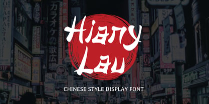 Hiany Lau is Font that inspired by chinese letter style, perfect for any Asian theme of design & promotion to create spectacular designs! Hiany Lau is perfect for branding, logo, invitation, stationery, social media post, product packaging, merchandise, blog design, game titles, cute style design, Book/Cover Title and more. Hope you enjoy with our font! Attype Studio
 - Bastinado by Elemeno,
$25.00Big, thick and chunky, Bastinado is imposing, but the bat-like, scalloped edges give it a sinister presence. Bastinado is an ancient Asian method of torture in which the bottoms of the victim's feet are beaten until he can no longer walk. This font looks like it wants to catch other fonts in a dark alley. - Zetwih by Twinletter,
$17.00 Zetwih, is a stunning display font with an alluring Japanese feel. With the beauty and charm of faux Japanese, Zetwih is the perfect solution for projects that require a distinctly Japanese and Southeast Asian touch. With Zetwih, you can create designs that are themed by Japanese and Southeast Asian culture in an authentic and captivating style. Each letter is carefully designed, combining elements of a distinctly Japanese aesthetic with a modern twist. Zetwih’s top features give you flexibility and creativity in your typography designs. With the available ligatures and alternates, you can combine beautiful characters and create interesting variations in letter composition. Zetwih also supports multilingualism, allowing you to express your message in multiple languages and reach an international audience. That way, you can adapt this font to the needs and preferences of your target market. Let Zetwih immerse you in the beauty and elegance of Japanese and Southeast Asian culture. Get this font now and create inspiring and stunning designs with an unforgettable Japanese touch. What’s Included : File font All glyphs Iso Latin 1 Alternate, Ligature Simple installations We highly recommend using a program that supports OpenType features and Glyphs panels like many Adobe apps and Corel Draw so that you can see and access all Glyph variations. PUA Encoded Characters – Fully accessible without additional design software. Fonts include Multilingual support
 - FS Olivia Paneuropean by Fontsmith,
$90.00Antwerp On a visit to Belgium and the Netherlands while still an MA student at Reading University, Eleni Beveratou made some important discoveries. First, there was the letter ‘g’ from the Didot family seen at Plantin Moretus Museum in Antwerp, which seemed “almost like a mistake”. Then there were strange details such as the serifs on the “l”, “h”, “k”, “b” and “d” in Egmont Cursive and other typefaces by Sjoerk Hendrik de Roos, found in volumes of poetry she picked up from a chaotic bookshop in Amsterdam. These were characters that stood out from the text but seemed to blend harmoniously with the rest of the letters. “And there it was, the spark. I decided to design a typeface that would capture the details of the process of writing.” A guiding hand Eleni shared her initial thoughts with Phil Garnham and Jason Smith. They liked what they saw in her tentative first sketches, and gave her the chance to develop her ideas further. Phil, in particular, provided valuable input as FS Olivia took shape. Eleni’s main influence – the handwritten – would give the font its character. “When creating a typeface,” says Eleni, “it’s fair to say that it reflects some of the designer’s personality. And that’s certainly the case with FS Olivia. “Although technology is part of my everyday life. I am a great admirer of traditional graphic design where you can touch and feel paper and ink.” Irregular “What I particularly like,” says Eleni, “is that a printed item can develop its own personality sometimes as a result of imperfections in the print. “FS Olivia has some of these characteristics as it’s inspired by handwriting, and yet it also includes some very modern features.” Feminine and fascinating, FS Olivia captures the expressive twists and turns of (the poet’s?) pen on paper, with low junctions, deep top serifs and semi-rounded edges. Round outstrokes contrast with the rough corners of the instroke, while strong diagonals and inclined serifs create a richly textured pattern. Polytonic It’s only fitting that there should be a version of this poetic font for one of the birthplaces of poetry and song. Eleni, who hails from Athens, developed an extensive range of glyphs that could be used for the Greek language, in both modern and ancient texts. For the latter, there is a version of Olivia for displaying polytonic Greek (a system that utilises a range of accents and “breathings”), which brings the 21st century technology of OpenType to the presentation of poetic texts from Ancient Greece. Just think what Homer could have done with that. - FS Olivia by Fontsmith,
$70.00 Antwerp On a visit to Belgium and the Netherlands while still an MA student at Reading University, Eleni Beveratou made some important discoveries. First, there was the letter ‘g’ from the Didot family seen at Plantin Moretus Museum in Antwerp, which seemed “almost like a mistake”. Then there were strange details such as the serifs on the “l”, “h”, “k”, “b” and “d” in Egmont Cursive and other typefaces by Sjoerk Hendrik de Roos, found in volumes of poetry she picked up from a chaotic bookshop in Amsterdam. These were characters that stood out from the text but seemed to blend harmoniously with the rest of the letters. “And there it was, the spark. I decided to design a typeface that would capture the details of the process of writing.” A guiding hand Eleni shared her initial thoughts with Phil Garnham and Jason Smith. They liked what they saw in her tentative first sketches, and gave her the chance to develop her ideas further. Phil, in particular, provided valuable input as FS Olivia took shape. Eleni’s main influence – the handwritten – would give the font its character. “When creating a typeface,” says Eleni, “it’s fair to say that it reflects some of the designer’s personality. And that’s certainly the case with FS Olivia. “Although technology is part of my everyday life. I am a great admirer of traditional graphic design where you can touch and feel paper and ink.” Irregular “What I particularly like,” says Eleni, “is that a printed item can develop its own personality sometimes as a result of imperfections in the print. “FS Olivia has some of these characteristics as it’s inspired by handwriting, and yet it also includes some very modern features.” Feminine and fascinating, FS Olivia captures the expressive twists and turns of (the poet’s?) pen on paper, with low junctions, deep top serifs and semi-rounded edges. Round outstrokes contrast with the rough corners of the instroke, while strong diagonals and inclined serifs create a richly textured pattern. Polytonic It’s only fitting that there should be a version of this poetic font for one of the birthplaces of poetry and song. Eleni, who hails from Athens, developed an extensive range of glyphs that could be used for the Greek language, in both modern and ancient texts. For the latter, there is a version of Olivia for displaying polytonic Greek (a system that utilises a range of accents and “breathings”), which brings the 21st century technology of OpenType to the presentation of poetic texts from Ancient Greece. Just think what Homer could have done with that.
 - Satampra by Scriptorium,
$24.00Satampra evokes the spirit of Arabic calligraphy with a hint of something strange and magical. It is an unusual calligraphic font based on an obscure hand lettered style with unique overlapping character strokes. It fits the theme of oriental fantasy and would work well with the fonts in our Arabian Nights Fonts and Art package. Satampra is an upper-case only font, but the lower case positions have alternative versions of the upper case character set. - Maus by Sentinel Type,
$10.00A heavy duty block-shadow font derived from Sentinel Sten Type, Maus' inflexible, near-featureless block-like shapes give the impression of great mass and solidity. Maus is an example of minimalism in type design, using a minimum of sculpting to elicit the essence of familiar Latin forms. Two sets of complimentary letters allow designers to pick and choose combinations for letter fit, for their symmetric values, or to create a particular look or feel to suit the subject. Obviously Maus has great potential for signage, posters and billboards, and screen-printed garments. - Aztec Club by HIRO.std,
$19.00 Aztec Club is a display decorative typeface. The typeface is presented in two fonts: regular and basic. The typeface describes about stylish, ethnic, different, pride, unique and easy to use. Aztec Club inspired by ethnic, local pride, culture and sub culture around the world. FEATURES - Uppercase and Lowercase letters - Numbering and Punctuations - PUA Encoded Characters - Multilingual Support - Works on PC or Mac - Simple Installation USE Aztec Club typeface works great in logotype, headline, apparel, poster, magazine, décor item and wherever you want to be seen. Enjoy using! Thanks. HIRO.std
 - Bernhard Fashion by Monotype,
$40.99The German-born designer Lucian Bernhard designed Bernhard Fashion in 1929. An American" typeface, Bernhard's original design was created for the American Type Founders (ATF). It bespeaks the spirit of the roaring 20s. The hairline-thin letters exhibit elongated ascenders (but not descenders), and many stylized elements. The capital letters also all descend visibly below the baseline. In text, the extra large capitals seem almost like drop caps. This typeface is best used sparingly in text. Largely set headlines will allow readers to enjoy the fashionable quality of Bernhard Fashion's design." - Nipon by URW Type Foundry,
$39.99 Nipon has an affiliation with the Far East. The first character I designed for this alphabet was the capital P. The stepped thin lines are linking to the Japanese characters and the circle shape is a classic Japanese element which means literally: the origin of the Sun, Nippon. So this is where the name comes from, I skipped one P in the name, so my Nipon gets his own identity. Next to this oriental look it also carries a light resemblance with a juwel box. Precious and elegant shapes for the gentle touch in writing.
 - Lyonette NB by No Bodoni,
$39.00 These four typefaces, Berlinette NB, Lyonette NB, Marseillette NB and Parisette NB, were designed from the same basic shape, a geometric form that avoids strict horizontals and uses more offbeat triangular shapes. Lyonette is a fanciful type, gentle and precocious. It seems aloof at times but isn�t really. The frivolity and quirkiness of the narrow width is offset by the fey, finger-like horizontals, vaguely reminiscent of strange encounters and dark closets. It�s great for fashion advertising with literary pretensions. Or maybe a kinder, gentler sci-fi movie.
 - Cheltenham by Bitstream,
$29.99 Daniel Berkeley Updike seems to have stimulated the architect Bertram G. Goodhue to design the prototype in 1896 for Ingalls Kimball at the Cheltenham Press. Six years later Morris Fuller Benton at ATF developed it into the design and then the series that we know today. “Owing to certain eccentricities of form,” writes Updike, “it cannot be read comfortably for any length of time.” But he concludes: “It is, however, an exceedingly handsome letter for ephemeral printing.” Mergenthaler bought composing machine rights to the original design c. 1896, but bought the Benton design in 1904.
 - Aront by BaronWNM,
$14.00 Aront is a font with a modern and simple style. Having round and triangular geometric shapes adds a simple and stable impression to this font, plus a slight curve at each corner so that this font doesn't look stiff. The Aront font is perfect for logos, branding, film titles, games, and other techno-themed projects. Not only limited to techno themes, this font is also suitable for use in other themes that seem clean and simple. Aront font has multilingual support, alternate, and several ligatures as a plus.
 - Consent by Sarid Ezra,
$15.00 Consent is an editorial serif font with unique lowercase. With special features, Consent will make your project more stand out and elegant. This font suitable for brand or title of the magazine. You also can use this font for logo, branding, and also versatile for any project! No need a complicated step for using the features. Just type in lowercase, uppercase, or both! You can also access the additional features from opentype ligatures. Just type equal + number (1-4) for the magic. Example =3. Try it in the type sample below!
 - Space Mode by Justin Penner,
$20.00 Space Mode is a multi-weighted typeface, sent back in time from the distant future. Forward-looking typeface designers often predict a reductive future where Latin letterforms have become increasingly modularized and simplified, or random bits have mysteriously gone missing. Thankfully, this is not the case, and typography has instead flourished and evolved. New forms have appeared, and some revived from historical references. A more complex drawing model has arisen that seems to add new curves in a effort to tame the strange diagonals that appear in the final quarter of the alphabet.
 - Dahaut by Scriptorium,
$12.00Dahaut is a stylized, modernistic uncial variation. The idea for this font came from a small sample of hand lettering in a title on a book by Peter Tremayne. The idea of a bolder, more angular variation on uncial script seemed intriguing, so we developed it into a full font. It should work very well for titles and catches the eye by presenting traditional uncial letter forms in an almost futuristic style. For those who care about such things, the name comes from a princess in a Breton folk story. - Geometric Slabserif 712 by ParaType,
$30.00 The Bitstream version of Monotype Rockwell, 1934. Twentieth-century design influence is revealed in strokes of more even weight than in the original nineteenth-century Egyptians or Slab Serifs. Rockwell is a prime example of this twentieth-century approach. It seems to be a simple Constructivist geometric sans with strong square slab serifs added to. Angular terminals make its sturdy design particular sparkling. It is a strong face for headlines and posters, and is legible in very short text blocks. Cyrillic version was developed at ParaType in 2000 by Isay Slutsker and Manvel Shmavonyan.
 - DuaSatu by Factory738,
$15.00 A casual and stylish serif and handwritten typeface called TwoOne is now available! Along with numbers, punctuation, and multilingual letters, it also contains distinct lowercase and uppercase letters, seems really at work among the vintage designs, logos, and brands. The Alternate and Ligature typefaces will be useful for anything you can think of! 2 Styles Basic Latin A-Z and a-z Numerals & Punctuation Stylistic Ligatures Multilingual Support for ä ö ü Ä Ö Ü ... OTF file format Free updates and feature additions Thanks for looking, and I hope you enjoy it.
 - Workstation Clutter by Zang-O-Fonts,
$25.00This typeface came about when playing with felt tip marker settings in Corel Painter and is derivative of my own handwriting. Up until Workstation Clutter, all of my fonts were designed on paper, then scanned or reproduced into a digital format. With the use of Painter, the non-digital steps were removed, making this the first fully-digital Zang-O-Fonts typeface. Brian J Bonislawsky of the Astigmatic One Eye Typographic Institute helped round out the character set and additional needed characters. The name was inspired by an ex-girlfriend's disorganized desk. - Linotype BioPlasm by Linotype,
$29.99Linotype BioPlasm is a display face created by Italian design Mauro Carichini in 2002. It distorts and deletes parts of letters, creating the appearance of a living, typographic organism in pages of text. Lines set in Linotype BioPlasm seems bubble to the surface, and always hints at some sort of unrevealed secret. Although only parts of most letterforms are visible, the high x-heights of Linotype BioPlasm's letters make its text surprisingly legible for such a concept-font. For usage in products ranging from Sonic to Science, Linotype BioPlasm may be the font for you! - LiebeChristmas by LiebeFonts,
$19.90 LiebeChristmas is a hand-crafted collection of Santas, Rudolphs, gifts, treats and more Christmas items in countless variations and sizes. Create pretty Christmas greetings with a personal touch. Surprise your family and friends by printing individual cards for everyone. Decorate your blog or website for the holiday season. More than 100 carefully crafted drawings are included in this single font and can be used in any text or graphics application. How about creating your own wrapping paper with LiebeChristmas patterns? Or how about making Christmas cards in combination with our popular typeface LiebeErika?
 - Baggage Claim JNL by Jeff Levine,
$29.00 Sometimes type designs are set aside as one project takes priority over another and occasionally it becomes overlooked. One such example is a set of extra bold, sans serif stencil characters drawn out in 2017. Regrettably, as much time has passed, no backstory can be applied to this typeface. It was checked against existing releases in the Jeff Levine Fonts library and didn’t seem to have been re-worked for any subsequent release. With this in mind, Baggage Claim JNL makes its belated appearance and is available in both regular and oblique versions.
 - Dephion by Locomotype,
$15.00 In many ways, handmade items fit as collectibles, because they look unique and not boring. Dephion is one of the handmade fonts we made to give a casual and natural impression that brings modern style calligraphy made in a very manual way. We want to get out of the habit of seeing perfect font types by making the shape imperfect and irregular. Dephion presents three styles: Dephion Script Regular, Italic and Dephion Sans. You can pair them to create a variety of attractive designs with a sense of casual.
 - Respect by Resistenza,
$39.00 Respect! Our tribute to hand lettering culture. This exuberant new script font family draws inspiration from the traditional craftsmanship of sign painting and brush pen calligraphy techniques. Our aim was to create a modern interpretation of brush script, which referenced old-school hand lettering but also adds some contemporary forms, terminations and swashes you might expect to find in street art. The slanted angles and curved steams are designed to give this font an active energy, plenty of attitude and a courageous/brave character. We recommend to combine Timberline with: Turquoise
 - Casual Deco JNL by Jeff Levine,
$29.00 The hand lettered sans serif title on the1931 sheet music for “(Potatoes are Cheaper-Tomatoes are Cheaper) Now’s the Time to Fall in Love” presented another opportunity to create a typeface from the wealth of unusual alphabets found on the covers of vintage and antique song sheets. However, it seems that even as late as the 1930s, song writers had the urge to pen long-worded titles for their musical compositions. This thirteen word verbal excursion became the model for Casual Deco JNL, which is available in both regular and oblique versions.
 - Love Lovely by Letterara,
$12.00 Love Lovely is a cute handwritten font. It features amazing heart-shaped titling. These cute handwritten characters with connecting hearts are great for creating personalized items. This font is PUA encoded which means you can access all of the cute glyphs and swashes with ease. It also features a wealth of special features including alternate glyphs and ligatures. Fall in love with its authentic feel and use Love Lovely to create gorgeous wedding invitations, beautiful stationary art, eye-catching social media posts, cute greeting cards, and much more.
 - My Hero Father by Putracetol,
$18.00 My Hero Father is a quirky playful font with father's day theme. This font has 7 variations of fonts, each variation has a different decoration. The decorations are items that a father often wears, such as: cigarettes, glasses, hats, mustaches, ribbons and crowns. I made this font specifically for the Father's Day theme, but other than that this font can also be used for other projects. This font is suitable for logos, crafting, greeting cards, invitation cards, social media, products, stickers, headings, quotes and more. This font is also support multi language.
 - 1751 GLC Copperplate by GLC,
$38.00 This family was inspired by an engraved plate from Diderot & Dalembert's Encyclopedia (publication beginning in 1751), illustrating the chapter devoted to letter engraving techniques. The plate bears two engravers names : "Aubin" (may be one of the four St Aubin brothers ?)and "Benard" ( which name is present below all plates of the Encyclopedia printed in Geneva ). It seems to be a transitional type, but different from Fournier or Grandjean. Small caps are included in fonts for TTF and OTF version, separate files are included in the family sets of the Mac TT version.
 - Lokomotiv by Hanoded,
$15.00 The 1930 Geneva Motor Show (Salon International De l'Automobile Et Du Cycle) showcased a lot of new cars, but one item in particular took my interest: the amazing art deco poster announcing the show. Lokomotiv font was based on this poster. It is a very deco-ish font, futuristic, angular, with bold squares, rounds and triangles. As I had to work with just a handful of glyphs, and needed to fill an entire font, I made up the missing ones myself. Lokomotiv, by the way, is German for Locomotive.
 - Ultra Thin Stencil JNL by Jeff Levine,
$29.00 Online auctions offer a treasure trove of lost or forgotten merchandise, and many items pertaining to lettering just beg to be digitized into a typeface. Case in point is a partial set of brass stencils that were the visual model for Ultra Thin Stencil JNL. While most of the brass interlocking stencils available now and in the past have bold lettering for easy readability, this particular set consisted of condensed letters with thin lines. Available in both regular and oblique versions, they join a long list of stencil designs available from Jeff Levine Fonts.