1,460 search results
(0.018 seconds)
- Fat Times by Wiescher Design,
$39.50 FatTimes is an extension to my HardTimes family. Times are too hard for boring typefaces, so try the fat one one for a change. Your hardworking typedesigner - Gert Wiescher
 - Fat Sally by Autographis,
$39.50 FatSally is written with a broad felt-tip marker, scanned and finished by hand on screen, taking care to emphasize the typical "marker" feeling.
 - Fat Rhino by Pink Broccoli,
$14.00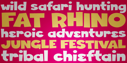 A heavyweight playful typeface with a children's comic feel.
 - Lucida Fax by Monotype,
$40.99Lucida is a family of fonts with one basic design, but offered in two variations. It has both serif and sans serif characters. Lucida is suitable for books/text, documentation/business reports, posters, advertisement, multimedia. - Real Fat by vanAllerlei,
$30.00 RealFat is a typeface that has been started with the intention to create a very squared bold font with a futuristic look and feel. The squared shapes also refer to the architecture of big city buildings with small windows. This font fits perfect on modern posters, flyers and other artwork or pixel based work. Most characters have the same width and height and are perfect 'building-blocks' for typographic compositions.
 - Cuckoo Fat by Very Good Fonts,
$19.00Cuckoo Fat was first seen in 1988 when I painted it on a record shop's window. Since then this hand lettered font has been there and done that. Cuckoo Fat is a loud and proud, classic and informal display font designed to work well on any job. - Fat Ink by High Peak,
$20.00 This handwritten font is as juicy as the strokes from a fat marker! Unpredictable but harmonious, the lines and shapes give this font a fun, funky vibe. Perfect for creating logos, charts, pricing, and more. Full uppercase and lowercase, it supports several languages, lots of discretionary ligatures, and alternatives that combine with each other. Have fun! High Peak
 - Norman Fat by Resistenza,
$49.00 Get to know Norman Fat a new version of our best seller Norman, elegant and fashion forward. This new condensed high contrast and heavy weight serif font is based on expansion giving a sense of self confidence. The oblique ax was specially added to get a contemporary and innovative sense. Norman Fat is young and idealist, he has a distinctive sense of style. A complete set of ligatures and stylistic alternates is included, this will help the designer to customize and give a special look to any layout. We recommend to use it for big title, magazine, editorial purposes and display.
 - Fat Freddie by CastleType,
$59.00 A bold, playful typeface named after my late and much-missed grey cat, Freddie, who was my best buddy for 18 years.
 - Fat Marker by Kraken,
$10.00A rough and ready typeface created from a series of doodles that comes in uppercase only. - Fat Inker by Hanoded,
$10.00 For once the name of this font corresponds with the way it looks: Fat Inker is a fat, inky font. I made it with a Chinese brush and ink, Fat Inker is a nice poster font and it comes with extensive language support and some cool discretionary ligatures for double letter combinations.
 - Alt Fat by ALT,
$- Do you like fat fonts? Well here is a free one from me. Regular & Italic both free. Fat is a caps only font. Because of that if you type something with caps on, as you can see is typing in Greek I decide to make it like this since there no lowercase letters.
 - Far Fetch by Kijiji Hub,
$20.00 Farfetch is inspired by the serif typefaces used in editorial media and magazines. Farfetch is a contemporary typeface sans-serif typeface designed to give a fresh extended look. This typeface is ideal for display purposes like logos and big, bold headlines with extended language support (+ Cyrillic), fractions, tabular figures, arrows, ligatures and more. here are over 547 glyphs that allow you endless customizations It comes in 2 different weights with 1 styles in each weight (Standard & Slanted).
 - Fat Nib by A New Machine,
$12.00 This hand drawn calligraphy font was made with a wide nib pen. It is all cap with different glyphs for the upper and lower case letters for mixing and matching. The Splatter family comes with extra splatter glyphs. Great for use when you need some added punch in a headline or callout.
 - Fat Face by URW Type Foundry,
$35.99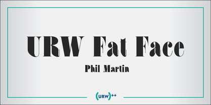
- Fab Figures by Letterwerk,
$10.00 Fab Figures is a numbers-only font. This high contrast display font family with curly terminals is a great choice for infographics and posters. The entire font family consists of 10 styles: 2 styles for big usage, 2 styles for normal usage, 2 styles for small usage and 3 patterned styles (fitting to the big styles). Character Set: 1 2 3 4 5 6 7 8 9 0 | % # • ~ { $ £ € } . , : ; + - = ÷ / ° * ' ’ (Arrows) (No-Symbol) (Nr-Symbol)
 - Fan Script by Sudtipos,
$99.00 A friend of mine says that sports are the ultimate popular drug. One of his favorite things to say is, “The sun’s always shining on a game somewhere.” It’s hard to argue with that. But that perspective is now the privilege of a society where technology is so high and mighty that it all but shapes such perspectives. These days I can, if I so choose, subscribe to nothing but sports on over a hundred TV channels and a thousand browser bookmarks. But it wasn't always like that. When I was growing up, long before the super-commercialization of the sport, I and other kids spent more than every spare minute of our time memorizing the names and positions of players, collecting team shirts and paraphernalia, making up game scenarios, and just being our generation’s entirely devoted fans. Argentina is one of the nations most obsessed with sports, especially "fútbol" (or soccer to North Americans). The running American joke was that we're all born with a football. When the national team is playing a game, stores actually close their doors, and Buenos Aires looks like a ghost town. Even on the local level, River Plate, my favorite team where I grew up, didn't normally have to worry about empty seats in its home stadium, even though attendance is charged at a high premium. There are things our senses absorb when we are children, yet we don't notice them until much later on in life. A sport’s collage of aesthetics is one of those things. When I was a kid I loved the teams and players that I loved, but I never really stopped to think what solidified them in my memory and made them instantly recognizable to me. Now, thirty-some years later, and after having had the fortune to experience many cultures other than my own, I can safely deduce that a sport’s aesthetic depends on the local or national culture as much as it depends on the sport itself. And the way all that gets molded in a single team’s identity becomes so intricate it is difficult to see where each part comes from to shape the whole. Although “futbol” is still in my blood as an Argentinean, I'm old enough to afford a little cynicism about how extremely corporate most popular sports are. Of course, nothing can now take away the joy I got from football in my childhood and early teens. But over the past few years I've been trying to perceive the sport itself in a global context, even alongside other popular sports in different areas of the world. Being a type designer, I naturally focus in my comparisons on the alphabets used in designing different sports experiences. And from that I've come to a few conclusions about my own taste in sports aesthetic, some of which surprised me. I think I like the baseball and basketball aesthetic better than football, hockey, volleyball, tennis, golf, cricket, rugby, and other sports. This of course is a biased opinion. I'm a lettering guy, and hand lettering is seen much more in baseball and basketball. But there’s a bit more to it than that. Even though all sports can be reduced to a bare-bones series of purposes and goals to reach, the rules and arrangements of baseball and basketball, in spite of their obvious tempo differences, are more suited for overall artistic motion than other sports. So when an application of swashed handlettering is used as part of a team’s identity in baseball or basketball, it becomes a natural fit. The swashes can almost be visual representation of a basketball curving in the air on its way to the hoop, or a baseball on its way out of the park. This expression is invariably backed by and connected to bold, sleak lettering, representing the driving force and precision (arms, bat) behind the artistic motion. It’s a simple and natural connective analysis to a designer, but the normal naked eye still marvels inexplicably at the beauty of such logos and wordmarks. That analytical simplicity was the divining rod behind Fan Script. My own ambitious brief was to build a readable yet very artistic sports script that can be a perfect fit for baseball or basketball identities, but which can also be implemented for other sports. The result turned out to be quite beautiful to my eyes, and I hope you find it satisfactory in your own work. Sports scripts like this one are rooted in showcard lettering models from the late 19th and early 20th century, like Detroit’s lettering teacher C. Strong’s — the same models that continue to influence book designers and sign painters for more than a century now. So as you can see, American turn-of-the-century calligraphy and its long-term influences still remain a subject of fascination to me. This fascination has been the engine of most of my work, and it shows clearly in Fan Script. Fan Script is a lively heavy brush face suitable for sports identities. It includes a variety of swashes of different shapes, both connective and non-connective, and contains a whole range of letter alternates. Users of this font will find a lot of casual freedom in playing with different combinations - a freedom backed by a solid technological undercurrent, where OpenType features provide immediate and logical solutions to problems common to this kind of script. One final thing bears mentioning: After the font design and production were completed, it was surprisingly delightful for me to notice, in the testing stage, that my background as a packaging designer seems to have left a mark on the way the font works overall. The modern improvements I applied to the letter forms have managed to induce a somewhat retro packaging appearance to the totality of the typeface. So I expect Fan Script will be just as useful in packaging as it would be in sports identity, logotype and merchandizing. Ale Paul
 - Fat Bubble by IbraCreative,
$23.00 Fat Bubble is a cute, cheerful and modern display font. Thick and friendly, this font will be an ideal choice for a wide range of casual, comic, kids book, and any informal designs. Use Fat Bubble for your creations and explore its endless possibilities.
 - Far Kingdoms by Gleb Guralnyk,
$15.00 Hello! Presenting the Far Kingdoms vintage typeface. This font has an OpenType features, such as stylistic alternates.
 - Romeo Fans by Haksen,
$17.00 Romeo Fans is a natural brush script with texture and similar to hand written. I designed it by hand and I really hope you will enjoy using this font. I love using this one with layer masks in Photoshop, it really looks natural written. Romeo Fans Script includes a couple ligatures to make everything look totally hand-done, it also contains other additional features like swashes and spots. What's Included: - Ligatures - Numbers + Punctuation - Non-English support - Swashes - Spots Please contact me if anything question, I'm glad to help. Happy Designing!
 - Nimbus Sans Novus by URW Type Foundry,
$89.99 The first versions of Nimbus Sans have been designed and digitized in the 1980s for the URW SIGNUS sign-making system. Highest precision of all characters (1/100 mm accuracy) as well as spacing and kerning were required because the fonts should be cut in any size in vinyl or other material used for sign-making. During this period three size ranges were created for text (T), the display (D) and poster (P) for small, medium and very large font sizes. In addition, we produced a so-called L-version that was compatible to Adobe’s PostScript version of Helvetica. Nimbus was also the product name of a URW-proprietary renderer for high quality and fast rasterization of outline fonts, a software provided to the developers of PostScript clone RIPs (Hyphen, Harlequin, etc.) back then. Also in the 80s, a new, improved version of the Nimbus Sans, namely Nimbus Sans Novus was designed. Nimbus Sans Novus was conceptually developed entirely with URW’s IKARUS system, i.e. all styles harmonize perfectly with each other in terms of line width, weight, proportions, etc. On top of that, Nimbus Sans Novus contains more styles than Nimbus Sans.
 - Digital dream Fat - Unknown license

- 7 days fat - Unknown license

- F25 Bank Printer - 100% free

- Fat Free Solid - Unknown license

- Fat Legs Outline - Unknown license

- BeeMeX fat stripes - Unknown license

- Ego trip Fat - Unknown license

- WEAR FAT SHIRT by TypoGraphicDesign,
$15.00 CONCEPT/ CHARACTERISTICS A display font that allows you to »Kleckern und Klotzen« (modified German proverb »to not take half-measures«) The fat and square character to the font, a bold and loud statement. The motto is square, practical, fat. The font styles ranging from high-contrast line difference "beanpole" over mediocrity "slim" to the fattest and blackest "okay" style. A font with humor ^^ APPLICATION AREA The modern, square lightweight »Fat Wear Shirt« would be happy as a display typeface in headline size on the following areas and would find this very real bold: Editorial Design (Magazine or Fanzine) or Webdesign (Headline Webfont for your website), party flyer, movie poster, music poster, clothing, fashion, t-shirts, music covers or webbanner. And and and… TECHNICAL SPECIFICATIONS Headline Font | Display Font | Fat Techno Font »Wear Fat Shirt« OpenType Font (Mac + Win) with 3 styles (okay, slim, beanpole) & 268 glyphs. Alternative letters and ligatures (with accents & €) Desktop Font (.otf) + Web Font (.svg, .eot, .woff) KONZEPT/BESONDERHEITEN Eine Display-Schrift bei der Kleckern und Klotzen erlaubt ist! (Verändertes deutsches Sprichwort »nicht kleckern sondern klotzen«) Der fette und eckige Charakter verleihen der Schrift eine plakative und laute Aussage. Das Motto lautet quadratisch, praktisch, fett. Die Schriftschnitte reichen von kontrastreichen Linienunterschied »beanpole«, über mittelmaß »slim« bis zum fettesten und schwärzesten »okay« Style. Eine Schrift mit Humor ^^ EINSATZGEBIETE Das moderne, quadratische Leichtgewicht »Wear Fat Shirt«, würde sich als Auszeichnungsschrift in Headlinegröße über folgende Einsatzgebiete sehr freuen und fände dies echt fett: Logos/Wortmarken aller Art, Flyer für fast jede Party, Platten Cover, CD-Cover und Icon Design, Plakat Design, Kleidung, T-Shirts, Comics und Graphicnovels, Game– und Videospiel Design aller Genres, als Headlineschrift für print und digitale Magazine, Bücher und Webseiten u.v.m. TECHNISCHE INFORMATIONEN Headline Font | Display Font | Fat Techno Font »Wear Fat Shirt« OpenType Font (Mac + Win) mit 3 Schriftschnitten (okay, slim, beanpole) & 268 Glyphen. Inkl. diakritisches Zeichen, alternative Buchstaben, Ligaturen & €. Desktop Font (.otf) + Web Font (.svg, .eot, .woff)
 - PIXymbols FAR Marks by Page Studio Graphics,
$39.00Aircraft marking alphabets and numerals drawn in accordance with FAR Part 45 ¤ 45.29 (c), (d), and (e) of Federal Aviation Regulations. All characters are also in EPS files. - Fat Kitty Kat by Hanoded,
$20.00 Fat Kitty Kat is a hand made, rather bouncy and happy font. It was thought up, drawn and vectorized during an unusually long rainy period in a small Porto hotel room. Kitty Kat's glyphs are rather rough, but legible and fun to use. The font comes with extensive language support and a full range of alternates for the lower case letters.
 - Fat Albert BT by Bitstream,
$50.99 Ray Cruz releases another typeface family, this time inspired by 1970's pop culture. Fat Albert Regular, Outline and Shadow are bold poster types that evoke the fun and funk of an era gone by. Go on bro, get Fat Albert and get down.
 - Wild Fat Font by Softulka,
$10.00 Wild Fat Font - playful handwriting experimental display typeface inspired by classic old cartoons. Wild Fat Font is available in 3 styles: outline, outline distorted, and regular. The regular style imitates writing with a fat marker. The Wild Fat Font works perfectly for bold titles, Festival posters, a graphic element for bright T-shit or hoodies, designs for Kids, graffiti concepts, modern aesthetics, fashion, any visual design project, and even backgrounds! This bulging and chunky font likes an experiment with spacing and different deformation. Please, don't hold back on your bold modern ideas!
 - Dear And Fans by Anaya Studio,
$8.00 Dear and Fans is all class. A stylish modern font that is a mix of serif and sans serif. It's soft curves mixed with high contrast glyphs lend it self to both feminine and masculine qualities. With a contrasting light italic, Dear and Fans works great in layout design for quotes or body copy. The Elegant curves also make for a unique logo or masthead. Dear and Fans comes with multilingual support also. Full upper/lower case, numbers, punctuation and multilingual support. Full italic style included also.
 - Adobe Fan Heiti by Adobe,
$29.00 - LHF Fat Cat by Letterhead Fonts,
$35.00 Inspired by Alf Becker's Rounded Block letterstyle. Nice 30's/40's era appeal.
 - Far Space AT by Andrew Tomson,
$10.00 Hi, friends! Sitting under the starry sky, I thought about extraterrestrial life and was inspired. I imagined if there was extraterrestrial life and their means of communication. The outline of this font popped up in my mind and I quickly sketched it out so I wouldn't forget it! This font is great for logos, quotes, space-themed inscriptions, it's also just pleasing to the eye and makes you think about the extraterrestrial!
 - Fat Font Grotesk by Intellecta Design,
$9.00a naive grotesque font - Fan Magazine JNL by Jeff Levine,
$29.00 In the December, 1934 issue of Modern Screen magazine, a number of feature article headlines were hand lettered in a condensed slab serif with a relatively uniform stroke weight. This is now available digitally as Fan Magazine JNL, in both regular and oblique versions.
 - Old Fat Boy by Gleb Guralnyk,
$14.00 Hello! Introducing a creative all caps font named Old Fat Boy. It's a vintage shape smooth typeface with authentique 90's style look. This font includes lots of multilingual characters (check out a screenshot with available letters and signs).


