9,470 search results
(0.029 seconds)
- Blackoak by Adobe,
$29.00Joy Redick designed Blackoak, a big and heavy Egyptienne-sytle titling slab serif face, in 1990. The extremely robust style of the characters in this typeface was consciously distorted; creating letterforms that appear flattened and stretched, like a rubber band. Blackoak is drawn in the style of old wood tpes, just like those that one envisions when one thinks of the large, decorative posters that once filled Wild West America. The wood type collection of the Smithsonian Institute in Washington, DC acted as a primary source of inspiration for this design. True to its rooks, Blackoak is meant for use exclusively in headlines in very large point sizes, or for logos and other corporate advertising purposes. - Monotype Modern Display by Monotype,
$29.99Cut by Monotype between 1900 and 1902, the Monotype Modern font family was based on Miller & Richards News 23 and 28; slightly condensed news text types of the 1890s. Monotype Modern is a lively typeface, with long, fine hairlines and well rounded letterforms, representing the best of nineteenth century modern face design. A classic text face, and typical of the moderns that were produced in the United Kingdom at that time, being less extreme in its rendering than some of the models of purer form being produced elsewhere. Monotype Modern is an excellent text face for magazines, newspapers and books, the heavier and more condensed versions are useful in headlines and display. - Falstaff MT by Monotype,
$29.99 Falstaff first appeared with Monotype in 1931, an alphabet in the style of a wide, bold antiqua that was especially popular in the first third of the 19th century. Such typefaces distinguished themselves through their consistent basis in the transitional antiqua style. They are characterized by their extremely fine unflexed serifs with no curve connecting them to the thick strokes. The numerals with their generous curves and ball-like stroke endings and beginnings are particularly decorative. The vertical strokes are dominant and give lines of this typeface a column-like and therefore static look. Falstaff is today often used for book titling, especially for mystery novels. It is best used sparingly in middle and larger point sizes.
 - Bumpy Ride by Hanoded,
$16.00 I live in a small hamlet near the Rhine river. It is a sleepy little town and it doesn’t have any facilities. For groceries I need to go to the next town. The only road leading to that town has been closed for half a year, because of ‘maintenance’, so doing groceries got a lot trickier. The fastest way to travel is through yet another hamlet in the forest, on a very narrow road with extremely bumpy shoulders. Yes, you’ve guessed it: it is a Bumpy Ride. Bumpy Ride was made using a so called Brush Pen. It comes with all the accents and a sweet set of alternates for the lower case letters.
 - Train Of Thought by Pesic,
$29.00 Train of thought is a decorative font based on vintage and retro posters of the 19th and 20th centuries. Contains all Latin and Cyrillic glyphs. It is very modern, and it is intended for the use of creating logos and T-shirt designs as well as highlighting the essential elements on billboards, magazines, etc. Today's digital designers can use these stencil patterns to embellish text set in other alphabet stencils or by themselves to evoke the feeling of rustic Americana. Train of the thought is extremely detailed, and looks good in both small and large dimensions. It also contains a set of symbols, which you can use to further emphasize the essential elements.
 - Kalpa by Octotypo,
$15.00 The early inspiration designs for Kalpa comes from some old wrist watches dials from an iconic diving watch company. The result is a sharp and sleek design that gives an extremely strong look to the font. Kalpa comes in 4 weights and italics to make it versatile and easy to use on all kinds of media. It is a wise choice for headlines, logos, branding, packaging, publications and websites. The design comes with some alternatives glyphs which enhanced the use of the font and let you customise your letter works. The name comes from a Sanskrit word meaning a relatively long period of time to connect with its early inspirations of wrist watches dials.
 - Taman Siganture by Gilar Studio,
$16.00 Introducing,Taman Signature This Taman Signature script typeface includes many different alternates for each lowercase letter. It's extremely fun to use as each word can be transformed to your liking. Taman Signature Inspired by contemporary fashion and streetwear and combination with Hand Lettering style. I'm made with personality touch every single curve. I hope this can make inspire you from your work. and a very bouncy baseline It has a perfectly paired complimentary marker font. Ideal for logos, handwritten quotes, product packaging, header, poster, merchandise, social media & greeting cards. Features Basic Latin A-Z and a-z Numbers Symbols Stylistic Set Ligature PUA Encode Multilanguage Supportc Check my other fonts here : gilarstudio.com Thanks and happy designing :-)
 - Endurance by Monotype,
$92.99Endurance Pro was designed by Steve Matteson to fill the need for a more graceful, less industrial-looking neo-grotesque sans serif design. The name Endurance lends itself to the reality that the typeface was designed to work well under extreme conditions from billboards to mobile phone screens. Endurance Pro was designed with on-screen legibility as a key attribute, and with careful detailing for a more polished appearance in large sizes. Endurance Pro has an wide-ranging character set with WGL support (Greek, Cyrillic and Eastern European characters) to meet the needs of multinational companies and creative professionals who desire OpenType's typographic features (with old style figures, proportional figures, fractions, superiors and a slash zero). - Arial for Ortho Clinical by Monotype,
$45.99Arial was designed for Monotype in 1982 by Robin Nicholas and Patricia Saunders. A contemporary sans serif design, Arial contains more humanist characteristics than many of its predecessors and as such is more in tune with the mood of the last decades of the twentieth century. The overall treatment of curves is softer and fuller than in most industrial style sans serif faces. Terminal strokes are cut on the diagonal which helps to give the face a less mechanical appearance. Arial is an extremely versatile family of typefaces which can be used with equal success for text setting in reports, presentations, magazines etc, and for display use in newspapers, advertising and promotions. - Italienne by Linotype,
$29.99Inspired by the large American wood type of the Wild West, Richard Yeend created Italienne Std in 2002. Italienne Std is both very condensed and very decorative. It sports heavy, band like serifs, reminiscent of other italienne-style fonts, like Westside. Italienne-style fonts rose in popularity during the early 19th Century, when designers were first beginning to experiment with extreme contrast within letterforms, and across lines of text. Interestingly enough, letterforms with similar designs were just as common during the 1970s as during the 1870s, so you may use Italienne Std for applications ranging from country music concerts to disco parties. Italienne Std is part of the Take Type 5 collection from Liinotype GmbH." - Versteeg by Blank Is The New Black,
$10.00 Versteeg was originally designed as a font that would work at a singular pixel level. In the spirit of this reduction, Versteeg was designed with an x-height of 3 units with capitals at 4 units. This extreme simplification is what makes Versteeg unique. After designing the square version of the typeface, creating a series of circular versions was a natural evolution. These versions have a resemblance to braille, but don't actually have a relationship with any braille characters. The width of each face is carefully designed to make sure that the letters will align perfectly in multiple lines. Versteeg is, for the most part, a display typeface, and isn't recommended for large blocks of text.
 - Springsteel Serif by Paragraph,
$21.00 A companion to Springsteel (sans), this serif typeface is intended for longer text blocks and smaller sizes. Like the sans-serif, it has unusual construction using curves on the outside and straight lines inside characters, giving it quite an expressive and warm feel. It contains small caps and old-style figures, as well as superior/inferior figures and common fractions and mathematical symbols. It supports Western plus Nordic, Eastern European and Turkish languages. Excellent spacing and extensive kerning (over 2800 pairs) provided by Igino Marini/iKern. The free fonts in the Springsteel Serif Extreme family (thin and heavy weights) should only be used as display typefaces, at large size and short text blocks.
 - Celebrity by Canada Type,
$24.95 Celebrity is a new execution of a film type concept put forth by Willy Wirtz in 1971. The original idea, called Latus, had many irregularities and unfit characters that are now fixed and expanded in this digital version. Celebrity's construct combines extreme thicks with hairline thins to build forms that contribute to a type totality that is at once modern and techno, as well as retro-deco. Eye catching and memorable, Celebrity is ideal for use on posters, book covers, media sleeves and packaging. It also has enough geometric appeal to inspire unique logos and set attractive titling. Celebrity comes in all popular font formats, and includes a very expanded Latin character set.
 - Dix by Just My Type,
$20.00 An offbeat not-quite-slab, not-quite-bracketed serif. And its extreme weight and width. Richard Dix started as a surgeon and turned out an actor, one of the lucky few who made a successful transition from silent film to talkies. In 1929 he made the movie western, “Redskins,” and his name appeared on a brilliant poster promoting the film. “Richard DIX”; four upper case and six lower case letters. The font Dix is derived and extrapolated from impressions of those 10 letters. Inspired by the poster for the 1929 film, “Redskin,” and a desire to create a black Edwardian font with an offbeat serif. Usage recommendations Western movie or 19th century-style advertising posters.
 - Plau Redonda by Plau,
$249.00 Humanist on one hand, geometric wannabe on the other Born from the need of having a custom font for our own branding, Redonda became too big to keep just for us. Like that, came to light Plau's 10th retail font, the first one designed by Carlos Mignot. The font's personality is a result of a search for extreme impact. Having started out as a exclusively Black geometric face, it became a full, versatile humanist sans. While it maintains the impact that inspired it, it also offers performance for both UI and body copy. This balance reflects the font's creative process: at first it referenced historic examples, but we also made sure it worked as a contemporary face.
 - Arial Unicode by Monotype,
$208.99Arial was designed for Monotype in 1982 by Robin Nicholas and Patricia Saunders. A contemporary sans serif design, Arial contains more humanist characteristics than many of its predecessors and as such is more in tune with the mood of the last decades of the twentieth century. The overall treatment of curves is softer and fuller than in most industrial style sans serif faces. Terminal strokes are cut on the diagonal which helps to give the face a less mechanical appearance. Arial is an extremely versatile family of typefaces which can be used with equal success for text setting in reports, presentations, magazines etc, and for display use in newspapers, advertising and promotions. - Arial Paneuropean by Monotype,
$92.99Arial was designed for Monotype in 1982 by Robin Nicholas and Patricia Saunders. A contemporary sans serif design, Arial contains more humanist characteristics than many of its predecessors and as such is more in tune with the mood of the last decades of the twentieth century. The overall treatment of curves is softer and fuller than in most industrial style sans serif faces. Terminal strokes are cut on the diagonal which helps to give the face a less mechanical appearance. Arial is an extremely versatile family of typefaces which can be used with equal success for text setting in reports, presentations, magazines etc, and for display use in newspapers, advertising and promotions. - Panorama KG by Posterizer KG,
$24.00 Panorama KG is a black display font. The starting idea was to design letters that stand on the horizon. For that reason, the descenders are extremely short, and the elements of the letters lying on the base line are cutten, the horizontal strokes are lowered ... These characteristics should reduce the spacing and emphasize the compactness of densely composed titles and shorter text forms. Panorama KG was designed specifically for headlines, logotypes, branding, and similar applications... Due to the characteristics that are in function only in the bold version, it did not make sense to make more styles or family, but Panorama KG can be combined with many other serif and sans serif typefaces.
 - Ovenci by ENCI Fonts,
$19.00 Ovenci is a unique font family based on ovals and curves. Its unique and original design makes it unlike any other. As in nature, the oval curves of Ovenci family combine very well with the rest of the shapes. Trust your eyes to create the perfect mix for your projects using the Ovenci fonts family along with other fonts that you consider appropriate for what you want. For millions of years organic forms have been part of creation. The shape of Ovenci family glyphs is extremely organic, which makes it very pleasing to the eye, so you can give it the use you want. Thank you for choosing us, you will surely create great things with the Ovenci family.
 - M Razor PRC by Monotype HK,
$523.99 M Razor is so called ""neo Sung-style"" typefaces. Crossbars (橫) and stems (豎) are orthogonal and upright. Their entry and finial points are squarish, parallel without flare. Contrast of strokes is extremely high. This creates sharpness, stiffness in the midst of elegance of Sungti. Even distribution of space, careful positioning, size and proportion of radicals create a slightly expanded, opened and balanced construction. Zhonggong are slightly expanded, its relatively less inter-character spacing makes the line of text better coupled and aligned. Its features and construction create a feel of wholesome, elegance with contrasting sharpness and stiffness. It is best suited for casual, creative display eye-catching text, set upright (non-slanted), non-condensed.
 - Clearface Gothic by Linotype,
$29.99 Clearface Gothic first appeared in 1910, designed by Morris Fuller Benton, the world-famously prolific typeface artist. In addition to Clearface Gothic, Benton also designed classics like Franklin Gothic, Century Expanded, and many other types. Clearface Gothic is a sans serif face with light forms displaying the Zeitgeist of the turn of the 20th century. Distinguishing characteristics are the open forms of the a" and "c," the arched "k," and the upward-tilting horizontal stroke of the "e." The relatively narrow typeface, with its open inner white spaces, is extremely legible even in small point sizes. There is no accompanying italic. This digital version of Clearface Gothic was made in 1984 by the Linotype Design Studio."
 - Waters Titling by Adobe,
$35.00Waters Titling is the work of lettering artist Julian Waters, a multiple master typeface of classical calligraphic roman capitals. This broad-tipped pen design is related to other historically-based titling alphabets but offers a wider range of weights and widths, making it extremely versatile for movie titles, book jackets, posters, banners, calendars, etc. Waters Titling is based on the timeless Roman monumental inscription forms of almost 2000 years ago, but also has a touch of contemporary vigor and flair. The design displays a strong calligraphic thick/thin stroke weight contrast and flowing, subtly bracketed serifs. In lighter weights, Waters Titling is elegant and delicate, while the bolder weights offer a more substantial sparkle. - Gothiks by Blackletra,
$50.00 Gothiks is a powerfull 6-weight display sanserif influenced by Texturas. The rithm and verticality of Texturas can be easily identified on the letters with diagonal strokes like A N M K k V v W w X x Y y Z z: here they are all vertical. This kind of morphology was chosen because it accepts condensation in a very natural way, giving to this compact sanserif a very unique personality. The intermediate weights can be used for short texts while extreme weights are excellent for big sizes. It has an extensive character set — with extensive language support — and many OpenType features like fractions, small capitals and different figure sets. Default figures align with lowercase.
 - Modernica by Quintana-Font,
$29.00 Modérnica is a sans serif type including roman & oblique styles in 9 weights. Originally published in 2014, then in 2020 we released version 2.0, in which we expanded the language coverage and character set, adding a new Fat weight, tabular figures, smart fractions & arrows. We’ve improved the OpenType features adding new Stylistic Sets. Besides this, we have retuned the letters spacing in the whole family. Seeking for the best performance, we added a bit of spacing between letters in the text versions (middle weights from Book to Bold), while as for the display variants (extreme weights from Thin to Fat) we made them gain space in the light versions and loose it in the blacks.
 - Manuel by profonts,
$51.99 Manuel, a simple, almost mathematically constructed typeface, includes stylistic alternates for a number of upper case characters. This comes in very helpful when designing logo letterings. Manuel(a) is a very charming, self-confident und exciting typeface design. The idea was to try to apply a given design criteria (also see Volker Schnebel's Marita and Martin fonts) to every single character. In other words, start with a character and develop all of the others from it. This is quite easy for some characters but extremely difficult for others. This process generates creativity and the characters move away from the initial constructed sketch. Together in a typeface, the individual characters are now all of a piece and character.
 - Flax by Wilton Foundry,
$29.00Flax Regular lives in a somewhat unusual space... it is not a normal “handwriting” font, nor is it a formal script, or a rounded italic. Flax is a slightly more formal handwriting script that is extremely legible and useful- it can stretch from invitations to packaging, to menus, to brochures to ads. The rough hand-drawn finish gives Flax some of its unique character. This is almost unnoticeable in smaller point sizes while clearly visible in display sizes. While Flax is slightly formal, it has a very friendly presence - mainly from the unpretentious rounded characters and rough finish. Flax is available in Postscript, Truetype and Opentype for Mac and Windows. You will enjoy putting Flax to work! - Meguro Serif by GT&CANARY,
$34.00 Potent, clean and classy. Meguro serif has a modern-styled boxy shape with small glyphic serifs emphasizing the edge of its vertical and horizontal strokes. Inspired by iconic fonts of the 1900s, Meguro serif incorporates the sophistication of the digital age to strike its own unique character. Its mono-line oriented, pointy serifs and very high X-height ensure that it is extremely legible and creates a strong impression. The Meguro serif font family is comprised of 10 styles with 5 different weights from light to black, along with matching italics offering possibilities for use in web, print, package and sign design, all with the goal of building an established look for brands in wide range of industries.
 - Modern MT for Dior JP by Monotype,
$29.99Cut by Monotype between 1900 and 1902, the Monotype Modern font family was based on Miller & Richards News 23 and 28; slightly condensed news text types of the 1890s. Monotype Modern is a lively typeface, with long, fine hairlines and well rounded letterforms, representing the best of nineteenth century modern face design. A classic text face, and typical of the moderns that were produced in the United Kingdom at that time, being less extreme in its rendering than some of the models of purer form being produced elsewhere. Monotype Modern is an excellent text face for magazines, newspapers and books, the heavier and more condensed versions are useful in headlines and display. - WriteHand by Scholtz Fonts,
$21.00 WriteHand is a light-hearted, fluid, freeform script font. It is one of Anton Scholtz's contemporary designs. Based on actual handwriting, the font contrasts a strong, artistic nature with a feminine sensitivity. WriteHand successfully combines exuberant capitals with devil-may-care swashes, and toned down lower case characters to make an extremely readable handwritten font. The font is most versatile and has a number of uses, among which are contemporary invitations, greeting cards, magazine pages, adverts, cosmetic packaging and promotions, clothing swing tags and promotions, and book covers. It has been carefully letterspaced and kerned. It contains a full character set: all upper and lower case characters, punctuation, numerals and accented characters are present.
 - Joanna by Monotype,
$40.99 The English stone carver, artist, and typographer Eric Gill conceived the Joanna typeface as a personal design for use in books printed at his Joanna Press."" Gill saw his press work there as a continuation of the British Arts and Crafts Movement, pioneered in the 19th Century by William Morris. Joanna is notable for its almost vertical ""upright"" italics, and the unusally small size of its italic characters. Joanna is versatile and extremely legible. The letterforms are a bit narrow, so the face is very economic as well. A lot of text may be packed densely together onto a page with Joanna. Joanna mixes very well with other typefaces designed by Eric Gill; especially Gill Sans.
 - Apollo by Monotype,
$29.99 Apollo is oddly one of the lesser known typefaces of Frutiger, perhaps due to the extreme fame of some of his other works, like the typefaces Frutiger® and Univers®. Stylistically, the very legible and harmonic Apollo is an old face. Frutiger designed it especially for the photosetting used at the time. The Apollo typeface family consists of the weights roman and semibold and their respective italics as well as expert sets. Frutiger optimized the relation between the two weights so that the roman is robust enough to present a legible text on soft paper but light enough to contrast with the semibold. The clear, elegant Apollo is perfect for headlines as well as long texts.
 - Modern MT for Dior KO by Monotype,
$29.99Cut by Monotype between 1900 and 1902, the Monotype Modern font family was based on Miller & Richards News 23 and 28; slightly condensed news text types of the 1890s. Monotype Modern is a lively typeface, with long, fine hairlines and well rounded letterforms, representing the best of nineteenth century modern face design. A classic text face, and typical of the moderns that were produced in the United Kingdom at that time, being less extreme in its rendering than some of the models of purer form being produced elsewhere. Monotype Modern is an excellent text face for magazines, newspapers and books, the heavier and more condensed versions are useful in headlines and display. - Moliere by Eurotypo,
$44.00 The life of Molière is a story of struggle, hard work, domestic unhappiness, death and burial in obscurity and almost in shame. Molière left behind a body of work that not only changed the face of French classical comedy, but has also come to influence the work of other dramatists from around the world. Despite his own preference for tragedy, which he had tried to further with the Illustre Théâtre, Molière became famous for his farces, which were generally in one act and performed after the tragedy. Both the comic and the serious drama were powerfully affected by the work of Molière, not only in his own age and country but everywhere and up to the present time. Didot is a name given to a group of typefaces named after the famous French printing and type producing family. The classification is known as modern, or Didone. The typeface we know today was based on a collection of related types developed in the period 1784–1811. Firmin Didot cut the letters, and cast them as type in Paris. Along with Giambattista Bodoni of Italy, Firmin Didot is credited with establishing the use of the "Modern" classification of typefaces. The types that Didot used are characterized by extreme contrast in thick strokes and thin strokes, by the use of hairline serifs and by the vertical stress of the letters. As in the extreme contrasts of the literature of Molière, in Didione's typefaces, thick and thin strokes, straight and curved, are the most relevant characteristic for an era marked by the changes.
 - Fresh Orange by Lettersams,
$12.00 Fresh Orange is a type of font that presents a unique style for every design project such as cartoons, comics, poster designs, and so on. Fresh Orange has two styles: regular and extrude, which will create a great layered look when combined.
 - KG Chasing Cars by Kimberly Geswein,
$5.00 This cute bunting style font includes extras like a cupcake, anchor, and a fleur de lis. Use the ( ) { } [ ] to make end pieces and join them with the underscore __.
 - Uncut Madness by Mirco Zett,
$15.00 Uncut Madness is a another horror genre font, inspired by vintage movie posters, books and vinyl covers. Including some bloody extras... ;) Made for logos, headlines, apparel design etc.
 - MC Fiton Kiton by Maulana Creative,
$16.00 Fiton Kiton a display font, fun character with a bit of ligatures. To give you an extra creative work. Fiton Kiton font support multilingual more than 100+ language.
 - PMN Caecilia eText by Monotype,
$29.99PMN Caecilia™ is the premiere work of the Dutch designer Peter Matthias Noordzij. He made the first sketches for this slab serif design in 1983 during his third year of study in The Hague, and the full font family was released by Linotype in 1990. The PMN prefix represents the designer's initials, and Caecilia is his wife's name. This font has subtle variations of stroke thickness, a tall x-height, open counters, and vivacious true italics. Noordzij combined classical ductus with his own contemporary expression to create a friendly and versatile slab serif family. With numerous weights from light to heavy, and styles including small caps, Old style figures, and Central European characters, PMN Caecilia has all the elements necessary for rich typographic expression. eText fonts - the optimum of on-screen text quality With our new eText fonts that have been optimised for on-screen use, you can ensure that your texts remain readily legible when displayed on smartphones, tablets or e-readers. The poor resolution of many digital display systems represents a major challenge when it comes to presenting text. It is necessary to make considerable compromises, particularly in the case of text in smaller point sizes, in order to adapt characters designed in detail using vector graphics to the relatively crude pixel grid. So-called 'font hinting' can help with this process. This, for example, provides the system with information on which lines are to be displayed in a particular thickness, i.e. using a specific number of pixels. As font hinting is a largely manual and thus very complex technique, many typefaces come with only the most necessary information. What is unimportant for a text printed in high resolution can result in a poor quality image when the same text is displayed on a screen, so that reading it rapidly becomes a demanding activity. Specially optimised eText fonts can help overcome this problem. An extremely refined and elaborate font hinting system makes sure that these fonts are optimally displayed on screens. Monotype has not only adopted font hinting for this purpose but has also thoroughly reworked the fonts to hone them for display in low resolution environments. For example, the open counters present in the letters C, c, e, S, s, g etc. have been slightly expanded so that these retain their character even in small point sizes. Also with a view to enhancing appearance in smaller point sizes, line thickness has been discreetly increased and x-height carefully adjusted. Kerning has also been modified. Don't leave the on-screen appearance of your creations to chance. Play it safe and use eText fonts to achieve perfect results on modern display devices. Many typefaces, including many popular classics, are already available as eText fonts and new ones are continually being published. The eText font you can purchase here are available for use as Desktop Fonts or Web Fonts. Should they be used in Mobile Devices such as smartphones, tablets or eReaders, please contact our OEM specialists at sales-eu@monotype.com. - Somes Slab by Ie Fonts,
$10.00 Somes Slab Small Caps Extra-Light Display IMPROVED VERSION 2.0 + SWASH Somes Slab is a slab serif small caps designed by Ivan Yelizarow in 2019, inspired and named after The Matiu/Somes Island in Wellington, New Zealand. Its distinctive feature is a combination of wavy curves with slab serifs that makes it ideal for titling, headlines, subheads, spotlighting a short few-paragraph text that needs detachment. Best at Display sizes. Complete classification: Wavy Squircle Slab-Serif Small Caps Extra-Light Display.
 - Brickston by Maulana Creative,
$14.00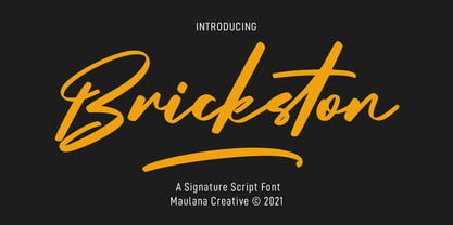 Brickston is a Fancy casual signature script font. With regular contrast stroke, slanted and fun character with a ligatures and extra swash plus a bit lowercase alternates. To give you an extra creative work. Brickston font support multilingual more than 100+ language. This font is good for logo design, Social media, Movie Titles, Books Titles, a short text even a long text letter and good for your secondary text font with sans or serif. Make a stunning work with Brickston font. Cheers, MaulanaCreative