10,000 search results
(0.039 seconds)
- Mieke by Olivetype,
$18.00 Mieke is a dry brush handwritten script font. Very cool if use for posters, logos, headlines, branding, etc. So what’s included : Basic Latin A-Z & a-z Numbers, symbols, and punctuations Ligatures and swashes Accented Characters : ÀÁÂÃÄÅÆÇÈÉÊËÌÍÎÏÑÒÓÔÕÖØŒŠÙÚÛÜŸÝŽàáâãäåæçèéêëìíîïñòóôõöøœšùúûüýÿžß Thank you
 - Toscography by Misprinted Type,
$25.00 Toscography is inspired by vernacular and naive hand-painted walls and signs from Brazil. It feels organic, spontaneous and fresh and it has a light texture on its characters that makes it feel like it is starting to decay.
 - Aulian by Saxofont,
$18.00 Aulian is an arabic font style made in all characters in uppercase, lowercase, multilingual, ligature, numeric and punc.this typeface with artistic style verym terestingt for loads of different projects and promotions, such as logo, poster, catalogs, advertisement needs, packagingdesign.
 - Being Strong by Subectype,
$15.00 Being Strong is a layered script and is inspired by bold, hand-lettered, vintage scripts. It includes OpenType features and additional accented characters, and is great for logotype, posters, badges, book covers, t-shirt designs, packaging and any more.
 - Moderna by Los Andes,
$16.00 Moderna is a sans serif family inspired in simplicity of Modernism. Its contruction neutral and clean has been especially designed for short texts, headlines, logos and branding. With sixteen variants includes unicase version, some alternate characters, arrows and labels.
 - Vanigar Display by Tony Type Studio,
$15.00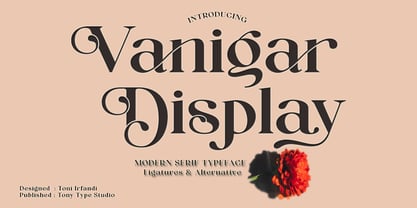 Vanigar Display is a serif font that comes with a very beautiful change character that will bring a touch of luxury and style to your projects. Vanigar Display is perfect for editorial design, branding, headings, logos, magazines and more.
 - Organicon by URW Type Foundry,
$39.99 Organicon is based on the geometric forms used in chemical formulas and tables. It is the best possible font for use in scientific areas because of its handwriting character and excellent legibility. Organicon was designed for the URW++ FontForum.
 - Kompress Pro by RMU,
$35.00 Kompress Pro - a font family of two highly compressed sans serif fonts, regular and shadowed. Both fonts contain West and East European character sets, as well as Cyrillic glyphs. This multilingual font family is well suited for decorative purposes.
 - Engineer by GRIN3 (Nowak),
$15.00 Engineer is a new, completely redesigned and improved version of my font TechnicznaPomoc, which was released for the first time in 2001. Language support includes Western, Central and Eastern European character sets, as well as Baltic and Turkish languages.
 - Zemestro by Monotype,
$29.99 Zemestro from 2003 was one of the first of the new “squarish sans-serifs”. Its designer David Farey says: “There’s nothing calligraphic about it, and there are no defining or identifiable single characters – it’s just clean and simply constructed.”
 - Typesetter JNL by Jeff Levine,
$29.00 Typesetter JNL is based on an old-style 'grotesk' (or 'grotesque') text face popular with printers and rubber stamp makers since the 1800s. The nonconformist character shapes and line widths are reminiscent of hand-cut type of the era.
 - Lemonstyle by ffeeaarr,
$13.00 lemonstyle, we named as a lemon because near of girly name character. girly font name are much similar, so we added and combine including style in one name without space. it's really good for women including cosmetic products & anothers
 - Dreamure by Nexitype,
$18.00 Dreamure is a font designed specifically for reading on online platforms. With the fun and cheerful character of the font, Dreamure also gives you an easy-to-read design. Dreamure will help your work become attractive and user-friendly.
 - Coins Coupes NF by Nick's Fonts,
$10.00 Chamfer, released by Barhart Brothers & Spindler in the late nineteenth century, provided the pattern for this simple, elegant headline face. Both flavors of this font feature the 1252 Latin, 1250 Central European, 1254 Turkish and 1257 Baltic character sets.
 - Magules by HansCo,
$15.00 Magules is a serif typeface with vintage and retro look!. Equipped with all complete characters ranging from uppercase letters, lowercase letters, numbers, punctuation marks and multi-lingual support, this font is ready to be used in any project. Enjoy!
 - Reach by Salamahtype,
$17.00 Introducing our font called “REACH” – display typeface with 12 styles included (Fill-Fill Outline-Stamp-Outline). Perfect for branding projects, logos, labels, logotypes and more. Features: A-Z all caps characters (12 styles) Numbers, Symbols, and Punctuation Multilingual Support
 - Irish Stout BB by Blambot,
$20.00 Created by Blambot’s Nate Piekos for a party invitation, IRISH STOUT has a deep, dark aroma and a creamy, white head. Serve ice cold with a heaping plate of Shepherd's Pie! Comes with a six-pack of European characters.
 - 2010 Outta Space by Morganismi,
$10.00 2010 OuttaSpace is a late space age font with geometric yet organic characters. Ideal for use in posters, cards, invitations etc. 2010 OuttaSpace Icons show you what it's all about in the universe. 2010 OuttaSpace supports West European languages.
 - ALS Fuchsia by Art. Lebedev Studio,
$63.00 Fuchsia is a soft, romantic, and slightly eclectic script. The characters feature wide proportions, high contrast, and backward bends at joints—all ensuring the typeface truly shine in large sizes. Complex capitals look very nice next to lowercase letters.
 - Yodo by The Northern Block,
$12.80 A geometric typeface that combines elegant curves with precise angles. The contemporary nature of this font will compliment a wide variety of graphic design applications. Details include 3 weights, a full character set, manually edited kerning and Euro symbol.
 - Wireline JNL by Jeff Levine,
$29.00 Inspired (in part) by a vintage photo of a storefront neon sign for Cushman’s Furs, Wireline JNL is a thin monoline font with the appearance of bent wire characters. The font is available in both regular and oblique versions.
 - Mariner by Scriptorium,
$24.00Mariner is based on hand lettering originally done by Willy Pogany for his illustrated edition of Coleridge's Rime of the Ancient Mariner. It's a variation of classic medieval lettering with decorative elements and alternative versions of almost every character. - Cape Horn by Palmer Type Company,
$30.00 Cape Horn is a typeface inspired by seafarers who have perished by navigating the treacherous seas surrounding Cape Horn, which is at the southern-most tip of South America. A-Z Numbers Multi-language support Symbols Special Characters Uppercase
 - Gladis by Motokiwo,
$14.00 Gladis is a modern calligraphy font that has thin strokes and wide characters. A super stylish and elegant for branding purpose and also great for romantic projects. Gladis created with passion and designed to be a reflection of beauty.
 - Kiddie Blokz JNL by Jeff Levine,
$29.00Kiddie Blokz JNL is a limited character set font in three styles: Regular, Lined and Block, emulating the look of toy blocks for themes with a juvenile motif. For a companion font to set regular copy, use Roughshod JNL. - Mariana by Letterena Studios,
$9.00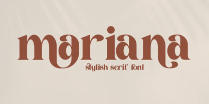 Mariana is a modern and classic serif font with a unique style and beautiful characters. This typeface is perfect for an elegant & luxury logo, book or movie title design, fashion brand, magazine, clothes, lettering, quotes, and so much more.
 - Heraldic Creatures by Gerald Gallo,
$20.00 Many fabulous creatures were created for use on heraldic crests. The Heraldic Creatures font is an assortment of simplified renderings of some of these creatures. There is a total of 47 creatures all located under the normal character keys.
 - Occidental Tourist NF by Nick's Fonts,
$10.00Dave West's eponymous Futura Casual, designed for Photo-Lettering, Inc. in the 1960s, inspired this loosy-goosy take on a classic face. Both versions of the font contain the complete Unicode Latin 1252 and Central European 1250 character sets. - Hip Slop by Ampercamp,
$9.95 Inspired by field research of marker graffiti in the Pearl District of Portland, Oregon, Hip Slop is an urban all-caps typeface with a serendipitous edge. Includes over 60 unique characters to accomodate any message worth defacing property for.
 - Old Fat Boy by Gleb Guralnyk,
$14.00 Hello! Introducing a creative all caps font named Old Fat Boy. It's a vintage shape smooth typeface with authentique 90's style look. This font includes lots of multilingual characters (check out a screenshot with available letters and signs).
 - Monotype Grotesque by Monotype,
$40.99 This updating of Berthold’s Ideal Grotesque was supervised at Monotype in 1926 by F.H. Pierpont. With some of the eccentricities in the borrowed original reduced, this series retains enough character to have become one of the world’s great sanserifs.
 - Second Impression JNL by Jeff Levine,
$29.00Second Impression JNL is the solid version of Lasting Impression JNL by Jeff Levine. It emulates the look of ink-stamped letters and numerals. Based on a 1930s-era set of rubber stamps, there is a limited character set. - Venti CF by Connary Fagen,
$35.00 Venti CF is a geometric font family with a warm, engaging character. Inviting and versatile, Venti's subtle human overtones are well suited to headlines, logos, and short text. Venti includes Latin and Cyrillic scripts across eight weights with obliques.
 - Moving Forward by Crumphand,
$20.00 Introducing, Moving Forward a Slab Serif Font. inspired by vintage and modern letterforms with alternate characters and full symbol sets. Moving Forward can be used for posters, web headers, and display text of all kinds. good kerning and readable.
 - Gentium, a typeface family created by SIL International, is distinguished by its comprehensive approach to typographic representation. Designed by Victor Gaultney, Gentium (which means "of the nation...
- Teimer Std by Suitcase Type Foundry,
$75.00Typographer and graphic designer Pavel Teimer (1935-1970) designed a modern serif roman with italics in 1967. For the drawing of Teimer he found inspiration in the types of Walbaum and Didot, rather than Bodoni. He re-evaluated these archetypes in an individual way, adjusting both height and width proportions and modifying details in the strokes, thus effectively breaking away from the historical models he used as a starting point. Teimer's antiqua has less contrast; the overall construction of the characters is softer and more lively. The proportions of the italics are rather wide, making them stand out by their calm and measured rhythm. This was defined by the purpose of the typeface, as it was to be utilised for two-character matrices. The long serifs are a typical feature noticeable throughout the complete family of fonts. In 1967, a full set of basic glyphs, numerals and diacritics of Teimer's antiqua was submitted to the Czechoslovak Grafotechna type foundry. However, the face was never cast. At the beginning of 2005 we decided to rehabilitate this hidden gem of Czech typography. We used the booklet "Teimer's antiqua - a design of modern type roman and italics", written by Jan Solpera and Kl‡ra Kv’zov‡ in 1992, as a template for digitisation. The specimen contains an elementary set of roman and italics, including numerals and ampersands. After studying the specimen, we decided to make certain adjustments to the construction of the character shapes. We slightly corrected the proportions of the typeface, cut and broadened the serifs, and slightly strengthened the hair strokes. In the upper case we made some significant changes in the end serifs of round strokes in C, G and S, and the J was redrawn from the scratch. The top diagonal arm of the K was made to connect with the vertical stem, while the tail of Q has received a more expressive tail. The stronger hairlines are yet more apparent in the lower case, which is why we needed to further intervene in the construction of the actual character shapes. The drawing of the f is new, with more tension at the top of the character, and the overall shape of the g is better balanced. We also added an ear to the j, and curves in the r have become more fluent. To emphasise the compact character of the family, the lining numerals were thoroughly redrawn, with the finials being replaced by vertical serifs. The original character of the numerals was preserved in the new set of old-style figures. To make the uppercase italics as compact as possible, they were based on the roman cut rather than on the original design. The slope of lowercase italics needed to be harmonised. The actual letter forms are still broader than the characters in the original design, and the changes in construction are more noticeable. The lower case b gained a bottom serif, the f has a more traditional shape as it is no longer constricted by the demands of two-matrice casting, the g was redrawn and is a single storey design now. The serifs on one side of the descenders of the p and q were removed, the r is broader and more open. The construction of s, v, w, x, y, and z is now more compact and better balanced. Because Teimer was designed to make optimal use of the OpenType format, it was deemed necessary to add a significant amount of new glyphs. The present character set of one font comprisess over 780 glyphs, including accented characters for typesetting of common Latin script languages, small caps and a set of ligatures, tabular, proportional, old style and lining, superscript and fraction numerals. It also contains a number of special characters, such as arrows, circles, squares, boxed numerals, and ornaments. Because of its fine and light construction, the original digitised design remained the lightest of the family. Several heavier weights were added, with the family now comprising Light, Light Italic, Medium, Medium Italic, Semibold, Semibold Italic, Bold, and Bold Italic. - Serling Galleria by Mans Greback,
$39.00 Serling Galleria is a classy, classic serif font that exudes an air of fine art and high-end creativity. With its clear, legible letterforms and modernist inventiveness, Serling Galleria brings a touch of strict creativity to your designs, making them stand out in sophistication. This versatile font family is perfect for projects that require a refined, elegant aesthetic. With its variable font feature, you have the flexibility to fine-tune the font to your specific needs and create a truly bespoke typographical experience, or use the pre-defined font styles: Thin, Thin Italic, Extra Light, Extra Light Italic, Light, Light Italic, Regular, Regular Italic, Medium, Medium Italic, SemiBold, SemiBold Italic, Bold, Bold Italic, Extra Bold, Extra Bold Italic, Black, Black Italic The diverse styles in the Serling Galleria font family provide unmatched versatility, allowing you to adapt your typography to various design contexts and moods seamlessly. With this array of weights and styles at your fingertips, you can effortlessly create a visual hierarchy, emphasize key elements, and establish a cohesive, engaging design language across your creative projects. Also includes a variable font! Only one font file, but the file contains multiple styles. Use the sliders in Illustrator, Photoshop or InDesign to manually set any weight and width. This gives you not only the predefined styles, but instead more than a thousand ways to customize the type to the exact look your project requires. Built with advanced OpenType functionality, Serling Galleria ensures top-notch quality and provides you with full control and customizability. It includes stylistic and contextual alternates, ligatures, and other features to make your designs truly unique and tailored to your needs. Serling Galleria offers extensive lingual support, covering all Latin-based languages, from Northern Europe to South Africa, from America to South-East Asia. It contains all the characters and symbols you'll ever need, including all punctuation and numbers.
 - PG Gothique by Paulo Goode,
$30.00 This is my addition to a long line of traditional gothic typefaces. As you can probably tell, PG Gothique is inspired by classics such as Trade Gothic, News Gothic, Franklin Gothic, Alternate Gothic, and Gothic Gothic. Well, maybe not the last one... But Paulo, we have all those already, why would we want to add PG Gothique to our collection? This typeface has many subtle design nuances that differentiates itself from its historical influences. Also, this is possibly the most comprehensive Latin gothic font family released to date. It has 99 fonts that cover pretty much every style you could ever need, and if you do require more, this family is available as a single variable font that covers all the weights and widths in between. PG Gothique is designed to handle a multitude of applications, from branding projects, to titles, body text, user interfaces, and film poster credits. This type family has a style that will suit the purpose. There are 99 fonts in this family, ranging from Thin to Ultra weights across six widths in both roman and italic*. Activate Stylistic Set 1 and you will get the alternate slab serif-style capital “I” that offers improved legibility when placed adjacent to a lowercase “l”. PG Gothique has an extensive character set that covers every Latin European language. If you would prefer PG Gothique as a single variable font, please choose PG Gothique Variable. Test drive PG Gothique today – both the Regular and Italic fonts are offered as a free download. See full details and hi-res examples at https://paulogoode.com/pg-gothique Key features: 9 Weights 6 Widths 99 Fonts Small Caps Old Style Figures European Language Support (Latin) 600+ Glyphs per font *Compressed weights do not include italics.
 - Supernett cn by FaceType,
$19.90 ›Hi! Please note you are visiting Old Supernett. We decided to upgrade it: more styles, more glyphs, more features, more everything! View New Supernett here: Supernett 2019› Georg from FaceType Supernett – a versatile hand drawn/handmade/handwritten font – is tailored for large font sizes but also impresses with an astounding legibility in small typesettings. Supernett is fairly condensed for space-saving headlines. The extensive character set supports Central and Eastern European as well as Western European languages. Each style contains more than 4700 glyphs to let the font look real hand-made. Three OpenType features are specially created to enhance this impression, with a maximum effect when applied to big type: Alternating Letters For a truly hand-drawn look, letters and numerics alternate randomly between three different variants → activate Contextual Alternates Rotating letters All glyphs rotate randomly and slightly around their own axis → activate OpenType Swashes Varying Baseline Shift Each single glyph moves individually up or down → activate OpenType Titling Alternates More OpenType Features: Case Sensitive Forms This feature shifts various punctuation marks to a position that works better with all caps typography → It is deployed when an app’s all-caps styling is applied Slashed Zero The problem with the numeral 0 is that it can look too much like O in some typefaces. This feature replaces every zero with a slashed zero → activate Zero with a Slash Fractions Substitutes figures separated by a slash by proper fraction glyphs. A date however, written like 10/12/2013 will remain unchanged → activate Fractions Stylistic Set 03 Choose between two different styles of bullet (•) → activate Stylistic Set 03 Stylistic Set 04 Choose between two different styles of Y → activate Stylistic Set 04 View other fonts from Georg Herold-Wildfellner: Sofa Serif | Sofa Sans | Mila Script Pro | Pinto | Supernett | Mr Moustache | Aeronaut | Ivory | Weingut
 - Wilke Kursiv by Canada Type,
$24.95 Martin Wilke’s underrated yet influential deco classic from 1932 has both feet firmly planted in the high traditions of Western European calligraphy while carefully and subtly introducing some traits from the sweeping geometric/minimalist vision of the time. In a way, it was one of the representatives of the European anti-type typefaces of that era, when print media was searching for the elusive aesthetic balance between humanism and geometry. This typeface enjoyed some popularity in Germany for a few years, and went on to influence further type designs in Holland and Italy. After the second World War, the black hole that swallowed a big chunk of Europe’s print culture, new influences and technologies overtook the scene, and selective historical emphasis ensued, highlighting some of the era’s designs and overlooking others. Further selective picking in the digital era all but buried Wilke’s body of work - unfairly so, because he was just as important in German type history as Bernhard, Post, Schneidler, Tiemann and Trump. The original metal Wilke Kursiv came in one weight. This digital version goes a long way in expanding on that original offering. Now Wilke’s masterpiece comes in three weights, and with a full Pro treatment including swash caps, small capitals, five types of figures, automatic fractions, and plenty of other OpenType niceties. Each of the Wilke Kursiv Pro fonts comes with over 700 characters, and contains support for most Latin-based languages. Also available are three non-Pro fonts in each weight.