10,000 search results
(0.04 seconds)
- Tropicane by Heyfonts,
$18.00 Tropicane - Stylish Typeface refers to a font that possesses a distinct and attractive aesthetic, often characterized by unique design elements, creative flair, and an overall fashionable or contemporary look. Stylish typefaces are crafted to make a visual impact and are frequently chosen for design projects where the typography plays a crucial role in conveying a specific mood, personality, or brand identity. Here's an in-depth explanation of the characteristics and significance of a stylish typeface: - Distinctive Design Elements: Stylish typefaces stand out due to their distinctive design features. This may include unique letterforms, creative ligatures, elegant serifs, or modern sans-serif shapes. The goal is to create a visually appealing and memorable set of characters. - Contemporary Aesthetic: The term "stylish" implies a modern and fashionable design. Stylish typefaces often incorporate contemporary design trends, keeping up with current aesthetics to ensure that they remain visually relevant and appealing. - Versatility: Stylish typefaces are often versatile, suitable for a variety of design applications. Whether used for branding, editorial design, websites, or marketing materials, these typefaces maintain their stylish appeal across different contexts. - Attention to Detail: A stylish typeface is characterized by meticulous attention to detail. Designers pay close attention to the shapes, proportions, and spacing of individual characters to create a harmonious and visually pleasing overall appearance. - Expressive Characters: Stylish typefaces can convey a sense of expressiveness and personality. This expressiveness can be achieved through unique letter shapes, playful elements, or the incorporation of design features that evoke a particular mood or emotion. Applicability to Branding: Brands often use stylish typefaces to create a distinctive visual identity. A stylish font can contribute to the overall brand image, helping to communicate the brand's values, tone, and style to the target audience. - Innovative Typography: Stylish typefaces are often at the forefront of typographic innovation. They may push the boundaries of traditional letterforms, experimenting with new shapes, styles, and arrangements to create a sense of novelty and creativity. - Readability and Functionality: Despite their emphasis on style, these typefaces generally maintain a balance between visual appeal and readability. Clear and legible letterforms are crucial, ensuring that the text remains accessible while still making a stylish statement. - Adaptability to Trends: Stylish typefaces are often designed with an awareness of design trends. This adaptability allows them to stay relevant over time, making them a popular choice for designers who want their projects to reflect a contemporary and stylish aesthetic. - Customization Options: Some stylish typefaces come with additional features, such as alternative characters, ligatures, or stylistic sets, offering designers the flexibility to customize the appearance of the text for specific design needs. In summary, a stylish typeface is a carefully crafted font that goes beyond mere functionality, aiming to enhance the visual appeal and expressiveness of the text.
 - Brassens by Typorium,
$53.00 Le Typorium présente une nouvelle famille de caractères calligraphiques basés sur une écriture étudiée à travers les manuscrits et autographes de Georges Brassens, poète et musicien (1921-1981). Son tracé, rigoureux et appliqué, souvent minutieux, est à l’image d’une œuvre unique et singulière, immédiatement reconnaissable. Le script Brassens offre des fonctionnalités OpenType telles que des caractères alternatifs pour les majuscules et les minuscules afin de renforcer la fluidité d’une écriture manuelle, des chiffres alternatifs, des fractions et un jeu de caractères accentués étendu pour prendre en charge de nombreuses langues étrangères. Trois graisses ont été créées afin d’offrir une large palette de possibilités graphiques. 60 images d’un poète qui a cassé sa pipe à l’âge de 60 ans., classées en trois séries de vignettes (pictogrammes, symboles, portraits), elles illustrent l’univers imagé et la richesse symbolique de la poésie de Georges Brassens où les représentations mythologiques et allégoriques y tiennent une part importante. Georges Brassens est un poète, auteur-compositeur-interprète né à Sète le 22 octobre 1921, mort à Saint-Gély-du-Fesc le 29 octobre 1981 et enterré au cimetière Le Py de Sète. Auteur de plus de deux cents chansons populaires, il met en musique et interprète ses poèmes en s’accompagnant à la guitare. Outre ses propres textes, il met également en musique des poèmes de François Villon, Victor Hugo, Paul Verlaine, Paul Fort, Antoine Pol, ou encore Louis Aragon. Il reçoit le Grand Prix de Poésie de l’Académie Française e 1967. Un grand nombre d’écoles, salles de spectacle, voies, parcs et jardins portent également son nom, dont à Paris le parc Georges-Brassens, tout proche de l’impasse Florimont où il vécut ses premières années parisiennes, de sa maison de la rue Santos-Dumont et du café Les Sportifs Réunis – Chez Walczak – rue Brancion qui lui inspira « Le Bistrot ». À Sète, l’Espace Georges Brassens ainsi que de nombreux festivals et associations redonnent vie au poète et à son œuvre. The Typorium presents a new calligraphic typeface family based on a writing studied through the manuscripts and autographs of Georges Brassens, poet and musician (1921-1981). Its layout, rigorous and applied, often meticulous, is in the image of a unique and singular work, immediately recognizable. Brassens script offers OpenType features such as alternate characters for upper and lower case to enhance the fluency of handwriting, alternate numbers, fractions and an extended accented character set to support many foreign languages. Three weights have been created to offer a wide range of graphic possibilities. 60 images of a poet who broke his pipe (French expression for passing away) at the age of 60, classified into three series of vignettes (pictograms, symbols, portraits), they illustrate the imagery world and the symbolic richness of Georges Brassens poetry where mythological and allegorical representations hold an important part. Georges Brassens is a poet, singer-songwriter born in Sète on October 22, 1921, died in Saint-Gély-du-Fesc on October 29, 1981 and buried in Le Py cemetery of Sète. Author of more than two hundred popular songs, he sets to music and performs his poems, accompanying himself on the guitar. In addition to his own texts, he also sets to music poems by François Villon, Victor Hugo, Paul Verlaine, Paul Fort, Antoine Pol, or Louis Aragon. He received the Grand Prix of Poetry from the Académie Française in 1967. A large number of schools, theaters, streets, parks and gardens also bear his name, including in Paris the Georges-Brassens park, very close to the impasse Florimont where he lived his first years in Paris, his house in the rue Santos-Dumont and the café Les Sportifs Réunis - Chez Walczak - rue Brancion which inspired "Le Bistrot". In Sète, the Espace Georges Brassens as well as numerous festivals and associations bring the poet and his work back to life.
 - Oxford Street by K-Type,
$20.00 Oxford Street is a signage font that began as a redrawing of the capital letters used for street nameplates in the borough of Westminster in Central London. The nameplates were designed in 1967 by the Design Research Unit using custom lettering based on Adrian Frutiger’s Univers typeface, a curious combination of Univers 69 Bold Ultra Condensed, a weight that doesn’t seem to exist but which would flatten the long curves of glyphs such as O, C and D, and Universe 67 Bold Condensed with its more rounded lobes on glyphs like B, P and R. Letters were then remodelled to improve their use on street signs. Thin strokes like the inner diagonals of M and N were thickened to create a more monolinear alphabet; the high interior apexes were lowered and the wide joins thinned. The crossbar of the A was lowered, the K was made double junction, and the tail of the Q was given a baseline curve. K-Type Oxford Street continues the process of impertinent improvement and includes myriad minor adjustments and several more conspicuous amendments. The stroke junctions of M and N are further narrowed and their interior apexes modified. The middle apex of the W is narrowed and the glyph is a little more condensed. The C and S are drawn more open, terminals slightly shortened. The K-Type font adds a new lowercase which is also made more monolinear so better suited to signage, loosely based on Univers but also taking inspiration from the Transport typeface both in a taller x-height and character formation. The lowercase L has a curled foot, the k is double junctioned to match the uppercase, and terminals of a, c, e, g and s are drawn shorter for openness and clarity. A full repertoire of Latin Extended-A characters features low-rise diacritics that keep congestion to a minimum in multiple lines of text. The font tips the hat to signage history by including stylistic alternates for M, W and w that have the pointed middles of the earlier MOT street sign typeface. Incidentally, Alistair Hall (‘London Street Signs’, Batsford, 2020) notes that when the manufacturer of signs was changed in 2007, Helvetica Bold Condensed was substituted in place of the custom design, “an unfortunate case of an off-the-peg suit replacing a tailored one” and a blunder that has happily since been rectified, though offending nameplates can still be spotted by discerning font fans.
 - Sassoon Handwriting Starter by Sassoon-Williams,
$45.99 Sassoon fonts package for handwriting starters The three upright "infant" fonts developed to meet the demand for letters to produce pupil material for handwriting as well as for reading. Letters have extended ascenders and descenders ideal on screen and print. They facilitate word recognition. The exit strokes link words together visually, also crucially, they space the letters for improved legibility. The "joined" font puts the skills gained into practice producing joined-up handwriting. Together these typefaces provide a valuable resource for Teachers to create consistent material across the curriculum. Sassoon Infant Tracker B font: This font with its direction arrows helps pupils to start in the correct place. Motor movements can be refined by keeping inside the line. When starting and direction is no problem, the arrow font can be dropped and the Dotted font used. Sassoon Infant Dotted B font: Writing over the dots of this font refines motor skills. The aim here is to give confidence by reinforcing starting points, exits and to now encourage fluidity. Sassoon Infant font: With some words in this font and a baseline beneath to copy onto, pupils can use their learned starting points and exit strokes to write freely along the baseline - still unjoined. Once learned, this leads to spontaneous joins along the baseline leading logically to a joined-up hand. Sassoon Joined font: Having learned to write letters with correct starts and exits, this is when the joined font for teaching handwriting can be used. With some words in this font and a baseline beneath to copy onto, pupils can use their learned starting points and simply extend their exit strokes to make joined-up writing. The default joins the font provides are recommended, however there are alternative letterforms that are so important for some Teachers which can be accessed. Create ‘pen lifts’ anytime too! NOTE: Fonts display unjoined by default on this website and are delivered that way - joining is controlled by your text editing application such as Word or TextEdit, read more for instructions… Free to download PDF resources: Stylistic Sets and how to access the alternative letters feature in these OpenType fonts. Using the separate letter fonts Using the joined font Teachers copybooks using these fonts: How to teach pre-cursive Copybook How to teach cursive handwriting Copybook
 - VLNL Bromfiets by VetteLetters,
$30.00 Vette Letters are thrilled to add maverick designer Dirk Uhlenbrock to the family, with the release of VLNL Bromfiets. Bromfiets (the Dutch word for moped) is a ‘holiday child’, the basic idea coming from a stop at a road junction in the Dutch coastal province of Zeeland. The Dutch signage, the black and white rings of traffic light poles, the symbols for brom- and snorfiets have always appealed to Dirk. While on vacation in Zeeland the first scribbles and digital drafts were created, always in mind that the typeface had to be striking, clear and friendly. The end result is more than that, a strong and instantly recognisable font with a matching dingbat weight full of icons and arrows. Stencil fonts have always interested Dirk, the informal character and the possible universal use as a paint- or spray-stencil on a wide variety of surfaces makes this type of font so interesting for me. The technically necessary dissolution of closed font contours always ensures a special aesthetic: What’HAT and HOW MUCH has to be removed or left, in order to make words easy to read and to avoid a fractal impression. Dirk Uhlenbrock has been working as graphic designer and illustrator in his hometown Essen, Germany for over 30 years. Always interested in typedesign he got in contact with Fontographer in 1996 and started to create and distribute loads of free fonts through his online platforms ‘Eyesaw’ and ‘Fontomas’. A bunch of these type experiments have been extented on request to complete fonts. Still located in Essen in 2009 Dirk started his second owner-based business erste liga büro für gestaltung - ersteliga.de
 - Novelty Script by HiH,
$10.00 Novelty Script is a bold dynamic script, sharply delineated, yet fluid. Most of the lower case letters and many of the upper case letters have joins. The typeface was designed by Nicholas J. Werner and Gustave F. Schroeder and patented in March 1893. The original release was by the Central Type Foundry of St. Louis, Missouri. Although a part of ATF from 1892, the Central Type Foundry continued to operate under its own name until 1895. Novelty Script uses our new encoding, as noted in the All_customer_readme.txt. The Euro symbol has been moved to position 128 and the Zcaron/zcaron have been added at positions 142/158 respectively. Otherwise, Novelty Script has our usual idiosyncratic glyph selection, with the German ch/ck instead of braces, Western European accented letters, lower case “o” and “u” with Hungarian umlaut and our usual Hand-in-Hand symbol. But that is not all. With the takeover of the Central Type Foundry by ATF, a group of special characters appeared. All are included in this font, except the “&Co” and the "'s", for a total of nine in all. The “Ch” and “nd” ligatures are especially interesting because of the impact they have on the color and overall appearance of the page. Download the PDF Type Specimen for locations. This is a fun font to use. Its strength is print, where it gives a page a refreshing look. The joins sometimes have difficulty on the screen, in spite of extensive hinting. Playing around with small changes on the point size can pay dividends. Not for the faint-of-heart. Are you up to the challenge?
 - Deadfall by Mofr24,
$11.00 Discover Deadfall, the ultimate horror display font that will send shivers down your spine! What sets Deadfall apart is its unique blend of fear-inducing aesthetics and multilingual capabilities. This Monospace typeface exudes a captivating dripped and splash style, adding an extra layer of terror to your designs. Notably, Deadfall supports the Cyrillic alphabet, making it an ideal choice for a global audience. Deadfall offers both regular and italic variations, granting you even more creative possibilities. Whether you're designing posters, crafting marketing materials, conjuring chilling movie titles, creating Death metal logotypes, or working on Halloween-themed crafts, Deadfall will infuse your projects with a bone-chilling atmosphere. To ensure versatility, consider pairing Deadfall with related font families or other typefaces that complement its macabre charm. Its functional aspects include an extensive character set and special features, making it suitable for a wide range of applications. The design concept behind Deadfall revolves around the idea of capturing the essence of horror. The font's distinctive dripped and splash style adds a sense of chaos and unease to any composition, immersing the viewer in a world of terror. The inclusion of the Cyrillic alphabet reflects our commitment to providing a font that caters to diverse audiences, bringing fear to every corner of the globe. We created Deadfall to meet the demand for a truly spine-tingling font that conveys a sense of horror and foreboding. Whether you're a graphic designer looking to evoke fear or a Halloween enthusiast seeking to amplify the spooky atmosphere, Deadfall is here to unleash terror in your designs. Get ready to embrace the darkness with Deadfall - the ultimate font for all things haunting and macabre!
 - Belgato by Molly Suber Thorpe,
$9.00 Belgato is a vintage-inspired typeface with delicate details. It comes in six weights – plus italics! – for a total of 12 fonts, making it a highly versatile display face. The variable font version allows for ultimateweight and slant customization in print and web. Belgato has Latin, Greek, and Cyrillic alphabets, and supports dozens of languages, making it ideal for multilingual branding, publications, ads, social media, and more! I had so much fun designing this typeface, playing with classic serif letterforms to create an elegant, mid-century modern vibe. Belgato Light is fresh, airy, and delicate – perfect for feminine branding. By contrast, Belgato Black boasts fat curves with thin details, perfectly-suited to bold layouts and retro branding projects. Each Belgato font has 665 glyphs, encompassing: - the Latin alphabet (including hundreds of accented characters) - the Modern Greek alphabet - the Cyrillic alphabet (for Russian, Ukrainian, Bulgarian, and Serbo-Croatian) - discretionary ligatures - stylistic and alternate glyphs - numerals (lining and old style), small figures, and fractions - extensive punctuation, symbols, and diacritical markings Software: No special software is required to use Belgato fonts. You can even use these fonts with Canva! To access Belgato’s variable font features, ligatures, and stylistic alternates, it is best to use software that supports these functions (Adobe programs, Corel Draw, Sketch, etc). Languages: Belgato supports dozens of languages which use the Latin, Greek, and Cyrillic alphabets. Among the most common languages it supports are: English, Bulgarian, Catalan, Croatian, Czech, Danish, Dutch, Filipino, Finnish, Flemish, French, German, Modern Greek, Hungarian, Icelandic, Indonesian, Italian, Luxembourgish, Maltese, Norwegian, Polish, Portuguese, Russian, Serbo-Croatian, Spanish, Swedish, Swiss German, Turkish, and Ukrainian.
 - Ripple - Unknown license

- Cotorra by Letter INC.,
$20.00 Cotorra is a birdie font with a full character set ideal to write feathered messages. Part of the official selection of Tipos Latinos 2016, Latin American Biennale of type design. Published by Letter INC.
 - Art Of Japanese Calligraphy by Okaycat,
$29.95 Art of Japanese Calligraphy is a Kanji font. This is a collaboration with experienced calligrapher, Shigeru Nomura. Developed directly from the hand-written Kanji (Japanese/Chinese Characters). Perfect for anywhere authentic Kanji is needed.
 - Corpus Typewriter by Brent Galloway,
$14.00 Corpus Typewriter is an authentic typewriter font, sampled from a real vintage typewriter. Each letter and number has three alternative characters, giving you a large variety of options to get an authentic, vintage look.
 - Holy Ornaments by Gerald Gallo,
$20.00 Holy Ornaments was inspired by the religious motifs used to embellish altar cloths, crosses, and church vestments in the Middle Ages. There is an assortment of 47 ornaments located under the character set keys.
 - Fair Play JNL by Jeff Levine,
$29.00 Inspired by hand lettering on a 1939 World’s Fair Poster, Fair Play JNL is a bold, condensed design with spurred serifs and some flared characters… and is available in both regular and oblique versions.
 - Black Sweet by madjack.font,
$15.00 Black Sweet is a rocking handwritten script font! This font is perfect for quotes, shirt designs, websites, branding, children's designs, blogs, logos, invitations, and more! Most of the accented characters are included. Thank you!
 - Rocket Wildness by Studio Fat Cat,
$14.00 ROCKET WILDNESS is a minimalist, modern, simplicity and elegant font serif that designed carefully for all industry needs. ROCKET WILDNESS also provided stylistic alternative characters that allowed you to play your typography game freely.
 - Beautiful Things by Brittney Murphy Design,
$8.00 Beautiful Things is a wistful non-connecting script with sweeping ascenders and descenders and natural, flowing lines for an informal, yet elegant look. Contains over 700 glyphs, including foreign Latin characters, alternates and ligatures.
 - Bellamye by Viswell,
$18.00 Introducing Bellamye Modern Calligraphic Font. It looks stunning on wedding invitations, logos, bussines cards and every other design which needs a handwritten touch. Bellamye include : Uppercase & Lowercase Character Numeral & Punctuations Ligature & Alternates Multilingual Support
 - Wisconsin by QUADRAAT,
$35.00 Wisconsin is a complete character set including three stylistic sets in nine weights offering a new singular aesthetic to each. Three differents attitudes in one font, a real typographic weapon. Supports all latin languages
 - Snow Cap by Bitstream,
$29.99Snow Cap from Bitstream is a wintry display face with snow effects dropped onto Jennifer Maestre’s Mister Earl. Released in 1995, the snow was artfully placed onto each character by Bitstream designer Richard Stetler. - XingXungXang by Thinkdust,
$10.00 XingXangXung is a display font designed by Diogo Pisoeiro. Although it only has a limited number of characters, this display face with a unique style will work well for graphic design and display work.
 - Longtime by Sinfa,
$10.00 Longtime is drawn with thick font with a retro style and includes several swash characters. Longtime is suitable for product logos and labels, in cafes, restaurants, magazine titles, business cards, invitations, and product branding.
 - Little Pet by WAP Type,
$10.00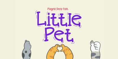 Little Pet is a fun and cute kids handwritten font, perfect for invitations, birth announcements, logo design, stickers, quotes and much more! Features Uppercase and lowercase letters Accented characters Thank you for your interest!
 - Amberlight by Get Studio,
$25.00 Introducing Amberlight Script - a new fresh & modern script with a sweet calligraphy style, decorative characters, and a dancing baseline! So beautiful on invitations like greeting cards, branding materials, business cards, quotes, posters, and more!
 - Alpine Script by Borges Lettering,
$42.00 Get creative with the adventurous brush casual Alpine Script from Charles Borges de Oliveira. This stunning typeface contains 29 alternate characters waiting to be explored. Great for anything from signage to culinary packaging. Enjoy!
 - JH Zoya Cyrillic by JH Fonts,
$49.00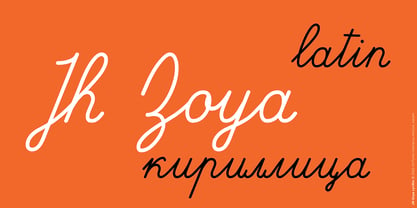 JH Zoya is an advanced Latin and Cyrillic script. It includes over 1500 characters to simulate school handwritten calligraphy. продвинутый кириллический курсивный шрифт. Он включает в себя множество персонажей для имитации школьной рукописной каллиграфии.
 - BDR A3MiK by Typedifferent,
$35.00 The BDR A3MIK is an uppercase alphabet with alternatives including European/Eastern European, Russian Cyrillic, Greek and Japanese Katakana characters. Its strong, constructive, futuristic appearance works perfectly for titling in science fiction related media.
 - Postal JNL by Jeff Levine,
$29.00Postal JNL lets you print out initials, words or phrases emulating postage stamps. Although there's a limited character set, it can be used along with Printing Set JNL to match any additional word copy. - Herralds by Heyfonts,
$13.00 Herralds is a graffiti display font . Herralds is a free-style font that has the characteristics of street art that shows freedom and is filled with unique characters to make your projects stand out.
 - Golddrew by Daldsgh,
$15.00 Golddrew is a handwritten font. A beautiful display font with alternate characters, very suitable for any design purpose like magazines, packaging, branding , website header, posters, greeting cards, letterhead, and many more other creative project.
 - Protocol by Rômulo Gobira,
$11.99 Protocol is an experimental pixelated font, which allows you to easily experiment and to combine it with other typefaces. This version (1.0) comes with 580+ glyphs, multiple language support and some unique emoji characters.
 - Anniversary Seals by Gerald Gallo,
$20.00 Anniversary Seals is composed of a seal design reminiscent of the embossed foil seals used in commemorating company anniversaries. The font contains 100 consecutive characters from the first anniversary through the one-hundredth anniversary.
 - Lambency by Ali Hamidi,
$12.00 Lambency is a modern script font with an elegant and natural touch. Every character comes with an initial tail and an ending tail. This font is perfect for wedding invitations, quotes, branding, logos, etc.
 - Bumbbled by Viswell,
$19.00 Bumbbled is a rounded monoline script featuring 2 styles and is well suited for your design project with a playful and fresh look. Features: Uppercase & Lowercase Characters Numerals & Punctuation Standard Multi-ligual Support Alternates
 - Splinters JNL by Jeff Levine,
$29.00Splinters JNL is a fun, hand-drawn font emulating letters formed from pieces of wood. Use at larger point sizes for best results. Please note: There is no kerning and a limited character set. - Chyletoon by Typotheticals,
$5.00 Chyletoon, a hand crafted cartoon font consisting of 24 styles. Crafted from childish mind, the cartoonish characters of this font are suitable for many uses, the limit being the boundaries of your own imagination.
 - Hyperizo by AbtoCreative,
$15.00 Hyperizo is a futuristic style font in three weights. It's the perfect font for logo, game, packaging, poster, web use, etc. The family contains a set of 231 characters, supporting multilingual and OpenType features.
 - Bomber by Komet & Flicker,
$10.00 Bomber was inspired by the lettering used on the vehicles of the U.S. military. This font works great as an old-school style of athletic lettering. Also included is a fifteen character dingbat set.
 - Omega by Thinkdust,
$10.00 Omega is a display font designed by Diogo Pisoeiro. Although Omega only has a limited number of characters, this display face with a unique style will work well for graphic design and display work.
 - Rodenberg by Zealab Fonts Division,
$18.00 Rodenberg is multipurpose display typeface with cool characters, inspired by urban culture that combine the classic and modern style. It is perfect for headlines, logotypes, signs, posters, greeting card, letterhead, t-shirts and more.
