10,000 search results
(0.097 seconds)
- Skolar PE by Rosetta,
$70.00 Originally developed for academic publishing, Skolar asserts credibility and sustains comfortable reading. It has established itself as a go-to choice for all kinds of scholarly texts, no matter the field or school of thought: it handles the minutiae of linguistic, scientific, and editorial typography with ease. A classic with a twist, Skolar brings a trace of human touch to serious typography. Thanks to this knack for subtlety, it is also successfully used in other genres from branding to children’s literature. Skolar PE has a vast character set that caters to nearly four hundred languages and transliteration systems (Pinyin, IAST/Sanskrit) using Latin, Cyrillic, and Greek (including polytonic). Its larger x-height, robust serifs, low contrast, and its deft italic make it a pleasure to read even at small sizes. With Skolar, footnotes and bibliography become readers’ best friends. The OpenType feature set is engineered for the most rigorous editorial settings. Tabular, proportional, old-style, and lining figures as well as a full set of fractions, ordinals, and scientific superiors and inferiors will stand up to any conjectural challenge. Language-sensitive forms and compound diacritics will handle the demands of many linguistic texts. The companion families Skolar Gujarati, Skolar Devanagari, Skolar Sans PE, and Skolar Sans Arabic expand its typographic and semantic potential even further.
 - Declaration Of Independence by Celebrity Fontz,
$17.99The Signers of the Declaration of Independence font is a collection of all 56 signatures that appeared on America's Declaration of Independence. A must-have for autograph collectors, desktop publishers, lovers of history, or anyone who has ever dreamed of sending a letter, card, or e-mail to a friend or family member "signed" as if by one of the signers of America's Declaration of Independence. This unique font puts every signature on that history-altering document at your fingertips in the form of a high-quality Open Type font. Our fonts behave exactly like any other font on your system and are installed and selected the same way. No special software is needed. Each signature contained in our fonts is mapped to a regular character on your keyboard. Just as with any True Type or Open Type font, you can resize the signature, change its color, etc. Open any Windows application, select the installed font, and type a letter, and you will see the President's signature appear right there on your page where you placed your cursor. Painstaking craftsmanship and an incredible collection of hard-to-find signatures go into this one-of-a-kind font. We're confident you will enjoy it. Please note that this font is intended for entertainment purposes only. - Stern Pro by Canada Type,
$49.95 Originally released in 2008, Stern is the only typeface to be produced and marketed simultaneously in digital and metal. In the twenty-first century, no less. It is also the last typeface Jim Rimmer ever completed. The process he used for its design and manufacture is the stuff of legend, and can be seen in the Richard Kegler documentary, Making Faces: Metal Type in the 21st Century. The design is a delicate upright italic named in memory of Chris Stern, the late artist and printer from Washington State. In 2013, Canada Type remastered and expanded the design's offerings to a glyphset of over 1200 characters, updated programming. Now Stern Pro includes the following features: - Small caps. - Caps-to-small-caps functionality, useful for setting mid-height caps alongside lowercase. - Tall caps. - Historical forms. - A wide variety of alternates for both uppercase and lowercase letters. - Plenty of ligatures. - Seven types of numerals, enclosers, cojoiners and currency symbols. - Automatic fractions. - A complete set of lowercase ordinals, from a to z. - Case-sensitive forms. - Language support for Greek and over 50 Latin languages. 20% of this font's revenues will be donated to the Canada Type Scholarship Fund, supporting higher typography education in Canada.
 - STP Display Cyrillic by Sete Std,
$30.00 Its inspiration comes from the types without serifs, with features ranging from architecture to modernist design products. With generous shapes and counterforms, the type becomes showy wherever it is, masterfully fulfilling the purpose for which it was designed. Initially designed for a signaling project in the Brazilian city of Jaraguá do Sul, Santa Catarina, the STP Display was expanded to include the largest number of characters in the Cyrillic anda Latin alphabet. This helps to find solutions in cases where a large number of languages to communicate something is needed, such as to inform a specific place for a tourist or also a direction to follow for an employee in a company. The STP Display is a modular feature, developed with rounded corners and a design based on geometric elements, ideal for use in large sizes. Forms and counterforms, its main characteristics, bring prominence to any signaling project. The STP Display Cyrillic also has another version, the STP Stencil Cyrillic, and in addition to wayfinding projects, both can be used in architectural projects, advertising, packaging, posters, and others. With a complete Latin alphabet, STP Display Cyrillic covers over 90% of the supported languages, covering the whole American continent, East and West Europe and most of the countries of Africa, Asia and Oceania.
 - Pressato by Resistenza,
$180.00 Pressato Font is a dynamic and innovative typeface meticulously crafted in collaboration with Pressato Coffee Bookshop in Torino. This unique font boasts three axes—weight, width, and slant—providing designers with unparalleled flexibility and control over their typographic compositions. With a total of 12 distinct fonts and a variable option, Pressato Font allows for a rich variety of styles, making it a versatile choice for a myriad of design applications. The font's flexibility in weight enables users to seamlessly transition from bold and impactful headlines to subtle and elegant body text, ensuring a cohesive and visually appealing design. The inclusion of width and slant axes further enhances the adaptability of Pressato Font. Designers can effortlessly customize the width of characters for a condensed or expanded look, while the slant axis adds a dynamic tilt, injecting personality and movement into the typography. Rooted in the aesthetics of Pressato Coffee Bookshop, this font exudes a contemporary and artistic vibe. Its variable nature opens up endless possibilities for creative expression, making it an ideal choice for branding, editorial design, and various other graphic projects. Pressato Font stands as a testament to the seamless integration of form and function, providing a sophisticated and engaging typographic solution for diverse design needs.
 - Baka Expert by Positype,
$25.00 Why Baka Expert? There’s actually a simple answer. The original Baka was done as an experiment of sorts. I wanted to quickly capture a rough, frenetic handwriting style that broke normal conventions. Commercially, it was successful, received some accolades ... but I wasn’t completely satisfied, so I went back to the master art and the lettering explorations and produced Baka Too. This addressed some of the line items I wanted to refine in Baka. I liked it. Each font has been out for a few years now, and I have seen them in use. I’m very critical of my work, and I could still see things—modulations of strokes, angle of the nib, ink swell, and so on—that I wanted to change, refine, and reorder. For me, it is typographic indulgence, but I wanted to take this handwriting ‘font’ and turn it into a robust ‘typeface.’ So I did just that and a bit more by adding back more of my initial flourish concepts; attaining tighter, consistent control of the modulation; optimizing points; adding titling options; and expanding the character language set. Baka and Baka Too had to exist to produce this entirely new re-envisioning of an old friend ... and they all play well together :)
 - K-Block by HiH,
$10.00 K-Block was inspired by a hand-lettered sign by a young lady by the name of Kristina Lee. It captures a light-hearted, youthful feeling and is not intended to be taken too seriously. It was drawn for fun and is fun to use. Its very inconsistency insists on being casual and relaxed. Probably better for a birthday party announcement than a bank letterhead. Can you imagine a Just-For-Fun National Bank? K-Block Solid compliments K-Block and provides a stronger presence when required. For two-color work, K-Block can be layered on top of K-Block Solid to provide a different color outline for a very effective presentation. Full Western European character set plus alternate g and y, as well as a Th ligature. If you have a drawing program like Corel Draw, you can easily convert the alternate g and y to curves and stretch out the tails to underline an entire word. The zip package of each font includes two versions. There is an OTF version which is in Open PS (Post Script Type 1) format and a TTF version which is in Open TT (True Type)format. Use whichever works best for your applications. K-Block and K-Block Solid are sold separately.
 - American Presidents by Celebrity Fontz,
$19.99The American Presidents font is a collection of the signatures of all 44 U.S. Presidents. A must-have for autograph collectors, desktop publishers, lovers of history, or anyone who has ever dreamed of sending a letter, card, or e-mail to a friend or family member “signed” as if by one of America’s Presidents. This unique font puts the signatures of America’s Presidents at your fingertips in the form of a high-quality Open Type font. Our fonts behave exactly like any other font on your system and are installed and selected the same way. No special software is needed. Just as with any True Type or Open Type font, you can resize the signature, change its color, etc. Each signature contained in our fonts is mapped to a regular character on your keyboard. Open any Windows application, select the installed font, and type a letter, and you will see the President’s signature appear right there on your page where you placed your cursor. Painstaking craftsmanship and an incredible collection of hard-to-find signatures go into this one-of-a-kind font. We're confident you will enjoy it. Please note that this font is intended for entertainment purposes only. - STP Display by Sete Std,
$30.00 Its inspiration comes from the types without serifs, with features ranging from architecture to modernist design products. With generous shapes and counterforms, the type becomes showy wherever it is, masterfully fulfilling the purpose for which it was designed. Initially designed for a signaling project in the Brazilian city of Jaraguá do Sul, Santa Catarina, the STP Display was expanded to include the largest number of characters in the Latin alphabet. This helps to find solutions in cases where a large number of languages to communicate something is needed, such as to inform a specific place for a tourist or also a direction to follow for an employee in a company. The STP Display is a modular feature, developed with rounded corners and a design based on geometric elements, ideal for use in large sizes. Forms and counterforms, its main characteristics, bring prominence to any signaling project. The STP Display also has another version, the STP Stencil, and in addition to wayfinding projects, both can be used in architectural projects, advertising, packaging, posters, and others. With a complete Latin alphabet, STP Display covers over 90% of the supported languages, covering the whole American continent, East and West Europe and most of the countries of Africa, Asia and Oceania.
 - Gens De Baton by HiH,
$10.00 Gens De Baton is based on a charming lower case alphabet that appeared in the Almanach des Enfants pour 1886 (Paris 1886) under the heading “Amusing Grammar Lessons.” Gens De Baton means simply “Stick People.” The unknown designer turned the bare letter forms into drawings of people for the enjoyment of the children for whom the almanac was intended. The letter forms themselves were based on the French Romain du Roi (King’s Roman), except for the ‘g’ and the ‘j’ -- which were based on Baskerville. The letters ‘w’ and ‘y’ were not included, as they are seldom seen in French. We have left the letters somewhat rough, as they appeared in the Almanach des Enfants , resisting the temptation to clean up all the lines and render them with digital perfection. We have used our HiH Firmin Didot to supply an upper case and auxiliary characters, as Didot was originally a modified version of Romain du Roi. It is interesting to observe the contrast between the polished look of the Didot upper case and the rough, hand-drawn look of the lower case. Purchasers of this font have our permission to use it for the amusement of adults as well as children. We recommend setting Gens De Baton at 24 points or larger.
 - Quendel by URW Type Foundry,
$39.99 Quendel has been expanded to become Quendel Happy Family. Apart from the new Bold weight for easy distinction and emphasis, there are now four other very exciting variants, rendering different writing tools and writing materials. The basic form of Quendel was written with a Japanese bamboo tip and therefore embodies a form letter of natural flow. The new versions show other features that provide the feel of written scripts. While the styles Wood and Crayon include some alternate characters, Q Marking Pen and Q Fingertip, due to their apparently more complex enacted forms, do not need additional alternates without looking stiff or boring. The wood relief of Quendel Wood was created by a freehand wood relief drawn with oiled chalk. Quendel Marking Pen seems to be written with a felt-tip pen soon depleted. At the same time it is also reminiscent of the blooming effect, which we know from photography. The name of Quendel Fingertip suggests what can be seen - someone seems to have written with the finger in a grainy material. One would like to try it himself. The effect of broken lines which can be gained by writing with chalk as reflected in Quendel Crayon. Almost like parched sandy soil, the writing material seems to crumble.
 - New Age Gothic by Type Innovations,
$39.00 New Age Gothic is an original design by Alex Kaczun. It is a contemporary gothic design based on generous proportions and clean crisp lines. Ideally suited for easy reading and long lines of copy. The concept for the design came from a previously successful font family Contax Pro. Alex felt that the skeleton for Contax Pro was ideally suited to modify the design into a true gothic companion typeface series. Numerous modifications where made to the body proportions, stems and shapes. Serifs where added reminiscent to Copperplate Gothic to solidify the overall design. The result is a truly unique modern gothic font. Unlike other typefaces, New Age Gothic incorporates uniform stems throughout the capitals, lower case and figures. This gives the design a uniform appearance in overall color and strength. There is a perfect visual balance between inter-letter spacing, stem weights and proportions. The large Pro font character set, which supports most Central European and many Eastern European languages, also include small caps to compliment the old style figures. As a result, the design is ideally suited for display copy as well as text composition. In the near future, Alex plans to expand the typeface to include a broad range of weights along with italics.
 - ATF Poster Gothic by ATF Collection,
$59.00 ATF Poster Gothic is an expansion of a typeface designed in 1934 by Morris Fuller Benton for American Type Founders. The one-weight design was a slightly condensed display companion to Benton’s ubiquitous Bank Gothic family. This new family of aggressively rectilinear headline types expands the design’s possibilities, offering 30 fonts. The all-cap design sports square corners in the counters, creating tension between angular and curved details; this feature, and the generally rectangular shape of the whole alphabet, makes ATF Poster Gothic distinctive on the page or screen, while its relationship to Bank Gothic makes it seem somehow familiar. Vertical strokes on the C, G, J, and S, as well as on several of the numerals, are cut off at an angle, which suggest the curves those strokes might typically display if the characters were less boxy in design and more along the lines of late-19th-century headline faces. Certain weights also recall the style of lettering used on athletic team jerseys, television crime dramas, action & adventure movie titles, and engraved stationery. With three widths and five weights, ATF Poster Gothic is distinctive and versatile at the same time. The full family is also available in a “Round” version, with corners subtly rounded for a softer, more “printed” feel.
 - MVB Sirenne by MVB,
$39.00A rare natural history book from the early 18th century served as inspiration for the MVB Sirenne typefaces. The artisan who engraved the book—likely a map engraver—had a distinctive style of lettering that was used on the descriptive captions for the many tropical fishes depicted in the book. The plates used to print the illustrations would have been copper, the letterforms hand-engraved. The designers at MVB Fonts found the distinctive quirks of the roman letterforms and the eccentric stress of the italic interesting enough to embark on developing digital fonts based on the engraved samples. As the captions were hand-lettered, there was a great degree of variation, making a direct “revival” impossible, so Alan Dague-Greene interpreted the characteristics of the letterforms into a workable typeface design. The challenge was to retain a rustic quirkiness to the forms, yet have a typeface that was useful for more than display. The solution was to make optical sizes. The “Six” faces are full of character, but strong and open for clarity at small sizes. The design of the “Text” faces is more subtle, so that they can be used for passages of text, but retain the feel of their model. MVB Sirenne “Eighteen” and “Seventy Two” are intended for display use. - Duepuntozero Pro by Zetafonts,
$39.00 Created as a logo typeface in 2004 by Francesco Canovaro, Duepuntozero is one of Zetafonts classic typefaces. A monolinear sans serif typeface with rounded corners and condensed proportions, strictly based on modular geometric design, it was at first designed in five weights to be used as a condensed companion typeface to the rounded display family Arista. In 2019 the family was completely redesigned by the Zetafonts Team, expanding the original character set to include cyrillic and greek glyphs and adding four extra weights and italics to the original weight range. This restored and revamped version, named Duepuntozero Pro, also includes full Open Type features for positional figures, fractions and Small Caps. With his rounded, minimal aesthetic, Duepuntozero embodies the desire for simplicity and playfulness of contemporary mobile applications, making it a perfect choice for gaming and app interface design. Its compact design allow for maximum space saving on mobile screens when used as a text typeface, while the strictly geometric design and the extreme range of weights (including thin and black) make it excel in display, logo and editorial use. A complementary set of free icons in the same range of weights of the font is provided to help designers build consistent branding through pictograms in infographics, interfaces and editorial products.
 - Ongunkan Younger Futhark by Runic World Tamgacı,
$45.00 The Younger Futhark, also called Scandinavian runes, is a runic alphabet and a reduced form of the Elder Futhark, with only 16 characters, in use from about the 9th century, after a "transitional period" during the 7th and 8th centuries. The reduction, somewhat paradoxically, happened at the same time as phonetic changes that led to a greater number of different phonemes in the spoken language, when Proto-Norse evolved into Old Norse. Also, the writing custom avoided carving the same rune consecutively for the same sound, so the spoken distinction between long and short vowels was lost in writing. Thus, the language included distinct sounds and minimal pairs that were written the same. The Younger Futhark is divided into long-branch (Danish) and short-twig (Swedish and Norwegian) runes; in the 10th century, it was further expanded by the "Hälsinge Runes" or staveless runes. The lifetime of the Younger Futhark corresponds roughly to the Viking Age. Their use declined after the Christianization of Scandinavia; most writing in Scandinavia from the 12th century was in the Latin alphabet, but the runic scripts survived in marginal use in the form of the medieval runes (in use ca. 1100–1500) and the Latinised Dalecarlian runes (ca. 1500–1910)
 - Lost and Foundry by Fontsmith,
$15.00 Breaking the cycle of homelessness We are partnered with The House of St. Barnabas, a private members club in Soho Square, whose work as a not for profit charity aims to break the cycle of homelessness in London. Each purchase (of the family pack) comes with a one month membership to The House and 100% of the proceeds from sales of fonts go directly to the charity to help their essential work. This unique collection of 7 typefaces is based on the disappearing signs of Soho, at risk of being lost forever due to the ever changing landscape of the area. By re-imaging the signage as complete fonts, we have rescued this rich visual history from the streets and present the typefaces into a contemporary context for a bright optimistic future. FS Berwick Thanks to its humble tiled origins, this Egyptian serif type maintains a uniform character width, creating the irregular letter proportions found in the final alphabet. Broad-shouldered, the bracketed serifs firmly ground the font, whilst its extreme hairlines become a necessity due to the uniform width. Of note is the upside down ‘S’, to be found on the original sign on Berwick Street. Perhaps due to its ceramic origins, there is a surprising ‘slippiness’ to its final appearance. FS Cattle Cattle & Son is best described as a wide, but not overly extended, grotesque-style sans serif, showing a uniform width and carrying a robust strength to its form. Whilst lightly functional overall, the purposeful diagonal legs of the ‘K’, ‘R’ and the tail of the ‘Q’ add an urgency to its appearance. The reduced size of the ampersand gives away Cattle & Son’s hand-painted origins, and the oblique compacted ‘LTD’ found on the original sign is also included in the final set. This beautiful sign is tucked away under an arch in Portland Mews, sheltering from the weather. Perhaps this is why it has lasted so long. FS Century This somewhat elongated set of Roman capitals was originally rendered in paint circa 1940, but its roots trace back to the Trajan Column in Rome. Witness the slightly unbalanced ‘W’ and the painter’s hand is revealed. Century’s flared serif style is extremely short, sharp and bracketed. The ‘M’ is splayed and has no top serifs. Century has a uniform appearance of width, probably due to its sign-written origins. Yet is elegant, classic and exudes sophistication. FS Charity A true Tuscan letterform, the original is located on The House of St. Barnabas in ceramic tiles and was revealed in all its broken glory in 2014. FS Charity retains the option of using these incorrect characters (try typing lowercase in the test drive above and compare with the more uniform uppercase characters). FS Charity features fishtailed terminals on its strokes, a curious branched ‘T’ and the ‘S’ displays tear-drop ends to its serifs. Almost uniform in width, the ‘A’, ‘M’ and ‘W’ are the widest characters in this set. FS Marlborough The elongated Marlborough features diagonal terminals to some characters and numerals. Also retained is the space-saving contracted ‘T’ glyph from the original sign, while the ‘R’ features a distinctive wedge-shaped leg. Highly individual in this form, similar signage appears around Soho, but featuring a variety of widths in their design. FS Portland The sister type to Cattle & Son, Portland is oblique rather than italic. The serifs are not overly long, yet still enhance its rather rigid cap height and baseline appearance. Its ‘A’ has a top serif, the ‘M’ is square and the ‘G’ foregoes any spur. Particularly delightful is the open ampersand. Numerals align to encourage the horizontal flavour of the oblique style. Overall, Portland is both confident and graceful. FS St James A lineal Continental style, St James also displays a true sense of ‘Londoness’ in its titling form, perhaps influenced by early Underground signage. Irregular letterforms display a continental flavour, particularly evident in its Deco style ‘W’, ampersand and numerals. The rather high cross bar in the ‘A’ is also reflected in the raised middle strokes of the ‘M’. Noteworthy are the distinctive unions found on all of the characters and the additional small caps. The original lettering is still located on Greek St.
 - Levato by Linotype,
$29.99 Levato, the first font designed by Felix Bonge, is an Antiqua that is full of character and is refined but by no means sterile. This typeface provides for a wide range of options for creating individual designs. It was not really Felix Bonge's intention to create a whole font family when, as a second year student, he began several exercises in contrast and proportion as part of the typeface design course of Professor Veljovi? at Hamburg University of Applied Sciences. However, these initial studies developed into a project that Bonge persisted with over the following years while working towards his degree. He continually had new insights and ideas that he was able to exploit for his font. Of particular importance, he claims, was a calligraphy seminar, which prompted him to completely rework his concept. It took him several years before his extensive font Levato™ was ready. Although the forms of Levato are ultimately derived from Renaissance Antiqua, Bonge has slightly increased the relative contrast in his version. This gives the font a graceful appearance that is further emphasized by the reduced x-height and the associated prominence of the ascenders. And, in addition, the relatively fine serifs, which are almost linear at their ends, infuse Levato with a hint of classical Antiqua á la Bodoni. At the same time, Bonge cleverly compensates for the sterilising tendency of this font form. Soft and rounded serif attachments and rounded line apexes offset the severe nature of the font and provide it with an aura of vivacity. This effect is promoted by the calligraphic-like foot of the lowercase h, n and m and the not quite horizontal bars of the uppercase E and F. Overall, Bonge has succeeded in creating a refined and yet very dynamic typeface. Levato is available in five weights; Light, Regular, Medium, Bold and Black, in each case with the corresponding italic versions. Bonge treats Levato Italic as a genuine cursive typeface. Its letters are thus slightly narrower than the analogous upright letters and their forms are considerably more curvilinear. All the versions of Levato boast an enormous range of characters to meet all possible requirements. In addition to four sets of minuscule and majuscule numerals for tabular and proportional typesetting, there are also small caps, numerous ligatures, ornamental characters and even swash variants of letters. With their generous, sweeping curves, the swash variants (available as OpenType versions) can be used for striking titling effects or as initials.
 - Anger & Wrath by Omaikraf Studio,
$10.00 Introducing "Anger Style": Unleash the Power of Emotion Are you ready to harness the raw energy of emotions and bring them to life in your designs? Look no further than "Anger Style," an electrifying and dynamic font that will leave a lasting impact on your audience. Designed by our team of expert font designers, "Anger Style" is a captivating blend of intensity, power, and expressiveness. Possible Design Uses: "Anger Style" is a font that excels in making a bold statement. Its commanding presence and fiery nature make it perfect for various design applications, including: Headlines and Titles: Grab your audience's attention and make a lasting impression with powerful headlines that demand to be noticed. Logos and Branding: Infuse your brand identity with passion and intensity, creating a memorable and distinct visual presence. Posters and Flyers: Advertise events, concerts, or special promotions with eye-catching designs that embody rebelliousness and energy. Book Covers: Create striking covers that captivate readers and convey the emotional depth of your story or message. Apparel and Merchandise: Add an edgy touch to your clothing designs, making a statement that resonates with your target audience. Unique Qualities: What sets "Anger Style" apart from other fonts is its ability to evoke a wide range of emotions, not just anger. It transcends its name, allowing you to express passion, determination, and rebellion through your designs. Its versatility lies in its bold strokes and sharp edges, which convey a sense of intensity and power. By choosing "Anger Style," you gain access to a font that embodies the very essence of raw human emotion. Font Pairing: "Anger Style" pairs exceptionally well with other fonts that complement its intensity and create harmonious combinations. Consider combining it with: "Bold Sans Serifs": The clean lines and strong presence of a bold sans serif font can enhance the impact of "Anger Style," creating a balanced and eye-catching composition. "Elegant Script Fonts": To add a touch of contrast and sophistication, pairing "Anger Style" with an elegant script font can create a visually engaging and dynamic design. Functional Aspects: "Anger Style" offers a range of functional aspects designed to enhance your creative possibilities: Styles: "Anger Style" is available in bold and regular styles, allowing you to emphasize different levels of intensity within your designs. Character Sets: The font includes an extensive character set, covering uppercase and lowercase letters, numbers, punctuation marks, and special characters. This ensures versatility and legibility across various design projects. Special Features: "Anger Style" includes stylistic alternates and ligatures, providing you with additional design options and allowing you to create a truly customized and unique look.
 - Bentto by Twinletter,
$12.00 Our sans serif font, Named Bentto. This simple, dynamic and exotic themed font has a character that is suitable for you to use in formal and informal design themes, both feminine and masculine design characters. this font will look beautiful. This font is very suitable as text with displays for various kinds of branding, advertisements, posters, banners, packaging, news headlines, magazines, websites, logo design, banners, social media design and of course you can use a lot more.
 - Cremotic by Gatype,
$14.00 Cremotic Sans is stylish with extreme cuts, sharp angles, and interactive straps. Affected characters are spread across three capital-only subfamilies, with distinct styles, and distinct personalities. The bold separation of characters and the considered standard of ligature create a type that is solid, modern, and attractive. Cremotic is a modern fashion serif font, each letter has been carefully crafted to make your text look unique. Don't hesitate to send me a message if you have any questions!
 - Rocking the Kasbah NF by Nick's Fonts,
$10.00This lively script is based on a handlettered offering from The Hunt Brothers, which they called simply "Ornamental Italic". Ornamental, yes, but there’s also a lot of action and attitude in this typeface. Please note that, due to the extreme slant of the characters, spacing in the font has been optimized for upper- and lowercase use. Both versions of this font contain complete Unicode 1252 (Latin) and Unicode 1250 (Central European) character sets, with localization for Romanian and Moldovan. - Bullterrier by Beewest Studio,
$10.00 Bullterrier is a bold type of font that has a unique character than other bold fonts, Bullterrier has a strong but soft character, with an elegant and fresh theme, Bullterrier is provide your something different unique bold font . Its weight excels in logos, posters, social media, magazine titles, clothing, large print formats – and anywhere you want to see it. Inspired by the design styles that are currently popular, let’s make your imagination come true with Bullterrier.
 - Restflaws by Maulana Creative,
$14.00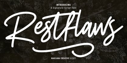 Restflaws is a casual script font. With medium mono-line stroke, fun character with a bit of ligatures and alternate characters. To give you an extra creative work. Restflaws font support multilingual more than 100+ language. This font is good for logo design, Social media, Movie Titles, Books Titles, a short text even a long text letter and good for your secondary text font with sans or serif. Make a stunning work with Restflaws font. Cheers, MaulanaCreative
 - Plastikcycle by Maulana Creative,
$12.00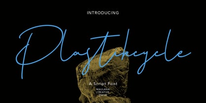 Plastikcycle is casual script font, with clean regular contrast stroke, slanted and fun character. It has Opentype features ligatures of character and alternates lowercases, To give you an extra creative work. Plastikcycle font support multilingual more than 100+ language. This font is good for logo design, Social media, Movie Titles, Books Titles, a short text even a long text letter and good for your secondary text font with sans or serif. Make a stunning work with Plastikcycle font.
 - Girlfinest by Maulana Creative,
$12.00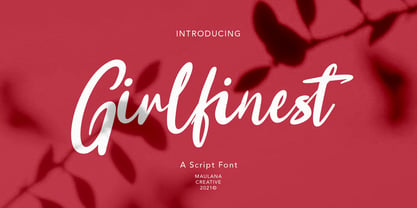 Girlfinest is casual script font, with clean bold stroke, slanted and fun character. It has Opentype features ligatures of character, To give you an extra creative work. Girlfinest font support multilingual more than 100+ language. This font is good for logo design, Social media, Movie Titles, Books Titles, a short text even a long text letter and good for your secondary text font with sans or serif. Make a stunning work with Girlfinest font. Cheers, MaulanaCreative
 - Rain Lily by SavoringSurprises,
$10.00 Rain Lily is a hand lettered sans-serif font. The monoline font is cute, simple, and could be used for any project! - Contains over 200 accented characters for language support. Some of the languages supported are: English, Spanish, Portuguese, German, Italian, French, Polish, Catalan, Irish, Norwegian, Croatian, Gaelic, and more! If you would like to know if a certain language is supported, please contact me with the language and/or any special characters you wanted to know about.
 - Dailytrust by Maulana Creative,
$14.00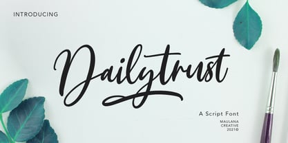 Dailytrust is casual signature font, with feminine thin stroke, super slanted and fun character. It has Opentype features ligatures of character, To give you an extra creative work. Dailytrust font support multilingual more than 100+ language. This font is good for logo design, Social media, Movie Titles, Books Titles, a short text even a long text letter and good for your secondary text font with sans or serif. Make a stunning work with Dailytrust font. Cheers, MaulanaCreative
 - Gliteri by Sensatype Studio,
$15.00 A Modern Elegant Luxury font that we created special for elegant branding needs, with unique shape will be ready to add value of your brand. It so nice to leverage designer or product owner that need solutions to make their design look more stylish and modern. Gliteri Modern Elegant Luxury font ready with: Unique Classy Characters Preview as a inspirations that you can do with Gliteri font Ready with Lowercase and Uppercase characters Wish you enjoy our font. :)
 - Screwged by Ingrimayne Type,
$14.95 Screwged is a letterbat font in which letters are made of screwdrivers and screws. It is caps only, but the characters on the lower-case keys differ from those on the upper-case keys. It contains a large set of accented characters. It is not often that one needs a typeface made of screws and screwdrivers, but if one does, there is a font for that. For related, tool-based typefaces, see WrenchedLetters, NailsNStaples, and Hammered.
 - Bloomshine by Maulana Creative,
$11.00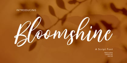 Bloomshine is casual script font, with feminine touch contrast stroke, slanted and fun character. It has Opentype features ligatures of character, To give you an extra creative work. Bloomshine font support multilingual more than 100+ language. This font is good for logo design, Social media, Movie Titles, Books Titles, a short text even a long text letter and good for your secondary text font with sans or serif. Make a stunning work with Bloomshine font. Cheers, MaulanaCreative
 - Mustang by Linotype,
$29.99German Designer Klaus Sutter digitized Mustang, a brush script typeface from the 1950s originally drawn by Imre Reiner (1900-1987) and published in 1956 by D. Stempel AG. Mustang is a right slanted brush type drawn with simple and strong strokes. It has a dynamic character, and could be perfectly applied for emphasis in headlines. Mustang has the character of Imre Reiner's handriting. Imre Reiner was a prominent book illustrator, painter, and typographer during the 1950s. - Galina by Sensatype Studio,
$15.00 A Unique Display Logo Font that we created special for Beauty and Modern branding needs that will give you more elegant look. And specially for this font, We prepared any alternate characters to help you create unlimited variations for your creative needs. Galina Display Logo font ready with: Any options to get creative variations (combination of Alternates) Preview as a inspirations that you can do with Galina font Ready with Lowercase and Uppercase characters Wish you enjoy our font. :)
 - Zholud's Modern Ghotic by Vladzh,
$30.00The first ideas about creation this font appeared in spring 2005. I took gothic fonts and a technique of feather as the base and create something unusual. Zholud's Modern Ghotic font has only A-Z, a-z, 0-9 and . , : ; ' " ! ? - characters. I recommed you to use this font in headers. It looks better if you'll start each word with Caps. Please use an application that supports kerning in order to display the spaces between characters correctly. - Jugenstil Kunsthand by Scriptorium,
$12.00Jugendstil Kunsthand is based on a sample of late 19th century lettering in a style often associated with artists of the Jugendstil Art Nouveau movement in Germany. The characters are done in heavy outline with a rough-hand drawn look. The style is interesting because it shows the influence of the Arts and Crafts movement on Art Nouveau with many of the characters featuring alternate versions that nest together in a manner typical of Arts & Crafts lettering. - Emitensy script by Maulana Creative,
$11.00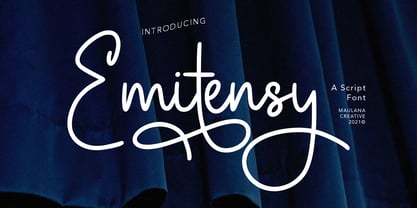 Emitensy script is a handwritten script font With some flourist, clean and fun character. It has Opentype features of ligatures character, To give you an extra creative work. Emitensy script font support multilingual more than 100+ language. This font is good for logo design, Social media, Movie Titles, Books Titles, a short text even a long text letter and good for your secondary text font with sans or serif. Make a stunning work with Emitensy script font. Cheers, MaulanaCreative
 - Sonora by profonts,
$51.99 Sonora is a brandnew profonts script typeface family supplied in the new OpenType Pro font format. Sonora contains six styles as light, medium, bold and the corresponding italics. The character set covers about 1.500 glyphs for the complete Latin character set (West, East, Baltic, Turkish, Romanian), and a huge number of handmade ligatures and alternates to make it a perfect OpenType Pro connecting script. Sonora is a very distinguished, elegant and versatile, intentionally non-slanted script font.
 - QARVIC by Alit Design,
$12.00 Introducing QARVIC TYPEFACE, a simple and beautiful font made with persistence and passion. QARVIC has a unique character when compared with the others sans serif font, it has two types of letters (plain type and type grunge) and there also has an outline QARVIC icon characters. QARVIC typeface is suitable for simple logo design, website header, wedding design, badges, menu fonts for website, to design fashion and others that have a minimalist and simple concept. Thank you and enjoy :)
 - Valentine by profonts,
$51.99 Valentine is another brand-new profonts script typeface family with versions in light, light italic, medium and medium italic, supplied in the new OpenType Pro font format. Valentine contains about 1.100 glyphs for every weight, covering the complete Latin character set (West, East, Baltic, Turkish, Romanian), and a huge number of handmade ligatures, character combinations and alternates to make it a perfect OpenType Pro connecting script. Valentine is a very distinguished, elegant and versatile script font.
 - Berrylina by Amarlettering,
$20.00 Berrylina Script come with 320+ glyphs. The alternative characters were divided into several OpenType features such as Swash, Stylistic Sets, Stylistic Alternates, Contextual Alternates. The OpenType features can be accessed by using Open Type savvy programs such as Adobe Illustrator, Adobe InDesign, Adobe Photoshop Corel Draw X version, And Microsoft Word. And this Font has given PUA unicode (specially coded fonts) so that all the alternate characters can easily be accessed in full by a craftsman or designer.