10,000 search results
(0.038 seconds)
- Slender by Gerald Gallo,
$20.00 Slender is a sans serif contemporary font with each character having a horizontal connecting bar before and after.
 - Aqua Lagoon by Patria Ari,
$15.00 Aqua Lagoon is a strong and sharp script typeface with alternative characters that inspired from beach and lagoon.
 - Rainmaker by Coniglio Type,
$9.00A stencil font you won't find anywhere else of limited glyph characters at the rock bottom price. Enjoy! - Pimba by BRtype,
$24.90 Pimba is an original font. All characters were designed from handmade rubber stamps and printed with much ink.
 - StamPete by JOEBOB graphics,
$9.00 A font made with a children’s stamp set using too little ink. Not a complete set of characters. %
 - Tiger Wong by Epiclinez,
$18.00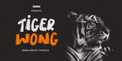 Tiger Wong is a display brush font with a very strong character. Suitable for headlines, posters, and apparel.
 - Nubrix Grotesk by Ensor Creative,
$19.99 Nubrix Grotesk is a condensed geometric sans full of curves, character & charm. Perfect for big statements and impact!
 - Ramolina Script by Mega Type,
$14.00 Ramolina Script is an elegant calligraphy script font that comes with lovely alternates character. a mixture of from copperplate calligraphy with handlettering style. Designed to convey style elegance. Ramolina is attractive like a smooth, elegant, clean, feminine, sensual, glamorous, simple and highly legible typeface. Its classic style is perfect to be applied in any type of formal pieces such invitations, labels, certificate, menus, Logos, fashion, make up, stationery, letterpress, romantic novels, magazines, books, greeting / wedding cards, packaging, badges etc. Ramolina Script features 400+ glyphs and 200+ alternative characters. including multiple language support. With OpenType features with stylistic alternates, ligatures and swash characters, that allows you to mix and match pairs of letters to fit your design. To enable the OpenType Stylistic alternates, you need a program that supports OpenType features such as Adobe Illustrator CS, Adobe Indesign & CorelDraw X6-X7, Microsoft Word 2010 or later versions. (Windows), Font Book (Mac) or a software program such as PopChar (for Windows and Mac). How to access all alternative characters using Adobe Illustrator: https://www.youtube.com/watch?v=XzwjMkbB-wQ How to use stylistic sets fonts in Microsoft Word 2010 or later versions: https://www.youtube.com/watch?v=NVJlZQ3EZU0 There are additional ways to access alternates / swashes, using the Character Map (Windows), Nexus Font (Windows) Font Book (Mac) or a software program such as PopChar (for Windows and Mac). How to access all the alternative characters, using the Windows Character Map with Photoshop: https://www.youtube.com/watch?v=Go9vacoYmBw If you need help or advice, please contact me by e-mail "megatype04@gmail.com" Thank you for your purchase & Happy Designing!
 - La Luxes by Set Sail Studios,
$22.00 Indulge yourself in a luxurious typography pairing with La Luxes; a classic font duo consisting of an elegant Script & ligature-rich Serif. These fonts are designed to pair harmoniously, and lend themselves to high end branding, logo designs, product packaging & invitation designs. Here’s a run through the fonts in more detail; 1. La Luxes Script • A clean, elegant hand-drawn script font containing upper & lowercase characters, all punctuation and numerals. Also contains 30 ligatures to help the text flow naturally and add a custom-made feel. 2. La Luxes Serif • A stylish & modern all-caps serif containing upper & new lowercase characters, all punctuation & numerals. Also contains 38 ligatures and 11 special characters giving you a variety of layout options. Using Ligatures and Special Characters; Both fonts contain a large range of ligatures (unique double-letter pairings) to provide you with more customisation options; Most programs will automatically have Standard Ligatures switched on for you, if not you will need to enable this OpenType feature. The Serif font contains a number of raised ‘small caps’ (A, E, O, U, C) and characters with elongated tails (L, K, R,). These can be accessed by switching on ‘Stylistic Alternates’ in any OpenType capable software and typing these characters. The star icon can be accessed simply by typing the asterisk key (*) with the Serif font. All Ligatures and Special Characters can also be accessed via a Glyphs panel. This is available on most Adobe software & Affinity Designer. The stylised vertical ‘AND’ and ‘CO’ icons can only be accessed this way. Language Support; Both fonts support English, French, Italian, Spanish, Portuguese, German, Swedish, Norwegian, Danish, Dutch, Finnish, Indonesian, Malay, Hungarian, Polish, Turkish, Slovenian
 - Renner Antiqua by Linotype,
$29.99First published in 1939 by Stempel, Renner Antiqua is a classic serif text typeface. Designed by Paul Renner, the father of Futura, this design stands out as strikingly different from his other designs. The letterforms are relatively compact and space saving and the strokes have a strong contrast to look as if made by a pen. This design is extremely distinctive and individualized, but without being overly distracting. Notice many of the small details such as the serifs on the uppercase C, E, and L and the bar at the top of the uppercase A. Also observe the special curve in the bowl of the lowercase b, the dot of the i, and the tail of the y. This design is wonderful for extended amounts of text at 10pt, but the subtle details will be fully appreciated when used larger for titles and display settings. - Feisty by Fauzistudio,
$20.00 Feisty (2020) is a straight script bold using magic OpenType automatically at mimic real hand lettering. Use it for magazine, fashion, invitations, greeting cards, bussines card, logo, t-shirt, web banner, book cover, campaign and watermark photography. Feature Presents an advanced OpenType to automatically choose the appropriate letter shape as you type based on whether the letter appears at the beginning, middle or end of a word. The width of the bar in the lowercase "t" can be changed as desired. Has two different styles of caps: Normal caps, which are the same style as the lowercase; and a type of Comic font, plain caps for setting acronyms, roman numerals or any other case that calls for all caps. With extended language support for most Latin-based Western and Central European languages. Automatic all fractions. *Requires an application with support for OpenType advanced typography, such as Adobe Creative Suite and QuarkXPress.
 - Bologna by David Turner,
$35.00 Inspired by pointed pen calligraphy and modulated sans serif typefaces used for advertising in the 1920´s, Bologna is a high contrasted sans serif with a modern and fashionable look. Bologna comes in three weights: Regular, Bold and Black. The Regular and Bold weights are, despite of their high contrast, also build for body texts. Whereas Bologna Black, with a more expressive look and sharp angles, is specially designed for large and striking headlines, packaging or identities. Overview: 3 weights - Regular, Bold, Black Regular/Bold: 657 Glyphs Black: 871 Glyphs Lining, tabular and old style figures Ligatures: fl, fi, ff, ffi ffl, Unicase Letters: a, e, m, n, r Alternative Guillemets Case Sensitive Arrows Bologna Black: hairline accents and interpunctations Fractions Extended Language Support Stylistic Sets: ss01 = Alternative Guillemets / Alternative y ss02 = Unicase glyphs ss03 = Numerals in circle ss04 = Numerals in black circle ss05 = Hairline Accents and Interpunctations (Bologna Black)
 - Vesta by Linotype,
$29.99 In the late 1990s Gerard Unger won the assignment to design the signage system for the Holy Year celebrations to be held in Rome in 2000. The system he developed in cooperation with the design agency n|p|k used a classically inspired serif typeface, but the earlier proposals included a sans-serif, which became Vesta (2001). Vesta is a versatile family that can be used as a display face alongside Unger's serif faces Gulliver, Capitolium or Coranto; it can also be used on its own, even in longer texts. Vesta is narrower and therefore more economical than some commonly used sans serifs such as Arial and Helvetica; there is also a noticeable contrast between thick and thin parts, which makes it more lively. Vesta is to be extended with narrow versions, small capitals and old style numerals, along with some special versions for headlines.
 - Vtg Stencil US No. 4 by astype,
$18.00 The Vtg Stencil fonts from astype are based on real world stencils from several countries. The US No. 4 design was derived from a typical antique US-American stencil-plate. This revolving stencil-plate was invented by Eugene L. Tarbox and patented in 1868. It was a mass factored product and a very common tool in the United States until the success of the interlocking stencils. In case of US No. 4 an original early stencil plate from New York Stencil Works was used. The Regular font style is a clean font design featuring an extended Latin glyph set including some typical stencil ornaments and tabular figures. The Paint font style is made from true stenciled letters and features all the letters of the stencil-plate only. If you like the later interlocking design have a look to my Vtg Stencil US No.2 font. More info: pdf specimen
 - Chella Lyfe by Chella Lyfe,
$25.00 Features: Chella Lyfe Print: Uppercase letters, numbers, & extended punctuation We Offer Non-English support for the international designer as well Same stroke thickness with each font, so you don't need to make any time-consuming adjustments to get it looking right! This is such a fun new display font, perfect for creating quotes, logos, or just adding a hand-written touch to any project! While other fonts usually take some size adjusting to look just right, The ChellaLyfe variations in stroke thickness for upper and lower case fonts, so you can so it can display creativity and life in every stroke! Each font also has alternates for each letter, so when you type uppercase or lowercase for each font, the letters will change slightly. For example, tying in all caps with the Script font will connect each letter, whereas typing all lowercase will disconnect each letter.
 - Octagen Condensed by deFharo,
$11.00 Octagen is a family of 16 condensed Sans Serif fonts of geometric construction and neo-Gothic style with short descenders and a humanistic finish in the curves and auctions of the tiny letters to avoid the coldness of the grotesque typographies, providing expressiveness, energy, warmth and docility , resulting in a friendly typography with a lot of personality and readability, specially drawn for the composition of short and medium texts, signage or headlines where horizontal space saving is needed. The typography has 529 glyphs (Latin Extended-A) with advanced OpenType functions, several number games, a complete set of neutral-style alternative lower case letters and the Bitcoin symbol. For Octagen cursive styles I used a set of lowercase letters without terminal finishes, more neutral than the regular versions, this being compensated by the expressiveness of the italics inclination, thus achieving important morphological, coherent differences within the conceptual development of this typographic family.
 - Mottle by NONBook,
$8.99 Mottle is a strong, chiseled typeface made to help you stand out from the crowd. Gnarled after patterns found in nature such as marble, tree bark, and the brindled coats of animals, Mottle exudes a unique, natural, yet man made look. Great for display use such as logos, movie and album covers, and signage, Mottle gives off a feeling that is old yet new, gothic yet modern. Mottle supports over 30 languages, featuring over 400 glyphs and 500 OpenType kerning pairs. The Dollar, Euro, Yen, and Pound symbols are included, as well as Extended Diagonal Fractions support, and the Estimated Symbol. Language support for Basic Latin English, Western European Diacritics, Afrikaans, Basque, Breton, Catalan, Croatian, Czech, Danish, Dutch, English, Estonian, Finnish, French, Gaelic, German, Hungarian, Icelandic, Indonesian, Irish, Italian, Latvian, Lithuanian, Norwegian, Polish, Portuguese, Romanian, Saami (Southern), Serbian, Slovak, Slovenian, Spanish, Swahili, Swedish, and Turkish.
 - Ganges Slab by ROHH,
$40.00 Ganges Slab is a condensed slab serif typeface inspired by Central European advertising typography from late XIX century. It is a perfect match for Ganges Sans. The font has condensed proportions and original letter shapes. Ganges is designed mainly for editorial design, especially for display use, as well as short paragraphs of text. Its narrow proportion makes it very practical to use for posters and magazine covers. Characteristic letter forms fit great for branding, logo and packaging design. It is also a very interesting choice for websites and e-book headlines. Ganges Slab family consist of 27 fonts - 9 weight, 9 italics and 9 obliques. It supports extended set of latin languages, as well as broad number of OpenType features, such as case sensitive forms, standard and dicretionary ligatures, stylistic alternates, contextual alternates, lining, oldstyle and tabular figures, slashed zero, fractions, superscript and subscript, ordinals, currencies and symbols.
 - ST Gaidar by ShimanovTypes,
$9.00 The font "Gaidar" named in the honour of Arkady Gaidar. He was a Soviet writer, whose stories were very popular among Soviet children, and a Red Army commander. He died in combat fighting with German nazis in 1941. Few generations of Soviet kids are raised on his books and a number of films were made based on his stories. This font inspired by posters, movie titles and book covers of this writer. The letterforms are bold and gnarly and comes in 2 styles: uppercase and small caps. It has LATIN and Extended Eastern Europe CYRILLIC letters. "ST-Gaidar" created for titles, poster design, web design, branding and packaging works, illustrations, badges and other typography works. Pls, don't use it for for typing large arrays of text. ST Gaidar supports 15+ languages: Belarusian, Bosnian, Bulgarian, Croatian, Dutch, English, German, Macedonian, Norwegian, Russian, Serbian, Swedish, Spanish, Slovenian, Ukrainian and probably others
 - Ethos Nova by Designova,
$15.00 Ethos Nova is a minimalist neo-geometric sans-serif typeface family of 12 fonts featuring the finest design inspired by the simple and clean design approach of the modern era. The typeface is made with a special focus on minimalism and simplicity in typography, this typeface can transform your design projects to another level of visual appeal. Handcrafted and designed with powerful OpenType features in mind, each weight includes extended language support including Western European & Central European sets. A total of 312 glyphs are included. Ethos Nova is a perfect choice for graphic design, text presentation, web design, print and display use. The typeface can be an amazing option for branding, logo / logotype design projects, marketing graphics, banners, posters, signage, corporate identities as well as editorial design. Adding extra letter-spacing for the Caps will make this font perfect for minimal headlines and logotypes, as shown in promo images here.
 - CDuflos by Eurotypo,
$42.00 Claude Duflos was a French engraver and printmaker at the end of the 1600s. He produced a great number of beautiful plates, executed principally with the graver very neatly finished. At the base of his work we can appreciate his legible lettering carefully executed with his particular ductus. During this period three different hands were developed in France: Ronde (an script deriving from “Civilité”), “Lettre Italianne” and Bâtarde Coulée that is a modification of ronde. The hand of joined letters, which lent itself to a rapid writing, became a model for English round hand or copperplate style. CDuflos is our typographic interpretation of the lettering style produced by Claude Duflos. CDuflos is presented in two versions: Basic and Extended Pro, which include diacritics for Central European languages. The Pro version also comes with a set of decorative glyphs including ligatures, alternates and swashes, including terminal letters and a set of ornaments.
 - Cosmetiqa by Mysterylab,
$15.00 Here's a posh serif typeface and its matching italic. Glowing with elegance, Cosmetiqa can go head to head with classic evergreens like Bodoni, Didot, or Century. And just like those go-to favorites, Cosmetiqa really shines at the huge, layout-dominating sizes which have been a staple of top-shelf fashion branding and magazine design since at least the mid-1980s. You'll also find this font to be a great workhorse at much smaller sizes and in extended text passages, as the hairline serifs don't disappear in the smaller size ranges. As its title suggests, Cosmetiqa's unique look works perfectly in cosmetics and fashion branding, but also try it with 1990s-style message forward ad headline applications if you're after a retro look with a hint of a modern twist. The semi-condensed proportions and tall x-height make it great for pull quotes, page banners, and logo design.
 - Blue Goblet Christmas Ornaments by insigne,
$32.00 insigne is pleased to present new Christmas ornaments as the latest in the Blue Goblet series, a series of fonts and ornaments by artist Cory Godbey. This best-selling series has now been extended to include a new Christmas-themed member. Hand drawn by the artist, the Blue Goblet additions are a fun and lively take on Christmas ornaments. Expressive and spontaneous, these ornaments seem to dance their way across the page. They can be used in conjunction with the original Blue Goblet Ornaments and the Blue Goblet fonts, which include both a sans serif and serif member. Combine them to form interesting compositions, or insert them directly into your layout as chapter headings or illustrations. There are over 60 of the Christmas-themed ornaments, including Christmas trees, bows, ivy and more. Check out the .pdf or the promotional graphics to see all of these great options.
 - Shàngó Gothic by CastleType,
$59.00 Shàngó is CastleType’s beautifully-rendered interpretation of Professor F.H.E. Schneidler's elegant titling typeface released in 1936 with the name 'Schneidler-Mediaeval mit Initialen'. This latter design is usually referred to as Schneidler Initials. Although early on Medium and Bold weights were added to the somewhat delicate design of Shàngó, it seemed there were other possibilities that might be useful for display use. So, for the last couple of years I have been working on and off on a monoline version of Shàngó. This new design maintains the classic letterforms of the original, but its relatively even strokes gives it a more solid appearance, making it useful where a more modern, masculine look is needed. This new family is called Shango Gothic and is available in four weights: Regular, Medium, Bold, and Extra Bold. Shàngó Gothic is a member of the extended Shàngó family (Classic, Chiseled, Sans, Gothic).
 - Steam by Type Forward,
$- Steam combines the spirit of the old-fashioned wood type with modern flavours. Its distinctive reversed high contrast and extremely bold serifs make it impossible to stay unnoticed. It’s a fun and bold unconventional typeface that we’ve designed with great passion and curiosity! The type family consists of 13 weights that are divided into several packs. Each font in the pack can be layered on top of each other to make a funkier look. Steam is multilingual! It speaks more than 130 languages and supports extended Latin, Cyrillic, punctuation, default and small numbers, symbols and signs. It is also familiar with the OpenType features like standard and discretionary ligatures, stylistic sets, localized forms, small numbers and fractions and more. Steam looks best on logos, posters, headlines, and T-shirts and is perfect anytime you need some bold letters with specific flavour and touch. Have fun creating!
 - Newcastle by FaceType,
$9.00 Newcastle gives you great opportunities for spicy typography. If you find some similarities to one of our fonts, ‘Blitzplakat’, you are right. We took it to the next level and made it even better: We extended the range of letters, added optional catchwords, extra shapes, shadows, dust and arrows. Here is a lead to get the most out of Newcastle: Use ‘Discretionary Ligatures’ in the OpenType section of your layout program of choice to turn frequent short words like ‘and’, ‘of’ or ‘from’ into catchwords. Choose ‘Styleformat 01’ to make them vertical. Keep ‘Contextual Alternates’ activated to make consecutive letters look more realistic (the second letter will be replaced automatically by a slightly different looking version). Want to roughen the look of your design even more? Add the dust hidden in the ‘Extras’ style by typing underscore, emdash, endash or hyphen. This font is vintage fun - let’s party!
 - Antipod by Octotypo,
$18.00 Antipod is a versatile sans serif family designed with the stroke of the nib in mind. The early sketches were made with a reed pen and then stabilised to keep the specific junctions between verticals and horizontals shapes. The design of the letters constantly balance between curves and inner sharp corners and the contrast of one is cohabiting with the other to give Antipod its specific design. When Antipod is set at small size its specific are almost unnoticeable but the text has a very particular type colour. And this specificity is useful when setting texts for display, to give your design a strong personality. Each weight includes a set of extra glyphs to make your text settings more singular. It also comes with extended language support, tabular figures, fractions and more. It is suited for any work editorial design, signage, corporate as well as onscreen applications.
 - Halogen Flare by Positype,
$29.00 When I released Halogen, I asked ‘Who doesn't want or need an expansive contemporary extended sans that has a sense of style and swagger… what if it had a lowercase, small caps and various numeral options… how could you say no?’ Go, click on the Halogen link and read on, if you're interested. Halogen was well-received, so I decided to take it further with Halogen Flare (the name kinda tips you off as to what kind of typeface it is, don't ya think?). As always, I prefer not to take short cuts and provide an anemic offering of glyphs — a modern typeface offered today must provide more than just the basics and this one does — lowercase, smallcaps, old style numerals, tabular forms, stylistic and titling alternates, fractions, case-sensitive features, and even an alternate uppercase ordinal set is included. Now, go make cool print and digital things with it.
 - Gill Hebrew by Lerfu,
$55.00Near the end of his life, legendary type designer Eric Gill lived in Jerusalem, and became interested in the typesetting of the Hebrew alphabet and the challenges it entailed. He designed his own Hebrew font which has not (to my knowledge) been digitized before. It is sometimes held up as an example of how not to do a Hebrew font: Gill introduced strange serifs and shapes that were jarring to readers used to more traditional fonts. But it is quite readable, and does start to grow on you after a while; extended text in Gill Hebrew is possible. I've added a set of alternate digits that are based on the shapes of the letters (Gill's digits are pretty standard text figures). I've also made some of the Unicode Hebrew symbols that Gill didn't (e.g. New Sheqel Sign, Alef-Lamed ligature, etc.) and also included vowel-points. - Okaytext by Okaycat,
$24.50The inspiration for the Okaytext family came from seeing so many fun, highly individualized special-use fonts. Alongside this massive selection, the choice of simple, plain & readable typefaces is relatively spartan. As a newly established foundry, we feel it a "must" to contribute our very best work to this important but oft-neglected genre of fonts. So the construction of the Okaytext family began. We feel that a rounded, sans serif font should be easily read, and very clean looking. It does not need to tire the eyes with any needless twists or silly quirks. So is Okaytext, it exists simply to be read, and hopes that it is a pleasant read. Okaytext is perhaps our most versatile font yet, its ultra-simplicity makes it adaptable to the demands of almost any typeset environment. Okaytext is extended, containing the complete West European diacritics & ligatures, making it suitable for multilingual environments & publications. - Yakout by Linotype,
$187.99Yakout is an Arabic text face that was developed by Linotype & Machinery in 1956 for hot-metal typesetting. Similar to the typewriter fonts created during this period, it utilises a limited range of letterforms to represent a full Arabic characer set, thus forming a style of type design known as Simplified Arabic. The skilful reshaping of letterforms demanded by the constraints of the original restrictive technology has given Yakout a very dynamic effect, and has helped to produce a design whose overall pattern works particularly well in newspaper setting. Digital technology has enhanced the original design by permitting the introduction of wide characters and some additional letterforms, and by improving the joining of the strong, slightly curved baseline. Yakout is available in two OpenType weights: Yakout Light and Yakout Bold. Both of the fonts include Latin glyphs (from Times Europa Roman and Times Europa Bold, respectively) inside the font files, allowing a single font to set text in both most Western European and Arabic languages. Yakout incorporate the Basic Latin character set and support all languages that use the Arabic script. They include tabular and proportional Arabic, Persian, and Urdu numerals and a set of tabular European (Latin) numerals. - Maiers Nr. 8 Pro by Ingo,
$27.00 A handwritten ”font for technicians“ from ca. 1900. Very geometrical, rigid forms borrowed from the typical characteristics of Jugendstil / Art Nouveau. This script is found in an old magazine which was issued sometime in the years shortly before WWI. The original copy, produced by means of a galvanized plate, is just 7 centimeters wide. It served as the model for technical professions in which, at that time, the captions of drawings were still done by hand. ingoFonts has not only digitized this beautiful typeface, we have also extended it to a whole family. In »Maier’s Alte Nr. 8« special attention was given to ensure the ”uneven“ edges, typical of handwritten script, remained effectively noticeable even in the digitized form. As a result, this ”technical“ font retains a handmade touch, while »Maier’s Neue Nr. 8« is the clean version with exact contours. The Art Nouveau forms, which are characteristic for the period of origin around the turn of the century around 1900, look especially pretty. The high degree of abstraction also seems strange in Maier's No. 8, especially when the age of the original is known. It is generally assumed that it was not until the Bauhaus in the late 1920s that such "modern" typefaces were created. Maier's No. 8 is a generation older! So many of today's supposedly "ultramodern" typefaces look quite old in comparison. In addition to the original two weights, Light and Bold, the Maiers Neue Nr. 8 got a regular and a extra-bold weight. Furthermore, the Neue is also available in italics. Although this is only a slanted version, unlike common practice, it is inclined to the left. Maier’s Nr. 8 Pro is suitable for all European languages. It includes ”Latin Extended-A,“ for Central and Eastern Europe incl. Turkish, and even Cyrillic and Greek, too. The font includes several stylistic alternates as well as a number of ligatures.
 - Anselm Sans by Storm Type Foundry,
$63.00One of the good practices of today’s type foundries is that they release their type families as systems including both serif and sans serif type. Usually, the sources of inspiration need to be well tried with time and practice, since production of a type family is such a laborious and complex process. From the beginning, it needs to be clear that the result will be suited for universal use. Such systems, complete with the broad, multi-lingual variations permitted by the OpenType format, have become the elementary, default instrument of visual communication. Non-Latin scripts are useful for a wide scope of academic publications, for packaging and corporate systems alike. And what about outdoor advertisement designated for markets in developing countries? Cyrillics and Greek have become an integral part of our OpenType font systems. Maybe you noticed that the sans serif cuts have richer variety of the light – black scale. This is due to the fact that sans serif families tend to be less susceptible to deformities in form, and thus they are able to retain their original character throughout the full range of weights. On the other hand, the nature of serifed, contrasted cuts does not permit such extremes without sacrificing their characteristic features. Both weights were drawn by hand, only the Medium cut has been interpolated. Anselm Ten is a unique family of four cuts, slightly strengthened and adjusted for the setting in sizes around 10 pt and smaller, as its name indicates. The ancestry of Anselm goes back to Jannon, a slightly modified Old Style Roman. I drew Serapion back in 1997, so its spirit is youthful, a bit frisky, and it is charmed by romantic, playful details. Anselm succeeds it after ten years of evolution, it is a sober, reliable laborer, immune to all eccentricities. The most significant difference between Sebastian/Serapion and Anselm is the raised x-height of lowercase, which makes it ideal for applications in extensive texts. Our goal was to create an all-round type family, equally suitable for poetry, magazines, books, posters, and information systems. - Anselm Serif by Storm Type Foundry,
$63.00 One of the good practices of today’s type foundries is that they release their type families as systems including both serif and sans serif type. Usually, the sources of inspiration need to be well tried with time and practice, since production of a type family is such a laborious and complex process. From the beginning, it needs to be clear that the result will be suited for universal use. Such systems, complete with the broad, multi-lingual variations permitted by the OpenType format, have become the elementary, default instrument of visual communication. Non-Latin scripts are useful for a wide scope of academic publications, for packaging and corporate systems alike. And what about outdoor advertisement designated for markets in developing countries? Cyrillics and Greek have become an integral part of our OpenType font systems. Maybe you noticed that the sans serif cuts have richer variety of the light – black scale. This is due to the fact that sans serif families tend to be less susceptible to deformities in form, and thus they are able to retain their original character throughout the full range of weights. On the other hand, the nature of serifed, contrasted cuts does not permit such extremes without sacrificing their characteristic features. Both weights were drawn by hand, only the Medium cut has been interpolated. Anselm Ten is a unique family of four cuts, slightly strengthened and adjusted for the setting in sizes around 10 pt and smaller, as its name indicates. The ancestry of Anselm goes back to Jannon , a slightly modified Old Style Roman. I drew Serapion back in 1997, so its spirit is youthful, a bit frisky, and it is charmed by romantic, playful details. Anselm succeeds it after ten years of evolution, it is a sober, reliable laborer, immune to all eccentricities. The most significant difference between Sebastian/Serapion and Anselm is the raised x-height of lowercase, which makes it ideal for applications in extensive texts. Our goal was to create an all-round type family, equally suitable for poetry, magazines, books, posters, and information systems.
 - Gilman by Miller Type Foundry,
$29.00 The idea for Gilman started simple enough, a serif typeface that works well for large amounts of text. However, after many struggles creating a quality typeface digitally, I decided to first draw the complete alphabet by hand on paper, and then trace that digitally. The result is a unique workhorse typeface with a subtle “human touch” that is very rare in this modern technological age. Gilman has extensive language support and comes with many opentype features like true small caps, tabular lining figures, stylistic alternates, ligatures and more. Gilman Sans (derived from the serif) is an excellent compliment and works together harmoniously with Gilman on the page.
 - Appetite Pro Rounded by Serebryakov,
$39.00 Appetite Pro Rounded is an extension of the world wide popular display fonts Appetite Pro (2016) and Appetite Rounded (2011). Appetite Pro Rounded consists of 10 weights — 5 regular and 5 italic — from Light to Heavy. It’s a multilingual and international rounded font, with a full western latin, cyrilyc (russian, belarusian, ukrainian) and basic Greek support. Appetite Pro Rounded font family special designed made in addition for Appetite Pro. Due to the 10 weights rounded font and 10 weights normal weights palette you can solve a wide variety of professional problems without spending money on extra fonts for titles, sub-titles and main text.
 - Orbi Sans by ParaType,
$30.00 Orbi Sans was designed as an extension of the font system Orbi released on the end of 2010. It’s a low contrast humanist sans serif of open design with the elements of dynamic nature that inherited from Orbi its elegance and clearness. The faces were coordinated with Orbi on metrics, proportions, weights, and design features. Orbi Sans consists of 4 roman weights with corresponding true italics. It can be used together with Orbi and separately. Due to wide variety of styles the family is very good for books, periodicals, and business papers. The fonts were designed by Natalia Vasilyeva. Released by ParaType in 2011.
 - Flexo by Durotype,
$49.00 Flexo is a geometric sans typeface, with humanistic warmth. It is a synthesis of the geometric and the humanistic. It has both mathematical straightforwardness, and humanistic refinement. Flexo has a squarish design, making it stand out in many uses. It will shine in both headlines and text. It is well suited for graphic design and corporate identity design. Flexo has sixteen styles, extensive language support, eight different kinds of figures, sophisticated OpenType features — so it’s ready for advanced typographic projects. Free demo font available. Flexo in use: 1 2 3 4 5 6 7 8 9 10 11 12 13. For more information about Flexo, download the PDF Specimen Manual.
 - Allure And Grace by Anmark,
$19.00 Allure and Grace is an elegant, feminine font. The modern calligraphy uppercase letters are ideal for your wedding monograms and logos. Use this font for wedding invitations, branding, packaging, magazines, florist shops, social media, restaurant menus, greeting cards, headers and many more. This font includes 121 stunning ligatures to make your text as close to a natural handwritten script as possible. It's perfect for wedding design projects, instagram, invitations, signatures, watermarks, logos, letterpress address, titles, birthday invitations, handwriting and other. The font has extensive language support, it includes English and European latin-based languages: French, Italian, Spanish, Portuguese, German, Swedish, Norwegian, Danish, Finnish and other.
 - Quizles by Struvictory.art,
$15.00 Quizles is an elegant stencil serif with contrast. The font has classic proportions with bold serifs and fading thin lines. Quizles is easy to use in various design programs or without any program. The font is suitable for modern and vintage typographic compositions, design of books and fashion magazines, branding, packaging and social media design. Also use individual letters to create logos and monograms. The font has extensive language support, it includes English, French, German, Italian, Spanish, Portuguese, Danish, Norwegian, Swedish, Finnish, Estonian, Turkish. Quizles serif includes stylistic alternates for symbols: K, k, O, R. There are also ligatures: tt, ff, fi, gi, oo, ll, ra, ga, ca.