10,000 search results
(0.045 seconds)
- Stolzl Display by Inhouse Type,
$33.78 Stolzl Display is an original font family designed for headlines, titles and subtitles. Based on the combination of contrasting shapes, the harmony of form and rhythm is fundamental to the design. Inspired by Bauhaus, Stolzl represents, not just the significant influence of this “crucible of modernism”, but aims at capturing its original idealism, commitment to creativity and experiment driven philosophy. Details include six weights, Cyrillic, 480 characters, alternative glyphs, manually edited kerning and Opentype features. Named after Gunta Stölzl, the Bauhaus’s only female master, Stolzl Display is the first subfamily of the Stolzl font collection to be released this year.
 - Skope by Type-Ø-Tones,
$62.00 Skope is an experiment in horizontal stress and also a recreation of the extreme lettering style of comic masters such as Josep Coll or Manuel Urda from his cartoons in the pages of the classic TBO (Barcelona, Spain, 1917-1998) or our contemporary favorites Francesc Capdevila -Max- and Joost Swarte. The proportions and some of the fundamental features of Skope are drawn from the features of the masthead of the magazine Triunfo (Valencia, Spain, 1946-1982). The inspiration for the numbers comes from a kitchen clock from the 70’s photographed in the distance in a second-hand shop.
 - Cardea by Emigre,
$39.00 The Cardea family of typefaces is the outcome of David Cabianca’s 2003–04 MA Typeface Design experience at the University of Reading. With Cardea, Cabianca intended to mix classical and modern characteristics, and in the process he created a typeface that “sparkles” on the page, with high contrast, luster and crisp edges. The result is a type with a muscular or sculptural feel much like the work of artists like Arne Quinze or Mark di Suvero. Cardea was designed to function as a text face. It features three weights each with accompanying italics, small caps and a variety of ligatures.
 - NS Yorkest Poster by Novi Souldado,
$25.00 Experience the around-the-world traveling vibes from the past with Yorkest Poster. It was inspired by the vintage retro national travel arts and printings from the 60s and 70s eras back in the day. Comes along with 2 styles (Serif and Script) that would never go wrong to be paired. A pack of Stylistic Alternates features to give a personal touch to your design, and also Swashes to cover your visual needs to be stronger in every appearance. Perfectly fit for logo design, headliner, signage, poster, postcard, title, postage stamp, and a lot of other printing works and stuff.
 - The Kallyne by Flawlessandco,
$9.00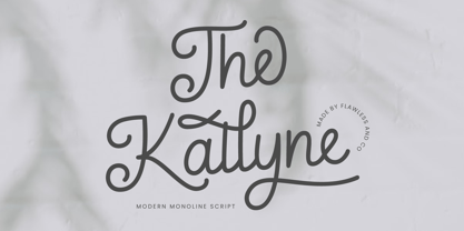 Introducing "The Kallyne" - A Modern Monoline Script Font. Experience the fusion of modern simplicity and timeless style with "The Kallyne," a contemporary monoline script font that adds a touch of elegance and versatility to your designs. There's some connected letters and some alternates that suitable for any graphic designs such as branding materials, t-shirt, print, business cards, logo, poster, t-shirt, photography, quotes .etc This font support for some multilingual. Also contains uppercase A-Z and lowercase a-z, alternate character, numbers 0-9, and some punctuation. If you need help, just write me! Thanks so much for checking out my shop!
 - Bowen Script by Ashton,
$9.00 The font was inspired by the persistent demands of editors for scripts which actually looked like real handwriting, a lot of historical fiction projects and a love of maps. While making a map for a prequel to Treasure Island I decided to make a font from the lettering of some Caribbean maps of the period. The glyphs are all hand drawn vector outlines which although very legible and consistent in style carry the variation and irregularity you expect from handwriting. This font has been featured on maps for books by authors such as Peter V. Brett, Mark Lawrence and Michael Crichton.
 - Baghadeer by Stephen Rapp,
$49.00 Baghadeer, from the hand of Stephen Rapp, is an upright connecting script brimming with personality. With its exuberant capitals, dashing crossover strokes, and rhythmic pulse; it retains the active spirit most associated with slanted scripts, but with the grounded presence of an upright. Baghadeer contains 780 glyphs featuring a plethora of swashes, ligatures, and alternate letters to individualize the look of your project. There is also a set of small caps and ornamental flourishes to add some finishing touches. It contains feature programming to make typesetting seamless and has all the language coverage you'd expect in a pro font.
 - Fonde SS by Sensatype Studio,
$15.00 fonde is a elegant chic font for brand, logo and quotes design. Based on our experience as a graphic designer who works for a lot of companies, we often are requested to design a logo in a unique style but with an elegant shape. So, we try to brainstorming and create this font to make the idea is going out. This is perfect for BRANDING and LOGO DESIGN. You will get classy, elegant, and certainly unique logos with this font. fonde is also included full set of: uppercase and lowercase letters multilingual characters numerals punctuation Wish you enjoy our font. :)
 - Holiday Harmony by Putracetol,
$22.00 Introducing “Holiday Harmony,” a quirky Christmas-themed font that encapsulates the joy and spirit of the holiday season. This display font, crafted with precision, is unique and playful, making it a perfect choice for a wide range of festive applications. Each letter is designed with elements reminiscent of Christmas – from jolly Santa Claus to graceful reindeers, snowflakes to gifts wrapped with love. With nine distinct variations, “Holiday Harmony” offers versatility; each style resonating the warmth and happiness associated with Christmas. It’s not just a font but an experience, bringing stories to life with its all-caps and crafting-friendly design.
 - Grimmig by Schriftlabor,
$40.00 Grimmig draws inspiration from solid and angular blackletter shapes and the idea of cutting letters out of paper. The interaction between curves, sharp edges, and partially unconventional serif placement makes it an excellent typeface for impactful headlines. The vivid details fade into the background in smaller sizes and provide an enjoyable reading experience for continuous text. Open counters and a large x-height contribute to Grimmig’s legibility in text sizes. It was developed as part of the MA Typeface Design in the University of Reading but had started before as a graduation project for Tamara Pilz.
 - Raisin Rage by Missy Meyer,
$12.00 It's a weird name, but it's a weird font! Introducing RAISIN RAGE, a quirky font that expresses that feeling of when you bite into a cookie expecting it to be full of chocolate chips, but it's full of squishy, rubbery raisins instead. (Don't write to me, raisin lovers - you'll never change my mind.) Raisin Rage has some fun casual elements like varying stroke widths plus some bouncing heights which make this fun to use for branding, packaging, logos, and more; I've cleaned the letters up extensively, so the font is great for cutting and crafting as well!
 - Minimalist by Ingrimayne Type,
$12.95 PostScript fonts are constructed by connecting dots, dots that have special attributes that control the shape of the connecting lines. In designing Minimalist, I wanted to see how few dots could be used to construct each letter. This is the source of the name--it is (or was) a minimum-point alphabet. I did not expect much from it, and was surprised that it turned out as well as it did. Since I originally drew it, I have added some points to some of the letters to get them to generate proper bitmaps, so it no longer has minimum points.
 - Antheia by Flawlessandco,
$9.00 Introducing "Antheia" - An Elegant Signature Font. Experience the epitome of elegance and sophistication with "Antheia," a graceful signature font that adds a touch of timeless beauty to your designs. There's some connected letters and some alternates that suitable for any graphic designs such as branding materials, t-shirt, print, business cards, logo, poster, t-shirt, photography, quotes .etc This font support for some multilingual. Also contains uppercase A-Z and lowercase a-z, alternate character, numbers 0-9, and some punctuation. If you need help, just write me! Thanks so much for checking out my shop!
 - Lloyd Serif by Ivan Kostynyk,
$- Initially, I participated in the contest to design the logo for Bill Lloyd. In the end, the design was rejected, but letters remained. I then decided to continue with the idea and complete the entire typeface. After a couple of months, I realized that the typeface was imperfect, and now that I’m working on an updated Lloyd type, this one is free. The main characteristic of the typeface is its bold and curvy shapes. It is also tall and original in design. It was a great experience because it taught me how failure inspires people to move on, and create something better.
 - SK Phlegmatica by Shriftovik,
$10.00 SK Phlegmatica™ is a heavy geometrical grotesque with an industrial spirit. The typeface is built on a contrast between thin and wide lines. Such contrast creates certain frames, which in turn give room for experiments with the rhythm of symbols. The monumental shape of the typeface with the rhythmic contrast of the characters creates a unique pattern in the text line. In addition to the visual advantages, the typeface has technological advantages. SK Phlegmatica is a monospaced multilingual typeface that supports more than 100 Latin and Cyrillic languages. The typeface is great for highlighting titles, working with posters, and web design.
 - Styx by Canada Type,
$24.95 Philip Bouwsma makes use of his extensive calligraphy and type design experience by reaching into his vault and completing one of his unfinished projects from the mid-1990s. The result is Styx, a four-font connected-script family, with rough and smooth variations, each containing two sets of majuscules and plenty of alternates sprinkled throughout the character map. The Styx family comes in all popular font formats, and includes an extended range of language support covering Western and Central/Eastern European languages, Turkish, Baltic, Esperanto and Celtic/Welsh. The OpenType fonts contain both flat and class-based kerning.
 - Gioties by IbraCreative,
$11.00 Gioties is an adorable display font that radiates an irresistible charm and playfulness. With its cute and whimsical letterforms, Gioties encapsulates the essence of innocence and joy. The rounded edges and friendly curves of each letter exude a sense of approachability, making it the perfect choice for designs that require a touch of sweetness and lightheartedness. Gioties effortlessly adds a delightful flair to children's books, playful merchandise, and cheerful branding. Its unique character variations and vibrant energy create a captivating visual experience, ensuring that any project adorned with Gioties becomes a canvas of endearing cuteness and boundless creativity.
 - Grimmig Variable by Schriftlabor,
$200.00 Grimmig draws inspiration from solid and angular blackletter shapes and the idea of cutting letters out of paper. The interaction between curves, sharp edges, and partially unconventional serif placement makes it an excellent typeface for impactful headlines. The vivid details fade into the background in smaller sizes and provide an enjoyable reading experience for continuous text. Open counters and a large x-height contribute to Grimmig’s legibility in text sizes. It was developed as part of the MA Typeface Design in the University of Reading but had started before as a graduation project for Tamara Pilz.
 - As of my last update in April 2023, if "Jano" refers to a specific font that has garnered widespread recognition or been released by a notable foundry, I unfortunately do not have detailed informatio...
- Nerone by The Ampersand Forest,
$20.00 Nerone is a quasi-unicase display type family in four weights, from light to black. In its lighter versions, it's reminiscent of dignified flared serifs like Albertus. In its black version, it's comparable to display faces like Serif Gothic, with a hint of Mostra-like despotism... Inspired by ancient Roman capitals, Nerone takes a whimsical look at how they might turn into a black fatface, and how a matching lowercase might give the whole affair a whimsical feel — specifically when applied to fun branding and marketing uses. Part of The Ampersand Forest's Sondheim Series.
 - Digot 03 by Fontsphere,
$16.00 DIGOT 03 is an innovative two-font family that blends minimalism and geometric precision to create a visually striking and modern design. These fonts are perfect for those seeking a clean and contemporary look for their projects. --- Usage Recommendations DIGOT 03 is a font that thrives in environments where simplicity and clarity are valued. It works exceptionally well in both digital and print formats. Consider using DIGOT 03 in the following situations: Web Design: DIGOT 03 can add a touch of modernity to website designs, providing a clean and contemporary experience for users. Poster Design: Whether creating event posters or advertising material, DIGOT's bold and eye-catching letterforms make it a perfect choice for grabbing attention. Logo Design: This font, despite its very experimental approach, can help establish a strong and memorable brand identity. Its simplicity allows the logo to be easily recognizable and versatile across various marketing channels. Iconography: As DIGOT 03 is built upon geometric principles, it excels in creating visually appealing icons and symbols that follow the same minimalist style. --- DIGOT 03 is the perfect font for designers and creatives who appreciate simplicity and have a keen eye for detail. With its unique minimalist geometric style, DIGOT offers endless possibilities for creating clean and impactful designs.
 - Poultry Sign by Ingrimayne Type,
$5.95 While searching through microfilm of an old, 1932 newspaper, I stumbled on the word "Poultry" written with trapezoidal letters. I did not recall seeing lettering like this and it inspired me to design a typeface that could produce a similar result. Poultry Sign has two widths each with three weights giving the family six styles. It is monoline, monospaced, and all caps. The letters on the lower-case keys reverse the trapezoid of those on the upper-case keys. The designer's expectation is that the most common use for this typeface will alternate upper-case and lower-case keys, and to make this effect easy, included in the font is a contextual alternatives (calt) OpenType feature that automatically produces this result if your word processor supports this feature. To get text with all letters with big bottoms or all letters with with big tops, this feature must be turned off. The spacing of the letters is identical within each width so the styles can be layered to produce bi-colored or tri-colored letters. There is a second set of numbers that can be accessed with an OpenType stylistic alternative. Also accessible with OpenType stylistic alternatives are variations of letters T, N, L, Y, and V.
 - Wingman by Fontforecast,
$23.00 Wingman consists of nine fonts, that can work together in perfect harmony to create beautiful designs. Like a true wingman they reinforce each others potential and offer mutual support. Wingman Brush takes the lead and is, with its six styles, well equipped for many challenging typographic tasks. All Brush styles (except Brush Extra) have 815 glyphs and are packed with Open Type magic, e.g. contextual alternates, that automatically replace beginning and ending glyphs as you type. There are lots of swashes to choose from, organized in several stylistic sets. The bold and the regular styles have matching shadow versions. Brush Bold and Brush Silhouette fit together also. Nice logo-like effects can be achieved by layering these styles. On top of that Brush Vintage was added for a rustic feel. Brush Extra has 322 design elements in both smooth and vintage style. Wingman Serif was designed to use together with the brush styles. It comes in a solid and outline version. Both fonts can fly solo, but together with Wingman Brush they make a powerful formation. Wingman Family requires the use of an Open Type savvy application.
 - Samarra by madjack.font,
$13.00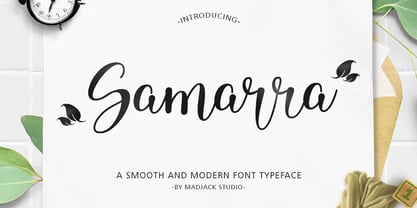 Samarra is a modern script. This font is casual and beautiful with exceptional swashes. It can be used for various purposes, such as logos, product packaging, wedding invitations, branding, headlines, signage, labels, signatures, book covers, posters, quotes, and more. Samarra includes a change of the OpenType language style, binding and international support for most Western languages. To activate the OpenType Stylistic alternative, you need a program that supports OpenType features such as Adobe Illustrator CS, Adobe Indesign & CorelDraw X6-X7, Microsoft Word 2010 or newer versions. How to access all alternative characters using Adobe Illustrator: https://www.youtube.com/watch?v=XzwjMkbB-wQ Samarra script is coded with PUA Unicode, which allows full access to all additional characters without having to design special software. Mac users can use the Font Book, and Windows users can use Character Map to view and copy one of the additional characters to insert into your favorite text editor / application. How to access all alternative characters, using Windows Character Map with Photoshop: https://www.youtube.com/watch?v=Go9vacoYmBw If you need help or have questions, please let me know. I am happy to help :) Thank you & Congratulations on Designing.
 - Desphalia Pro by Ingo,
$42.00 A classic “American” sans serif with a kink Desphalia belongs to the kind of sans serif fonts that were created in the 19th century. You could also name it “American Gothic”, a sans serif in the style of fonts like Franklin Gothic, News Gothic and similar. Above all, the high x-height characterizes this typeface style, as do the identical heights of uppercase and ascenders. However, I allowed myself a few peculiarities ;-) On the one hand, there is the gently sloping horizontal middle line on letters such as H, E, F, A and e. The M also got gently slanted sides. Some of the lower-case letters have an up- or down-stroke: a d m n p u. This "kink" on the shaft also serves to better distinguish the small l from the capital I — as can be seen clearly with the term »Illinois«. In keeping with the tradition of American typefaces, Desphalia does not have a true italic. Rather, the letters of the “Italic” have the same character forms as the normal upright variant, but in oblique — and so it is not called “Italic” but “Oblique”. Style Set 01: Another American peculiarity is the capital I with dashes above and below. It is included in the Desphalia as an alternate character form. An alternative small l with the “kink” in the ascender is also included — as is a y with the “kink” in the descender. Style Set 02: The corresponding “straight” forms a d l m n p u without the break are included as alternatives in a separate style set. Small caps are uppercase letters that are optically the same size as lowercase letters. They offer a very classy way of emphasis. Desphalia is available in the widths Condensed, Normal and Expanded, the weights include Thin, Light, Book, Bold, Black. Using the variable font, all intermediate levels can be freely selected. The figures are optionally available as tabular figures, proportional lining figures or old style figures.
 - Brandon Grotesque by HVD Fonts,
$40.00 Brandon Grotesque is a sans serif type family of six weights plus matching italics. It was designed by Hannes von Döhren in 2009/10. Influenced by the geometric-style sans serif faces that were popular during the 1920s and 30s, the fonts are based on geometric forms that have been optically corrected for better legibility. Brandon Grotesque has a functional look with a warm touch. While the thin and the black weights are great performers in display sizes the light, regular and medium weights are well suited to longer texts. The small x-height and the restrained forms lend it a distinctive elegance. Brandon Grotesque is equipped for complex, professional typography. The OpenType fonts have an extended character set to support Central and Eastern European as well as Western European languages. Brandon Grotesque won the TDC2 Award, 2011.
 - Luzern by Gumpita Rahayu,
$- Inspired by the most common grotesque heights and boxed sans serif typefaces, Luzern Typefaces was built with low-mid contrast sans serif and was designed in quite tall caps height and lower x-height which represents the flavor of the dynamic typefaces and is subtle for the display typefaces. The typefaces comes with five weights, from light to extra bold, plus matching italics in each weights. And Luzern Typefaces is loaded with OpenType features such as some stylistic alternates in uppercase, case-sensitive forms, fractions, and another numerals features such as super and subscript characters, tabular figures, numerator-denominator, etc. It’s highly usable for display text titles such as editorial magazine headline, websites heading, poster, advertising, logo, also it works well for medium body text. It comes with more 400+ glyph support including more latin european diacritics language.
 - Hutton by Fettle Foundry,
$10.00 Hutton is a sans-serif typeface with flattened overshoots, such as shoulders, arms, and bowls. There are seven weights, from light to bold, with matching oblique italics. Inspired by using a ruler to write straight lines, and offering additional horizontality to characters, Hutton’s flattened bowls are intended to evoke a sense of flatness and retro influence – as if drawn at a drafting table. Featuring closed counters and low-contrast, Hutton is closely related to grotesque sans serif designs of the 20th Century, but with something a little different. Included is comprehensive European language support with contextual kerning on common diacritic combinations – as well as localised alternatives for languages such as Polish. Also included are two stylistic sets, which feature characters with a more geometric quality or a more humanistic quality, depending on which you would like to bring to your design.
 - Snare by In-House International,
$5.00 A typeface that celebrates marching to the beat of your own drum. Snare is a jazzy little display type that presents like a stencil but behaves in its own way.Featuring angled section breaks and variable heights, Snare keeps each character’s footprint steady as as its heights change, revealing unique crossbars, periscoping capitals and deep-sinking descenders. Because each character follows its own rules, the more each word grows, the more it shows the beautiful rhythm of variety. Or stretch individual characters to shape the contours of your words. Beyond just being playful, fun to dress in colors, and delightfully useful for tight spaces,Snare’s lanky verticals and nervous energy reflect the time it was created. In this second pandemic spring, Snare brings up the drumroll-expectant heartbeat of our uncertainty, and the wish that when we can all meet again, our newfound weirdnesses will find a home in the world. The Snare font family includes one uppercase alphabet with two lowercase variants and comes in ten standard weights-which-are-just-really-heights (.otf) and as a variable type(.ttf) for designers using compatible platforms. Snare was designed by Alexander Wright and In-House International and developed byRodrigo Fuenzalida at FragType. In-House International’s foundry was launched in the summer of 2020 to offer bold, experimental, display typefaces that tell a story. Our previous releases have been featured on Design Milk, DesignBoom, Slanted and all sorts of exciting places.
 - Totemic by Canada Type,
$29.95 Jim Rimmer’s first typeface was originally published in 1970 as a basic film type alphabet through a small, independent type house in central California. Its sources of influence (now calligraphic type standards by Dair, Goudy and Zapf) are ones that remained with Jim for the rest of his career. If you squint at Totemic in just the right way, you can see some recognizable themes Jim would later flesh out and make his own in later works throughout his career as a type designer and printer. Totemic is now available for the first time as a digital font, of the refined and expanded kind now expected from Canada Type. It comes with quite a few standard advanced typography features: Small caps, caps-to-small-caps, automatic fractions and standard ligatures, stylistic alternate sets, six kinds of figures, case-sensitive forms, and extended Latin language support. It also comes with a very unique and unprecedented feature: Variably stackable totem poles. Simply enable the discretionary ligatures feature, type any unique three-digit combination using numbers between 1 and 4, and watch the magic happens. With a name like Totemic, we just couldn't help ourselves. Many thanks to Andrew Steeves of Gaspereau Press for finding Jim’s lost gem in a most unexpected place, and for helping us bring it back to life 45 years after its analog birth. 20% of Totemic’s revenues will be donated to the Canada Type Scholarship Fund, supporting higher typography education in Canada.
 - Squizzlie - Unknown license

- Stoopid - Unknown license

- ZeroDegrees - Unknown license

- Pecot - Unknown license

- DejaVu Serif - Unknown license

- DejaVu Serif Condensed - Unknown license

- Tecna Dark Down Triangle BNF by Descarflex,
$30.00 The Tecn@ Dark&Light Triangle Background Nomenclature Font family is differentiated by the direction of the triangle tip in the 4 cardinal points. The family were designed to head, enumerate, indicate or highlight writings or design plans, for this reason, the characters are available only in capital letters and some signs or symbols that can serve such purposes. A triangle or empty character is included so that the user can use it overlaying any character of his choice or to be used alone.
 - Tecna Dark Left Triangle BNF by Descarflex,
$30.00 The Tecn@ Dark&Light Triangle Background Nomenclature Font family is differentiated by the direction of the triangle tip in the 4 cardinal points. The family were designed to head, enumerate, indicate or highlight writings or design plans, for this reason, the characters are available only in capital letters and some signs or symbols that can serve such purposes. A triangle or empty character is included so that the user can use it overlaying any character of his choice or to be used alone.
 - New Land Contour - Unknown license

- Brigitta by Autographis,
$39.50 Brigitta is the complementary joining script that can be mixed with Annabella. Also written with a Japanese brush on rough paper, first scanned and then carefully finished by hand on screen.


