10,000 search results
(0.039 seconds)
- Gameness by Typodermic,
$11.95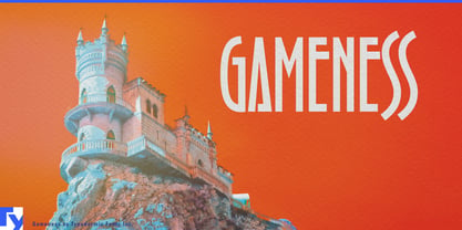 Step back into the 1990s with Gameness, the font that embodies the spirit of the era’s gaming culture. Inspired by the Game Boy box art for Final Fantasy Adventure, Gameness evokes a sense of nostalgia while still looking fresh and modern. But this isn’t just any retro font. Gameness is sleek and sophisticated, with a narrow elegance that sets it apart from other throwback designs. Its tall letters are perfect for headlines, logos, and branding materials, giving your projects a bold, confident look. For clients who demand only the best, Gameness comes with an alternate barred “A”, adding even more versatility to your designs. And in OpenType-enabled applications, the “S” shape subtly alters to match the adjacent letters, ensuring a smooth, harmonious look every time. So why settle for ordinary fonts when you can make a statement with Gameness? Download it now and bring a touch of retro cool to your next project. Most Latin-based European writing systems are supported, including the following languages. Afaan Oromo, Afar, Afrikaans, Albanian, Alsatian, Aromanian, Aymara, Bashkir (Latin), Basque, Belarusian (Latin), Bemba, Bikol, Bosnian, Breton, Cape Verdean, Creole, Catalan, Cebuano, Chamorro, Chavacano, Chichewa, Crimean Tatar (Latin), Croatian, Czech, Danish, Dawan, Dholuo, Dutch, English, Estonian, Faroese, Fijian, Filipino, Finnish, French, Frisian, Friulian, Gagauz (Latin), Galician, Ganda, Genoese, German, Greenlandic, Guadeloupean Creole, Haitian Creole, Hawaiian, Hiligaynon, Hungarian, Icelandic, Ilocano, Indonesian, Irish, Italian, Jamaican, Kaqchikel, Karakalpak (Latin), Kashubian, Kikongo, Kinyarwanda, Kirundi, Kurdish (Latin), Latvian, Lithuanian, Lombard, Low Saxon, Luxembourgish, Maasai, Makhuwa, Malay, Maltese, Māori, Moldovan, Montenegrin, Ndebele, Neapolitan, Norwegian, Novial, Occitan, Ossetian (Latin), Papiamento, Piedmontese, Polish, Portuguese, Quechua, Rarotongan, Romanian, Romansh, Sami, Sango, Saramaccan, Sardinian, Scottish Gaelic, Serbian (Latin), Shona, Sicilian, Silesian, Slovak, Slovenian, Somali, Sorbian, Sotho, Spanish, Swahili, Swazi, Swedish, Tagalog, Tahitian, Tetum, Tongan, Tshiluba, Tsonga, Tswana, Tumbuka, Turkish, Turkmen (Latin), Tuvaluan, Uzbek (Latin), Venetian, Vepsian, Võro, Walloon, Waray-Waray, Wayuu, Welsh, Wolof, Xhosa, Yapese, Zapotec Zulu and Zuni.
 - Acroyear by Typodermic,
$11.95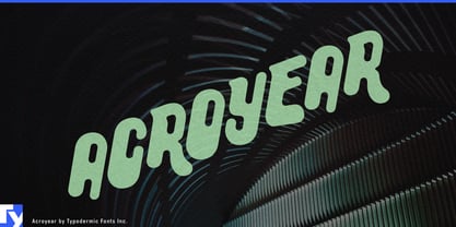 Looking for a unique display typeface that will set your designs apart? Look no further than Acroyear! This quirky font is based on a soft, capsule shape that is sure to catch the eye of anyone who sees it. And while it can be used horizontally, it truly shines when placed on an upward incline. Whether you’re designing a poster, logo, or website, Acroyear is the perfect font to add a touch of personality to your work. Its soft curves and playful vibe make it perfect for anything from children’s books to edgy fashion campaigns. But don’t just take our word for it—give Acroyear a try for yourself and see how it can elevate your designs to the next level. With its unique style and endless versatility, this font is sure to become a staple in your toolkit in no time. So why wait? Try Acroyear today and see the difference it can make! Most Latin-based European, Greek, and some Cyrillic-based writing systems are supported, including the following languages. Afaan Oromo, Afar, Afrikaans, Albanian, Alsatian, Aromanian, Aymara, Bashkir (Latin), Basque, Belarusian (Latin), Bemba, Bikol, Bosnian, Breton, Bulgarian, Cape Verdean, Creole, Catalan, Cebuano, Chamorro, Chavacano, Chichewa, Crimean Tatar (Latin), Croatian, Czech, Danish, Dawan, Dholuo, Dutch, English, Estonian, Faroese, Fijian, Filipino, Finnish, French, Frisian, Friulian, Gagauz (Latin), Galician, Ganda, Genoese, German, Greek, Greenlandic, Guadeloupean Creole, Haitian Creole, Hawaiian, Hiligaynon, Hungarian, Icelandic, Ilocano, Indonesian, Irish, Italian, Jamaican, Kaqchikel, Karakalpak (Latin), Kashubian, Kikongo, Kinyarwanda, Kirundi, Komi-Permyak, Kurdish (Latin), Latvian, Lithuanian, Lombard, Low Saxon, Luxembourgish, Maasai, Macedonian, Makhuwa, Malay, Maltese, Māori, Moldovan, Montenegrin, Ndebele, Neapolitan, Norwegian, Novial, Occitan, Ossetian, Ossetian (Latin), Papiamento, Piedmontese, Polish, Portuguese, Quechua, Rarotongan, Romanian, Romansh, Russian, Sami, Sango, Saramaccan, Sardinian, Scottish Gaelic, Serbian, Serbian (Latin), Shona, Sicilian, Silesian, Slovak, Slovenian, Somali, Sorbian, Sotho, Spanish, Swahili, Swazi, Swedish, Tagalog, Tahitian, Tetum, Tongan, Tshiluba, Tsonga, Tswana, Tumbuka, Turkish, Turkmen (Latin), Tuvaluan, Uzbek (Latin), Ukrainian, Venetian, Vepsian, Võro, Walloon, Waray-Waray, Wayuu, Welsh, Wolof, Xhosa, Yapese, Zapotec Zulu and Zuni.
 - Lonsdale by Typodermic,
$11.95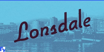 Introducing Lonsdale, the ultimate disconnected script typeface that’s going to take your designs to the next level. With its elegant curves and unique technical quality, Lonsdale is the perfect choice for those looking to add a touch of sophistication to their designs. Partially based on the iconic Parkway Script font produced by Emil Hirt in 1964, Lonsdale combines classic script elements with a contemporary twist. The result is a font that not only looks stunning, but also instills a sense of serenity in your designs. One of the most striking features of Lonsdale is its curved corners, which give it a soft, gentle look that’s sure to catch the eye. Whether you’re designing a logo, a poster, or anything in between, Lonsdale will help you create a design that’s truly unforgettable. So why wait? Add Lonsdale to your font collection today and start creating designs that are as sweet as they are beautiful! Most Latin-based European writing systems are supported, including the following languages. Afaan Oromo, Afar, Afrikaans, Albanian, Alsatian, Aromanian, Aymara, Bashkir (Latin), Basque, Belarusian (Latin), Bemba, Bikol, Bosnian, Breton, Cape Verdean, Creole, Catalan, Cebuano, Chamorro, Chavacano, Chichewa, Crimean Tatar (Latin), Croatian, Czech, Danish, Dawan, Dholuo, Dutch, English, Estonian, Faroese, Fijian, Filipino, Finnish, French, Frisian, Friulian, Gagauz (Latin), Galician, Ganda, Genoese, German, Greenlandic, Guadeloupean Creole, Haitian Creole, Hawaiian, Hiligaynon, Hungarian, Icelandic, Ilocano, Indonesian, Irish, Italian, Jamaican, Kaqchikel, Karakalpak (Latin), Kashubian, Kikongo, Kinyarwanda, Kirundi, Kurdish (Latin), Latvian, Lithuanian, Lombard, Low Saxon, Luxembourgish, Maasai, Makhuwa, Malay, Maltese, Māori, Moldovan, Montenegrin, Ndebele, Neapolitan, Norwegian, Novial, Occitan, Ossetian (Latin), Papiamento, Piedmontese, Polish, Portuguese, Quechua, Rarotongan, Romanian, Romansh, Sami, Sango, Saramaccan, Sardinian, Scottish Gaelic, Serbian (Latin), Shona, Sicilian, Silesian, Slovak, Slovenian, Somali, Sorbian, Sotho, Spanish, Swahili, Swazi, Swedish, Tagalog, Tahitian, Tetum, Tongan, Tshiluba, Tsonga, Tswana, Tumbuka, Turkish, Turkmen (Latin), Tuvaluan, Uzbek (Latin), Venetian, Vepsian, Võro, Walloon, Waray-Waray, Wayuu, Welsh, Wolof, Xhosa, Yapese, Zapotec Zulu and Zuni.
 - Korataki by Typodermic,
$11.95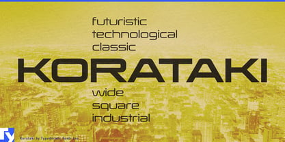 Discover the mesmerizing power of Korataki—the ultimate contemporary font that pays tribute to the iconic ultramodern style of the 1970s classic, China/Chimes. With its simplistic yet striking industrial design, Korataki captures the essence of a bygone era while simultaneously bringing it into the modern age. The beauty of this font lies in its ability to communicate with unparalleled clarity and precision, evoking a sense of wonder and intrigue in the mind of the beholder. Whether you’re looking to make a bold statement or convey a subtle message, Korataki has got you covered. With seven distinct weights and accompanying italics, as well as OpenType alternates for A, G, Q, and 4, this font is fully customizable to suit your every need. Let Korataki guide you on a journey of creativity and self-expression. With its wide industrial design and timeless aesthetic, it’s sure to make a lasting impression on anyone who beholds it. Most Latin-based European, and some Cyrillic-based writing systems are supported, including the following languages. A Afaan Oromo, Afar, Afrikaans, Albanian, Alsatian, Aromanian, Aymara, Bashkir (Latin), Basque, Belarusian (Latin), Bemba, Bikol, Bosnian, Breton, Bulgarian, Cape Verdean, Creole, Catalan, Cebuano, Chamorro, Chavacano, Chichewa, Crimean Tatar (Latin), Croatian, Czech, Danish, Dawan, Dholuo, Dutch, English, Estonian, Faroese, Fijian, Filipino, Finnish, French, Frisian, Friulian, Gagauz (Latin), Galician, Ganda, Genoese, German, Greenlandic, Guadeloupean Creole, Haitian Creole, Hawaiian, Hiligaynon, Hungarian, Icelandic, Ilocano, Indonesian, Irish, Italian, Jamaican, Kaqchikel, Karakalpak (Latin), Kashubian, Kikongo, Kinyarwanda, Kirundi, Komi-Permyak, Kurdish (Latin), Latvian, Lithuanian, Lombard, Low Saxon, Luxembourgish, Maasai, Macedonian, Makhuwa, Malay, Maltese, Māori, Moldovan, Montenegrin, Ndebele, Neapolitan, Norwegian, Novial, Occitan, Ossetian, Ossetian (Latin), Papiamento, Piedmontese, Polish, Portuguese, Quechua, Rarotongan, Romanian, Romansh, Russian, Sami, Sango, Saramaccan, Sardinian, Scottish Gaelic, Serbian, Serbian (Latin), Shona, Sicilian, Silesian, Slovak, Slovenian, Somali, Sorbian, Sotho, Spanish, Swahili, Swazi, Swedish, Tagalog, Tahitian, Tetum, Tongan, Tshiluba, Tsonga, Tswana, Tumbuka, Turkish, Turkmen (Latin), Tuvaluan, Ukrainian, Uzbek (Latin), Venetian, Vepsian, Võro, Walloon, Waray-Waray, Wayuu, Welsh, Wolof, Xhosa, Yapese, Zapotec Zulu and Zuni.
 - Raincoat by Typodermic,
$11.95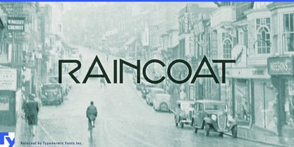 Looking for a typeface that oozes class and style? Look no further than Raincoat. This stunning display font combines the best of both worlds, with a geometric sans serif that’s been given a timeless, antique feel. But Raincoat is more than just a pretty face. With its OpenType features, it’s a font that can truly personalize your designs. Letter combinations are transformed into custom ligatures, making your work truly unique. From the altered ends of the “T” to the interlocking rings of the “O”, Raincoat is a typeface that adds a touch of personality to any design. So if you’re looking to make a statement, whether it’s for a logo, poster, or website, Raincoat is the perfect choice. With its candid style and classy design, it’s a font that’s sure to impress. So why not try Raincoat today and see for yourself the creative design options it can bring to your work? Most Latin-based European, Greek, and most Cyrillic-based writing systems are supported, including the following languages. Afaan Oromo, Afar, Afrikaans, Albanian, Alsatian, Aromanian, Aymara, Bashkir, Bashkir (Latin), Basque, Belarusian, Belarusian (Latin), Bemba, Bikol, Bosnian, Breton, Bulgarian, Buryat, Cape Verdean, Creole, Catalan, Cebuano, Chamorro, Chavacano, Chichewa, Crimean Tatar (Latin), Croatian, Czech, Danish, Dawan, Dholuo, Dungan, Dutch, English, Estonian, Faroese, Fijian, Filipino, Finnish, French, Frisian, Friulian, Gagauz (Latin), Galician, Ganda, Genoese, German, Greek, Greenlandic, Guadeloupean Creole, Haitian Creole, Hawaiian, Hiligaynon, Hungarian, Icelandic, Ilocano, Indonesian, Irish, Italian, Jamaican, Kalmyk, Kaqchikel, Karakalpak (Latin), Kashubian, Kazakh, Khalkha, Kikongo, Kinyarwanda, Kirundi, Komi-Permyak, Kurdish, Kurdish (Latin), Kyrgyz, Latvian, Lithuanian, Lombard, Low Saxon, Luxembourgish, Maasai, Macedonian, Makhuwa, Malay, Maltese, Māori, Moldovan, Montenegrin, Ndebele, Neapolitan, Norwegian, Novial, Occitan, Ossetian, Ossetian (Latin), Papiamento, Piedmontese, Polish, Portuguese, Quechua, Rarotongan, Romanian, Romansh, Russian, Rusyn, Sami, Sango, Saramaccan, Sardinian, Scottish Gaelic, Serbian, Serbian (Latin), Shona, Sicilian, Silesian, Slovak, Slovenian, Somali, Sorbian, Sotho, Spanish, Swahili, Swazi, Swedish, Tagalog, Tahitian, Tajik, Tatar, Tetum, Tongan, Tshiluba, Tsonga, Tswana, Tumbuka, Turkish, Turkmen (Latin), Tuvaluan, Ukrainian, Uzbek, Uzbek (Latin), Venetian, Vepsian, Võro, Walloon, Waray-Waray, Wayuu, Welsh, Wolof, Xhosa, Yapese, Zapotec Zulu and Zuni.
 - Mexcellent by Typodermic,
$11.95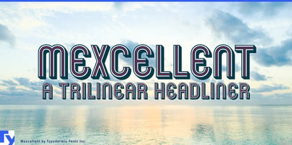 Welcome to the world of Mexcellent, a tri-linear stripe typeface that is sure to add a touch of jubilation to your designs! Inspired by the custom font created for the iconic 1968 Mexico City Olympic Games, this font will transport you to a world of vibrant colors and striking patterns. With Mexcellent, you can experiment with layers to produce an endless array of captivating color effects. Let your imagination run wild as you explore the countless possibilities that this font has to offer. Whether you’re designing a poster, a flyer, or even a social media graphic, Mexcellent will make your message pop. The cool stripes and playful angles will add a touch of flair and panache to your creations, setting them apart from the rest. Your audience will be captivated by the unique and innovative style that you bring to the table. So what are you waiting for? Try Mexcellent today and discover the joyous and dynamic world of tri-linear stripe typography! Most Latin-based European writing systems are supported, including the following languages. Afaan Oromo, Afar, Afrikaans, Albanian, Alsatian, Aromanian, Aymara, Bashkir (Latin), Basque, Belarusian (Latin), Bemba, Bikol, Bosnian, Breton, Cape Verdean, Creole, Catalan, Cebuano, Chamorro, Chavacano, Chichewa, Crimean Tatar (Latin), Croatian, Czech, Danish, Dawan, Dholuo, Dutch, English, Estonian, Faroese, Fijian, Filipino, Finnish, French, Frisian, Friulian, Gagauz (Latin), Galician, Ganda, Genoese, German, Greenlandic, Guadeloupean Creole, Haitian Creole, Hawaiian, Hiligaynon, Hungarian, Icelandic, Ilocano, Indonesian, Irish, Italian, Jamaican, Kaqchikel, Karakalpak (Latin), Kashubian, Kikongo, Kinyarwanda, Kirundi, Kurdish (Latin), Latvian, Lithuanian, Lombard, Low Saxon, Luxembourgish, Maasai, Makhuwa, Malay, Maltese, Māori, Moldovan, Montenegrin, Ndebele, Neapolitan, Norwegian, Novial, Occitan, Ossetian (Latin), Papiamento, Piedmontese, Polish, Portuguese, Quechua, Rarotongan, Romanian, Romansh, Sami, Sango, Saramaccan, Sardinian, Scottish Gaelic, Serbian (Latin), Shona, Sicilian, Silesian, Slovak, Slovenian, Somali, Sorbian, Sotho, Spanish, Swahili, Swazi, Swedish, Tagalog, Tahitian, Tetum, Tongan, Tshiluba, Tsonga, Tswana, Tumbuka, Turkish, Turkmen (Latin), Tuvaluan, Uzbek (Latin), Venetian, Vepsian, Võro, Walloon, Waray-Waray, Wayuu, Welsh, Wolof, Xhosa, Yapese, Zapotec Zulu and Zuni.
 - Scriptina Pro by CheapProFonts,
$-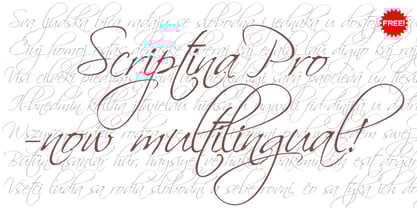 This is the 100th font released by CheapProFonts, and I wanted to make something special - so I have chosen to upgrade one of the most popular free fonts ever: the one and only Scriptina by the infamous Fredrick “Apostrophe” Nader! After first cleaning up the outlines, spacing and kerning, Scriptina Pro has been expanded with a set of alternate letters without the loops and swashes, using the OpenType contextual alternates feature to switch them around automatically to avoid too many overlapping and repeating elements. You can also manually turn off the loops and swashes with the OpenType titling and swash features respectively. The originals alternate letters have been incorporated as stylistic alternates (and stylistic set 02) and the ligatures as discretionary ligatures if you should want them. The alternate non-script lowercase z is programmed as stylistic set 01. In addition Scriptina Pro has been given the usual CheapProFonts large multilingual character set, of course. I hope many will enjoy the improvements and additional language support. And, naturally: it is still free! ALL fonts from CheapProFonts have very extensive language support: They contain some unusual diacritic letters (some of which are contained in the Latin Extended-B Unicode block) supporting: Cornish, Filipino (Tagalog), Guarani, Luxembourgian, Malagasy, Romanian, Ulithian and Welsh. They also contain all glyphs in the Latin Extended-A Unicode block (which among others cover the Central European and Baltic areas) supporting: Afrikaans, Belarusian (Lacinka), Bosnian, Catalan, Chichewa, Croatian, Czech, Dutch, Esperanto, Greenlandic, Hungarian, Kashubian, Kurdish (Kurmanji), Latvian, Lithuanian, Maltese, Maori, Polish, Saami (Inari), Saami (North), Serbian (latin), Slovak(ian), Slovene, Sorbian (Lower), Sorbian (Upper), Turkish and Turkmen. And they of course contain all the usual “western” glyphs supporting: Albanian, Basque, Breton, Chamorro, Danish, Estonian, Faroese, Finnish, French, Frisian, Galican, German, Icelandic, Indonesian, Irish (Gaelic), Italian, Northern Sotho, Norwegian, Occitan, Portuguese, Rhaeto-Romance, Sami (Lule), Sami (South), Scots (Gaelic), Spanish, Swedish, Tswana, Walloon and Yapese.
 - Lineavec by Typodermic,
$11.95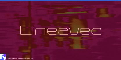 Introducing Lineavec—the typeface of the future. With its precise, wide, and light design, Lineavec embodies the essence of technology and innovation. This futuristic font will transport your message to the far reaches of space and time, evoking images of vector arcade games, laser beams, and the intricate traces of a circuit board. Lineavec is not just a font, it’s a statement. It’s a symbol of the ever-evolving digital landscape and the unstoppable march of progress. Its sleek and minimalistic design is perfect for a range of contemporary projects, including tech startups, gaming websites, and sci-fi films. So if you want to give your message a sense of interstellar distinctiveness, Lineavec is the font for you. Whether you’re looking to captivate your audience with bold headlines, or to add a touch of sophistication to your brand identity, Lineavec is the perfect choice. Don’t miss out on the opportunity to make your mark on the future—get Lineavec today! Most Latin-based European writing systems are supported, including the following languages. Afaan Oromo, Afar, Afrikaans, Albanian, Alsatian, Aromanian, Aymara, Bashkir (Latin), Basque, Belarusian (Latin), Bemba, Bikol, Bosnian, Breton, Cape Verdean, Creole, Catalan, Cebuano, Chamorro, Chavacano, Chichewa, Crimean Tatar (Latin), Croatian, Czech, Danish, Dawan, Dholuo, Dutch, English, Estonian, Faroese, Fijian, Filipino, Finnish, French, Frisian, Friulian, Gagauz (Latin), Galician, Ganda, Genoese, German, Greenlandic, Guadeloupean Creole, Haitian Creole, Hawaiian, Hiligaynon, Hungarian, Icelandic, Ilocano, Indonesian, Irish, Italian, Jamaican, Kaqchikel, Karakalpak (Latin), Kashubian, Kikongo, Kinyarwanda, Kirundi, Kurdish (Latin), Latvian, Lithuanian, Lombard, Low Saxon, Luxembourgish, Maasai, Makhuwa, Malay, Maltese, Māori, Moldovan, Montenegrin, Ndebele, Neapolitan, Norwegian, Novial, Occitan, Ossetian (Latin), Papiamento, Piedmontese, Polish, Portuguese, Quechua, Rarotongan, Romanian, Romansh, Sami, Sango, Saramaccan, Sardinian, Scottish Gaelic, Serbian (Latin), Shona, Sicilian, Silesian, Slovak, Slovenian, Somali, Sorbian, Sotho, Spanish, Swahili, Swazi, Swedish, Tagalog, Tahitian, Tetum, Tongan, Tshiluba, Tsonga, Tswana, Tumbuka, Turkish, Turkmen (Latin), Tuvaluan, Uzbek (Latin), Venetian, Vepsian, Võro, Walloon, Waray-Waray, Wayuu, Welsh, Wolof, Xhosa, Yapese, Zapotec Zulu and Zuni.
 - TT Bricks by TypeType,
$29.00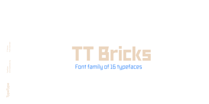 TT Bricks useful links: Graphic presentation | Customization options Do you love the early Soviet visual culture as much as we do? We’ve tried going back a hundred years and rethinking the constructivist era. We’ve created an extensive font family that consists of the simplest triangle and rectangle forms. TT Bricks font family includes 16 typefaces: Hairline, Thin, Light, Regular, Medium, Bold, ExtraBold, Black and Italics. Regardless of its Soviet past, TT Bricks is a very fresh and visually powerful font family that perfectly fits the contemporary media landscape. TT Bricks is perfect for mobile apps and corporate websites, as well as for printed press layout. Thanks to the exaggeratedly simple forms of all signs, TT Bricks looks great in very small type sizes. FOLLOW US: Instagram | Facebook | Website TT Bricks language support: Acehnese, Afar, Albanian, Alsatian, Aragonese, Arumanian, Asu, Aymara, Banjar, Basque, Belarusian (cyr), Bemba, Bena, Betawi, Bislama, Boholano, Bosnian (cyr), Bosnian (lat), Breton, Bulgarian (cyr), Cebuano, Chamorro, Chiga, Colognian, Cornish, Corsican, Cree, Croatian, Czech, Danish, Embu, English, Erzya, Estonian, Faroese, Fijian, Filipino, Finnish, French, Friulian, Gaelic, Gagauz (lat), Galician, German, Gusii, Haitian Creole, Hawaiian, Hiri Motu, Hungarian, Icelandic, Ilocano, Indonesian, Innu-aimun, Interlingua, Irish, Italian, Javanese, Judaeo-Spanish, Kalenjin, Karachay-Balkar (lat), Karaim (lat), Karakalpak (lat), Kashubian, Khasi, Khvarshi, Kinyarwanda, Kirundi, Kongo, Kumyk, Kurdish (lat), Ladin, Latvian, Laz, Leonese, Lithuanian, Luganda, Luo, Luxembourgish, Luyia, Macedonian, Machame, Makhuwa-Meetto, Makonde, Malay, Manx, Maori, Mauritian Creole, Minangkabau, Moldavian (lat), Montenegrin (lat), Mordvin-moksha, Morisyen, Nahuatl, Nauruan, Ndebele, Nias, Nogai, Norwegian, Nyankole, Occitan, Oromo, Palauan, Polish, Portuguese, Quechua, Rheto-Romance, Rohingya, Romanian, Romansh, Rombo, Rundi, Russian, Rusyn, Rwa, Salar, Samburu, Samoan, Sango, Sangu, Scots, Sena, Serbian (cyr), Serbian (lat), Seychellois Creole, Shambala, Shona, Slovak, Slovenian, Soga, Somali, Sorbian, Sotho, Spanish, Sundanese, Swahili, Swazi, Swedish, Swiss German, Tagalog, Tahitian, Taita, Tatar, Tetum, Tok Pisin, Tongan, Tsonga, Tswana, Turkish, Turkmen (lat), Ukrainian, Uyghur, Vepsian, Volapük, Võro, Vunjo, Xhosa, Zaza, Zulu.
 - Ogelic by Ardyanatypes,
$17.00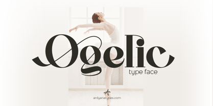 Ogelic Typeface Serif is modern and elegant. It pairs well with san serif as pictured or stands firm as a title and brand representative for an elegant look. This Ogelic Typeface is equipped with a modern professional character that can present an elegant and attractive identity for your company for business purposes such as business cards, name tags, and uniforms as a brand enhancement. This modern Ogelic typeface is suitable to be embossed as a letter nameplate or even pasted in your office with a cutting sticker that looks elegant. This elegant Ogelic-type shape is also stunning for book covers or magazine writing. You can see all the available characters in the screenshot above, and you can try the modern & elegant Ogelic now for any design issues. Ogelic also comes with multiple languages, making it easy for any country and language use. It also comes with alternative Ligatures and stylistics to make your designs more attractive.
 - Carnova by Typotheticals,
$4.00This is a standard, plain face with no special distinguishing features. It was created over a period of four months for use in small text in a cartographer package. While the face was extremely suitable for the purpose it was designed for, the party who was to purchase the family outright decided upon another design, allowing me to offer it up for sale. The original design for this face is nothing new, and has been greatly influenced by many others already in existence. It was not intended to be flashy, nor eye-catching, and I believe I have managed to escape any individuality that could have affected the face. It displays well in the lower text sizes, and, in my own opinion, displays some characters more clearly than some other similar faces that are currently in use (not all, some). While individuality makes a typeface stand out from all the others, this style of design would have been compromised with it. - Ghost Town by Comicraft,
$19.00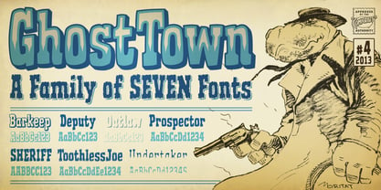 The Gold Rush is over, the prospectors have made their fortune and the mine has been worked out! The inhabitants of Boomtown USA have moved on -- the saloon is dry, the sheriff has hung his hat and the only visitors to the local whorehouse are tumbleweeds. Yeah, the buildings remain -- hollowed out husks carrying memories of bar room brawls, high noon shootouts and high stake poker games between outlaws -- but if you take a walk down the street be careful not to kick up too much dust... Turn the corner and you might see Ol' Toothless Joe standing on the corner sucking on a bottle of whiskey... And don't walk too slowly past the storefront of the undertaker -- that guy made his living putting strangers like you in a wooden overcoat from sunrise to sundown. Spooks and Spectres linger everywhere... there's a sign just down the road -- didn't you see it? "Ghost Town! Abandon Hope all who Enter Here!"
 - Kulturista by Suitcase Type Foundry,
$39.00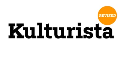 Kulturista is an unmistakeable linear slab serif typeface with pronounced rectangular serifs. The drawings are based on the sans-serif Nudista typeface, and Kulturista also inherits Nudista’s distinctive narrowed character proportions, range of weights and glyph sets. The italics are inclined sufficiently, and have the same width and colouring as the plain styles. They aren’t just a mechanically-slanted version of the basic styles, as is often the case for typefaces derived from geometrical images — a whole range of characters have their own drawn variants, which greatly strengthens their highlight function. The italics are therefore an equal partner for the roman styles. Kulturista is definitely a good choice for a headline typeface for magazines and book covers. The range of boldness can come in handy when editing sections, headlines and supplements. The typeface understandably proves itself as a healthy foundation for a unified visual style, and holds up at display sizes as well as on shorter texts.
 - Empirical by Type Associates,
$32.50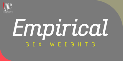 When I first approached this design back in 2003 I wrote myself a design brief that called for a simple sans serif "avec serifs" (with serifs). Its emphasis needed to be on text usage but to be at home in display sizes. A range of weights with a controlled step from one weight to the next, uniform character sets, spacing and kerning throughout the range. Attention to openness of counter spaces would be paramount to work in text sizes. Matching italics should be true italics not merely slanted - with a cursive feel. During extensive testing I decided to include a suite of ligatures to eliminate the hairline gaps that occur between slab serifs at display sizes. The user may activate "Discretionary Ligatures" or "Stylistic Set 1" for ligatures that are not included in the Standard Ligatures (ff, fi, fl, ffi and ffl). A concise User Guide can be downloaded at this link.
 - M Lady PRC by Monotype HK,
$523.99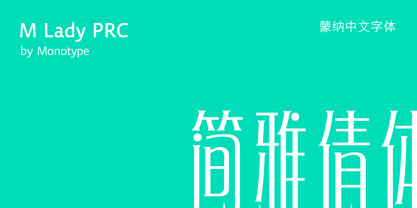 M Lady is a design inspired by Agfa Waddy’s rather elegant design comes with narrow proportion. M Lady is a rare condensed design in world of Chinese typefaces. Entry and finial points of strokes are squarish, with a sharp but small symmetric serif. It has a medium contrast to improve character recognition. Its thin stems (豎) make it suitable for fine print with minimal conglutination. Dots (點) are straight, reversely curved or round. Downstrokes (撇、捺), ticks (剔) and hooks (勾) are highly regular and consistent. Dots (點), downstrokes (撇、捺) and ticks (剔) are long, smooth, monolinear and curved with small symmetric serif and sometimes angled entry and finial points of strokes to create subtle sharpness in the midst of its softness and elegance, which is better for larger text print. Its features and construction create subtle sharpness in the midst of softness and slim elegance. It is best suited for casual subheading or display, set upright (non-slanted), non-condensed (naturally condensed).
 - Black Magica by Designova,
$15.00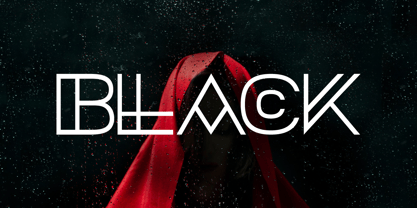 BLACK - A typeface born at midnight. A typeface that crawls to the darkness. A typeface with split-personality. A typeface that can conjure the UNKNWN. BLACK is a hybrid / mysterious typeface with a true uniqueness of it's own. This all caps typeface has two different nature: the uppercase is defined by rare dimensions while the lowercase is purely simple & minimal. This typeface is perfectly suitable for anything that needs to stand out from crowd, be it some Ultra Modern Branding, Techno or Cosmic Themed Designs, Haunted Movie Posters, Mysterious Arts and even the Minimal Stuffs. The typeface could be perfect choice for logo / logotype design, branding, marketing graphics, banners, posters, signage, corporate identities as well as for editorial design that can bring uniqueness. Please see the examples shown above to get an idea about the capability of this typeface. Handcrafted and designed with powerful OpenType features in mind, each weight includes extended language support including Western European & Central European sets.
 - Surf Bum by Jeff Levine,
$29.00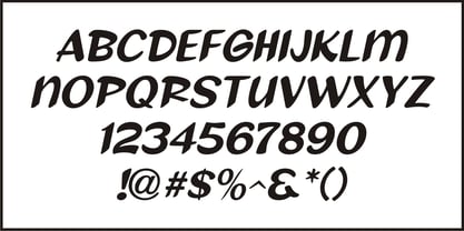 The term “Surf Bum” was a slang phrase used to casually describe anyone who spent as much of their time as possible at the beach catching waves in the 1960s. The Revell Company was a well-established maker of plastic model kits such as military airplanes, monsters from Universal horror films and other such items when it hooked up with custom car designer Ed “Big Daddy” Roth to develop a model kit line capitalizing on the surfing fad that was sweeping the West Coast at the time. A number of crazy-looking hot rods, dune buggies and what-have-you were turned out, and one such kit (“Surfite”, with Figure) featured a futuristic one-person dune buggy. It was on the box for the model that the words “with Figure” appear in a casual, brush design type face. Those few letters were the inspiration for creating a new retro type face entitled Surf Bum JNL, which is available in both regular and oblique versions.
 - Bum Steer JNL by Jeff Levine,
$29.00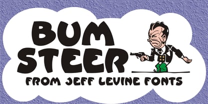 In older American slang, a "bum steer" is a bad tip, some bad advice or being sent in the wrong direction (to name a few examples). Bum Steer JNL was modeled from some playful hand lettering found on a piece of early 20th Century sheet music entitled "When Uncle Joe Plays a Rag on His Old Banjo". It's very possible that "Hobo" (a popular type design of the time) was a strong influence on the sheet music's style of title lettering. It seems that songwriters in those bygone days were prone to cramming as many words from a line of their song into the title itself. Another such example of a wordy song title which coincidently is in keeping with the theme of a "bum steer" (pun intended) is a novelty number from 1915: "Cows May Come and Cows May Go but the Bull Goes on Forever" (words by Vincent Bryan, music by Harry Von Tilzer). [It's kind of self-descriptive, don't you think?]
 - VLNL Bon Bon by VetteLetters,
$35.00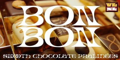 Exuberantly delicious and lusciously sweet! VLNL Bon Bon embodies the perfect after dinner treat. Chocolate is a known aphrodisiac and bonbons are its most romantic carrier. Bonbon is not for nothing the French word for ‘good’ twice! You could definitely consider VLNL Bonbon the typographic equivalent of these exquisite chocolate sweets. Inspired by lettering on an Amsterdam church facade and a ladies clothing store window, Donald DBXL Beekman started drawing the first incarnation of Bon Bon already in 2004. The original idea was an alphabet design with slanted oval inner shapes and extremely long and striking serifs. This proved to be a quite demanding design job, so It took Bon Bon some time to get finished. But now it’s here in all its extravagant glory. Most recently a number of lowercase characters were added to make Bon Bon more versatile. Totally insane and over-top-the-top it has been called. But hey, we all love Bon Bon. Don't we?
 - M Lady HK by Monotype HK,
$523.99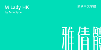 M Lady is a design inspired by Agfa Waddy’s rather elegant design comes with narrow proportion. M Lady is a rare condensed design in world of Chinese typefaces. Entry and finial points of strokes are squarish, with a sharp but small symmetric serif. It has a medium contrast to improve character recognition. Its thin stems (豎) make it suitable for fine print with minimal conglutination. Dots (點) are straight, reversely curved or round. Downstrokes (撇、捺), ticks (剔) and hooks (勾) are highly regular and consistent. Dots (點), downstrokes (撇、捺) and ticks (剔) are long, smooth, monolinear and curved with small symmetric serif and sometimes angled entry and finial points of strokes to create subtle sharpness in the midst of its softness and elegance, which is better for larger text print. Its features and construction create subtle sharpness in the midst of softness and slim elegance. It is best suited for casual subheading or display, set upright (non-slanted), non-condensed (naturally condensed).
 - Waza by Linotype,
$29.99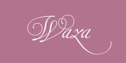 Reviving a handwriting style from centuries past is similar to playing antique musical instruments; the pleasure of communing with live music arranged centuries ago by brilliant composers is heightened by the use of authentic or reconstructed artifacts. A new revived" script from the Baroque epoch is the Waza typeface, developed by Polish designer Franciszek Otto. Waza is inspired by a Wilhelm Hondius (Hondt) etching. Hondius was a Dutch court engraver for the Polish king, Ladislaus IV of the Vasa dynasty. The decorative character of the script engraved in the etching is a display of Hondius's calligraphic skill. The tangle of the flourishes in the capital letters, as well as the decorative lengthening of ascenders and descenders in the lowercase, contrast ideally with the rhythmic 30-degree slant of the design. Waza includes a set of alternative capital letters that have been deprived of ornaments; these allow the setting of proper Roman numerals, e.g., Ladislaus IV."
 - Grantig by Julien Fincker,
$19.99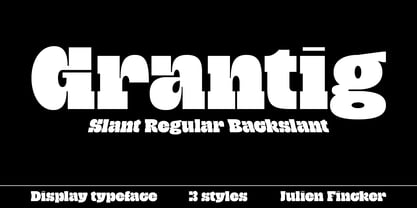 Grantig is a bold serif display typeface. Inspired by the opening titles of old western movies, the genre of western slab serifs has been translated into a modern context and adapted to today's needs. As a result, it breaks free from the chains of its genre and opens up to many themes. Grantig is the german word for grumpy. With its massive serifs and strictly rounded curves, it comes particularly close in character to the grumpy Western heroes of days gone by, always in the presence of his two leaning companions, Slant and Backslant. With Grantig, it is particularly easy to create eye-catching and type-accentuated headlines. Its expressive nature makes it particularly suitable for editorial, packaging and advertising. With its 482 characters, Grantig covers the language usage for many Latin-based languages. At the same time, it has the most important open type features, such as lining and oldstyle figures, alternate characters, and arrows.
 - Interzone by MYSTERIAN,
$9.00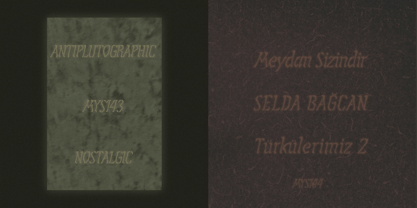 This type crept up the sense that it was made in Eastern Europe by poorly trained urbanites from a crippled nation, or that it is the remains of a contemporary gothic (like Eckmann) stencil. The choice of what this type signifies is up to the public. Lately I like the idea of 'putting on' (in McLuhan's sense) a genre of idea that is somewhat different from my tradition's beliefs, and fitting a core category of that toward a teleological/eschatological advantage. Therefore postmodernist/apocalyptic carelessness (which I may 'put on' by using this type) is how I abstain from the cravings of immortality, or more so that wanting it is pointless. It’s stands as memento morí; that I will have to die someday. I have to become less, He must become more. Of course, Interzone may signify a classic Joy Division track from Unknown Pleasures as well as the Cold Warish ongoings of conflicted eastern European life. I considered naming this Lunik 9.
 - Bihext by Ingrimayne Type,
$10.00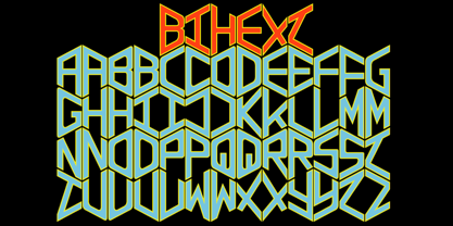 The letters of Bihext fit into the trapezoids formed by bisecting hexagons from the top corner to the bottom corner. Because these trapezoids have two orientations, there are two sets of characters and the typeface was designed assuming that the user would want to alternate these two character sets. The alternating of characters is done automatically with the OpenType feature of contextual alternatives (calt) in applications that support it. The typeface is monospaced with very tightly letter spacing. If the letter spacing seems too tight, consider alternating colors to make the individual letters stand out as an alternative to loosening the letter spacing. Almost certainly the user will need to adjust line spacing if more than one line of text is used. The family includes an outline style that can be used in a layer above the filled style. A decorative, display face, Bihext is too difficult to read to be used for long text.
 - Quars by Letterjuice,
$66.00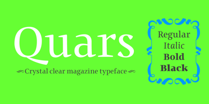 Quars is a text and display typeface family designed to work on magazines. However, it is also suitable for books and other editorial material. It has a strong personality with elegant, sharp and contemporary features. This typeface comes from several subtle influences, from the contrast of the Scotch Romans to the sharpness of contemporary Dutch designers. Quars is a crystal clear and neat typeface full of small details, its structure is bursting with curves and accurate features which gives it its firm personality. Its italic experiments with the boundaries of italics themselves; with just 1 degree of slant Quars Italic accomplishes its purpose of highlighting pieces of text within its Roman. This carefully thought out inclination protects the uppercase from the usual distortion which Italic caps suffer. It offers a generous glyph set with many ligatures specially crafted for titling and ornaments based on anonymous metal types found in the drawers of an old printing workshop in a coast town near Barcelona.
 - Built by Typodermic,
$11.95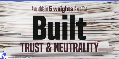 In the world of journalism, headlines are the lifeblood of a publication. They need to be compact, sturdy, and project a voice that exudes trust and neutrality. Enter Built, the font family designed specifically for creating striking headlines that grab the reader’s attention. With its wraparound curves and subtle curls, Built evokes a feel of a bygone newspaper era without being too old-fashioned. The font family is available in five weights, ranging from Extra-Light to Bold, each with its own unique character and style. But what sets Built apart from other fonts is its ability to scale up without sacrificing readability. Lighter typefaces may look great on paper, but on-screen, they can quickly become unreadable if not properly designed. With Built, however, the font becomes narrower as it becomes lighter, allowing designers to set oversized page titles without worrying about copyfitting. In addition to its unique scaling capabilities, Built also offers a simple solution to the problem of aligning numbers in headlines. By disabling kerning, Built ensures that all numerals, monetary symbols, and most math symbols will line up perfectly, saving designers time and frustration. Built also includes a range of other typographical features, such as fractions, primes, ordinals, and vertically compact accents. And as the font becomes lighter, the asterisk grows more legs, allowing it to appear tonally even in Extra-Light. So whether you’re designing a front page for a major newspaper or simply need to create eye-catching headlines for your blog, Built is the font family that can deliver the perfect balance of style and readability. With its range of weights and styles, it’s the perfect choice for any journalist or designer looking to make a bold statement on-screen. Most Latin-based European writing systems are supported, including the following languages. Afaan Oromo, Afar, Afrikaans, Albanian, Alsatian, Aromanian, Aymara, Bashkir (Latin), Basque, Belarusian (Latin), Bemba, Bikol, Bosnian, Breton, Cape Verdean, Creole, Catalan, Cebuano, Chamorro, Chavacano, Chichewa, Crimean Tatar (Latin), Croatian, Czech, Danish, Dawan, Dholuo, Dutch, English, Estonian, Faroese, Fijian, Filipino, Finnish, French, Frisian, Friulian, Gagauz (Latin), Galician, Ganda, Genoese, German, Greenlandic, Guadeloupean Creole, Haitian Creole, Hawaiian, Hiligaynon, Hungarian, Icelandic, Ilocano, Indonesian, Irish, Italian, Jamaican, Kaqchikel, Karakalpak (Latin), Kashubian, Kikongo, Kinyarwanda, Kirundi, Kurdish (Latin), Latvian, Lithuanian, Lombard, Low Saxon, Luxembourgish, Maasai, Makhuwa, Malay, Maltese, Māori, Moldovan, Montenegrin, Ndebele, Neapolitan, Norwegian, Novial, Occitan, Ossetian (Latin), Papiamento, Piedmontese, Polish, Portuguese, Quechua, Rarotongan, Romanian, Romansh, Sami, Sango, Saramaccan, Sardinian, Scottish Gaelic, Serbian (Latin), Shona, Sicilian, Silesian, Slovak, Slovenian, Somali, Sorbian, Sotho, Spanish, Swahili, Swazi, Swedish, Tagalog, Tahitian, Tetum, Tongan, Tshiluba, Tsonga, Tswana, Tumbuka, Turkish, Turkmen (Latin), Tuvaluan, Uzbek (Latin), Venetian, Vepsian, Võro, Walloon, Waray-Waray, Wayuu, Welsh, Wolof, Xhosa, Yapese, Zapotec Zulu and Zuni.
 - Doovy Groovy Party by Mofr24,
$11.00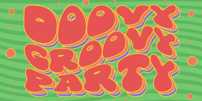 Introducing the Doovy Groovy Party font! This stylized, psychedelic, and round Groove Display Font takes you back to the 90's and 00's era. With its multilingual support, it's perfect for creating a pop, funky, and bold vibe. What sets the Doovy Groovy Party font apart is its unique ability to capture the essence of the vibrant and energetic 90's and 00's era. Its stylized, psychedelic design evokes a sense of nostalgia while still offering a fresh and contemporary look. This font is a true standout, allowing your designs to stand out as well. For designers looking to create harmonious compositions, the Doovy Groovy Party font has a few relatives and typefaces that complement it beautifully. Consider pairing it with "Retro Sans Serif" for a bold and cohesive look, or experiment with "Funky Display" to amplify the funky vibes. These combinations will add an extra layer of creativity and versatility to your design projects. The Doovy Groovy Party font comes in three variations - Regular, Outline, and Shadow - making it a versatile tool for various design needs. The Regular version provides a solid foundation, ideal for headlines and titles that demand attention. The Outline variation adds an element of sophistication and can be used for modern designs, while the Shadow option creates depth and dimension for a more dynamic appearance. Additionally, this font boasts extensive multilingual support, ensuring that it can be used effectively across different languages and cultures. The Doovy Groovy Party font draws inspiration from the bold and expressive typography prevalent in the 90's and 00's. It captures the vibrant and carefree spirit of that era, where music, art, and pop culture collided to create an explosion of creativity. The psychedelic elements incorporated into the font pay homage to the colorful and trippy visuals that defined the time. This font encapsulates the nostalgia and excitement of those years, allowing designers to infuse their projects with a sense of fun and playfulness. We created the Doovy Groovy Party font with a passion for celebrating the bold and expressive designs of the past. We wanted to provide designers with a versatile tool that brings the nostalgic charm of the 90's and 00's to their modern projects. By using this font, you can effortlessly transport your audience to a time when colors were brighter, music was groovier, and creativity knew no bounds. Let your imagination run wild with the Doovy Groovy Party font and infuse your designs with a vibrant touch that will captivate and inspire! Unlock the power of nostalgia and creativity with the Doovy Groovy Party font. Its unique design, versatile variations, and multilingual support make it the perfect choice for posters, marketing materials, T-shirt designs, headlines, and much more. Get ready to groove and let this font elevate your creative projects to a whole new level!
 - Shlop by Typodermic,
$11.95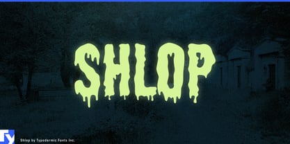 Welcome, dear victim, to the terrifying world of Shlop! Behold, as the letters drip with wickedness and ooze with horror. Shlop is not for the faint of heart—it’s a font that will leave you trembling with fear. But don’t stop there, my dear. Meet Shlop’s shloppy brother, the ultimate nightmare, Shlop Shloppy! Shlop Shloppy is not for the weak-willed, as it is even more shloppy than its sibling. When you use this font, you’ll be engulfed by the horrific sight of the letters melting into each other, forming a grotesque amalgamation of terror. It will make your skin crawl, and your mind will scream with horror. But that’s not all, my dear. When you use Shlop Shloppy in an OpenType savvy application, it will automatically replace common letter pairs with custom pairs, creating a more realistic and terrifying shloppy effect. Imagine the letters joining together in a monstrous dance of horror, leaving a trail of slime and terror behind them. Gross? Absolutely! So, dare to enter the nightmare that is Shlop and Shlop Shloppy. Let these fonts take over your design, and watch as your audience shivers with terror. Be warned, once you use these fonts, you’ll never look at typography the same way again. Don’t say I didn’t warn you! Most Latin-based European writing systems are supported, including the following languages. Afaan Oromo, Afar, Afrikaans, Albanian, Alsatian, Aromanian, Aymara, Bashkir (Latin), Basque, Belarusian (Latin), Bemba, Bikol, Bosnian, Breton, Cape Verdean, Creole, Catalan, Cebuano, Chamorro, Chavacano, Chichewa, Crimean Tatar (Latin), Croatian, Czech, Danish, Dawan, Dholuo, Dutch, English, Estonian, Faroese, Fijian, Filipino, Finnish, French, Frisian, Friulian, Gagauz (Latin), Galician, Ganda, Genoese, German, Greenlandic, Guadeloupean Creole, Haitian Creole, Hawaiian, Hiligaynon, Hungarian, Icelandic, Ilocano, Indonesian, Irish, Italian, Jamaican, Kaqchikel, Karakalpak (Latin), Kashubian, Kikongo, Kinyarwanda, Kirundi, Kurdish (Latin), Latvian, Lithuanian, Lombard, Low Saxon, Luxembourgish, Maasai, Makhuwa, Malay, Maltese, Māori, Moldovan, Montenegrin, Ndebele, Neapolitan, Norwegian, Novial, Occitan, Ossetian (Latin), Papiamento, Piedmontese, Polish, Portuguese, Quechua, Rarotongan, Romanian, Romansh, Sami, Sango, Saramaccan, Sardinian, Scottish Gaelic, Serbian (Latin), Shona, Sicilian, Silesian, Slovak, Slovenian, Somali, Sorbian, Sotho, Spanish, Swahili, Swazi, Swedish, Tagalog, Tahitian, Tetum, Tongan, Tshiluba, Tsonga, Tswana, Tumbuka, Turkish, Turkmen (Latin), Tuvaluan, Uzbek (Latin), Venetian, Vepsian, Võro, Walloon, Waray-Waray, Wayuu, Welsh, Wolof, Xhosa, Yapese, Zapotec Zulu and Zuni.
 - Nerdropol by Typodermic,
$11.95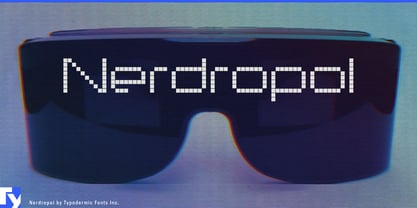 As I perused the latest offerings in the realm of graphic design, I chanced upon a curious creation that caught my discerning eye. Nerdropol, an offspring of the Neuropol X typeface, is a simulated bitmap typeface that touts a bevy of striking effects. This digital wonder is designed to capture the essence of original pixel fonts, rendering each character with precision and attention to detail. As I delved deeper into Nerdropol’s aesthetic, I couldn’t help but marvel at its distinctly industrial feel. Indeed, this font exudes a hard-edged, high-tech vibe that is sure to turn heads and captivate the senses. Every letter, meticulously crafted to evoke a sense of raw, unadulterated power, is sure to make an impact in any project. Nerdropol takes things to a whole new level by limiting kerning to full pixel increments, further emphasizing its digital origins. This meticulous attention to detail serves to heighten the overall effect of the font, resulting in a truly unique and visually stunning experience. In conclusion, if you seek to infuse your graphic design projects with a touch of cyberpunk flair, look no further than Nerdropol. With its daring aesthetic and unrivaled attention to detail, this font is sure to take your creations to new heights of digital excellence. Most Latin-based European writing systems are supported, including the following languages. Afaan Oromo, Afar, Afrikaans, Albanian, Alsatian, Aromanian, Aymara, Bashkir (Latin), Basque, Belarusian (Latin), Bemba, Bikol, Bosnian, Breton, Cape Verdean, Creole, Catalan, Cebuano, Chamorro, Chavacano, Chichewa, Crimean Tatar (Latin), Croatian, Czech, Danish, Dawan, Dholuo, Dutch, English, Estonian, Faroese, Fijian, Filipino, Finnish, French, Frisian, Friulian, Gagauz (Latin), Galician, Ganda, Genoese, German, Greenlandic, Guadeloupean Creole, Haitian Creole, Hawaiian, Hiligaynon, Hungarian, Icelandic, Ilocano, Indonesian, Irish, Italian, Jamaican, Kaqchikel, Karakalpak (Latin), Kashubian, Kikongo, Kinyarwanda, Kirundi, Kurdish (Latin), Latvian, Lithuanian, Lombard, Low Saxon, Luxembourgish, Maasai, Makhuwa, Malay, Maltese, Māori, Moldovan, Montenegrin, Ndebele, Neapolitan, Norwegian, Novial, Occitan, Ossetian (Latin), Papiamento, Piedmontese, Polish, Portuguese, Quechua, Rarotongan, Romanian, Romansh, Sami, Sango, Saramaccan, Sardinian, Scottish Gaelic, Serbian (Latin), Shona, Sicilian, Silesian, Slovak, Slovenian, Somali, Sorbian, Sotho, Spanish, Swahili, Swazi, Swedish, Tagalog, Tahitian, Tetum, Tongan, Tshiluba, Tsonga, Tswana, Tumbuka, Turkish, Turkmen (Latin), Tuvaluan, Uzbek (Latin), Venetian, Vepsian, Võro, Walloon, Waray-Waray, Wayuu, Welsh, Wolof, Xhosa, Yapese, Zapotec Zulu and Zuni.
 - Wakerobin by Monotype,
$50.99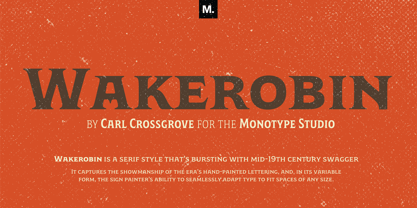 Wakerobin takes its charming swagger from the hand-painted billboard, poster and signage lettering of the mid-19th century. These showy styles did everything they could to stand out from the background cacophony of advertising, with signwriters using sharp and high contrast serif letters, squared block shapes, or art nouveau forms to grab the attention of passersby. Wakerobin embraces the spirit of these letterforms, bringing these various styles together in one typeface - as if users had their own sign painter on hand. Just as lettering artists had to adapt to a variety of sizes - from wide streetcar lettering to compressed forms that squeezed into narrow Victorian windows - the variable version of Wakerobin scales up and down in width to fit whatever environment the user’s working in. The static fonts come in three widths and five weights. As well as its adaptability, Wakerobin is bursting with vintage flavour, making it hard to ignore. Its distinctive, spiky serifs would be right at home on food and drinks packaging, as well as shop windows, adverts, and any other place that calls for some typographic showmanship. It performs particularly well in busy environments, or anywhere with a lot of visual noise - just as its historic predecessors did. And while Wakerobin is first and foremost a display typeface, it’s surprisingly elegant when used at text size, or in the lighter end of the weight spectrum.
 - VLNL Gindicate by VetteLetters,
$30.00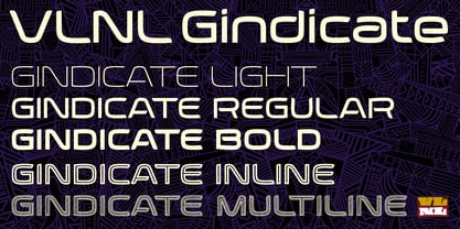 The alcoholic beverage Gin is drunk around the world, as far back as the 13th century. Originally distilled as a medicine, it draws its main flavour from juniper berries. Gin is colourless itself but – due to its smooth taste – a major ingredient in a long list of famous colourful cocktails. Gimlet, Singapore Sling, Negroni, Charlie Chaplin, French 75, Vesper, Tom Collins, White Lady, Aviation, Monkey Gland, Southside, Gin Gin Mule and New Orleans Fizz are but a few of them. That made us decide it simply cannot be missing from the Vette Letters font collection. Vette Letters designer Henning Brehm originally designed VLNL Gindicate for the 2015 action movie Hitman: Agent 47. It was specifically used for the logo and signage of the maverick ‘Syndicate International’ organisation in the film. It lay dormant in a folder for a while, when it was reworked into this flashy 5 weight family. VLNL Gindicate is a rounded modern sans serif family, suitable for a multitide of applications, corporate or otherwise. It has somewhat of a warm sci-fy feel, without being overtly techno-ish. In the family are 3 regular weights (Light - Regular - Bold), but also an Inline and Multiline weight for extra design possibilities. Company logos, brand identities, music flyers or posters, you name it. VLNL Gindicate will spice up any design. Bottom’s up!
 - Sabine by Arabetics,
$45.00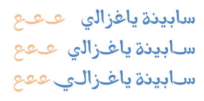 Sabine is an Arabetic type design with a calligraphic flavor. It follows the guidelines of the Mutamathil Taqlidi type style with one glyph for every basic Arabic Unicode character or letter, as defined in Unicode Standards version 5.1, and one additional, final-position, glyph for each Arabic letter that is normally connected with other letters from both sides in traditional cursive Arabic strings. Sabine employs variable x-height values. It includes all required Lam-Alif ligatures and uses ligature substitutions and selected marks positioning but it does not use any other glyph substitutions or forming. Text strings composed using types of this family are non-cursive with stand-alone isolated glyphs. Tatweel (or Kashida) glyph is a zero width space. Keying it before any glyph will display that glyph isolated form. In Sabine Kashidah, Irsal, and Tasmim keying Tatweel (shift J) after certain glyphs will replace it with a long stroke glyph. In Sabine Tasmim, keying it a second time will replace glyph with a final form swash (Irsal) glyph. In Sabine Irsal all final forms are swash glyphs. Keying Tatweel before Alif Lam Lam Ha will display the Allah ligature. Sabine family includes both Arabic and Arabic-Indic numerals; all required diacritic marks, Allah ligature, in addition to standard English keyboard punctuations and major currency symbols. Fonts are available in regular and italic styles.
 - Yasmine by Arabetics,
$39.00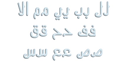 The Yasmine type family follows the guidelines of the Mutamathil Taqlidi type style. It has one glyph for every basic Arabic Unicode character or letter and one additional, final-position, glyph for each Arabic letter that is normally connected with other letters from both sides in traditional cursive Arabic strings. Yasmine employs four fixed x-height values, two above and two below the x-axis. Values are high to give a slight vertical overall look. Its design uses full curves with equally distributed weight. Yasmine family includes all required Lam-Alif ligatures and uses ligature substitutions, and marks positioning but it does not use any other glyph substitutions or forming. Text strings composed using types of this family are non-cursive with stand-alone isolated glyphs. It employs our “natural Arabic input” method where first glyph is displayed in its non-isolated form. Tatweel (or Kashida) glyph is a zero width space. Keying it before any glyph will display that glyph isolated form. Keying it before Alif Lam Lam Ha will display the Allah ligature. Yasmine family includes both Arabic and Arabic-Indic numerals, all required diacritic marks, Allah ligature, in addition to all standard English keyboard punctuations and major currency symbols. The fonts in this family support the following scripts: Arabic, Persian, Urdu, Pashtu, Kurdish, Baluchi, Kashmiri, Kazakh, Sindhi, Uyghur, Turkic, and all extended Arabic scripts.
 - VLNL Thueringer by VetteLetters,
$30.00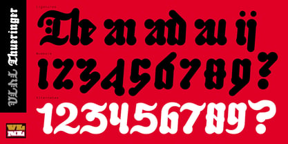 We cannot imagine anyone not liking beer. Especially on a warm summer night there is simply little that can top an ice cold brewski. And with the current wave of home-brewed ales and lagers, Vette Letters decided to not stay behind and brew its own brand. Just so we can design our own beer bottle label using our own font. VLNL Thueringer comes from the drawing board of Jacques Le Bailly (a.k.a. Baron von Fonthausen), the German-French specialist in the fields of both beer and type design. One day Jacques got inspired by Albrecht Dürers 15th century Fraktur (blackletter) alphabet, and decided to design a contemporary rounded version of it. Although the historic context is clearly visible, Thueringer definitely stands its own ground. It's a modern techno-style blackletter with a (beer)truckload of interesting design details. Thueringer contains a number of ligatures and an alternate set of numbers. Apart from the regular uses like logos, posters, flyers and headlines we definitely would like to see our Thueringer used on beer bottle labels and crates, but also cafés and hipster bars would do well with this modern-day blackletter. Hell, even wine or liquor labels, football team jerseys, Oktoberfest flyers, it's just too much to mention. As long as it is accompanied by a cold beer.
 - Amudi by Arabetics,
$39.00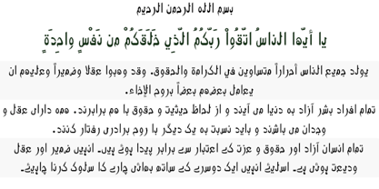 The Amudi type family follows the guidelines of the Mutamathil Taqlidi type style. It has one glyph for every basic Arabic Unicode character or letter and one additional, final-position, glyph for each Arabic letter that is normally connected with other letters from both sides in traditional cursive Arabic strings. Amudi employs four fixed x-height values, two above and two below the x-axis.. Values are high to give a slight vertical overall look. Amudi family includes all required Lam-Alif ligatures and uses ligature substitutions, and marks positioning but it does not use any other glyph substitutions or forming. Text strings composed using types of this family are non-cursive with stand-alone isolated glyphs. It employs our “natural Arabic input” method where first glyph is displayed in its non-isolated form. Tatweel (or Kashida) glyph is a zero width space. Keying it before any glyph will display that glyph isolated form. Keying it before Alif Lam Lam Ha will display the Allah ligature. it Amudi family includes both Arabic and Arabic-Indic numerals, all required diacritic marks, Allah ligature, in addition to all standard English keyboard punctuations and major currency symbols. The fonts in this family support the following scripts: Arabic, Persian, Urdu, Pashtu, Kurdish, Baluchi, Kashmiri, Kazakh, Sindhi, Uyghur, Turkic, and all extended Arabic scripts.
 - Alverata by TypeTogether,
$58.00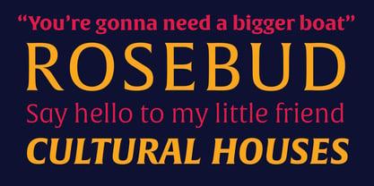 Gerard Unger’s new typeface Alverata is a twenty-first-century type-face inspired by the shapes of romanesque capitals in inscriptions of the eleventh and twelfth centuries, without being a close imitation of them. It is additionally based on the early twentieth-century model, but tweaked so as to prevent blandness and monotony. Alverata performs beautifully in both screen and on paper, delivering excellent legibility. Its letters are open and friendly in small sizes and lively and attractive in large sizes. They are robust, and show refinement in their detail. It is an extensive type family, with versions for both formal and informal applications. Alverata consists of three different fonts: Alverata, Alverata Informal and Alverata Irregular, that variate in form and width, but maintain the same spirit. The ‘irregular’ version is particularly inspired by the Insular letterforms, the uncials, and their constantly changing positioning. Alverata PanEuropean includes Greek and Cyrillic relatives. The typeface strikes a balance among Europe’s diversity of languages, combining contemporary typographical practices with features of medieval letterforms, from the time when Europe came into being. Visually, some written languages, such as Czech and Maltese, differ quite strongly from languages like English and German, notably because of their many accented characters. While other typefaces will show this difference, Alverata removes it. As a result, Alverata enables harmonious convergence of languages.
 - Kufi Mutamathil by Arabetics,
$39.00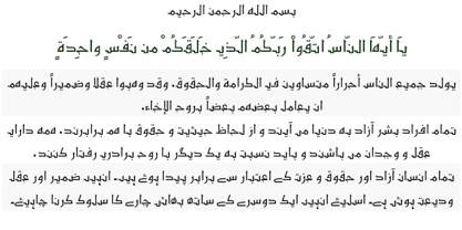 Kufi Mutamathil is an Arabetic (extended Arabic) typeface design with heavy Arabic Kufi calligraphy accent, both on a single letter level and in an overall text look and feel. Although Kufi, the earliest Arabic calligraphy style, is often described as “stiff”, it is in fact a very flexible style. The Kufi Mutamathil typeface design underlines this calligraphy style flexibility and openness through visualizing a very legible Mutamathil design with Kufi shapes. The Mutamathil type style utilizes only one isolated glyph per Arabic Unicode character or letter, as defined in Unicode Standards. It is a very light style which does not require any standard glyph substitution or the shaping engine. The Kufi Mutamathil font family employs variable, unrestricted, x-height values. It comes in regular and left-slanted italic styles. Kufi Mutamathil includes all required Lam-Alif ligatures. Soft-vowel diacritic marks, or harakat, are selectively positioned with the majority of them appearing on the same level, over or below, following a letter, to ensure that they would not interfere with individual glyphs appearance. Kashida, or tatweel, (shft-j) is a zero-width character. Keying it before Alif-Lam-Lam-Ha will display the Allah ligature. Kufi Mutamathil includes both Arabic and Arabic-Indic numerals, in addition to all Standard English keyboard punctuations and major currency symbols.
 - Wakerobin Variable by Monotype,
$209.99Wakerobin takes its charming swagger from the hand-painted billboard, poster and signage lettering of the mid-19th century. These showy styles did everything they could to stand out from the background cacophony of advertising, with signwriters using sharp and high contrast serif letters, squared block shapes, or art nouveau forms to grab the attention of passersby. Wakerobin embraces the spirit of these letterforms, bringing these various styles together in one typeface - as if users had their own sign painter on hand. Just as lettering artists had to adapt to a variety of sizes - from wide streetcar lettering to compressed forms that squeezed into narrow Victorian windows - the variable version of Wakerobin scales up and down in width to fit whatever environment the user’s working in. The static fonts come in three widths and five weights. As well as its adaptability, Wakerobin is bursting with vintage flavour, making it hard to ignore. Its distinctive, spiky serifs would be right at home on food and drinks packaging, as well as shop windows, adverts, and any other place that calls for some typographic showmanship. It performs particularly well in busy environments, or anywhere with a lot of visual noise - just as its historic predecessors did. And while Wakerobin is first and foremost a display typeface, it’s surprisingly elegant when used at text size, or in the lighter end of the weight spectrum. - Cyclopentane by Typodermic,
$11.95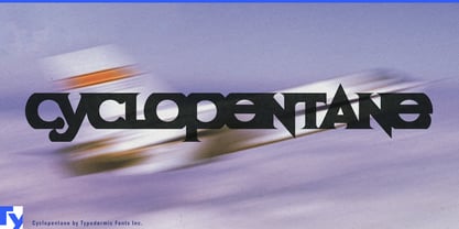 The gorgeous back-glass artwork for the iconic pinball game Xenon influenced Cyclopentane. The peculiar letter interactions are challenging to employ but pay off handsomely when they communicate your message in such an unusual manner. Most Latin-based European writing systems are supported, including the following languages. Afaan Oromo, Afar, Afrikaans, Albanian, Alsatian, Aromanian, Aymara, Bashkir (Latin), Basque, Belarusian (Latin), Bemba, Bikol, Bosnian, Breton, Cape Verdean, Creole, Catalan, Cebuano, Chamorro, Chavacano, Chichewa, Crimean Tatar (Latin), Croatian, Czech, Danish, Dawan, Dholuo, Dutch, English, Estonian, Faroese, Fijian, Filipino, Finnish, French, Frisian, Friulian, Gagauz (Latin), Galician, Ganda, Genoese, German, Greenlandic, Guadeloupean Creole, Haitian Creole, Hawaiian, Hiligaynon, Hungarian, Icelandic, Ilocano, Indonesian, Irish, Italian, Jamaican, Kaqchikel, Karakalpak (Latin), Kashubian, Kikongo, Kinyarwanda, Kirundi, Kurdish (Latin), Latvian, Lithuanian, Lombard, Low Saxon, Luxembourgish, Maasai, Makhuwa, Malay, Maltese, Māori, Moldovan, Montenegrin, Ndebele, Neapolitan, Norwegian, Novial, Occitan, Ossetian (Latin), Papiamento, Piedmontese, Polish, Portuguese, Quechua, Rarotongan, Romanian, Romansh, Sami, Sango, Saramaccan, Sardinian, Scottish Gaelic, Serbian (Latin), Shona, Sicilian, Silesian, Slovak, Slovenian, Somali, Sorbian, Sotho, Spanish, Swahili, Swazi, Swedish, Tagalog, Tahitian, Tetum, Tongan, Tshiluba, Tsonga, Tswana, Tumbuka, Turkish, Turkmen (Latin), Tuvaluan, Uzbek (Latin), Venetian, Vepsian, Võro, Walloon, Waray-Waray, Wayuu, Welsh, Wolof, Xhosa, Yapese, Zapotec Zulu and Zuni.
 - Fragile Bombers by Typodermic,
$11.95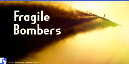 Fragile Bombers is a military-themed display typeface. Its crisp letterforms will instill a sense of technological precision in your message. It comes in Regular and two rusted metal finishes. Most Latin-based European writing systems are supported, including the following languages. Afaan Oromo, Afar, Afrikaans, Albanian, Alsatian, Aromanian, Aymara, Bashkir (Latin), Basque, Belarusian (Latin), Bemba, Bikol, Bosnian, Breton, Cape Verdean, Creole, Catalan, Cebuano, Chamorro, Chavacano, Chichewa, Crimean Tatar (Latin), Croatian, Czech, Danish, Dawan, Dholuo, Dutch, English, Estonian, Faroese, Fijian, Filipino, Finnish, French, Frisian, Friulian, Gagauz (Latin), Galician, Ganda, Genoese, German, Greenlandic, Guadeloupean Creole, Haitian Creole, Hawaiian, Hiligaynon, Hungarian, Icelandic, Ilocano, Indonesian, Irish, Italian, Jamaican, Kaqchikel, Karakalpak (Latin), Kashubian, Kikongo, Kinyarwanda, Kirundi, Kurdish (Latin), Latvian, Lithuanian, Lombard, Low Saxon, Luxembourgish, Maasai, Makhuwa, Malay, Maltese, Māori, Moldovan, Montenegrin, Ndebele, Neapolitan, Norwegian, Novial, Occitan, Ossetian (Latin), Papiamento, Piedmontese, Polish, Portuguese, Quechua, Rarotongan, Romanian, Romansh, Sami, Sango, Saramaccan, Sardinian, Scottish Gaelic, Serbian (Latin), Shona, Sicilian, Silesian, Slovak, Slovenian, Somali, Sorbian, Sotho, Spanish, Swahili, Swazi, Swedish, Tagalog, Tahitian, Tetum, Tongan, Tshiluba, Tsonga, Tswana, Tumbuka, Turkish, Turkmen (Latin), Tuvaluan, Uzbek (Latin), Venetian, Vepsian, Võro, Walloon, Waray-Waray, Wayuu, Welsh, Wolof, Xhosa, Yapese, Zapotec Zulu and Zuni.