1,833 search results
(0.018 seconds)
- Publica Sans by FaceType,
$- Publica Sans is a clean geometric typeface, equipped with a variety of OpenType features to give you all you need for great typography: Alternates, arrows, rare currency symbols, case sensitive forms, various sets of figures and discretionary ligatures. Publica Sans has two sisters: Publica Play and Publica Slab Take a close look at our gallery (especially ‘OpenType Features 1–6’) to discover the versatility of Publica Sans. Alternates Give your typography a certain spin with the variety of alternate letters provided. Currency You need to set prices in exotic countries? No problem: Publica Sans gives you loads of rare currency symbols. Case Sensitive Forms Sometimes you write in all caps and there are some symbols (e.g. brackets) that need some extra treatment to make it look perfect – that’s what case sensitive forms are for. Figures Publica Sans provides 6 sets of figures, like lining, tabular, oldstyle, numerators ... Discretionary Ligatures Ligatures can make your logo or headline look spicy. So there are plenty of them.
 - Publica Slab by FaceType,
$- ‘Publica Slab’ is the serifed sister of Publica Sans and Publica Play – packed with subtle open type features, tabular options, rare currencies signs and symbols and arrows, ‘Publica Slab’ provides everything you need for big design tasks like signage, corporate design and magazine design. Take a close look at our gallery (especially ‘OpenType Features 1–6’) to discover the versatility of Publica Slab. Alternates Give your typography a certain spin with the variety of alternate letters provided. Currency You need to set prices in exotic countries? No problem: Publica Slab gives you loads of rare currency symbols. Case Sensitive Forms Sometimes you write in all caps and there are some symbols (e.g. brackets) that need some extra treatment to make it look perfect – that’s what case sensitive forms are for. Figures Publica Slab provides 6 sets of figures, like lining, tabular, oldstyle, numerators ... Discretionary Ligatures Ligatures can make your logo or headline look spicy. So there are plenty of them.
 - Publica Play by FaceType,
$- Publica Play is Publica Sans’ and Publica Slab’s playful sister. It comes with loads of subtle open type features, tabular options, rare currencies signs and symbols and arrows – ‘Publica Play’ has everything you need for playful design tasks. Take a close look at our gallery (especially ‘OpenType Features 1–7’) to discover the versatility of Publica Play. Alternates and Stylistic Sets Give your typography a certain spin with the variety of alternate letters provided. Explore the Stylistic Sets provided. Currency You need to set prices in exotic countries? No problem: Publica Play gives you loads of rare currency symbols. Case Sensitive Forms Sometimes you write in all caps and there are some symbols (e.g. brackets) that need some extra treatment to make it look perfect – that’s what case sensitive forms are for. Figures Publica Play provides 6 sets of figures, like lining, tabular, oldstyle, numerators ... Discretionary Ligatures Ligatures can make your logo or headline look spicy. So there are plenty of them.
 - World Madly by Putracetol,
$16.00 World Madly - Display Font is a delightful and quirky typeface designed with an environmental theme in mind. This font exudes a sense of fun and playfulness with its rounded and condensed letterforms, making it a perfect choice for projects related to nature and the Earth. Featuring a remarkable array of ten alternative font versions, each inspired by elements of the Earth and plant life such as tree trunks, leaves, globes, roots, and trees, World Madly is purposefully created for Earth Day-themed designs. It seamlessly integrates into projects with themes centered around nature, green initiatives, and the Earth. This font is an ideal choice for creating designs like Earth Day-themed invitations, birthday invites, party decorations, logos, stickers, clothing, packaging, children's books, magazines, and more. With its crafty and playful style, World Madly lets you express your love for the planet and the environment in your creative projects, adding a touch of eco-consciousness.
 - Tea And Oranges by Hanoded,
$15.00 Tea And Oranges is a line from Leonard Cohen’s song Suzanne. “She feeds you tea and oranges that come all the way from China”… The song was a favourite of my brother Rizja who, sadly, recently passed away. Tea And Oranges is a a handwritten ‘pencil’ style font. It comes with impressive language support and a bunch of Discretionary ligatures for you to play with!
 - DF Zzzz by Dutchfonts,
$33.00 This typeface, in fact a bitmap font 'avant la lettre' is an interpretation of the Old Face condensed type. It is being used where space is scarce. Its skeleton is projected on the chain structure of a fly screen. Eventually your text lines fill the space as wide as hypothetical doors can be. In small sizes the text appears to be drawn with a pencil.
 - The Shensie by Soft Creative,
$20.00 Introducing The Shensie. The Shensie Font, is a classic thin font with an italic style. Here you will get beautiful classic fonts. this font is available in several modern swirls that can make your work look elegant, sweet and perfect. With this style, this font would be perfect for logos, branding projects, household designs utensils, product packaging, mugs, quotes, posters, shopping bags, logo, t-shirt, book cover, business card, invitation card, greeting cards, and all your other beautiful projects.
 - Mothman by Hanoded,
$15.00 In 1966 and 1967 a series of weird events spooked Point Pleasant, a small town in West Virginia. Townspeople described a creature that looked like a man, with red eyes and moth-like wings, which appeared at several locations around town. The Mothman myth was born. Mothman font is spooky as well. It is a very scratched and distorted typeface, completely hand drawn, using ink and various sharp utensils. Mothman font will surely leave a lasting impression!
 - Covent BT by Bitstream,
$50.99Designed by Jochen Hasinger of Frankfurt, Germany, Covent BT is an unconventional geometric sans serif typeface, featuring rounded terminal ends and a stencil-like break of the contour in some glyphs. At first glance you might think of it as a display typeface, but the generous x-height and openness of the lowercase makes Covent BT very legible at text sizes. Central Europe and Cyrillic is supported in the extended glyph set. Each weight contains 485 glyphs and includes some alternate figures, some upper and lowercase alternates, as well as others, all accessible via OpenType features. Covent BT Symbols is a stylized geometric symbol font, intended to stand alone or used as a companion to the Covent BT typefaces. The array of glyphs covers many of the more popular icons of the day including symbols for web use, numbers, sports, travel and astrology, to name a few, each with its own unique stylized interpretation. - Leco 1988 by CarnokyType,
$18.00 The typeface LECO 1988 is another font family which belongs to LECO set. It is a display typeface, which is inspired by the title written on the bottle of lečo from 1988. Its typical features are embedded diacritics and significant black look with low contrast. Lower case is united with upper case and has several identical glyphs in both forms. Font contains alternative set of glyphs for letter „E“. Tabular numerals, superiors and inferiors and the full set of (glyphs - symbols) for languages using the Latin alphabet are also included in this font. LECO 1988 font family includes six specific styles: Regular, Blind, Gradient, Outline, Shadow and Stencil style. Those styles extend typographic options by mutual combination or overlapping, whilst every style share the identical metrics and kerning. Font format is Open Type with the support of several open type features. This typeface is suitable for creating logotypes, powerful posters or can be used as a headline display typeface.
 - Hand Printing Press by Fontscafe,
$39.00 Hand printing typography revolutionized the way books were published. The earliest printing presses made it possible for newspapers to reach the doorstep every morning, for information to freely be shared among the masses for the first time on a large scale…and the fonts that were used in those classic times are forever embedded within the collective memories of societies across the planet. It is to this collective memory that we give a visual form with our new Hand Printing Press Pack. Up for grabs are a set of 10 Hand Printing fonts plus one "Stamps" elements font. The fonts are: the Normal, the Stencil, the Eroded, the Meshed and the Scraped in REGULAR and BOLD versions; each of them displaying a simplistic yet classic printing style and as often happens lately, we are also offering you an "elements" pack, the "Stamps" font, to go with these to create your customized stamp giving to your creations a touch of "official documentation".
 - Wafero by Absonstype,
$17.00 WAFERO is the Stencil display typeface with combine uppercase and lowercase looks and feel nice balanced. Provide with alternates and ligatures font in variant style make the design letter looks nice. Honestly it works perfectly for headlines, logos, posters, packaging, T-shirts and much more. Recommended to use in Adobe Illustrator or Adobe Photoshop with opentype feature. Ligatures feature is default setting in Adobe Illustrator or Adobe Photoshop in Uppercase character. So when you want not to use the ligatures. Open glyphs panel : In Adobe Photoshop choose tool Window Character and then please click fi symbol In Adobe Illustrator choose tool Window Type Open Type and then please click fi symbol How to access Alternates Character? Open glyphs panel : In Adobe Photoshop choose tool Window glyphs In Adobe Illustrator choose tool Type glyphs If you have questions, just send me a message and I’m glad to help. Have a great day, Absonstype
 - Cooper Black Pro by SoftMaker,
$15.99 SoftMaker’s Cooper Black Pro is a friendly, chubby typefaces with rounded serifs and tilted back ovals. It is perfect whenever an informal, friendly character is desired in your designs. Oswald Cooper designed Cooper Black in 1919 for Barnhart Brothers & Spindler; later it was popularized by ATF. This release adds variations not present in the original design: In addition to a true italic and a condensed version, you can also experiment with a “poster” variant (tighter spacing, integral umlauts and accents) and a “stencil” variant. SoftMaker’s Cooper Black Pro typeface family contains OpenType layout tables for sophisticated typography. It also comes with a huge character set that covers not only Western European languages, but also includes Central European, Baltic, Croatian, Slovene, Romanian, and Turkish characters. Case-sensitive punctuation signs for all-caps titles are included as well as many fractions, an extensive set of ligatures, and separate sets of tabular and proportional digits.
 - Aviano Silk by insigne,
$22.00 A premier product from insigne, the powerful Aviano redefines its classic lines for the contemporary elegance of Aviano Silk. This modern development of a timeless font, part of insigne's annual tradition in adding to the Aviano family, was elected the clear leader in a poll of insigne design's social media followers. Aviano Silk refers to the smooth flowing feel that the negative space gives the font. This particular example is sort of a hybrid between the stencil and a centerline. It has a certain amount of velocity to it. Extended characters lend formality and a sense of wealth and power. Due to the modifications required for the new look, the Silk family cannot work as an overlay for Aviano, though it pairs nicely with it. There are also 12 Aviano families that work well with Silk. Aviano Silk is particularly suited to high-end luxury applications and especially branding projects. Use Aviano Silk to lend refinement and luxurious elegance to your design.
 - Leophard by Arterfak Project,
$16.00 Create a great combination design with this font family! Leophard font family is a modern slab serif that is inspired by sporty design and vintage style. There are 6 different styles that you can apply in your design projects. This font is made with tenacious basic shapes, the visuality of strength, old school movement, and modern minimalist style. - Regular style - good for your titles, sub-headlines or body text for readability. - Bold style - recommended for your titles, naming, labels or logos. - Bold inline style - is cool for your big typographic designs that are showing the precision of the shapes. - Outline style - good for your additional text, or minimalism design purposes. - Shadow style - suitable for vintage logos, minimalist effects, and titles. - Stencil style - inspired by street art and letterpress design. Recommended for design project which visualizes strength and movement. Make a great combination on your label designs, brand, poster headlines, movie titles, storefront, monograms, sport designs and merchandise design.
 - Interzone by MYSTERIAN,
$9.00 This type crept up the sense that it was made in Eastern Europe by poorly trained urbanites from a crippled nation, or that it is the remains of a contemporary gothic (like Eckmann) stencil. The choice of what this type signifies is up to the public. Lately I like the idea of 'putting on' (in McLuhan's sense) a genre of idea that is somewhat different from my tradition's beliefs, and fitting a core category of that toward a teleological/eschatological advantage. Therefore postmodernist/apocalyptic carelessness (which I may 'put on' by using this type) is how I abstain from the cravings of immortality, or more so that wanting it is pointless. It’s stands as memento morí; that I will have to die someday. I have to become less, He must become more. Of course, Interzone may signify a classic Joy Division track from Unknown Pleasures as well as the Cold Warish ongoings of conflicted eastern European life. I considered naming this Lunik 9.
 - Rushen by Arterfak Project,
$18.00 Presenting to you Rushen. A vintage display sans serif with 5 styles. Designed with a bold weight that is awesome to be used for many purposes such as headline, branding, logo, apparel, logotype, cards, labels, poster, packaging, and many more. These fonts are all-caps fonts complete with multilingual support. Be Bold with Rushen! What you'll get : Regular: The basic one, with sharp geometrical shapes, formal and elegant look. Good to apply in Books, newspapers, letterhead. Curvy: Inky inspired from the old-school advertising, can be combined with your favorite fonts. Perfect for labels, posters, and short editorial. Stencil: The most explored with some adjustments that look good for a manly theme, urban style, military themes, brave, and youth. Shadow: The complement from all, but still can be stand-alone for western design, old school, and food themes. Distressed: The vintage-inspired with the neat ink effect and minimal anchor points to keep font still ergonomic. Thank you for your support!
 - Bomber TV by Kustomtype,
$25.00 I was asked by a good friend of mine to design his tattoo lettering. This fellow prefered an easy stencil with no ornament, such as swirls or loops. After some preliminary design I finally accepted the challenge and while completing the whole alphabet, the idea of creating a cool font of it occured to me. Only a few months later this new font family already contained 4 weights, every weight has a companion Italic style, punctuation, numerals and mathematical operators, as well as all accented characters. Bomber TV is a brand-new font and all glyphs have been contemplated very carefully so that all characters match in a well-balanced and streaming way. In both shaped weights, the font suits extraordinary well for headings, slogans etc. The cleanly cut and powerful Bomber TV font can easily be used for logotype, games, prints, magazines, web, apps, packaging, posters, T-shirts, signage & design projects. The font is original and custom made by Kustomtype.
 - Gridiot by Peter Bain,
$10.00 Gridiot is a constructed, semi-serif, two-weight stencil family that expands an approach taken by Josef Albers. Intended for display or headline setting, it features chamfered or bevel-cut corners, used instead of curves. The individual letter components sometimes vary in depth, avoiding a strictly modular approach, while the widths are kept consistent. The lining figures provide a standard set of numbers, and the oldstyle figures align with the lowercase, encouraging lowercase-only setting. Currency and other useful numerical symbols are provided in both versions. The zero is intentionally lighter, following early Renaissance types; there are filled versions as stylistic alternates. While horizontal scaling distorts the relationship between verticals and horizontals in a typeface, since every chamfer in Gridiot is at 45°, changing the horizontal scaling of the type will affect all diagonals equally. When used at a large size, or for a just few words, Gridiot can be very tightly spaced. Remember, any idiot can design a typeface on a grid: Gridiot.
 - Pencil Caps is a distinctive font that embodies the essence of handmade artistry and the simplicity of pencil sketches. Designed to capture the whimsy and raw aesthetic of pencil-drawn capital letter...
- Chlorophyll by Alit Design,
$18.00 Introducing "Chlorophyll" - A Sans Serif Font with a Refreshing Natural Elegance Unveil the beauty of nature in your design projects with "Chlorophyll," a stunning sans serif font that combines modern simplicity with the organic charm of leaf illustrations. This elegant typeface is designed to infuse your creations with a sense of natural harmony, making it perfect for a wide range of applications, from branding to packaging and beyond. Key Features: Sans Serif Sophistication: "Chlorophyll" boasts a clean and versatile sans serif style, making it ideal for both display and body text. Its balanced letterforms exude a sense of modern sophistication, ensuring legibility and impact in all your design endeavors. Leafy Delight: With meticulously crafted leaf illustrations integrated into the font's characters, "Chlorophyll" embodies the spirit of the great outdoors. Each letter and symbol subtly incorporates the elegance of leaves, creating a seamless connection to the natural world. Elegance in Simplicity: "Chlorophyll" captures the essence of natural beauty through its simplicity. This font is a testament to the idea that less is more, allowing your content to shine while adding a touch of eco-friendly charm. Versatile Usage: Whether you're designing a logo for an eco-conscious brand, creating invitations for a garden wedding, or crafting a menu for a farm-to-table restaurant, "Chlorophyll" adapts effortlessly to diverse design projects. It's a versatile tool that can evoke a sense of elegance and sustainability in any context. Extensive Character Set: "Chlorophyll" includes an extensive character set, encompassing uppercase and lowercase letters, numerals, punctuation, and a wide range of special characters. This ensures compatibility with multiple languages and enables you to express your message with clarity and grace. Digital and Print Ready: "Chlorophyll" is delivered in multiple formats, making it ready for both digital and print applications. Its high-quality vectors ensure crisp and sharp rendering in any size or medium. Embrace the allure of nature and elevate your design projects with "Chlorophyll." This sans serif font, inspired by the beauty of leaves and the elegance of simplicity, brings a touch of the natural world to your creative endeavors. Elevate your designs, evoke a sense of harmony, and make a lasting impression with "Chlorophyll" today.
 - Enforcer by Tour De Force,
$25.00 Modern simple typeface expressing sharp and bright words without need for writing something really smart. Made by Dusan Jelesijevic one day when he left without anything smart to say or write, so he just grabbed a pencil and forced the paper to be cooperative. Someone said that this typeface looks like the ancient Greeks went in present future and used contemporary equipment for writing those letters. It is ideal for branding and avantgarde identities.
 - Pluckypot by Maulana Creative,
$12.00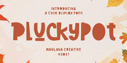 Pluckypot is a decorative handwritten display font. With pencil effect stroke, fun character with a bit of ligatures. To give you an extra creative work. Pluckypot font support multilingual more than 100+ language. This font is good for logo design, Social media, Movie Titles, Books Titles, a short text even a long text letter and good for your secondary text font with Script or Handwrittens. Make a stunning work with Pluckypot font. Cheers, MaulanaCreative
 - BoxyBlocks by d[esign],
$17.38 The laboriously hand drawn letters of the BoxyBlocks font family are something reminiscent of the letters and decorative elements which adorned our childhood artworks, posters, pencil cases and workbooks. The BoxyBlocks font family consists of three fonts; BoxyBlocks, BoxyBlocks Nero and BoxyBlocks Original. BoxyBlocks and BoxyBlocks Nero can be used together to fill in the sides of BoxyBlocks' letters, by layering BoxyBlocks above a differently coloured BoxyBlocks Nero in your image editor of choice.
 - Reclaim - Personal use only

- Austin Pen by Three Islands Press,
$29.00 Empresario Stephen F. Austin (1793-1836) is considered by many the “Father of Texas” for leading the first Anglo-American colony into the then-Mexican territory back in the 1820s. A few years later, while on a diplomatic mission to Mexico City, Austin was arrested on suspicion of plotting Texas independence and imprisoned for virtually all of 1834. During this time he kept a secret diary of his thoughts and musings—much of it written in Spanish. Austin Pen is my interpretation of Austin’s scribblings in this miniature prison journal (now in the collection of the wonderful Dolph Briscoe Center for American History, in the Texas city that bears his name). The little leather-bound book is filled with notes in ink and pencil—some of the faded penciled pages traced in ink years later by Austin’s nephew Moses Bryan. A genuine replication of 19th century cursive, Austin Pen has two styles: a fine regular weight, along with a bold style that replicates passages written with an over-inked pen. Each is legible and evocative of commonplace American penmanship of two centuries ago.
 - Jillican by Typodermic,
$11.95 Introducing Jillican, the sans-serif typeface that is all about precision and practicality. With its clean lines and geometric design, Jillican is the perfect choice for any project where clarity and efficiency are key. But don’t let its no-frills appearance fool you. Jillican’s simplicity is precisely what makes it so special. This typeface is angled only where necessary, free of any unnecessary adornments or distractions. The result is a typeface that is both modern and timeless, suitable for a wide range of applications. Jillican is available in six weights and italics, giving you plenty of flexibility to use it in any situation. And for those who want to take things up a notch, Jillican offers some exciting variations. Jillican War is a bold stencil style that makes a statement, while Jillican Warpaint adds a touch of artistic flair with its dripping paint effect. For a more dimensional look, there’s Jillican War 3D, a shaded stencil style that brings your text to life. Overall, Jillican is the perfect choice for anyone looking for a typeface that is both practical and distinctive. With its classic British inspiration and computer plotter-drawn aesthetic, Jillican is sure to turn heads and make an impact in any design project. Most Latin-based European writing systems are supported, including the following languages. Afaan Oromo, Afar, Afrikaans, Albanian, Alsatian, Aromanian, Aymara, Bashkir (Latin), Basque, Belarusian (Latin), Bemba, Bikol, Bosnian, Breton, Cape Verdean, Creole, Catalan, Cebuano, Chamorro, Chavacano, Chichewa, Crimean Tatar (Latin), Croatian, Czech, Danish, Dawan, Dholuo, Dutch, English, Estonian, Faroese, Fijian, Filipino, Finnish, French, Frisian, Friulian, Gagauz (Latin), Galician, Ganda, Genoese, German, Greenlandic, Guadeloupean Creole, Haitian Creole, Hawaiian, Hiligaynon, Hungarian, Icelandic, Ilocano, Indonesian, Irish, Italian, Jamaican, Kaqchikel, Karakalpak (Latin), Kashubian, Kikongo, Kinyarwanda, Kirundi, Kurdish (Latin), Latvian, Lithuanian, Lombard, Low Saxon, Luxembourgish, Maasai, Makhuwa, Malay, Maltese, Māori, Moldovan, Montenegrin, Ndebele, Neapolitan, Norwegian, Novial, Occitan, Ossetian (Latin), Papiamento, Piedmontese, Polish, Portuguese, Quechua, Rarotongan, Romanian, Romansh, Sami, Sango, Saramaccan, Sardinian, Scottish Gaelic, Serbian (Latin), Shona, Sicilian, Silesian, Slovak, Slovenian, Somali, Sorbian, Sotho, Spanish, Swahili, Swazi, Swedish, Tagalog, Tahitian, Tetum, Tongan, Tshiluba, Tsonga, Tswana, Tumbuka, Turkish, Turkmen (Latin), Tuvaluan, Uzbek (Latin), Venetian, Vepsian, Võro, Walloon, Waray-Waray, Wayuu, Welsh, Wolof, Xhosa, Yapese, Zapotec Zulu and Zuni.
 - Publica Sans Round by FaceType,
$22.00 Publica Sans Rounded is the rounded version of Publica Sans. A clean geometric typeface, equipped with a variety of OpenType features to give you all you need for great typography: Alternates, arrows, rare currency symbols, case sensitive forms, various sets of figures and discretionary ligatures. Publica Sans Rounded has two other sisters: Publica Play and Publica Slab Take a close look at our gallery (especially ‘OpenType Features 1–6’) to discover the versatility of Publica Sans. Alternates Give your typography a certain spin with the variety of alternate letters provided. Currency You need to set prices in exotic countries? No problem: Publica Sans gives you loads of rare currency symbols. Case Sensitive Forms Sometimes you write in all caps and there are some symbols (e.g. brackets) that need some extra treatment to make it look perfect – that’s what case sensitive forms are for. Figures Publica Sans provides 6 sets of figures, like lining, tabular, oldstyle, numerators ... Discretionary Ligatures Ligatures can make your logo or headline look spicy. So there are plenty of them.
 - Treatise by Zephyris,
$- Treatise was born in a notebook at the back of a boring lecture on immunology with the simple thought of “How can I make a serif more fun?” When writing a scientific treatise, there are not many options for making it enjoyable. However, some little quirks and fun features in the font can take the serious edge off the writing.... Treatise is a light and open serif with some design quirks, which give it a slightly calligraphic feel; a single -storey “a” and “g,” a visible stroke mark on the “o,” and a curved arm on the “k.” These features are subtle enough to fit into a paragraph of text but bold enough to give a title some character. The Treatise family includes a true italic and a heavy-struck style bold, and several OpenType features; standard and discretional ligatures, contextual alternatives, and different figure styles. The character coverage includes Basic Latin, Latin-1 Supplement, and Latin Extended-A and will support most Latin-alphabet languages, including languages with more exotic characters such as Icelandic and Maltese.
 - Poem Script Pro by Sudtipos,
$79.00 Poem Script is a mixed collection of interpretations conjuring a late nineteenth century American pen script style. Though not an actual Italian letterform, this style was called “Italian Alphabet” stemming from an old penman’s term for an alphabet where the stress or shades are opposite their normal placement. The American variant followed from the late eighteenth century British hand also confusingly called “Italian Hand,” which itself evolved from some seventeenth century French batarde scripts. It showcases the phenomenal control and mastery of hand skills required to create such ornamental and lively letters centuries ago. Producing the shaded strokes in reversed positions such as this required holding the pen in a position horizontal to the baseline, or the letterforms would have to be written backwards or by rotating the paper at peculiar and extreme angles to achieve the effect. Exotic, elaborate and very attractive, Poem Script contains plenty of variations on each letter and comes with hundreds of calligraphic ornaments. Poem Script received a Certificate of Excellence at the Type Directors Club NY and was selected at the Bienal Tipos Latinos 2012.
 - Flinders by Eko Bimantara,
$24.00 Flinders is a modern humanist sans serif font family designed by Eko Bimantara in 2023. This typeface is intended to be used for various reading purposes and has letterforms optimized for legibility and ease of reading. The styles of Flinders are a sans serif interpretation of classical roman proportions, characterized by a low x-height, subtle calligraphic strokes, angled stroke ends, and open counters and apertures. Flinders is a versatile typeface that is readable in both large and small sizes. Its legibility makes it an excellent choice for body text in books, magazines, and newspapers, while its modern design and open counters make it well-suited for digital screens and web design. Flinders can also be used for branding and identity design, as well as packaging and signage. Overall, Flinders is a contemporary and readable typeface that is suitable for a wide range of design projects. Its humanist characteristics and modern design make it a unique and versatile option for designers looking for a typeface that combines classical proportions with contemporary style.
 - Cogsworth by Anastasia Kuznetsova,
$17.00 Get to know the natural and neat font "Cogsworth"! This beautiful neat retro font with imperfect ink edges and a little careless shading is inspired by nature. Eco-friendly fashion takes into account the health of consumers, the health of the planet. The "Cogsworth" font is perfectly combined with any stylized graphics, watercolors, and also looks great on its own as part of a minimalist design. Play with letters to get different effects. Great for branding, wedding invitation design, packaging design, quotes, label design and more. Font Features A-Z; a-z character set; 1 language (English); numbers and punctuation marks, symbols. A font containing uppercase and lowercase letters, numbers, and a wide range of punctuation marks. Fonts can be opened and used in any software that can read standard fonts, even in MS Word. No special software is required, and to get started. It is recommended to use it in Adobe Illustrator or Adobe Photoshop Made with love ♡ Thanks for checking it out, and feel free to drop me a message if you had any queries! ~ Anastasia
 - BenderHead AEF by Altered Ego,
$45.00Now, more than ever, the world needs BenderHead. Why? – Because... it just does. Don't ask why, just take our word for it. BenderHead has its thicks and thins all mixed up. For you typographic aficionados, stroke weights and hairline weights aren't consistent, and many rules of typographic design were broken to make this font. We're sure there's a use for it... we've used it on CD covers and posters - and have seen it on a poster for the Zelda video game at Babbages. It's offered here for the first time through Altered Ego Fonts. I don't think we need to explain its history, its inspiration, or its historical reference to you... (we're not certain there is any.) Just accept it as it is, and use it profusely. Benderhead AEF features a full character set, including the Euro. It supports the following codepages: -Latin 1 -Latin 2 (Eastern Europe) -Western Baltic -Turkish AEF highly recommends the OpenType version for compatibility with future Macintosh and Windows operating systems. Not to mention they work better in Adobe InDesign. - ITC Simran by ITC,
$29.99ITC Simran was created by the London designer Satwinder Sehmi in 1998. The Indian influence is recognizable at first glance and lends the font an exotic feel - at least to the western eye. Sehmi borrowed forms and feelings from northern Indian writing systems for this typeface. Both the upper and lowercase letters make use of the same lowercase forms, but the upperacse letters have the addition of a horizontal bar running over them at the ascender height. This feature is directly reminiscent of writing systems in northern India, and is ITC Simran's most distinguishing characteristic. But there were other influences as well: Sehmi was also inspired by uncial forms when designing this typeface. ITC Simran exhibits the typical look of writing with a broad-tipped pen, with its strong strokes, as well as characteristic letter forms, for example, the a or h. ITC Simran is a fascinating and harmonious symbiosis of a variety of influences from different cultures. This font is best used for headlines and short texts in point sizes of 12 and larger. - Barbedor by Linotype,
$29.99The Swiss designer, Hans Eduard Meier, originally designed Barbedor for the Hell Digiset machine. Barbedor is based on handwritten humanist book scripts of the 15th century, and its chracters are typical of the style of those made by broad tipped pens. Tiny serif-like elements reveal the line of the writing utensil and emphasize the nature of this typeface. Classic and legible, Barbedor is a clear, harmonious typeface and an excellent choice for longer body texts. Its large choice of weights offers variety, which makes the typeface suitable for multiple design applications. - Sueno by Mix Fonts,
$13.00 Looking for a font that's chic, stylish, and oh-so-slightly handwritten? Look no further than MIX SUENO! This monoline semi-script was crafted with care using an iPad Pro and Apple Pencil, and is the perfect addition to any design project. Whether you're creating invitations, social media graphics, or just sprucing up your website, MIX SUENO will bring a touch of sophistication and personality to your work. So don't hesitate - give MIX SUENO a try today!
 - ITC Stylus by ITC,
$29.99ITC Stylus is the work of American designer Dennis Pasternak, who based its forms on those of freehand architectural lettering from historical and contemporary sources. Pasternak points out that while the typeface emulates hand lettering, no pencil drawings or scanned art were used in its creation. The letters bounce slightly across the baseline, giving the typeface the look of true handwriting. ITC Stylus emanates warmth when used for extended text and a fresh quality in display sizes. - Oun by Ezzazebra,
$15.00 Inspired from Cambodia’s alphabet, Khmer. I tried to explore the visual of the original character in Latin characters. Inspired by 2 gothic fonts, Old London (for the modern/straight feel) and Berliner (for the dynamic between thin and bold line). The letters are made with pencil in a millimeter block book, then scanned into clean vector format. And the result can be use for Display or a Headline with traditional or ethnic theme, including film, game, event, etc.
 - Full Blast by Hanoded,
$15.00 I was cleaning out my pencil box and found an old marker pen. I wanted to throw it away, because it was leaking all over my stuff, but decided I could use it one more time. The result is Full Blast font: a ‘brush’ font (made with that leaking old marker pen). Use if for your fireworks packaging, fiery pepper sauce bottles and whoopee cushions (and just about anything else as well). Comes with an explosive amount of diacritics.
 - Euroque by CozyFonts,
$20.00 Euroque is the 23rd font family from Cozyfonts Foundry, a California Foundry established in 2012 by designer and typographic illustrator Tom Nikosey Euroque began with pencil sketches, as all my fonts trace their beginnings. Influenced by European poster art of the 1920s and 1930s Euroque takes its name almost literally, European Style. These fonts are designed as a Small Caps Family, where the lower case mirrors the Upper case in design but its weights are compatible and consistent.
