2,568 search results
(0.01 seconds)
- Golften by Craft Supply Co,
$20.00 In the world of typography, Golften – Art Nouveau Serif Font stands as an epitome of elegance. It gracefully channels the beautiful and harmonious flow, drawing inspiration from the Art Nouveau style. Let’s delve into why Golften is an exceptional choice for those seeking refined and graceful design. Elegance at Its Core First and foremost, Golften exudes elegance through its graceful serifs and harmonious lines. It encapsulates the very essence of Art Nouveau. Moreover, its flowing curves and intricate details create a captivating visual experience, making it the ideal choice for designers aiming to create visually stunning projects. Versatile Beauty What sets Golften apart is its versatility, which knows no bounds. It seamlessly adapts to various design projects. Whether you’re crafting wedding invitations, establishing elegant branding, or designing artistic posters, Golften adds an exquisite touch that elevates your work. Furthermore, this font’s adaptability makes it suitable for a wide range of creative endeavors. Inspired by Art Nouveau Golften draws inspiration from the Art Nouveau movement, celebrated for its organic forms and ornate aesthetics. This font mirrors those principles, making it a perfect choice for projects aiming to capture the timeless allure of this influential style. With Golften, you can effortlessly infuse your designs with the spirit of Art Nouveau.
 - Athelas Arabic by TypeTogether,
$89.00 Athelas Arabic, created by talented Iranian designer Sahar Afshar, is an elegant typeface for fine digital and printed books — perfect for Arabic literature’s captivating forms. Originally designed independently, it worked entirely on its own and yet already seemed a good fit for Athelas. So it was decided to give Athelas Arabic a thorough reworking to make them appropriate companions while maintaining the natural aesthetic qualities of Arabic. First, the Arabic letter sizes were readjusted so as to not appear larger next to the Latin, then weight and contrast were changed in the same way. Finally, the spacing and connections in the Arabic were considered to achieve comparable colour as the Latin in a block of text. Ultimately, both the Latin and Arabic are graceful designs based on classic proportions, prioritising the beauty, tranquility, and fluid nature of the wordsmith’s art. With extensive Middle Eastern language coverage and the expected OpenType features, Athelas Arabic is the counterpart for which Athelas Latin, Greek, and Cyrillic have been waiting. The graceful, elegant curves of the Athelas heritage have remained a hallmark in each script. With this release it will only gain a wider and quite appropriate audience. The complete Athelas family has been optimised for today’s varied screen uses, along with our entire catalogue.
 - Artisan Paris by Jolicia Type,
$25.00 Artisan Paris, a true embodiment of Parisian finesse and grace, is a mesmerizing display font crafted with a delicate and aesthetic feminine style. Characteristics: Aesthetic Feminine Style: Artisan Paris showcases a refined, feminine aesthetic that speaks of sophistication and beauty. Its design embraces the elegance synonymous with Parisian artistry. Intricate Craftsmanship: The font is meticulously designed, with every character bearing intricate details reminiscent of the craftsmanship seen in the heart of Paris. Delicate curls and ornate elements define this font, showcasing the skilled artistry of Parisian artisans. Two Weights: Artisan Paris provides versatility with two distinct weights – Regular and Italic. The Regular weight exudes a balanced and poised demeanor, while the Italic weight adds a playful and dynamic touch, enhancing your creative expressions. Usage: Artisan Paris is the font of choice when you want to infuse your designs with the grace and allure associated with Parisian artistry. Ideal for headlines, titles, branding, invitations, and any design project seeking an elegant and feminine touch. Designer: Artisan Paris was meticulously designed by a team of dedicated artists and designers, drawing inspiration from the chic and timeless femininity of Paris. Every element in this font reflects their passion for capturing the essence of Parisian artisans.
 - Florako by Nathatype,
$29.00 Florako is a mesmerizing serif font designed with an elegant and modern touch. With its lightweight, this typeface exudes a sense of delicacy and refinement, adding a touch of sophistication to your creative projects. The slender letterforms with precise lines and graceful curves embodies the perfect balance between elegance and modernity. The clean and refined serifs lend a classic touch to the font, while the contemporary styling infuses it with a fresh and current vibe. This harmonious fusion creates a captivating aesthetic that is both timeless and on-trend. The light weight of Florako adds to its graceful and delicate appearance, making it ideal for projects that require a subtle and refined typography while maintaining its legibility. You can also enjoy the available features here. Features: Alternates Ligatures Stylistic Sets Multilingual Supports PUA Encoded Numerals and Punctuations Florako fits in headlines, logos, posters, titles, invitations, branding materials, print media, editorial layouts, website headers, and many more. Find out more ways to use this font by taking a look at the font preview. Thanks for purchasing our fonts. Hopefully, you have a great time using our font. Feel free to contact us anytime for further information or when you have trouble with the font. Thanks a lot and happy designing.
 - Calevor by DM Studio,
$15.00 The Calevor Elegant Font is a sophisticated and refined typeface that embodies timeless beauty and a touch of class. With its graceful letterforms and stylish design, this font adds an air of elegance and professionalism to your branding, invitations, editorials, and various design projects. Features: Elegant and Timeless Style: The Calevor Elegant Font exudes a timeless and sophisticated aesthetic. Its graceful letterforms, balanced proportions, and stylish design create an atmosphere of refined elegance, making it perfect for projects that demand a touch of class and sophistication. Refined Design: The font's design is characterized by its clean lines and harmonious curves. It's meticulously crafted to ensure every detail reflects the epitome of elegance, making it suitable for projects that require a polished and professional look. Versatile Application: This font is versatile and well-suited for a wide range of design projects where an elegant and timeless typeface is needed. Use it in branding, invitations, editorial design, luxury packaging, and more to add an element of sophistication and class to your designs. Uppercase and Lowercase Letters: The font includes both uppercase and lowercase letters, providing flexibility and creative freedom in your designs. Mix and match the cases to create visually appealing and balanced typography. Punctuation and Symbols: In addition to the alphabet, the Calevor Elegant Font includes a comprehensive set of punctuation marks, numerals, and common symbols. This ensures consistency and ease of use when incorporating the font into your design projects. Easy to Use: Installing and utilizing the Calevor Elegant Font is hassle-free. It is compatible with both Windows and Mac operating systems and seamlessly integrates into popular design software such as Adobe Photoshop, Illustrator, and InDesign. This ensures a smooth and efficient design workflow. Elevate your designs with the timeless elegance of the Calevor Elegant Font. Let its graceful letterforms and refined design add an air of sophistication and professionalism to your branding, invitations, and various design projects. Embrace the classic beauty of this font and create designs that exude elegance and style.
 - Gill Display Compressed by ITC,
$29.99The successful Gill Sans® was designed by the English artist and type designer Eric Gill and issued by Monotype in 1928 to 1930. The roots of Gill Sans can be traced to the typeface that Gill's teacher, Edward Johnston, designed for the signage of the London Underground Railway in 1918. Gill´s alphabet is more classical in proportion and contains what have become known as his signature flared capital R and eyeglass lowercase g. Gill Sans is a humanist sans serif with some geometric touches in its structures. It also has a distinctly British feel. Legible and modern though sometimes cheerfully idiosyncratic, the lighter weights work for text, and the bolder weights make for compelling display typography. Gill Sans is also available as Value Pack for Macintosh, PC or as Hybrid CD with both platforms. - Ely Rounded by Cory Maylett Design,
$30.00 Smooth and shapely without a trace of fat. A seductively handsome devil without the attitude. This typeface wears a tie at the office, but keeps a pair of sneakers and a beach volleyball in the car. Ely Rounded is a family of four weights plus matching italics (with more on the way). Each weight includes extended language support for European, Cyrillic and Greek. OpenType features include fractions, tabular and proportional figures plus a few ligatures thrown in for good measure. This is a typeface that works well from text sizes to billboards, and is equally at home in print or on the web. Future updates of purchased fonts are, of course, free. Buy the full set and receive yet-to-be-released weights at no charge — even as the price of that growing full package increases.
 - Dessert Menu by My Creative Land,
$22.00 A new 100% handmade brush script font family with lots of swashes, alternates and extras. Caps letters in the script font can also be used as a separate font, so you are getting three, not two, fonts + some extras such as catchwords & design elements. Each letter was carefully traced by hand and have clear edges so both fonts can be safely used on a website (sans serif is 61kB and script is 150kB only!). The font is fully unicode mapped. Most letters in the script typeface have few different swash styles that can be accessed via OpenType panel of your application such as Adobe Illustrator, Adobe InDesign, Adobe Photoshope and even MS Word. If you are working in Sihouette Studio, to get an access to all glyphs you may need an additional software (for example, PopChar or Ultra Character Map).
 - Gill Sans MT Greek by Monotype,
$67.99The successful Gill Sans® was designed by the English artist and type designer Eric Gill and issued by Monotype in 1928 to 1930. The roots of Gill Sans can be traced to the typeface that Gill's teacher, Edward Johnston, designed for the signage of the London Underground Railway in 1918. Gill´s alphabet is more classical in proportion and contains what have become known as his signature flared capital R and eyeglass lowercase g. Gill Sans is a humanist sans serif with some geometric touches in its structures. It also has a distinctly British feel. Legible and modern though sometimes cheerfully idiosyncratic, the lighter weights work for text, and the bolder weights make for compelling display typography. Gill Sans is also available as Value Pack for Macintosh, PC or as Hybrid CD with both platforms. - Storyteller by My Creative Land,
$18.00 A lovingly handwritten, hand-traced and developed font family that you can use in all sort of design projects - branding, invitations, quotes design etc. The family contains 33 fonts in total. Script fonts all have initial and end swashes as well as ligatures and contextual alternates. Serif and Sans serif fonts are all capitals fonts and all of them have stylistic alternates and catchwords ligatures. The fonts are fully unicode mapped so you can use them basically in any software. If the software you are working in is not OpenType-aware one, you'll need an additional software to help you to find the glyphs you want - PopChar (MAC & Windows) or Ultra Character Map (MAC) will do the job. Take a look at the How-to PDF in the Gallery Section showing how to use OpenType features within the font.
 - Gill Kayo Condensed by ITC,
$40.99The successful Gill Sans® was designed by the English artist and type designer Eric Gill and issued by Monotype in 1928 to 1930. The roots of Gill Sans can be traced to the typeface that Gill's teacher, Edward Johnston, designed for the signage of the London Underground Railway in 1918. Gill´s alphabet is more classical in proportion and contains what have become known as his signature flared capital R and eyeglass lowercase g. Gill Sans is a humanist sans serif with some geometric touches in its structures. It also has a distinctly British feel. Legible and modern though sometimes cheerfully idiosyncratic, the lighter weights work for text, and the bolder weights make for compelling display typography. Gill Sans is also available as Value Pack for Macintosh, PC or as Hybrid CD with both platforms. - Masonic Lodge by Eclectotype,
$20.00 As part of the day job I had to trace an old hand drawn logo of a Masonic Lodge from a very poor scan. When I finally got to the end of it I had almost a whole alphabet and I really liked the hand drawn uneven quality, so I made up the rest of the letters and set about making it into a font. I roughened up all the edges for an even older look, added a host of OpenType features and hey presto, Masonic Lodge was born. There are two versions of each letter and number which automatically alternate when contextual alternates are set, more alternates for O and o characters, a good amount of interlock style L and T ligatures (uppercase) and a square & compass ornament. Use it for pub signs, secret society meetings, monster movie titles and pub menus.
 - Gill Sans MT WGL by Monotype,
$92.99The successful Gill Sans® was designed by the English artist and type designer Eric Gill and issued by Monotype in 1928 to 1930. The roots of Gill Sans can be traced to the typeface that Gill's teacher, Edward Johnston, designed for the signage of the London Underground Railway in 1918. Gill´s alphabet is more classical in proportion and contains what have become known as his signature flared capital R and eyeglass lowercase g. Gill Sans is a humanist sans serif with some geometric touches in its structures. It also has a distinctly British feel. Legible and modern though sometimes cheerfully idiosyncratic, the lighter weights work for text, and the bolder weights make for compelling display typography. Gill Sans is also available as Value Pack for Macintosh, PC or as Hybrid CD with both platforms. - Gill Sans MT Cyrillic by Monotype,
$67.99The successful Gill Sans® was designed by the English artist and type designer Eric Gill and issued by Monotype in 1928 to 1930. The roots of Gill Sans can be traced to the typeface that Gill's teacher, Edward Johnston, designed for the signage of the London Underground Railway in 1918. Gill´s alphabet is more classical in proportion and contains what have become known as his signature flared capital R and eyeglass lowercase g. Gill Sans is a humanist sans serif with some geometric touches in its structures. It also has a distinctly British feel. Legible and modern though sometimes cheerfully idiosyncratic, the lighter weights work for text, and the bolder weights make for compelling display typography. Gill Sans is also available as Value Pack for Macintosh, PC or as Hybrid CD with both platforms. - Gill Sans MT Infant by Monotype,
$43.99The successful Gill Sans® was designed by the English artist and type designer Eric Gill and issued by Monotype in 1928 to 1930. The roots of Gill Sans can be traced to the typeface that Gill's teacher, Edward Johnston, designed for the signage of the London Underground Railway in 1918. Gill´s alphabet is more classical in proportion and contains what have become known as his signature flared capital R and eyeglass lowercase g. Gill Sans is a humanist sans serif with some geometric touches in its structures. It also has a distinctly British feel. Legible and modern though sometimes cheerfully idiosyncratic, the lighter weights work for text, and the bolder weights make for compelling display typography. Gill Sans is also available as Value Pack for Macintosh, PC or as Hybrid CD with both platforms. - Sassoon Sans US by Sassoon-Williams,
$48.00 North American version for teaching children’s first letterforms With dots and arrows these print script fonts have no ‘exit stroke’ found in the European version. An upright typeface family developed to meet the demand for letters to produce pupil material for handwriting as well as for reading. Upright letters with extended ascenders and descenders are ideal on screen. They facilitate word recognition. Teachers can print desk strips, charts of letter families and alphabet friezes, as well as consistent material across the curriculum. Together these typefaces provide a valuable resource for special needs teachers. Free to download resources How to access Stylistic Sets of alternative letters in these fonts
 - Fastlynk by Gassstype,
$23.00 Here comes a New Font,Introducing FASTLYNK is a Race Theme Display Font.This Handmade Display Font with a stylish touch inspired by the famous minimalist logo FASTLYNK has is perfect for the purposes of designing templates, brochures, videos, advertising branding, logos and more. That is Sport Display with strong and Sport nuances.This font is great for your next creative project such as logos, printed quotes, invitations, cards, product packaging, headers, Logotype, Letterhead, Poster, Label, and etc.Crafted manually with love and passion.
 - Andras by Alive Fonts,
$40.00 Inspired from fragments peeled from the helmet of retired stunt-man Andras Balaset, font designer Allen Mercer of Alive fonts has created an alphabet ready to give you the best performance in a variety of conditions. Andras Bold has a more noticeable casual flare with uniquely angled strokes while Andras Slim is a more polished and rigid contender. Whether hand painted on rockets, race cars or pleather jackets, Andras has been highly refined to maintain readability even while traveling at high speeds.
 - Stormlight by Gassstype,
$23.00 Here comes a New Font ,Introducing STORMLIGHT is a Race Theme Display Font.This Handmade Display Font with a stylish touch inspired by the famous minimalist logo STORMLIGHT has is perfect for the purposes of designing templates, brochures, videos, advertising branding, logos and more. That is Sport Display with strong and Sport nuances.This font is great for your next creative project such as logos, printed quotes, invitations, cards, product packaging, headers, Logotype, Letterhead, Poster, Label, and etc.Crafted manually with love and passion.
 - Energize by Burntilldead,
$10.00 Energize is a sports font family with 3 weight (thin, regular, bold) & various styles of outline - extrude. The Italic styles bring another vibe of speed. This font family is built to bring active looks, racing, workouts, and other athletic activities. Its shape is rooted in the the competitive sports spirit. The Idea is to bring the dynamic shape mixed with weight , elevating athletic performance through progressive innovation of font, so whenever people see the font they think of hard work and sports.
 - Fasten by Gassstype,
$23.00 Here comes a New Font,Introducing FASTEN is a Race Theme Display Font .This Handmade Display Font with a stylish touch inspired by the famous minimalist logo FASTEN has is perfect for the purposes of designing templates, brochures, videos, advertising branding, logos and more. That is Sport Display with strong and Sport nuances.This font is great for your next creative project such as logos, printed quotes, invitations, cards, product packaging, headers, Logotype, Letterhead, Poster, Label, and etc.Crafted manually with love and passion.
 - Nightrace by Gassstype,
$23.00 Here comes a New Font, Introducing NIGHTRACE is a Race Theme Display Font.This Handmade Display Font with a stylish touch inspired by the famous minimalist logo NIGHTRACE has is perfect for the purposes of designing templates, brochures, videos, advertising branding, logos and more. That is Sport Display with strong and Sport nuances.This font is great for your next creative project such as logos, printed quotes, invitations, cards, product packaging, headers, Logotype, Letterhead, Poster, Label, and etc.Crafted manually with love and passion.
 - Fulgora by Sudtipos,
$39.00 Fulgora is a sort of ‘calligraphic typography’ or ‘typographic calligraphy’, depending on the point of view. Inspired by late-medieval Bâtarde and Civilité blackletter styles, the Kannada and Sinhala writing systems from Southern India, Celtic uncials, and diverse vernacular Mexican scripts, Fulgora was created straight from pen on paper as a personal calligraphic style where fantasy in the chief ingredient. The idea to take it to the digital realm came later, as an extension of the creative process. To this end, originals for each character were made, directly traced with the nib with no retouching, then vectorized to be digitally assembled. Work has been done on spacing and kerning with the aim to digitally reproduce an utterly calligraphic outcome keeping the natural, imperfect, manual finish of all signs. Fulgora has two variants: Blanca (white) and Negra (black), executed with different nib widths but the same style and proportions.
 - Barata Display by Estudio Arellano Type Foundry,
$25.00 Barata Display is an all caps script family font inspired by the street vendors and informal commerce in Latin countries. A condensed defined and thick stroke evokes the chalk signs that are made in "tianguis", markets, greengrocers, barbecues and flea markets from Los Angeles to Buenos Aires. It is a typeface that "SCREAM" buy me, save money, discounted, almost Free, opportunity!. What distinguishes the New Barata Display from Estudio Arellano Type Foundry is the expressive power of its structure. The Alphabet is built on the geometric principle of free traces from freehand writing. Composed of 236 capital Roman characters, Barata Display includes most common accents and diacritics. Barata Display can be used in any kind of commercial or personal promotion, in graphic design, web, print, animation, etc. Perfect for price labels, tags and other applications such as posters and t-shirts. It is a typeface ideal for headlines and Lettering.
 - Lectio by Eurotypo,
$14.00 Lectio is a Roman font based on a Venetian Renaissance early typefaces, but with a modern and expressive design. His obvious calligraphic influence favors continuous text reading. The generous internal "eye" gives Lectio an appropriate legibility, its soft and organic modulation avoids fatigue, its robust character is attractive and stimulating in large bodies, especially for use in headlines. Lectio comes in two versions: Lectio and Lectio B. Lectio has seven weight and their corresponding slanted variables (true italics). Lectio B is composed only of Italics in six weight. The ascenders are slightly lower, the descending are more regular and the oblique trace of some letters have a more constant rhythm. Each of these faces has the optimum amount of contrast agains the background and clear and open internal letter shape. These fonts include diacritics for CE languages, Old Style figures, standard and discretional ligatures.
 - Korolev by Device,
$39.00 DF Korolev is a 72 weight geometric sans serif family based on lettering by an anonymous Soviet graphic designer from the propaganda displays at the Communist Red Square parade in 1937. It has been named in honor of Sergey Pavlovich Korolyov, or Korolev, considered by many to be the father of practical astronomics. Rational and robust, it is also elegant and refined. Tracings done in Illustrator over a photograph featuring this type pinned down some of the basic character shapes. These were then imported into FontLab, where the full glyph complement was developed. The lower-case has been designed from scratch, and adheres to the structural logic of the uppercase as closely as possible. The complete Korolev super-family includes standard, italic, condensed, and compressed versions, each in five weights. Try the ‘rounded’ and ‘rough’ companion families. The Alternate families come with a double-story “a”.
 - Rue Display by Winnie Tan,
$29.00 Rue is an organic, casually ornamental, narrow-faced sans serif. It is a display type structured with random traces of calligraphic tendencies. It does not begin with any noble ideals, other than to mediate between the muse of imagination and the act of realization. The spirited and exploratory design is the materialization of a feeling about fonts as a family of organisms taking on a life of its own, in work and play. Rue is the epitome of vanity and indulgence which seems to purpose itself well in aesthetics, wellness and botanicals. Its whimsical quality also suggests applications in the form of gifts and ornamentation. In retrospect, Rue was conceived as a typeface, used as an image and discovered as an ornament. It comes in 5 weights of light, regular, medium, semibold and bold, and their matching italics. Rue Display was published in 2010 by TypeTogether. http://www.behance.net/gallery/Rue/373854
 - Kennedy by Galapagos,
$39.00The Kennedy family is a completely original design, inspired by lettering discovered by George during his exploration of 16th century cartography, some years ago. The charm exhibited by these beautiful artifacts is as much reflected in the letterforms they employ as in the drawing style or content they present. After familiarizing himself with the offerings of the various printing centers of that period, George began work on a design which he called Marconova. This design continued to evolve until it began to take on the look of Dutch Oldstyle typefaces of a later period. At this point George re-christened his work-in-progress Kennedy, and added the Book, Book Italic and Small Cap companion typefaces. Only a small trace of its design ancestry is evident in the resulting typeface family. There is enough, however, to make them a unique entry in the collection of distinguished contemporary designs. - Doublethink by Barnbrook Fonts,
$30.00 Doublethink was developed from lettering drawn in the 1960s by Vinko Ožić-Pajić and used on the shop fronts of Yugoslavian state-owned clothes company Standard Konfekcija. The original design has been reinterpreted and expanded and is offered as a two weight typeface—Doublethink Medium and Doublethink Bold Inline. Standard Konfekcija was established first as a military fabric company and later became the premier fashion brand outlet in the Communist state of Yugoslavia. It is famous for being the first shop in the country to offer plastic bags (Standard Konfekcija stores ceased trading after the fall of Communism).
 - Epigraph by Pesic,
$29.00 Epigraph is a font which has role models in the lapidary letter. The glyphs doesn't have serifs, but it has humanistic qualities and the nucleus of a serif. The differences between thick and thin stokes are small, and the font design is unobtrusive and graceful with traditional proportions. Epigraph has satisfactory readibility, it is suitable for the text and brochures headlines, catalogues, books and other typographic demands with historical, archeological and artistic content, as well as other etiquette. Character map contains all Latin glyphs of European languages and Cyrillic. Besides its regular version it has Italic, Bold, BoldItalic and SmallCaps.
 - Hardly by Amarlettering,
$15.00 Hardly is a delicate and elegant script font with a modern and sophisticated appearance. Its thin letterforms feature fluid strokes and subtle curves, creating a graceful and refined feel. The font is perfect for designs that require a sense of elegance and sophistication, such as wedding invitations, branding, or editorial design. Hardly is a versatile script font that can be used for both body text and headlines, and its delicate yet readable style makes it perfect for a variety of design projects. This font is PUA encoded which means you can access all the glyphs and ligatures with ease!
 - Narration by Pesic,
$39.00 Narration is a bright serif font with classic proportions, that is inspired by the Renaissance as well as neoclassical tradition, contemporary design with a delicate sense of rhythm, clarity and legibility. Serif fonts, although reduced and simplified geometric lines, have a role model in the Roman lapidary inscriptions. Narration is suitable for the style that requires elegance and grace of the text, publications of historical, archaeological, artistic and other cultural events, as well as fashion, labels for cosmetics, wine... Character folders correspond to all functional letterpress requirements and contain all the glyphs of Latin European languages and Cyrillic.
 - Daisy & Violette by Letterhend,
$18.00 Look the allure of Daisy & Violette, a mesmerizing serif font that blends modernity with classic refinement. With its thin serifs and captivating alternates adorned with graceful flourishes, this font is a true testament to elegance. Whether used for high-end packaging, editorial layouts, or upscale event invitations, Daisy & Violette brings an air of sophistication that will leave a lasting impression. Features : Uppercase & lowercase Numbers and punctuation Alternates & Ligatures Multilingual PUA encoded We highly recommend using a program that supports OpenType features and Glyphs panels like many of Adobe apps and Corel Draw, so you can see and access all Glyph variations.
 - Cerulya CF by Connary Fagen,
$35.00 Airy and delicate, Cerulya CF is a striking display typeface brimming with movement and grace. A unique semi-serif design with rounded teardrop terminals, Cerulya CF shines brightest at large sizes – perfect for logos, posters, headlines, and more. Includes five weights, roman and italic sets, and a selection of optional ligatures, swashes, and alternates. Cerulya CF pairs well with a contrasting, simple geometric sans-serif like Greycliff CF; for maximum effect, try a large difference in typeface size between the two. All typefaces from Connary Fagen include free updates, including new features, and free technical support.
 - Sixties Symbols JNL by Jeff Levine,
$29.00The 1960s was the most tumultuous decade of the 20th century. Sixties Symbols JNL collects twenty-six icons and phrases from that time of change and unrest including the peace symbol, a dove, a daisy—even the militant 'power fist' that signified rebellion against mainstream society. There's also a blank lapel button on the Y/y keys and a blank protest poster on the Z/z keys for your own special message. For the more daring, the left and right brace Keys {and } have the 'one finger salute' the radical hippie factions displayed generously. Use that one with discretion! - Letro by Thinkdust,
$10.00 Letro’s sturdy, slab serif form and sleek alternates make it perfect for any sort of display, whether it’s professional or personal, casual or serious, big, small, on a computer screen or on paper. Letro does everything: elegant while slightly blocky, stylised while legible, solid but full of finesse, this font isn’t the jack of all trades, it comes close to being the master. Letro comes in two weights, light and regular, with support for a multitude of languages. When you need a font with serifs to get the job done, Letro is your go to type.
 - Anastasya by Create Big Supply,
$15.00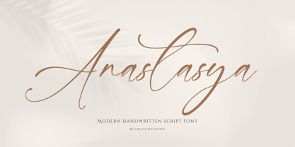 Introducing Anastasya, an elegant script handwritten signature font that exudes beauty and femininity. With its captivating style, Anastasya is perfect for a wide range of projects. Whether you're designing wedding invitations, crafting sophisticated logos, or adding a touch of elegance to your branding, this font is sure to impress. It features both uppercase and lowercase letters, numbers, and punctuations, allowing for versatile design options. Anastasya is also multilingual, enabling you to communicate your message globally. With ligatures and PUA encoding, accessing unique glyphs and special characters is effortless. Explore the full character set of Anastasya and elevate your designs with its graceful charm.
 - Okaluera by Hishand Studio,
$15.00 Okaluera Sans Serif font seamlessly blends elegance and luxury with a touch of minimalism, creating a sophisticated visual experience. Its sleek and graceful letterforms exude opulence, making it ideal for projects that demand a touch of class. The font's minimalist design adds a sense of modernity, ensuring it remains versatile for various applications. Whether used in print or digital media, Okaluera effortlessly captures attention, making a bold statement with its refined aesthetics. Good for logos, branding, invitations, stationery, wedding designs, social media posts, and much more. Complete with ligatures alternates regular italic icon kerning multilingual support
 - Humayroh by Flawlessandco,
$9.00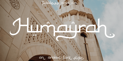 Introducing Humayroh, an exquisite Arabic font that embodies elegance and sophistication. With its graceful curves and meticulous attention to detail, Humayroh is designed to add a touch of refinement to your projects. An Original typeface that suitable for any graphic designs such as branding materials, t-shirt, print, business cards, logo, poster, t-shirt, photography, quotes .etc This font support for some multilingual. Modern Sweet Retro that contains uppercase A-Z and lowercase a-z, alternate character, numbers 0-9, and some punctuation. If you need help, just write me! Thanks so much for checking out my shop!
 - Bryan Talbot by Comicraft,
$39.00 The lettering style of Lancashire's finest comic book artist, graphic novelist and NEMESIS deviant Bryan Talbot is finally at your beck and call thanks to the good graces of those awfully nice chaps at Comicraft. Created for Bryan's magnum opus, Alice in Sunderland, the Bryan Talbot font will take you on a journey into delirium, through the looking glass of British underground comix into the complex world of experimental narrative techniques and bestow upon you semi-legendary cult status and prestigious awards from no less than the New York Times.* *Results may differ if you are not actually Bryan Talbot.