2,568 search results
(0.014 seconds)
- Paku by Kah Khiong Design,
$13.00 Paku, a typeface that grow on the inspiration of fiddlehead (fern), taking Fibonacci curve as the base, with influence of Art Nouveau & Art Deco, it evolves into a simple yet magical typeface. The spiral’s characteristic in the typeface give the stylish impression of grace, rhythmic, classical & poetry. It’s unique & distinctive looks suitable for any surface printing, publishing, branding, packaging, advertising & digital content.
 - Adira smile by Sulthan Studio,
$14.00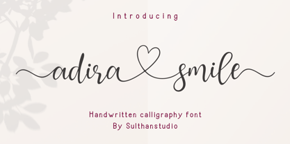 Adira smile is a handmade calligraphic font made with a touch of love in each character with a heart that can be connected to make this font more graceful. This font is perfect for logos, branding, business cards, watermarks, posters and more. Adira smile comes with a full set of uppercase letters, lowercase numbers and punctuation marks, and multilingual support.
 - Cast Shadow JNL by Jeff Levine,
$29.00Cast Shadow JNL uses the same wood type as found in Trade Printer JNL and adds to it a cast shadow in right or left versions for a bold and unique look. Both fonts have limited character sets and should be used in point sizes larger than normally chosen to compensate for the visual discrepancy due to the cast shadow's effects. - Royale & Caikes by Hishand Studio,
$16.00 Royale & Caikes, a captivating new serif font, exudes timeless elegance with its graceful curves and refined serif, making it a sophisticated choice for any design project. Combines classical elements with a modern twist, resulting in a font that is both beautiful and distinctive, perfect for creating a sense of luxury and elegant. Complete with ligatures alternates regular italic hollow icon kerning multilingual support
 - Ciao Mamma by Comics Font Store,
$19.00 CIAO MAMMA is a vintage-style font, inspired by old almanacs and classic comics. It is ideal for auteur comics as well as commercial products. It is made with a marker, has contrast-free letters and regular spacing helping its legibility and clarity. The font is elegant and graceful and is reminiscent of the history of comics, evoking great, timeless comic strips.
 - Elefantasia NF by Nick's Fonts,
$10.00The inspiration for this typeface—originally called Elefanta—enjoyed popularity stateside in the late nineteenth century, an import from the Karl Brendler & Söhne foundry of Vienna. Its graceful yet playful elegance makes it suited for a wide range of projects where projecting warmth is desirable. Both versions contain the complete Latin 1252, Central European 1250 and Turkish 1254 character sets. - Koralle NF by Nick's Fonts,
$10.00This typeface made its first appearance in Schelter & Giesecke's 1915 specimen book. It exhibits the cleanness and crispness one might expect in a sans-serif face, along with a few unexpected grace notes that make it warm and friendly, as well. Both versions of this font include the complete Unicode Latin 1252, Central European 1250 and Turkish 1254 character sets. - Carlos by CastleType,
$59.00 Carlos was inspired by a Spanish typeface designed by Carlos Winkow called 'Elektra' (c. 1940), available elsewhere as Casablanca. Carlos is an exceptionally graceful, condensed art deco sans serif design that supports all European languages that use the Latin alphabet as well as those that use the Cyrillic alphabet, and includes OpenType features, arbitrary fractions, and a collection of geometrics, dingbats & fleurons.
 - Penman by Page Studio Graphics,
$25.00The Penman fonts are partially based on the 19th century penmanship of one of the designer’s ancestors, and originally created for a personal mailing with an “old-times tradition” flavor. The fonts are lightly pair-kerned, in order to control punctuation and numeral spacing. Auto-kerning should be turned on, and tracking should be checked to make sure all characters join well. - Betrand by Balevgraph Studio,
$12.00 Betrand is a thin lettered and graceful script font. Fall for its ravishing style and use it to create gorgeous wedding invitations, beautiful stationary art, eye-catching social media posts, and much more! This font is PUA encoded which means you can access all of the glyphs with ease! What's Included? Uppercase & Lowercase Numbers & Punctuation Ligature, Alternate & Swashes Multilingual Support PUA Encoded
 - Zenaida by Hanken Design Co.,
$30.00 Zenaida is a distinctive display serif font adorned with stylized serifs, evoking a floral essence. Its graceful, flowing ligatures and stylistic alternates add an organic touch to text. Featuring a range of styles including Regular, Medium, Bold, ExtraBold, and an additional semibold weight, Zenaida offers versatility across various design applications, providing a diverse set of options to infuse character and distinction into projects.
 - Penman B by Page Studio Graphics,
$25.00The Penman fonts are partially based on the 19th century penmanship of one of the designer’s ancestors, and originally created for a personal mailing with an “old-times tradition” flavor. The fonts are lightly pair-kerned, in order to control punctuation and numeral spacing. Auto-kerning should be turned on, and tracking should be checked to make sure all characters join well. - Casual Slab Serif JNL by Jeff Levine,
$29.00 Samuel Welo’s “Studio Handbook for Artists and Advertisers” (published in both 1927 and 1960) showcased this talented man’s hand-lettered alphabets; used as inspiration for the sign trade and for graphic designers. A particularly interesting slab serif from the 1960 edition has many unusual character shapes, and served as the model for Casual Slab Serif JNL – available in both regular and oblique versions.
 - Elina by ParaType,
$30.00 Elina continues the series of graceful calligraphic typefaces by Natalia Vasilyeva that partially imitate broad pen drawings. The family consists of two styles -- normal and decorative. Decorative style contains characters ornamented with thin strokes that add a beauty and charm to the design. The fonts can be used in display matters, advertising and celebration texts. Released by ParaType in 2011.
 - Nightspot JNL by Jeff Levine,
$29.00 Nightspot JNL was modeled from one of many display alphabets created by the late sign painter and lettering expert Alf Becker. His work has graced the pages of Signs of the Times® magazine for decades. Special thanks to Tod Swormstedt of the American Sign Museum and ST Publications, Inc. in Cincinnati, Ohio for providing the source material for this typeface.
 - ITC Esprit by ITC,
$29.99ITC Esprit is the work of designer Jovica Veljović and blends the classic proportions of a serif typeface with the grace and charm of calligraphy. Highly legible even in small point sizes, the font can also be used as an impressive display face for use with sans serif text. In 2010 Veljovic revised this family and released this as ITC New Esprit. - CalliSans Variable by 38-lineart,
$140.00 Hello. this is the variable version of CalliSans : a revolution in typography. 14 fonts, 7 regular and 7 italic, seamlessly blend calligraphy's grace with sans-serif simplicity. Perfect for projects demanding elegance, from books to digital screens. Make a bold statement with its distinctive style. Timeless yet contemporary, it transcends trends. Your creative secret weapon. CalliSans Pro: where art meets design.
 - Classica Pro by URW Type Foundry,
$35.99 Classica Pro by Bernd Möllenstädt A real alternative for letterpress printing A masterpiece It was only after many years, shortly before the end of his life, Bernd Möllenstädt brought out these early drafts of his Classica Light and Light Italic from his drawer, and asked me to produce for him on the computer a Bold and Bold Italic, from which we later wanted to interpolate further cuts like Regular and so on. The boldening of letters with an oblique axis and with hairlines which should not grow to the same extent as the general line widths, is hard to cope with perfectly, even for the smartest computer program, and even more so, when it concerns an as complicated set of data as those conceived by Bernd. The automatically generated result could therefore only be a first step that had to be improved manually later. This was about the stage that we had reached when Bernd died in March 2013, leaving me behind with comprehensive corrections on proofs of this automatically generated Bold. Although I was aware that it would mean a lot of work to complete the project, I did not want to leave it unfinished and decided to finalize and publish the Classica, also in Bernd‘s honor. In the course of the two years that I worked on this font family it somewhat naturally became also my own. New details were added and some of the existing changed. A book typeface requires the supreme and forgives rarely, it represents a true masterpiece. My intention and my ambition were to create a real alternative for letterpress printing, with a font family that contains all the typographic options for an excellent typesetting, and is better readable and has a better appearance than other existing typefaces. Whether this was achieved, the reader may decide. Volker Schnebel, Hamburg, december 2014
 - Julietta Alexart by Piece of Cake Typework,
$19.00 Hello World, Introducing, Julietta Alexart is a beauty script font suitable for your design project needs, such as; wedding themes, social media posts, quotes, overlays on images, tagline logos, posters, print needs, website banners, and more. Features A set of uppercase and lowercase glyphs Number, symbol, and punctuation Multilingual support Some swashes and ligature So Easy to Use Access Swashes by keyboard key bracket left ' [ ' to feature beginning swash 1 key brace left ' { ' to feature beginning swash 2 key parent left ' ( ' to feature beginning swash 3 key plus ' + ' to feature middle swash 1 key equal ' = ' to feature middle swash 2 key bracket right ' ] ' to feature ending swash 1 key brace right ' } ' to feature ending swash 2 key paren right ' ) ' to feature ending swash 3 For Example type (you=me) Thank you a million times for downloading and using this font for your projects. Enjoy this font and happy creating!
 - Blue Plaque by K-Type,
$20.00 Blue Plaque is a distressed font that simulates the low relief, white-painted lettering on English Heritage plaques attached to buildings where famous people have lived. For creating mock plaques, a blank disk, with the English Heritage title at the top and the logo at the bottom, is included at the brace left { keystroke, and also at the section § keystroke. A blank plaque without the English Heritage title and logo is included at the bar | keystroke. A distressed English Heritage logo is included at the asterisk * keystroke. he outer ring of the blue plaques, which is glazed in dark grey, is included at the brace right } keystroke, and also at the plusminus ± keystroke. Photoshop's Outer Bevel Layer Style is perfect for adding a relief appearance to the letters. Buyers are welcome to request a 1000px jpeg image of a blank blue plaque by emailing K-Type directly https://www.k-type.com/contact/
 - Proprietor by Sudtipos,
$59.00 The great value of something crafted thoroughly by hand has been observed for years by Guille Vizzari throughout a wide spectrum of clients and projects developed at «Yani & Guille» —the studio he runs cheek by jowl with Yani Arabena—, and they both noticed that recently it has been taking on a new meaning. From barbers at their shops, to a barista that passionately prepares coffee every morning, or a bartender that deeply enjoys diving towards unknown ingredients, and even Guille’s admiration for sign painters worldwide that keep spreading their passion for the perfectly constructed letter. This wide trades universe, where craftsmanship represents a huge difference, is where «Proprietor» lives, and it’s the reason why it exists. «Proprietor» was born in a Moleskine notebook —just pencil, paper and ink— as a tribute to those crafts, and to regain the art behind Type Design that involves the fusion between tools, materials and the action of the hand. Fed by these principles, every single glyph within the whole «Proprietor» Family has been fully designed and illustrated by hand by its author (including all the ornaments, frames and crafts icons that can be seen along this specimen), showcasing Vizzari’s solid formation in the drawing field. Proprietor can be described as a compact type family system illustrated by hand, intended and designed to be able to create solid —but beautifully ornamented— paragraphs, and elaborate compositions. For this purpose, Proprietor Roman and Open displays a notorious x-height which goes perfectly with plenty of ornaments that unfold along the ascenders and descenders, but always containing its swashes inside the text line. The icing on the cake, Proprietor Script, a copperplate-based font unbelievably flooded with ornamented capitals, flourishes and endings to break through the coarse feeling of the Proprietor non-script sets, with a huge load of delicate and warm letterforms. Proprietor Wide and Wide Open hand a complete font set to complement the family for composing extended words in uppercase, matching in style and adding a striking personality. And as being part of Sudtipos’ catalogue «Proprietor» comes packed with full Open Type support —thanks to Ale Paul, fearless to tame this hand–drawn beast, supported by his vast knowledge in programming and optimization—. 7 imperfectly elegant and completely handmade fonts join the «Proprietor» system, bringing life to designs that are meant to represent the spirit of the genuine and skilled craftsmen, showing respect for their trade, and at the same time being part of it.
 - America Line by Kustomtype,
$30.00 Since its foundation in 1901, the iconic building in the Rotterdam neighborhood Kop van Zuid, is shining. Where previously the Holland America Line was housed, you will now find Hotel New York. A building with a tremendous history. We’re glad to take you back in time with captivating memories. In 1991, catering entrepreneurs Daan van der Have, Hans Loos and Dorine de Vos refurbished the at the time vacant property into a hotel/restaurant. To honor its 25 years existence, we celebrate this happening with a brand-new font, ‘America Line’. A tribute to Wim ten Broek, the multi-talented Dutch Graphic Designer. As early as the 1930’s before the Second World War, Wim ten Broek made the famous posters for the Holland-America Line. The influence of A.M. Cassandre here in, is clearly recognizable. Wim ten Broek also worked for HAL with large surfaces and fixed lines in which primary colors dominate, accentuated with shadows acquired by spraying technique. He also made graphic works for, among others, the World Exhibition in New York, the Dutch railway company ‘Werkspoor’ and the royal Dutch steel factory ‘Hoogovens’. His drawings and lettering gave me a love for the trade and naturally gave me a completely different view on fonts. That’s how I slowly but surely made my way to the trade. Based on the letters I had at my disposal from the Holland – America Line poster, I started to complete the alphabet in the same style as the original text. I digitized everything in order to acquire a usable and modern font. The Holland America Line Font comes with uppercase and lowercase with all the needs of modern times to create a good digital font and to be able to use it for all graphic purposes. The font is ideal for headtext, posters, logos, etc... Don't hesitate and use this unique historical font! It will give your work that glamour that you will find in few fonts. Enjoy the Holland America Line. The Holland America Line Font comes with uppercase, lowercase, numerals, punctuations so you can use the Holland America Line font to customize all your designs. The Holland America Line font is designed by Coert De Decker in 2018 and published by Kustomtype Font Foundry. The Holland America Line Font can be used for all graphic purposes. It is ideal for headtext, posters, logos, logos, letterhead, apparel design, package design, label design etc... Don't hesitate any longer and enjoy this unique historical font! It will give your work the glamour that you will only find in a few fonts. Enjoy your journey with the Holland America Line!
 - Miranda Wright by Din Studio,
$29.00 Miranda Wright is a captivating serif font designed in an exquisite and elegant style. Each letter is meticulously crafted with fine details, evoking a sense of sophistication and grace. What sets Miranda Wright apart are the last few letters, which feature graceful circular swings that add a touch of charm and uniqueness to the font.. The circular swings at the end of certain letters infuse this serif with a delightful flair. These subtle and graceful details add an air of playfulness and individuality to the font, setting it apart from conventional serif typefaces. The circular swings give the font a distinctive personality, making it ideal for creative projects that seek to stand out. Its legible and elegant letterforms make it suitable for both body text and headings, while the circular swings add a touch of character that enhances the overall visual appeal. Enjoy the available features here. Features: Stylistic Sets Ligatures Multilingual Supports PUA Encoded Numerals and Punctuations Miranda Wright fits in headlines, logos, posters, flyers, invitations, greeting cards, branding materials, print media, editorial layouts, website headers, and many more. Find out more ways to use this font by taking a look at the font preview. Thanks for purchasing our fonts. Hopefully, you have a great time using our font. Feel free to contact us anytime for further information or when you have trouble with the font. Thanks a lot and happy designing.
 - Breakneck by Alphabet Agency,
$15.00 Breakneck Font Duo includes Breakneck and Breakneck Italic fonts. The fonts are excellent for expressing motion; ideal for racing themes. The sharp angles combined with the bold sport style create the expression of speed. Each font contains all basic Latin characters that includes uppercase, lowercase, numbers, punctuation plus much more (130+ characters).
 - Bell Gothic by Bitstream,
$29.99Designed specifically for AT&T to set telephone directories by Chauncey Griffith at Mergenthaler in 1938, Bell Gothic was the standard American directory typeface for forty years. Limited in performance by linecaster matrix requirements, Bell Gothic was replaced by Bell Centennial. Furlong is a version of Bell Gothic adapted for the racing form. - Gilman by Miller Type Foundry,
$29.00 The idea for Gilman started simple enough, a serif typeface that works well for large amounts of text. However, after many struggles creating a quality typeface digitally, I decided to first draw the complete alphabet by hand on paper, and then trace that digitally. The result is a unique workhorse typeface with a subtle “human touch” that is very rare in this modern technological age. Gilman has extensive language support and comes with many opentype features like true small caps, tabular lining figures, stylistic alternates, ligatures and more. Gilman Sans (derived from the serif) is an excellent compliment and works together harmoniously with Gilman on the page.
 - ITC Malstock by ITC,
$29.99ITC Malstock is the work of Czech designer Frantisek Storm. The idea is based on a sign painting technique that uses a flat brush and a Maalstok, a long bar with soft padding which is used as a rest for the painter's hand and a guide for vertical lines. The strokes of this font end with a split stem which recalls the traces of the writer's brush. ITC Malstock is a narrow typeface which is ideal for headlines, invitations and advertisements. The designer recommends combining his typeface with others, to create harmony with sans serif typefaces in text sizes or contrast with serif typefaces. - Mozzart Sketch by Posterizer KG,
$19.00 Mozzart Sketch is a decorative version of Mozzart Sans, slightly rounded, Neo-Grotesque corporate font, created for MOZZART D.O.O. company from Belgrade, Serbia. Mozzart Sketch is a decorative hand-sketched font for headlines and short texts, and also very readable in small weights. All glyphs were carefully hand drawn, with marker as a tool, then traced and digitized. The family contains: 5 Weights, 3 Condensed and 1 Oblique versions of the font, complementing each other perfectly. All versions contains completely MacOS Roman and MacOS Cyrillic code pages, tabular figures, small caps... perfect for profesional designers and very useful for artistic things, catalogues, music... and many other sensual and beautiful things. Enjoy!
 - Jacky Chan by Asd Studio,
$15.00 Introducing, Jacky Chan - Brush Font Jacky Chan font preserves all the high definition detail of the original handwritten letters. This font it truly looks realistic. Take your design to the up level with a hyper-realistic font that truly looks hand painted. Jacky Chan uses feature Bitmap Trace in Inkscape that makes way for more authentic looking fonts and is sure to grab the attention of customers and designers alike. Jacky Chan installs like any other font, and can be used in any color, on any background. What's Included? :: Uppercase & Lowercase (Regular and Italic Version) :: Numbers & Punctuation : Swashes Ligature :: Multilingual Support Enjoy our font, thank you.
 - Cullion by Greater Albion Typefounders,
$9.95 Cullion is a new departure for Greater Albion, being a modern Fraktur, embodying future trends sch as highly stylised glyphs, a single case of lettering and highly evolved letterforms. At the same time it can trace its inspiration back to blackletter traditions, and is inspired by the sort of ironwork to be found in a medieval portcullis. The resulting typeface can sit happily in traditional, modern or futuristic design work. As the gallery images suggest, it does rather lend itself to work with a 'horror' theme, but it could have many other uses too-even in religious work. Cullion is particularly effective in poster headings.
 - Rifleman by Open Window,
$19.95 What a nice tranquil feeling you get from the wide forms of this font. The air of spontaneity was the most important thing about developing Rifleman. The forms were carefully and slowly constructed and then loosely traced with a paintbrush. Maybe the original drawings will become a font someday but i like to think that they won't for some reason. Surprisingly Rifleman is left to only the bare essential elements, anything that wasn't necessary was left out or removed. The goal was to make it as lightweight as possible to make up for the intricate detail. Rifleman is a surprisingly lightweight font offering lends itself to speedy typesetting!
 - Nouveau Rose by Jeff Levine,
$29.00 In the July 24, 1915 issue of “Dry Goods Reporter” is a demonstration of hand lettering rendered with the use of a “speed pen”. Two suggested examples cited in the accompanying article were the Payzant pen and the then-new Speedball pen. An ornate Art Nouveau serif alphabet is displayed, with some examples having delicate floral elements entwining the letters. The initial alphabet was auto-traced, then cleaned-up and modified to recreate the core design of the basic (unadorned) letters. The numerals, punctuation and all additional characters were then made from scratch. Nouveau Rose JNL is the finished result, and is available in both regular and oblique versions.
 - Type Warmers JNL by Jeff Levine,
$29.00 The name Type Warmers JNL traces its lineage to small catalog booklets issued by Indianapolis' Cobb Shinn for his line of letterpress cuts; of which a few can be found included within this typeface. Presumably type could "warm up to" these stock illustrations and work hand-in-hand to deliver the message, hence the "Type Warmers" sobriquet. Originally known for illustrating many attractive and comical postcards of the early 1900s, Shinn moved into the field of purchasing stock art and redistributing them as electrotypes or "cuts", the predecessor to today's digital clip art. A number of the cartoons he sold can be found in the Shinn Kickers JNL font.
 - Bad Marker by Haiku Monkey,
$10.00 The marker has been sitting in your pen drawer for years. You can't bring yourself to throw it out, because it's the best marker in the world; but it has become worn and frayed, and you can't bring yourself to use it, either. But today you have just the project for the best bad marker in the world, and you take it from the drawer, remove the cap, and notice with glee that time has accumulated a perfect supply of ink in the frayed tip. You bring it down on the pristine white paper in front of you, and magic begins to trace itself on the page...
 - Flinscher by Greater Albion Typefounders,
$16.00 The Flinscher family contains twenty display typefaces, in weights that vary from light to black, and widths that extend from condensed to expanded. The family’s design inspiration traces its roots to the early portion of the twentieth century. In essence, it is a calligraphic script typeface family with blackletter influences. The letter forms are decorative and distinctive, yet clear and easy to read, and in use set up a regular rhythm that leads the eye from character to character. The Flinscher typefaces are well suited to design work that needs to combine formality with fun. Just the thing for a certificate or a book cover!
 - Kansas Casual by Kyle Wayne Benson,
$10.00 Kansas Casual offers a more upright, gothic, and modern alternative to the conventional sign painter's one stroke. Kansas provides a completely unique take on a overdone classic with proportions and crossbar heights inspired by the more friendly Chicago style. This all-caps set provides six weights so that you can adjust size with weight to maintain that authentic single brush weighted look. The proofing process included projecting, tracing, and then painting the letters out to see how true the small details were to the medium. The set also includes wide language support, opentype fractions, and arrows. You can learn more about its development here.
 - Neo Contact by Linotype,
$40.99Neo Contact is the typeface used on the packaging of Marlboro cigarettes (Marlboro “Reds,” the main line of the brand). The typeface is bold and condensed, designed in the Egyptienne style. Egyptienne types were first designed in the 1800s, as type founders - especially in the westward-expanding United States - began to dream up newer, bolder styles of letters for advertising usage. During the 1800s, it became increasingly important for businesses to set themselves, and their products, apart from competitors. This desire has remained with corporations, as well as with advertisers and designers, into the 21st century. In addition to cigarette packaging, Neo Contact (as part of Marlboro’s branding efforts) can be seen on numerous items, including Ferrari’s F1 racers, and at Formula 1 race tracks. The letters in Neo Contact are filled with personality. Their forms display two distinct weights of line, and the serifs are made up of tiny, strict slabs. Ball terminals round out the design. Neo Contact is a complete font, with a complete western character set. Typefaces in the Egyptienne style preceded the development and distribution of larger, crazier wood typefaces, but also share many similarities with these descendents. More traditional, text faces in the Egyptienne manner are also available from Linotype GmbH (e.g., Adrian Frutiger’s Egyptienne F). On the opposite end of the spectrum, we offer interesting, personality-filled wood display types, like Ponderosa as well. - 1769 by Almarena,
$22.00 1769® Display is an elegant and modern serif typeface inspired by the history of France and more particularly the Romantic movement (1700s and 1800s). The roundness of its characters and its numerous ligatures reflect the grace, refinement and sensitivity that were omnipresent during the 18th century. Its name refers to the birth of Napoleon Bonaparte, the fascinating or revolting emperor, the emblematic figure of this period.
 - Picturama Founder by Mans Greback,
$59.00 Picturama Founder is a beautiful script font that elegantly bridges the gap between time-honored formality and contemporary innovation. Every curve and connection in this formal calligraphy type speaks of finesse, flowing with an unmatched grace reminiscent of vintage labels or classic vinyl covers. Yet, there's a modern twist that sets it apart: its bold stance and innovative touches redefine what we expect from formal script.
 - Daffadowndilly NF by Nick's Fonts,
$10.00Here’s another offering based on the work of Alf Becker, long-time contributor to Signs of the Times magazine. This only comes from the 1940s, and is a light and bouncy single-stroke face that’s sure to pep up any project it graces. This font contains the complete Latin language character set (Unicode 1252) plus support for Central European (Unicode 1250) languages as well.