706 search results
(0.009 seconds)
- Ascender Uni by Ascender,
$197.99Ascender™ Uni is a proportionally spaced comprehensive Unicode-compatible font with support for the Unicode Standard, v2.1 (supporting most major code pages and character sets in modern use). Ascender Uni is a 39MB TrueType (TTF) font with approximately 53,000 glyphs. The Latin and related glyphs (designed by Steve Matteson) are Sans Serif, with Gothic ideographs drawn in Japanese style, and complementary styles for other scripts. There are also versions of Ascender Uni that provide localized support for Korean, Simplified Chinese and Traditional Chinese. OpenType layout support is included for Arabic (initial, medial, final, isolate, and required ligature forms, as well as basic mark positioning), and vertical writing for CJK locales (consisting mostly of Latin, symbol, punctuation, and kana glyph variants). Character Set: Latin-1, WGL Pan-European (Eastern Europe, Cyrillic, Greek and Turkish), Chinese, Japanese, Korean, Thai, Vietnamese, Hebrew, Arabic. NOTE: Not all applications provide complete support for all the glyphs in this Unicode font. - Nu School Munitions - Unknown license

- Univers Next Cyrillic by Linotype,
$49.00 Linotype Univers is a completely reworked version of the original Univers typeface family designed by Adrian Frutiger in 1957. After a long process of painstakingly detailed revision, Frutiger and the design staff at Linotype completed this large joint project in 1997. The result: a brilliant and cohesive font family of 63 weights and styles including the 4 monospaced typewriter weights. All the existing weights were completely redrawn, with careful attention paid to making the proportions more consistent with each other and improving fine details such as curves and thick-to-thin stroke ratios. The family was expanded from 27 to 63 weights, providing a much larger framework to graphic designers for choosing just the right style. The bold and condensed weights were reworked for improved legibility and on-screen application. The stroke weights were revised for consistency within each face as well as in relationship to the other weights. By following Frutiger's original designs, the humanist character of the sans serif Univers now comes through more distinctly. The systemized numbering system has also been updated. With its sturdy, clean forms Univers can facilitate an expression of cool elegance and rational competence. In fact, the strong familial relationships between all the styles and weights make it a serviceable choice for large graphic design projects that require versatility with consistency. Frutiger was successful in staying true to his initial aims; the new Linotype Univers does indeed work in longer texts as well as for display settings. In 2010 the typeface family was extended and renamed into a more logical naming of "Univers Next" to fit better in the Platinum Collection naming.
 - Univers Next Arabic by Linotype,
$99.00 Univers Next Arabic is designed by Lebanese designer Nadine Chahine as a companion to the Latin typeface Univers Next and with the consulting of Adrian Frutiger. It is a modern Kufi design with large open counters and low contrast. It is mainly designed to work in titles and short runs of text. Its contemporary look makes it perfect for corporate branding as well as for advertising work. It is also well suited for user interfaces and low resolution display devices. The font includes the basic Latin part of Univers Next and support for Arabic, Persian, and Urdu. It also includes proportional and tabular numerals for the supported languages.
 - Univers Next Paneuropean by Linotype,
$89.00 Linotype Univers is a completely reworked version of the original Univers Univers typeface family designed by Adrian Frutiger in 1957. After a long process of painstakingly detailed revision, Frutiger and the design staff at Linotype completed this large joint project in 1997. The result: a brilliant and cohesive font family of 63 weights and styles including the 4 monospaced typewriter weights. All the existing weights were completely redrawn, with careful attention paid to making the proportions more consistent with each other and improving fine details such as curves and thick-to-thin stroke ratios. The family was expanded from 27 to 63 weights, providing a much larger framework to graphic designers for choosing just the right style. The bold and condensed weights were reworked for improved legibility and on-screen application. The stroke weights were revised for consistency within each face as well as in relationship to the other weights. By following Frutiger's original designs, the humanist character of the sans serif Univers now comes through more distinctly. T he systemized numbering system has also been updated. With its sturdy, clean forms Univers can facilitate an expression of cool elegance and rational competence. In fact, the strong familial relationships between all the styles and weights make it a serviceable choice for large graphic design projects that require versatility with consistency. Frutiger was successful in staying true to his initial aims; the new Linotype Univers does indeed work in longer texts as well as for display settings. In 2010 the typeface family was extended and renamed into a more logical naming of "Univers Next" to fit better in the Platinum Collection naming.
 - Univers Next Variable by Linotype,
$259.99 Univers Next Variable Set is a single font file that features three axes: Weight, Width and Italic. The Weight axis has a range from Light to Extra Black. The Width axis provides a range of condensed and extended values. The Italic axis is a switch between upright and italic. Variable fonts act as a complete family of fonts in a single file. The new Variation font feature is supported by a growing number of desktop design applications, and more importantly by all the major web browsers. Variable fonts provide a variety of benefits to web and print designers and developers including flexible, responsive typography.
 - Une Nuit Parisienne by Megami Studios,
$10.00 This font is based on a lot of the downtempo culture in Paris. Smoky bars, jazz clubs, that sort of thing. How a font can be influenced by intangibles is a question that I can't quite answer, but I can say that when I created it, it strongly reminded me of a couple of times spent in Paris back in the mid-90s.
 - Neospace Exp - Personal use only

- AB Exp - 100% free

- Covington Exp - Unknown license

- Exus Pilot - Personal use only

- Covington Exp - Unknown license

- Plasmatica Ext - Unknown license

- Plasmatica Ext - Unknown license

- Covington Exp - Unknown license

- Covington Exp - Unknown license

- EXT Unicase by Kevin Thrasher,
$5.00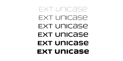
- Exo Soft by Polimateria,
$35.00 Exo Soft. Technology meets humanity. The geometric design got organic with carefully crafted smoothed edges. Exo Soft is a contemporary sans-serif font with a warm and humane feeling. It has an extended language support (both in Latin and Cyrillic) and an handful set of Opentype features. The 9 weights plus correspondent italics give Exo Soft a huge versatility. Because aesthetics are not everything Exo Soft was fine tuned in order to perform well both in screen and in print. The large x-height and open counters makes it function well even on small font sizes but the full potential of Exo Soft will be seen on headlines, branding and advertising.
 - Labelo Ext by T-26,
$19.00 - Exa Metline by Gleb Guralnyk,
$14.00 Exa Metline is a conceptual font. It's a modern style geometric typeface with unusual letter shapes. This package consists of 3 fonts with separate inside line layer. Also 10 alternate characters are available, if you'll need a more familiar letter shapes. Thank you and have a nice day!
 - Tempora LGC Uni - 100% free

- Fuel Uni Extended by VersusTwin,
$39.00 The Fuel Uni Extended typefaces are a modern update on the techno sans extended for stronger impact, adding further versatility with unicase design complete with soft rounded corners as well as decorative inktraps. Stylistic Alternates included within all styles are alternates for the capital B, E, and R, as well as lowercase g characters, as well as all of their accented siblings. The Fuel Complete package bundles all of the dynamic styles of the Fuel, Fuel Extended, Fuel Uni, Fuel Uni Extended, and Fuel Script typefaces into one powerhouse of a collection.
 - Knitting And Sewing Doodles by Outside the Line,
$19.00Knitting & Sewing Doodles are just that. If you type all caps you get 15 knitting icons and lower case is 15 sewing doodles. Knitting items include yarn, knitting, needles, ball winder, spinning supplies, stitch counter, etc. Sewing machine, buttons, thread, pin cushion, bobbin, thimble and needles, scissors, label, tape measure, darning egg, zipper, seam ripper, and pins, all in the Outside the Line style. - Covington SC Exp - Unknown license

- GM Exp Shadow - Unknown license

- Covington SC Exp - Unknown license

- Covington SC Exp - Unknown license

- Covington SC Exp - Unknown license

- GM Exp Norm - Unknown license

- Exo Slab Pro by Polimateria,
$35.00 Exo Slab Pro is a slab serif with a technological and futuristic tone. Even though it has a very peculiar look and many distinct shapes that pop out in an headline, it also works well as whole creating a nice shade of text. Large x-height, ink-traps and a modest contrast ensures that this font will work well even on small font sizes. Loaded with opentype features Exo Slab provides a huge versatility. You can use it on rigorous work as well as on more funny projects. From Branding to Editorial, from Paper to Screen, from Today to the Future. Please see our promotional video.
 - Neospace Circuit Exp - Personal use only

- Liquid Ex - Unknown license

- Lichtner Ex - Unknown license

- University Ex - Unknown license

- Sorren Ex by Reserves,
$49.00 Sorren Ex is a slightly less condensed, more robust version of Sorren. Its overall width has been increased to the point just before its rounded forms begin to flatten, retaining the aesthetic essence of the original without compromise. Sorren is a definitive bold condensed sans influenced by neo-grotesque designs. A relatively low stroke contrast complimented with sharp, horizontal stroke ends lend an unyielding appearance, while its rounded forms and refined curves juxtapose its inherent strength with grace. Stylistically, Sorren has a classic, timeless feel with a contemporary finish and attention to detail. It is characteristically more elegant and considerably sturdier than the typical condensed sans, lending to its singular disposition.
 - Ex Libris by Fenotype,
$25.00 Ex Libris is a high contrasted Flared Serif font family in two weights. Ex Libris is a display type and it’s at its best in headlines, branding, packaging or as a logotype. Try adding some extra flair with Swash, Stylistic or Titling Alternates or wield any of Ex Libris’s 33 Discretionary Ligatures when typing in caps.
 - Ex Ponto by Adobe,
$35.00 - GM Exp Shadow outline - Unknown license

- Bionic Comic Exp Italic - Unknown license

- GM Exp Shadow Gravestone2 - Unknown license


