9,398 search results
(0.023 seconds)
- Bacboc by Baqoos,
$18.00 Bacboc is an overflowing coequal handwritten typeface apt for headline, editorial, branding, packaging, printed materials and typographic applications. 200+ glyphs including punctuation and numerical.
 - Geopa by Baqoos,
$15.00 Geopa is a fractional conversant tech sans apt for headline, editorial, branding, packaging, printed materials and typographic applications. 200+ glyphs with ligatures and fractions.
 - Letterpress Retro JNL by Jeff Levine,
$29.00 More treasures from the heyday of letterpress printing are found in Letterpress Retro JNL, with plenty of great cartoons, catch words, embellishments and more.
 - Tribal Tattoos III by Otto Maurer,
$18.00 Tribal Tattoos comes from the German tattoo artist Otto Maurer. This clean vector Tribal art is best for making good plott or printed art.
 - Freggo by Baqoos,
$18.00 Freggo is a beauteous kooky handwritten typeface apt for headline, editorial, branding, packaging, printed materials and typographic applications. 200+ glyphs including punctuation and numerical.
 - Maesgo by Baqoos,
$12.00 Maesgo is a bodacious joculatory linear sans apt for headline, editorial, branding, packaging, printed materials and typographic applications. 200+ glyphs including punctuation and numerical.
 - Weggio by Baqoos,
$15.00 Weggio is a brimming mucho handwritten typeface apt for headline, editorial, branding, packaging, printed materials and typographic applications. 200+ glyphs including punctuation and numerical.
 - Gosbry by Baqoos,
$10.00 Gosbry is a serene gregarious handwritten typeface apt for headline, editorial, branding, packaging, printed materials and typographic applications. 220+ glyphs including punctuation and numerical.
 - Jumory by Baqoos,
$23.00 Jumpy is dinkum heuristic mono lineal typeface apt for headline, editorial, branding, packaging, printed materials and typographic applications. 220+ glyphs including punctuation and numerical.
 - Santica by Aestherica Studio,
$12.00 Santica is a beautiful handwritten font. Santica is ideal for headings, flyers, greeting cards, product packaging, book covers, printed quotes, logotypes, and album covers.
 - Kidprint Paneuropean by Monotype,
$92.99The Kidprint font is designed to look like a child´s printing. Kidprint is useful any time a playful or whimsical look is required. - Centennial Script by Canada Type,
$24.95 Centennial Script was designed and cut by Hermann Ihlenburg in 1876 (the centennial of American independence, hence the typeface's name) for the MacKellar, Smiths & Jordan foundry in Philadelphia. Ihlenburg was then only 33 years old, and these beautiful forms put him on his way to become the most prolific and innovative deco, ornamental and script typeface designer and punch cutter of the nineteenth century. In trying to be a true homage to the history of the new world, Centennial Script transcends its then-contemporary deco fashion to embrace script elements historically similar to lettering found on maps or political documents of the 18th century. Letters like the p and s extend themselves high and mighty to accentuate words and lines of text in a fancy hand-drawn manner. The dots on the i and j are those of a careful scribe who acknowledges the importance of the document being lettered. The lowercase letters connect with two slight angular motions of the hand, also very carefully and elegantly. Even the ligatures and ending swashes Ihlenburg made for this face were reminiscent of a mapmaker's patient hand, though Ihlenburg's elegant touch in them cannot be mistaken. Although Centennial Script was one of the few Ihlenburg faces to make it to film type technology, the transition was neither credited nor faultless. The film type version was a bit sloppy in the way the connectors were made, so the lowercase needed a lot of manual work to typeset properly. To alleviate such waste of time for the user of this digital version, the connectors were redrawn according to the original metal ones made by Ihlenburg himself, and tested thoroughly in print to ensure the quality of the typeface's flowing cursive nature. This wasn't an easy task, and very time-consuming, since the changing angles on both ends of the connection made it impossible to escape from having to build every lowercase letter with both left and right connectors that would fit with the rest of the letters. This is one typeface that couldn't be revived in any other manner than the way it was originally made, regardless of more than 130 years of technological advances since the face was designed. Centennial Script comes in all popular font formats, and supports most Latin-based languages. Also included is an Alts fonts that contains alternates, ligatures, snap-on swash endings, some ornaments, as well as a complete set of the lowercase without left side connectors, for a more natural combination when following a majuscule, or just in case the user finds it fit to set the copy in a non-connecting script instead of the face's original connected flow. Centennial Script Pro, the OpenType version, combines the main font with the Alts font in a feature-packed single font. Use the ligature feature to set wordmarks like Mr, Ms, Mrs, Dr, and &Co, the stylistic alternates feature to replace some letters with their alternative forms, the contextual alternates feature for better uppercase-lowercase sequences, and the titling feature to set your text in a disconnected script. Centennial Script is the only script we currently know of that can be set connected or disconnected simultaneously, either using the titling feature in the OpenType Pro version, or manually in the other formats.
 - Lucky Dream by Mindtype Co.,
$25.00 Lucky Dream is a handmade font bold, new fresh & modern script with a calligraphy style. Lucky Dream can used for anything from promotional material and handwritten quotes, to product packaging, signage, labels, newsletters, posters, merchandise and branding projects.
 - The Cheese by Selvia Design,
$15.00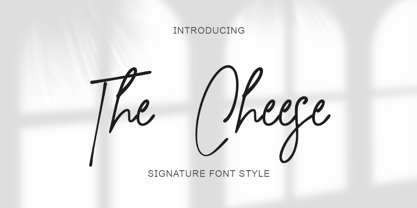 "The Cheese" is an elegant and beautiful signature font. This font is equipped with uppercase, lowercase, numerals, punctuation, and multilingual support. It is suitable for weddings, invitations, engagements, business branding, logos, banners, posters, promotions, social media, and others.
 - Tap Water JNL by Jeff Levine,
$29.00 A WPA (Works Progress Administration) poster for the Rural Electrification Administration’s promoting of running water for rural areas is the basis for Tap Water JNL. A condensed slab serif, it is available in both regular and oblique versions.
 - Giamatti by Febri Creative,
$10.00 Giamatti is a handwritten font made with its own uniqueness. Unique, beautiful, simple font but looks elegant and professional. This font is perfect for use as logos, signatures, product names, company names, brands, promotional adverts, and much more.
 - Sydonia Atramentiqua by Wardziukiewicz,
$20.00 Sydonia Atramentiqua is a strange creation. The inspiration was the first releases of "Malleus Maleficarum" (actually the typography used there). I decided I wanted something strange, so Sydonia came into being. Like a blood of all witches who were being hunted down by Malleus Maleficarum's "fans" for their skills and beliefs. Why Sydonia? Sydonia von Borck was a witch from my area. It was probably the last woman executed for witchcraft. The genesis of the name. Sydonia was THE WITCH, and by the name I added "Atramentiqua". It is a combination of the words "Ink" (polish "ATRAMENT") + "Antiqua". The idea of spilling a font is historical. The former Zecer composition was not perfectly sharp. As it was a "wet job", there were always light exits behind the lines. Who supported me? The GENEALOGIA project has been carried out for several years in cooperation with the Academy of Art in Szczecin and the National Museum in Szczecin. The project's supervisors are prof. Waldemar Wojciechowski and MA Patrycja Makarewicz, who runs the Visual Communication Studio. Some information: Sydonia was like that! This is not an everyday font. It is a stylized font, used to imitate old prints made by Zecer. The first version of Sydonia Atramentiqua was created in 2018 for the purposes of the exhibition at the National Museum in Szczecin. Base inspiration: Malleus Maleficarum & Caslon.
 - Caryn by Typodermic,
$11.95 Y’all, have you met Caryn? She’s a typeface that’s as friendly as a front porch conversation on a sunny day. With her short brush strokes and swooping flourishes, she’ll make your words sing with genuine warmth and charm. Caryn is like a cozy quilt or a hot apple pie, bringing a homemade touch to everything she touches. Whether you’re crafting a wedding invitation, designing a logo for your farm stand, or just writing a letter to a friend, she’ll help you express your message with a down-to-earth grace. And here’s the best part: Caryn doesn’t put on airs. She’s unassuming and approachable, like a neighbor who always has a smile and a kind word. You don’t need fancy design skills or a big budget to make Caryn work for you. She’ll fit right in with your homespun style and make you look like a pro. So if you want to add a touch of warmth and hospitality to your next project, give Caryn a try. She’s the perfect typeface to welcome your readers, customers, or loved ones with open arms. Most Latin-based European writing systems are supported, including the following languages. Afaan Oromo, Afar, Afrikaans, Albanian, Alsatian, Aromanian, Aymara, Bashkir (Latin), Basque, Belarusian (Latin), Bemba, Bikol, Bosnian, Breton, Cape Verdean, Creole, Catalan, Cebuano, Chamorro, Chavacano, Chichewa, Crimean Tatar (Latin), Croatian, Czech, Danish, Dawan, Dholuo, Dutch, English, Estonian, Faroese, Fijian, Filipino, Finnish, French, Frisian, Friulian, Gagauz (Latin), Galician, Ganda, Genoese, German, Greenlandic, Guadeloupean Creole, Haitian Creole, Hawaiian, Hiligaynon, Hungarian, Icelandic, Ilocano, Indonesian, Irish, Italian, Jamaican, Kaqchikel, Karakalpak (Latin), Kashubian, Kikongo, Kinyarwanda, Kirundi, Kurdish (Latin), Latvian, Lithuanian, Lombard, Low Saxon, Luxembourgish, Maasai, Makhuwa, Malay, Maltese, Māori, Moldovan, Montenegrin, Ndebele, Neapolitan, Norwegian, Novial, Occitan, Ossetian (Latin), Papiamento, Piedmontese, Polish, Portuguese, Quechua, Rarotongan, Romanian, Romansh, Sami, Sango, Saramaccan, Sardinian, Scottish Gaelic, Serbian (Latin), Shona, Sicilian, Silesian, Slovak, Slovenian, Somali, Sorbian, Sotho, Spanish, Swahili, Swazi, Swedish, Tagalog, Tahitian, Tetum, Tongan, Tshiluba, Tsonga, Tswana, Tumbuka, Turkish, Turkmen (Latin), Tuvaluan, Uzbek (Latin), Venetian, Vepsian, Võro, Walloon, Waray-Waray, Wayuu, Welsh, Wolof, Xhosa, Yapese, Zapotec Zulu and Zuni.
 - Minuet by Canada Type,
$24.95 Minuet, an informal script with crossover deco elements giving it an unmistakable 1940s flavor, is a revival and expansion of the Rondo family, the last typeface drawn by Stefan Schlesinger before his death. This family was initially supposed to be a typeface based on the strong, flowing script Schlesinger liked to use in the ads he designed, particularly the ones he did for Van Houten’s cocoa products. But for technical reasons the Lettergieterij Amsterdam mandated the face to be made from unattached letters, rather than the original connected script. Schlesinger and Dooijes finished the lowercase and the first drawings of the uppercase just before Schlesinger was sent to a prison camp in 1942. Dooijes completed the design on his own, and drew the bold according to Schlesigner’s instructions. The typeface family was finished in February of 1944, and Schlesinger was killed in October of that same year. Though he did see and approve the final proofs, he never actually saw his letters in use. It took almost four more years for the Lettergieterij Amsterdam to produce the fonts. The typeface was officially announced in November of 1948, and immediately became a bestseller. By 1966, according to a memo from the foundry, the typeface had become “almost too popular”. This digital version of Schlesigner’s and Dooijes’s work greatly expands on the metal fonts. Both weights include a complete set of lowercase alternates — based on Schlesinger’s own drawings, as well as alternative variations for some of the capitals, a few ligatures, and extended language support covering Western, Eastern and Central European languages, plus Baltic, Celtic/Welsh, Esperanto, Maltese and Turkish. Minuet is available in all popular formats. The OpenType version, Minuet Pro, takes advantage of internal font programming to combine the main and alternate fonts into a single file per weight, making all alternates and ligatures automatically available at the push of a button in OpenType supporting programs.
 - PF DIN Stencil by Parachute,
$39.00 DIN Stencil on Behance. DIN Stencil: Specimen Manual PDF. Despite the fact that over the years several designers have manually created stencil lettering based on DIN for various projects, there has never been a professional digital stencil version of a DIN-based typeface. After the successful introduction of DIN Monospace a few months earlier, PF DIN Stencil now completes Parachute’s extensive library of DIN superfamilies. It was based on its original counterpart DIN Text Pro and was particularly designed to address contemporary projects, by incorporating elements and weights which are akin to industries such as fashion, music, video, architecture, sports and communications. Traditionally, stencils have been used extensively for military equipment, goods packaging, transportation, shop signs, seed sacks and prison uniforms. In the old days, stencilled markings of ownership were printed on personal possessions, while stencilled signatures on shirts were typical of 19th century stencilling. Two companies dominated the market in the mid-twentieth century: the Marsh Stencil Machine Company in the United States and the Sächsische Metall Schablonen Fabrik in Germany. Ever since the late 1930s, it was the German Sächsische Metall Schablonen Fabrik which used heavily the new DIN 1451 standard font (introduced in 1936), attempting to overthrow the reign of the Didot-style modern roman which was at the time the most common stencil letter in Germany. These letters were manufactured mainly as individual zinc stencils which could be ordered in sizes between 10 and 100mm. The DIN Stencil family manages to preserve several traditional stencil features, but introduces additional modernities which enhance its pleasing characteristics and make it an ideal choice for a large number of contemporary projects. Furthermore, the spacing attributes of the glyphs were redefined and legibility was improved by revising the shape of the letterforms. The DIN Stencil family consists of 8 diverse weights from the elegant Hairline to the muscular Black. Currently, it supports Latin, Eastern European, Turkish and Baltic.
 - Rockwell by Monotype,
$40.99 Whether you call them slab serif, square serif, or Egyptian, you know them when you see them – sturdy, nearly monoweight designs with blunt, straight-edged serifs and a no-nonsense attitude. The Rockwell® Nova family is a fine example of this appealing and eminently usable type style. This is a design that is both robust and adaptable. Marked by the flat top-serifs on the cap A, unusual Q tail and high-legibility two-storied lowercase a, Rockwell has a bit of handmade charm that distinguishes it from the cool, more modern interpretations of the slab serif style. The family is excellent for branding, headlines and other display uses. The simple shapes and hearty serifs also make it a good choice for short blocks of textual content in both print and on-screen environments. The light and bold weights are perfect for setting blocks of text copy, while the extra bold and condensed designs bring authority to display copy. Throw in a little color, and you amp up Rockwell’s messaging power. The regular and italic designs perform handsomely, in the most modest of screen resolutions. With four weights of normal proportions, each with a complementary italic, and three condensed designs, two with italics, the family is a commanding and versatile graphic communicator. Rockwell’s large x-height, simple character shapes and open counters, make for an exceptionally legible design. It should not, however, be set so tight that its serifs touch, as this will erode legibility and impair readability. A benefit to Rockwell’s slab serifs, however, is that the design combines beautifully with both sans serif typefaces and a variety of serif designs. Rockwell OpenType® Pro fonts have an extended character set supporting Greek, Cyrillic, most Central European and many Eastern European languages, in addition to providing for the automatic insertion of ligatures and fractions. Looking for its perfect pairing? Look no further than ITC Berkeley Old Style, Between™, ITC Franklin Gothic®, Harmonia Sans™, Metro® Nova or Frutiger® Serif.
 - Ad Words by Outside the Line,
$19.00 Just in time for the sale season. Ad Words is a font of words you would use if you did retail ads. Some words in script, some print, some bold, some not. Plus 2 starbursts. Enlarge the starbursts and then reverse one of the words out of it… like Now! Win! or Free! Other Outside the Line fonts work with this one, check out Architectural Lettering Regular and Bold, Plz Print or Plz Script.
 - Mrs Eaves by Emigre,
$125.00 This typeface is named after Sarah Eaves, the woman who became John Baskerville’s wife. As Baskerville was setting up his printing and type business, Mrs. Eaves moved in with him as a live-in housekeeper, eventually becoming his wife after the death of her first husband, Mr. Eaves. Like the widows of Caslon, Bodoni, and the daughters of Fournier, Sarah similarly completed the printing of the unfinished volumes that John Baskerville left upon his death.
 - Fleurious by Proportional Lime,
$9.95 This font was inspired by the many changes in printing habits over the last half millennium. Every book has a story and sometimes the printing itself can be its own story. Every era has its own tendencies in decorative elements and these practices were observed and included such that the font contains over 200 hundred glyphs with which to add variety to your documents. It is provided with a complete character map.
 - Bertrade by NJ Studio,
$19.00 Hi...Thank for your visit :) Bertrade monoline stylish script Fonts are font designs that are made for various vector designs, printing such as digital wedding invitations, blogs, online shops, social media, while printing can be used in the field of product clothing, accessories, bags, pins, logos, business cards, watermarks and many others ... Bertrade is equipped with complete alternates, so it can make your product look elegant and attractive, and also Multilingual support!!! Happy design ...
 - Antique Typewriter JNL by Jeff Levine,
$29.00 “Victoria Underwood” was found within the pages of the 1923 American Type Founders specimen book. It was one of many printing fonts faithfully replicating those used on various makes and models of actual typewriters. The purpose of such type was to allow mass production of letters or notices that could appear personalized rather than shop printed. Antique Typewriter JNL is the digital version of this design, and is available in both regular and oblique versions.
 - Perio by Aah Yes,
$12.00Perio is a small family, offering a distressed rendering of a conventional serif typeface in 4 varieties. There's Ordinary, All Caps, Small Caps, Clean and Jumbled. Many of the letters contain little bits of extra print around the body of the character, in imitation of imperfect printing, in all except the Clean version. It's especially useful for display, poster and headlines, but easily legible enough to be used in a paragraph of text. - TT Marxiana by TypeType,
$59.00 TT Marxiana useful links: Specimen | History of creation | Graphic presentation | Customization options Please note! If you need OTF versions of the fonts, just email us at commercial@typetype.org About TT Marxiana: TT Marxiana is a project to reconstruct a set of pre-revolutionary fonts that were used in the layout of the "Niva" magazine, published by the St. Petersburg publishing house A.F. Marx. In our project, we decided to focus on a specific set of fonts that were used in the preparation and printing of the "Niva" magazine in 1887, namely its Antiqua and Italic, Grotesque and Elzevir. As part of the TT Marxiana project, we sought to adhere to strict historicity and maintain maximum proximity to the paper source. We tried to avoid any “modernization” of fonts, unless of course we consider this to be kerning work, the introduction of OpenType features and creation of manual hinting. As a result, with the TT Marxiana font family, a modern designer gets a full-fledged and functional set of different fonts, which allows using modern methods and using modern software to create, for example, a magazine in a design typical of the late 19th century. The TT Marxiana project started in the late summer of 2018 and from the very beginning went beyond the traditional projects of TypeType because of the importance of preserving the historical identity. Since up to this point, we had never before reconstructed the font from historical paper sources and with such a level of elaboration and attention to detail, it took us two years to implement this project. You can read more about all stages of the project in our blog, and here we will briefly talk about the result. As it turned out, drawing a font following the scanned pages of a century-old magazine is a very difficult task. In fact, such a font reconstruction very much resembles archaeological excavations or solving a complex cipher, and all these efforts are needed only in order to finally understand what steps need to be taken so that the resulting font is not just an antiqua, but the specific and accurate antiqua from "Niva" magazine. In addition, due to the specifics of printing, same characters in the old magazine setting looked completely different, which greatly complicated the task. In one place, there was less ink than needed, and the letter in the reference was not well-printed and thin, in some other place there was more ink and the letter had flooded. An important task was to preserve and convey this feeling of typographic printing, but at the same time it was important to identify the common logic and character of the dot gains so that the font would form a harmonious, single, but at the same time lively picture. Since the "Niva" magazine was historically published in Russian, the magazine had no shortage of references for the reconstruction of Cyrillic characters, but there were not many Latin letters in the magazine at all. In addition, the paper source lacked a part of punctuation, diacritics, there were no currency signs nor ligatures at all—we developed all these characters based on font catalogs of the 19–20 centuries, trying to reflect characteristic details from the main character composition to the max. So, for example, the Germandbls character, which is not in the original "Niva" set, we first found in one of the font catalogs, but still significantly redesigned it. We decided that in such a voluminous project, only graphic similarities with the original source are not enough and we came up with a feature that can be used to exchange modern Russian spelling for pre-revolutionary spelling. When this feature is turned on, yat and yer appear in the necessary places (i, ѣ, b, ѳ and ѵ), the endings of the words change, and so appears a complete sensation of the historical text. This feature works in all fonts of the TT Marxiana font family. TT Marxiana Antiqua is a scotch style serif, the drawing of which carefully preserved some of the artifacts obtained by printing, namely dot gain, a slight deformation of the letters and other visual nuances. TT Marxiana Antiqua has an interesting stylistic set that imitates the old setting and in which some of the signs are made with deliberate sticking or roughness. Using this set will provide an opportunity to further simulate the setting of that great time. TT Marxiana Grotesque is a rather thick and bold old grotesk. Its drawing also maximally preserved the defects obtained during printing and characteristic of its paper reference. In addition to pre-revolutionary spelling, TT Marxiana Grotesque has a decorative set with an inversion. This is a set of uppercase characters, numbers and punctuation, which allows you to type inverse headers, i.e. print white on black. As a result of using this set, you get the text against black bars—this way of displaying was very characteristic for print advertising at the turn of the century. In addition, about 30 decorative indicator stubs were drawn for this set: arrows, hands, clubs, etc. TT Marxiana Elzevir is a title or header font and is a compilation of monastic Elzevir that were actively used in the "Niva" magazine for all its prints. Unlike the antiqua, TT Marxiana Elzevir has sharper forms, and the influence of deformations from typographic printing is not as noticeable in the forms of its signs. This is primarily due to the specifics of its drawing and the fact that it was usually used as a heading font and was printed in large sizes. The height of the lowercase and uppercase characters of Elsevier is the same as the heights of the antiqua, but the font is more contrasting and lighter, it has a lot of white and, unlike the antiqua and the grotesque, there are a lot of sharp corners. An exclusive feature of the TT Marxiana Elzevir is an alternative set of uppercase characters with swash. • TT Marxiana Antiqua consist of 625 glyphs each and and it has 23 OpenType features, such as: aalt, ccmp, locl, subs, sinf, sups, numr, dnom, frac, ordn, lnum, pnum, tnum, onum, salt, calt, liga, ss01, ss02, ss03, ss04, ss05, case. • TT Marxiana Antiqua Italic consist of 586 glyphs each and and it has 22 OpenType features, such as: aalt, ccmp, locl, subs, sinf, sups, numr, dnom, frac, ordn, lnum, pnum, tnum, onum, salt, calt, liga, ss01, ss02, ss03, ss04, case. • TT Marxiana Grotesque consists of 708 glyphs and it has 22 OT features, such as: aalt, ccmp, locl, subs, sinf, sups, numr, dnom, frac, ordn, lnum, pnum, tnum, onum, salt, calt, liga, ss01, ss02, ss03, ss04, case. • TT Marxiana Elzevir consists of 780 glyphs and it has 21 OT features, such as: aalt, ccmp, locl, ordn, frac, tnum, onum, lnum, pnum, calt, ss01, ss02, ss03, ss04, ss05, ss06, salt, c2sc, smcp, case, liga. FOLLOW US: Instagram | Facebook | Website TT Marxiana language support: Acehnese, Afar, Albanian, Alsatian, Aragonese, Asu, Aymara, Banjar, Basque, Belarusian (cyr), Bemba, Bena, Betawi, Bislama, Boholano, Bosnian (cyr), Breton, Bulgarian (cyr), Catalan, Cebuano, Chamorro, Chiga, Cornish, Corsican, Cree, Danish, Dutch, Embu, English, Erzya, Estonian, Faroese, Fijian, Filipino, Finnish, French, Friulian, Gaelic, Galician, German, Gusii, Haitian Creole, Hiri Motu, Hungarian, Icelandic, Ilocano, Indonesian, Interlingua, Irish, Italian, Javanese, Judaeo-Spanish, Kabuverdianu, Kalenjin, Karachay-Balkar (cyr), Kashubian, Khasi, Khvarshi, Kinyarwanda, Kirundi, Kongo, Kumyk, Ladin, Leonese, Luganda, Luo, Luxembourgish, Luyia, Macedonian, Machame, Makhuwa-Meetto, Makonde, Malagasy, Malay, Manx, Mauritian Creole, Minangkabau, Montenegrin (cyr), Mordvin-moksha, Morisyen, Nauruan, Ndebele, Nias, Nogai, Norwegian, Nyankole, Occitan, Oromo, Palauan, Polish, Portuguese, Rheto-Romance, Rohingya, Romansh, Rombo, Rundi, Russian, Rusyn, Rwa, Samburu, Sango, Sangu, Scots, Sena, Serbian (cyr), Seychellois Creole, Shambala, Shona, Soga, Somali, Sotho, Spanish, Sundanese, Swahili, Swazi, Swedish, Swiss German, Tagalog, Taita, Tetum, Tok Pisin, Tsonga, Tswana, Ukrainian, Uyghur, Valencian, Volapük, Võro, Vunjo, Walloon, Xhosa, Zulu.
 - Albrecht Pfister by Proportional Lime,
$14.99 Herr Pfister was a printer in the city of Bamberg Bavaria. He is known to have published nine works. And it has been contentiously argued that he printed the “36 line Bible.” He was responsible for two innovations. The first was printing in his native German language and the second was the use of woodblock prints to add illustrations to the text. These were both first with the use of movable type. He was heavily influenced by Gutenberg’s typefaces but there are a range of notable and also subtle differences between the two men’s output. He was known to be active in the industry from about 1460 to his death in 1466. This font was specifically based on his "Biblia Paperum."
 - 1467 Pannartz Latin by GLC,
$38.00 This family was inspired by the edition De Civitate Dei (by Sanctus Augustinus) printed in 1467 in Sobiano (Italy, Roma) by Konrad Sweynheym and Arnold Pannartz who was the Punchcutter. It is one of the first few “Roman style” fonts, just before the birth of Jenson’s pattern (look at 1470 Jenson Latin). The present font contains all of the specific latin abbreviations and ligatures used in the original (about 54). Added are the accented characters and a few others not in use in this early period of printing. Decorated letters such as 1512 Initials, 1550 Arabesques, 1565 Venetian, or 1584 Rinceau can be used with this family without anachronism. If Italic style is required (not yet existing in early time of printing), we recommend using 1557 Italique.
 - Printers in Marks by Proportional Lime,
$19.99 In the early days of printing it was soon recognized that there was a need to identify the printer and publisher behind the printed work. So these industrious people created marks to identify themselves to clients. This font contains over 160 marks dating back to the early years of printing with the likes of Fust, Ratdolt, Manutius, Caxton, and a whole host of others represented. Some of these printers were very influential and altered the course of history, some merely enabled the broader public to access the classics. Some were imprisoned and others helped foment revolutions. But all were riding the new current of this technology of moveable type that helped transform our world through the enabling of easily exchanging information.
 - FHA Tuscan Roman by Fontry West,
$20.00 The first Tuscan lettering was penned in the mid-fourth century by the calligrapher Furius Dionysius Filocalus. The style was still in common usage as calligraphy when Vincent Figgins designed the first Antique Tuscan for print in 1817. Antique and Gothic Tuscan woodtype fonts appeared in the 1830’s. By the 1850’s, Tuscan fonts had become popular in America. These styles continued in print use into the twentieth century. Tuscan Antique and Gothic styles, borrowed from print and calligraphy, were perfect for signs, posters, handbills and other large format advertising. Sign painter, Frank Atkinson demonstrated several Tuscan forms in his book Sign Painting, A Complete Manual. Modified & Spurred Tuscan Romans were inspired by this and other works of the same period.
 - Le Monde Courrier Std by Typofonderie,
$59.00 A rounded slab in 4 styles In our age, since the arrival of microcomputing, the majority of professional letters have been composed in quality typefaces. Typewriters & the typestyles they used have become antiques. A letter set in Times or Helvetica & printed with a laser printer at 600 dpi or more are of such quality that one can no longer distinguish it with a document produced by offset printing. But letters composed in this way appear overly institutional when a bit of informality is needed. Le Monde Courrier, designed by Jean François Porchez, attempts to re-establish a style halfway between writing and printing. Informal neo-tech style This rounded slab serif returns the informal character of “typewritten” fonts to letters and suit well all bad conditions, from inkjet printed memos to webfonts use. With a unique typographic colour, it integrate itself with the rest of the Le Monde family with effective contrast. The verticals metrics and proportions of Le Monde Courrier are calibrated to match perfectly others Typofonderie families. Bukva:raz 2001 Type Directors Club .44 1998 European Design Awards 1998
 - FiftiesHollow - Unknown license

- Jabogram by Baqoos,
$19.00 Jabogram is a quixotic fortuitous san serif typeface apt for headline, editorial, branding, packaging, printed materials and typographic applications. 250+ glyphs including punctuation and numerical.
 - Earon by Baqoos,
$18.00 Earon is an inquisitive gubernatorial mono lineal typeface apt for headline, editorial, branding, packaging, printed materials and typographic applications. 220+ glyphs including punctuation and numerical.
 - Ornubs by Baqoos,
$18.00 Ornubs is an agile ministerial mono lineal typeface apt for headline, editorial, branding, packaging, printed materials and typographic applications. 220+ glyphs including punctuation and numerical.
 - Gvonz by Baqoos,
$15.00 Gvonz is a volitional innoxious tech display typeface apt for headline, editorial, branding, packaging, printed materials and typographic applications. 150+ glyphs with ligatures and fractions.
 - Barmo by Baqoos,
$18.00 Barmo is an enigmatic vociferous mono lineal typeface apt for headline, editorial, branding, packaging, printed materials and typographic applications. 220+ glyphs including punctuation and numerical.
 - Disclaimer JNL by Jeff Levine,
$29.00Disclaimer JNL is a narrow, ultra-compact sans serif design that's perfect for fine print clauses or anywhere space is limited - but word copy isn't.
