4,202 search results
(0.021 seconds)
- Glorious Easter by Selvia Design,
$14.00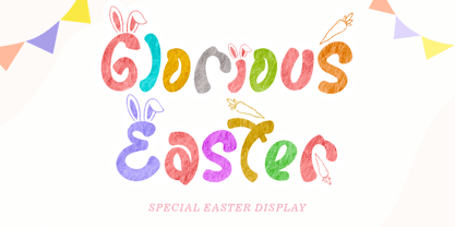 "Glorious Easter" is a unique and cute display font with an easter theme. This font is decorated with cute bunny ears and also a carrot. "Glorious Easter" is equipped with uppercase, lowercase, lowercase alternates, numerals, punctuations, and also multilingual support.
 - Kunst by Matt Grey Design,
$24.00Inspired by European brutalist design aesthetic, Kunst strives for form dominated by pure geometric precision, utilising 45° angles based on a strict grid. See the PDF specimen | Also available in Rounded and Imprint styles. Covers Western and Cyrillic character sets with a full range of Smallcaps. Includes Tabular Figures, Standard and Discretionary Ligatures, and Contextual Alternates such as arrows, Smart Quotes, and German Capital Eszett/scharfes (Sharp s). - Kunst Rounded by Matt Grey Design,
$24.00Inspired by European brutalist design aesthetic, Kunst strives for form dominated by pure geometric precision, utilising 45° angles based on a strict grid. See the PDF specimen | Also available in Normal and Imprint styles. Covers Western and Cyrillic character sets with a full range of Smallcaps. Includes Tabular Figures, Standard and Discretionary Ligatures, and Contextual Alternates such as arrows, Smart Quotes, and German Capital Eszett/scharfes (Sharp s). - RNS Miles by RNS Fonts,
$18.00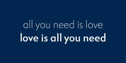 RNS Miles font family combines geometric shapes, open forms and grotesk mood for achieve a harmonic, neutral and low contrast shapes. Clearly influenced by Modernism it’s designed specially for headlines, titles and subtitles. The family consist of 7 weights ramping from thin to black, each weight having a matching italic. Take advantage of Mile’s extended OpenType features, including alternate glyphs, fractions, arrows, oldstyle figures, numerator / denominators and a variety of symbols.
 - Robots ht by Huerta Tipográfica,
$25.00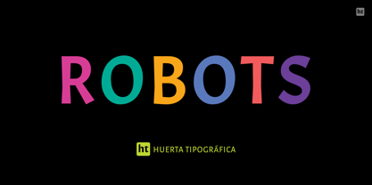 The challenge was to build a family of robots for using assembled or separated into modules. This family consists of 7 styles: the first one contains ready-to-use robots, the other styles contain 387 modules grouped into: heads, torsos, arms & hands, legs & feet, extras (eyes, accessories) and arrows. A family for everyone’s wish. Ready-to-use or make-it-your-own: more than 2 million possible combinations!
 - DR Krapka Round by Dmitry Rastvortsev,
$29.99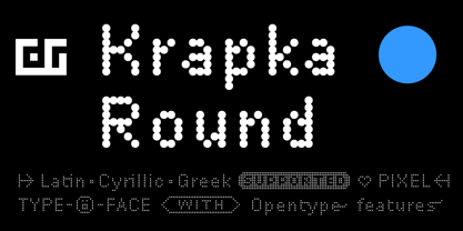 In the DR Krapka Round typefamily, the pixel has a round shape. The font supports OpenType features and contains small capitals, ligatures, oldstyle figures, terminal forms, historical forms, stylistic sets. The dingbats, arrows, emoji are also present. For small texts, it is recommended to use DR Krapka Round-FontSize10px in the font size 10 px. DR Krapka Round typefamily supported European languages based on Latin, Cyrillic and Greek scripts.
 - Triz by Typeóca,
$30.00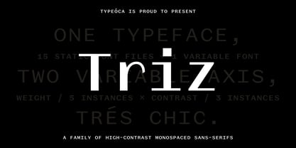 Triz is a high-contrast monospaced sans-serif, bringing together a typewriter rhythm and a fashion magazine look. With 5 different weights and 3 different contrast variations, Triz shines on both footnotes and headlines. With more than 1.000 glyphs, the Triz has an extensive language support and a lot of features, like its distinctive 'thin' alternates for diacritics, symbols and punctuation, small caps, arrows, manicules and much more.
 - Kunst Imprint by Matt Grey Design,
$24.00Inspired by European brutalist design aesthetic, Kunst strives for form dominated by pure geometric precision, utilising 45° angles based on a strict grid. See the PDF specimen | Also available in Normal and Rounded styles. Covers Western and Cyrillic character sets with a full range of Smallcaps. Includes Tabular Figures, Standard and Discretionary Ligatures, and Contextual Alternates such as arrows, Smart Quotes, and German Capital Eszett/scharfes (Sharp s). - Croma Sans by Hoftype,
$49.00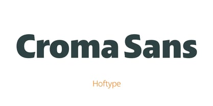 Croma Sans, created in 2016, is a linear sans with a controlled and distinct graphic flavour. The Croma Sans family consists of 16 styles and is well suited for ambitious typography. It comes in OpenType format with extended language support. All weights contain ligatures, proportional lining figures, tabular lining figures, proportional old style figures, lining old style figures, matching currency symbols, fraction- and scientific numerals and matching arrows.
 - DR Krapka Rhombus by Dmitry Rastvortsev,
$29.99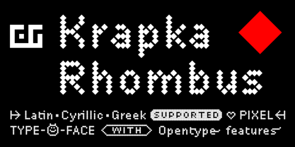 In the DR Krapka Rhombus typefamily, the pixel has a rhombus shape. The font supports OpenType features and contains small capitals, ligatures, oldstyle figures, terminal forms, historical forms, stylistic sets. The dingbats, arrows, emoji are also present. For small texts, it is recommended to use DR Krapka Rhombus-FontSize10px in the font size 10 px. DR Krapka Square typefamily supported European languages based on Latin, Cyrillic and Greek scripts.
 - Marat Sans by Ludwig Type,
$45.00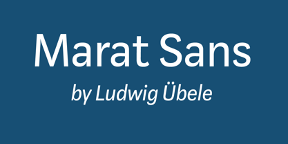 Marat Sans is a clean and lively sans serif typeface designed by Ludwig Übele. It is characterized by excellent legibility and suits a wide range of typography. The entire family contains 27 styles & weights and includes many OpenType features: various numerals, alternate glyphs, fractions, superiors and inferiors, language features, arrows, case sensitive forms and many more. Marat Sans is the perfect companion for Marat, a soft and elegant serif typeface.
 - Foro Rounded by Hoftype,
$39.00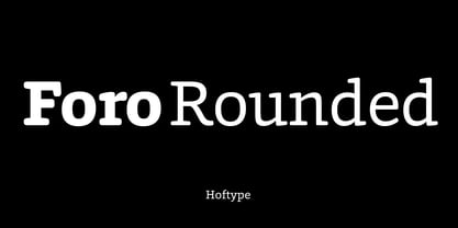 Foro Rounded is the softer sister of the succesful Foro family. Distinct in appearance, with pleasant haptic, objective, and with graphic appeal. Foro comes in 16 styles and in OpenType format. All weights contain standard ligatures, proportional lining figures, tabular lining figures, proportional old style figures, lining old style figures, matching currency symbols, fraction- and scientific numerals and arrows. Foro supports Western European, Central and Eastern European languages.
 - Substance by FaceType,
$24.00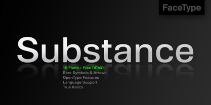 The grotesque workhorse: Substance fulfills the primary role of emphasizing content. Containing 8 weights + italics (800+ glyphs each) Substance is a workhorse with loads of subtle OpenType features (small caps, a choice of lining, tabular and old style figures, numerators, denominators, tabular figures and signs, fractions, ligatures), 21 currency signs and a diversity of symbols and arrows. Substance provides everything you need for demanding briefs like signage or corporate design.
 - Tandelle by Typodermic,
$11.95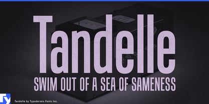 Welcome to the world of Tandelle—a sans-serif typeface with a unique flavor that will make your designs stand out. Tandelle was designed with a specific purpose in mind: to operate efficiently when there is a limited amount of horizontal space available. Its narrow letterforms are perfect for headlines, captions, and other types of text where space is at a premium. What sets Tandelle apart from other sans-serif typefaces is its flat points on verticals such as “A” and sharp points on horizontals such as “Z”. These distinctive features add a touch of sophistication and elegance to your designs, making them visually appealing and easy to read. Tandelle’s spacious shapes and minimal detail make it simple to read despite its narrowness. The typeface’s clean lines and modern design lend themselves to a wide range of applications, from branding and advertising to packaging and web design. Tandelle comes in four styles: Regular, Italic, Bold, and Bold-Italic. Whether you’re looking for a subtle accent or a bold statement, Tandelle has you covered. With its narrow letterforms and unique flavor, Tandelle is the perfect choice for any project that requires a touch of sophistication and style. So why settle for ordinary when you can have extraordinary? Try Tandelle today and see the difference for yourself. Most Latin-based European writing systems are supported, including the following languages. Afaan Oromo, Afar, Afrikaans, Albanian, Alsatian, Aromanian, Aymara, Bashkir (Latin), Basque, Belarusian (Latin), Bemba, Bikol, Bosnian, Breton, Cape Verdean, Creole, Catalan, Cebuano, Chamorro, Chavacano, Chichewa, Crimean Tatar (Latin), Croatian, Czech, Danish, Dawan, Dholuo, Dutch, English, Estonian, Faroese, Fijian, Filipino, Finnish, French, Frisian, Friulian, Gagauz (Latin), Galician, Ganda, Genoese, German, Greenlandic, Guadeloupean Creole, Haitian Creole, Hawaiian, Hiligaynon, Hungarian, Icelandic, Ilocano, Indonesian, Irish, Italian, Jamaican, Kaqchikel, Karakalpak (Latin), Kashubian, Kikongo, Kinyarwanda, Kirundi, Kurdish (Latin), Latvian, Lithuanian, Lombard, Low Saxon, Luxembourgish, Maasai, Makhuwa, Malay, Maltese, Māori, Moldovan, Montenegrin, Ndebele, Neapolitan, Norwegian, Novial, Occitan, Ossetian (Latin), Papiamento, Piedmontese, Polish, Portuguese, Quechua, Rarotongan, Romanian, Romansh, Sami, Sango, Saramaccan, Sardinian, Scottish Gaelic, Serbian (Latin), Shona, Sicilian, Silesian, Slovak, Slovenian, Somali, Sorbian, Sotho, Spanish, Swahili, Swazi, Swedish, Tagalog, Tahitian, Tetum, Tongan, Tshiluba, Tsonga, Tswana, Tumbuka, Turkish, Turkmen (Latin), Tuvaluan, Uzbek (Latin), Venetian, Vepsian, Võro, Walloon, Waray-Waray, Wayuu, Welsh, Wolof, Xhosa, Yapese, Zapotec Zulu and Zuni.
 - Meizda by Patria Ari,
$15.00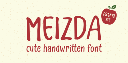 Introducing Meizda, a fun handwritten font with unique alternate and ligatures. Meizda can be played off easily to use for your project to make design more beautiful. Meizda suitable for book cover, tshirt, tote bags, merchandise, books, poster, title, quotes, and many more! Fonts featured : Uppercase Lowercase Numbers Punctuation & symbols Accented characters
 - Zepto by d[esign],
$-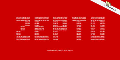 Zepto is about as small as you can get with pixel fonts without sub-pixel rendering. Featured on Make: A tiny screen font you can actually download and use, free. For optimal use, please turn font anti-aliasing off and set at a size of 8px with image resolution set to 72ppi.
 - Gurgle Jock by Bogstav,
$14.00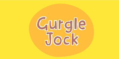 urgle Jock is actually two fonts in one: The Regular version is a classic handmade sans and the Outline version is…well, an outlined version of the Regular - however, I made it a bit off-grid and hasty scribbled looking. The two versions works well as they are and even greater together!
 - Lichtspielhaus by Typocalypse,
$19.00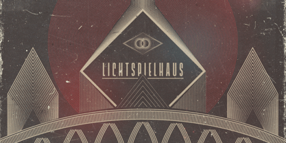 Lichtspielhaus is an ultra condensed Lichtspiele spin-Off with 8 weights. It still transports you back to a time where neon lights and marquee letters decorated cinema facades. There are 8 styles: Hairline, Thin, Light, Regular, Medium, Bold, Black and Heavy. "Lichtspielhaus" is the first part of a new Type Noir Quadrilogy.
 - Mister Rii PB by Pink Broccoli,
$19.00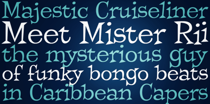 A spunktastic offbeat latin typeface inspired by numerous Caribbean travel brochures & retro album covers from the mid 50’s. This font really dances off the page! Opentype features include Stylistic Alternates that change the scale of monetary symbols, and Contextual Alternates that modifies the second letter when typing double letters in lowercase.
 - Houndcats PB by Pink Broccoli,
$14.00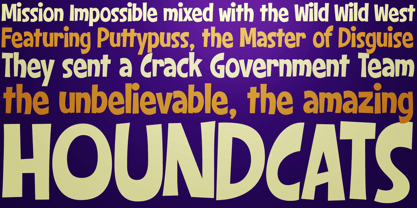 A light hearted comic sans-serif typeface inspired by a 1972 cartoon of the same name, Houndcats works with all it’s got to convey a funky, friendly, fantastic persona. A little bit off the chain, yet still easily legible, this typographic nutcase is ready and waiting for you to go wild with it!
 - Orange by ITC,
$40.99Orange is the work of British designer Timothy Donaldson and defies the conventional rules of letter construction. Its soft appearance and unusual stroke style produces a fascinating texture in both small and large point sizes. Orange is a departure from standard sans serif styles and ideal for a slightly off-beat look. - Ranchstyle by Ampersand Type Foundry,
$29.00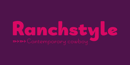 Based off of research into Nevada cattle branding irons of the 19th century, Ranchstyle takes the vernacular from rancher’s brands of the old west, digitizes it, and brings it into the contemporary world as a vivacious spunky typeface. The letterforms mimic bent metal and have the fluidity that follows such a material.
 - HU Masking Tape by Heummdesign,
$15.00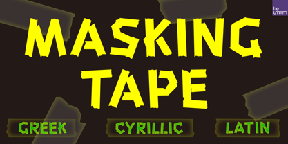 Masking tape, also known as painter's tape, is a type of pressure-sensitive tape made of a thin and easy-to-tear paper, and an easily released pressure-sensitive adhesive. It is available in a variety of widths. It is used mainly in painting, to mask off areas that should not be painted.
 - ZT Floogn by Khaiuns,
$14.00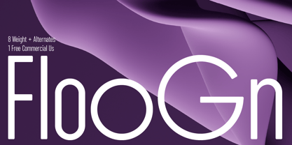 The new ZT Floogn font family, designed by Khaiuns and published by Zelowtype, is a modern, dense sans-serif style with a rounded look. This font is characterized by its balanced proportions, uniform stroke width, and subtle variations in type forms, giving it a distinctive look at all weights. Due to the narrow shape of the ZT Floogn typeface, it is best applied to headlines and poster-sized typography, resulting in designs with a fresh, friendly personality. ZT Floogn has 8 weights, one of them is commercial-free, and each style has a unique alternative font. I hope you have fun using ZT Floogn. Thanks for using this font ~ Zelowtype X Khaiuns
 - Batoswash by T4 Foundry,
$21.00Avantgarde fonts Batory and Batoswash are monoline sansserifs designed by Bo Berndal. The futuristic Batory (think Bladerunner and Total Recall) and the spicier relative Batoswash come in three versions: Narrow, Middle and Wide. The font family is available in Truetype and Postscript for Mac and PC. Bo Berndal, born 1924, has been designing typefaces over 56 years, for Monotype, Linotype and other foundries. "Batory is a monoline reaction to my many calligraphic fonts", says Bo Berndal. "That is also the reason I did several widths instead of weights. Batory has short stems and high x-height. Batoswash is a Batory gone wild!" The successful Batory has already been used for logotypes, vignettes in magazines and as headline type. - Balega by Linotype,
$29.99 Balega is stencil-like display font, created by German designer Jürgen Weltin in 2002. Balega's letters are very bold, and have a slight italic slant. While some of the uppercase forms appear somewhat sharp, the lowercase is definitively round and friendly. Text set in Balega has a very forward moving motion, as the slant makes all of the letters seem to be lunging toward the right. This gives the typeface a very dynamic feel. Because the counterforms in and between the letters are very narrow, we recommend using Balega in posters and other larger displays, where its design may be truly appreciated. Balega is part of the Take Type 5 collection, from Linotype GmbH."
 - Margon by ParaType,
$30.00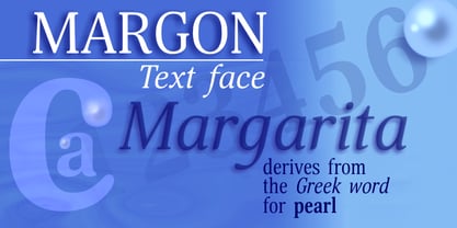 Margon is a serif font family with a temperate design -- small serifs, moderate contrast, tiny roundings on the corners make it calm and serene. The Margon font family consists of 18 members divided into 4 groups of different proportions marked by indexes 360, 380, 400, 430. These values correspond to densities of sets -- 360 is the widest style, 430 is the most narrow one. The peculiarity of Margon family is a rather small difference in proportions of characters between neighbor groups, it’s less than 10%. Such tiny step gives possibility to select the font that gives the best result in combination of capacity and readability. Margon can be used in book, magazine and newspaper design.
 - SK Nowatorus by Shriftovik,
$48.00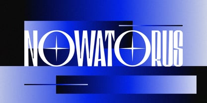 SK Nowatorus is a modern experimental display grotesque. This typeface challenges the usual ideas about the structure of symbols and harmony in the typesetting line. The typeface symbols are based on the average contrast of thicknesses and on the contrast of the shapes of the symbols themselves. The font combines both narrow characters of the main set and wide additional ones. This, coupled with a wide range of alternatives and ligatures, gives huge opportunities for creative experiments. SK Nowatorus supports a multilingual set of Latin Pro and Cyrillic Pro. This typeface is perfect for poster design and for a set of small text blocks due to the presence of a capital and lowercase set.
 - Stratosphere SG by Spiece Graphics,
$39.00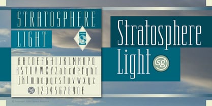 Every element in this typeface shouts tall and narrow, slender and provocative. With wispy delicate serifs attached to elevator-style vertical stems, Stratosphere’s only goal seems to be getting to the top in style. And no matter how you describe it - ultra thin or ultra condensed - this typeface is best for short headlines and titles. Use only in large display sizes and use sparingly. Stratosphere Light is also available in the OpenType Std format. Some new characters have been added to this OpenType version. Advanced features currently work in Adobe Creative Suite InDesign, Creative Suite Illustrator, and Quark XPress 7. Check for OpenType advanced feature support in other applications as it gradually becomes available with upgrades.
 - Gulden Display by Studio Gulden,
$20.00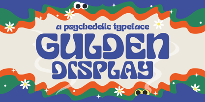 Gulden Display - Introducing our new psychedelic display font, perfect for adding some trippy vibes to your designs. This bold and eye-catching font features swirling, abstract shapes and patterns that seem to move and shift right before your eyes. With its unique, otherworldly aesthetic, this font is perfect for album covers, concert posters, and any project that wants to make a bold, unconventional statement. Whether you're a graphic designer, artist, or just looking to add some visual interest to your personal projects, this font is sure to make an impact. Give it a try and let your creativity take flight! Features: - Uppercase & Lowercase - Narrow and Wide Versions - Number - Multilingual Support - Punctuation Stay pop and inspiring! Regards, Studio Gulden.
 - Layfort by Identity Letters,
$29.00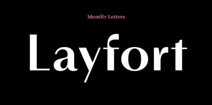 What do you get when you cross Industrial Revolution with Art Déco? The raw force of steam-powered vessels with the panache of dashing streamliners? A sturdy industrial grotesque with a swanky stylized sans? We don't know, but our Layfort is a strong contender. It's a contrasted sans-serif typeface with old-style proportions: varying letter widths create a more vivid texture than your usual contemporary sans, and the true italics are narrower than the uprights. Layfort is elegant enough for fashion, art, and luxury; yet sufficiently sincere for serious business. And at 16 styles & 750 glyphs, it's ready for complex typographic demands (try the round dots at SS09). Let your designs fly!
 - Payload by Device,
$29.00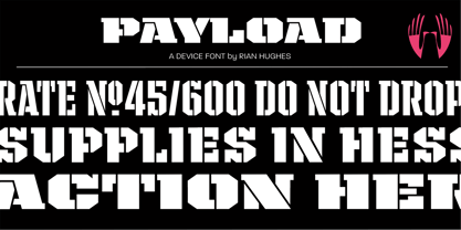 Payload began as an early concept for Loaded magazine, and here is developed into a clean outline and rough splattery spraycan version. In this font, the upper and lower case characters are subtly different enabling a more realistic appearance to be achieved by ßipping between cases whenever characters occur together in pairs. Wide and Narrow styles of this popular font have been subsequently been added. This font is reminicent of military stencilling, urban graffiti and freight packaging. The "Outline" version, as before, is a carefully weighted addition where the thickness of the stroke is identical to the stencil gap. It has also been respaced and rekerned to allow for the additional character spread.
 - DEXTER by Type Innovations,
$39.00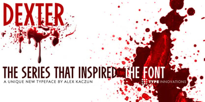 Dexter is an original new typeface creation by Alex Kaczun. It is a warmer, more sophisticated grotesque that is both fun and interesting. Its tight letter spacing and narrow proportions make the typeface particularly well suited for display sizes and headlines. This intriguing sans with distinctive letter shapes is typical for display fonts of the late 19th and early 20th centuries. Dexter is ideal for titles and headlines looking for impact and style. Dexter is also an excellent choice for magazines, books, posters, brochures, flyers, etc. The large Pro font character set, which supports most Central European and many Eastern European languages, also includes a corresponding small caps font along with old style figures.
 - Burdigala Sans by Asgeir Pedersen,
$19.99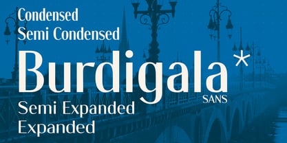 Burdigala is a clean-cut, modern yet classic typeface inspired by Didones and Aicher’s Rotis family. Burdigala Sans is especially well suited for on-screen usage such as in apps and pdf documents. It is also ideal for larger amounts of (printed) texts in brochures, magazines and books. It is slighty narrow in order to conserve space, but spacious enough to faciliate reading and overall clarity. Check out its sibling, the Burdigala Semi Serif version. The expanded versions, being wider and more open, works equally well in media intended both for print and on-screen reading, e.g. in Pdf-documents etc. Burdigala is the ancient Roman name of the city of Bordeaux France.
 - Karmaline by Mysterylab,
$9.00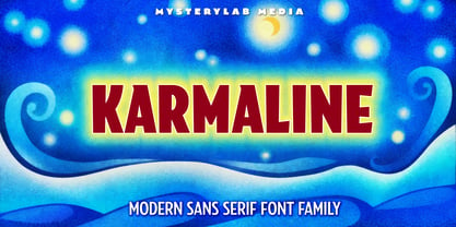 Karmaline is a six-weight sans serif font family with a unique and expressive design. This font has some intriguing special features such as subtly tapered topheavy vertical strokes and selected wedge-shaped horizontal strokes. It is evocative of designs from Switzerland, Germany, and the Netherlands in the period spanning 1900 – 1930, but with thoroughly modern features like high legibility at small sizes, even inter-character weight and flow, and a high x-height. You'll find Karmaline's semi-condensed width to be useful for both strong headlines and for comfortable copyfitting in narrow column widths. This font also works very well when adding layered shadow and highlight effects, and is a great choice for logos.
 - Bumpy Ride by Hanoded,
$16.00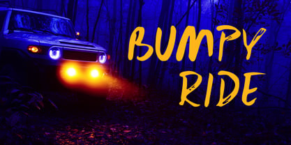 I live in a small hamlet near the Rhine river. It is a sleepy little town and it doesn’t have any facilities. For groceries I need to go to the next town. The only road leading to that town has been closed for half a year, because of ‘maintenance’, so doing groceries got a lot trickier. The fastest way to travel is through yet another hamlet in the forest, on a very narrow road with extremely bumpy shoulders. Yes, you’ve guessed it: it is a Bumpy Ride. Bumpy Ride was made using a so called Brush Pen. It comes with all the accents and a sweet set of alternates for the lower case letters.
 - ITC Whiskey by ITC,
$29.99Jochen Schuss, the Biedenkopf, Germany, designer who was most recently responsible for ITC Vino Bianco, has created in ITC Whiskey a condensed display face that's both angular and soft at the same time. While the letterforms of Whiskey are clearly roman, there's a slight reminiscence of blackletter in the face's narrow proportions, its dark weight, and its persistent internal angle - not quite the 45 degrees common in a classic German textura, but a gentler angle of 25 or 30 degrees. And the counters are all rounded, as are the ends of all the strokes, giving Whiskey a comfortable friendliness despite its severe structure. The character set includes an alternate z" and an "ft" ligature." - Neumatic Compressed by Arkitype,
$12.00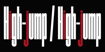 Neumatic compressed has a super compressed character set, increased cap height and tight kerning that combine to give you the ability to create large, beautiful and effective headlines and copy for your artwork. Neumatic Compressed packs punch when it comes to large copy lines and is perfect for posters, display copy, headlines in printed materials like magazines and books . The family comes in 8 weights from extra light to Black so it's versatile. Its extra light weight can give you some great height due to how narrow it is. Play around with the opentype Superscript with an underline or the Opentype stylistic sets which turns the default squared dots on i's, j's and punctuation to round dots.
 - Blooms by DearType,
$29.00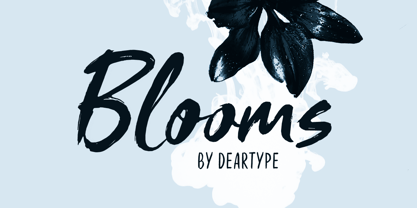 Say hello to Blooms - an edgy, brush script with lots of attitude! All handmade and then vectorized, Blooms is the perfect mix between sexy and serious. The script is made in two variations - one rough and one smooth for a more sleek look. The Blooms family comes with some great additions to support the script - a thick headline font for the ultimate impact and a narrow tagline font for more hand-style expression. Urban, modern and full of personality, Blooms is perfect for various occasions. Wedding invitations, T-shirts or cards, Instagram photos or interactive designs, it covers it all. Throw some ligatures and stylistic alternates on top of that and you have yourself a multipurpose family.
 - Sagarana by Eller Type,
$35.00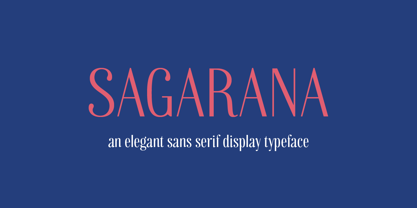 Sagarana is an elegant display typeface rooted in the style of romantic or didones letterforms; however, it is a sans serif with a cleaner appearance. The contrast and the vertical stress maintain the modern style, while the terminals, the finials, the proportions and the narrow look enhance its stylish personality. It could be suitable for editorial projects such as magazines, books or even for sophisticated environments, let’s say, fashion, department store, perfumes, cosmetics and so on. Sagarana was initially inspired by a Brazilian book cover from 50’s. The name itself combines the words “saga” (as in the English sense of “story”) and “rana,” a Tupi word (Indigenous language) that roughly means “showing similarities”.