10,000 search results
(0.018 seconds)
- Lapis Pro by Canada Type,
$29.95 Lapis was Jim Rimmer's venture into a territory he'd earlier explored with his Lancelot and Fellowship faces. This time he stayed much longer, dug pretty deep, and had plenty of fun in there. The end result is the kind of mosaic of influences only a guy like Jim could consider, gather, manage and apply in a way that ultimately makes sense and works as a type family. On the surface Lapis seems like something that can be billed as what Jim would have called an "advertising text face". But under the hood, it's a whole other story. On top of the calligraphic, nib-driven base Jim usually employed in his faces, Lapis shows plenty of typographic traits from a variety of genres, from Egyptian to Latin, from blackletter angularity to Dutch-like curvature, with an overall tension even reminiscent of wood type. There are some Goudy-informed shapes that somehow fit comfortably within all this. Then it's all strung together with a mix of wedged, tapered and leaning serifs, placed with precision to reveal expert spontaneity and a great command of guiding the forms through counterspace. In the fall of 2013, the Lapis fonts were scrutinized and remastered into versatile performers for sizes large and small. The three weights and their italic counterparts have been refined and expanded across the board to include small caps, alternates, ligatures, ordinals, case-sensitive forms, six kinds of figures, automatic fractions, and a character set that covers an extended range of Latin languages. Each of the Lapis Pro fonts contains over 760 glyphs. For more details on the fonts' features, text and display specimens and print tests, consult the Lapis Pro PDF availabe in the Gallery section of this page. 20% of Lapis Pro's revenues will be donated to the Canada Type Scholarship Fund, supporting higher typography education in Canada.
 - Beverly Catherine by Attract Studio,
$16.00 Beverly Catherine is a bold hand-drawn all-caps marker font that has really original brush edges and is rough in every stroke. Great for logos, merchandise, product packaging, quotes, comic book text, and hard-hitting titles. It also includes multilingual support.
 - Sweet Kitten by Yumna Type,
$16.00 Sweet Kitten is a elegant handwritten font. Made for any professional project branding. It is the best for logos, branding and quotes. Every letter has a unique and beautiful touch. Features: Standard Ligatures PUA Encoded Multilingual Support Numerals and Punctuation by Yumnatype
 - Silly Treat by PizzaDude.dk,
$10.00 The Silly Treat font is actually handmade, but I traced each and every letter and cleaned them up - however, I wanted to keep the handmade look, and left just about enough details for you to find details of my original drawn lines.
 - Saulifriend by Brithos Type,
$11.00 Saulifriend feels incredibly elegant and flowing. It looks stunning on wedding invitations, thank you cards, quotes, greeting cards, logos, business cards and every other design which needs a handwritten touch. It features a varying baseline, smooth lines, gorgeous glyphs and stunning alternates.
 - Poetry Grow by Carpiola Studio,
$12.00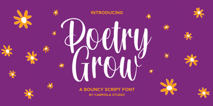 Poetry Grow is a bouncy and timeless handwritten font. It is the best choice for creating eye-catching logos, branding, and quotes. Every letter adds a unique and beautiful touch to your design, making it come alive with a classy and elegant look.
 - Boomboyah by Letterara,
$10.00 Boomboyah is a natural dry brush font. This font has a striking look and a good flow that can add a stylish touch to your designs. It’s perfect for logos, quotes, posters, for clothing, and every other design which needs a unique touch.
 - Appelsin by Bogstav,
$15.00 Perhaps all people knows that oranges are healthy. One single orange provides almost every daily need of vitamin C. This font is called Appelsin, which is the danish word for orange. Perhaps this font is just as healthy for your designs as well? ;)
 - Tabina by ErlosDesign,
$12.00 Tabina is a sweet, romantic and timeless handwritten font. It looks stunning on wedding invitations,thank you cards, quotes, greeting cards, logos, business cards and every other design which needs a handwritten touch.It features a varying baseline, smoothlines, gorgeous glyphs and stunning alternates.
 - Stuart Collins by Goodigital13,
$20.00 It looks stunning on wedding invitations, thank you cards, quotes, greeting cards, logos, business cards and every other design which needs a handwritten touch. add an eye-catching appeal to your logo designs, brand imagery, handwritten quotes, product packaging, merchandise & social media posts
 - Black Asgard by Letterara,
$16.00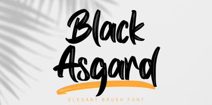 Black Asgard is a natural dry brush font. this font has a striking look and a good flow font that can add style to your designs. It’s perfect for logos, quotes, posters, clothing, and every other design which needs a strong touch.
 - Fresh Orange by Lettersams,
$12.00 Fresh Orange is a type of font that presents a unique style for every design project such as cartoons, comics, poster designs, and so on. Fresh Orange has two styles: regular and extrude, which will create a great layered look when combined.
 - Puppy Baby by Yumna Type,
$16.00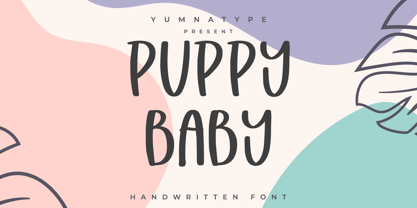 Puppy Baby is a elegant handwritten font. Made for any professional project branding. It is the best for logos, branding and quotes. Every letter has a unique and beautiful touch. Features: Standard Ligatures PUA Encoded Multilingual Support Numerals and Punctuation by Yumnatype
 - Paleos by Scriptorium,
$12.00For Halloween season, we thought we'd better trundle out a nice, crude prehistoric font to meet the growing need. Paleos features many different versions of almost every character so you can give it the natural variety of lettering hand-carved by a troglodyte. - Aerillyo by Stringlabs Creative Studio,
$29.00 The Aerillyo is a strong and bold script font. It’s curved and rounded in every single touch, and has an unique vintage and retro styles that’s perfect for branding. The Aerillyo font is suitable for all your retro, vintage, and 80s style projects.
 - Flabioga by PizzaDude.dk,
$20.00Flabioga may look like your every day stencil font - but it's not. It contains two sets of letters, one for uppercase and one for lowercase + ligatures for double letters and numbers! You will need to use OpenType supporting applications to use the autoligatures. - Revillia by Din Studio,
$29.00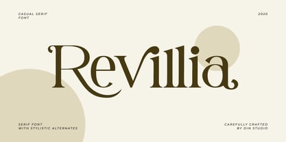 Revillia is modern serif font. Made for any professional project branding. It is the best for branding, printing, wedding and quotes. Every letter has a unique and beautiful touch. Features: Beautiful Ligatures Many Swashes Stylistic Sets PUA Encoded Multilingual Support Numerals and Punctuation
 - Billys Rock by Letterara,
$12.00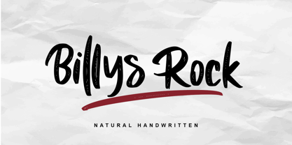 Billys Rock is a natural dry brush font. this font has a striking look and a good flow font that can add style to your designs. It’s perfect for logos, quotes, posters, clothing, and every other design which needs a strong touch.
 - Pink Miracle by Yumna Type,
$16.00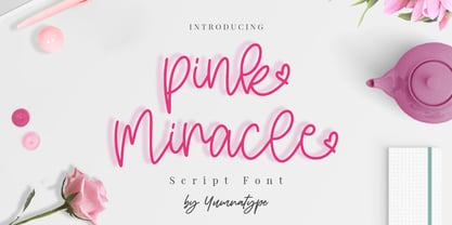 Silky Daisy is a elegant handwritten font. Made for any professional project branding. It is the best for logos, branding and quotes. Every letter has a unique and beautiful touch. Features: Standard Ligatures PUA Encoded Multilingual Support Numerals and Punctuation by Yumnatype
 - Magicelf by Yumna Type,
$16.00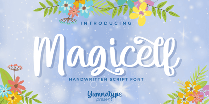 Magicelf is a elegant handwritten font. Made for any professional project branding. It is the best for logos, branding and quotes. Every letter has a unique and beautiful touch. Features: Standard Ligatures Swashes Alternates PUA Encoded Multilingual Support Numerals and Punctuation by Yumnatype
 - Haney love by Muksal Creatives,
$12.00 Haney Love feels incredibly elegant and flowing. It looks stunning on wedding invitations, thank you cards, quotes, greeting cards, logos, business cards and every other design which needs a handwritten touch. It features a varying baseline, smooth lines, gorgeous glyphs and stunning alternates.
 - Endure by Spinturnix,
$10.00 Endure is a new hand-painted brush font created to add a high detail and realistic feel to any project. Every glyph in Endure was painted by hand on actual paper and scanned in manually - A lengthy process, but worth the fine detail!
 - Geometry by Sfaranda,
$30.00 The GEOMETRY Font is based on a specific grid. The grid is made of vertical, horizontal, diagonal lines and circles. Every single letter, number and symbol fits perfectly in the grid, no exception! The GEOMETRY Font includes uppercase, lowercase, numbers and punctuation symbols.
 - Kasdio by Din Studio,
$29.00 Kasdio is a casual brush font. Made for any professional project branding. Every letter has a unique and beautiful touch. Includes: Kasdio (OTF) Features: Beautiful Ligatures PUA Encoded Multilingual Support Numerals and Punctuation Thank you for downloading premium fonts from DIn Studio
 - Thunderhouse by Aerotype,
$29.00 A tasty jambalaya of two different weights of wood type, Thunderhouse has alternates for every capital and lowercase letter, consecutive characters are controlled with the OpenType Ligature feature. Thunderhouse Pro extends the character set to support Eastern European Latin, Baltic, Greek and Turkish.
 - Monster Blood by Yoga Letter,
$16.00 "Monster Blood" is a unique horror font with a blood-like melt in every letter. This font is perfect for Halloween moments, movie titles, logos, book covers, horror stories and more. "Monster Blood" comes with lowercase, uppercase, multilingual support, numerals, and punctuations.
 - Christmas Heart by Letterafandi Studio,
$14.00 Christmas Heart feels incredibly elegant and flowing. It looks stunning on wedding invitations, thank you cards, quotes, greeting cards, logos, business cards and every other design which needs a handwritten touch. It features a varying baseline, smooth lines, gorgeous glyphs and stunning alternates.
 - Beach Fool by PizzaDude.dk,
$19.00 People might consider me a fool - they might even consider me a fool on the beach...because I take a swim in the ocean, even in the wintertime! Beach Fool is a simple but yet very strong headline font. It has its roots in both grafitti and comics, which makes it really powerful for graphical expressions that needs an extra punch!
 - Lisbeth by TypeTogether,
$39.00 Louisa Fröhlich’s Lisbeth is the charming all-italic trailblazer that handles branding and text with internal vividness. With no roman style, it’s an italic-only family whose creation was guided by imagination instead of restrictive writing tools. Some type families aren’t sure what they want. Lisbeth proceeds with the utmost confidence on its own terms — it’s a feisty three-dimensional thespian amidst the cast of strait-laced characters you’re used to. With branding and magazine usage in mind, Lisbeth addresses the distinct challenges of text and display in a characterful way. The curves of the text weights show a soft angularity, emphasising the handwritten quality and the subtle twist inside the letters. The stroke’s carefully balanced contrast is more pronounced in the vibrant heavier weights but almost absent in the graceful structure of the thin weight. The angle of the letters is almost upright and the x-height is relatively large, so longer texts can be read comfortably and without effort. Lisbeth is slightly condensed and so uses a smaller area to efficiently impart much information. So if a type design can be thought of as the clothing letters wear, then Lisbeth is an energetic, freely flowing stroke wrapped around practical and efficient letter proportions. Another highlight of the family is the quirky high-contrast display style, easily catching every eye. The design concept of the twisted stroke shows at the extreme here and makes the letters dance a little on the page. Even though the shapes behave wildly, every letter is carefully balanced in itself so that the rhythmic repetition of the lettershapes results in an even and harmonic total picture. Lisbeth’s five text weights (from thin to bold) perform excellently in text settings, and its funky display style amps up the internal shimmer within each glyph. It supports numerous languages (Latin-A extended) and comes with ligatures and contextual alternates to produce beautiful typography. The character set contains proportional lining and oldstyle figures, tabular figures, subscripts, superscripts, and fractions. The complete Lisbeth family, along with our entire catalogue, has been optimised for today’s varied screen uses.
 - Areplos by Storm Type Foundry,
$53.00To design a text typeface "at the top with, at the bottom without" serifs was an idea which crossed my mind at the end of the sixties. I started from the fact that what one reads in the Latin alphabet is mainly the upper half of the letters, where good distinguishableness of the individual signs, and therefore, also good legibility, is aided by serifs. The first tests of the design, by which I checked up whether the basic principle could be used also for the then current technology of setting - for double-sign matrices -, were carried out in 1970. During the first half of the seventies I created first the basic design, then also the slanted Roman and the medium types. These drawings were not very successful. My greatest concern during this initial phase was the upper case A. I had to design it in such a way that the basic principle should be adhered to and the new alphabet, at the same time, should not look too complicated. The necessary prerequisite for a design of a new alphabet for double-sign matrices, i.e. to draw each letter of all the three fonts to the same width, did not agree with this typeface. What came to the greatest harm were the two styles used for emphasis: the italics even more than the medium type. That is why I fundamentally remodelled the basic design in 1980. In the course of this work I tried to forget about the previous technological limitations and to respect only the requirements then placed on typefaces intended for photosetting. As a matter of fact, this was not very difficult; this typeface was from the very beginning conceived in such a way as to have a large x-height of lower-case letters and upper serifs that could be joined without any problems in condensed setting. I gave much more thought to the proportional relations of the individual letters, the continuity of their outer and inner silhouettes, than to the requirements of their production. The greatest number of problems arose in the colour balancing of the individual signs, as it was necessary to achieve that the upper half of each letter should have a visual counterbalance in its lower, simpler half. Specifically, this meant to find the correct shape and degree of thickening of the lower parts of the letters. These had to counterbalance the upper parts of the letters emphasized by serifs, yet they should not look too romantic or decorative, for otherwise the typeface might lose its sober character. Also the shape, length and thickness of the upper serifs had to be resolved differently than in the previous design. In the seventies and at the beginning of the eighties a typeface conceived in this way, let alone one intended for setting of common texts in magazines and books, was to all intents and purposes an experiment with an uncertain end. At this time, before typographic postmodernism, it was not the custom to abandon in such typefaces the clear-cut formal categories, let alone to attempt to combine the serif and sans serif principles in a single design. I had already designed the basic, starting, alphabets of lower case and upper case letters with the intention to derive further styles from them, differing in colour and proportions. These fonts were not to serve merely for emphasis in the context of the basic design, but were to function, especially the bold versions, also as independent display alphabets. At this stage of my work it was, for a change, the upper case L that presented the greatest problem. Its lower left part had to counterbalance the symmetrical two-sided serif in the upper half of the letter. The ITC Company submitted this design to text tests, which, in their view, were successful. The director of this company Aaron Burns then invited me to add further styles, in order to create an entire, extensive typeface family. At that time, without the possibility to use a computer and given my other considerable workload, this was a task I could not manage. I tried to come back to this, by then already very large project, several times, but every time some other, at the moment very urgent, work diverted me from it. At the beginning of the nineties several alphabets appeared which were based on the same principle. It seemed to me that to continue working on my semi-finished designs was pointless. They were, therefore, abandoned until the spring of 2005, when František Štorm digitalized the basic design. František gave the typeface the working title Areplos and this name stuck. Then he made me add small capitals and the entire bold type, inducing me at the same time to consider what to do with the italics in order that they might be at least a little italic in character, and not merely slanted Roman alphabets, as was my original intention. In the course of the subsequent summer holidays, when the weather was bad, we met in his little cottage in South Bohemia, between two ponds, and resuscitated this more than twenty-five-years-old typeface. It was like this: We were drinking good tea, František worked on the computer, added accents and some remaining signs, inclined and interpolated, while I was looking over his shoulder. There is hardly any typeface that originated in a more harmonious setting. Solpera, summer 2005 I first encountered this typeface at the exhibition of Contemporary Czech Type Design in 1982. It was there, in the Portheim Summer Palace in Prague, that I, at the age of sixteen, decided to become a typographer. Having no knowledge about the technologies, the rules of construction of an alphabet or about cultural connections, I perceived Jan Solpera's typeface as the acme of excellence. Now, many years after, replete with experience of revitalization of typefaces of both living and deceased Czech type designers, I am able to compare their differing approaches. Jan Solpera put up a fight against the digital technology and exerted creative pressure to counteract my rather loose approach. Jan prepared dozens of fresh pencil drawings on thin sketching paper in which he elaborated in detail all the style-creating elements of the alphabet. I can say with full responsibility that I have never worked on anything as meticulous as the design of the Areplos typeface. I did not invent this name; it is the name of Jan Solpera's miniature publishing house, in which he issued for example an enchanting series of memoirs of a certain shopkeeper of Jindrichuv Hradec. The idea that the publishing house and the typeface might have the same name crossed my mind instinctively as a symbol of the original designation of Areplos - to serve for text setting. What you can see here originated in Trebon and in a cottage outside the village of Domanín - I even wanted to rename my firm to The Trebon Type Foundry. When mists enfold the pond and gloom pervades one's soul, the so-called typographic weather sets in - the time to sit, peer at the monitor and click the mouse, as also our students who were present would attest. Areplos is reminiscent of the essential inspirational period of a whole generation of Czech type designers - of the seventies and eighties, which were, however, at the same time the incubation period of my generation. I believe that this typeface will be received favourably, for it represents the better aspect of the eighties. Today, at the time when the infection by ITC typefaces has not been quite cured yet, it does absolutely no harm to remind ourselves of the high quality and timeless typefaces designed then in this country.In technical terms, this family consists of two times four OpenType designs, with five types of figures, ligatures and small capitals as well as an extensive assortment of both eastern and western diacritics. I can see as a basic text typeface of smaller periodicals and informative job-prints, a typeface usable for posters and programmes of various events, but also for corporate identity. Štorm, summer 2005 - Viva Beautiful Collection by Cultivated Mind,
$19.00 Continue your branding with the ever popular Viva Beautiful font. A new hand-painted brush script collection by Cultivated Mind. Viva Beautiful is back with nine new fonts that include six scripts, a caps font, free words font, free extras and plenty of alternates/ligatures. There are five sets of alternates for every letter adding to the uniqueness of your designs. The new Viva Beautiful scripts are a much cleaner brush script than the original. All scripts come in pro and regular versions. Both versions are Latin Pro. Pro scripts include 260 alternates and 8 common ligatures. Ligatures are programmed to pop up when specific letter pairs are typed. Try the alternates and ligatures together to give your designs a realistic hand-painted look. The all caps font is a basic version that includes 5 common ligatures and looks great paired with the scripts. Regular versions include Latin Pro characters but do not include alternates and ligatures. Viva Beautiful Collection works best for beauty products, music branding, film, television, cookbooks, book covers, food marketing, magazines, and websites. Check out Cultivated Mind Type on Instagram for fun Viva design ideas. Bring beauty to your designs with Viva Beautiful! Fonts designed by Cindy Kinash. Poster designs by Corinne Alexandra.
 - Goudy Text by Monotype,
$29.99The word Text" in Goudy Text™ is short for Textura, and textura is the style of blackletter or gothic writing developed in Northern Europe in the middle ages. The use of space in blackletter is quite different from what we know about Roman letterforms. Lowercase forms in blackletter writing and typefaces must be evenly textured with black and white elements, like the texture of weaving or fabric. Capital letters can provide either an integration of the even texture (by the use of decoration in their construction) or, if they are wide and open and filled with white, they provide bright spots of visual emphasis. Goudy, despite being an American in the twentieth century, understood well the fundamental texture of medieval blackletter and the importance of both density and light. He designed Goudy Text in 1928 for Lanston Monotype after studying the type in Gutenberg's 42-line bible; still one of the best models for designers of blackletter typefaces. The lowercase of Goudy Text has impact and medieval authenticity. The standard caps have some Victorian eccentricities but are mostly well drawn. The alternate, or "Lombardic" caps are spectacular - they set beautifully with the lowercase letters, providing the proverbial shafts of light through the Gothic cathedral's stained glass windows. Use this potent font in sizes 14 point or larger, for Christmas greetings, certificates, wedding invitations, advertising, or music collateral pieces." - Wackado by BA Graphics,
$45.00A wild and wacky fun filled extreme design that can be used in many ways even in text sizes. - Aleante Sans by Pedro Teixeira,
$18.00 Aleante Sans is very readable (even in small sizes), clean and beautiful sans serif designed by Pedro Alexandre Teixeira.
 - Kuppa by Huh? Type Foundry,
$15.00 Kuppa is a yummy display unicase with a lot of attitude. Two styles within the Kuppa family a like brothers — look alike and still completely different. Both brothers have 555 glyphs, including alternates, ligatures, fractions and even german capital eszett and excluding Cyrillic in Basic version. Kuppa Regular is clear, powerful and will suit for menus, coffee shop and restaurant use, for magazine handwritten heads and sub-lines and even for kids books. Kuppa Fat is on the dark side — it is bizarre and wild, sometimes even hardly legible. Sometimes you won't see letters, just encrypted symbols — perfect for music posters, vinyl shops, cd covers and hip stuff.
 - Boxajoy by PizzaDude.dk,
$20.00Boxajoy drawn with an inky pen and scanned at high resolution - that's why it looks good, even at large sizes! - Bertina by 611 Studio,
$16.00 Bertina, simple and elegant typeface with feminine touch. It's simplicity makes it best for headlines, letterhead, quotes and even logo.
 - Ziggy Sans by Just Jace,
$5.00 Ziggy Sans is my debut font, a straightforward headline typeface. It was devised from simple sketches and came together fairly smoothly, but very slowly. Each letterform is comprised of only two shapes for maximum consistency, and every letter combination has been painstakingly kerned by hand.
 - Alyrak by Konstantine Studio,
$16.00 ALYRAK is born from the anxiety of the future dystopia of the human race. The fear of Artificial Intelligence, robots, and technology that potentially invade living things. Represented in a font and visual to emulate the vibe every time you type it from your keyboard.
 - Ondemande by Stefani Letter,
$14.00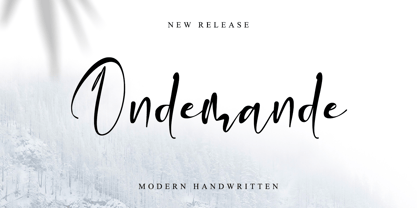 Ondemande feels equally charming and elegant. It looks stunning on wedding invitations, thank you cards, quotes, greeting cards, logos, business cards, and every other design which needs a handwritten touch. This font is PUA encoded which means you can access all of the glyphs.