10,000 search results
(0.062 seconds)
- Newspoint by Elsner+Flake,
$35.00 The design of the Newspoint typeface is based on the tradition of the American sans serif faces of the last century. This form expression was greatly influenced by the News Gothic type which was created by Morris Fuller Benton in 1908, and has, once again, become very popular. When the development of sans serif types such as Futura and Kabel by Renner and Koch began in 1925, the design of American sans serif types receded somewhat into the background. In the 1950’s, however, they experienced a renaissance which continues to this day. Thanks to its clean design and the relatively large x-height, the Newspoint is well suited for informative texts in newspapers, magazines, and brochures. In packaging design, as well, the Newspoint can display its strength in small print. Newspoint was developed as a customer-specific variation of the News Gothic. In contrast to the News Gothic, however, the face appears to be softer and more appealing thanks to the changed interpunctions. If so desired, the alternative characters give the typeface expanded individuality and a richness of design options.
 - Linotype Rezident by Linotype,
$29.99Flyers, Intros from James Bond films and PlayStation games as well as the typeface Senator from Zuzane Licko inspired the Dutch designer Paul van der Laan to create his font Linotype Rezident. To its design, van der Laan says, I was designing a business card for a friend and I had a certain mood in mind for the typography. I tried to capture this mood in a couple of sketches, drew a few characters directly onscreen and just expanded them into a typeface." And so began Linotype Rezident, with its cool, technical and constructivist appearance which brings to mind computers and virtual reality. And the name? " The name of the font comes from the game Resident Evil. One of the main characters in the game is called Leon and the typeface was initially drawn for a friend of mine called Leon. It also refers to the city of The Hague - where I live and got my education - since it's often called 'de residentie'", where the queen and parliament of The Netherlands are seated." - Oz Handicraft BT WGL by Bitstream,
$50.99Oswald Cooper is best known for his emblematic Cooper Black™ typeface. Although he was responsible for several other fonts of roman design, Cooper never drew a sans serif typeface. But that didn’t stop George Ryan from creating one. Ryan saw a sans serif example of Cooper’s lettering in an old book and decided that it deserved to be made into a typeface. Ryan’s initial plan was to make a single-weight typeface that closely matched the slender and condensed proportions of the original lettering. While the resulting Oz Handicraft™ typeface proved to be very popular, Ryan was not satisfied with the limited offering. So, between other projects – and over many years – Ryan worked on expanding the design’s range. The completed family includes light, semi bold and bold weights to complement the original design, plus a matching suite of four “wide” designs, which are closer to normal proportions. Fonts of Oz Handicraft include a Pan-European character set that supports most Central European and many Eastern European languages. - Haboro Soft by insigne,
$- Stop trekking through the thick, wintery font forest, and step lightly into the fresh life of the Haboro hyperfamily. Though simple in nature, the Haboro hyperfamily provides you with a variety of options. Take, for instance, Haboro Soft, the latest member. Soft features a clean, geometric shape based off Haboro Sans. Unlike Sans, however, Soft’s blunted terminals give your work a more contemporary appearance. It’s a gentle touch for those times you prefer subtilty over pounding your message home. Take Haboro Soft even farther with its OpenType features. The typeface contains specially shaped small caps and old-fashioned figures--just enough to give your work a unique touch. Of course, for more options, use the entire Haboro hyperfamily to expand your abilities. Enjoy the comfort in knowing you’re choosing a font family equipped with tools for most anything: packaging, branding, web pages, iPhone apps and more. Its simplicity lends itself to achieve perfect results. And yes, your work will even thank you.
 - Grand Slam SG by Spiece Graphics,
$39.00 Grand Slam is based on an old cardwriting style known as Poster Gothic. This dynamic letterstyle was used in the heyday of the Hollywood movie poster because of its powerful and snappy appeal. The face is of uniform thickness and made as wide as possible without interfering with legibility. Its vertical strokes seem to be thickened slightly where normal serifs would be. It is interesting to note that another group of tiny little serifs populate the entire design. Grand Slam comes with a complete set of alternates including small caps and small figures. A lowercase has been added for greater versatility. Grand Slam is now available in the OpenType format. In addition to small caps, lining figures, oldstyle figures, petite lining figures, and swashes, this expanded OpenType version contains some new stylistic alternates. These advanced features work in current versions of Adobe Creative Suite InDesign, Creative Suite Illustrator, and Quark XPress. Check for OpenType advanced feature support in other applications as it gradually becomes available with upgrades.
 - Samaritan by Comicraft,
$49.00 It's another beautiful day in scenic Astro City, home of post modern gods and ordinary mortals alike. Look into the sky and perhaps you'll get a glimpse of everyone's favorite man of the hour, if not the man of tomorrow... SAMARITAN! Relocated to Vertigo Comics in 2013, the ASTRO CITY series continues to tell the stories of people like you and me living in a world of super heroes like Winged Victory, Jack in the Box, the Honor Guard and Samaritan. In honor of the relaunch, Comicraft's JG Roshell has taken the original fifties style Astro City font apart, remastered it, expanded the international character set and given it a whole new secret identity – Samaritan. Everything old is new again. Pax Purists -- the SAMARITAN fonts come with our First Family of ASTRO CITY fonts, as published alongside the Image ASTRO CITY title in 1995. See the families related to Samaritan: Samaritan Tall & Samaritan Lower .
 - Helvetica World by Linotype,
$149.00 Helvetica is one of the most famous and popular typefaces in the world. It lends an air of lucid efficiency to any typographic message with its clean, no-nonsense shapes. The original typeface was called Neue Haas Grotesk, and was designed in 1957 by Max Miedinger for the Haas’sche Schriftgiesserei (Haas Type Foundry) in Switzerland. In 1960 the name was changed to Helvetica (an adaptation of Helvetia, the Latin name for Switzerland). Over the years, the original Helvetica™ family was expanded to include many different weights, but these were not as well coordinated with each other as they might have been. At the beginning of the 21st Century, Linotype released an updated design of Helvetica, the Helvetica World typeface family. This family is much smaller in terms of its number of fonts, but each font makes up for this in terms of language support. Helvetica World supports a number of languages and writing systems from all over the globe.
 - Blimone by Degarism Studio,
$40.00 Blimone Inspired from beautiful Art Nouveau styled and pop culture, Blimone approach with geometric shapes and dynamic humanist blends several calligraphic concepts to create a modernist style but with a strong and unique look. The subfamily Blimone ink-traps and the italic characters to appear monumentally "Sharp" in large sizes and jaggedly imperfect in small sizes. The Bilmone font family includes 24 fonts, Support for the variable version of the font, you can choose the individual thickness and the slopes. Support has many fancy ligatures, common standard ligatures are found in some fonts include fi, ff, ffi, fy, ti, tt, ty, tti, ttl , ffk, ft and the discretionary ligatures are gi, ggi, gt, gk, gj, gl, ggl, gh, gti,ct, cti, cty, et, eti, ety, st, and more. all intended to create a natural look that imitates the flow and spontaneous joins of handwriting.OpenType also supports tabular lining numbers, fractions, Numerator and Denominator.
 - Fishwrapper by E-phemera,
$25.00 Fishwrapper is a three-member font family (Regular, Bold, and Italic) designed to replicate the look of authentic vintage newspaper typography. The fonts are rough and are meant to be used at newspaper sizes. All three fonts have a complete alternate alphabet built in: using the contextual alternates feature will automatically substitute alternate versions of most glyphs, so that identical characters do not appear side by side, thus helping to create the look of metal type. Fishwrapper Regular has a complete set of small caps built in. Each font features assorted rule lines and other decorative material, many accessible through the discretionary ligature OpenType feature (three em dashes in a row, for example, will become a rule line), as well as fractions and a full international character set. Used in conjunction with some of E-phemera's vintage headline fonts, the Fishwrapper family is intended as a complete vintage newspaper and job-printing type solution.
 - Kaput Black Black - Personal use only

- PF Champion Script Pro by Parachute,
$125.00 PF Champion Script Pro is perhaps the most advanced and powerful calligraphic family ever made. It received an award for Excellence in Type Design from the International Type Design Competition ‘Modern Cyrillic 2009’ which was held in Moscow. Most recently, it received another award from the 3rd International Eastern Type Design Competition - Granshan Awards 2010. This typeface was first presented in June 2007 at the 3rd International Conference on Typography and Visual Communication (ICTVC) and was met with rave reviews. It is based mainly on the manuscripts of the 18th century English calligrapher Joseph Champion. Developed over a period of two and a half years, each one of the 2 weights is loaded with 4300 glyphs(!), offering simultaneous support for all European languages based on the Latin, Greek and Cyrillic scripts. Furthermore, a wide selection of alternate forms and ligatures is included for all languages, in order to accommodate diverse design aesthetics. These alternates are either applied automatically through an advanced programming scheme, or manually through several OpenType features. An attempt was made to design a contemporary script typeface with classic roots, by following certain guidelines, i.e. lowercase characters were designed so they are less inclined, have a higher x-height and are less condensed than the original. Several characters were stripped-off their connecting lines in order to enhance legibility. Four sets of alternate swashed capitals as well as a plethora of ornaments and frames (117) was included. Small caps and their alternate forms were designed to replace the capitals which disrupt the flow of text within a sentence with their extravagant swashes. All characters were carefully designed with the proper weight in order to sustain harsh printing conditions (on special papers), a situation which affects mainly the light connecting parts of calligraphic typefaces. Finally, it was programmed in such a way as to preserve handwriting qualities, by designing an extensive array of ligatures and alternate glyphs in all languages, never before released or incorporated within the same font.
 - Gryffensee by Catharsis Fonts,
$30.00 Gryffensee is designed to be the Futura of blackletter, combining the time-honored gravity and relentlessness of the Gothic script with the clean, contemporary freshness of the geometric sans. Built from a tightly controlled inventory of lines, arcs, sharp cuts, and OpenType features, Gryffensee was born and raised in the digital age, yet retains the powerful charisma and human warmth of its mediaeval blackletter ancestors. As a result, it excels in a wide range of display settings, logotypes, and short text. Unlike most conventional blackletters, it even handles all-caps usage with grace, and includes an extensive Cyrillic character set (in the Pro version). Apart from a generous range of automatic ligatures and contextual alternates, Gryffensee offers stylistic alternates that allow users to customize its appearance to their tastes. The capital letters |AGHIKZ| come in alternate cuts that trade traditional shapes for increased legibility, while the letter |s| appears in three cuts, each with a unique, distinct flavor. All these options are accessible through OpenType stylistic sets in the main Latin font, Gryffensee Eins. For easy use in applications without OpenType support, we provide two additional Latin fonts (Gryffensee Zwei and Drei) in which these options replace the default cuts. Finally, Gryffensee Pro offers all the functionality of Gryffensee Eins, plus Cyrillic support. My intention to devise a contemporary geometric blackletter was inspired by four hand-painted letters, |ABCD|, in Sasha Prood�s online portfolio. I later found out that he had, in turn, taken those letters from an existing font, Bastard, by Jonathan Barnbrook. Luckily, by that time my project had taken on a life of its own. Gryffensee is an original design that bears only the most superficial resemblance to Bastard. Gryffensee is a mediaeval spelling of the lake Greifensee near which I grew up. It is pronounced [?gri?f?n?se?], or "GRIEF-un-say" in English approximation. This font is dedicated to Simone.
 - California Kingston by Crumphand,
$25.00 California Kingston display is a typography design product that is specifically created for use in the headlines, titles, or other prominent text elements of a design. This typeface is often characterized by its bold, attention-grabbing appearance and its ability to make text stand out on a page. The main goal of a California Kingston font display is to create an impact and draw the viewer's attention. This is typically achieved through the use of thicker and more pronounced strokes, unique shapes and design elements, and often, a more stylized appearance. California Kingston displays can be used in a variety of design projects, including posters, logos, packaging, advertisements, and more. They are often paired with complementary fonts to create a well-designed and cohesive visual identity. When choosing a California Kingston font display, it is important to consider the project's overall aesthetic and message, as well as the intended audience. It's also essential to ensure that the font is legible and easy to read, even at smaller sizes. Overall, a California Kingston font display is an excellent way to make a bold statement in a design and to capture the viewer's attention.
 - Niemeyer by Latinotype,
$36.00 Oscar Niemeyer is one of the greatest architects of our time—his unique way of mixing straight lines and abstract curves gives rise to an unmistakable and characteristic style. This typeface is my own tribute to Brazilian architect Oscar Niemeyer. The design process started when my wife and I visited Brazil while she was running a series of workshops on calligraphy. In my spare time, I would walk through the streets of beautiful cities like Rio de Janeiro or São Paulo, enjoying the local architecture and urban life. I had also the opportunity to attend to some of the workshops during which I was able to observe the organic of calligraphy and people. Then, I started to draw some shapes that reflected everything about this beautiful place: Niemeyer’s architecture and work and, in his own words ‘the curves on the body of the beloved woman’. This versatile typeface comes in 8 weights with matching italics, alternative characters, oldstyle figures and much more! Niemeyer is well-suited for logotypes, advertising, publishing, branding and corporate use. Special thanks to everyone in the Latinotype Team (especially to César Araya) for their support, help with corrections and digital editing.
 - Spheris - Personal use only

- Voice by Hubert Jocham Type,
$39.00 In comparison to most of my typefaces that tend to be fairly expressive, I wanted Voice to be simple, effective and easy to use. Voice was designed to work well in a wide range of sizes, and also in narrow tight columns with a wide range of weights. Those are some criteria for a good corporate typeface that I could clearly see in all my corporate branding projects. It is not that a brand needs all the weights but some appropriate weights can be chosen from that wide range. In copy you should not use heavier than Heavy. ExtraBold and UltraBold work best in display. Recommended uses: corporate branding, magazines and other publications.
 - Kari Display by Positype,
$49.00 Kari Display is the product of a long standing idea I had to give the well-received Positype typeface, Kari, plastic surgery. Just referring to giving a typeface plastic surgery, or letter lipo, stuck in the back of my head until I was able to pick the project up. The ultimate objective was to refine Kari Display to a point where each glyph was expressed as simple as possible... and in that simplicity a sexiness would appear. Kari is a beautiful script, but it is very 'controlled' and orderly and I wanted Kari Display to break that mold with much more movement, curviness, greater modulation and a more elegant feel on the page. I did not want to take it too far, limiting the use of the typeface, but rather opted for a delicate balance of thick and thin against the added movement of the glyphs. The wealth of sketches and proposed variants during the concepting phase was encouraging and I really pushed to add as many alternate characters, ligatures, swashes (and more) as I possibly could. Just about every character has at least one or more alternates AND the complete offering of alternates completely covers a wide range of Latin-based language groups including Central European diacritics. If you are using any type of OpenType enabled application, then the Kari Display Pro typefaces are the way to go. They include everything found in the 3 separate variants for each style as well as entirely expanding offering of additional swash and ligature sets.
 - Elanor by Dirtyline Studio,
$25.00 Elanor is a serif typeface inspired by Retro ’70s fonts mixed with Experimental touches. Its main features are a diagonal stress and soft curved teardrop shape terminals. It has ligatures that make it more elegant and grotesque elements that give it a modern look and make it more versatile.This typeface both impressive at display sizes and easily readable in text size, while the sharp shapes of the triangular serifs and the distinctive letter shapes show their strength in logo design and impressive editorial use. Elanor come with elegant style, Retro and contrasts, with features an extended latin character set of 555 glyphs covering over 94 languages, Latin & Cyrillic. Elanor is ready to making your projects looking classic but contemporary, finely tuned but assertive, and elegant as the best retro design. 94 languages : Afrikaans, Albanian, Asu, Basque, Belarusian, Bemba, Bena, Bosnian, Bulgarian, Catalan, Chiga, Colognian, Cornish, Croatian, Czech, Danish, Embu, English, Esperanto, Estonian, Filipino, Finnish, French, Friulian, Galician, German, Gusii, Hungarian, Indonesian, Irish, Italian, Kabuverdianu, Kalaallisut, Kalenjin, Kamba, Kikuyu, Kinyarwanda, Latvian, Lithuanian, Low German, Lower Sorbian, Luo, Luxembourgish, Luyia, Macedonian, Machame, Makhuwa-Meetto, Makonde, Malagasy, Malay, Maltese, Manx, Meru, Morisyen, North Ndebele, Norwegian Bokmål, Norwegian Nynorsk, Nyankole, Oromo, Polish, Portuguese, Romanian, Romansh, Rombo, Rundi, Russian, Rwa, Samburu, Sango, Sangu, Scottish Gaelic, Sena, Serbian, Shambala, Shona, Slovak, Slovenian, Soga, Somali, Spanish, Swahili, Swedish, Swiss German, Taita, Teso, Turkmen, Upper Sorbian, Vunjo, Walser, Zulu
 - Gold Rush by FontMesa,
$25.00This old classic font has an interesting history, it was originally cut with lowercase by the Bruce Type Foundry in 1865 and listed as Ornamented No. 1514. Around 1903 the Bruce foundry was bought by ATF, in 1933 this font was revived by ATF as Caps only and was given the Gold Rush name but was sometimes called Klondike. A similar version of this font with lowercase and radiused serifs was produced by the James Conner's Sons Type Foundry around 1888. In the past other foundries such as the Carroll foundry, Type Founders of Phoenix and the Los Angeles Type Foundry have produced an all caps version of this font. After examining several printed sources of this font from more recent books I found that the original from Bruce's 1882 book was by far the best in design quality, it was also the only printed source that included the lowercase. New open faced, ornamented and distressed versions have been added to this old classic font, there are also many extended characters for Western, Central and Eastern European countries. The Gold Rush Trail OpenType version has alternate double letter pairs included in the font and will automatically be substituted when used in Adobe CS products or other software that takes advantage of OpenType features. Also available is a spurred version of this font listed under the name Gold Spur. - Letterpress Studio by Fenotype,
$15.00 Letterpress Studio -Crafted Vintage Goods Letterpress Studio includes following • 7 fonts - a textured and clean version of each • Ornaments • Catchwords • 25 Logo Templates Letterpress Studios core is seven fonts - textured and clean version of each. Fonts are designed in same proportions and work great together. Here’s a short introduction to the fonts: • Letterpress Script -A connected script with lot’s of OpenType features • Letterpress Script Bold -Bold version of Letterpress Script • Letterpress Condensed -A condensed sans-serif typeface with swash uppercase characters on • Letterpress Gothic -A sans-serif typeface with swash uppercase characters • Letterpress Sans -An extended sans-serif typeface with swash uppercase characters • Letterpress Wood -A woodcut style serif typeface with swash uppercase characters • Letterpress Black -A black woodcut style serif typeface with swash uppercase characters • Letterpress Ornaments -A set of pictograms, ornaments, borders and badges (OTF, AI & PDF) • Letterpress Catchwords -A set of over 100 woodcut-style catchwords (OTF, AI & PDF) All fonts have West European, Central European, Baltic, Turkish and Romanian character sets. Fonts come in OTF format. TTF are also available but OpenType features won’t work with them. Letterpress Templates -25 templates (AI) Letterpress Templates is a set of 25 ready made compositions with font pairings, shapes, ornaments and ready made 2-4 color schemes for each. Templates can be used as such or as a starting point for your own project. Download Letterpress Templates here.
 - Bacute by Afkari Studio,
$13.00 BACUTE Display Sans Typeface offers a captivating blend of contemporary design and readability, ensuring your projects stand out with finesse and clarity. Features: Three Unique Styles: Enjoy the versatility of BACUTE's three styles - Light, Regular, and Bold. Each style adds its distinctive visual appeal to complement various design aesthetics. Special Alternates: Unleash your creativity with alternative characters and glyphs that infuse uniqueness into your designs, allowing for personalized expressions. Complete Character Set: BACUTE includes uppercase and lowercase letters, numerals, punctuation, and a range of essential glyphs for comprehensive design flexibility. Cross-Platform Compatibility: Seamlessly use BACUTE across both PC and Mac platforms, effortlessly integrating with leading design software like Adobe Illustrator, Adobe Photoshop, Adobe InDesign, and Microsoft Word. Effortless Installation: Experience hassle-free installation, granting instant access to the font's capabilities without the necessity of additional design software. Multilingual Support: BACUTE ensures inclusivity by supporting a variety of special characters, catering to multiple languages, including ä, ö, ü, Ä, Ö, Ü, ß, ¿, and ¡. BACUTE adapts flawlessly to an extensive range of design projects, including Logos, Posters, Product Labels, Cartoons, Comics, Editorial Designs, Website/Blog Elements, Social Media Posts, Packaging Designs, Social Media Subtitle And more! Dive into the boundless potential that BACUTE Display Sans Typeface offers. Its modern aesthetic, coupled with a multitude of features, positions it as an invaluable asset for designers seeking to make an impactful impression without compromising readability. Embrace BACUTE to elevate your projects and captivate your audience with its distinctive charm!
 - Royal Avenue by Prestigetype Studio,
$21.00 Introducing Royal Avenue, a display serif font that exudes the sophistication and fancy feels you're looking for. Each is carefully character crafted with a unique touch. It's versatility and stylish appearance make it an excellent choice for any project, from logos and branding to packaging and social media graphics. Royal Avenue is the perfect choice for any project. With multilingual support, ligatures, and an extensive alternate feature set, this font allows for freedom to explore and experiment with different variations, adding a unique touch to your designs and making them truly one-of-a-kind. It enables greater flexibility and creativity in your design work. This font is perfect for catching your audience's attention and is ideal for any design project that requires a touch of elegance and style, making it a must-have for any designer or creative. We recommend using it for titles, headlines, and other attention-grabbing elements. To get the most out of Royal Avenue, we recommend using programs that support OpenType features and Glyphs panels, such as Adobe apps and Corel Draw. This will enable you to access all the glyphs and variations of the font and make your design projects truly unique. We hope you enjoy using Royal Avenue as much as we enjoyed creating it. For any questions or inquiries, please email us at info@prestigetype.com. Get your hands on Royal Avenue today and elevate your design projects to new heights.
 - Wolfhagen Blackletter by Mofr24,
$13.00 Introducing Wolfhagen Blackletter, an extraordinary font that embodies the perfect blend of medieval-modern elegance. With its strikingly bold and stylish appearance, this typeface effortlessly merges timeless aesthetics with contemporary flair. What sets Wolfhagen Blackletter apart is its ability to seamlessly transcend borders, thanks to its extensive multilingual support, empowering your creative endeavors on a global scale. This font is a true embodiment of sophistication, making it ideal for headlines, art crafts, logotypes, and beyond. Its unique charm and exquisite design concept bring an unparalleled allure to any project it graces. The intricate details and intricate strokes of Wolfhagen Blackletter capture the essence of medieval craftsmanship while infusing it with a modern twist, resulting in a truly captivating and versatile typeface. We created Wolfhagen Blackletter with a vision to offer designers a font that would stand out from the crowd and leave a lasting impression. The marriage of medieval inspiration with contemporary design was a deliberate choice, as we sought to evoke a sense of timeless elegance while meeting the demands of the modern creative landscape. Unleash the power of Wolfhagen Blackletter, and witness the transformation of your projects into works of art. This font embodies the harmonious convergence of past and present, enabling you to communicate your ideas with a touch of history and a dash of contemporary sophistication. Discover the uniqueness of Wolfhagen Blackletter and embark on a creative journey that is both captivating and unforgettable.
 - Gattermoon Handwritten Signature Font by Fontysia,
$12.00 Gattermoon Script takes you away for romantic rendezvous with your love of signature handwritten scripts. Slightly slick, slightly classy, Gattermoon is a must-have for any signature handwritten font collection. Gattermoon adds a different nuance because of its different slope. It's a little more cheerful and relaxed and tends to be more elegant. Perfect for: elegant branding, wedding stationery, romantic book cover designs, classy packaging, album covers, handwritten quotes, greeting cards, quirky social media posts and more.
 - AJ Quadrata by Adam Jagosz,
$25.00 Once, Blackletter was a calligraphy style. Full of ligatures, with letters bumping into each other to create an unapologetic picket-fence pattern. Some even claimed that the regularity improved legibility! But then Blackletter was cast into metal, and only a handful of established ligatures survived, while most interletter connections were disentangled. Everyone since followed suit, and hundreds of years later, digital Blackletter fonts were modelled mostly on the metal fonts that prevailed rather than the original handwriting. Up until now! AJ Quadrata is an authentic revival of the textura quadrata hand, and its major inspiration is a 15th-century Latin manuscript of the Bible from Zwolle, the Netherlands. The typeface is delivered in two flavors. The default cut is a modern take on textura quadrata that can be useful for today and tomorrow. The standard ligatures feature employs nearly all letters. The tittle of i retains its original, hasty squiggle form (except for the Turkish localization). Discretionary ligatures include medieval ligatures da, de, do, pa, pe, po (and their mixed-case counterparts!). Stylistic sets allow to use historic letter variants such as long s and rotunda r, closed-counter a, and alternate capitals. AJ Quadrata Medieval is perfect for setting Latin. Default forms of capital F, H and O are swapped with the alternates. The squiggles above i only appear for disamibiguation nearby m, n or u, as in original manuscripts. Discretionary ligatures and historic variants are promoted to the standard ligatures feature to make room in the discretionary ligatures feature for a variety of scribal abbreviations. Dedicated stylistic sets include medieval punctuation and justification alternates — glyphs with elongated terminals used for lengthening lines that end up too short. The Rubrum styles can be layered and colored to create the illuminated effect on the capital letters. Besides a faithful rendition of extended Latin including Vietnamese, numerous synthetic additions are included: polytonic Greek, Armenian, and Cyrillic (with Bulgarian and Serbian/Macedonian localizations). Both flavors of the typeface can be considered a starting point that can be further customized using OpenType features, including Stylistic Sets (some features differ between AJ Quadrata and AJ Quadrata Medieval): ss01 Alt E ss02 Descending F / Roman F ss03 Uncial H / Roman H ss04 Angular O / Round O ss05 Contextual closed-counter a ss06 Diamond-dot i j / Always dotted i, j ss07 Contextual rotunda r / No r rotunda ss08 Contextual long s / No long s ss09 Dotless y ss10 Serbian Cyrillic ss11 Alt Cyrillic de ss12 Alt Cyrillic zhe ss13 Alt Cyrillic sha ss14-ss17 [reserved for future use] ss18 Scribal punctuation ss19 Alt linking hyphen ss20 Justification alternates
 - Tripper Pro by Underware,
$50.00 Tripper is a rock-hard display font family. The six styles – from Light to Black – of this robust stencil typeface will assure your text grabs all the attention it can get. Instead of settings large amount of texts, just use this font for a small amount of words. Or even better: just one word. But most importantly: make it really, really, really big. The lightest weight is pretty condensed, and slowly expands when the weight increases. The bridges – essential to a stencil font – have the same width across all styles, so you can safely apply all styles in the same size without the risk of stencils falling apart. Due to the absence of curves throughout the whole family, Tripper is suitable for more limited, industrial applications too. Tripper comes in several flavours. Next to the basic flavour, there is a stencil family which automatically creates borders around every letter, word or line. Then there is Tripper Rough, a textured version with that intelligent random, grungy look. Together with the previously released multi-colour font Tripper Tricolor, the complete family consists of 24 styles. Tripper is equipped with a bunch of OpenType features, like different figure styles, fractions, superiors, etc. But if all the OpenType ding-dong is not enough for you, just try the ornaments. The separate ornament font comes with icons, indicators, manicules, banderoles and patterns.
 - Thinking by Graphicxell,
$19.00 Thinking Modern Bold Sans Font Typeface inspired by the famous minimalist logo perfect for the purposes of designing templates, brochures, videos, advertising branding, logos, invitation, layout design, elegant crafting, beauty design and other What's Included : + Standard glyphs + International Accent + Works on PC & Mac + Simple installations Accessible in the Adobe Illustrator, Adobe Photoshop, Corel Draw. PUA Encoded Characters - Fully accessible without additional design software. Fonts include multilingual support Image used : All photographs/pictures/vector used in the preview are not included, they are intended for illustration purpose only. Thank You
 - Balinese Culture by Graphicxell,
$19.00 Balinese Culture Condensed Sans Font Typeface inspired by the famous minimalist logo perfect for the purposes of designing templates, brochures, videos, advertising branding, logos, invitation, layout design, elegant crafting, beauty design and other What's Included : Standard glyphs International Accent Works on PC & Mac Simple installations Accessible in the Adobe Illustrator, Adobe Photoshop, Corel Draw. PUA Encoded Characters - Fully accessible without additional design software. Fonts include multilingual support Image used : All photographs/pictures/vector used in the preview are not included, they are intended for illustration purpose only. Thank You
 - Zapf Elliptical 711 by ParaType,
$30.00 The Bitstream version of Melior, a twentieth century modern face commissioned by Stempel and designed by Hermann Zapf in 1952. It is based on Zapf’s thoughts about the squared-off circle known as a super-ellipse. The type was originally intended as a newspaper text face by Linotype. Hermann Zapf’s Melior exhibits a robust character through classic and objective forms. Versatile and extremely legible, it can be used for a variety of texts and point sizes. Cyrillic version was developed by Natalya Vasilyeva and licensed by ParaType in 2002.
 - Husein Script by Ferry Ardana Putra,
$10.00 Husein Script is natural handwritten Ramadan themed script font, which support OpenType features and includes, numeral, punctuation ligatures, and it also supports multi-languages. This typeface is very catchy and natural because it was made using brush pen. This font also include additional extruded style. This font is perfect for branding projects, wedding designs, advertisements, product packaging, product designs, label, photography, invitation, quotes, religious design, ramadan design etc. Husein Script features: A full set of upper & lowercase characters Numbers & punctuations Multilingual language support PUA Encoded Characters Ligatures Layered Style
 - Working by Graphicxell,
$19.00 Working Condensed Sans Font Typeface inspired by the famous minimalist logo perfect for the purposes of designing templates, brochures, videos, advertising branding, logos, invitation, layout design, elegant crafting, beauty design and other What's Included : Standard glyphs International Accent Works on PC & Mac Simple installations Accessible in the Adobe Illustrator, Adobe Photoshop, Corel Draw. PUA Encoded Characters - Fully accessible without additional design software. Fonts include multilingual support Image used : All photographs/pictures/vector used in the preview are not included, they are intended for illustration purpose only. Thank You
 - Wonderful Wostered by Graphicxell,
$19.00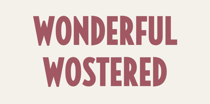 Wonderful Wostered Display Sans Font Typeface inspired by the famous minimalist logo perfect for the purposes of designing templates, brochures, videos, advertising branding, logos, invitation, layout design, elegant crafting, beauty design and other What's Included : + Standard glyphs + International Accent + Works on PC & Mac + Simple installations Accessible in the Adobe Illustrator, Adobe Photoshop, Corel Draw. PUA Encoded Characters - Fully accessible without additional design software. Fonts include multilingual support Image used : All photographs/pictures/vector used in the preview are not included, they are intended for illustration purpose only. Thank You
 - Burgs by Putracetol,
$16.00 Burgs - Multistyle Font is a versatile typeface that starts as a modern sans-serif font and expands into a diverse collection of eight alternative font styles. These variations include slab, stencil, display, sport, classic, serif, and decorative, offering a wide range of design options. Each font style can be combined with others or used individually, making it adaptable for a multitude of design purposes. Whether it's for logos, posters, packaging, branding, business names, stickers, headlines, or any creative endeavor, Burgs provides a wealth of options for your projects.
 - Display Explicit by Gerald Gallo,
$20.00 Display Explicit is a display font not intended for text use. It was designed specifically for display, headline, logotype, branding, and similar applications. Display Explicit has an uppercase alphabet located under the shift+character set keys with alternate characters for A, B, C, D, E, F, G, J, K, M, N, P, Q, R, and W located under the option+character and shift+option+character set keys. Under the character set keys are condensed uppercase characters. There are sets of numbers matching each of the uppercase sets, and punctuation.
 - Trends by Graphicxell,
$19.00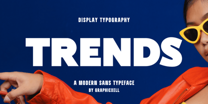 Trends Modern Bold Sans Font Typeface inspired by the famous minimalist logo perfect for the purposes of designing templates, brochures, videos, advertising branding, logos, invitation, layout design, elegant crafting, beauty design and other What's Included : + Standard glyphs + International Accent + Works on PC & Mac + Simple installations Accessible in the Adobe Illustrator, Adobe Photoshop, Corel Draw. PUA Encoded Characters - Fully accessible without additional design software. Fonts include multilingual support Image used : All photographs/pictures/vector used in the preview are not included, they are intended for illustration purpose only. Thank You
 - Bilton by Fettle Foundry,
$10.00 Bilton is a sans-serif typeface with the personality of serif and an incredibly large X-height. Intended for headlines and display sizes, Hutton can also be used at body sizes if needed. High contrast, sharp angles, and subtle serif-like flares are used throughout the design, making Bilton feel playful yet classy. Featuring ten styles – five roman and five matching italics – Bilton is suitable for a wide range of uses. The family supports more than 300 latin-based languages, and features contextual alternatives for character combinations and languages.
 - Sandra by Graphicxell,
$20.00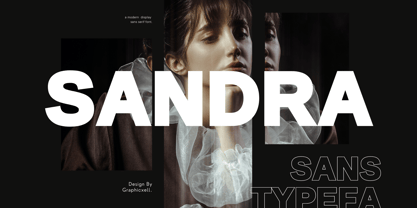 Sandra Bold Sans Font Typeface inspired by the famous minimalist logo perfect for the purposes of designing templates, brochures, videos, advertising branding, logos, invitation, layout design, elegant crafting, beauty design and other What's Included : + Standard glyphs + International Accent + Works on PC & Mac + Simple installations Accessible in the Adobe Illustrator, Adobe Photoshop, Corel Draw. PUA Encoded Characters - Fully accessible without additional design software. Fonts include multilingual support Image used : All photographs/pictures/vector used in the preview are not included, they are intended for illustration purpose only. Thank You
 - Nefarious by Hanoded,
$15.00 A few fonts ago I mentioned the fact that I like posh English words; words you don’t really use in conversation. As I am busy expanding my ‘halloween’ font collection, I came across the beautiful word Nefarious. It means wicked or evil and when you say the word, it even sounds evil! Fantastic! Nefarious is a halloween/witches font. It looks like my Griezelig font, but it is rougher and spikier. Use Nefarious for your halloween invitations, posters and books about evil geniuses. Comes with all diacritics and a bunch of swashes as well.
 - Amazing Paradise by Graphicxell,
$20.00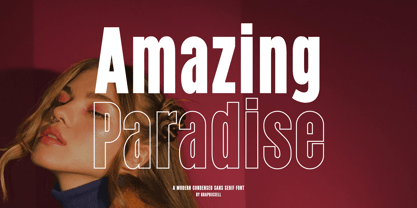 Amazing Paradise Condensed Sans Font Typeface inspired by the famous minimalist logo perfect for the purposes of designing templates, brochures, videos, advertising branding, logos, invitation, layout design, elegant crafting, beauty design and other What's Included : + Standard glyphs + International Accent + Works on PC & Mac + Simple installations Accessible in the Adobe Illustrator, Adobe Photoshop, Corel Draw. PUA Encoded Characters - Fully accessible without additional design software. Fonts include multilingual support Image used : All photographs/pictures/vector used in the preview are not included, they are intended for illustration purpose only. Thank You
 - Cronisse by Almarkha Type,
$35.00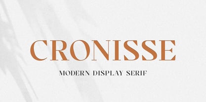 Introducing Cronisse – Modern Display Serif inspired by the famous minimalist logo, perfect for the purposes of designing templates, brochures, videos, advertising branding, logos and more. What’s Included : + Standard glyphs + Web Font + International Accent + Works on PC & Mac + Simple installations Accessible in the Adobe Illustrator, Adobe Photoshop, Adobe InDesign, even work on Microsoft Word. PUA Encoded Characters – Fully accessible without additional design software. Fonts include multilingual support Image used : All photographs/pictures/vector used in the preview are not included, they are intended for illustration purpose only. Cheers! Thank You

