10,000 search results
(0.054 seconds)
- Qualux by Asenbayu,
$12.00 Qualux is a versatile high-contrast serif font family. Qualux comes from the words Quality and Luxury. This font has vintage characteristics with a luxurious style in light, but also has a friendly and playful style in bold. Each glyph has a soft, rounded tip. This font is suitable for many various projects such as logos, branding, magazines, signage, fashion and many more. Qualux consists of 8 styles: Light, Light Italic, Regular, Italic, Semibold, Semibold Italic, Bold, and Bold Italic. These fonts feature Kerning, Standard Glyph, Stylistic Alternate & Ligature, Numeral, Symbol, and Multilingual Supports.
 - Garoa by Just in Type,
$20.00 Inspired by the 70's design, specially on Herb Lubalin's work, the typeface Garoa is a rounded mechanical display font without optical compensations, ideal for large bodies. The medium weight has lower case for short texts, and the Bold versions have singular upper case glyphs, with some alternates (at least one alternate per letter – some with OpenType features some using caps on the keyboard). The Garoa Hacker Clube Bold version is free and contains no OpenType features, but the glyphs have the same design as on Garoa Bold.
 - Holiday Dish by PizzaDude.dk,
$15.00 Holiday Dish has a simple and stylish art deco look. Freshen up your design using Holiday Dish, and you are guaranteed to get the eye-catching look your design deserves. Comes in both Regular and Bold.
 - Tetris Quadrate by Melissa Lapadula,
$19.95This font is influenced by the advancement in graphic computer technology that has evolved since the first basic pixilated computer games. This typeface aims to be bold and brazen. The fonts primary function is heading use. - ITC Machine by ITC,
$40.99 ITC Machine font was created by the design team of Bonder and Carnase, a bold uppcase alphabet whose geometric letters add strength to any presentation. ITC Machine font is excellent for signage and other display applications.
 - Unpretentious JNL by Jeff Levine,
$29.00 Simple, unassuming, yet fully functional in all sign, poster and headline applications is Unpretentious JNL and its oblique counterpart. Where plain, bold titling is necessary, this typeface will draw attention to the message with minimum effort.
 - Medinah by Trustha,
$15.00 Medinah is a stunning and bold script, completely suitable for a large number of designs. This font will leave you breathless, and give all your designs the impact they need to stand out from the crowd.
 - Mentari by Surotype,
$35.00 Mentari a brush script typeface, bold and elegant, with several alternate characters in each letter to give you ease in accomplishing the work of typographic such as logotype, poster, headline, T-shirt and other creative projects.
 - Pendragon by Motokiwo,
$17.00 Pendragon is one of our favorite font we have made. It’s sweet and bold script font that will useful for any typography project. Pendragon supports multilingual characters and easy to use in any device or program.
 - Glaster by Sulthan Studio,
$14.00 Glaster is a beautiful calligraphy typeface with a distinctive style of its own. It is a bold and elegant script font. Fall in love with its incredibly versatile style and use it to create spectacular designs!
 - Fransen by Khurasan,
$9.00 Introducing Fransen Typeface - a bold sans serif font that is very fresh and unique style handmade. Fransen Typeface is perfectly suited to logo, stationery, poster, apparel, branding, wedding invitation, card, tagline, layout design, and much more !!
 - Brik by Michael Hill Design,
$6.00Brik is a constructivism inspired sans serif typeface. Great for signage, the bold characters are made to create impact Available in Regular, Rough, alt and Lined. Great for mixing and matching and layering with each other. - Le Havre Hand by insigne,
$- Le Havre. It's a family with no lack of characters diverse, yet none are as deep or tested in their appearance as the weathered, hand-drawn texture of Le Havre Hand. Tall and lean, the well-aged face carries with it the stories of a thousand miles. Starting with a sans as its origin, this handwritten font's layered structure has been shaped through time and trial, ultimately capturing the simple beauty of a wise, experienced character. This layer-based font family includes style variations and new layering solutions. Le Havre Hand includes 21 font files. It also includes an outline, crosshatched versions and five inline variations, several extruded variants including a unique wireframe options. There are two extruded fonts and two drop shadow fonts. For users that have Opentype programs, such as Adobe Illustrator, Photoshop, InDesign, Microsoft Publisher and Quark, each font also comes with an established set of art deco alternatives. Le Havre Hand's alternate characters come together to exhibit a clear sensitivity to the art deco style. Use them on their own or increase your options by using them with any of the other members of the Le Havre family. Take time to look deep into the soul of Le Havre Hand. It's often the tested, weathered hand that is most reliable to guide you to success.
 - Adamslor by Maulana Creative,
$13.00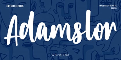 Adamslor is a handwritten script font. With high contrast bold stroke, fun character with a bit of ligatures and has a two files lowercase alternates. To give you an extra creative work. Adamslor font support multilingual more than 100+ language. This font is good for logo design, Social media, Movie Titles, Books Titles, a short text even a long text letter and good for your secondary text font with sans or serif. Make a stunning work with Adamslor font. Cheers, Maulana Creative
 - Greastly by Maulana Creative,
$12.00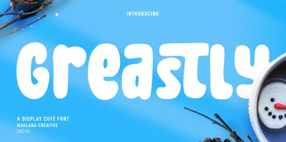 Greastly is a cute handwritten display font. With bold stroke, fun character with a bit of ligatures and has a two files lowercase alternates. To give you an extra creative work. Greastly font support multilingual more than 100+ language. This font is good for logo design, Social media, Movie Titles, Books Titles, a short text even a long text letter and good for your secondary text font with sans or serif. Make a stunning work with Greastly font. Cheers, Maulana Creative
 - Sobiah Written by Maulana Creative,
$14.00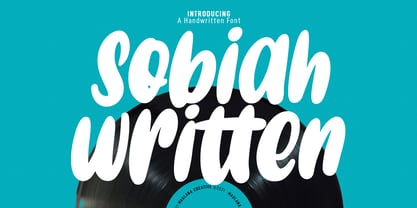 Sobiah Written is a bulb handwritten display font. With bold stroke, fun character with a bit of ligatures and has a two files lowercase alternates. To give you an extra creative work. Sobiah Written font support multilingual more than 100+ language. This font is good for logo design, Social media, Movie Titles, Books Titles, a short text even a long text letter and good for your secondary text font with sans or serif. Make a stunning work with Sobiah Written font. Cheers, MaulanaCreative
 - Deserted Canyon by Letterhend,
$17.00 Deserted Canyon is a textured SVG typeface with bold and strong look and feel. Available in two types, solid version and transparent version. This type of font perfectly made to be applied especially in headlines which is need a standout font, and the other various formal forms such as invitations, labels, logos, magazines, books, greeting / wedding cards, packaging, fashion, make up, stationery, novels, labels or any type of advertising purpose. Features : Solid version and svg version numbers and punctuation multilingual ligatures PUA encoded
 - Groen California by Fargun Studio,
$19.00 Introducing Groen California Font. It’s a cool and fancy font duo. When combined, these two fonts will add a unique spark to any design project! Here’s a run through everything included in this product: Groen California Sans is a modern and bold sans serif typeface featuring characters that stand out from every background. Groen California Script is a brush font with beautiful and natural brush stroke with Alternates and Ligatures, that perfect for logo, poster, product, apparel, packaging and many more.
 - Ongunkan Camunic Script by Runic World Tamgacı,
$60.00 The Camunic language is an extinct language that was spoken in the 1st millennium BC in the Valcamonica and the Valtellina in Northern Italy, both in the Central Alps. The language is sparsely attested to an extent that makes any classification attempt uncertain - even the discussion of whether it should be considered a pre–Indo-European or an Indo-European language has remained indecisive. Among several suggestions, it has been hypothesized that Camunic is related to the Raetic language from the Tyrsenian language family, or to the Celtic languages. The extant corpus is carved on rock. There are at least 170 known inscriptions, the majority of which are only a few words long. The writing system used is a variant of the north-Etruscan alphabet, known as the Camunian alphabet or alphabet of Sondrio. Longer inscriptions show that Camunic writing used boustrophedon. Its name derives from the people of the Camunni, who lived during the Iron Age in Valcamonica and were the creators of many of the stone carvings in the area. Abecedariums found in Nadro and Piancogno have been dated to between 500 BC and 50 AD. The amount of material is insufficient to fully decipher the language. Some scholars think it may be related to Raetic and to Etruscan, but it is considered premature to make such affiliation. Other scholars suggest that Camunic could be a Celtic or another unknown Indo-European language.
 - Chaotic Neutral by Missy Meyer,
$12.00 I'm letting my inner nerd show through on this one: "Chaotic Neutral" is a Dungeons & Dragons thing. But the name applies to this font, too! Chaotic: This font has all sorts of built-in irregularities. Some variation in letter heights and letter widths, and the stroke widths are all over the place. It's all about the hand-written messiness. Neutral: And yet! I've smoothed the strokes a bit, and gone for as few nodes on each letter as I can (while still keeping a bit of roughness), so this font can be used for any kind of purpose -- not just print, but cutting out as well! Chaotic Neutral also comes with over 300 extended Latin characters for language support, and is fully PUA-encoded for easy access no matter what program you're using.
 - Witch Hazel by Missy Meyer,
$16.00 Witch Hazel has been quite a while in the making; a fun font with slightly flared serifs, lots of ligatures and alternates, and over 1150 glyphs! This font is great for holiday designs, from Valentine's Day to Halloween to Christmas! It also bridges modern and vintage styling, so you can use it for fairy tales and pirates, or for your company's branding and logo! I just couldn't stop adding more and more to this font. Witch Hazel includes: - The usual A-Z, a-z, 0-9, and tons of punctuation; - Greek uppercase letters; - Cyrillic uppercase letters; - Over 430 extended Latin characters; - Small caps; - Decorative alternates for all letters (some letters have up to 8 alternates!); - Numbers and uppercase letters with pointy spurs; - Numbers and uppercase letters with rounded spurs; - 40 two-letter ligatures! All characters are OpenType coded and PUA-encoded, so they can be accessed by all design programs. And I'm including a PDF with the full character list; you can use it for reference, or you can copy/paste directly from the PDF into your project!
 - Steel Grrrder Script by ULGA Type,
$9.00 Steel Grrrder is an industrial-style joining script with a stencil effect, available in six weights ranging from Light to Black. Great for all kinds of display purposes including posters, film titles, book covers, magazines, advertising, signage, packaging, logos and tanks, this is a script with a sharp personality and a steely presence. However, if you’re searching for a “nice” script - sorry, bud - you’re looking in the wrong place. Steel Grrrder Script doesn’t entice the reader with voluptuous curves, flowing swashes or frisky letterforms, instead its sharp chiselled features compel the reader to pay attention. Characters muscle their way along like robotic bulldogs in steel-toe cap boots. Steel Grrrder Script is a veritable slab fest, best categorised as a constructivist joining script. Forged from carbon steel and wrapped in a layer of Graphene, this is a robust display typeface family able to withstand even the most demanding typographical situations. The Steel Grrrrder extended family also includes a six-weight sans-serif with corresponding italics and two display fonts, Groove & Nutjob - all designed to work with each other.
 - Ebisu by Thinkdust,
$10.00 Ebisu is a sans serif family consisting of 10 different weights. Designed by Alex Haigh in 2010, and influenced by one of his original designs from 2008 Hiruko - Ebisu loses the soft sans serif curves, for a more robust geometric styling. But it’s much more than a geo-replica. The lowercase characters also have a more exaggerated sharpness that gives the whole family a unique look and feel. The kerning has been individually crafted for each letter, with vigorous attention - to ensure that each letter from is produced in a way that works with every member of the set, for a tightly knit sans serif family. It speaks many languages too. The open type features have an extended character set to support Eastern and Western European languages. With each weight conveying a different personality, Ebisu is set to become the modern new sans serif family to sit alongside you classics for versatility, cleanliness and a crafted edge.
 - Clarence by Protimient,
$35.00Clarence is a modern, original typeface that has been designed to have a warm and slightly antiquated feel. It is slightly too idiosyncratic for great lengths of continuous text but does work very well at both small and display sizes. The serif structure takes some inspiration from architectural buttresses (a structure built against a wall to provide support or reinforcement). The serifs only protrude a small way from the body of the letter, which serves to ground the letter and, because the serifs bracket (the curve) joins the vertical at a relatively great distance from the tip of the serif, it remains subtle. The italic variant draws on the roman but has a more pronounced and curvier serif structure, analogous to the cursive element expected of an italic. This serif structure is present throughout the italic, even extending into the uppercase, making it more of a true italic than the commonplace sloped roman. - Noctis by Italiantype,
$39.00 Noctis was originally born as a single weight display typeface, designed by Luca Terzo who took inspiration by the unusual wedge serifs of Aldo Novarese's 1972 typeface for H. Berthold A.G., Primate. The design was developed by the Italian Type team into a full family of five weights from thin, each with its own true italic, and with a complementary set of decorative patterns. The strong Didonesque contrasts make this typeface both impressive at display sizes and easily readable in text size, while the sharp shapes of the triangular serifs and the distinctive letter shapes show their strength in logo design and impressive editorial use. Inspired by the elegant, self conscious and over-the-top aesthetics of Italian fashion scene of the eighties and nineties, Noctis finds its strength in its strong textural nature, that is explored in the Noctis Texturae subfamily, where each letter is used as a tile to produce seamless patterns that can be used to extend the branding capabilities of Noctis. Noctis features an extended latin character set of 481 glyphs covering over 190 languages, and includes advanced open type features like standard and discretionary ligatures, positional numerals, stylistic alternates and case sensitive brackets. Mixing versatility and personality, Noctis is ready to be like a top model on the design catwalk, making your projects looking classic but contemporary, finely tuned but assertive, and elegant as the best Italian luxury fashion.
 - Novantico by Typofactura,
$14.00 Novantico is an all capitals typeface, influenced mainly by roman inscriptional capitals and renaissance typefaces. Classicly designed forms give text a noble and elegant feel. It is intended to be used for relatively short and important texts, titles, headings, quotes, etc.
 - Lakeland JNL by Jeff Levine,
$29.00 Lakeland JNL was inspired by lettering seen on a vintage container of Yankee brand motor oil. Originally all-caps on the package, the remaining characters were developed to expand on this casual semi-script design which was popular during the 1940s.
 - Hedymosia by Wontenart,
$12.00 Hedymosia is a font that has unique glyphs on the curve intended to be shaped like noodles or spaghetti or similar food. font suitable for the food. Noodle food Font or anything about foods, New and Fresh font 2023, Thank You
 - Beginner by VladB,
$14.00 Beginner is a modern sans serif geometric font, includes upper and lower case characters, Latin and Cyrillic. Graphically, the characters have uniform thickness. Rounded corners give visual softness to fonts Intended use - infographics, design in technical areas, architecture, industry, sport.
 - Nikaia by Miller Type Foundry,
$- Nikaia started as an experimental typeface (the script weights) and was then expanded to its logical conclusions (italic & regular), producing the fastest look typeface in the world. Nikaia looks clean and sharp at any size, with 5 weights for contrast.
 - Rezak by TypeTogether,
$36.00 Nothing is hidden in the simplistic forms and overt aesthetic of Anya Danilova’s Rezak font family. Rezak is not a type family directly from the digital world, but was inspired by the stout presence of cutting letters out of tangible material: paper, stone, and wood. With only a few cuts, the shapes remain dark and simple. With more cuts, the shapes become lighter and more defined, resulting in a dynamic type family not stuck within one specific category. The Black and medium weights began as one approach before separating into display and text categories. The four text weights were created through pendulum swings in design direction that experimented with contrast, angles, tangent redirections, and the amount of anomalies allowed. The text weights are vocal when set larger than ten points and subtle at smaller sizes. The tech-heavy Incised display style came last, employing a surprising range of trigonometric functions to make it behave exactly as desired. Its look can result in something distinctive and emotional or completely over-the-top. Most normal typefaces change only in thickness; Rezak changes in intention, highlighting the relationship between dark and light, presence and absence, what’s removed and what remains. Rezak’s Black and Incised display styles are like a shaft of light in reverse and are perfect in situations of impact: websites, headlines and large text, gaming, call-outs, posters, and packaging. The tone works for something from youthful or craft-oriented to organic and natural products. Try these two in logotypes, complex print layering, branding, and words-as-pattern for greater experimentation. The text styles are bold, energetic, well informed, and round out the family with four weights (Regular, Semibold, Bold, Extrabold) and matching italics for a family grand total of ten. These jaunty styles work well in children’s books, call-outs, movie titles, and subheads for myriad subjects such as architecture, coffee, nature, cooking, and other rough-and-tumble purposes. Rezak’s crunchy letters are meant to expose rough, daring, or dramatic text. A further benefit is that this family is not sequestered within one specific genre or script, so it can be easily interpreted for other scripts, such as its current Latin and extended Cyrillic which supports such neglected languages as Abkhaz, Itelmen, and Koryak. Rezak’s push toward creativity and innovation, with an eye on typography’s rich history, reinforces our foundry’s mission to publish invigorating forms at the highest function and widest applicability.
 - Mundo Serif by Monotype,
$50.99 With designs drawn specifically for comfortable reading in everything from on-screen digital content to print in periodicals and books, Mundo Serif is ready to take on just about any project. Carl Crossgrove drew the suite of typefaces to complement his Mundo Sans family’s classic humanistic design traits – and added a subtle modern influence. Restrained stroke modulation, generous counters, commanding x-height and tall ascenders ensure that content set in Mundo Serif is both legible and easy on the eyes. While primarily designed for text copy in print and on screen, Mundo Serif becomes a powerful display type tool in the lightest and boldest weights. Headlines, navigational links and banners are naturals for this versatile collection of typefaces. Mundo Serif is a large family. Nine weights, each with an italic companion, enable precise typographic tuning. Captions, subheads, pull quotes and long-form copy can be melded to create a welcoming page of modulated text. For best results in digital environments, skipping a weight – or even two – ensures hierarchical clarity. Crossgrove did extensive testing of Mundo Serif to ensure the best possible on-screen readability. To further guarantee optimal digital imaging of the family, he gave the design generous inter-character spacing and slightly expanded intricate characters like the lowercase a and g. If the goal is diversified or multi-platform branding, look no further than Mundo Sans. The two designs harmonize with each other perfectly in weight, typographic color and proportion. Both designs benefit from large international character set that includes support for most Central European and many Eastern European languages. For a stronger contrast, pair Mundo Serif with virtually any sans serif grotesque design. Crossgrove has designed a variety of typefaces ranging from the futuristic and organic Biome™ to the warm, clean lines of the Mundo Sans. His work for Monotype also often takes Crossgrove into the realm of custom fronts for branding and non-Latin scripts.
 - Austragen by Almarkha Type,
$35.00 Introducing Austragen - Beautiful Bold Serif inspired by the famous minimalist logo, perfect for the purposes of designing templates, brochures, videos, advertising branding, logos and more. Perfect for adding a unique twist to word-mark logos, monograms or pull quotes. Austragen has 11 unique ligatures and 50 Alternate Glyphs as well as numbers and punctuation making it super fantastic. Like all of my fonts it is inspired by lettering from the good old past, but it still has a strong modern appearance. Its wide range of stylistic alternates allows versatile design options and works perfectly for headlines, logos, posters, packaging,,coffee shops, restaurants, magazine's headers, signs or gift/post cards,cafe's and weddings.
 - Pixelout by Ilhamtaro,
$17.00 PIXELOUT is a display font based on bold serifs combined with a psychedelic style and given a low pixel effect like in a game. With its pixelated stroke characteristics, this font is perfect for different or unique designs such as in games or for bands and music event posters. The uniqueness of this font is psychedelic-pixel, it can be categorized as a vintage font because usually old school games use this style plus it can be used for bands because psychedelic is also found in one genre of music. To enable the OpenType Stylistic alternates, you need a program that supports OpenType features such as Adobe Illustrator CS, Adobe Indesign & CorelDraw X6-X7. Cheers!
 - Regina Cursiv by HiH,
$10.00 Regina-Cursiv is a warm, bold, casual typeface. Its friendly, rounded curves remind me of the line from a gospel song by the Canton Spirituals, about "smoothin' up the roughway." Jointly released by the Bauer and Berthold foundries of Germany during the fin-de-siecle period, this typeface has some cultural flexibility. There are alternate versions of the uppercase ‘H’ and ‘I’ that can be chosen to reflect a humanist or blackletter tradition, whichever you prefer. Other alternates offer various stylistic choices. Regina Cursiv is a friendly, comfortable font. You will enjoy using it. Alternative letters: D, E, G, I, K, S, T, d, h, k, m, n and z. The numerals are old-style figures.
 - Segaon Soft by cretype,
$20.00 This family is the rounded version of Segaon family. Segaon Soft Family is a humanist sans-serif typeface that is clean, simple and highly readable. The spaces between individual letter forms are precisely adjusted to create the perfect typesetting. Segaon is versatile type family of 18 fonts. Segaon family consists of 9 weights (Thin, ExtraLight, Light, Regular, Medium, Bold, ExtraBold, Heavy & Black) with their corresponding italics. The Open Type fonts contain complete Latin 1252, Cyrillic, Central European 1250, Turkish 1254 character sets. Each font includes old-style figures, proportional figures, tabular figures, numerators, denominators, superscript, scientific inferiors, subscript, fractions and case features. We highly recommend it for use in books, web pages, screen displays, and so on.
 - Kelpo by Ahmad Jamaludin,
$15.00 Please welcome our new Groovy Retro Typeface, Kelpo! Kelpo - Created from our explorations which were inspired by 70's retro style and pop culture visual design like old comics, cartoons, and posters. The strong bold character with groovy style makes us feel retro vibes and takes us to the 70's era Kelpo - Comes with 59 beautiful alternates which consist of 4 stylistic sets. Contains 2 styles regular and italic, this font is best used for headings, logotype, quotes, apparel design, posters, flyers, packaging, book cover, and many more. What you get : Letters, numbers, punctuation, multilingual support Has 59 beautiful alternates Come and say hello over on Instagram! https://www.instagram.com/dharmas.studio/ Dharmas Studio
 - Couturier Poster by Latinotype,
$29.00 Elegance flows through Couturier Poster soul. The new cousin of early launched Couturier, brings higher contrast and an extended family, perfect for big sizes. Inspired by the didones from the 18th century, its design its heavily influenced by contemporary ideas makes it suitable to use for almost anything you can think of. Equipped with swashes, ligatures, small caps and alternates, this typography is very versatile and allows you to set a big range of compositions with discretion or personality. Couturier Poster comes in six weights and matching true italics, from thin to black. It's a good choice to pair with Couturier for smaller sizes and Couturier Poster for the big titles. It has a set of 1248 characters that cover more than 200 languages derived from latin.
 - Mouser by Sharkshock,
$100.00 Mouser has been an ongoing project that originated as a geometric sans of the same name before morphing into a similar, but entirely different family called TypoGraphica. It retains much of its earlier character such as limited contrast, high legibility, and tight spacing. Major changes were made for a simplistic, more cohesive look. This was done to maximize its usefulness for body text while keeping characteristics used for display purposes. Slices to top strokes are much more subtle with styling dialed down to a minimum. This family comes in 6 different versions to meet a variety of needs. Mouser is equipped with Basic and Extended Latin/diacritics, Cyrillic, kerning, ligatures, and fractions. Try it for website text, applications, or headlines.
 - Heltar by The Northern Block,
$19.30 A modern neo-grotesque typeface. Having grown up in Sheffield and been completely immersed in the work of The Designers Republic I became very drawn to their treatment of Helvetica, especially the close tracking of the letter space. This visual investigation led me to the study of the font Hass Unica, a so called improvement to Helvetica. In order not to replicate and become a clone of Unica I redrew all the characters from scratch improving optical appearance, developing subtle corrections and reshaping individual letterforms. The result is a remixed neo-grotesque font that has strong general optical balance with great rhythm under close tracking. Details include 10 weights, an extended European character set, true italic, manually edited kerning and Euro symbol.